Project: Various logo, icon, and illustrations Role: Art Director & Designer, Brand Design & Integration team Client: Silicon Valley Investors Network, Bluelink, Sleep Number, Best Buy Key Skills: Photoshop, Illustrator, Brand Design, Campaign Summary: An exploration of candidate marks for use in Best Buy’s national holiday campaign, and candidate marks for use by various divisions of an investor network.
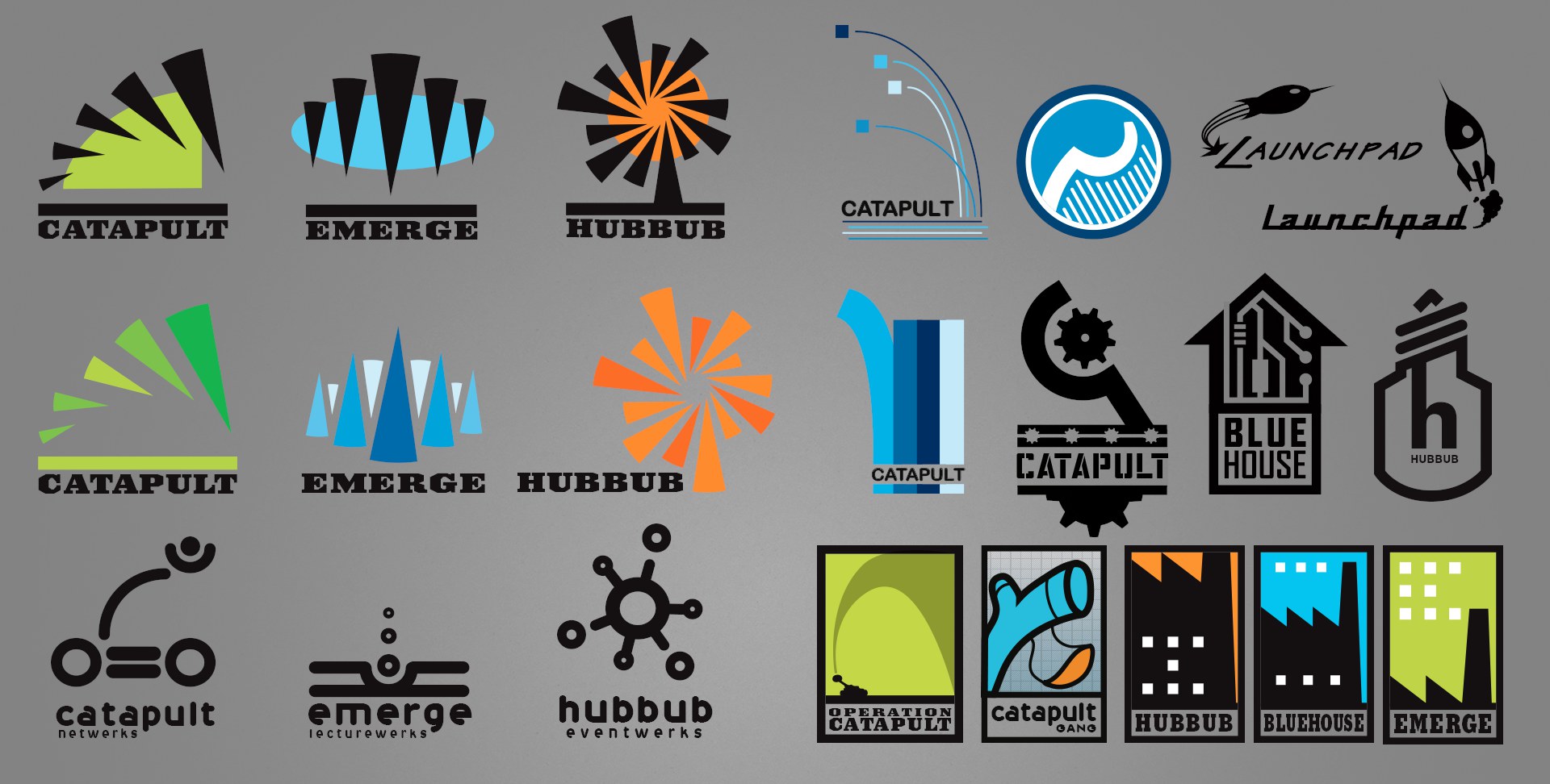
SVIN – Silicon Valley Investors Network
An organisation with three distinct divisions sought logos/marks for each group while retaining a cohesive identity between them. Above is a small sampling of my logo exploration for them.
The left half shows how I might carry one concept across all three identities; the right half shows additional graphic treatments, to show how I approach variety.
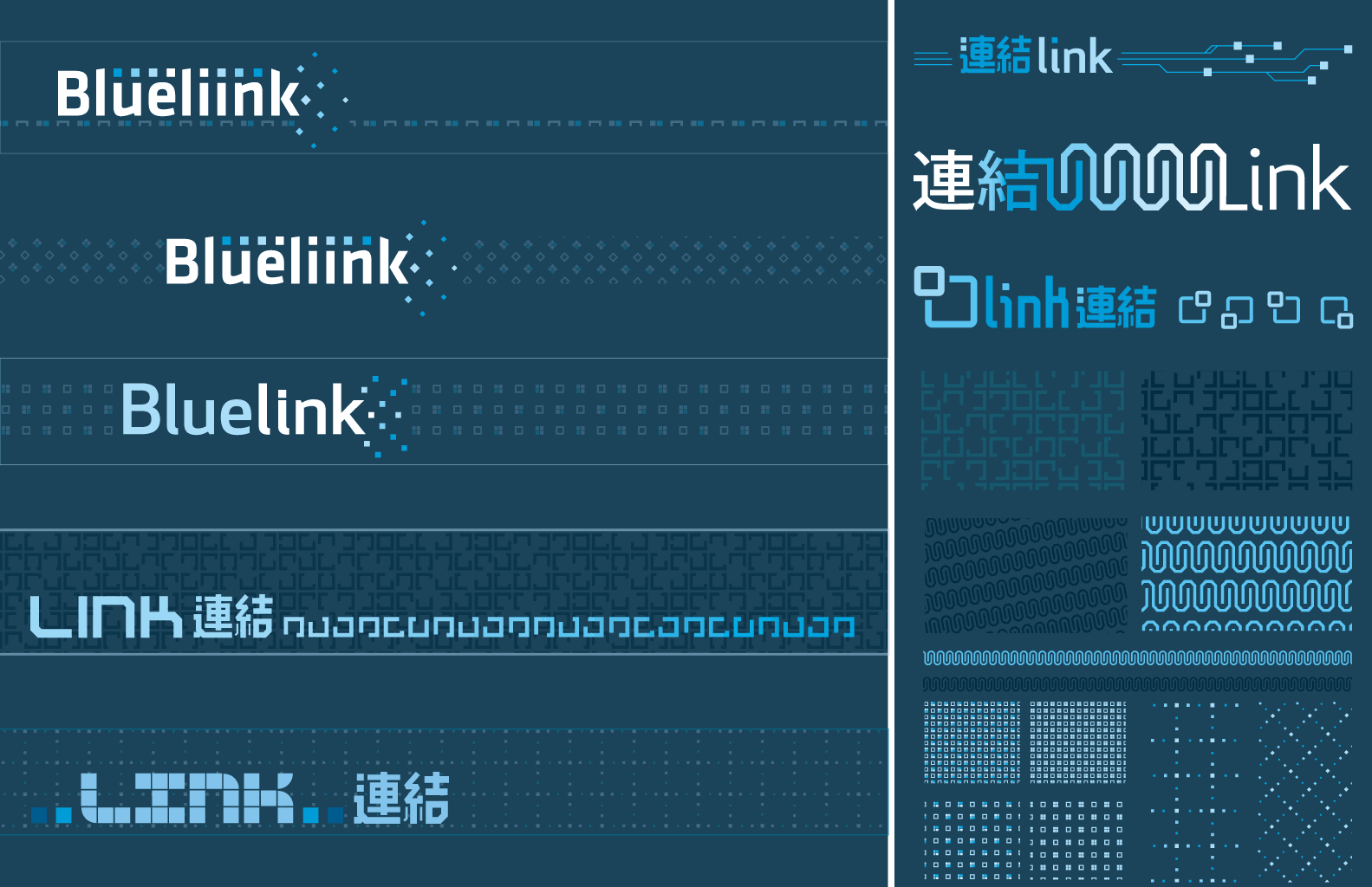
Bluelink
An exploration of sub-brand identity for a joint US–China venture. In Japanese, these characters mean “linking” or “connection”; I can only imagine there is a similar interpretation in Chinese (characters were provided by the international liaison).
Best Buy
Project: Holiday national advertising campaign style guide Role: Art Director & Designer, Brand Design & Integration team Client: Best Buy Co. Key Skills: Photoshop, Illustrator, InDesign, Brand Design, Campaign Summary: A thorough document which defines and illustrates every detail and usage for elements of a national ad campaign. Disseminated to Best Buy’s multiples channels (newspaper ads, print ads, in-store signage, website, etc.) to unify and govern execution for a consistent campaign experience.
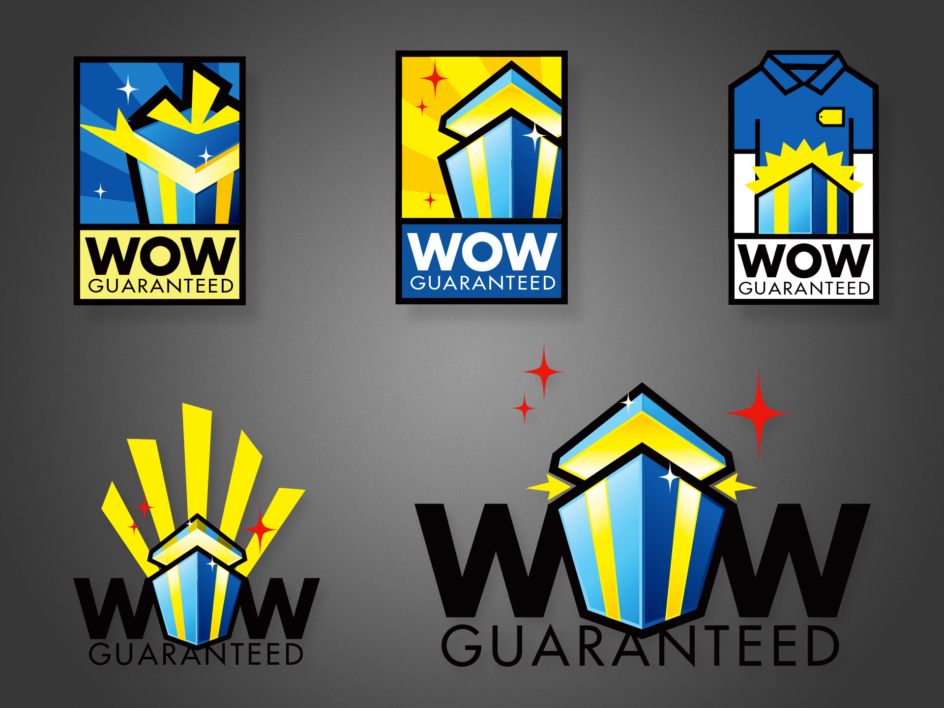
For ‘Holiday’ 2007, Best Buy used a hexagonal gift icon for its national campaign, with the slogan “Wrap up the WOW”, using typography similar to the lower two designs above. It was successful enough that the company wanted to recycle the idea for the following year. The difference was that while the first campaign focused on abundance and availability of gifts, the second wanted to add a focus on how the stores’ various services and staff can “guarantee” or maximize the experience.
Thus, several of my icon explorations feature a richer palette and a gift pictured at the magic moment when the recipient is blasted with delight. One concept even literally depicts a store staff to drive home the message that the company is here to make this magic happen for you.
While ultimately a slightly tweaked logo from the prior year was used, several of these were final candidates. I was one designer and art director on a small team tasked with this campaign, and all the work pictured above is my own illustration. Please check out my work creating the company’s style guide for the same drive period.
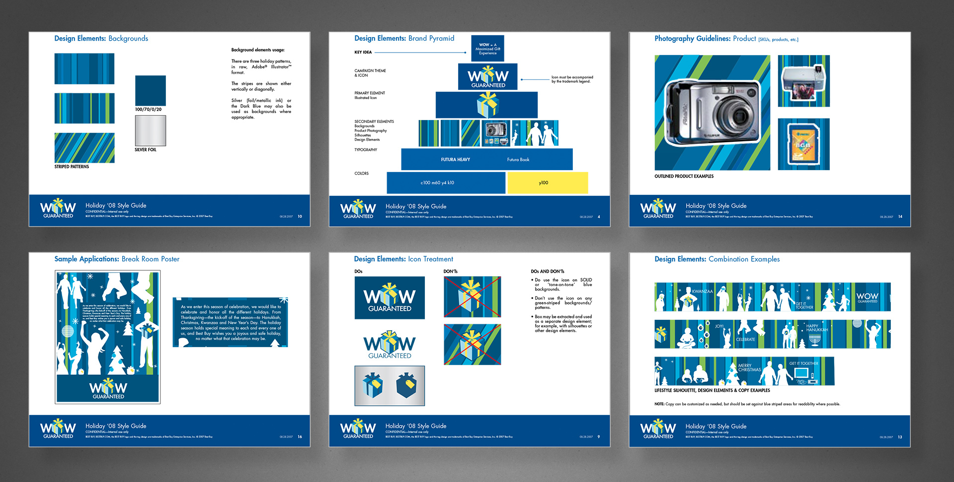
Several times per year, Best Buy would run national campaigns that would coincide with various holidays or drive times such as Christmas, Father’s Day, Back to School, and with each campaign would come a complete branded identity.
At the time, I was on the Brand Design & Integration team that helped conceptualize and then fully develop the campaign assets from a brief to roll-out across several channels, including online, in-store and signage, direct mail, newspaper insert, etc. So as a designer and art director, I helped come up with the visual components, but then I was also personally in charge of creating and managing a complete style guide so each creative department could apply it to their channel’s work, but also be used by the marketing groups in their various capacities.
The above example is a few pages from the Holiday campaign in 2008, though I personally managed dozens of similar campaign style guides. I created the template, layouts, and most of the sample design executions, based on actual workflows and guidelines of each channel. Note that this was created approximately a year and a half before the campaign’s public release, and thus each page contains a “confidential” mark.
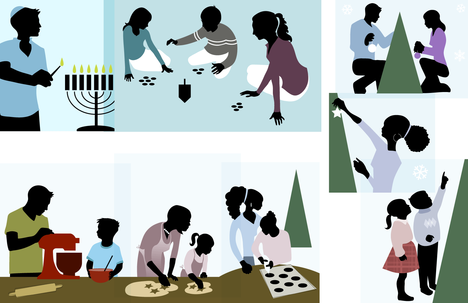
A collection of illustrations for an inclusive holiday season campaign.
“Flat” design is all the rage these days, but I’ve always had a thing for a minimalist approach.
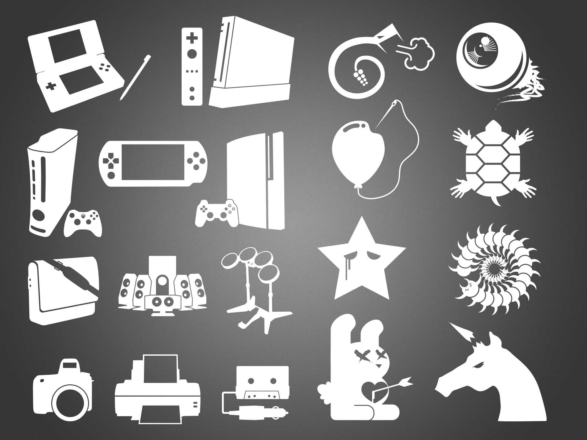
Left half: as part of a national drive-time campaign, we needed icons for a range of products to be advertised; icons that would give away a specific product or category at a glance, but be simple enough not to clash with any of the campaign’s visual vocabulary. I wound up doing hundreds of these, making the above image a tiny sample.
Right half: an collection of unusual or counter-culture style icons/illustrations intended for use in a “tween”-targeted gift card. Again, a small sampling of a much larger exploration set.
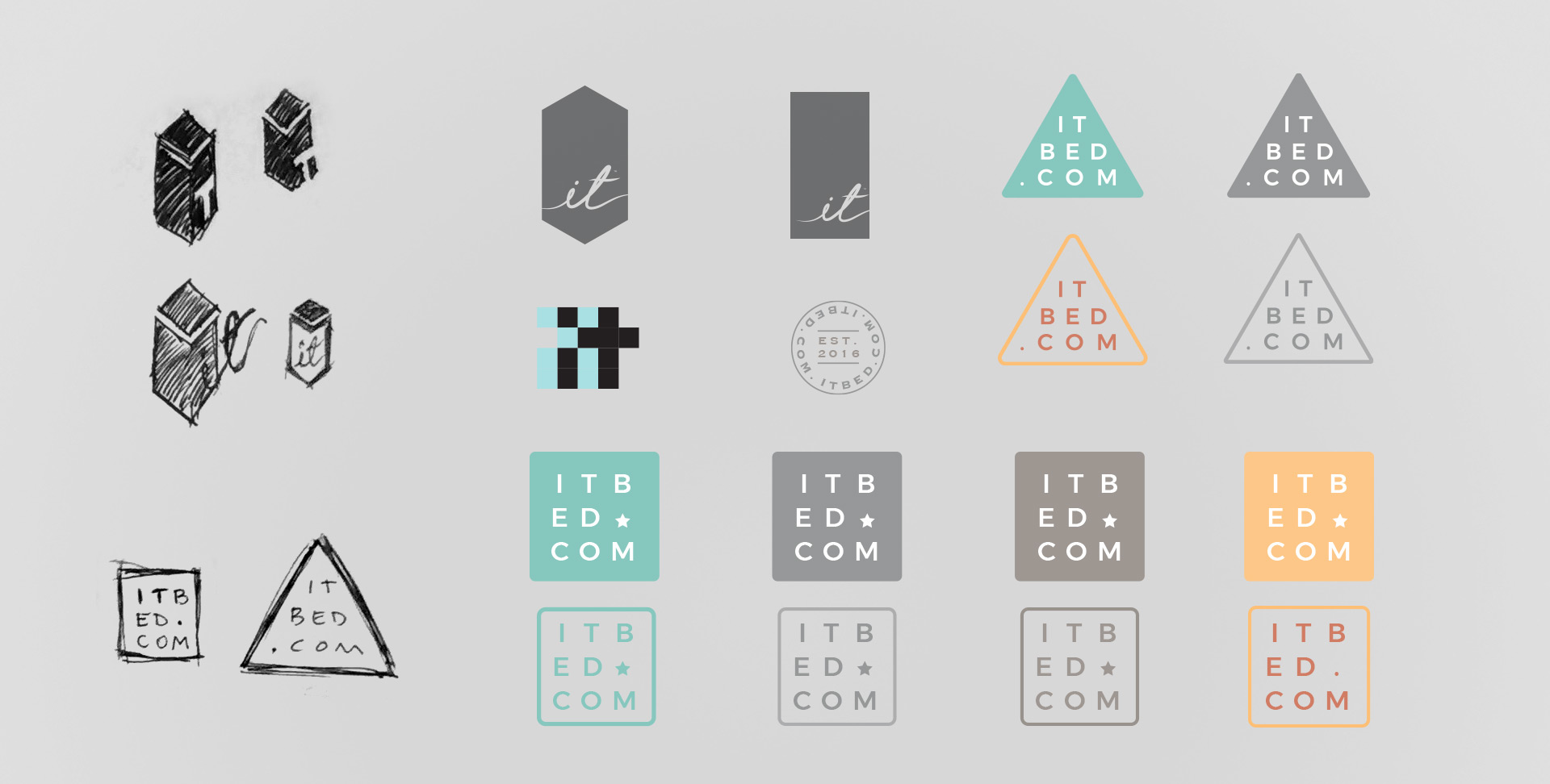
Sleep Number
As documented in the larger case study, the it Bed’s brand (design) had fallen into madness when I joined. Part of its journey back to rationality included a revised and refined brand visual language, replete with its own iconography similar to yet distinct from the company’s other product lines.
Similarly, I explored a new logo to bridge its existing brand equity with the rest of its new identity, keeping in mind this was a tech-connected bed (vacuum packed and shipped in a tall, thin box).
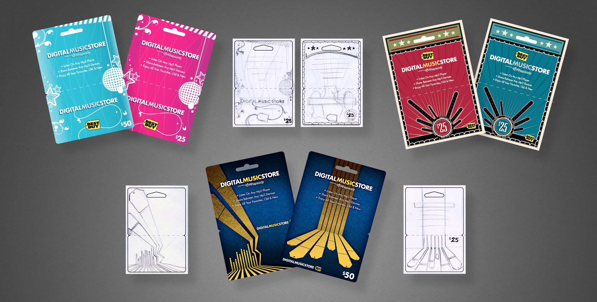
Project: BBY Gift Card Program Role: Art Director & Designer, Brand Design & Integration team Client: Best Buy Co. Key Skills: Photoshop, Illustrator, Brand Identity, Product Design Summary: An ongoing program of various gift card assortments. Each card targeted either a specific drive time, holiday, season, or consumer demographic. For each card, I began at the concept stage, finished at the press check, and everything in between.
Below is a gallery of assorted Gift Cards from my time with Best Buy. Photography of the final, printed product is shown where available.
Click any image to enlarge detail.
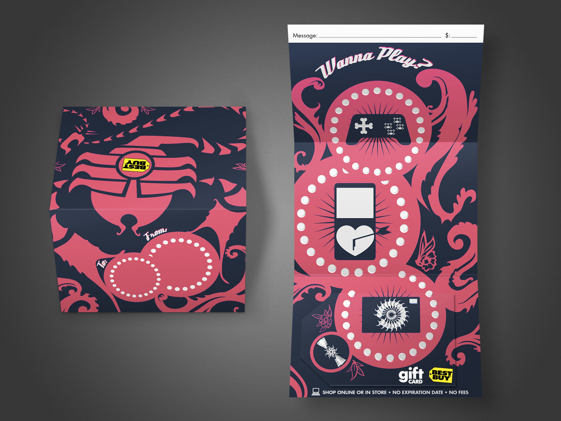
This is a trifold gift card that was produced to appeal to younger, edgier folks than the typical “vanilla” (slightly generic) cards otherwise available. Had to fight a bit to get approval for the skulls appearing on the game controller; the original concepts had heaps more, and my brainstorming files filled with similar odd/twisted cute-but-disturbing entries.
This card features UV spot gloss and spot thermographic (raised) texture for the white areas. My role spanned from the original concept sketch to illustrator, final mechanical production, and press check.
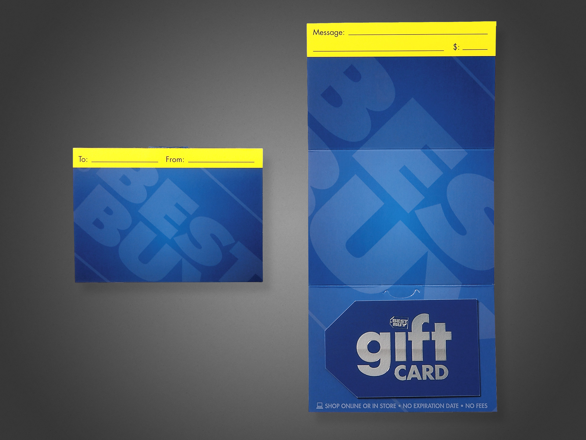
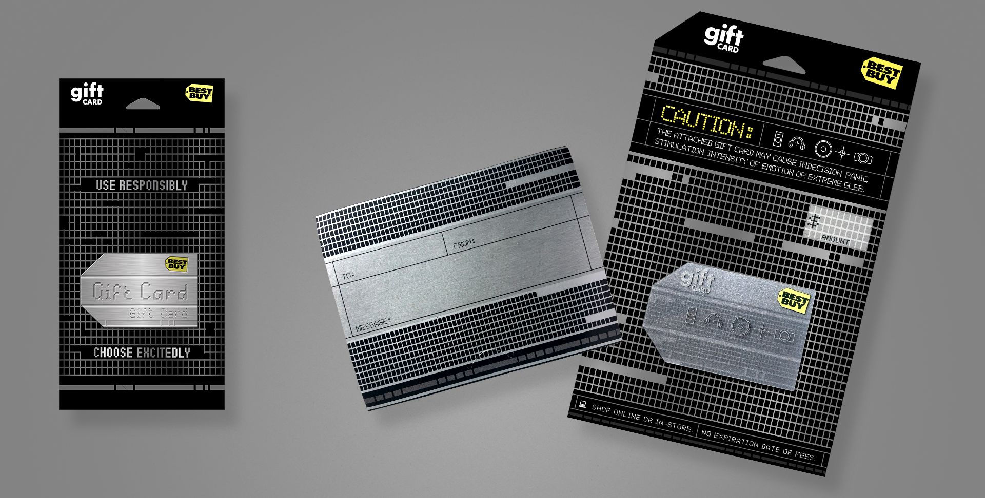
The open value, or “generic”, gift card is (or rather was at the time; I have no current data for comparison) Best Buy’s number one SKU; meaning it alone accounts for more revenue per year than any other single item they sell, exceeding a billion dollars annually. This makes it incredibly valuable as a brand vehicle—not just a product, and by far the most visible, high-dollar design I’ve ever created.
Some background on the project: at the time of its redesign, the company had been using a couple of flashy, and frankly gimmicky/gaudy designs that relied on cheap lenticular or hologram effects to gain attention. I understand the time and place for these things, but at a time when the company was looking to elevate their brand design, public image, and sophistication, such gimmicks are toys better left behind in childhood.
As such, a streamlined, elegant approach that put the brand name, marks and elements first. Solid on-brand blue, simple typography, and the use of subtle textures and contrast between shiny vs matte to do the talking. The card is a color-matched solid core plastic with a spot silver foil, and the giant logo on the carrier is a UV spot matte that exhibits different effects at varying viewing angles.
This design changed very little from my first concept presentation, and was received well both internally and publicly. I served as the Art Director, Designer, and Production Artist for this project, and assisted with on-site press checks.
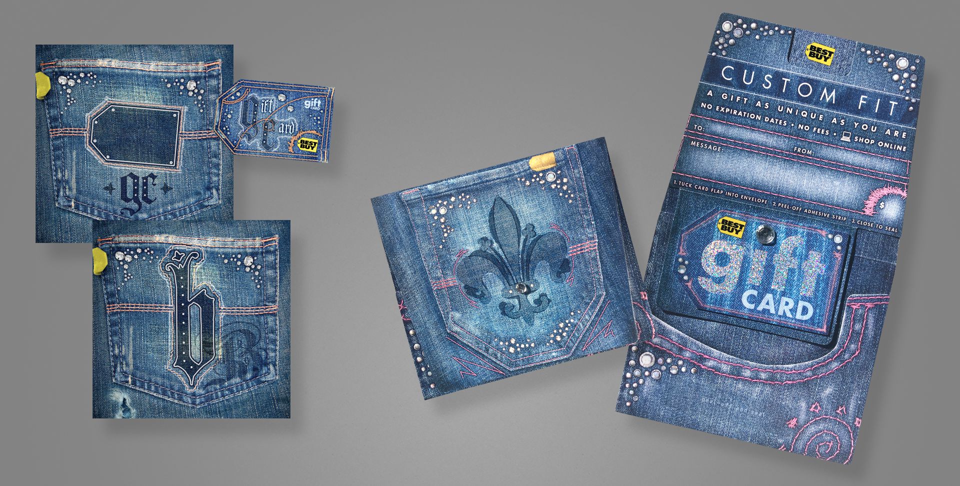
A brand-focused card, we decided to go all out with this one. Embossed, spot UV, spot matte, custom spot foil, and hand-affixed jewels to both the carrier and card. Shown left are two concepts for a gift bag, which eventually became the gift card.
My role spanned from original concept, to photographer, designer, production artist for final mechanicals, and on-press art director.
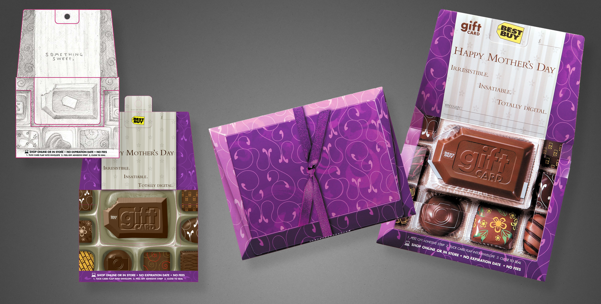
A gift card, available in Spring 2007. The brief was targeted at higher-middle income mothers, or at least as gifts for said demographic. We were to illicit a bit of “boutique”, plus a sense of abundance/selection. So I came up with a box of brand-specific chocolates. When closed, it looks like a box of chocolates, replete with a ribbon. When opened, you see the assortment of sweets.
Shown left are my original illustration and a digital comp. Shown right are my original concept sketch, my rough digital draft, and photography of the final product to show my workflow and vision carried out between media. I was responsible for the concept, client presentation, art direction and supervision of an illustrator hired for the final image, and the press check.
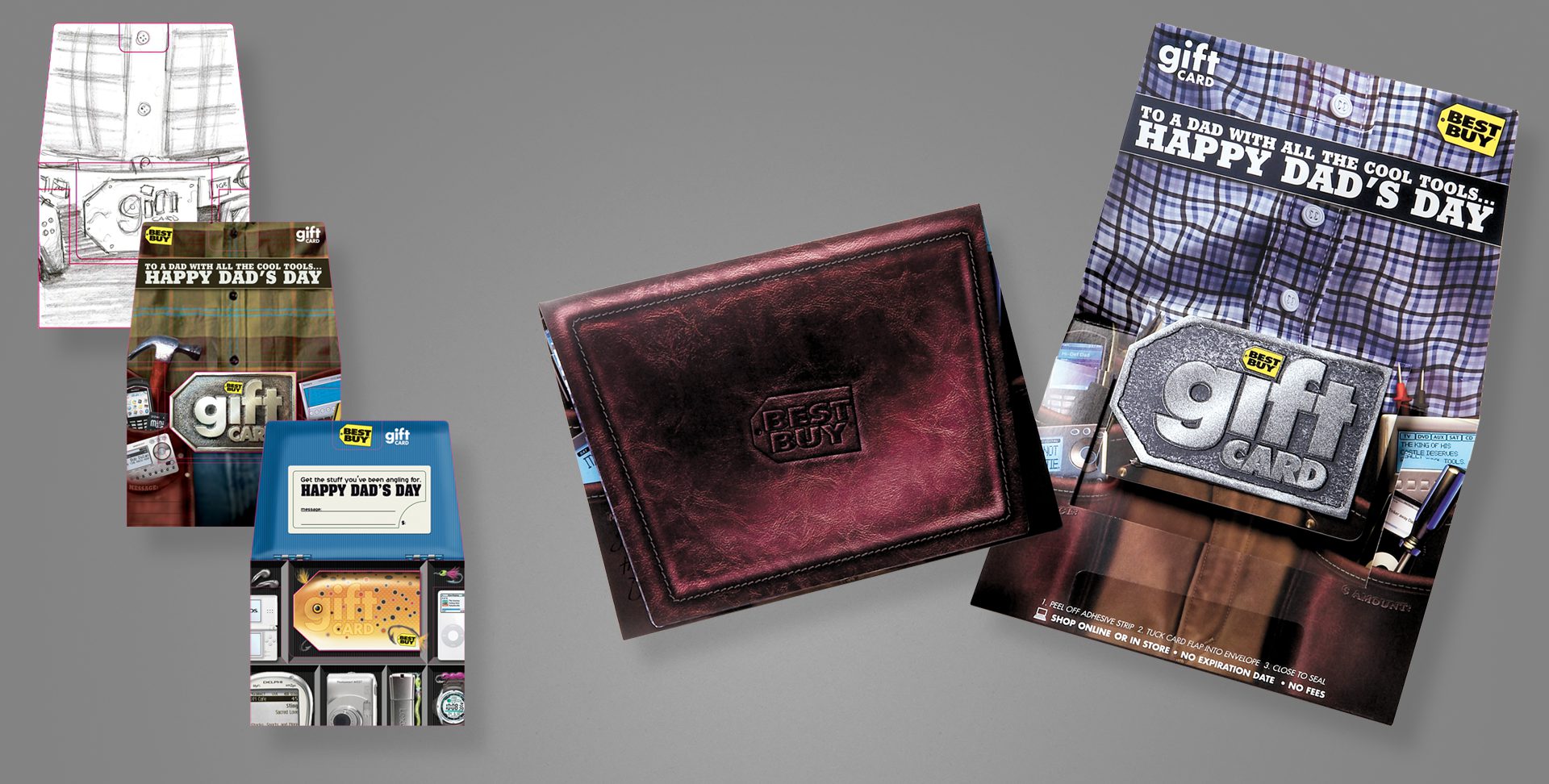
After having a Mother’s Day card aimed at a more sophisticated, upscale demographic, we of course needed one to match the fathers in the same category as well.
Shown left are my original pencil concept, and my first rough digital comp. An additional, unused tackle box concept is also shown. Finally, photography of the finished, printed illustration, open and closed. The closed design mimics a fine leather wallet, and the card design used a layered process with metallic inks to give depth and some visual flash.
Pencils and digital comps are my direct work; I art directed the final illustration via a sourced illustrator, and oversaw the printing process/press check.
A brand card that aimed at a more sophisticated, tech-savvy or early-adopter demographic. This project used a silver ink with 1C overprint for the textured metal effect on the carrier, and a layered card that shows different elements on the fronts and backs of each plastic layer, to give a parallax, 3D depth effect.
My original concept is on the left, and photography of the final printed card/carrier on the right. I art directed an illustrator for the final, prepared mechanical files as the project production artist, and oversaw the printing process/press check.
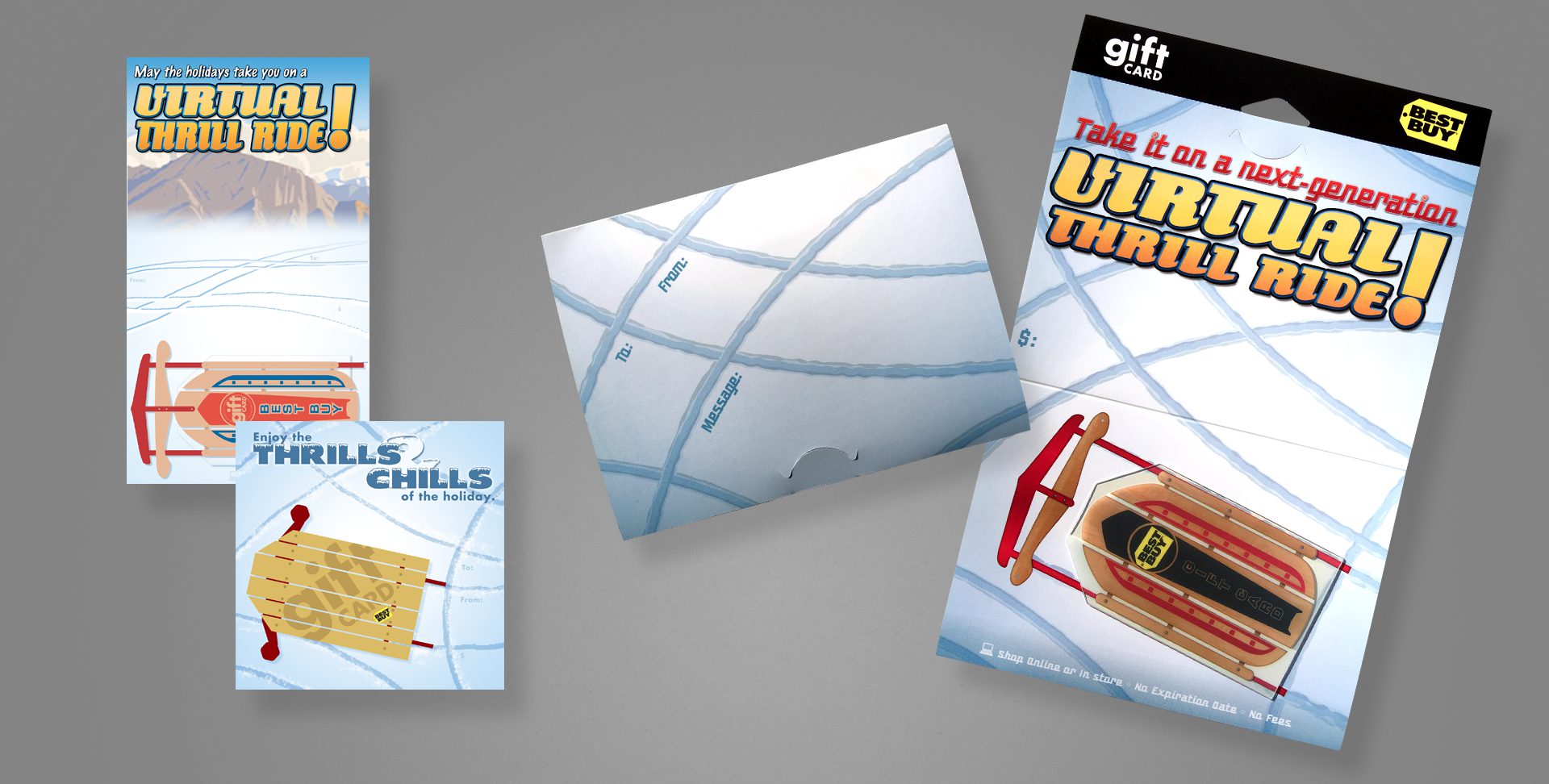
A holiday card that plays off the shape of the Best Buy tag. This card uses a clear card technology, so surrounding the sled body and between its wooden slots are completely clear.
My original concepts are on the left; photography of the final card and carrier are on the right.
I served as the designer from concept to the final design, with the exception of art directing an external illustrator, who produced the woodgrain and metallic elements of the sled; as well as assisted on production art of the mechanical files and attended all press checks.
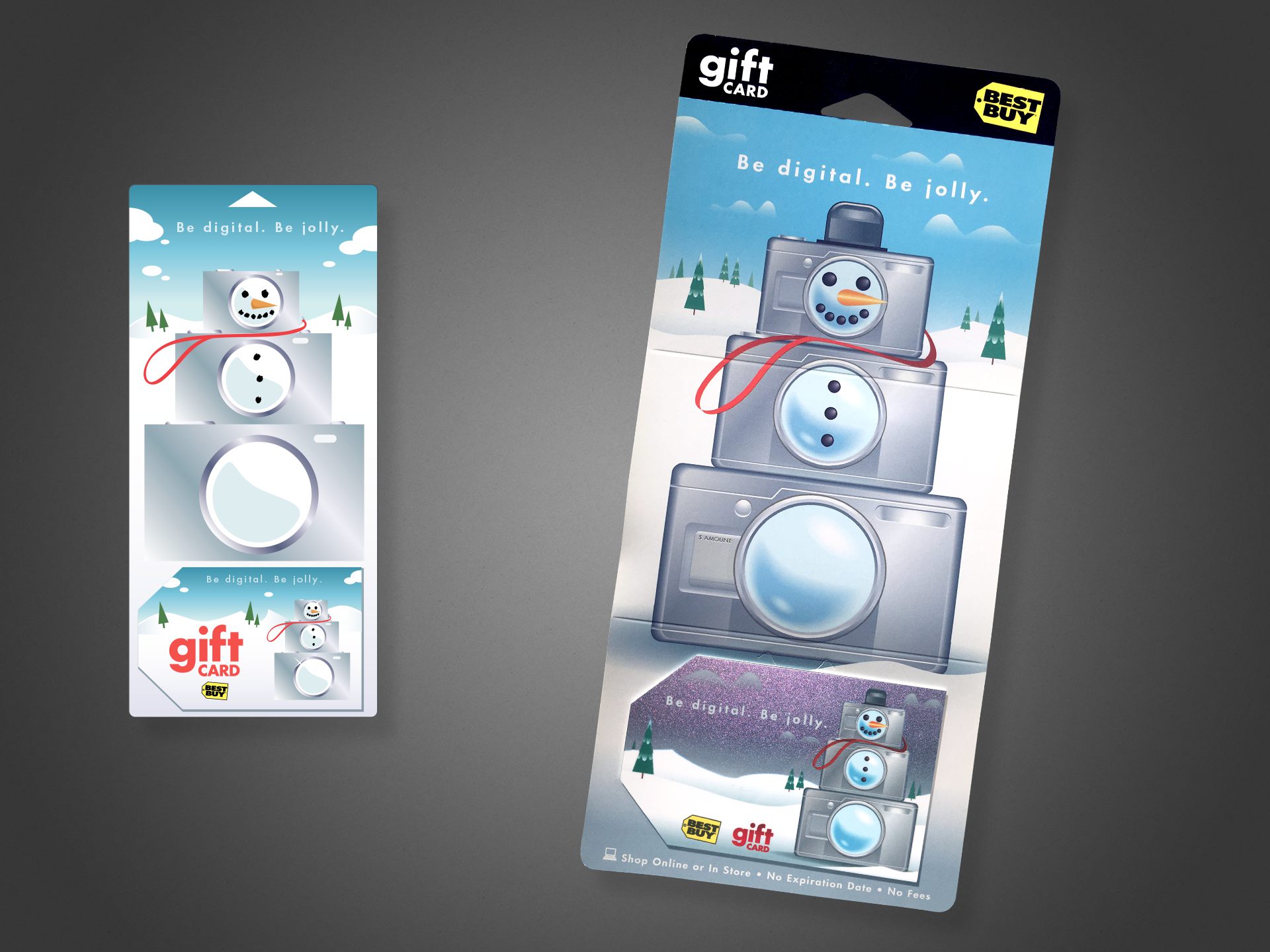
This holiday card is, conceptually, one of my favorites, simply due to it’s light-hearted, whimsical take on the Best Buy brand and its “abundance” component. This project features a color-shifting metallic fleck on the card, shifting between blue, teal, and the purple tones visible above.
Shown left is my original digital concept; shown right is photography of the final product. I served as the designer from concept, to art directing an external illustrator for the final illustration. I assisted with production art of the mechanical files, and attended press checks.
Cutting Room Floor
As gift cards became more popular in the mid ’00s, ways of standing out amid the massive selection became more important for the business end. That included exploring new substrates (plastic, clear, metal, etc.), new inks (metallic, color-changing, textured, etc.), and new form factors.
One of the alternate form factors our group explored was a gift card that doubled as a standalone speaker–requiring only an external audio source be plugged in via a standard headphone-style jack. Yes, it was thicker than a standard card, making swiping a magnetic strip impossible, and yes, the speaker was tiny and didn’t sound like much, but it was certainly on-brand as electronics and entertainment go, and something new to the gift card arena.
Included are a number of my pencil concept sketches, plus a number of digital comps.
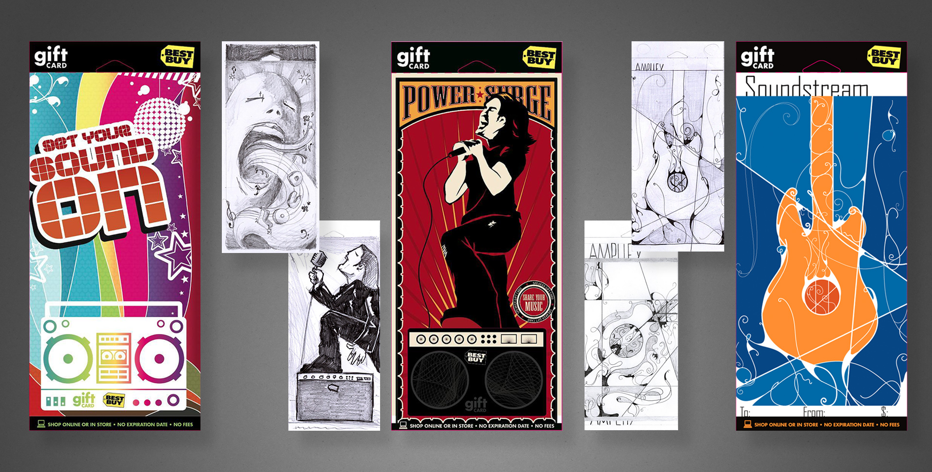
Above are a variety of concepts to be used for an online music service, each accompanied by my original sketch to illustrate my typical work flow. The dark blue cards in the lower-center were ultimately chosen for production, along with a third design in the series not pictured here.
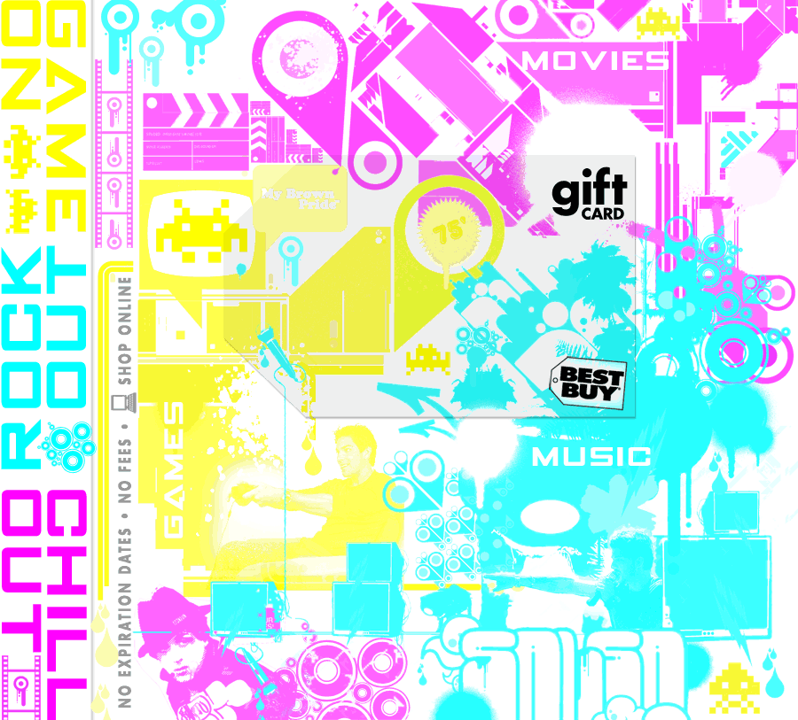
Less formally presented but my favourite… the 3-in-1 jewel case card:
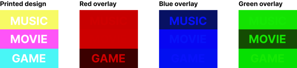
How the concept breaks down. For every vellum overlay, two ink colours would be “hidden”. For example, green hides cyan and yellow while darkening magenta, etc.
The brief was to design three entertainment gift cards, all to be merchandised amongst the in-store media (music, dvds, games).
To make the most of a limited budget, with some inspired and cunning use of the physical sciences, I devised a single design that would be transformed for each category using a different colour vellum overlay inside the jewel case. By exploiting properties of light, I could effectively hide two ink colours with a single transparent overlay.
B2B Gift Package
Project: B2B holiday gift package Role: Art Director & Designer, Brand Design & Integration team Client: Best Buy Co. Key Skills: Photoshop, Illustrator, InDesign, Brand Design, Product Design Summary: A premium holiday gift package for B2B customers, complete with a mailable box/packaging, exclusive discount coupons, and signed greeting card.
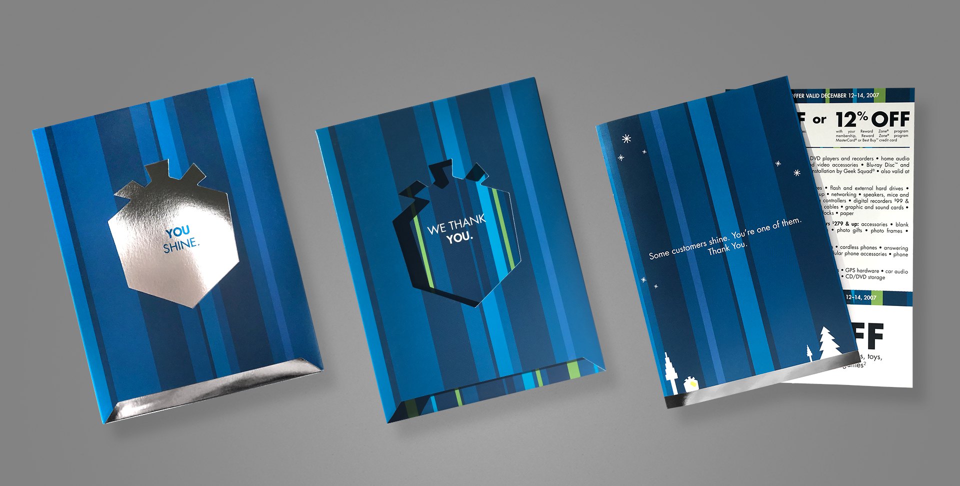
Every year, Best Buy produces a special holiday greeting card to its business customers (B2B), as a thank you for their patronage. When approached to lead the project one year, I took things a step beyond a simple greeting card, and created more of an actual gift package, one that also matched the company’s holiday campaign, which included gift box iconography and copy.
The box includes an additional flap that folds over the messaging visible on the above image (leftmost two samples), with space for mailing. Once opened, the recipient reads “You shine.”, on a shiny, silver foil box. Sliding out that box reveals a secondary message printed on the inside of the carton, “We thank you.” Inside the box is an actual greeting card, hand-signed by the team and containing a special offer coupon. The elegance and simplicity throughout this piece was really satisfying, and went over remarkably well with recipients.
My role extended from the original concept, where I literally spent the first week working through the form factor, hand-making various mockups to test; to the design and production of the final mechanical files.
Industrial Product Design
Project: Private label product line revision Role: Art Director & Industrial Designer Client: Insignia Key Skills: Photoshop, Illustrator, Brand Identity, Product Design Summary: A new line of private label products struggled to achieve a cohesive—and upscale—image across its variety of products.
Many consumers immediately associate private label (or as they’re commonly referred to in the pejorative, “generic”) products with similar, but inferior quality, at least compared to brand-name equivalents.
What those same consumers don’t know is that in many cases, the generics are manufactured by the same factories on the same equipment, etc. as their more expensive counterparts. Swapping a mould, logo, or packaging design between them is almost trivial.
The Insignia brand manufactures a heap of private label electronic goods for Best Buy, but early in their journey, they struggled to create a cohesive identity amongst their product lines, because each was produced independently by whichever facility was manufacturing it.
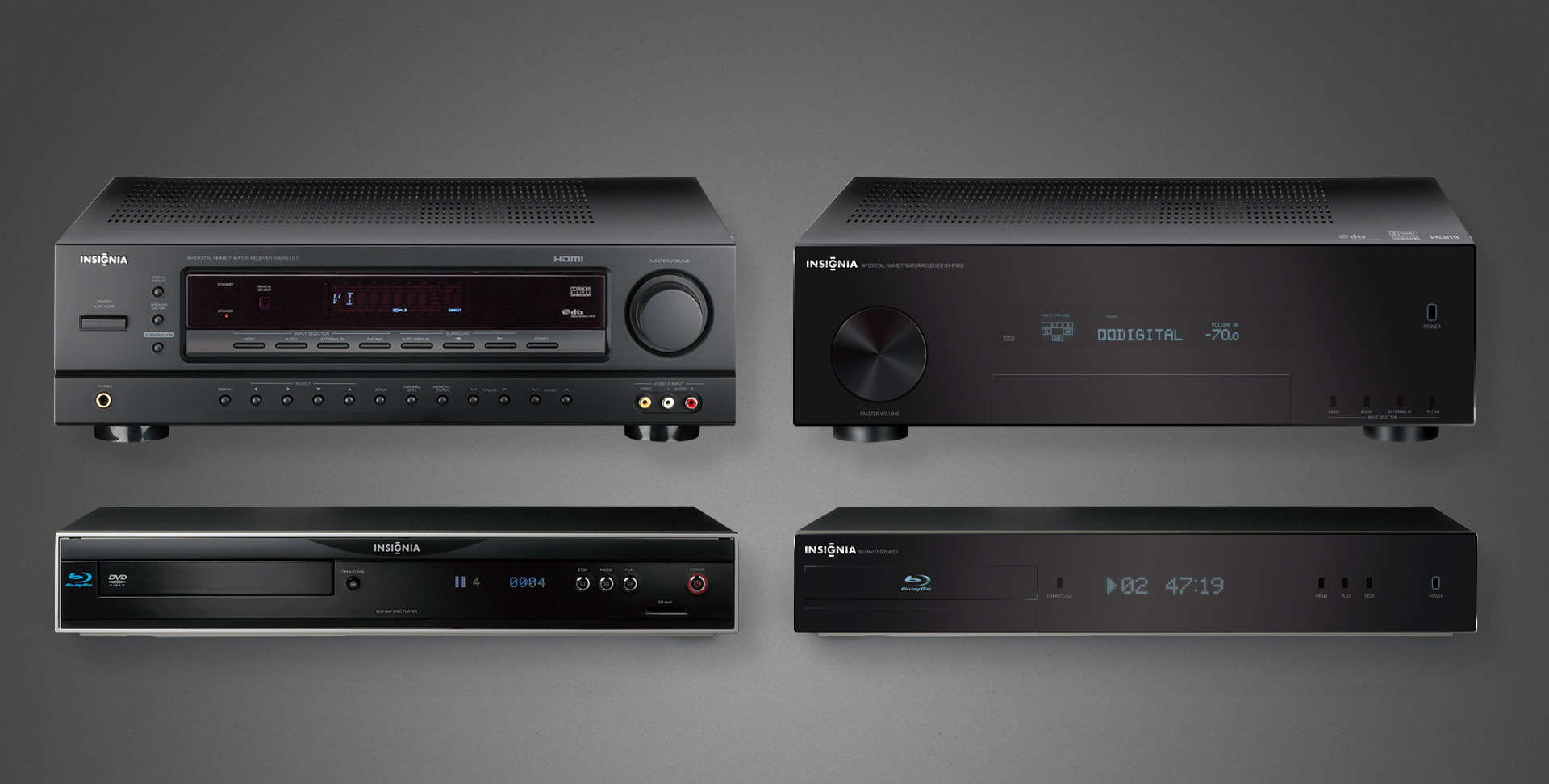
Left: the individually serviceable but collectively unrelated original A/V components Right: the family resemblance is not only obvious, but its refined elegance suitable for any discerned A/V enthusiasts
No more apparent a case made than that of home theatre products, when they’re often literally stacked together. Insignia A/V offerings were all over the place, literally and figuratively, because each factory did whatever they wanted to satisfy the technical requirements and called it a day.
I was charged with providing branding and industrial design support, both to align the products’ appearances but also elevate their chicness, especially when placed on shelves alongside high-design and higher-priced competition. The scattershot fit and finish simply reflected poorly on both the products and brand.
A peek at one example of product families, we can see on the left the somewhat schizophrenic and mismatched pairing of a receiver and its cohort Blu-ray player.
My recommendation for revisions to both—staying within budget—is shown on the right. All done completely in Photoshop (and with vector shapes/layer styles for resolution independence no less).
These efforts did spark something of a renaissance within Insignia’s product and manufacturing group, evident to this day in their more well-conceived line of goods.
I actually enjoyed this enough that I considered returning to school to get certified/qualified in industrial design. However, in the course of informational interviews with existing professionals, all interestingly shared the same warning: “if you want to do industrial design, just realise that everything you ever do will end up in a landfill someday”.