Project: Packaging and Retail Displays Design Role: Designer, Production Artist Client: Ghirardelli Chocolate Key Skills: Photoshop, Illustrator, InDesign, Product design, Concept development Summary: A collection of designs and illustrations for retail product packaging and POS displays. I worked on the final mechanical files released to the printers, as well as photo-realistic visualizations of what the products would look like once produced, for use by the marketing teams when selling to external vendors.
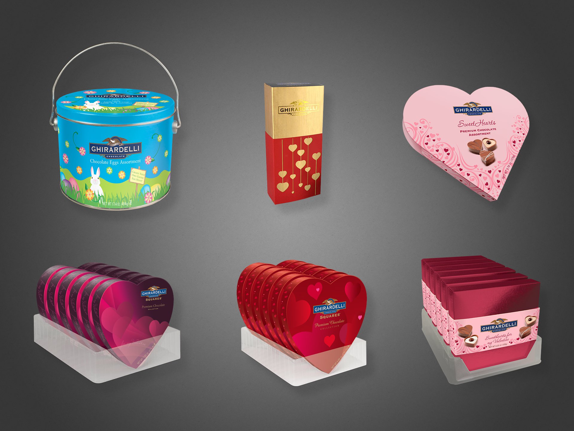
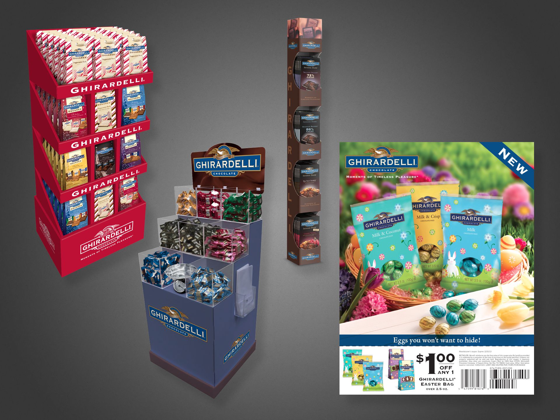
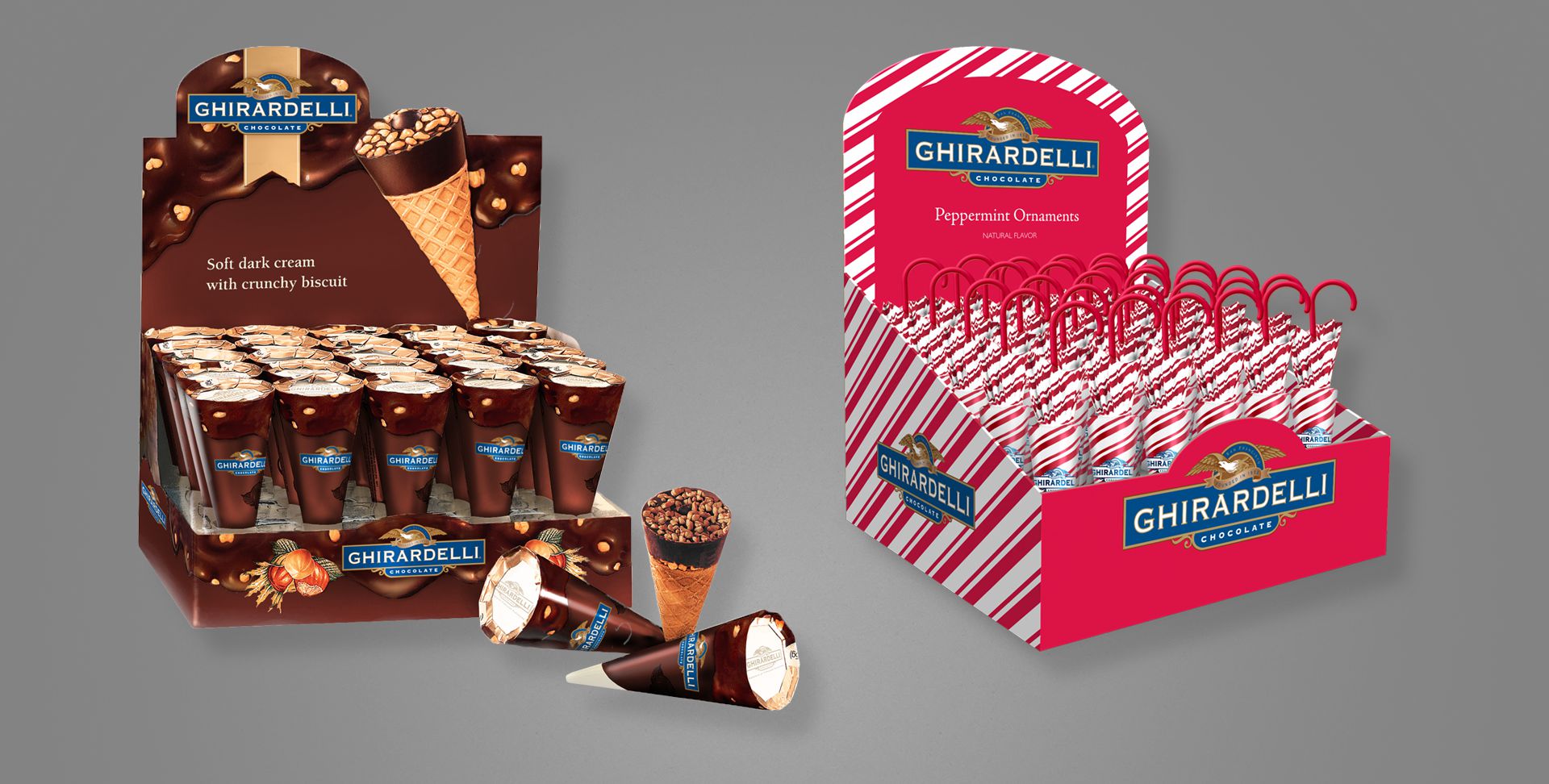
All of the images on this page may look like photographs, but are actually Adobe Photoshop renderings meant to look realistic.
The company’s Marketing team would often request imagery of upcoming products for promotional or sales meetings with retail vendors, but because the products had not yet been produced (in order to photograph), I would be tasked with producing “photography” for the non-existent items, using only design files, and flat printer’s dielines, to aid in visualizing.
The above are all seasonal products, for Easter and Valentine’s Day.
Above left, three free-standing in-store displays. Above right, an Easter coupon, available in stores and as magazine or newspaper inserts. All product shown in the coupon flyer—even in the photographed basket—is fictional; actual product had not yet been produced.
Above are two additional counter- or shelf-sitting displays. All product and the displays themselves were fabricated and painted for illustrative purposes.
Promotional Literature
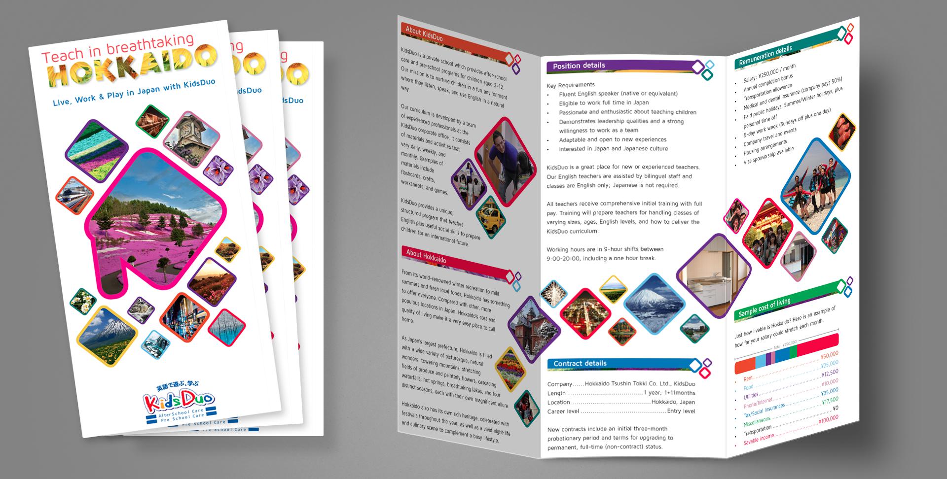
Project: Recruiting trifold pamphlet Role: Art Director, Designer, Copywriter, Production Artist Client: KidsDuo, Hokkaido Tsuushin Tokki Key Skills: Photoshop, Illustrator, InDesign, Print design Summary: A 6-panel trifold used for recruiting English teachers for a chain of private children’s schools in northern Japan.
A chain of franchised children’s English schools in northern Japan was looking to expand its business and needed to attract foreign teachers, so an informational pamphlet was commissioned to that end.
I served as the entire team for this one: Art Director, Designer, Production Artist, Photographer, Copywriter, and Print Producer. Basically, everything you see (including the white space in some sense) is my work. Of note to anyone unfamiliar with Hokkaido or Japan’s geography, the large shape on the front cover is a very stylized representation of the island’s shape, and the swath of photo diamonds on the inside spread is a rough representation of Japan as a collection of islands.
Distributed throughout high-traffic areas for foreigners, this trifold generated an immediate increase of interest for job-seeking English-speakers, allowing the business to expand with additional locations.
Direct Marketing
Project: Direct mail envelope design Role: Art Director & Designer, Brand Design & Integration team Client: Best Buy Co. Key Skills: Photoshop, Illustrator, InDesign, Brand Design Summary: Redesign of the envelope delivered to millions of customers per year; the plain blue kit with a simple logo lacked energy and failed to generate enthusiasm amongst recipients.
A Failure of Communication
Best Buy sends physical mail to millions of customers per year–sometimes coupons, promotional offers, or other communique–but found a distinct lack of enthusiasm when polling recipients amid waning response rates. Surprising no one, it turns out sending people something that looks like junk mail or workaday marketing chirashi will generate disinterest.
Recognising an opportunity to upgrade their brand image and also improve redemption without having to sweeten the offers, the underwhelming envelope needed replacing. That said, while the enclosed communique also underwent a redesign, this case study discusses only the envelope.
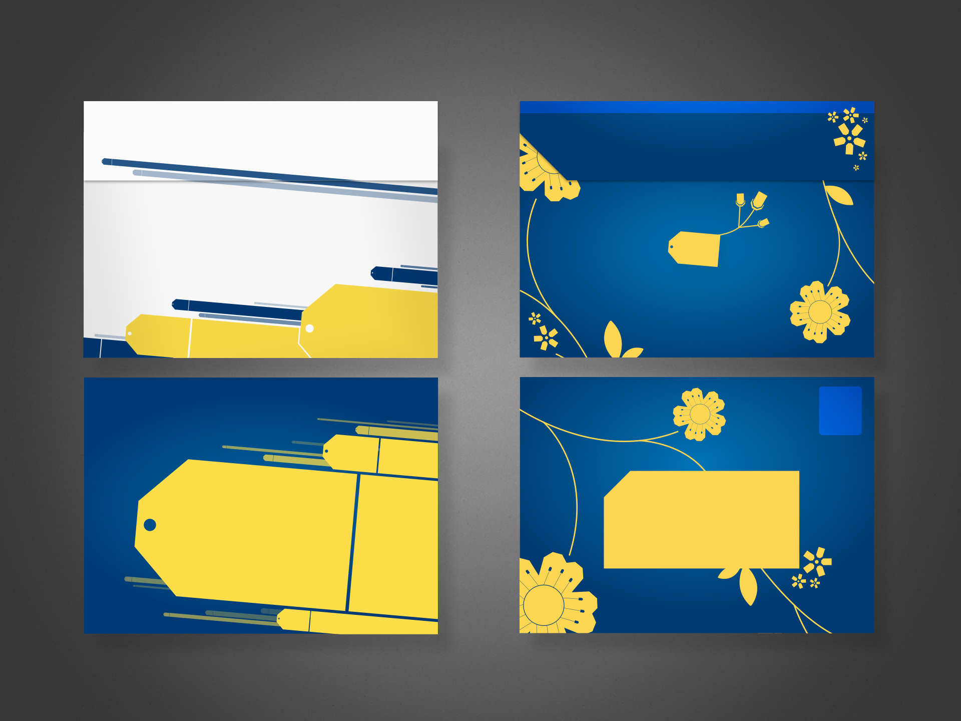
Left: the selected concept, final design. Top shows the rear with flap. Bottom shows postage and address areas. Right: alternate concept
Concepts Galore
All said and done, I produced well over a dozen concepts, each in varying stages of polish; four of them shared here. Aside from demonstrating diversity of thought, comparing the different ideas allows one to discern the various anatomical aspects of the envelope perhaps not otherwise obvious: the addressee area (reversed/white text not allowed), the return address, and the postage area.
At the time, efforts to transform the organisation into one more “customer centric” permeated virtually all discussions related to marketing.
For this project, I was the designer and art director. I produced pencil concepts, rough and polished presentational comps, and helped prepare files for press.
TLDR; some of my old, publicly released web/digital product work 🤷🏻♂️
Before we begin, realise most of the below projects precede the emergence of flat design trends, before responsive web design was standard practice, or even UX/UI as their own distinct fields.
Included here for context in my larger career and to illustrate some sense of design progression or contrast my natural aesthetic against the trends of yesteryear (skeuomorphism, anyone??).
Monkeypaw Games
Project: Branding and websites Role: Creative Director, Designer, Front-end Developer Team: <10 Environment: Remote Key Skills: Photoshop, Illustrator, Brand Identity, Web design, HTML, CSS Summary: Creating a teaser website for display during development of a full e-commerce site, plus establish corporate branding/identity.
Monkeypaw Games approached me first in need of a new website to promote its line of digital game releases on the Playstation Store, and as a company based in Japan, it marked my first international project*. A secondary objective to re-imagine the logo and branding lurked in the bushes, as their interim identity frankly looked the result of too casual a black Sharpie on napkin.
Die first, resurrect and live later
Monkeypaw needed something for visitors to land upon while their more robust site containing an online store and media engine underwent development.
A “tombstone” site back in the day described a single-page website, usually meant as a placeholder or simple informational block to satiate visitors with the basics. No links, tabs, menus or other frills; just the one page.
A surprising cottage industry sprouted in the late 00s supporting this trend, especially favouring new or small businesses wary of investing heavily in an online presence. Ironic for tombstones to represent so many new companies rather than “deceased” 🤷🏻♂️
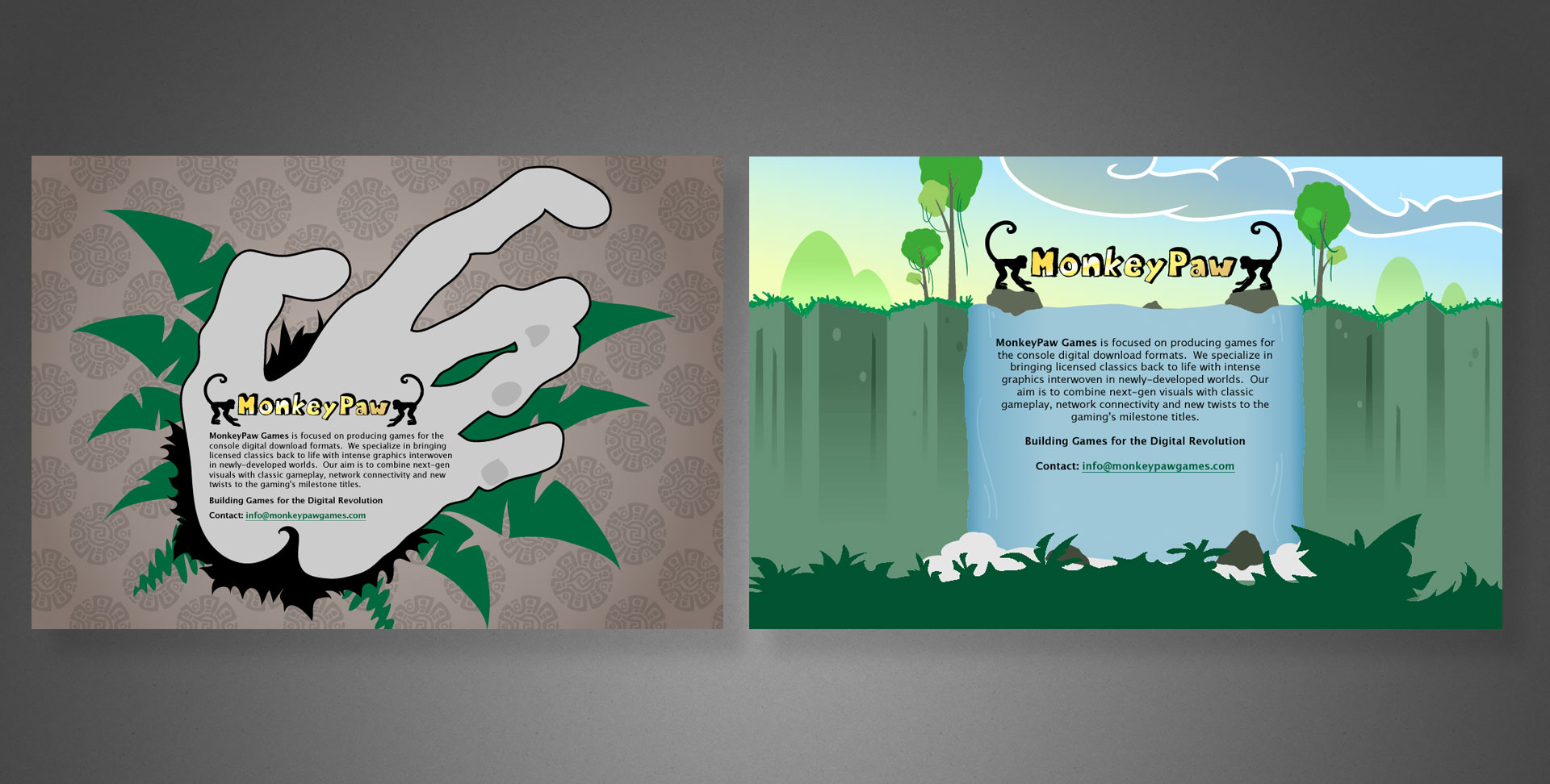
Two discarded concepts. Too literal/grotesque (left) and too whimsical (right).
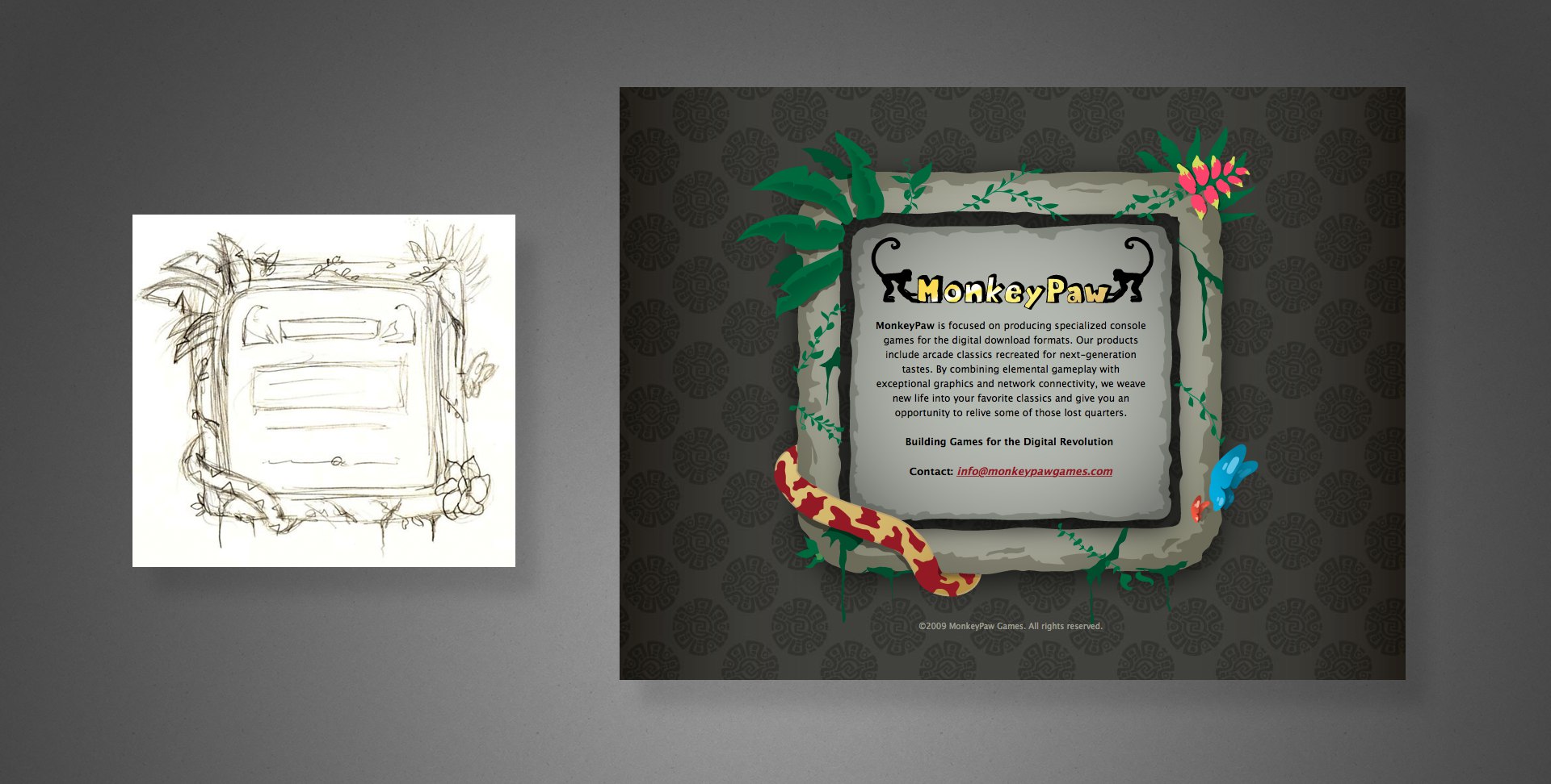
Curiously, their initial branding centred around a rather kitschy jungle motif instead of something slick and befitting a tech/gaming company. Anyway, a few rounds of sketches led us to the image below; a light-hearted illustration evoking tropical undergrowth and Incan ornamentation. …because monkeys?
Left: My quick sketch Right: the fully illustrated final UI
Rebranding
I do remember learning from our calls that their starter logo really was hand-drawn…on an inappropriately disposable substrate no less. Disposable indeed.
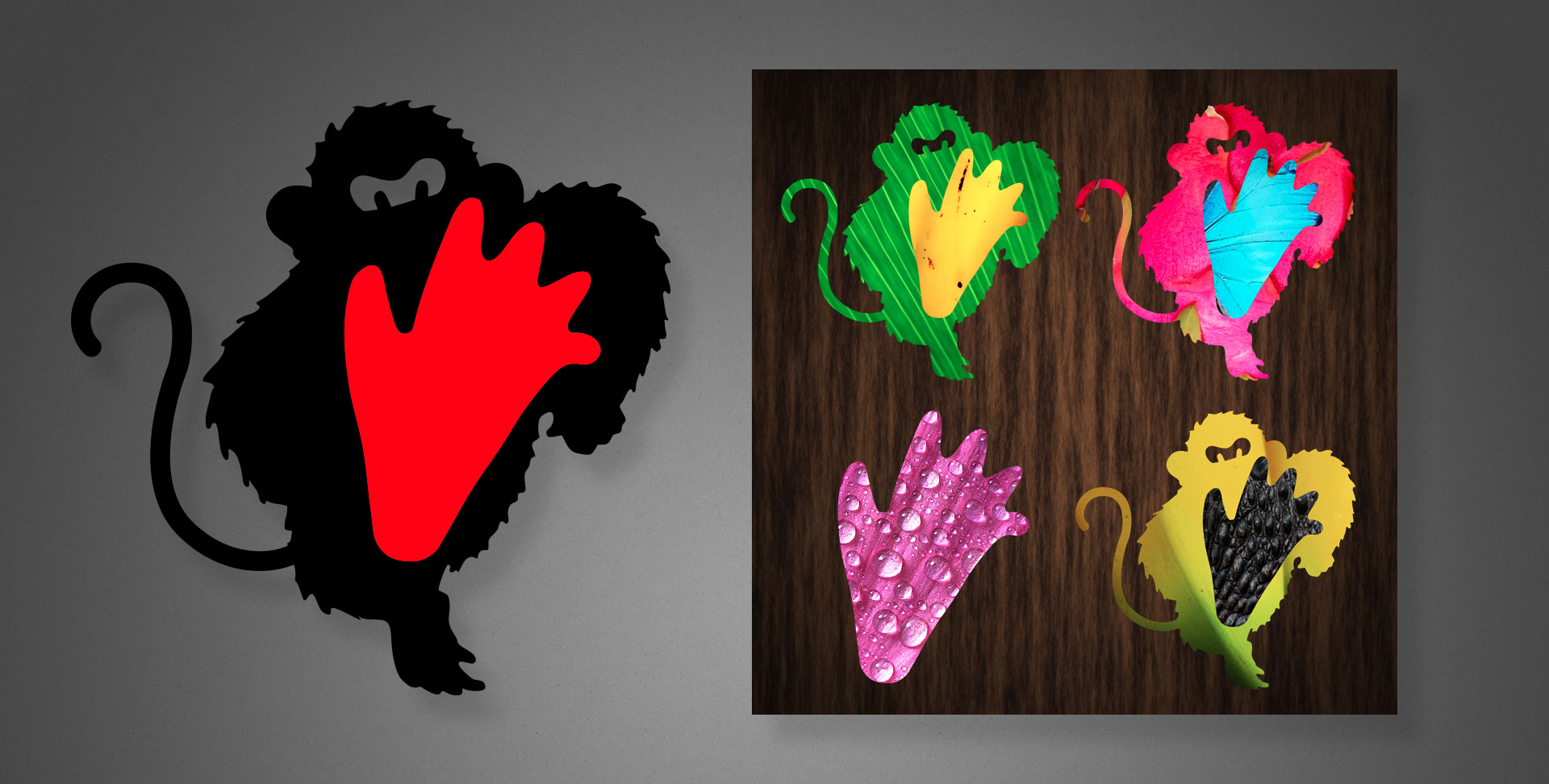
Because of illegibility at small sizes and an unrefined appearance, the simians bookending “MonkeyPaw” had but a single redeeming quality: its one colour reproducibility. It otherwise absolutely misfired as the image of a fresh gaming upstart whose products all lived on digital storefronts.
Going back to the drawing board, something much more edgy–literally in your face–emerged.
Left: The actual logo, shown in the brand’s black and red colours. Right: Alternate photo-textured motifs using the logo’s shapes as masks.
In addition to the standard black and red branding colours, the new logo allowed contrasting photographic textures masked within the shapes, as shown above right, or displaying the foot as a standalone graphic element.
Somewhere in my vast collection of sketchbooks lie a cornucopia of progress sketches, however their location remains a mystery…for now.
The accompanying word mark can be seen in my web examples below.
Reincarnated web experiences
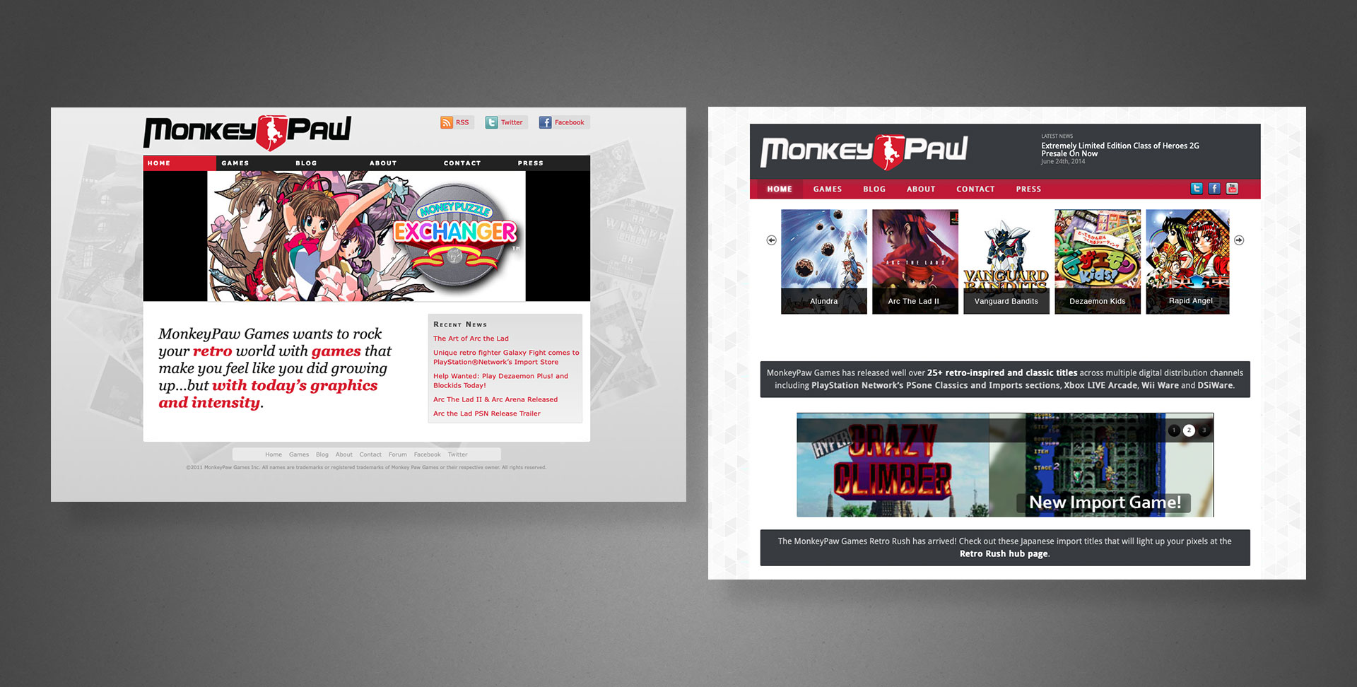
Beyond the tombstone, we eventually released a full website. Primarily a destination for fans and customers to gather news or other information about the company’s products, for the first five years it existed as a non-responsive, “classic” website (see below), courtesy of other designers/agencies.
Early versions of the desktop only website. Note these sport an alternate logo and word mark, courtesy of another designer.
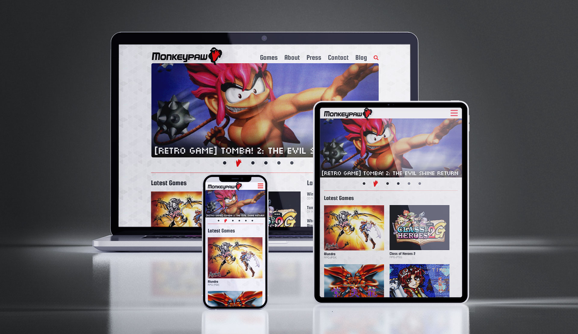
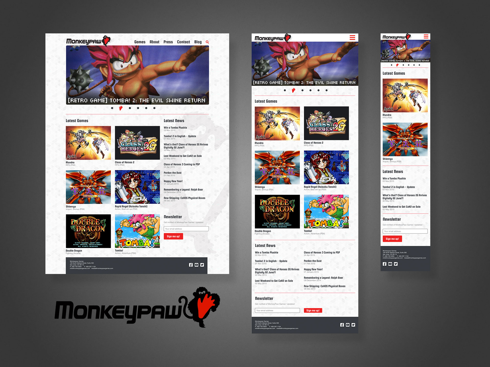
Only when 2015 came around did the site blossom into a fully responsive, multi-device offering. Shown below with my layouts, logo and word mark. Note the mobile (phone) version is intentionally truncated to display alongside its counterparts; some repetitive content not shown.
My responsive layouts, plus the logo and word mark. No disparagement intended to the previous designers, but these all display an obviously higher degree of professional TLC.
* Technically, I joined a project in the late 90s with a Canadian company, but do not consider it part of my professional canon 👍
Bardo Entertainment
Project: Website, pitch decks Role: Creative Director, Designer Team: <10 Environment: On-site in San Francisco Bay Area, California Key Skills: Photoshop, UX/UI, Web design, HTML, CSS Summary: A small tech company website (Bardo) aimed at delivering community-focused portal and B2B partner program sites, primarily to the gaming industry.
Freshly transplanted in the San Francisco Bay Area during the late aughts, this marks one of my first freelance projects in the area, spearheaded by my contacts in the video game industry and online game developer Bardo Entertainment.
Bardo hired me to design and pitch a massive growth project for their online community and gamification platform. We also partnered with enterprise web software company, OneSite, who developed much of the back-end technology.
Despite IE6 chucking its notorious wrenches into cross-browser compatibility for years, we wanted to include a few “cutting edge” web techniques (for 2009), such as massive, floating and overlapping layers and translucent elements, mostly for projecting some pizazz and technical prowess, given the site’s otherwise simple presentation.
Web browsers generally didn’t support 24-bit PNG yet, forcing us to adopt 8-bit GIFs and PNGs with their inherent jaggies and dithering effects familiar to anyone who might have played SNES games back in the 90s.
The Bardo “phoenix” in the background helps funnel the viewer to the centre and then downwards through the content. This let us streamline and prioritise the information, giving users just what they need, nothing more or less.
Sega of America, SegaNerds
Project: Website, pitch decks Role: Creative Director, Designer Team: <10 Environment: On-site in San Francisco Bay Area, California Key Skills: Photoshop, UX/UI, Web design, HTML, CSS Summary: A reinvention of Sega’s own community-facing presence while also building a network of third-party partner/affiliate sites under its umbrella.
A joint effort with Bardo Entertainment and Sega of America to improve their community outreach program both with their everyday users and also fans running their own sites, blogs, forums, etc.
We partnered with OneSite, a provider of enterprise-level front- and back-end solutions, especially for social media, which includes blog and forum features, but the platform’s biggest draw was its community gamification; giving users points for various activities, redeemable for exclusive gaming swag or digital goodies.
The plan included migrating Sega’s existing site, blogs and forums to OneSite’s platform, and then invite select fans to migrate their sites to sit alongside Sega’s official offering. Post launch, additional game studios and tiers of fan sites were scheduled for inclusion into the network, exercising common templates while also featuring each organisation’s unique branding, staff, and voices.
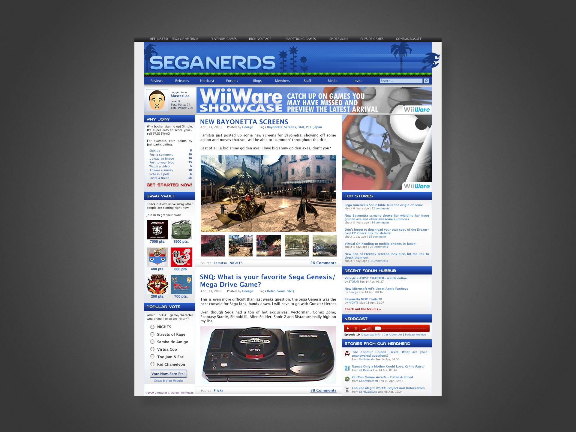
Shown above is an example pitch of “SegaNerds”, the world’s most popular unofficial Sega site, as it might look on the OneSite platform circa 2010. Note that I took liberties with an original typeset logo and custom illustration, since at the time, their site was essentially a WordPress blog with some stolen sprite art plus the actual Sega logo.
Admittedly, by today’s standards, the web portal style might be a bit busy, however it still represents an approach to organising heaps of content into a single page, in this case unifying a blog, forum, and the new platform’s content all in a single touchpoint.
Although now offline, a not insignificant portion of the intellectual property is evident in services like Loot Crate.
Nicalis
The deceptively simple, yet responsive site for Nicalis software’s head honcho.
Project:Website Role: Designer, Front-end developer Team: <20 Environment: Remote Key Skills: Photoshop, UX/UI, Web design, HTML, CSS Summary: A companion site for the CEO of an indie gaming company to do fan-direct PR and other random communication.
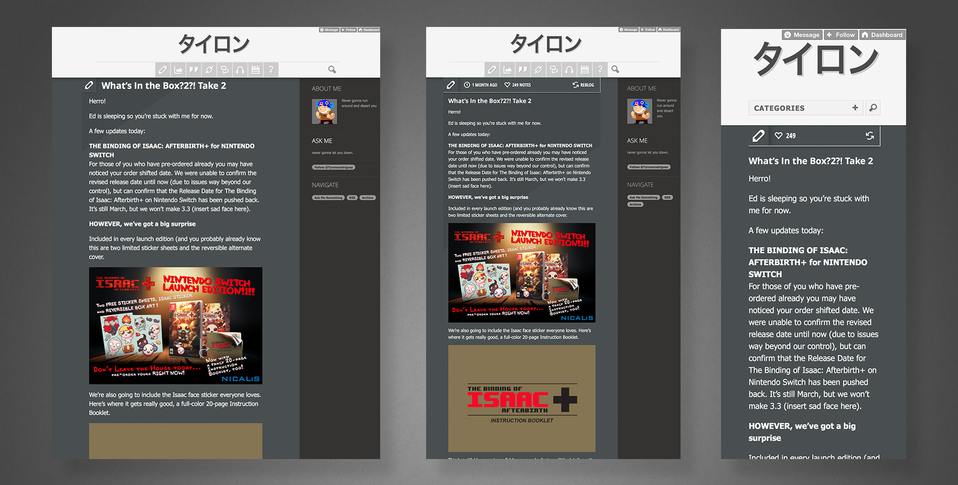
Nicalis is a darling of the indie gaming scene, amassing a huge fanbase with their niche titles released across virtually every platform. The studio’s boss came to me around 2014 looking for a way to make personal announcements and connect directly with those fans in ways exceeding Twitter’s capabilities.
Using Tumblr as the base CMS platform, additional requirements and features such as Twitter integration, AMA events, and multi-device responsiveness were designed and implemented.
The graphic above shows screen grabs of the site as it exists today (latest post 2017), replete with rendering anomalies either the result of modifications made by the client post release or changes to the hosting platform/browsers over time.
Curiously, instead of any title imagery, he opted to render his name in simple Japanese kana and live HTML text. Whatever the thinking behind it, it remained a popular destination far longer than Tumblr itself.
Sadly, no static renderings or wireframes of the pre-release development process exist, as most of the UX design work happened directly in the browser while I coded it, but the above does closely resemble the product I delivered. I may at some point recreate assets to further illustrate the process.
Project: BBY Gift Card Program Role: Art Director & Designer, Brand Design & Integration team Client: Best Buy Co. Key Skills: Photoshop, Illustrator, Brand Identity, Product Design Summary: An ongoing program of various gift card assortments. Each card targeted either a specific drive time, holiday, season, or consumer demographic. For each card, I began at the concept stage, finished at the press check, and everything in between.
Below is a gallery of assorted Gift Cards from my time with Best Buy. Photography of the final, printed product is shown where available.
Click any image to enlarge detail.
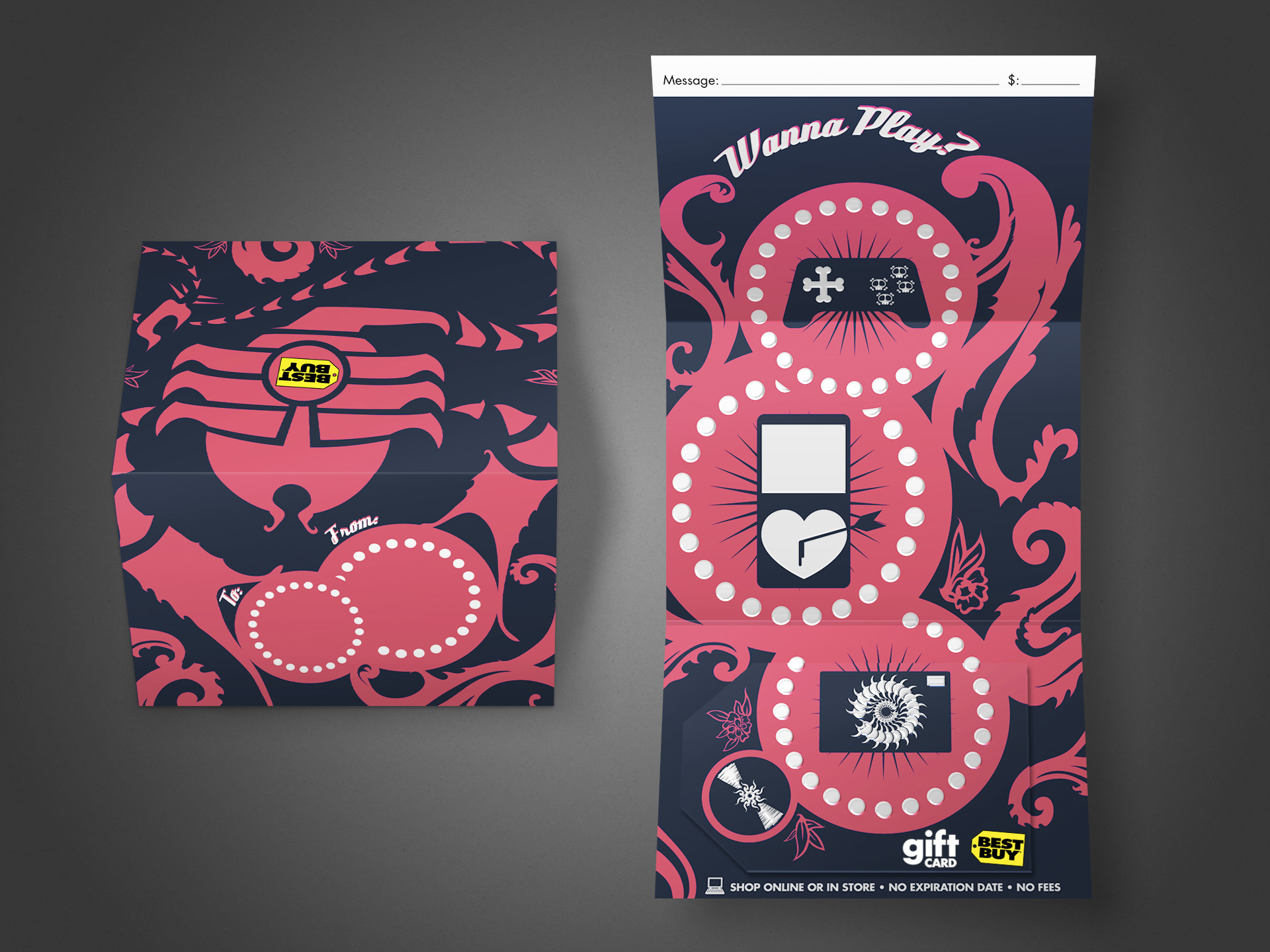
This is a trifold gift card that was produced to appeal to younger, edgier folks than the typical “vanilla” (slightly generic) cards otherwise available. Had to fight a bit to get approval for the skulls appearing on the game controller; the original concepts had heaps more, and my brainstorming files filled with similar odd/twisted cute-but-disturbing entries.
This card features UV spot gloss and spot thermographic (raised) texture for the white areas. My role spanned from the original concept sketch to illustrator, final mechanical production, and press check.
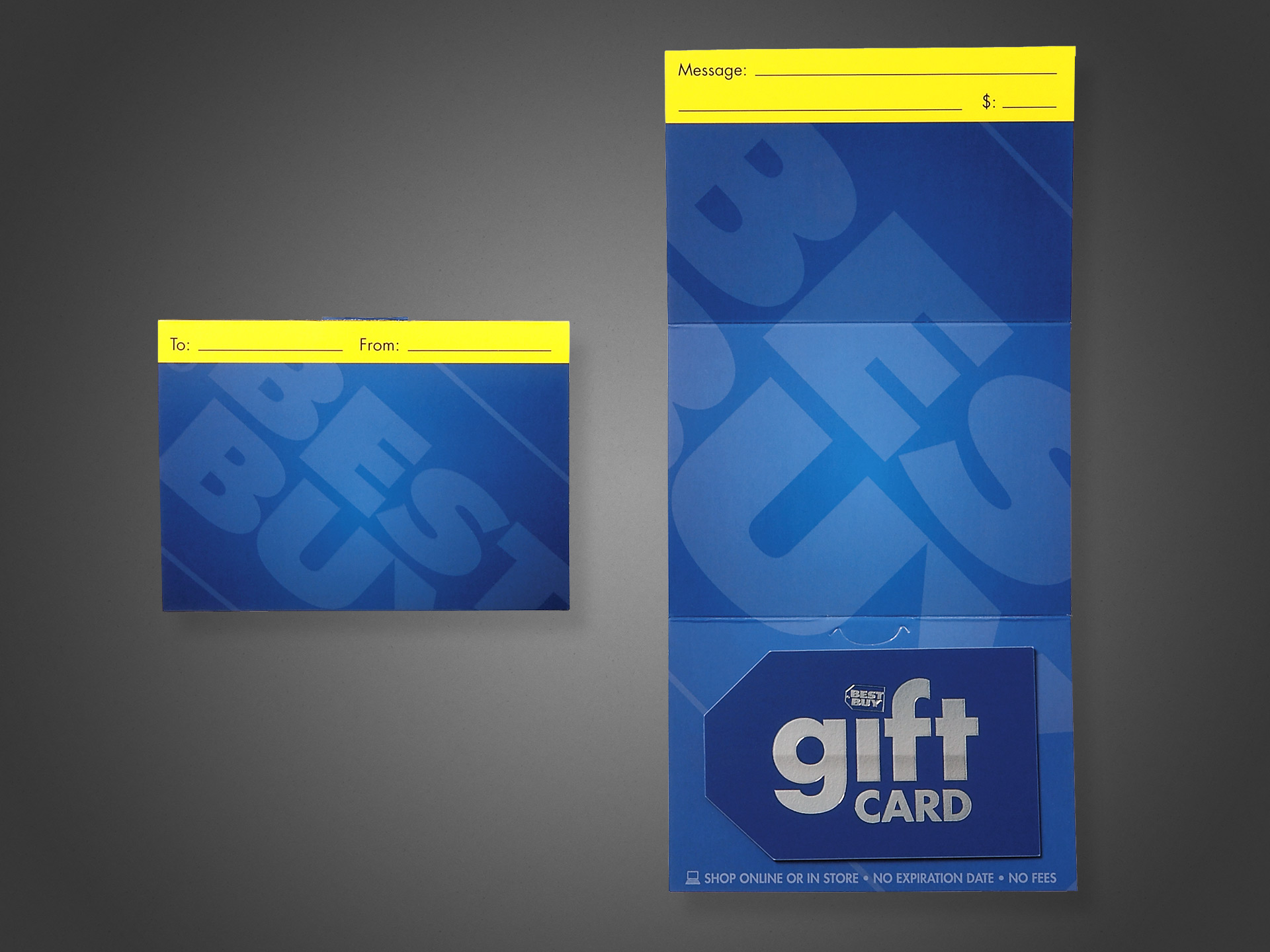
The open value, or “generic”, gift card is (or rather was at the time; I have no current data for comparison) Best Buy’s number one SKU; meaning it alone accounts for more revenue per year than any other single item they sell, exceeding a billion dollars annually. This makes it incredibly valuable as a brand vehicle—not just a product, and by far the most visible, high-dollar design I’ve ever created.
Some background on the project: at the time of its redesign, the company had been using a couple of flashy, and frankly gimmicky/gaudy designs that relied on cheap lenticular or hologram effects to gain attention. I understand the time and place for these things, but at a time when the company was looking to elevate their brand design, public image, and sophistication, such gimmicks are toys better left behind in childhood.
As such, a streamlined, elegant approach that put the brand name, marks and elements first. Solid on-brand blue, simple typography, and the use of subtle textures and contrast between shiny vs matte to do the talking. The card is a color-matched solid core plastic with a spot silver foil, and the giant logo on the carrier is a UV spot matte that exhibits different effects at varying viewing angles.
This design changed very little from my first concept presentation, and was received well both internally and publicly. I served as the Art Director, Designer, and Production Artist for this project, and assisted with on-site press checks.
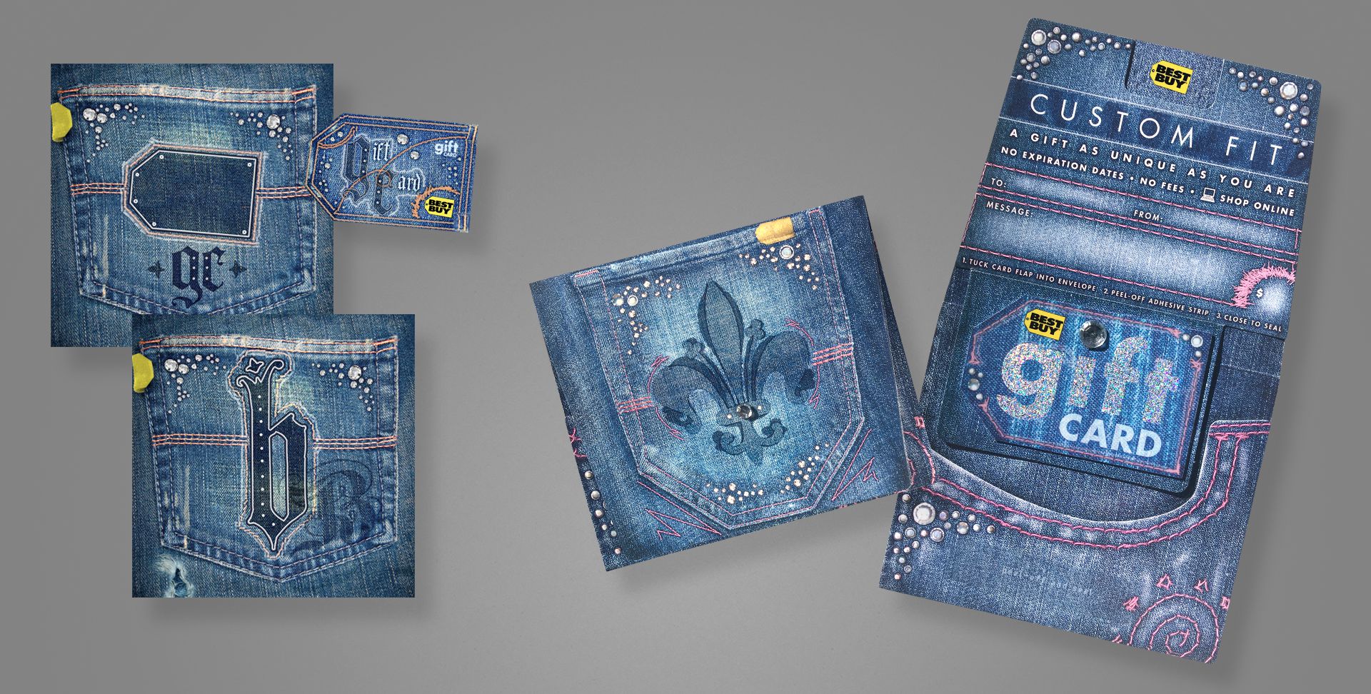
A brand-focused card, we decided to go all out with this one. Embossed, spot UV, spot matte, custom spot foil, and hand-affixed jewels to both the carrier and card. Shown left are two concepts for a gift bag, which eventually became the gift card.
My role spanned from original concept, to photographer, designer, production artist for final mechanicals, and on-press art director.
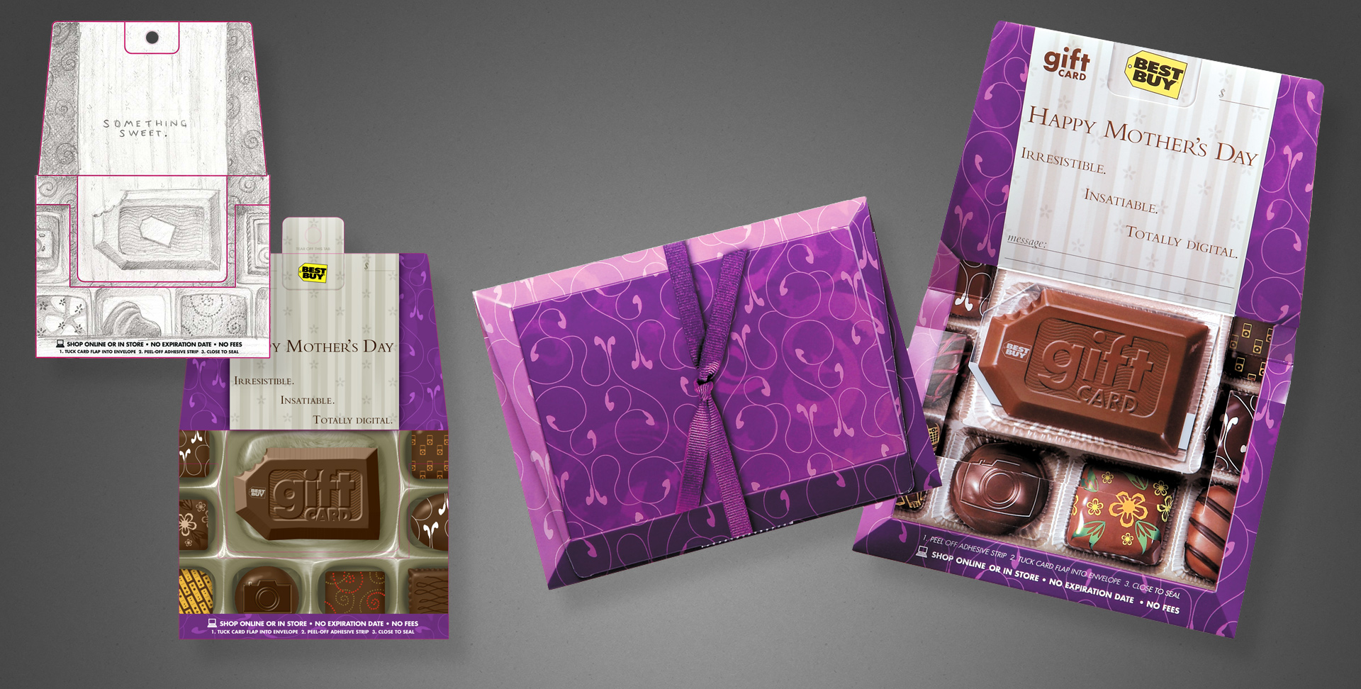
A gift card, available in Spring 2007. The brief was targeted at higher-middle income mothers, or at least as gifts for said demographic. We were to illicit a bit of “boutique”, plus a sense of abundance/selection. So I came up with a box of brand-specific chocolates. When closed, it looks like a box of chocolates, replete with a ribbon. When opened, you see the assortment of sweets.
Shown left are my original illustration and a digital comp. Shown right are my original concept sketch, my rough digital draft, and photography of the final product to show my workflow and vision carried out between media. I was responsible for the concept, client presentation, art direction and supervision of an illustrator hired for the final image, and the press check.
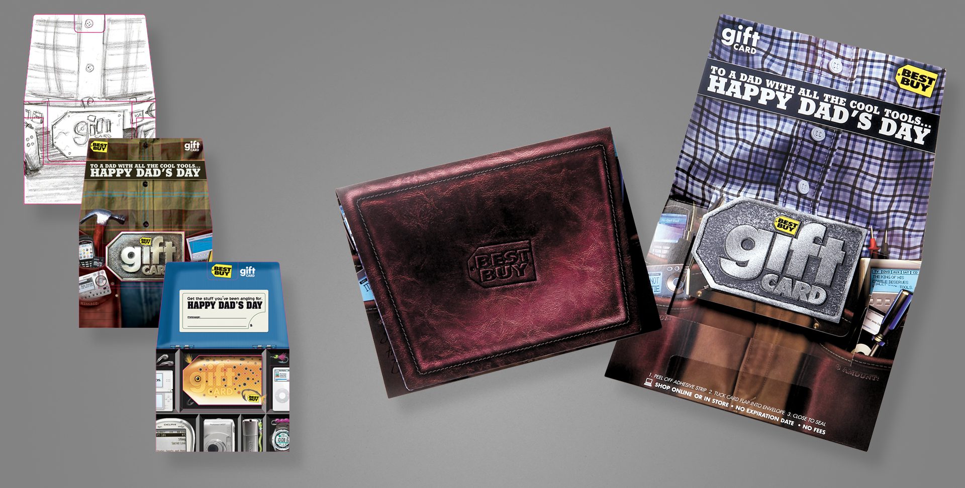
After having a Mother’s Day card aimed at a more sophisticated, upscale demographic, we of course needed one to match the fathers in the same category as well.
Shown left are my original pencil concept, and my first rough digital comp. An additional, unused tackle box concept is also shown. Finally, photography of the finished, printed illustration, open and closed. The closed design mimics a fine leather wallet, and the card design used a layered process with metallic inks to give depth and some visual flash.
Pencils and digital comps are my direct work; I art directed the final illustration via a sourced illustrator, and oversaw the printing process/press check.
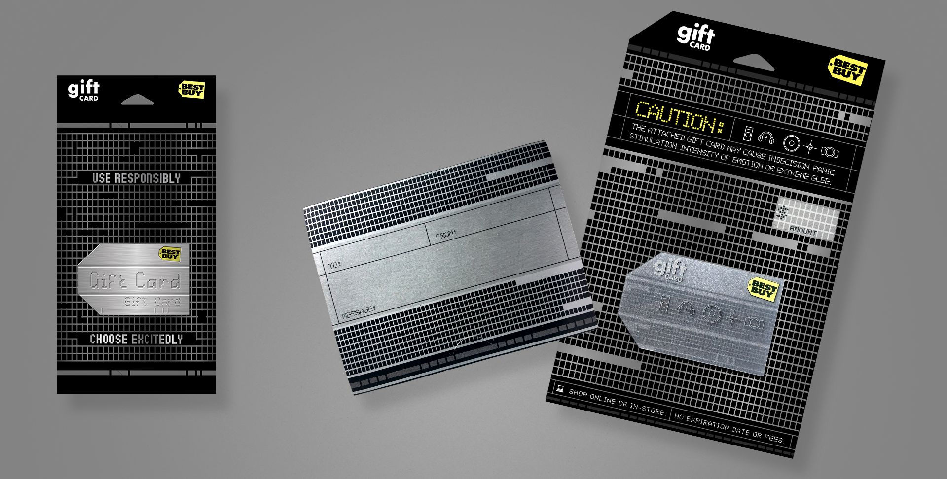
A brand card that aimed at a more sophisticated, tech-savvy or early-adopter demographic. This project used a silver ink with 1C overprint for the textured metal effect on the carrier, and a layered card that shows different elements on the fronts and backs of each plastic layer, to give a parallax, 3D depth effect.
My original concept is on the left, and photography of the final printed card/carrier on the right. I art directed an illustrator for the final, prepared mechanical files as the project production artist, and oversaw the printing process/press check.
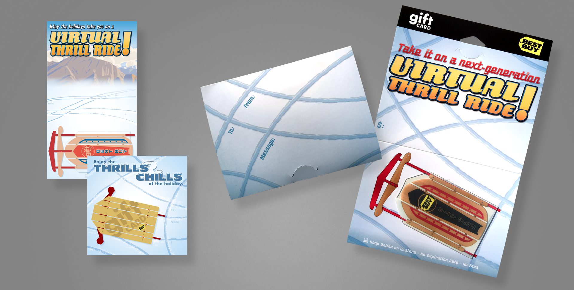
A holiday card that plays off the shape of the Best Buy tag. This card uses a clear card technology, so surrounding the sled body and between its wooden slots are completely clear.
My original concepts are on the left; photography of the final card and carrier are on the right.
I served as the designer from concept to the final design, with the exception of art directing an external illustrator, who produced the woodgrain and metallic elements of the sled; as well as assisted on production art of the mechanical files and attended all press checks.
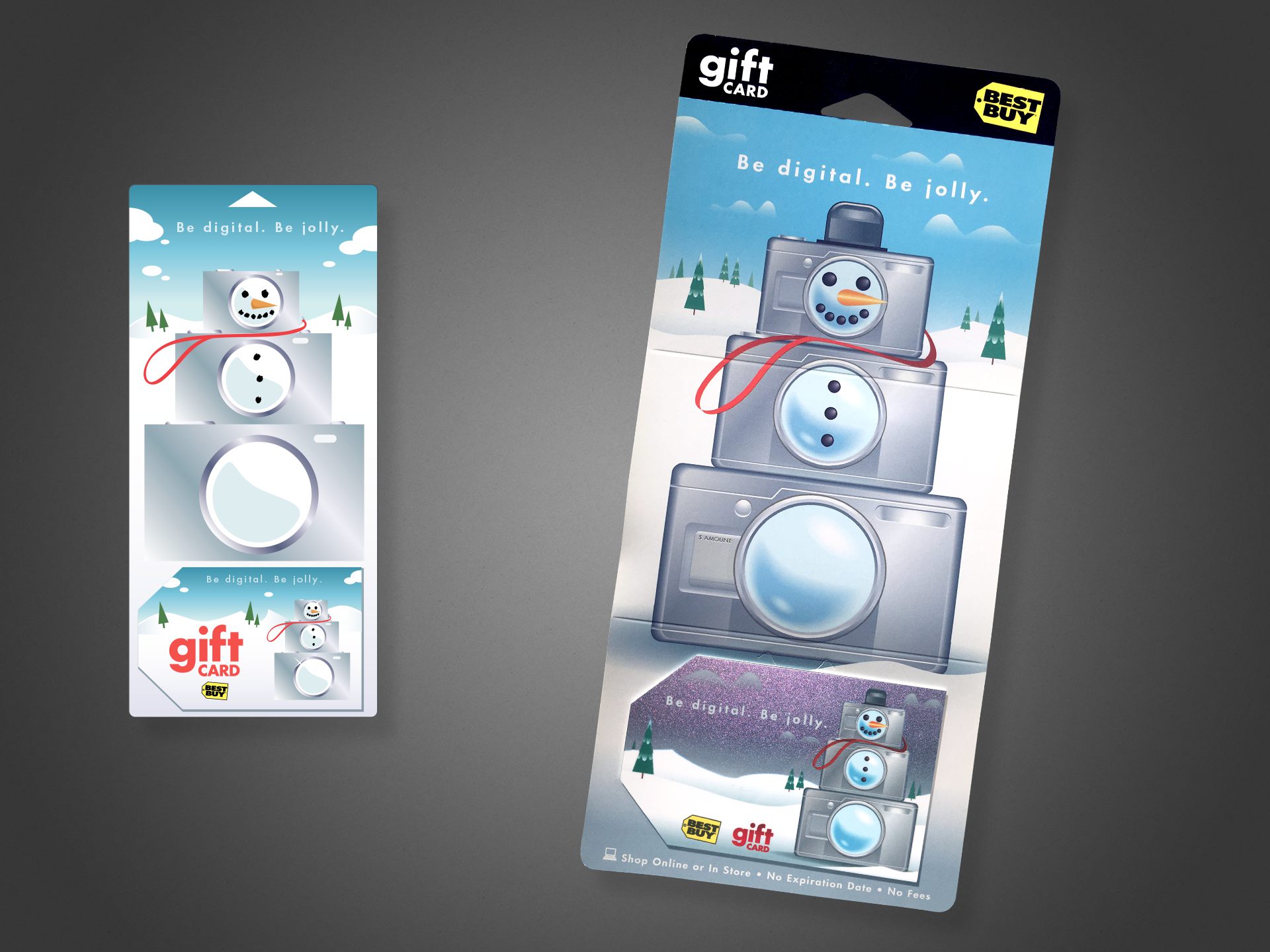
This holiday card is, conceptually, one of my favorites, simply due to it’s light-hearted, whimsical take on the Best Buy brand and its “abundance” component. This project features a color-shifting metallic fleck on the card, shifting between blue, teal, and the purple tones visible above.
Shown left is my original digital concept; shown right is photography of the final product. I served as the designer from concept, to art directing an external illustrator for the final illustration. I assisted with production art of the mechanical files, and attended press checks.
Cutting Room Floor
As gift cards became more popular in the mid ’00s, ways of standing out amid the massive selection became more important for the business end. That included exploring new substrates (plastic, clear, metal, etc.), new inks (metallic, color-changing, textured, etc.), and new form factors.
One of the alternate form factors our group explored was a gift card that doubled as a standalone speaker–requiring only an external audio source be plugged in via a standard headphone-style jack. Yes, it was thicker than a standard card, making swiping a magnetic strip impossible, and yes, the speaker was tiny and didn’t sound like much, but it was certainly on-brand as electronics and entertainment go, and something new to the gift card arena.
Included are a number of my pencil concept sketches, plus a number of digital comps.
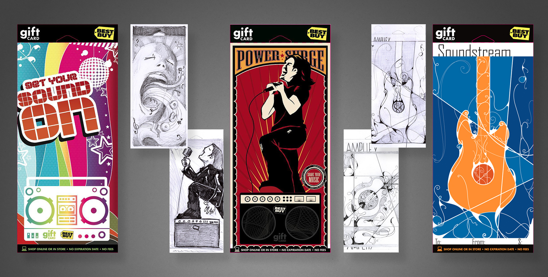
Above are a variety of concepts to be used for an online music service, each accompanied by my original sketch to illustrate my typical work flow. The dark blue cards in the lower-center were ultimately chosen for production, along with a third design in the series not pictured here.
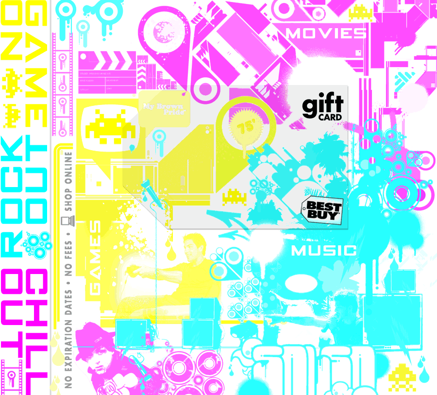
Less formally presented but my favourite… the 3-in-1 jewel case card:
How the concept breaks down. For every vellum overlay, two ink colours would be “hidden”. For example, green hides cyan and yellow while darkening magenta, etc.
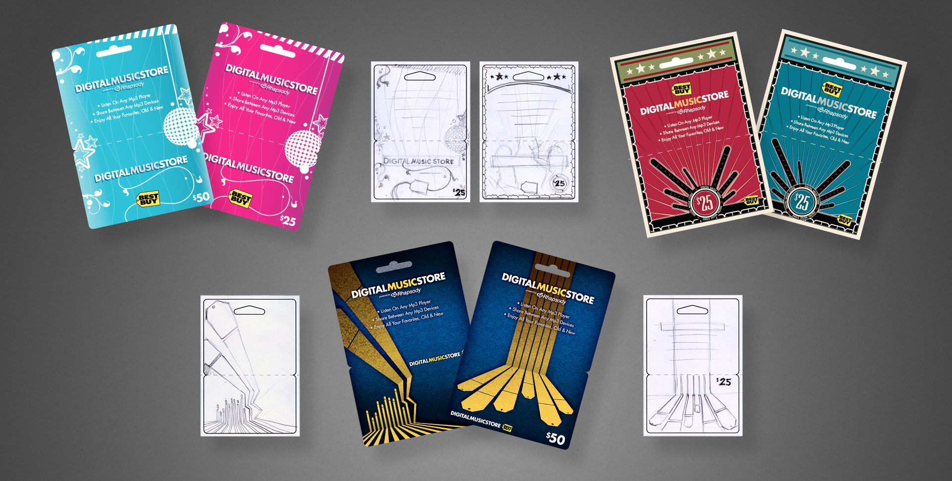
The brief was to design three entertainment gift cards, all to be merchandised amongst the in-store media (music, dvds, games).
To make the most of a limited budget, with some inspired and cunning use of the physical sciences, I devised a single design that would be transformed for each category using a different colour vellum overlay inside the jewel case. By exploiting properties of light, I could effectively hide two ink colours with a single transparent overlay.
B2B Gift Package
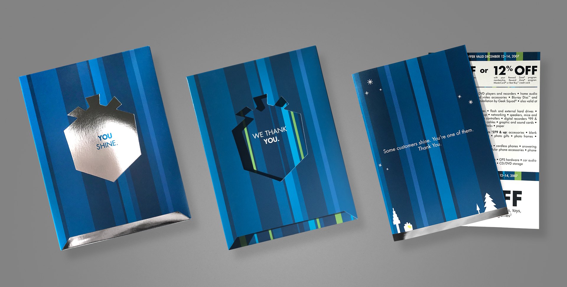
Project: B2B holiday gift package Role: Art Director & Designer, Brand Design & Integration team Client: Best Buy Co. Key Skills: Photoshop, Illustrator, InDesign, Brand Design, Product Design Summary: A premium holiday gift package for B2B customers, complete with a mailable box/packaging, exclusive discount coupons, and signed greeting card.
Every year, Best Buy produces a special holiday greeting card to its business customers (B2B), as a thank you for their patronage. When approached to lead the project one year, I took things a step beyond a simple greeting card, and created more of an actual gift package, one that also matched the company’s holiday campaign, which included gift box iconography and copy.
The box includes an additional flap that folds over the messaging visible on the above image (leftmost two samples), with space for mailing. Once opened, the recipient reads “You shine.”, on a shiny, silver foil box. Sliding out that box reveals a secondary message printed on the inside of the carton, “We thank you.” Inside the box is an actual greeting card, hand-signed by the team and containing a special offer coupon. The elegance and simplicity throughout this piece was really satisfying, and went over remarkably well with recipients.
My role extended from the original concept, where I literally spent the first week working through the form factor, hand-making various mockups to test; to the design and production of the final mechanical files.
Industrial Product Design
Project: Private label product line revision Role: Art Director & Industrial Designer Client: Insignia Key Skills: Photoshop, Illustrator, Brand Identity, Product Design Summary: A new line of private label products struggled to achieve a cohesive—and upscale—image across its variety of products.
Many consumers immediately associate private label (or as they’re commonly referred to in the pejorative, “generic”) products with similar, but inferior quality, at least compared to brand-name equivalents.
What those same consumers don’t know is that in many cases, the generics are manufactured by the same factories on the same equipment, etc. as their more expensive counterparts. Swapping a mould, logo, or packaging design between them is almost trivial.
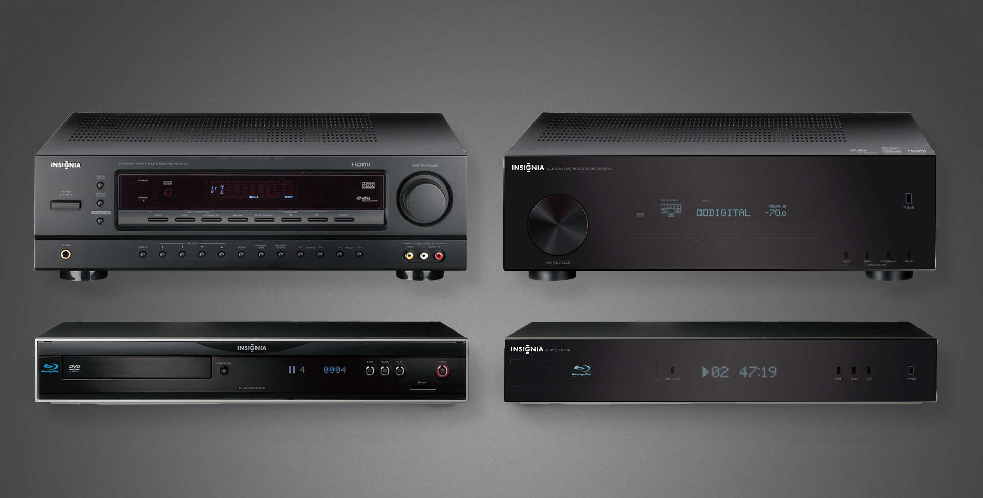
The Insignia brand manufactures a heap of private label electronic goods for Best Buy, but early in their journey, they struggled to create a cohesive identity amongst their product lines, because each was produced independently by whichever facility was manufacturing it.
Left: the individually serviceable but collectively unrelated original A/V components Right: the family resemblance is not only obvious, but its refined elegance suitable for any discerned A/V enthusiasts
No more apparent a case made than that of home theatre products, when they’re often literally stacked together. Insignia A/V offerings were all over the place, literally and figuratively, because each factory did whatever they wanted to satisfy the technical requirements and called it a day.
I was charged with providing branding and industrial design support, both to align the products’ appearances but also elevate their chicness, especially when placed on shelves alongside high-design and higher-priced competition. The scattershot fit and finish simply reflected poorly on both the products and brand.
A peek at one example of product families, we can see on the left the somewhat schizophrenic and mismatched pairing of a receiver and its cohort Blu-ray player.
My recommendation for revisions to both—staying within budget—is shown on the right. All done completely in Photoshop (and with vector shapes/layer styles for resolution independence no less).
These efforts did spark something of a renaissance within Insignia’s product and manufacturing group, evident to this day in their more well-conceived line of goods.
I actually enjoyed this enough that I considered returning to school to get certified/qualified in industrial design. However, in the course of informational interviews with existing professionals, all interestingly shared the same warning: “if you want to do industrial design, just realise that everything you ever do will end up in a landfill someday”.