TLDR; some of my old, publicly released web/digital product work 🤷🏻♂️
Before we begin, realise most of the below projects precede the emergence of flat design trends, before responsive web design was standard practice, or even UX/UI as their own distinct fields.
Included here for context in my larger career and to illustrate some sense of design progression or contrast my natural aesthetic against the trends of yesteryear (skeuomorphism, anyone??).
Monkeypaw Games
Project: Branding and websites
Role: Creative Director, Designer, Front-end Developer
Team: <10
Environment: Remote
Key Skills: Photoshop, Illustrator, Brand Identity, Web design, HTML, CSS
Summary: Creating a teaser website for display during development of a full e-commerce site, plus establish corporate branding/identity.
Monkeypaw Games approached me first in need of a new website to promote its line of digital game releases on the Playstation Store, and as a company based in Japan, it marked my first international project*. A secondary objective to re-imagine the logo and branding lurked in the bushes, as their interim identity frankly looked the result of too casual a black Sharpie on napkin.
Die first, resurrect and live later
Monkeypaw needed something for visitors to land upon while their more robust site containing an online store and media engine underwent development.
A “tombstone” site back in the day described a single-page website, usually meant as a placeholder or simple informational block to satiate visitors with the basics. No links, tabs, menus or other frills; just the one page.
A surprising cottage industry sprouted in the late 00s supporting this trend, especially favouring new or small businesses wary of investing heavily in an online presence. Ironic for tombstones to represent so many new companies rather than “deceased” 🤷🏻♂️
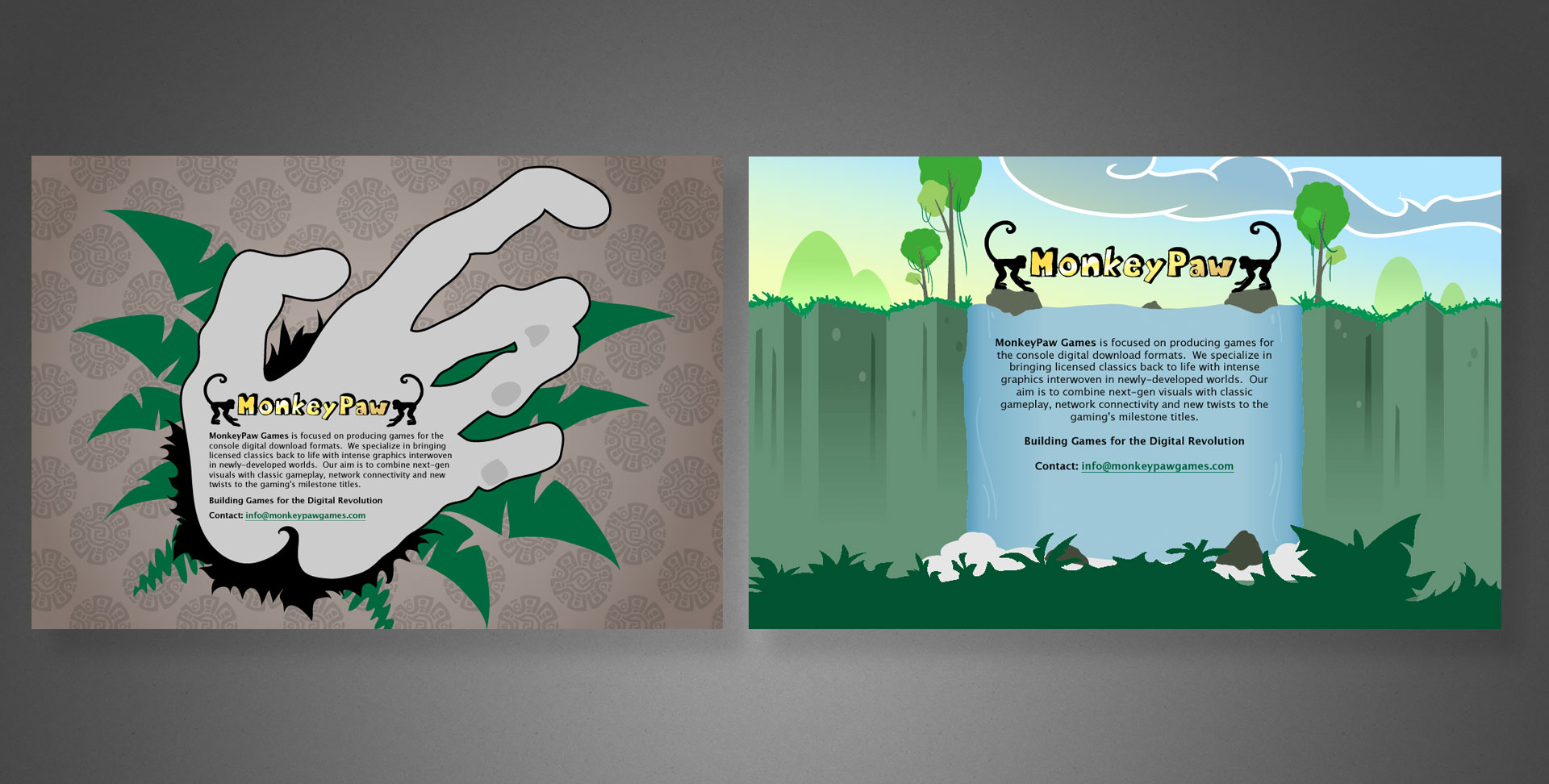
Curiously, their initial branding centred around a rather kitschy jungle motif instead of something slick and befitting a tech/gaming company. Anyway, a few rounds of sketches led us to the image below; a light-hearted illustration evoking tropical undergrowth and Incan ornamentation. …because monkeys?
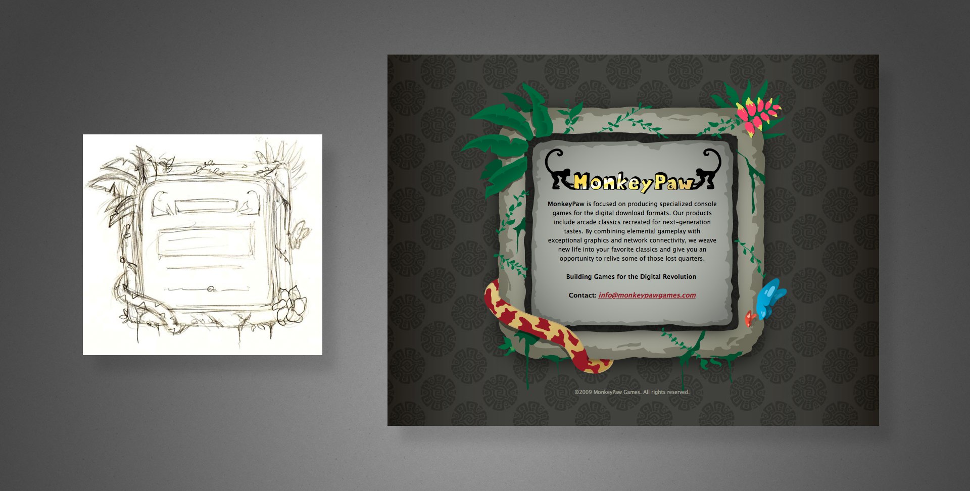
Right: the fully illustrated final UI
Rebranding
I do remember learning from our calls that their starter logo really was hand-drawn…on an inappropriately disposable substrate no less. Disposable indeed.
Because of illegibility at small sizes and an unrefined appearance, the simians bookending “MonkeyPaw” had but a single redeeming quality: its one colour reproducibility. It otherwise absolutely misfired as the image of a fresh gaming upstart whose products all lived on digital storefronts.
Going back to the drawing board, something much more edgy–literally in your face–emerged.
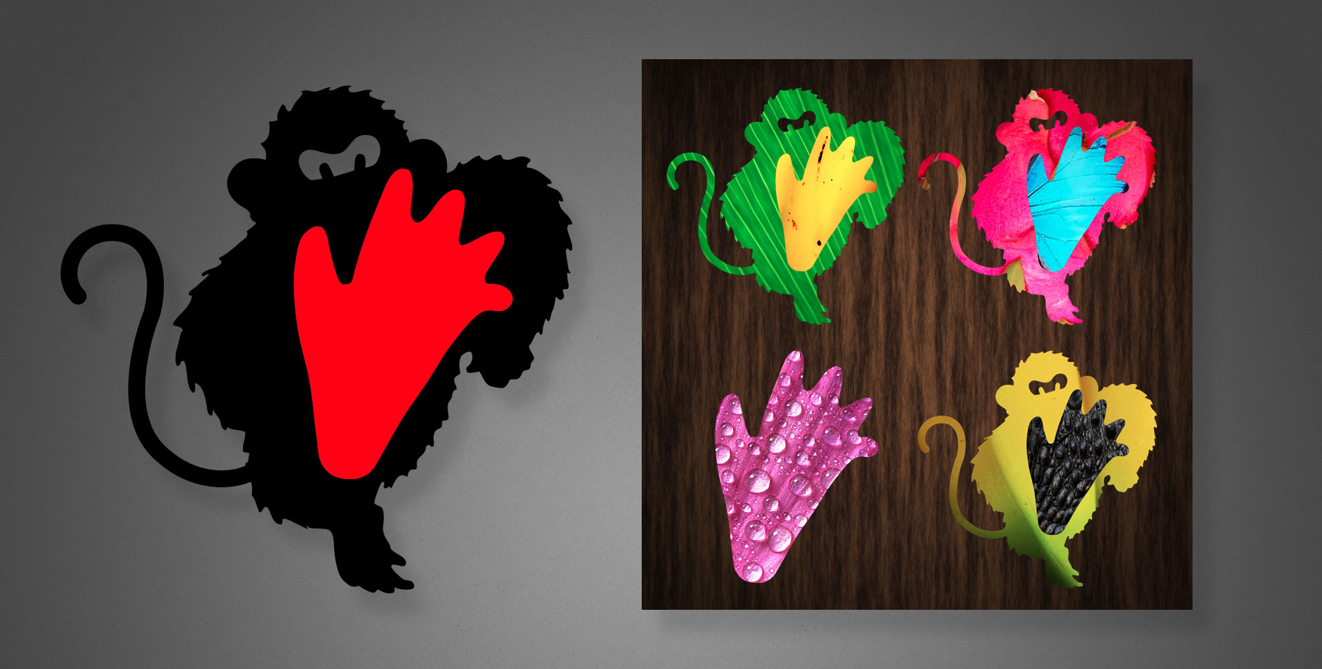
Right: Alternate photo-textured motifs using the logo’s shapes as masks.
In addition to the standard black and red branding colours, the new logo allowed contrasting photographic textures masked within the shapes, as shown above right, or displaying the foot as a standalone graphic element.
Somewhere in my vast collection of sketchbooks lie a cornucopia of progress sketches, however their location remains a mystery…for now.
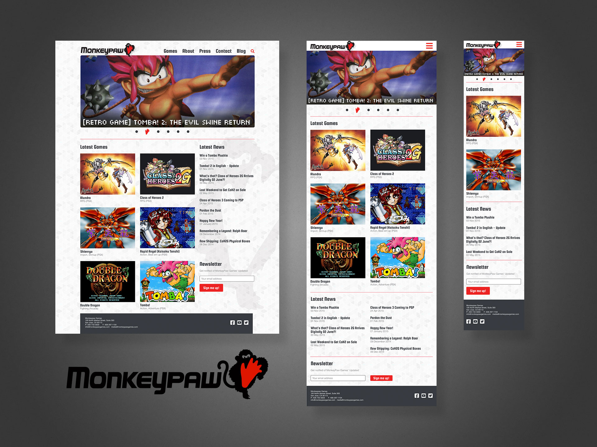
The accompanying word mark can be seen in my web examples below.
Reincarnated web experiences
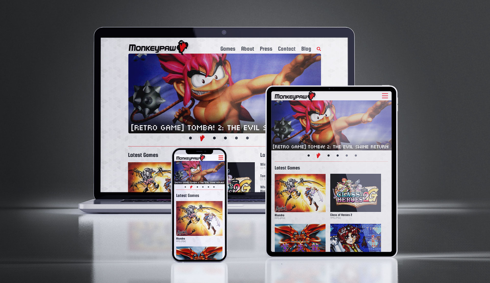
Beyond the tombstone, we eventually released a full website. Primarily a destination for fans and customers to gather news or other information about the company’s products, for the first five years it existed as a non-responsive, “classic” website (see below), courtesy of other designers/agencies.
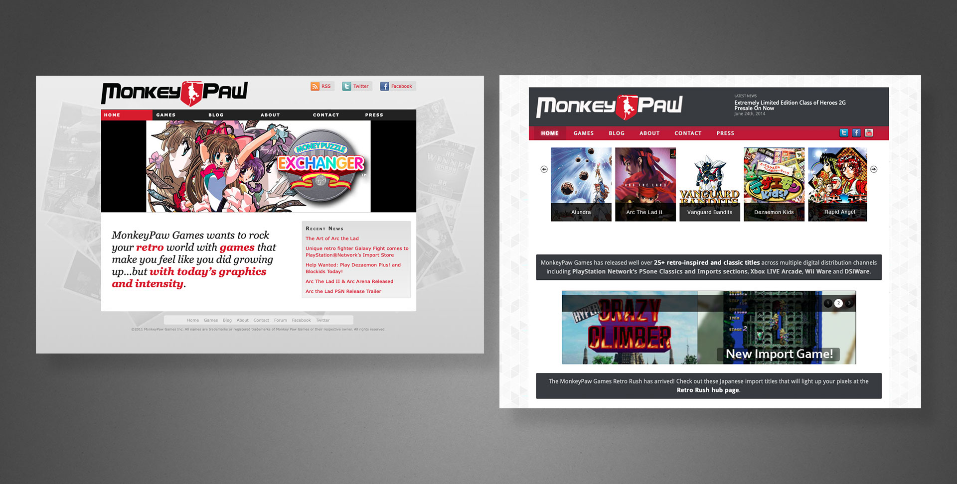
Only when 2015 came around did the site blossom into a fully responsive, multi-device offering. Shown below with my layouts, logo and word mark. Note the mobile (phone) version is intentionally truncated to display alongside its counterparts; some repetitive content not shown.
* Technically, I joined a project in the late 90s with a Canadian company, but do not consider it part of my professional canon 👍
Bardo Entertainment
Project: Website, pitch decks
Role: Creative Director, Designer
Team: <10
Environment: On-site in San Francisco Bay Area, California
Key Skills: Photoshop, UX/UI, Web design, HTML, CSS
Summary: A small tech company website (Bardo) aimed at delivering community-focused portal and B2B partner program sites, primarily to the gaming industry.
Freshly transplanted in the San Francisco Bay Area during the late aughts, this marks one of my first freelance projects in the area, spearheaded by my contacts in the video game industry and online game developer Bardo Entertainment.
Bardo hired me to design and pitch a massive growth project for their online community and gamification platform. We also partnered with enterprise web software company, OneSite, who developed much of the back-end technology.
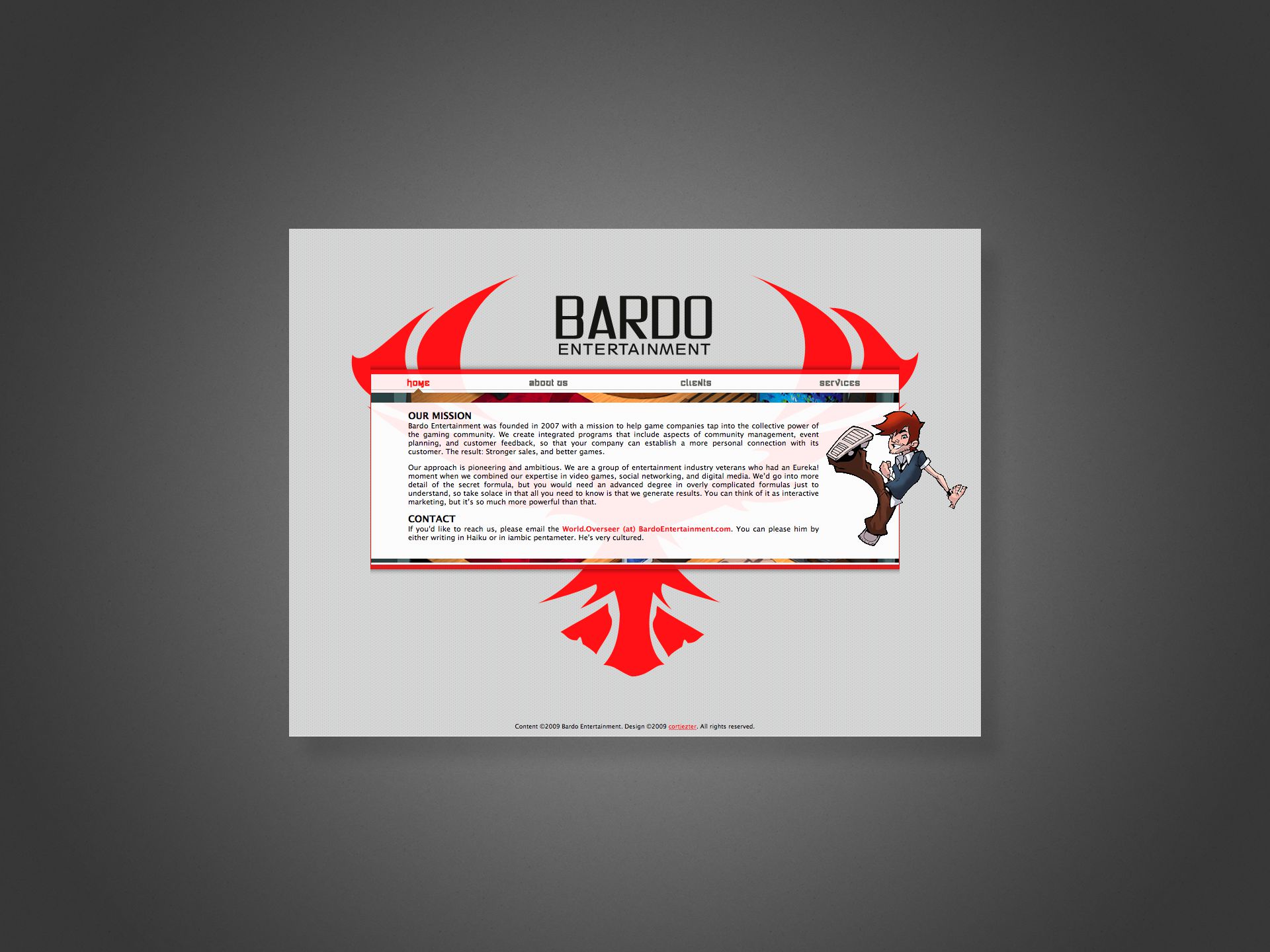
Despite IE6 chucking its notorious wrenches into cross-browser compatibility for years, we wanted to include a few “cutting edge” web techniques (for 2009), such as massive, floating and overlapping layers and translucent elements, mostly for projecting some pizazz and technical prowess, given the site’s otherwise simple presentation.
Web browsers generally didn’t support 24-bit PNG yet, forcing us to adopt 8-bit GIFs and PNGs with their inherent jaggies and dithering effects familiar to anyone who might have played SNES games back in the 90s.
The Bardo “phoenix” in the background helps funnel the viewer to the centre and then downwards through the content. This let us streamline and prioritise the information, giving users just what they need, nothing more or less.
Sega of America, SegaNerds
Project: Website, pitch decks
Role: Creative Director, Designer
Team: <10
Environment: On-site in San Francisco Bay Area, California
Key Skills: Photoshop, UX/UI, Web design, HTML, CSS
Summary: A reinvention of Sega’s own community-facing presence while also building a network of third-party partner/affiliate sites under its umbrella.
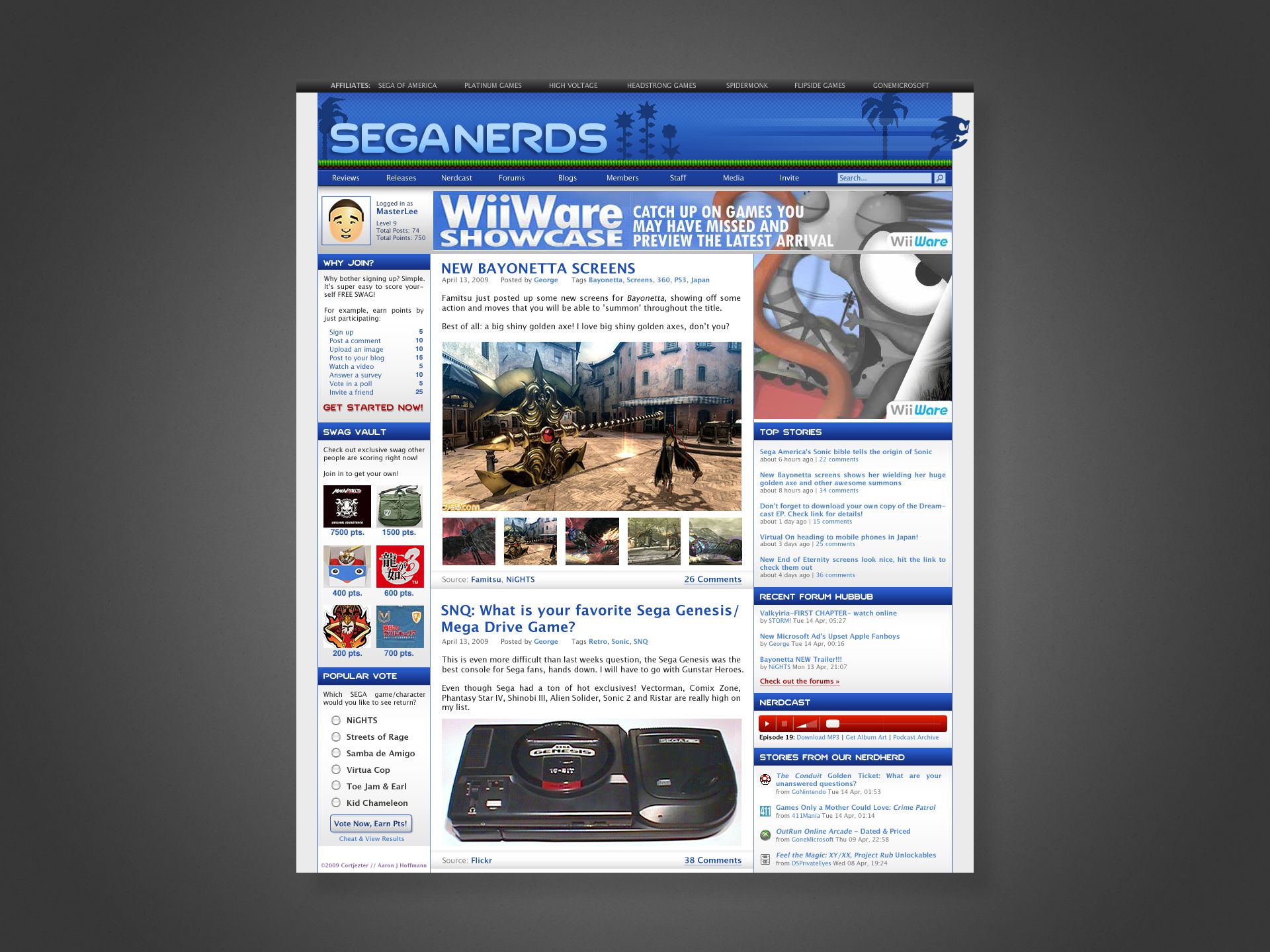
A joint effort with Bardo Entertainment and Sega of America to improve their community outreach program both with their everyday users and also fans running their own sites, blogs, forums, etc.
We partnered with OneSite, a provider of enterprise-level front- and back-end solutions, especially for social media, which includes blog and forum features, but the platform’s biggest draw was its community gamification; giving users points for various activities, redeemable for exclusive gaming swag or digital goodies.
The plan included migrating Sega’s existing site, blogs and forums to OneSite’s platform, and then invite select fans to migrate their sites to sit alongside Sega’s official offering. Post launch, additional game studios and tiers of fan sites were scheduled for inclusion into the network, exercising common templates while also featuring each organisation’s unique branding, staff, and voices.
Shown above is an example pitch of “SegaNerds”, the world’s most popular unofficial Sega site, as it might look on the OneSite platform circa 2010. Note that I took liberties with an original typeset logo and custom illustration, since at the time, their site was essentially a WordPress blog with some stolen sprite art plus the actual Sega logo.
Admittedly, by today’s standards, the web portal style might be a bit busy, however it still represents an approach to organising heaps of content into a single page, in this case unifying a blog, forum, and the new platform’s content all in a single touchpoint.
Although now offline, a not insignificant portion of the intellectual property is evident in services like Loot Crate.
Nicalis
Project: Website
Role: Designer, Front-end developer
Team: <20
Environment: Remote
Key Skills: Photoshop, UX/UI, Web design, HTML, CSS
Summary: A companion site for the CEO of an indie gaming company to do fan-direct PR and other random communication.
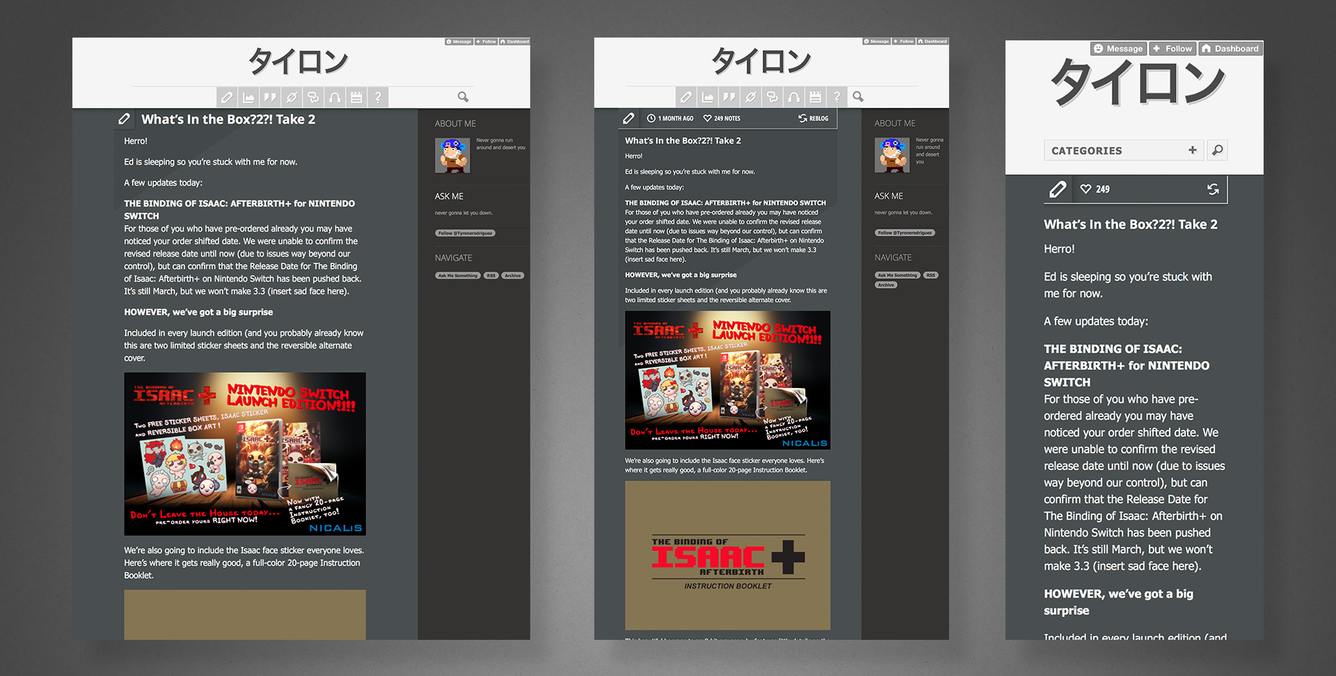
Nicalis is a darling of the indie gaming scene, amassing a huge fanbase with their niche titles released across virtually every platform. The studio’s boss came to me around 2014 looking for a way to make personal announcements and connect directly with those fans in ways exceeding Twitter’s capabilities.
Using Tumblr as the base CMS platform, additional requirements and features such as Twitter integration, AMA events, and multi-device responsiveness were designed and implemented.
The graphic above shows screen grabs of the site as it exists today (latest post 2017), replete with rendering anomalies either the result of modifications made by the client post release or changes to the hosting platform/browsers over time.
Curiously, instead of any title imagery, he opted to render his name in simple Japanese kana and live HTML text. Whatever the thinking behind it, it remained a popular destination far longer than Tumblr itself.
Sadly, no static renderings or wireframes of the pre-release development process exist, as most of the UX design work happened directly in the browser while I coded it, but the above does closely resemble the product I delivered. I may at some point recreate assets to further illustrate the process.