Project: Various logo, icon, and illustrations Role: Art Director & Designer, Brand Design & Integration team Client: Silicon Valley Investors Network, Bluelink, Sleep Number, Best Buy Key Skills: Photoshop, Illustrator, Brand Design, Campaign Summary: An exploration of candidate marks for use in Best Buy’s national holiday campaign, and candidate marks for use by various divisions of an investor network.
SVIN – Silicon Valley Investors Network
An organisation with three distinct divisions sought logos/marks for each group while retaining a cohesive identity between them. Above is a small sampling of my logo exploration for them.
The left half shows how I might carry one concept across all three identities; the right half shows additional graphic treatments, to show how I approach variety.
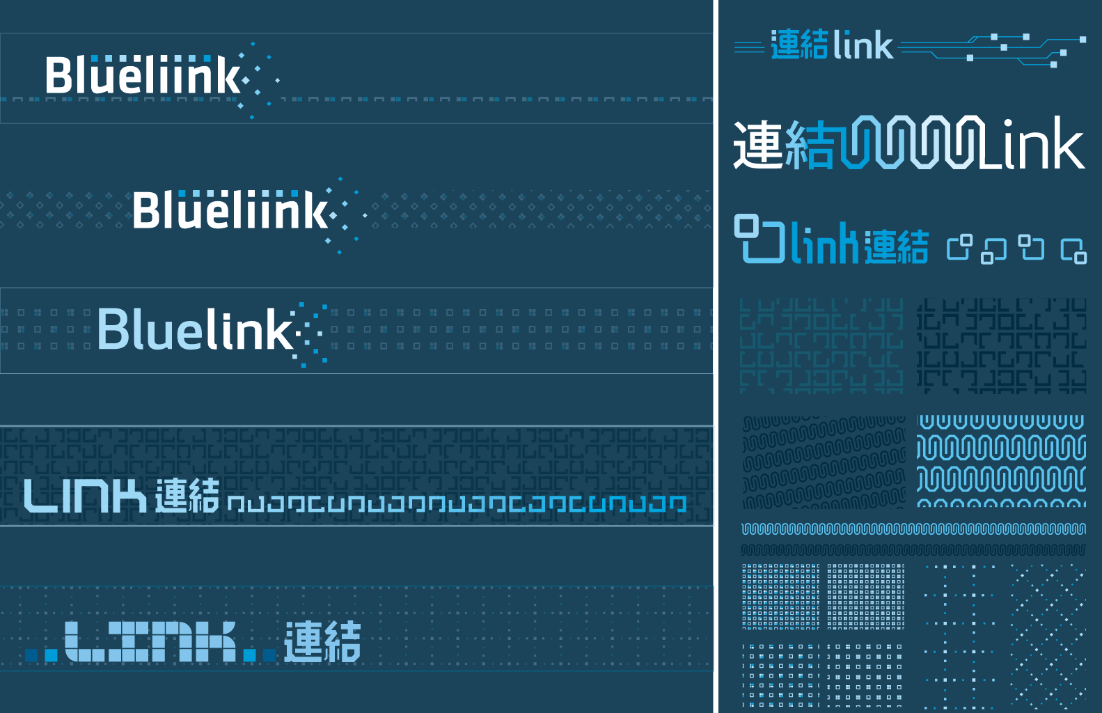
Bluelink
An exploration of sub-brand identity for a joint US–China venture. In Japanese, these characters mean “linking” or “connection”; I can only imagine there is a similar interpretation in Chinese (characters were provided by the international liaison).
Best Buy
Project: Holiday national advertising campaign style guide Role: Art Director & Designer, Brand Design & Integration team Client: Best Buy Co. Key Skills: Photoshop, Illustrator, InDesign, Brand Design, Campaign Summary: A thorough document which defines and illustrates every detail and usage for elements of a national ad campaign. Disseminated to Best Buy’s multiples channels (newspaper ads, print ads, in-store signage, website, etc.) to unify and govern execution for a consistent campaign experience.
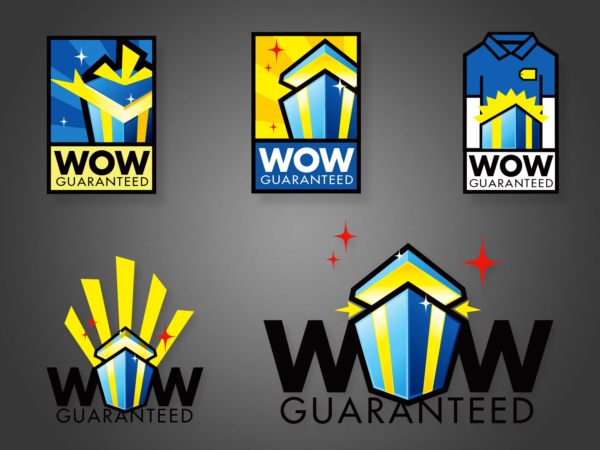
For ‘Holiday’ 2007, Best Buy used a hexagonal gift icon for its national campaign, with the slogan “Wrap up the WOW”, using typography similar to the lower two designs above. It was successful enough that the company wanted to recycle the idea for the following year. The difference was that while the first campaign focused on abundance and availability of gifts, the second wanted to add a focus on how the stores’ various services and staff can “guarantee” or maximize the experience.
Thus, several of my icon explorations feature a richer palette and a gift pictured at the magic moment when the recipient is blasted with delight. One concept even literally depicts a store staff to drive home the message that the company is here to make this magic happen for you.
While ultimately a slightly tweaked logo from the prior year was used, several of these were final candidates. I was one designer and art director on a small team tasked with this campaign, and all the work pictured above is my own illustration. Please check out my work creating the company’s style guide for the same drive period.
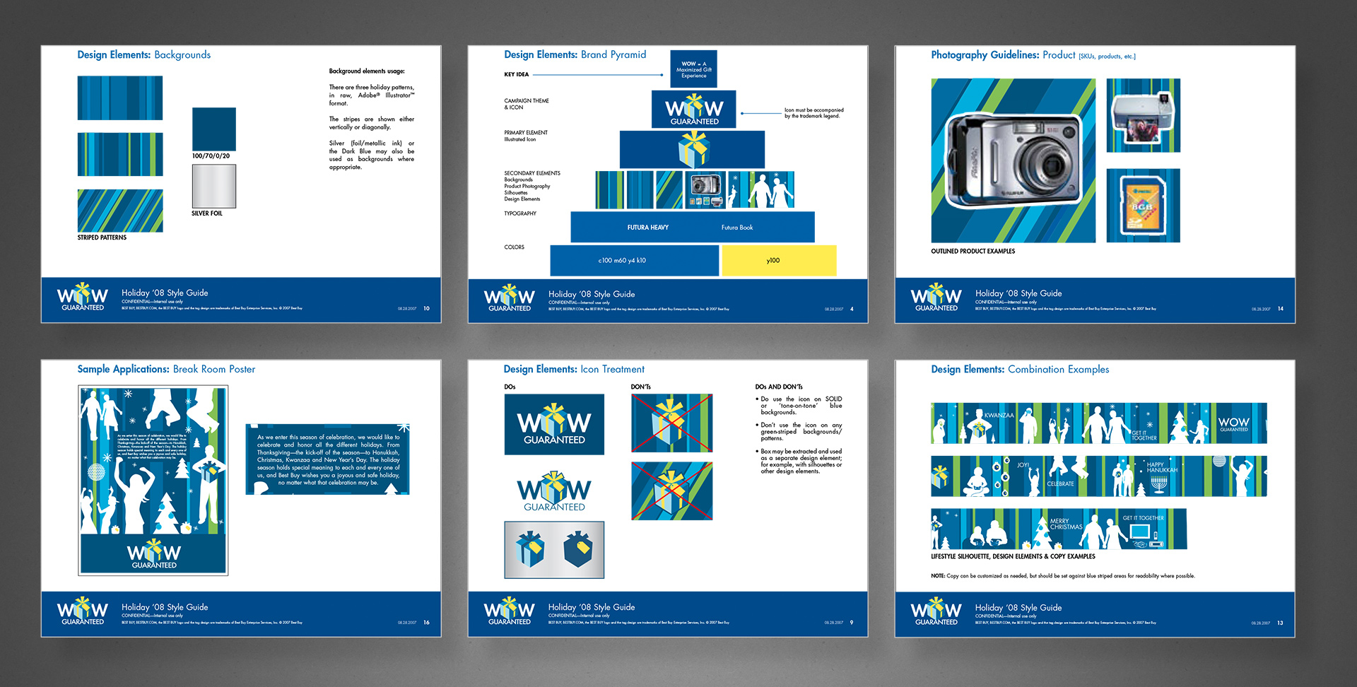
Several times per year, Best Buy would run national campaigns that would coincide with various holidays or drive times such as Christmas, Father’s Day, Back to School, and with each campaign would come a complete branded identity.
At the time, I was on the Brand Design & Integration team that helped conceptualize and then fully develop the campaign assets from a brief to roll-out across several channels, including online, in-store and signage, direct mail, newspaper insert, etc. So as a designer and art director, I helped come up with the visual components, but then I was also personally in charge of creating and managing a complete style guide so each creative department could apply it to their channel’s work, but also be used by the marketing groups in their various capacities.
The above example is a few pages from the Holiday campaign in 2008, though I personally managed dozens of similar campaign style guides. I created the template, layouts, and most of the sample design executions, based on actual workflows and guidelines of each channel. Note that this was created approximately a year and a half before the campaign’s public release, and thus each page contains a “confidential” mark.
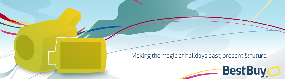
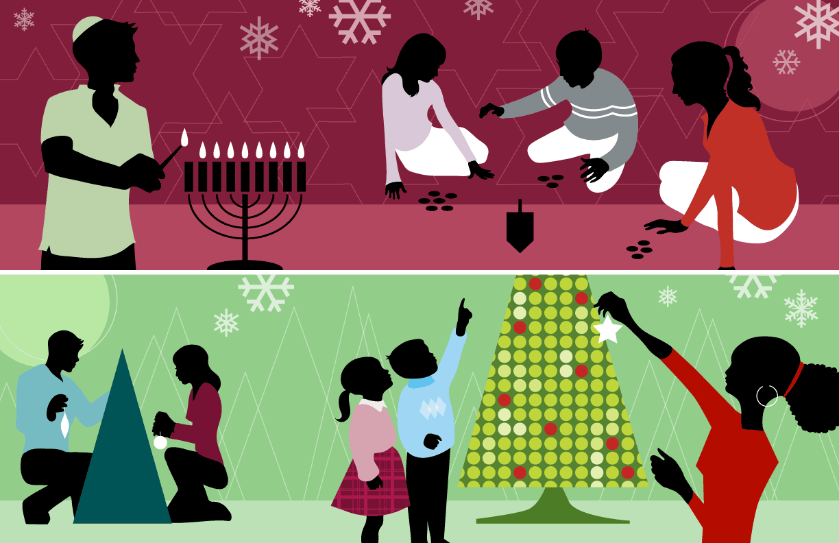
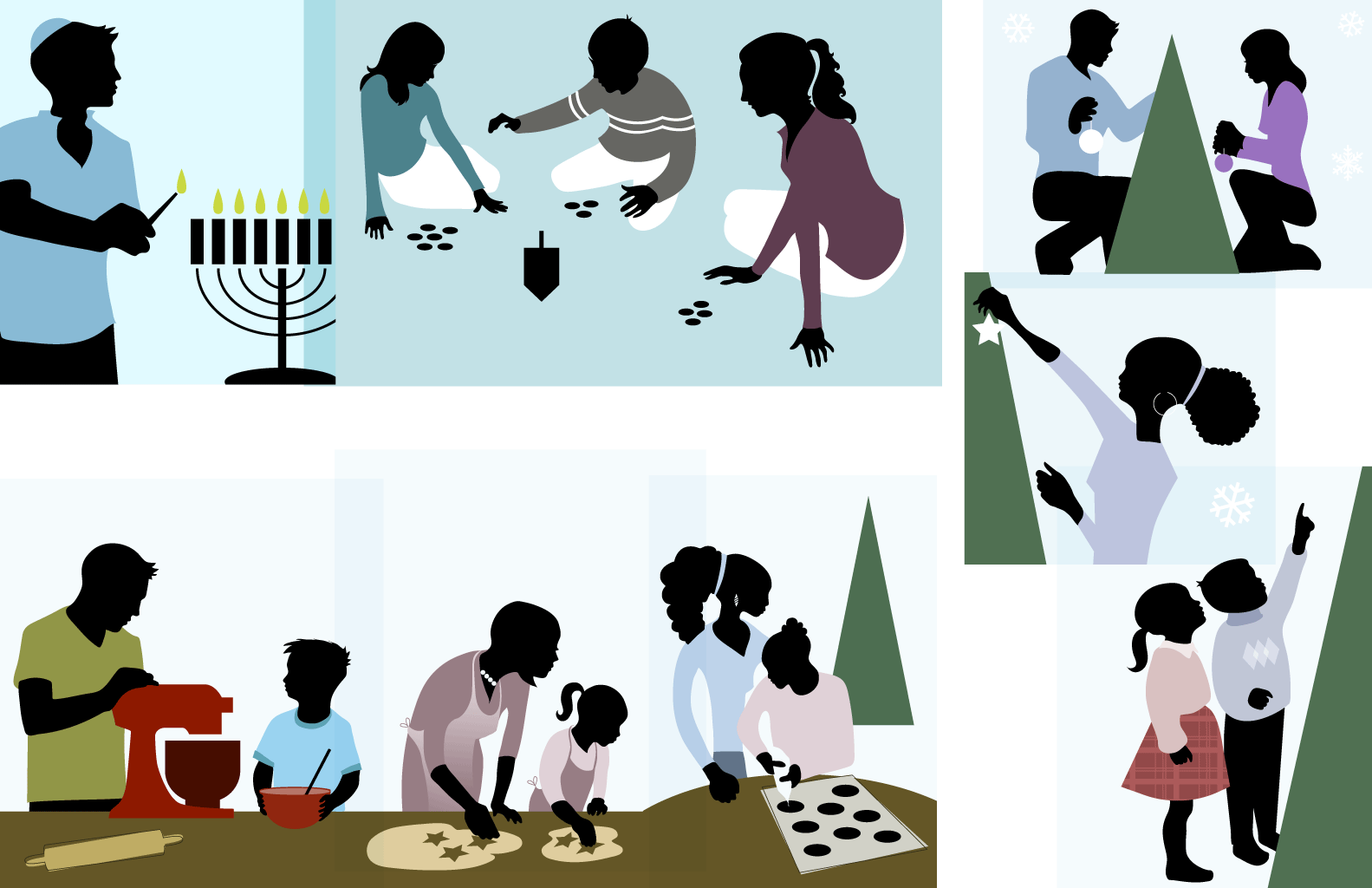
A collection of illustrations for an inclusive holiday season campaign.
“Flat” design is all the rage these days, but I’ve always had a thing for a minimalist approach.
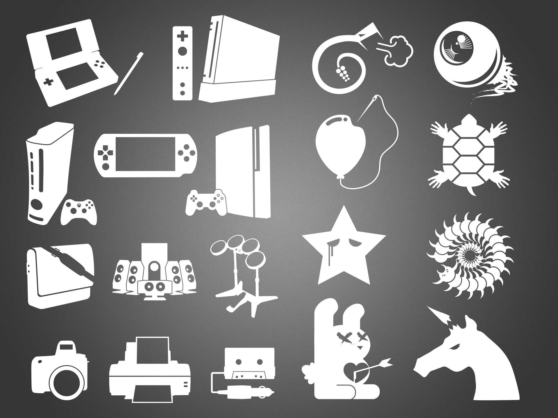
Left half: as part of a national drive-time campaign, we needed icons for a range of products to be advertised; icons that would give away a specific product or category at a glance, but be simple enough not to clash with any of the campaign’s visual vocabulary. I wound up doing hundreds of these, making the above image a tiny sample.
Right half: an collection of unusual or counter-culture style icons/illustrations intended for use in a “tween”-targeted gift card. Again, a small sampling of a much larger exploration set.
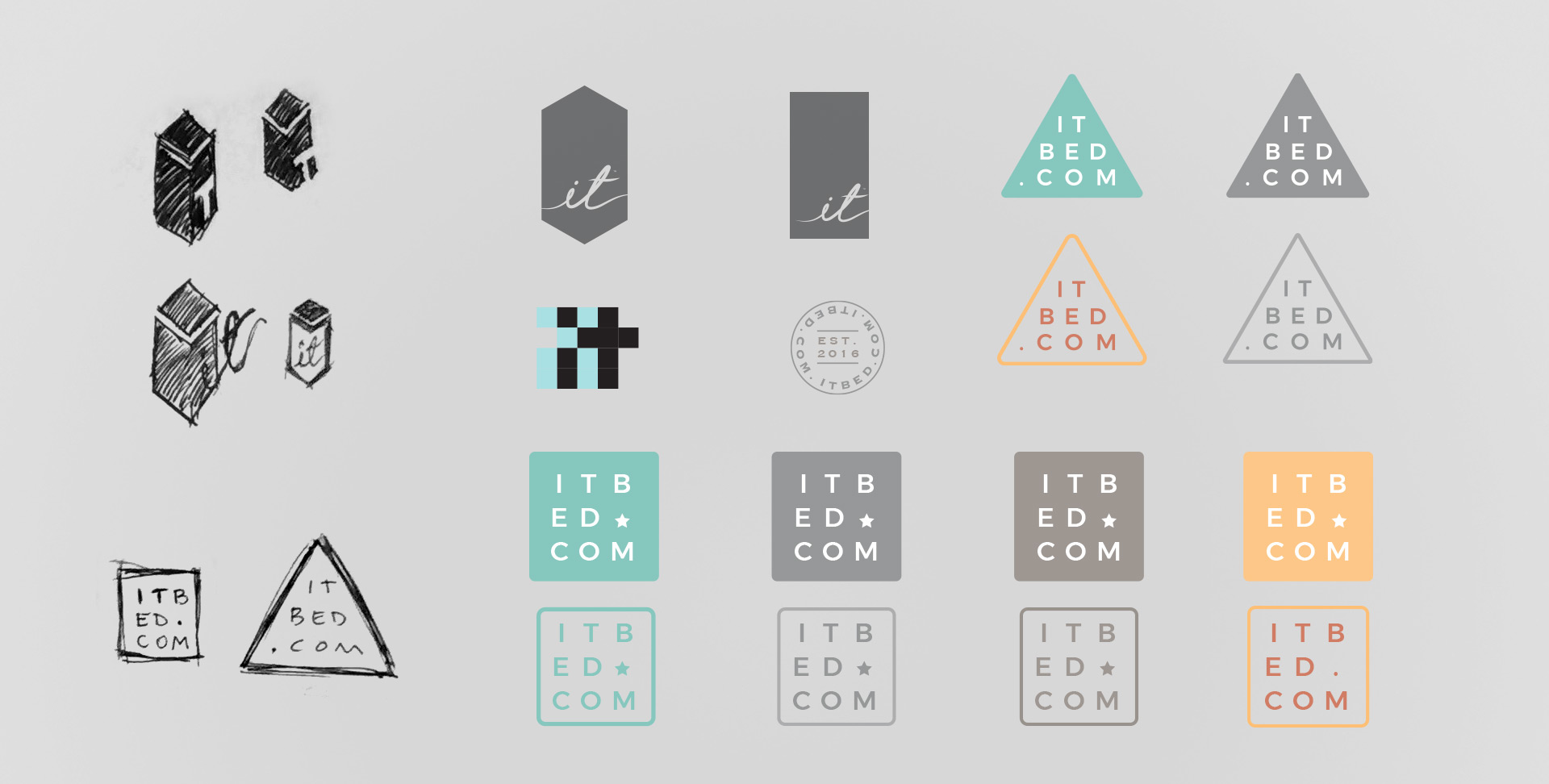
Sleep Number
As documented in the larger case study, the it Bed’s brand (design) had fallen into madness when I joined. Part of its journey back to rationality included a revised and refined brand visual language, replete with its own iconography similar to yet distinct from the company’s other product lines.
Similarly, I explored a new logo to bridge its existing brand equity with the rest of its new identity, keeping in mind this was a tech-connected bed (vacuum packed and shipped in a tall, thin box).
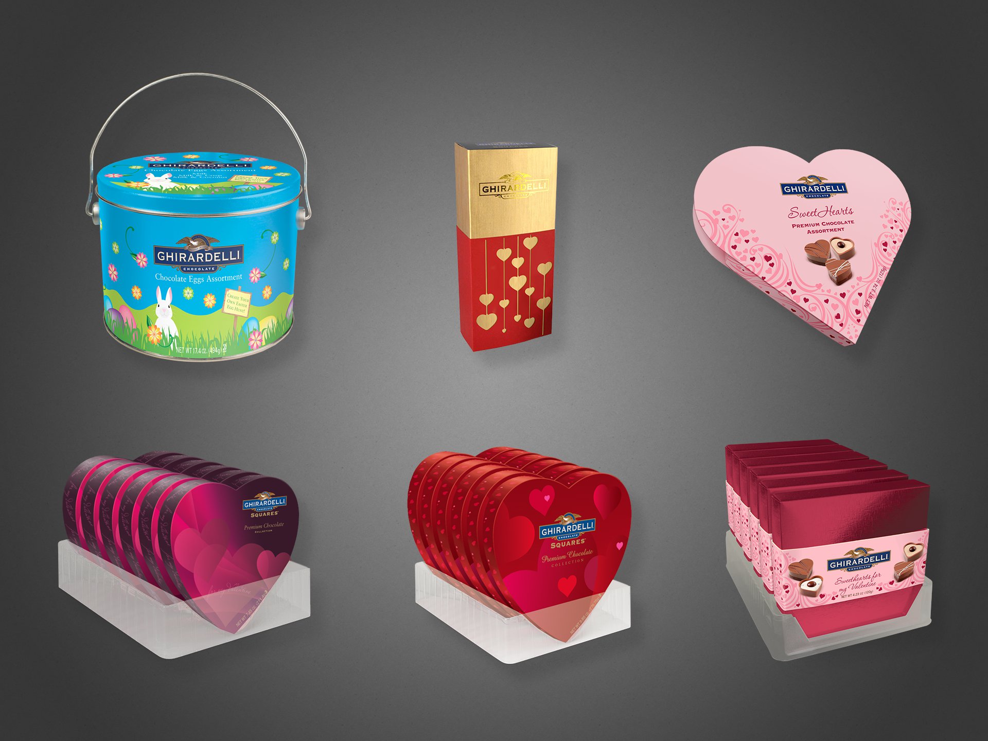
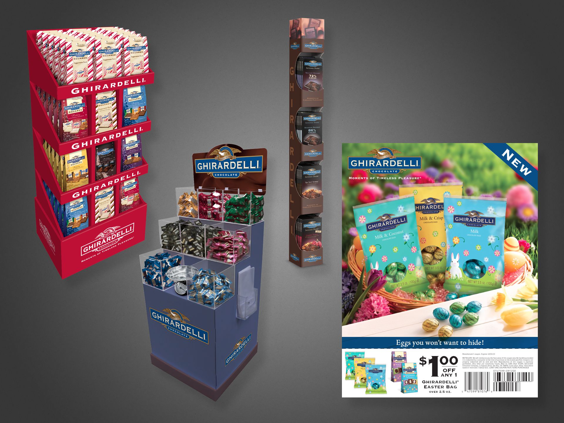
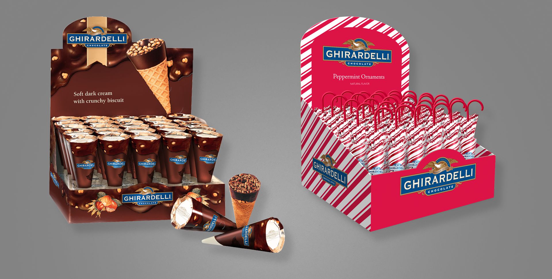
Project: Packaging and Retail Displays Design Role: Designer, Production Artist Client: Ghirardelli Chocolate Key Skills: Photoshop, Illustrator, InDesign, Product design, Concept development Summary: A collection of designs and illustrations for retail product packaging and POS displays. I worked on the final mechanical files released to the printers, as well as photo-realistic visualizations of what the products would look like once produced, for use by the marketing teams when selling to external vendors.
All of the images on this page may look like photographs, but are actually Adobe Photoshop renderings meant to look realistic.
The company’s Marketing team would often request imagery of upcoming products for promotional or sales meetings with retail vendors, but because the products had not yet been produced (in order to photograph), I would be tasked with producing “photography” for the non-existent items, using only design files, and flat printer’s dielines, to aid in visualizing.
The above are all seasonal products, for Easter and Valentine’s Day.
Above left, three free-standing in-store displays. Above right, an Easter coupon, available in stores and as magazine or newspaper inserts. All product shown in the coupon flyer—even in the photographed basket—is fictional; actual product had not yet been produced.
Above are two additional counter- or shelf-sitting displays. All product and the displays themselves were fabricated and painted for illustrative purposes.
Promotional Literature
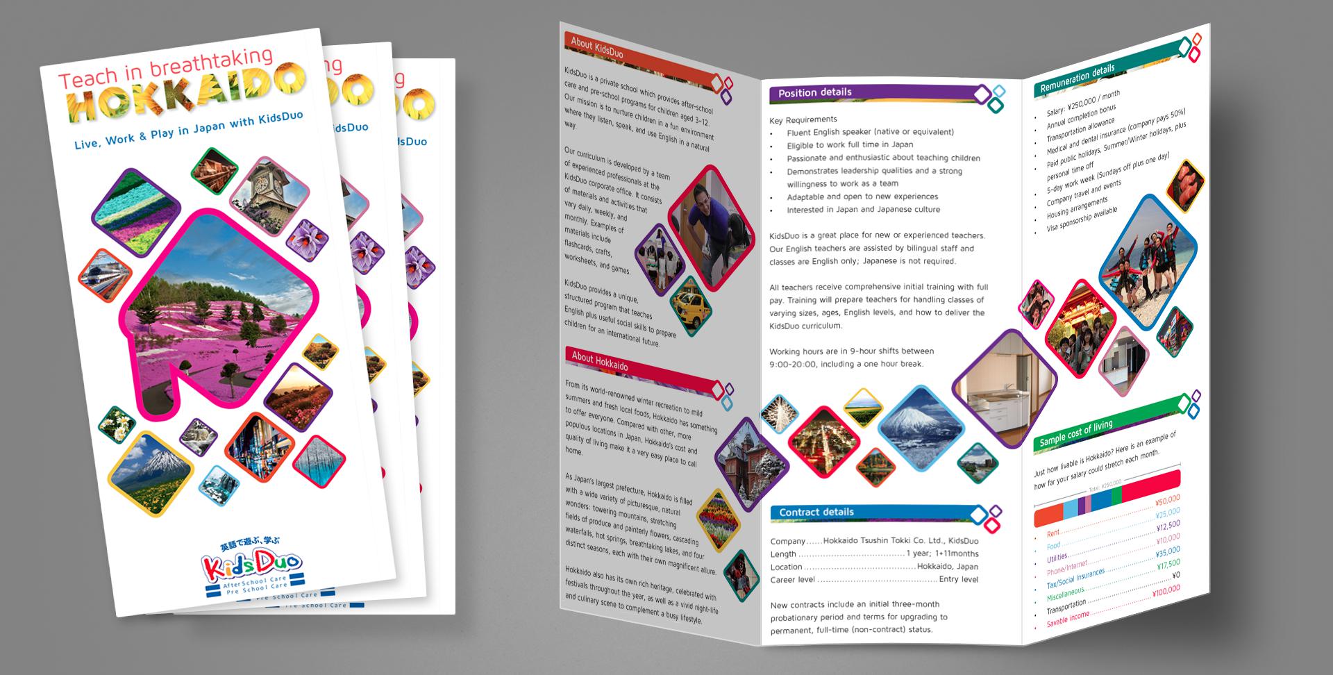
Project: Recruiting trifold pamphlet Role: Art Director, Designer, Copywriter, Production Artist Client: KidsDuo, Hokkaido Tsuushin Tokki Key Skills: Photoshop, Illustrator, InDesign, Print design Summary: A 6-panel trifold used for recruiting English teachers for a chain of private children’s schools in northern Japan.
A chain of franchised children’s English schools in northern Japan was looking to expand its business and needed to attract foreign teachers, so an informational pamphlet was commissioned to that end.
I served as the entire team for this one: Art Director, Designer, Production Artist, Photographer, Copywriter, and Print Producer. Basically, everything you see (including the white space in some sense) is my work. Of note to anyone unfamiliar with Hokkaido or Japan’s geography, the large shape on the front cover is a very stylized representation of the island’s shape, and the swath of photo diamonds on the inside spread is a rough representation of Japan as a collection of islands.
Distributed throughout high-traffic areas for foreigners, this trifold generated an immediate increase of interest for job-seeking English-speakers, allowing the business to expand with additional locations.
Direct Marketing
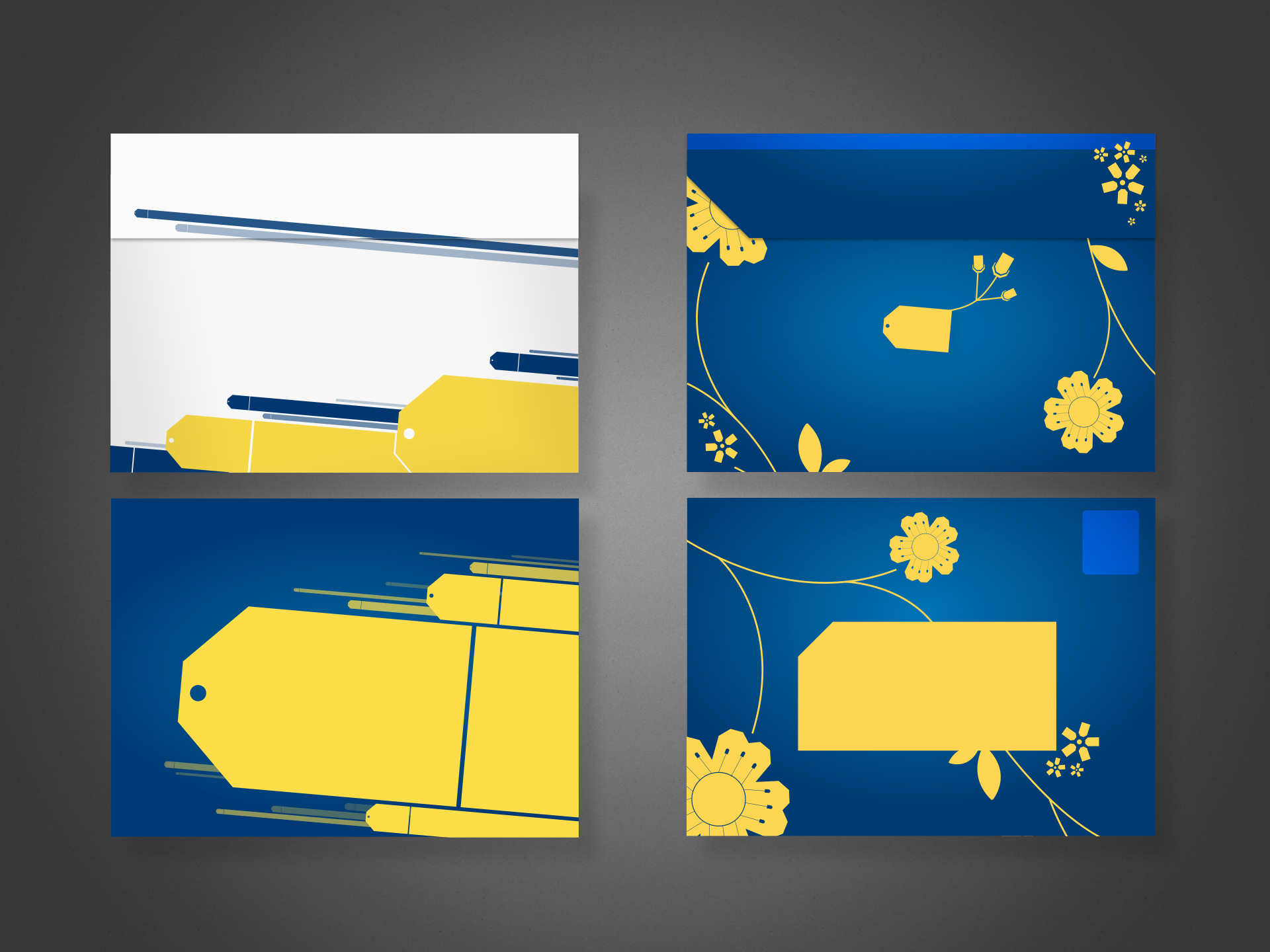
Project: Direct mail envelope design Role: Art Director & Designer, Brand Design & Integration team Client: Best Buy Co. Key Skills: Photoshop, Illustrator, InDesign, Brand Design Summary: Redesign of the envelope delivered to millions of customers per year; the plain blue kit with a simple logo lacked energy and failed to generate enthusiasm amongst recipients.
A Failure of Communication
Best Buy sends physical mail to millions of customers per year–sometimes coupons, promotional offers, or other communique–but found a distinct lack of enthusiasm when polling recipients amid waning response rates. Surprising no one, it turns out sending people something that looks like junk mail or workaday marketing chirashi will generate disinterest.
Recognising an opportunity to upgrade their brand image and also improve redemption without having to sweeten the offers, the underwhelming envelope needed replacing. That said, while the enclosed communique also underwent a redesign, this case study discusses only the envelope.
Left: the selected concept, final design. Top shows the rear with flap. Bottom shows postage and address areas. Right: alternate concept
Concepts Galore
All said and done, I produced well over a dozen concepts, each in varying stages of polish; four of them shared here. Aside from demonstrating diversity of thought, comparing the different ideas allows one to discern the various anatomical aspects of the envelope perhaps not otherwise obvious: the addressee area (reversed/white text not allowed), the return address, and the postage area.
At the time, efforts to transform the organisation into one more “customer centric” permeated virtually all discussions related to marketing.
For this project, I was the designer and art director. I produced pencil concepts, rough and polished presentational comps, and helped prepare files for press.
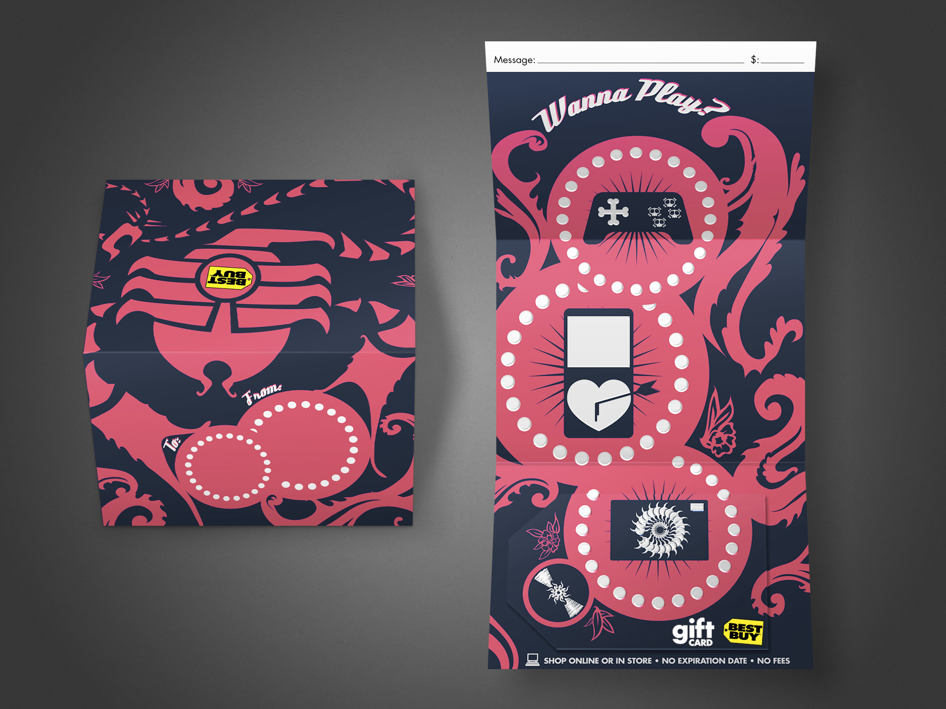
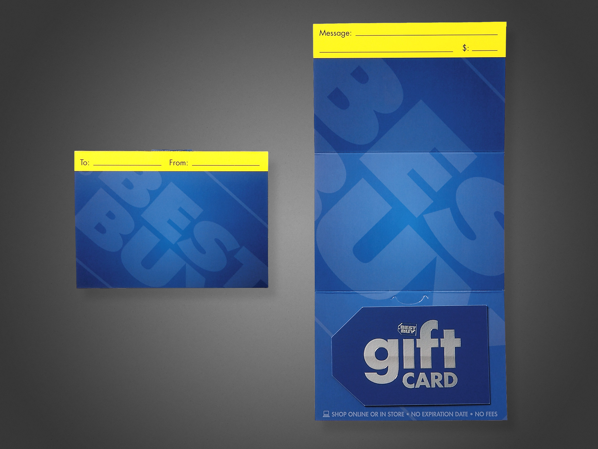
Project: BBY Gift Card Program Role: Art Director & Designer, Brand Design & Integration team Client: Best Buy Co. Key Skills: Photoshop, Illustrator, Brand Identity, Product Design Summary: An ongoing program of various gift card assortments. Each card targeted either a specific drive time, holiday, season, or consumer demographic. For each card, I began at the concept stage, finished at the press check, and everything in between.
Below is a gallery of assorted Gift Cards from my time with Best Buy. Photography of the final, printed product is shown where available.
Click any image to enlarge detail.
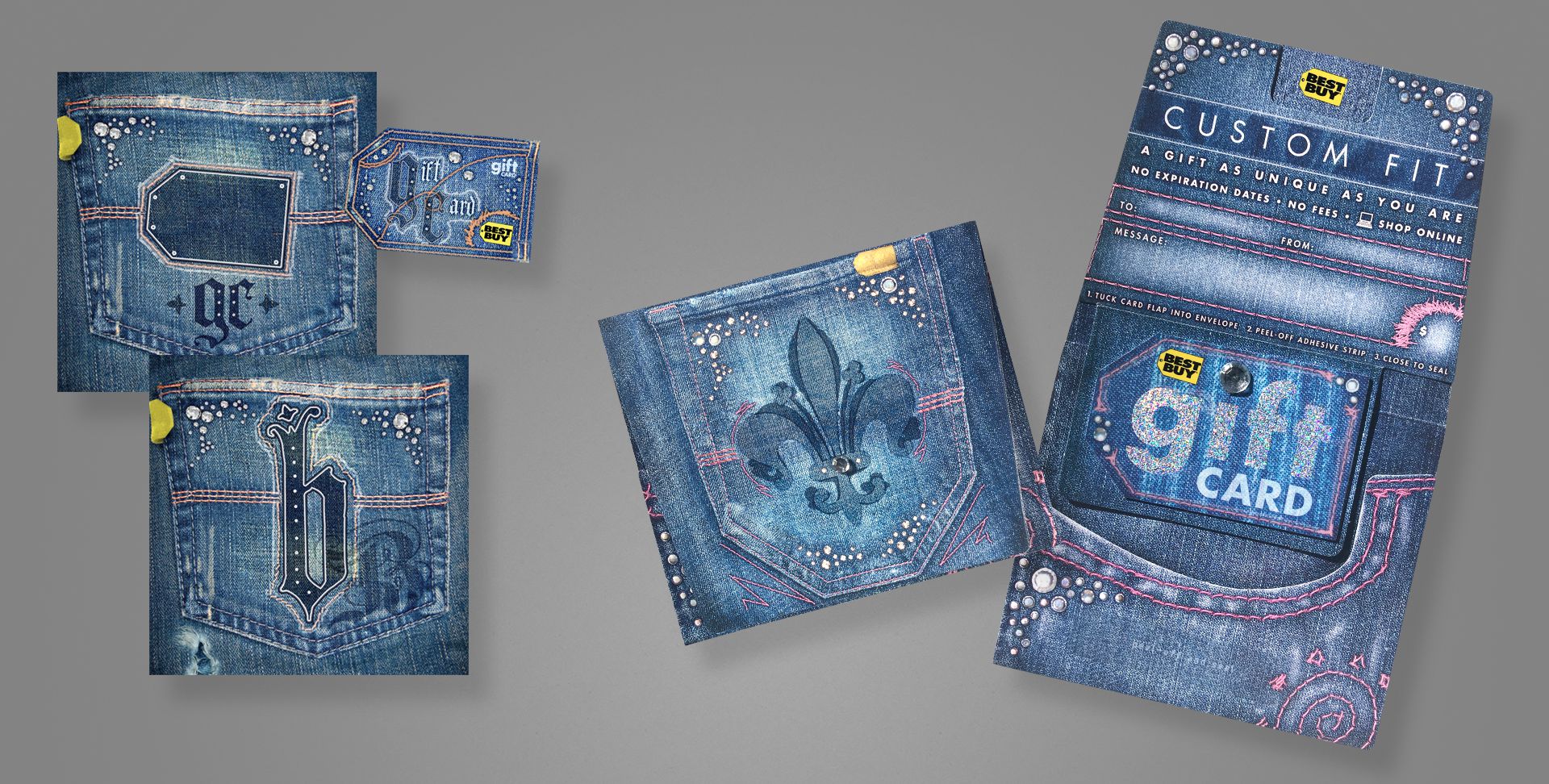
This is a trifold gift card that was produced to appeal to younger, edgier folks than the typical “vanilla” (slightly generic) cards otherwise available. Had to fight a bit to get approval for the skulls appearing on the game controller; the original concepts had heaps more, and my brainstorming files filled with similar odd/twisted cute-but-disturbing entries.
This card features UV spot gloss and spot thermographic (raised) texture for the white areas. My role spanned from the original concept sketch to illustrator, final mechanical production, and press check.
The open value, or “generic”, gift card is (or rather was at the time; I have no current data for comparison) Best Buy’s number one SKU; meaning it alone accounts for more revenue per year than any other single item they sell, exceeding a billion dollars annually. This makes it incredibly valuable as a brand vehicle—not just a product, and by far the most visible, high-dollar design I’ve ever created.
Some background on the project: at the time of its redesign, the company had been using a couple of flashy, and frankly gimmicky/gaudy designs that relied on cheap lenticular or hologram effects to gain attention. I understand the time and place for these things, but at a time when the company was looking to elevate their brand design, public image, and sophistication, such gimmicks are toys better left behind in childhood.
As such, a streamlined, elegant approach that put the brand name, marks and elements first. Solid on-brand blue, simple typography, and the use of subtle textures and contrast between shiny vs matte to do the talking. The card is a color-matched solid core plastic with a spot silver foil, and the giant logo on the carrier is a UV spot matte that exhibits different effects at varying viewing angles.
This design changed very little from my first concept presentation, and was received well both internally and publicly. I served as the Art Director, Designer, and Production Artist for this project, and assisted with on-site press checks.
A brand-focused card, we decided to go all out with this one. Embossed, spot UV, spot matte, custom spot foil, and hand-affixed jewels to both the carrier and card. Shown left are two concepts for a gift bag, which eventually became the gift card.
My role spanned from original concept, to photographer, designer, production artist for final mechanicals, and on-press art director.
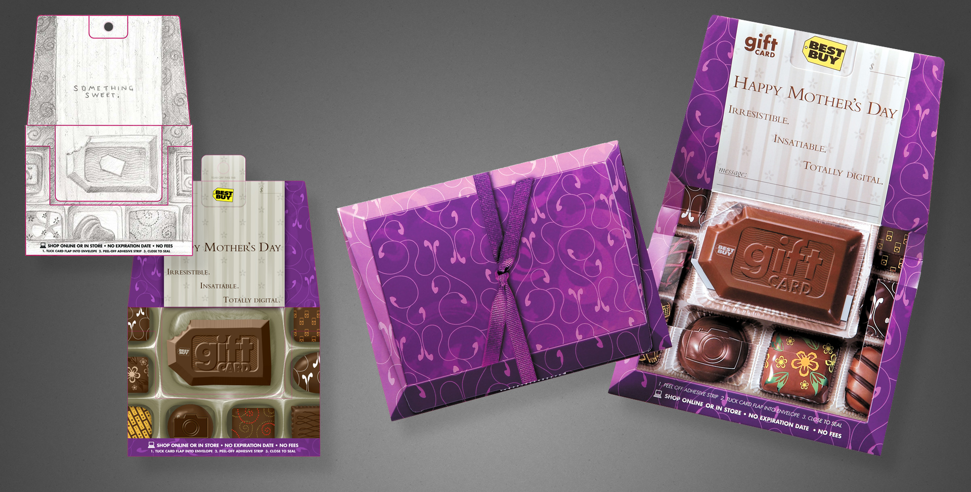
A gift card, available in Spring 2007. The brief was targeted at higher-middle income mothers, or at least as gifts for said demographic. We were to illicit a bit of “boutique”, plus a sense of abundance/selection. So I came up with a box of brand-specific chocolates. When closed, it looks like a box of chocolates, replete with a ribbon. When opened, you see the assortment of sweets.
Shown left are my original illustration and a digital comp. Shown right are my original concept sketch, my rough digital draft, and photography of the final product to show my workflow and vision carried out between media. I was responsible for the concept, client presentation, art direction and supervision of an illustrator hired for the final image, and the press check.
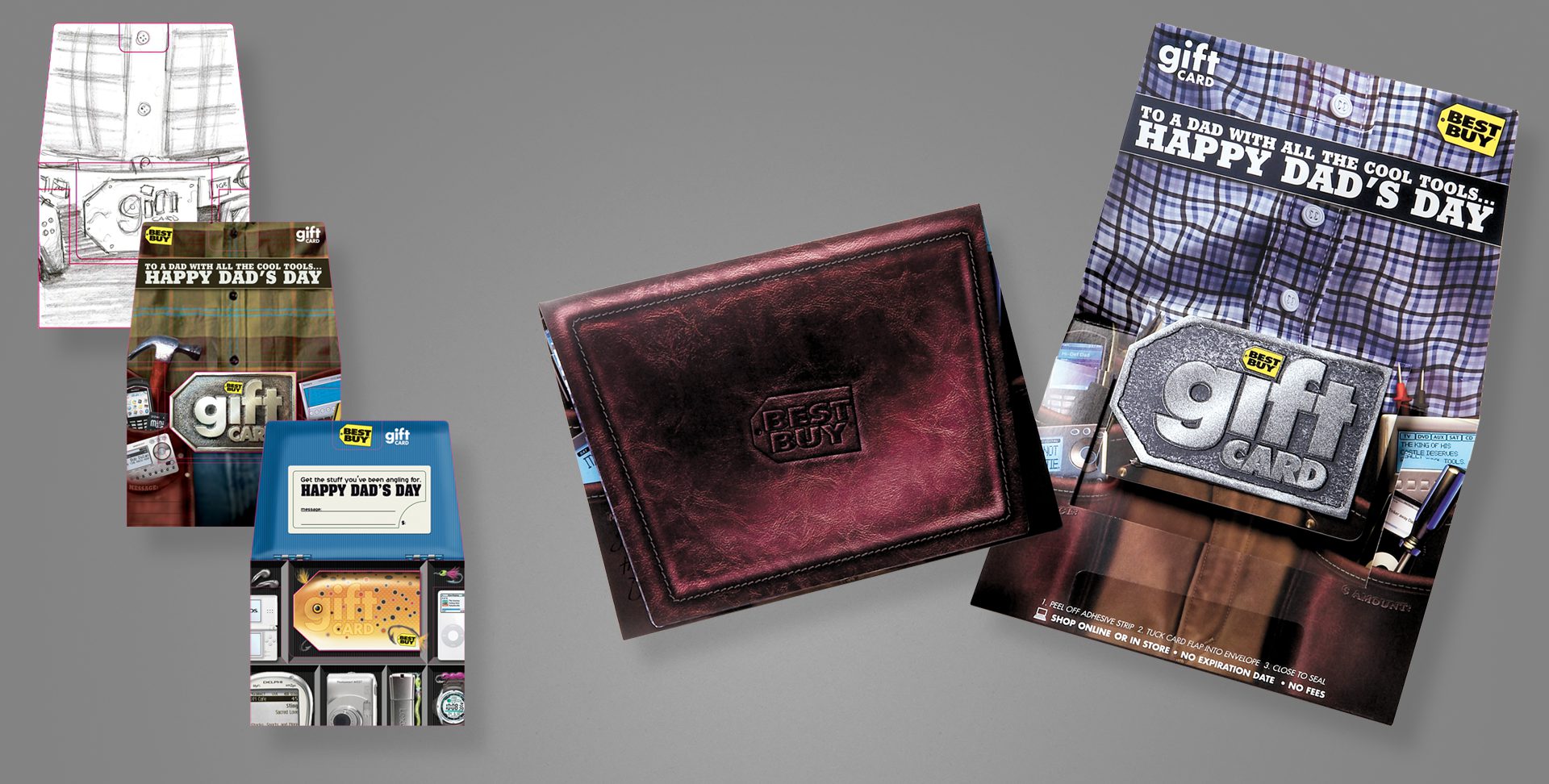
After having a Mother’s Day card aimed at a more sophisticated, upscale demographic, we of course needed one to match the fathers in the same category as well.
Shown left are my original pencil concept, and my first rough digital comp. An additional, unused tackle box concept is also shown. Finally, photography of the finished, printed illustration, open and closed. The closed design mimics a fine leather wallet, and the card design used a layered process with metallic inks to give depth and some visual flash.
Pencils and digital comps are my direct work; I art directed the final illustration via a sourced illustrator, and oversaw the printing process/press check.
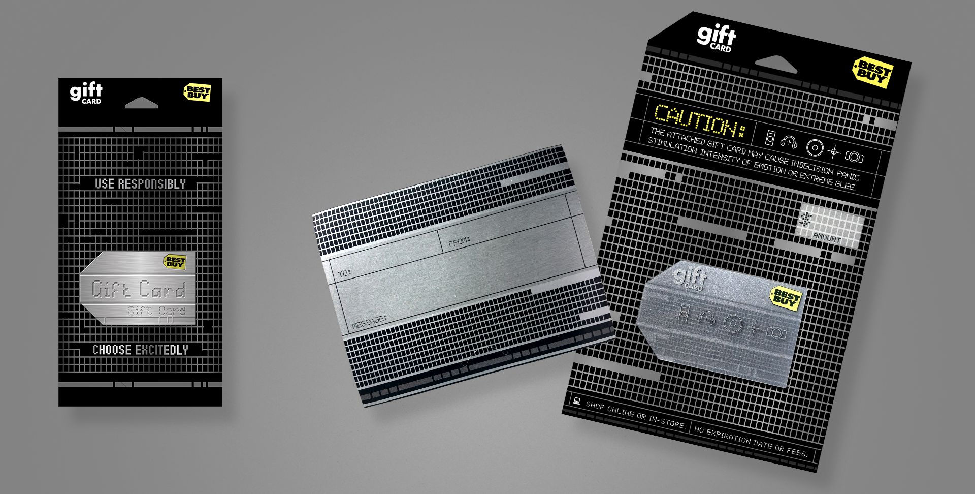
A brand card that aimed at a more sophisticated, tech-savvy or early-adopter demographic. This project used a silver ink with 1C overprint for the textured metal effect on the carrier, and a layered card that shows different elements on the fronts and backs of each plastic layer, to give a parallax, 3D depth effect.
My original concept is on the left, and photography of the final printed card/carrier on the right. I art directed an illustrator for the final, prepared mechanical files as the project production artist, and oversaw the printing process/press check.
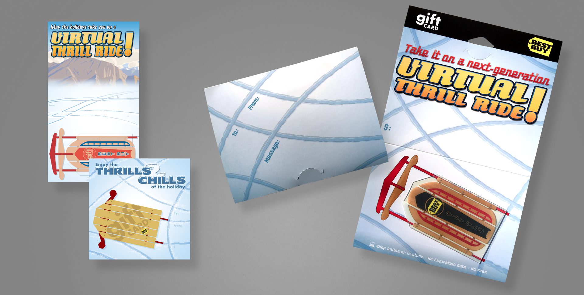
A holiday card that plays off the shape of the Best Buy tag. This card uses a clear card technology, so surrounding the sled body and between its wooden slots are completely clear.
My original concepts are on the left; photography of the final card and carrier are on the right.
I served as the designer from concept to the final design, with the exception of art directing an external illustrator, who produced the woodgrain and metallic elements of the sled; as well as assisted on production art of the mechanical files and attended all press checks.
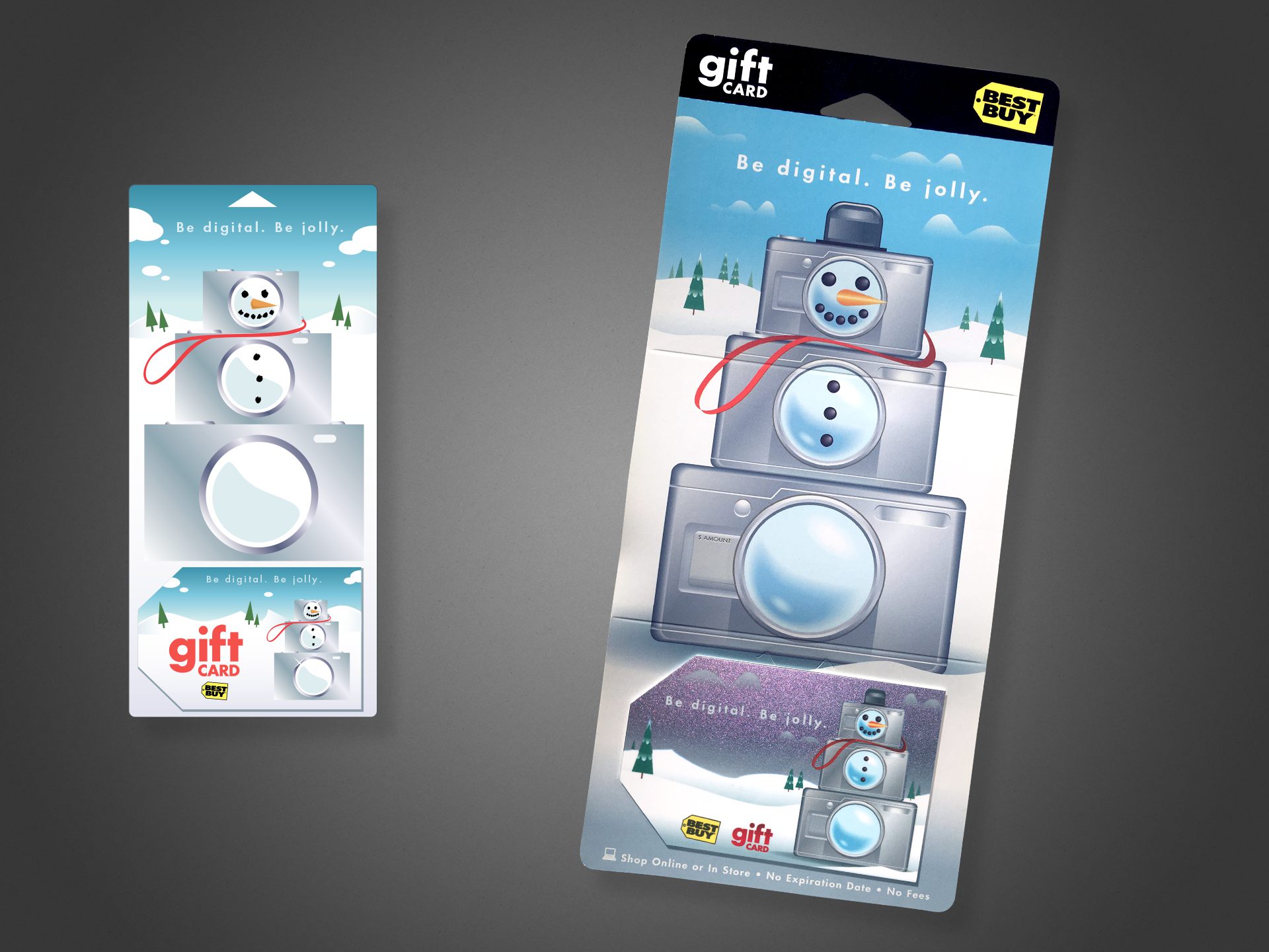
This holiday card is, conceptually, one of my favorites, simply due to it’s light-hearted, whimsical take on the Best Buy brand and its “abundance” component. This project features a color-shifting metallic fleck on the card, shifting between blue, teal, and the purple tones visible above.
Shown left is my original digital concept; shown right is photography of the final product. I served as the designer from concept, to art directing an external illustrator for the final illustration. I assisted with production art of the mechanical files, and attended press checks.
Cutting Room Floor
As gift cards became more popular in the mid ’00s, ways of standing out amid the massive selection became more important for the business end. That included exploring new substrates (plastic, clear, metal, etc.), new inks (metallic, color-changing, textured, etc.), and new form factors.
One of the alternate form factors our group explored was a gift card that doubled as a standalone speaker–requiring only an external audio source be plugged in via a standard headphone-style jack. Yes, it was thicker than a standard card, making swiping a magnetic strip impossible, and yes, the speaker was tiny and didn’t sound like much, but it was certainly on-brand as electronics and entertainment go, and something new to the gift card arena.
Included are a number of my pencil concept sketches, plus a number of digital comps.
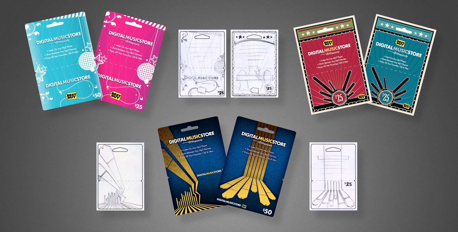
Above are a variety of concepts to be used for an online music service, each accompanied by my original sketch to illustrate my typical work flow. The dark blue cards in the lower-center were ultimately chosen for production, along with a third design in the series not pictured here.
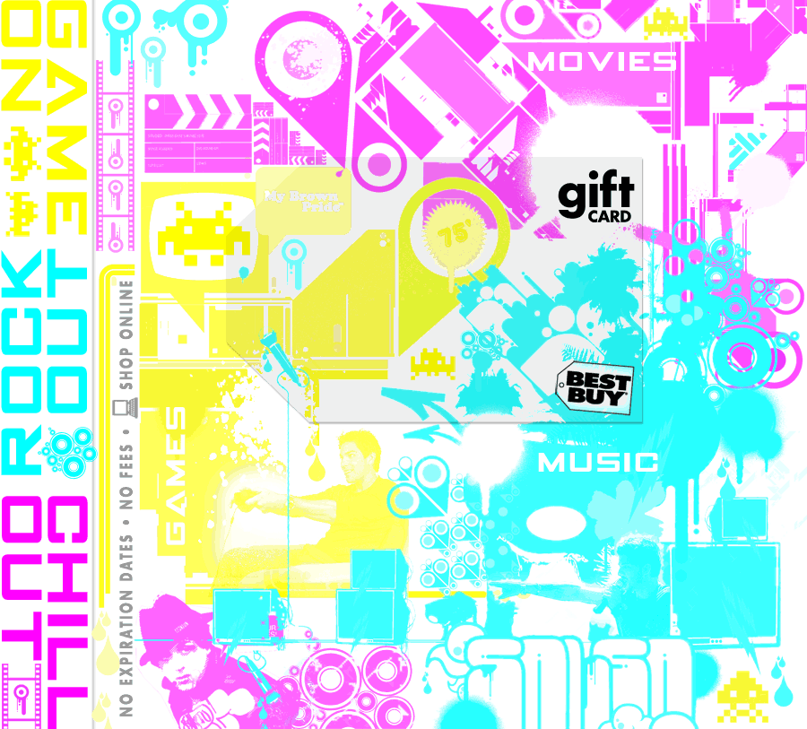
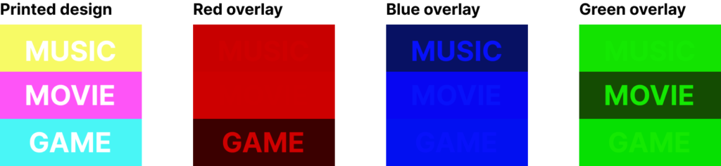
Less formally presented but my favourite… the 3-in-1 jewel case card:
How the concept breaks down. For every vellum overlay, two ink colours would be “hidden”. For example, green hides cyan and yellow while darkening magenta, etc.
The brief was to design three entertainment gift cards, all to be merchandised amongst the in-store media (music, dvds, games).
To make the most of a limited budget, with some inspired and cunning use of the physical sciences, I devised a single design that would be transformed for each category using a different colour vellum overlay inside the jewel case. By exploiting properties of light, I could effectively hide two ink colours with a single transparent overlay.
B2B Gift Package
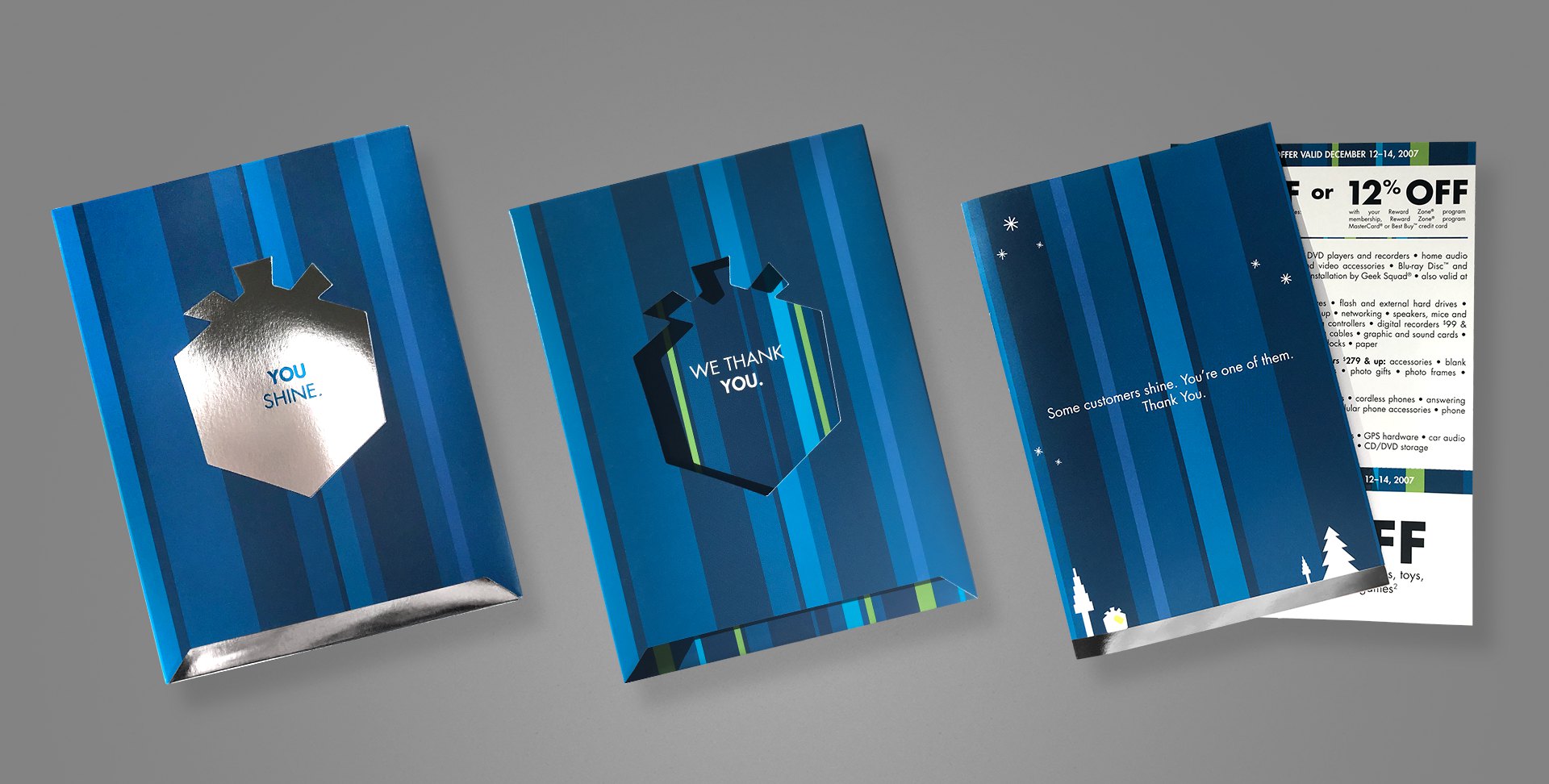
Project: B2B holiday gift package Role: Art Director & Designer, Brand Design & Integration team Client: Best Buy Co. Key Skills: Photoshop, Illustrator, InDesign, Brand Design, Product Design Summary: A premium holiday gift package for B2B customers, complete with a mailable box/packaging, exclusive discount coupons, and signed greeting card.
Every year, Best Buy produces a special holiday greeting card to its business customers (B2B), as a thank you for their patronage. When approached to lead the project one year, I took things a step beyond a simple greeting card, and created more of an actual gift package, one that also matched the company’s holiday campaign, which included gift box iconography and copy.
The box includes an additional flap that folds over the messaging visible on the above image (leftmost two samples), with space for mailing. Once opened, the recipient reads “You shine.”, on a shiny, silver foil box. Sliding out that box reveals a secondary message printed on the inside of the carton, “We thank you.” Inside the box is an actual greeting card, hand-signed by the team and containing a special offer coupon. The elegance and simplicity throughout this piece was really satisfying, and went over remarkably well with recipients.
My role extended from the original concept, where I literally spent the first week working through the form factor, hand-making various mockups to test; to the design and production of the final mechanical files.
Industrial Product Design
Project: Private label product line revision Role: Art Director & Industrial Designer Client: Insignia Key Skills: Photoshop, Illustrator, Brand Identity, Product Design Summary: A new line of private label products struggled to achieve a cohesive—and upscale—image across its variety of products.
Many consumers immediately associate private label (or as they’re commonly referred to in the pejorative, “generic”) products with similar, but inferior quality, at least compared to brand-name equivalents.
What those same consumers don’t know is that in many cases, the generics are manufactured by the same factories on the same equipment, etc. as their more expensive counterparts. Swapping a mould, logo, or packaging design between them is almost trivial.
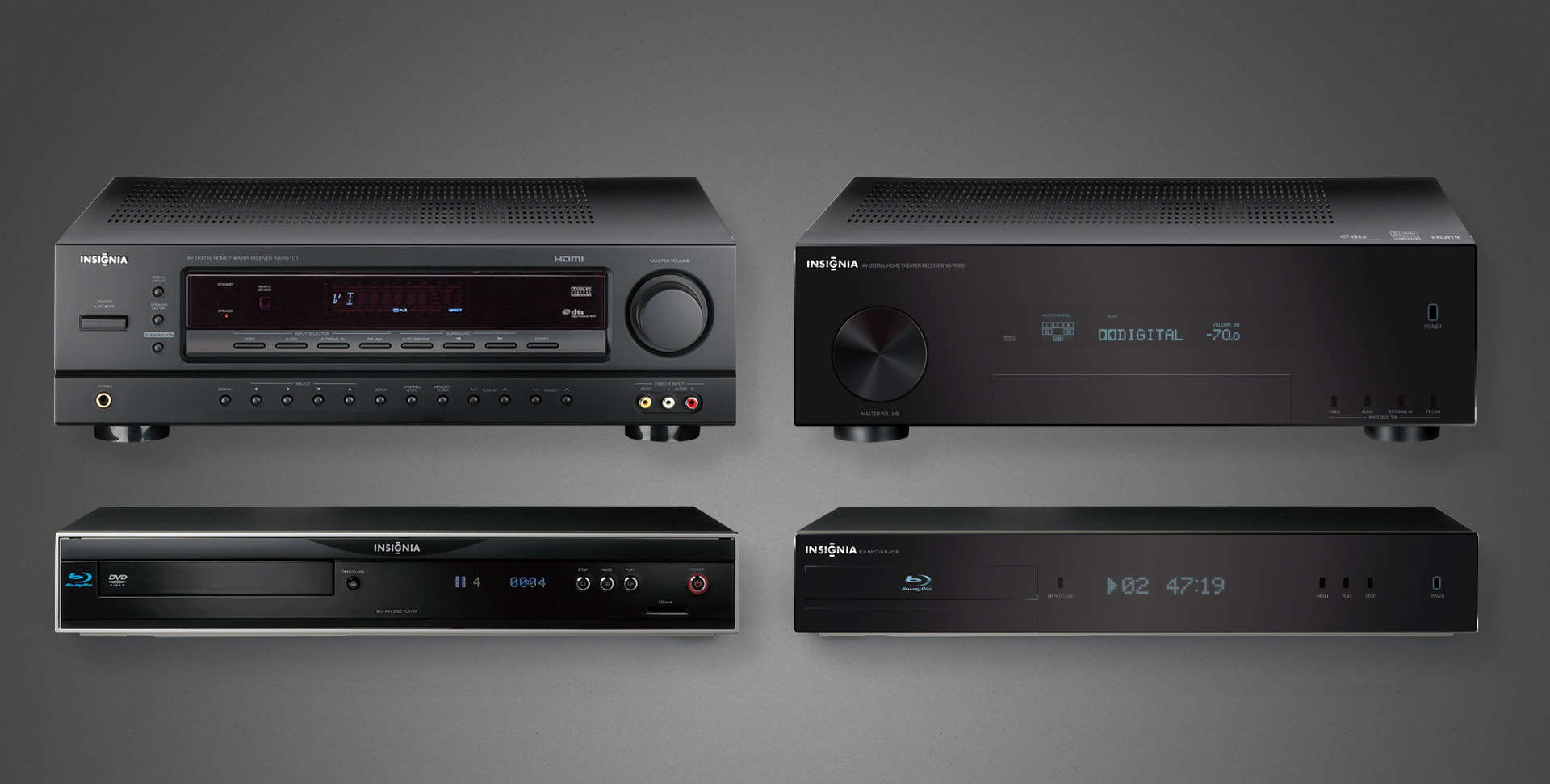
The Insignia brand manufactures a heap of private label electronic goods for Best Buy, but early in their journey, they struggled to create a cohesive identity amongst their product lines, because each was produced independently by whichever facility was manufacturing it.
Left: the individually serviceable but collectively unrelated original A/V components Right: the family resemblance is not only obvious, but its refined elegance suitable for any discerned A/V enthusiasts
No more apparent a case made than that of home theatre products, when they’re often literally stacked together. Insignia A/V offerings were all over the place, literally and figuratively, because each factory did whatever they wanted to satisfy the technical requirements and called it a day.
I was charged with providing branding and industrial design support, both to align the products’ appearances but also elevate their chicness, especially when placed on shelves alongside high-design and higher-priced competition. The scattershot fit and finish simply reflected poorly on both the products and brand.
A peek at one example of product families, we can see on the left the somewhat schizophrenic and mismatched pairing of a receiver and its cohort Blu-ray player.
My recommendation for revisions to both—staying within budget—is shown on the right. All done completely in Photoshop (and with vector shapes/layer styles for resolution independence no less).
These efforts did spark something of a renaissance within Insignia’s product and manufacturing group, evident to this day in their more well-conceived line of goods.
I actually enjoyed this enough that I considered returning to school to get certified/qualified in industrial design. However, in the course of informational interviews with existing professionals, all interestingly shared the same warning: “if you want to do industrial design, just realise that everything you ever do will end up in a landfill someday”.
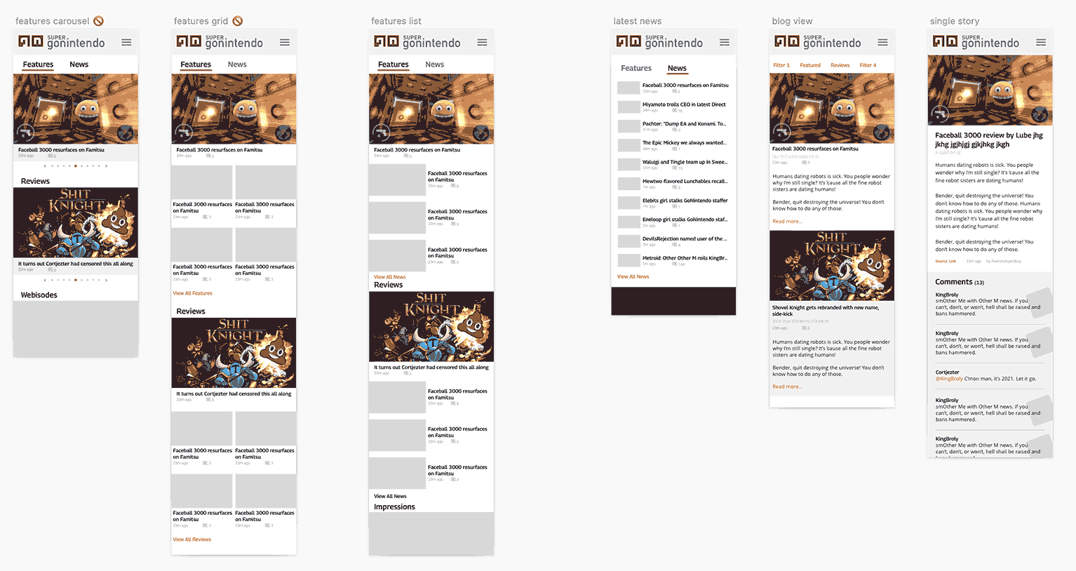
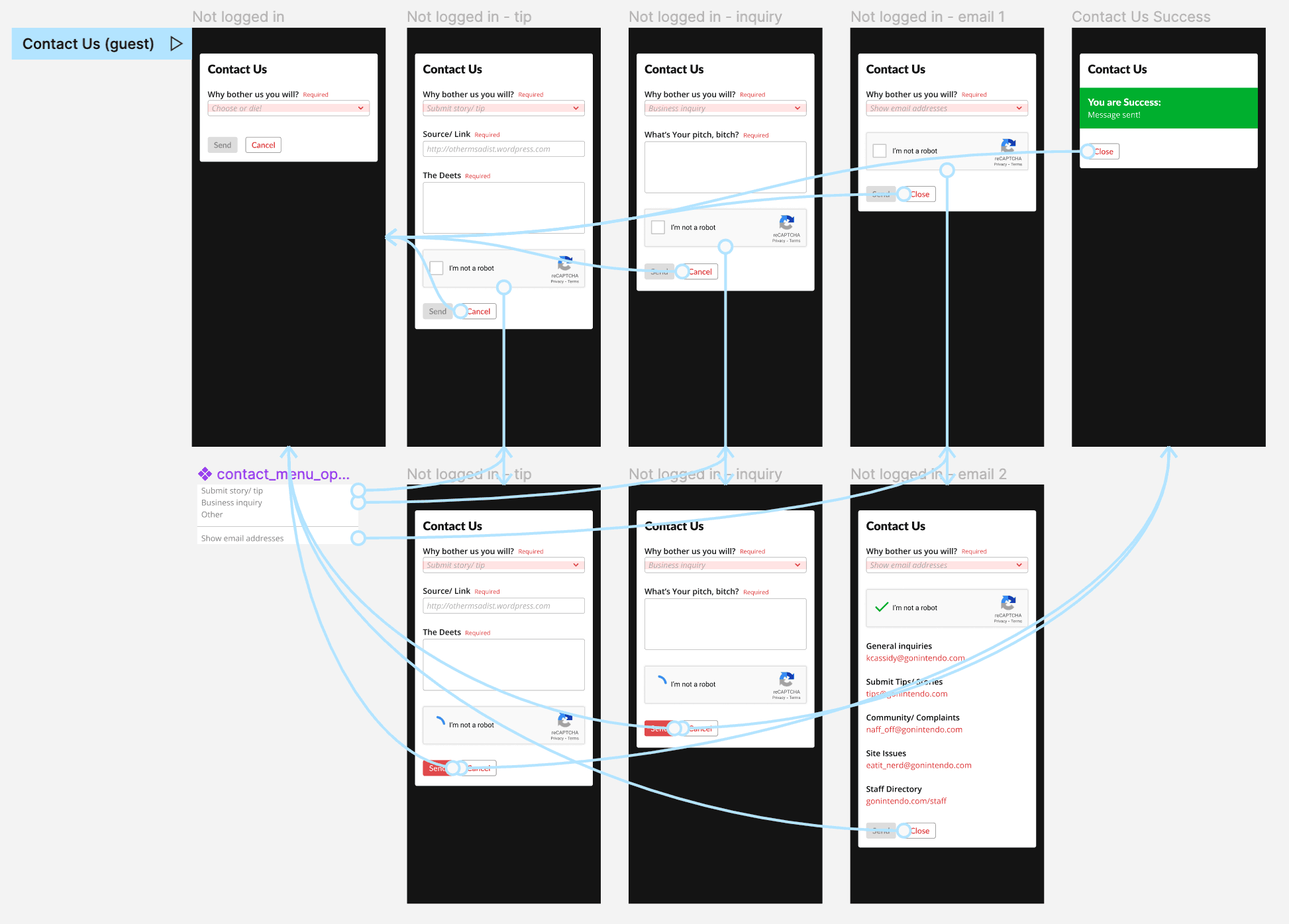
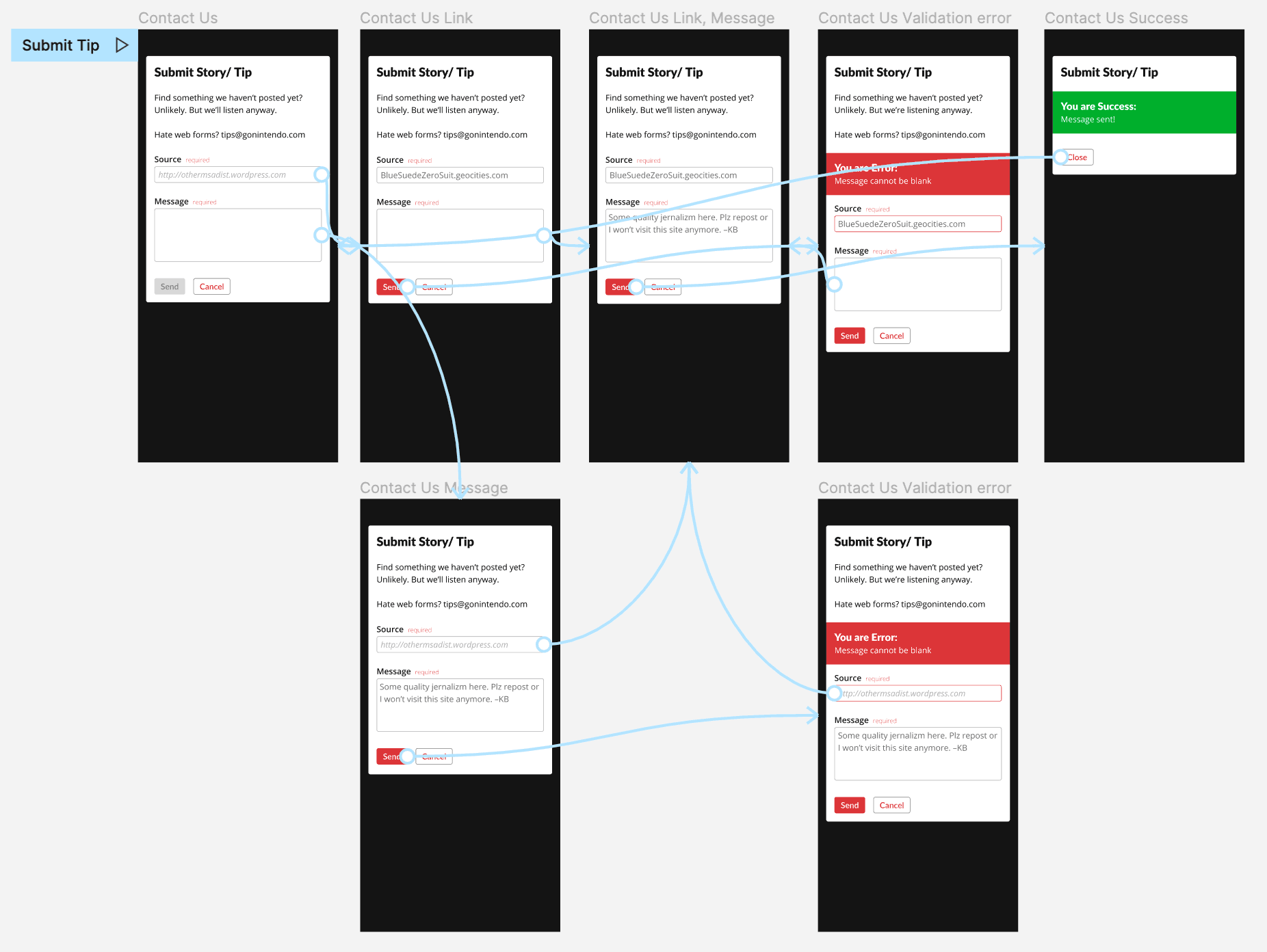
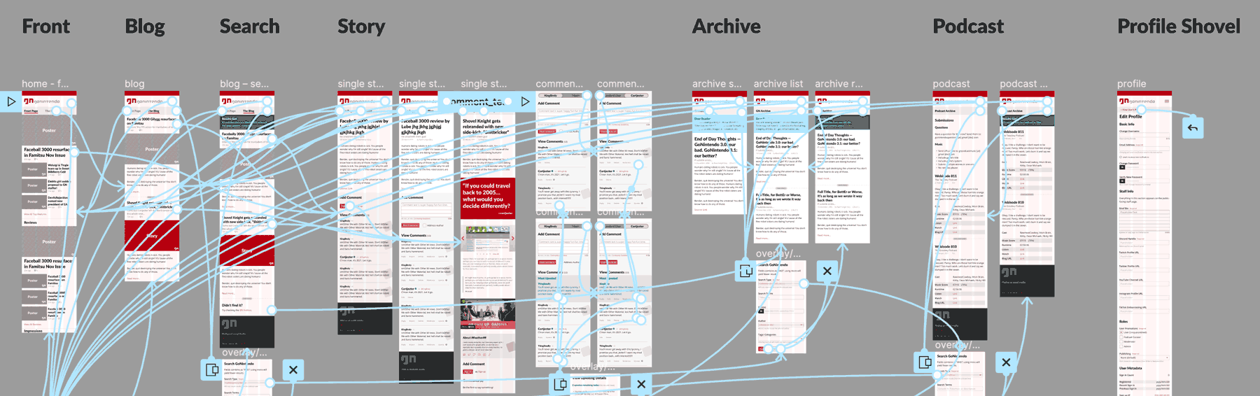
TLDR; an online gaming news site and community I’ve led the building and rebuilding half a dozen times since 2005.
Project: Web-based app, custom-built CMS for online media outlet Role: Director of Product & Design Client: GoNintendo Team: 5–40 Environment: Fully remote Key Skills: User research, market research, mobile first, wire framing, Figma, design system, brand design, documentation, code alignment, leadership Website: gonintendo.com Summary: An iterative web project spanning more than fifteen years, starting from the reskin of a humble WordPress-based site to its rebranding and replacement by a custom-built, responsive CMS…twice thrice.
Overview
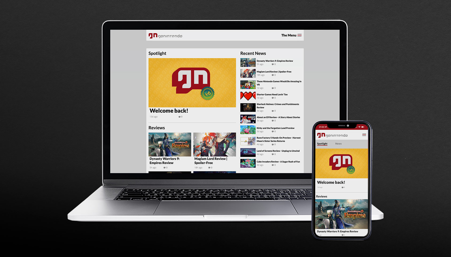
GoNintendo has been the world’s top destination dedicated to Nintendo gaming news and community since 2005. Having undergone six major product launches in that time—all under my direction, this case study will document the most recent launch from March 2022 following an internal tragedy which forced a site hiatus for the better part of a year.
For a deeper look at the history and previous releases, including my biggest career failure, read my article here
The Objectives
While we had previously built two completely custom CMS front- and back-end solutions replete with a content publisher and admin interface, the latest incarnation brought several new challenges that meant we could not simply recycle past efforts.
The outgoing site—while still highly capable—remains a testament to yesterday and simply not up to the challenges facing devices in 2022, supporting a team of writers or the structural differences in presenting feature content versus news.
Tragedy tends to put things into perspective. What worked yesterday was suddenly unfit for tomorrow.
– Aaron Hoffmann
Where things were
A fifth-generation system that while efficient, was built to support a feature set suffering from years of accumulated bloat
Fully responsive, but built to serve a largely desktop-based audience
Supported multiple domains, users and permissions groups, but the largely code-based editor resulted in huge output discrepancies and rendering issues between authors, even after training
Almost exclusively focused on the news feed in a blog-like format, at the expense of promoting editorial and exclusive content
Where we needed to go
New content mix, new layout and database/information architecture. Post-tragedy, the CEO’s vision for the site changed from mostly news to a larger emphasis on editorial and exclusive content.
New layout could not completely betray the passionate user base’s expectations. We learned this the hard way once before.
Massively streamline the feature list. Not minimal viable product, but it required a serious discussion of priorities amongst leadership. In terms of overall feature quantity, most of the past would be left behind.
Mobile first. For realz this time. Based on traffic analytics, we would for the first time be building for a mostly (80%) mobile audience. Compared to ten years prior, mobile technologies and expectations evolved substantially.
More organised editorial review workflows. The team would be expanding ten-fold to realise the new site’s direction and needed completely different technology and UX to support everyone.
A publishing tool that forced consistency between all authors. Expecting dozens of new staff to be or quickly become well-versed in HTML/CSS enough to all produce compliant content is unreasonable. Needs to work for beginners and experts alike.
The Work
Of course, with me, projects never begin with wireframes, largely because like developers, I prefer to avoid wasting time or expensive rework as much as possible.
While some back-end technology pieces began immediately and in parallel with design due to time constraints, I directed the project follow a structured UX methodology.
Define
gather requirements from CEO/leadership
translate requirements into discrete goals, including feature set
establish timeline and roadmap for launch and post-launch
define personas and essential new workflows
Research
conduct user interviews
understand usage patterns
understand device usage
outline essential workflow diagrams and matrices
competitive research and analysis
Structure
created design system
tokenised colours, sizes, etc
all components
began branding / identity refresh
authored documentation / style guide
targeting devs and future advertising partners
Design
produced wireframes and prototypes
facilitated weekly check-ins with leadership and design/development
completed re-branding efforts
Validate
weekly check-ins with leadership and dev lead, including demos and presentation of progress
conducted regular user interviews
A/B testing
Group interviews
Individual interviews
guided and unguided sessions
validated code against UX schematics with dev lead
my target was 80% accuracy by launch
Repeat
analysed/ synthesised feedback into actionable revisions
weekly sprints
Definition
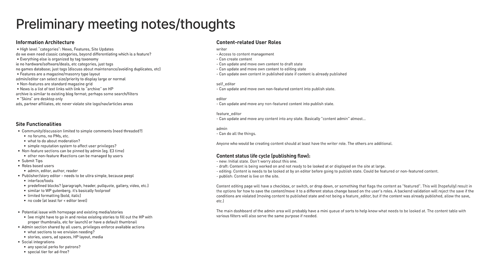
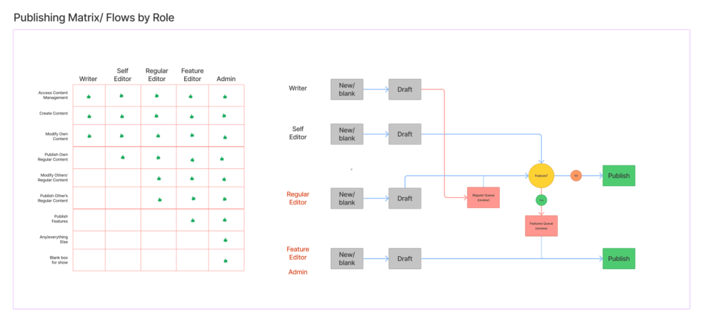
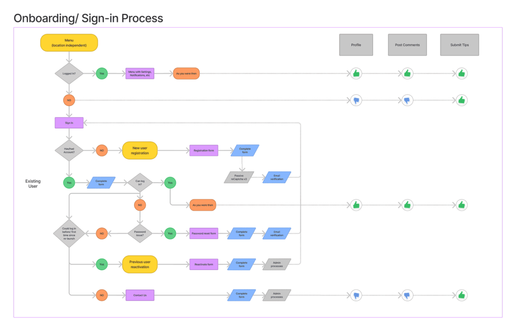
We conducted a series of preliminary meetings to define the goals, then identify and triage the feature list, and finally establish realistic delivery windows for launch and beyond.
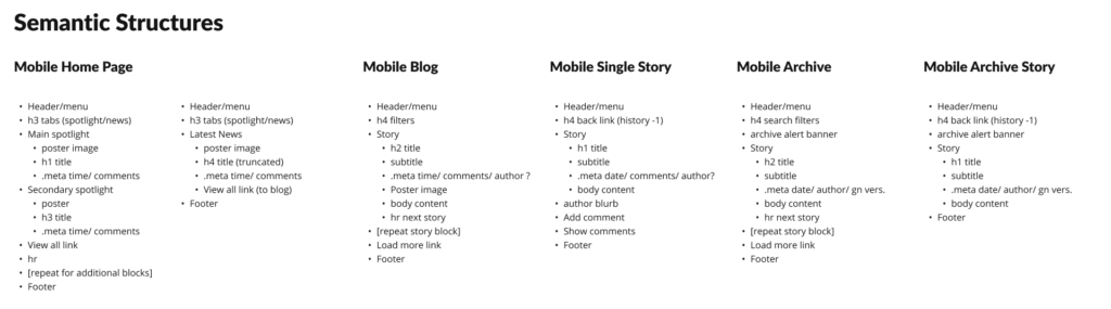
Defining basic IA, core feature set, personas, and a publishing user flow.Persona matrix and publishing user flowWorking out the onboarding user flow and permissions, accounting for previously onboarded accounts and brand new people.Defining the semantic structures early, to simplify design output later, but also to allow development to begin creating basic templates and test code with semi-accurate placeholders.
Research
We then conducted market/competitive research, partly to discover whether similar solutions existed but also to understand what our target audience is experiencing elsewhere, aka Jakob’s Law.
We spent considerable time researching and analysing our traffic data. Surprising almost no one, our device demographics nearly flipped since our previous iteration (built 2013-15), going from roughly 70% desktop to 80% mobile, 18% desktop, and the remainder filled by tablet and non-traditional devices.
Admin headaches
When it came to the publisher, the single greatest struggle in past iterations was training new users how to use the bloody thing, because until recently, good WYSIWYG editors still often relied on knowing enough HTML to tweak/fix things to achieve the desired result.
Plus, even if we could get the average person to rudimentary HTML fluency, each writer would still format their content however the cosmos struck them that day, aka zero consistency.
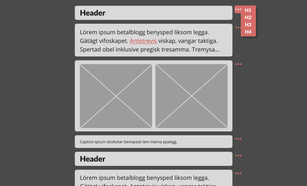
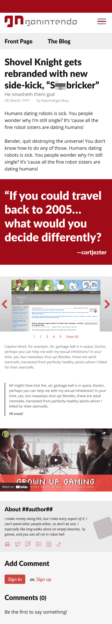
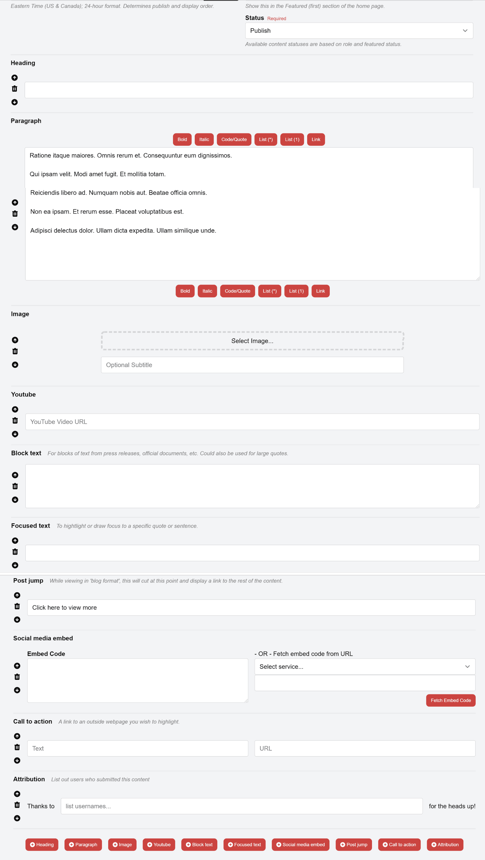
Rudimentary example of a block editor. Authors can easily and consistently build articles without coding. Simple options shown in the first header’s contextual flyout.
The lead developer and I each independently brought in the concept of a block editor, basically a component library for writers.
By stacking pre-made content blocks (eg headers, image galleries, pullquotes, etc.), each with predefined styling and simplified options, users would never need to muck about in the code, and would all produce identically formatted, valid HTML entries.
Ironically, WordPress introduced a similar feature in 2018, and though we had no interest in reverting to the platform we ditched over a decade earlier, their Gutenberg block editor did represent the direction we wanted to go, just without all its complexity and fluff.
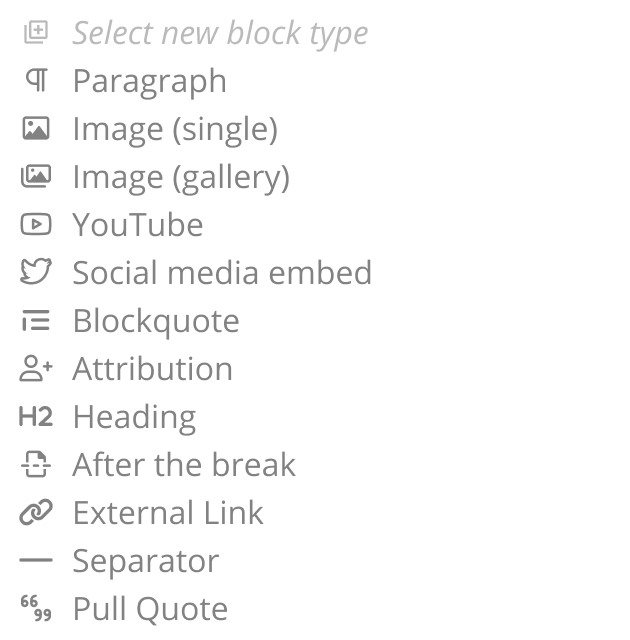
To determine what blocks we would need, we first brainstormed a list, and scraped the database for 50k past stories to generate a word cloud of common tags used by authors, and then compared the two.
It was then just a matter of prioritising (or alphabetising) the final collection, much like the arrangement of keys on an English-based keyboard. We chose organisation by usage over alphabetisation, as not every writer would know our vocab for the block they needed.
The complete list of blocks available to the writing teams.
Structure
Building an entire web app from scratch with an extremely tight delivery window meant that feeling our way in the dark was not an option. Unlike past iterations which allowed organic progress, highly collaborative efforts between design and development was critical to success this time around.
To that end, though we had some very, very rudimentary sketches to illustrate the overall concept and vision from the Define and Research stages, as development set its groundwork with various frameworks and libraries, I began building out our design system, starting with the essentials.
To save time further (ie two birds with one stone), I compiled and documented all components and design system elements as a style guide as they were built.
Design system foundations
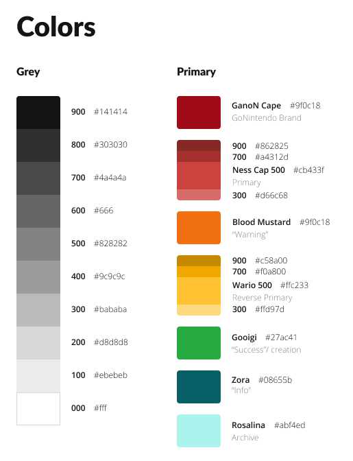
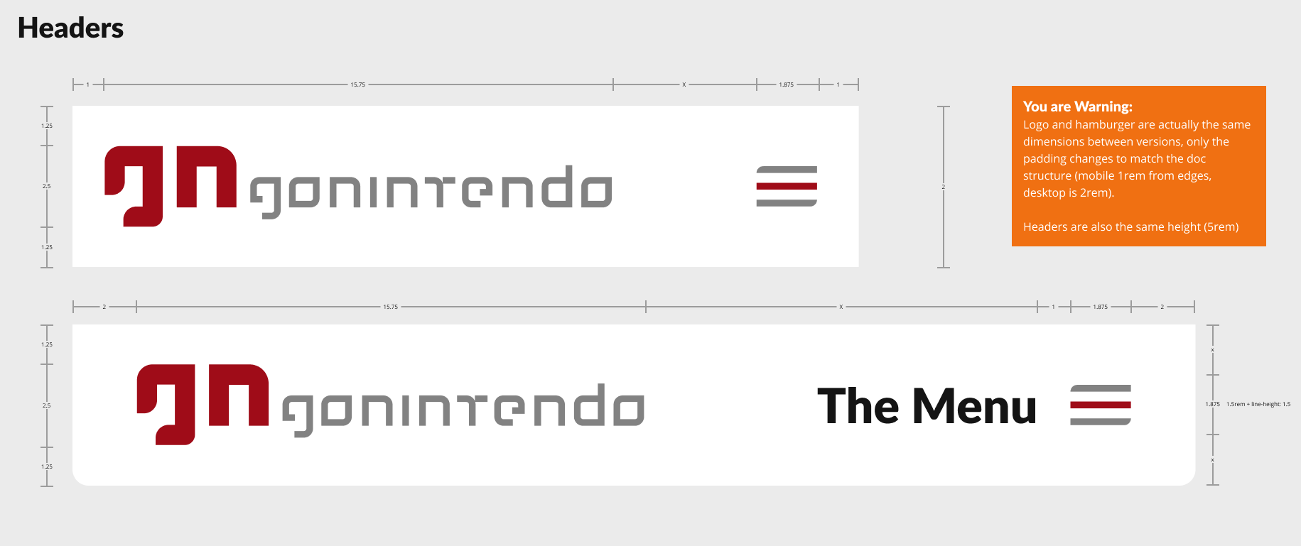
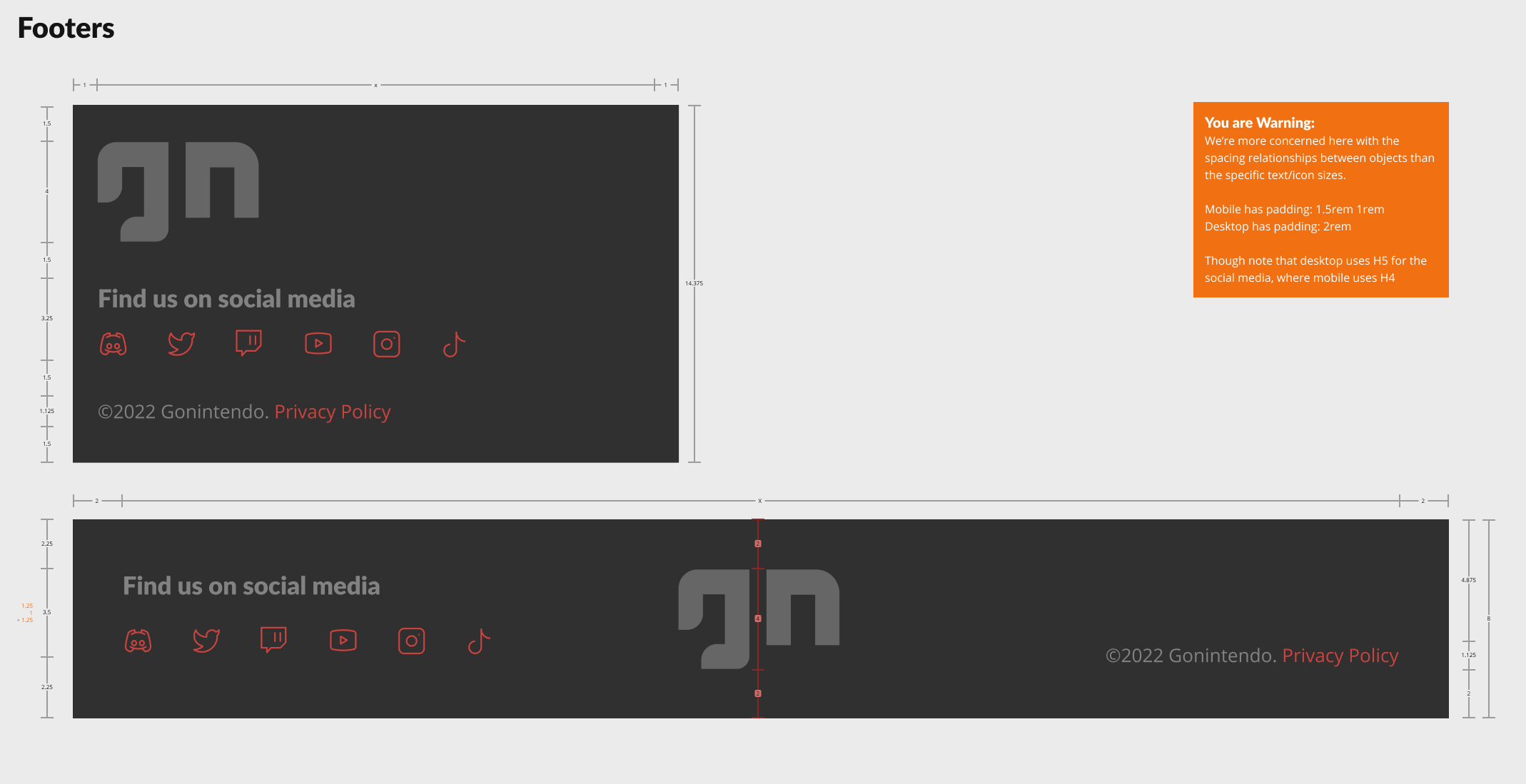
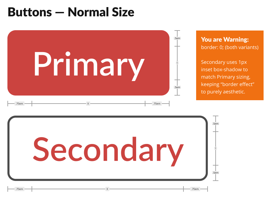
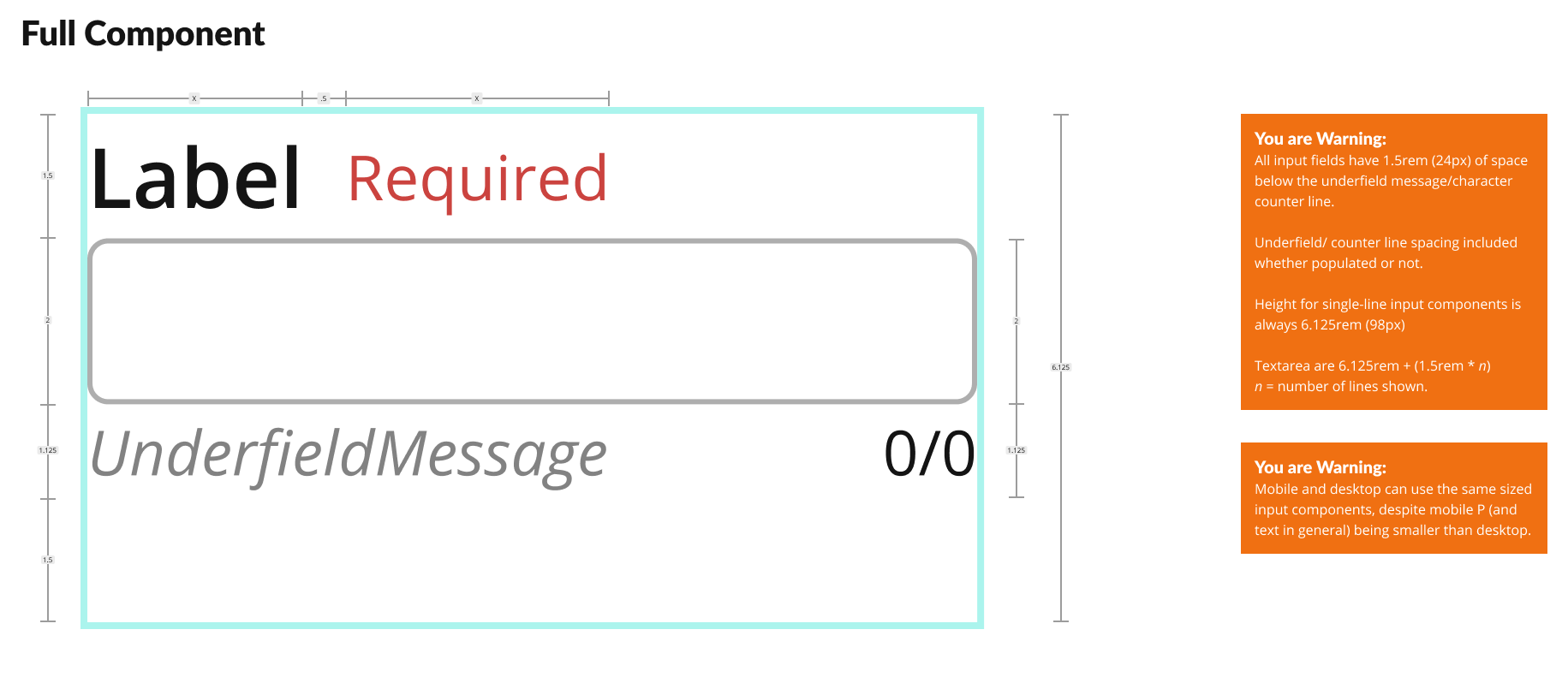
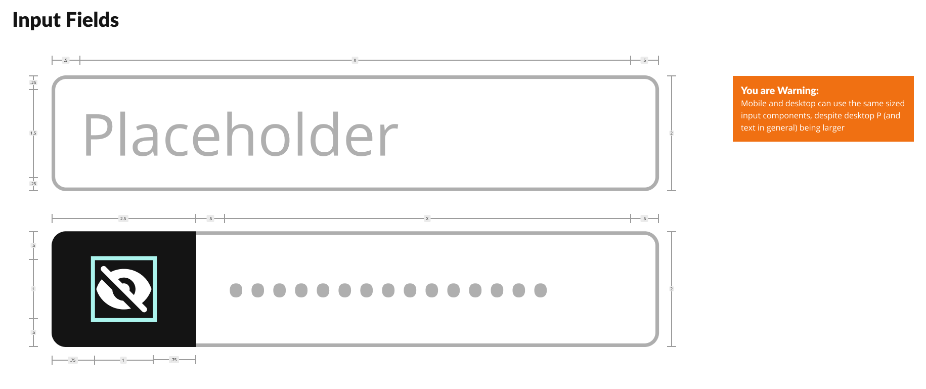
As always, my preferred design system rests upon an atomic, 16-point soft grid. All facets of the system from font sizes to spacing relate to multiples or fractions of 16.
Happy to explain that in greater detail…just reach out.
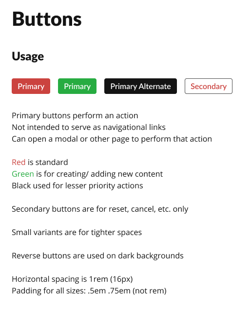
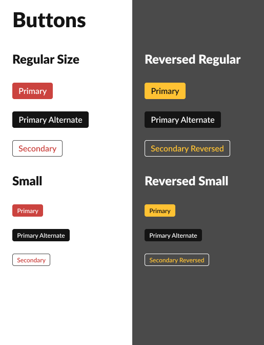
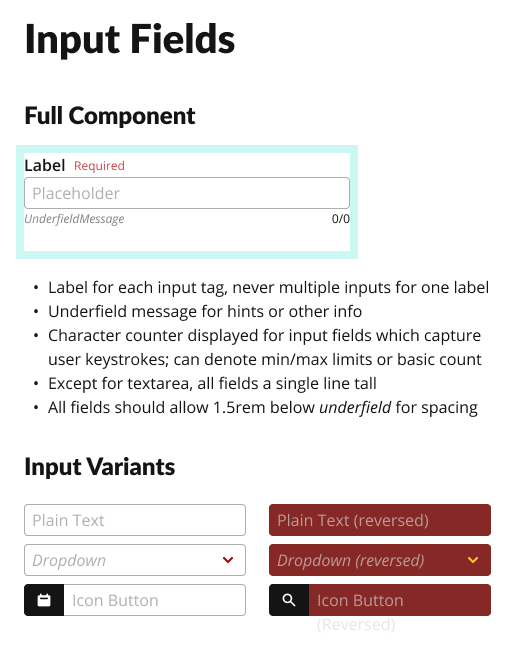
The most basic elements like font scales, colour grades, and tokens came first, followed by layout grids, buttons and input fields.
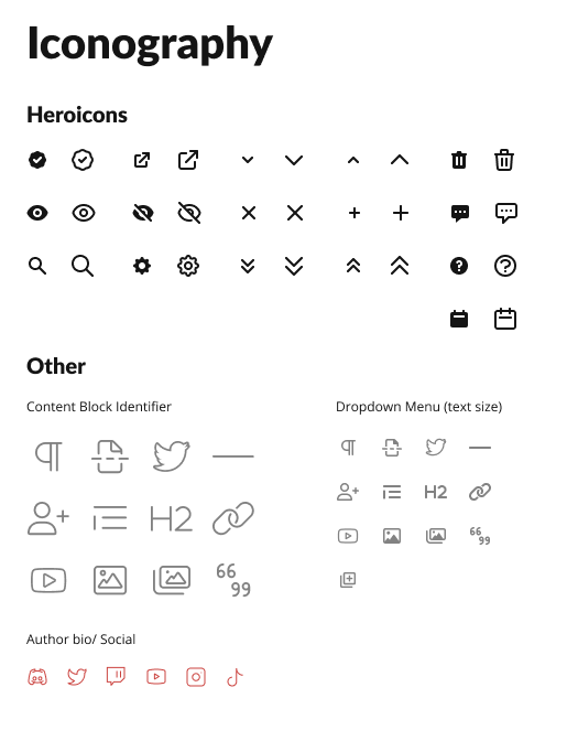
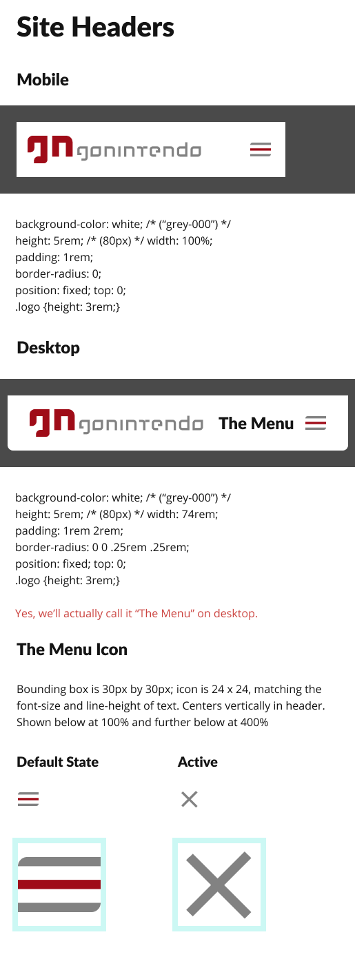
With Tailwind CSS as our presentational foundation, we also relied upon their official Heroicons collection to cover our limited iconography needs for the external facing front end.
For the block editor within the admin panel, we relied on a combination of official and custom icons inspired by FontAwesome 6.
Additional examples of more developer focused anatomical diagrams and notes:
Rebranding efforts
For a major relaunch not only of the digital product, but also a renewed vision of the services offered within it, we also wanted to introduce a refreshed branding to reflect a resurrected spirit.
Ok, enough with the “re-” words.
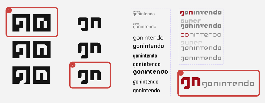
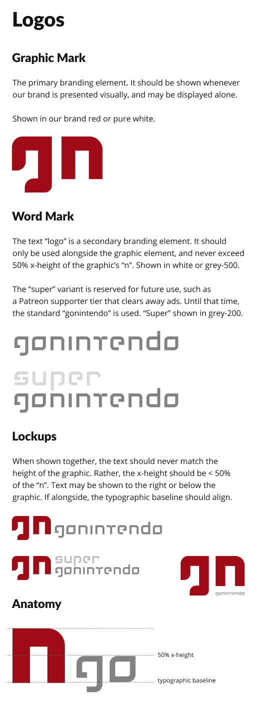
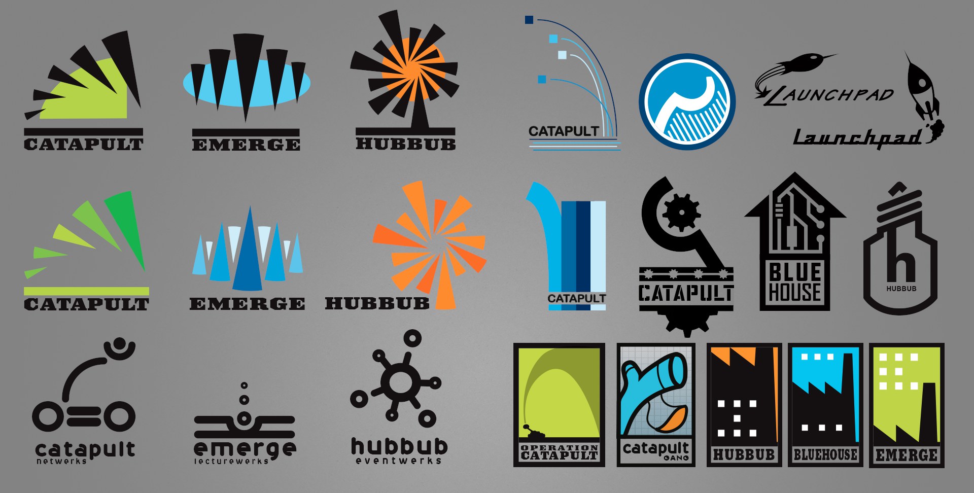
Some of the branding exploration. 1, one of our past logos. 2, the revised version. Third column, partial showing of commercial typeface options. Fourth column, my custom-designed typeface options. 3, the final selected lock-up.
Without exhausting the long history, we explored a number of options, but decided upon a simple streamlining of a past, fan-favourite identity.
For this, my goal was to reduce overall geometry for maximal use across devices and sizes.
Although we explored a number of commercial typefaces for our word mark, we ultimately used one I completely custom designed via Adobe Illustrator.
Design
Our goals included not just a responsive, public-facing front end, but a full admin panel and publisher, plus the new identity.
Public-facing
Given our early discussions, competitive analyses, etc.; we quickly settled into a viable mobile concept as our flagship and then expanding upon it to create desktop and tablet versions.
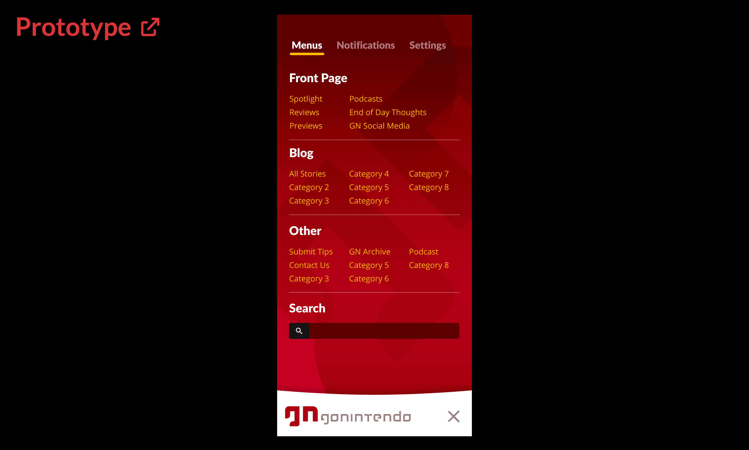
Early, low-medium fidelity mobile menu prototype options test:
Working prototypes of initial mobile menu options considered. External link to Figma.
The desktop navigation proved a more formidable hurdle, as the additional real estate allowed for a much wider variety of options. We ultimately presented these options in A/B testing for user validation (further below).
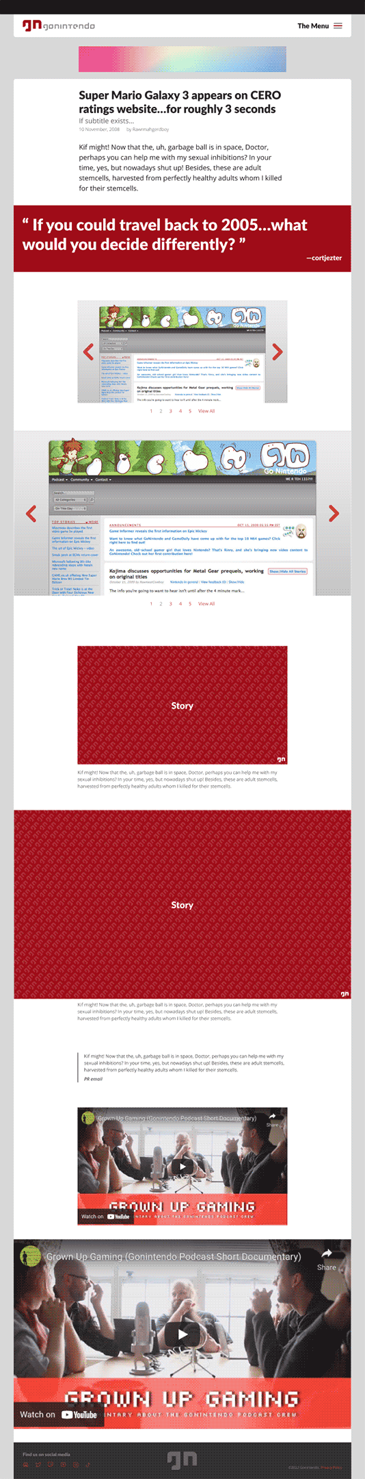
The remainder of the public-facing UI design mostly revolved around how each of the publisher’s story blocks would render across devices.
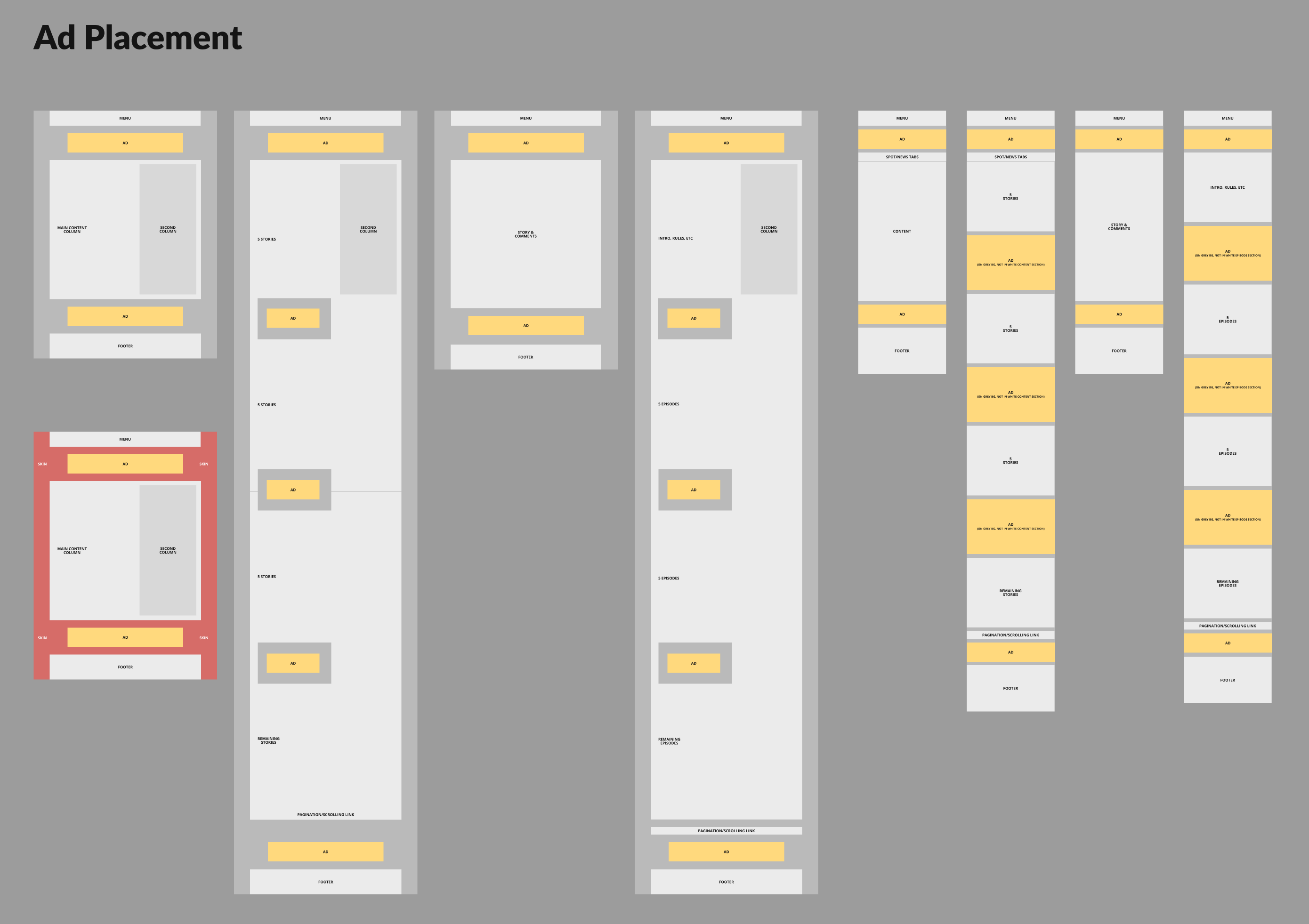
Ad placement required us to consider both the intrusiveness impact to users while balancing business needs to pay bills.
But the larger UX conundrum was how to intersperse ads given the user behaviour we discovered in earlier research.
In the past, standard pagination (click Next or Previous to load a new page) allowed us to place ads in consistent and specific locations within a layout; something highly desirable to ad companies.
However, based on our initial user research and their usage patterns, we explored using infinite scrolling instead of static pagination. This added several issues:
Infinite scrolling only allows a single masthead (most valuable, main header) ad once, and then lesser value ads between content as the user scrolls. This means considerably less revenue.
Most ads use iframes and loads of javascript, which significantly reduce performance with each instance, a serious problem for mobile (read: 80% of our) users.
this is further compounded by the media-heavy content our editors already post
Some users reported hating (automatically loading) infinite scrolling, so we needed to find a solution that allowed the freedom to peruse content endlessly but also remain purely opt-in.
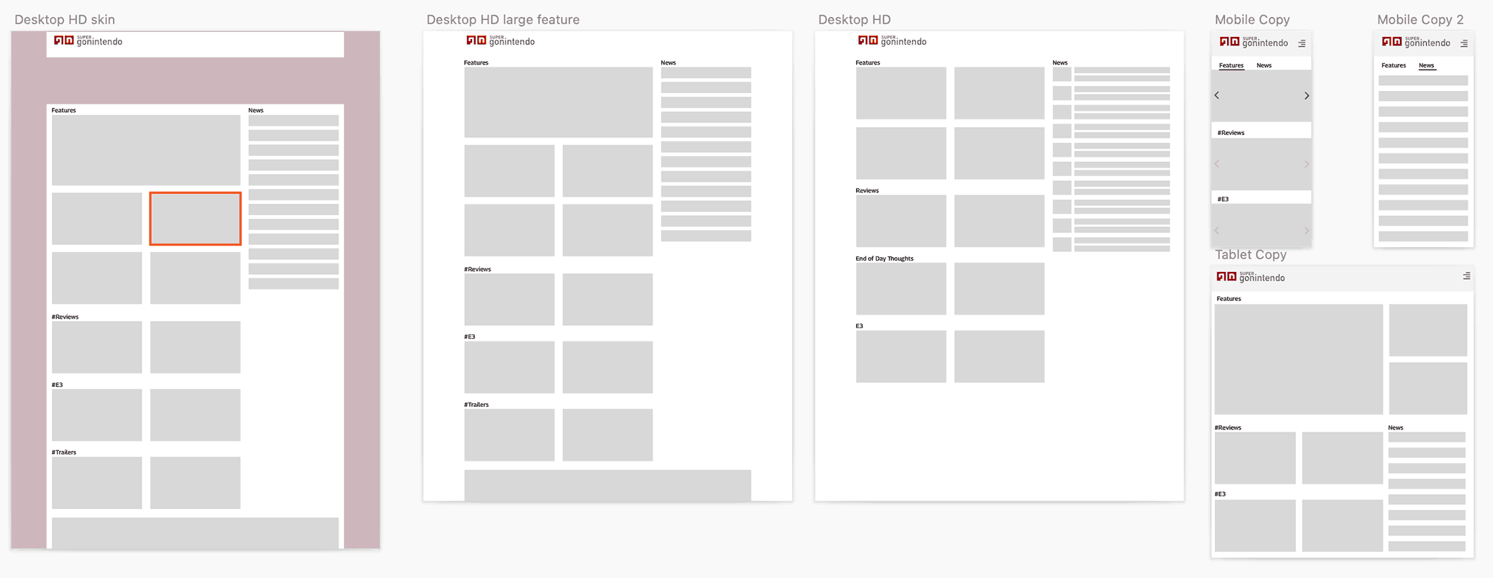
Given the high level templates for both desktop (left) and mobile, we also needed to account for the necessary evil of ad placement (yellow blocks).
As visible in the low-fidelity wireframes above, once we identified the main sections per layout across the app, we could identify the prime locations for ads.
When it came to infinite scrolling, to solve for the desired opt-in behaviour, avoid performance hits, and a consistent placement for advertisers, we:
Made loading infinite content a simple button/link at the bottom of each block.
Ad placement only affects the first fifteen articles; the initial load of content.
Users see the same amount of ads as a single static pagination, have freedom to load additional content as desired, and advertisers gain their reliable placement. 🥇
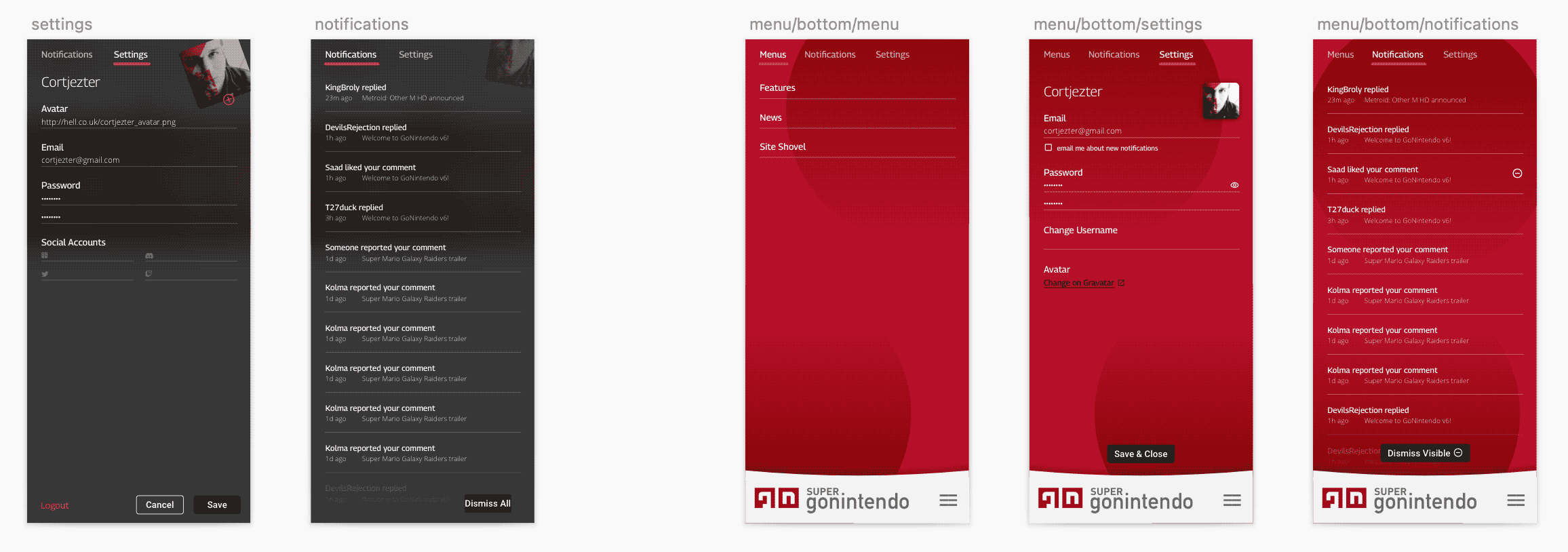
Admin panel & publisher
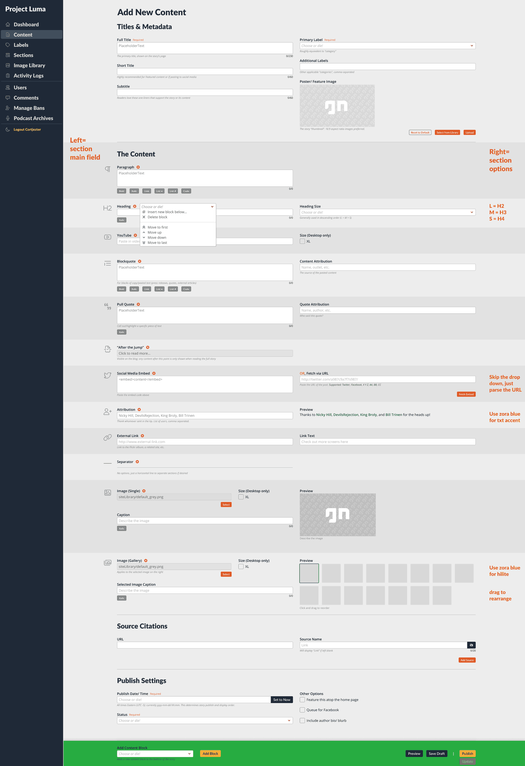
Having defined the necessary publisher blocks earlier and their external-facing appearances, we needed more detailed design and UX attention given to the space our staff would be interacting with the most.
As shown below, we began with really bare bones wireframes, mostly to establish the base functionality, necessary fields, database structures, etc. Everything was essentially a single column with tiny block management buttons hugging the left side; with a stationary, floating panel along the bottom of the user’s screen.
provide users a preview of the block content when appropriate
provide users enough help/context for each block’s functionality
make each block visibly unique/identifiable when scrolling through a longer list of them
simplify block management tools while providing a more robust selection of functions
simplify the footer contents
We performed a rigorous testing of the interface, blocks, options, etc. over the course of several weeks to refine and optimise the UX for maximum productivity and usability.
The solutions (shown in image):
a two-column layout was chosen; data left, options/preview right.
previews for blocks like images or text appear in the right column, immediately next to the input for side-by-side comparison
explanatory text resides beneath and/or placeholders inside most fields
the left margin was repurposed for its identifying icon, which can easily be scanned whilst scrolling
each block has a management menu next to its title, with greater options to re-order, add, remove, etc.
footer was simplified to a single dropdown, allowing the interface to remain consistent across browsers, display sizes, and independent of the addition/removal of blocks
Our block editor brilliantly achieved its goal of a large, diverse team all publishing consistent content and with virtually zero training.
Aaron Hoffmann
When it came to other areas of the admin area, we again streamlined wherever possible.
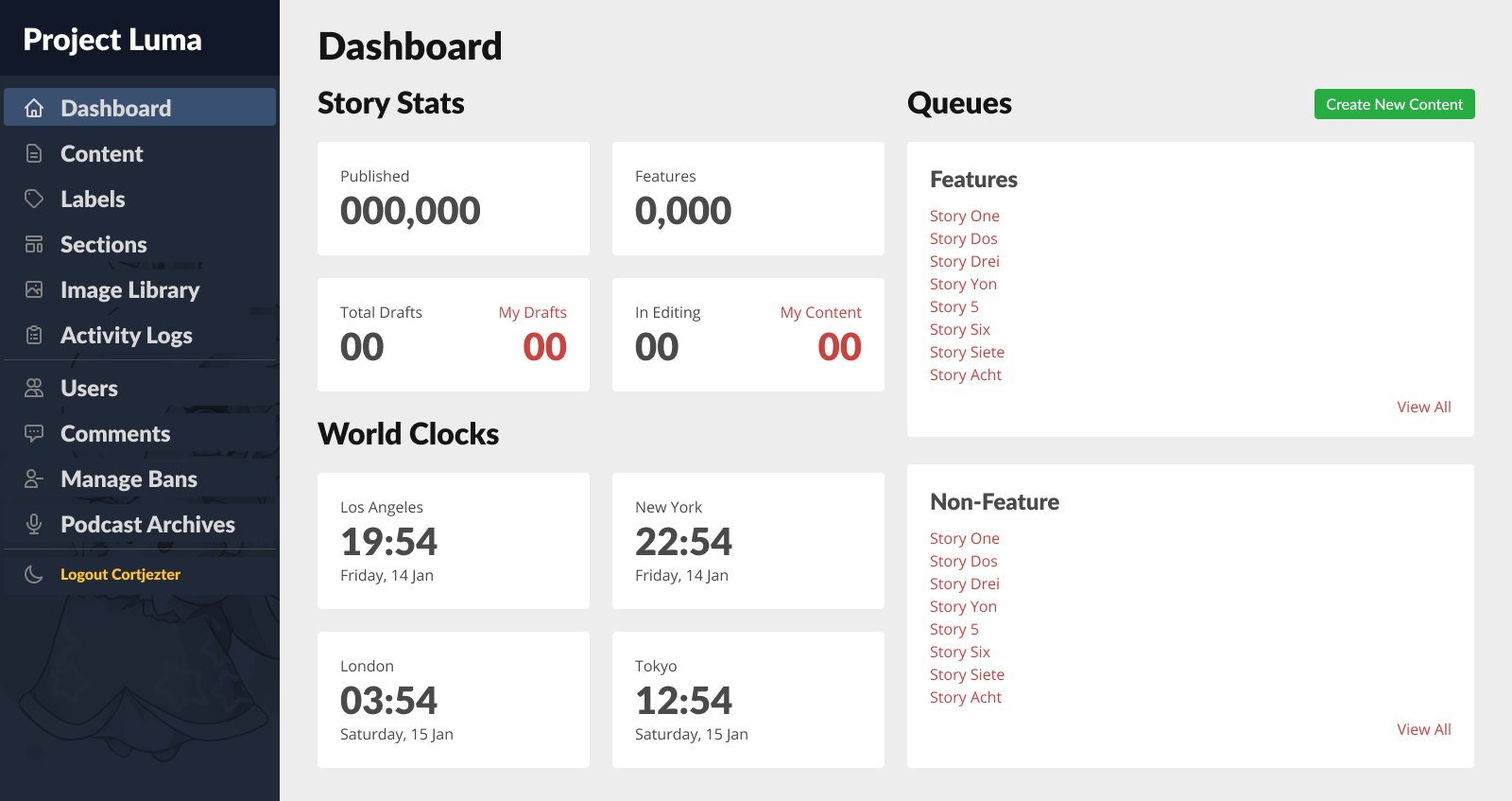
The dashboard underwent several iterations, ultimately formatted with cards to present writers/editors all of their necessary stats or to-dos at a glance.
It wasn’t always this organised.
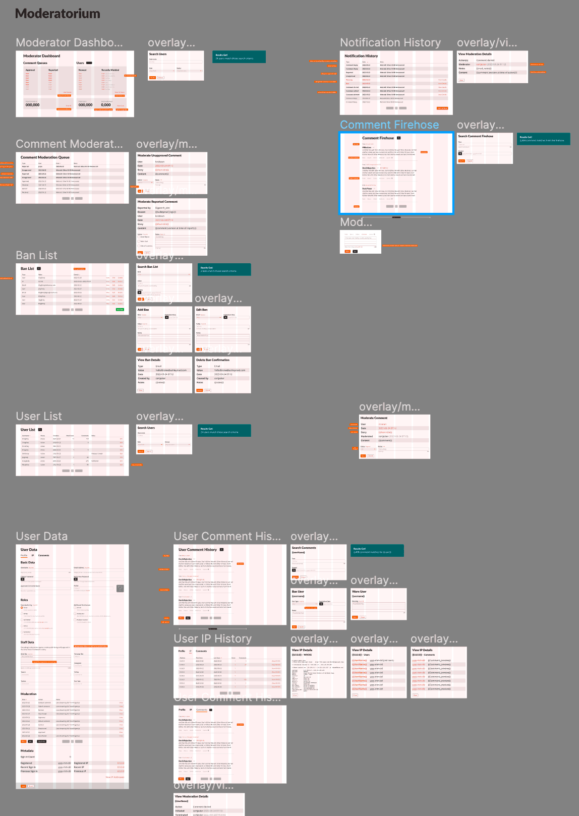
And finally, to show a bit of the other scaffolding, flows, and IA behind the scenes of behind the scenes, in this case, features available to moderator and admin personas.
Orange buttons/text on and adjacent to wireframes indicate notes for design/development.
Branding
Honestly, we kept most of the identity work internal throughout the process until launch, relying more upon leadership approvals than user validation or external focus groups.
We felt confident with this approach for one reason: as mentioned earlier, we based the new branding upon our most popular past identity, and our primary aim was to reduce complexity while remaining faithful to the source.
The overwhelmingly positive reaction upon release validated this decision.
Our validation phase relied on two primary sources: direct user feedback via interviews and sessions; and code review.
We relied upon the former to ensure the layouts, navigation, etc worked as expected and that we delivered on users’ needs.
The latter, in order to reach our defined goal of 80% compliance by launch, largely relied on my personal review of production code and comparing it to the design specs, and then prioritising for the most salient or efficacious cost/benefit ratio.
User focused
For user interviews, due to Covid and our internationally-distributed team, all sessions were conducted remotely.
Users would be presented anything from low-fidelity wireframes to working coded demos. Notes taken during sessions were processed and findings presented in our weekly leadership and development check-ins.
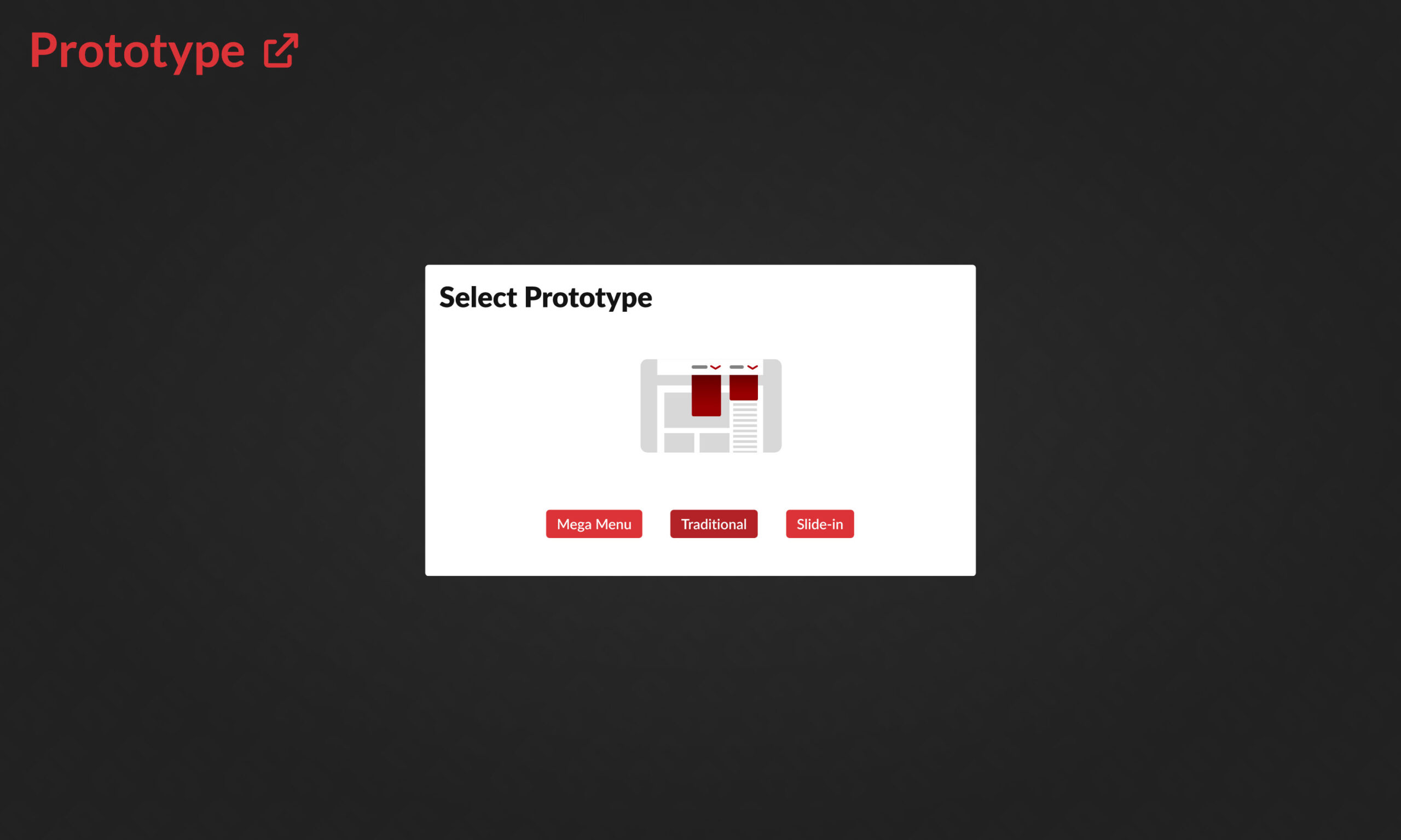
Below, an example of a medium-fidelity A/B prototype I designed, meant to capture user feedback regarding possible desktop navigation constructs.
Note the lovingly crafted micro-interactions and transitions intended to make each option maximally desirable. ❤️
Prototype designed for A/B user testing of desktop navigation options. External link to Figma.
In this particular case, after user testing, we ultimately pursued the “Mega Menu” approach:
Amongst users who expressed a preference, they strongly favoured either Traditional menus or the Slide-in, and strongly disliked the other.
While fewer people so strongly preferred it as the other two, nobody disliked the Mega Menu. 🤷🏻♂️
Code focused
Often this process involved excerpting the Github repository or browser inspector, then using Figma to create aides that illustrate deltas, issues, or present rationale for needing certain code revisions.
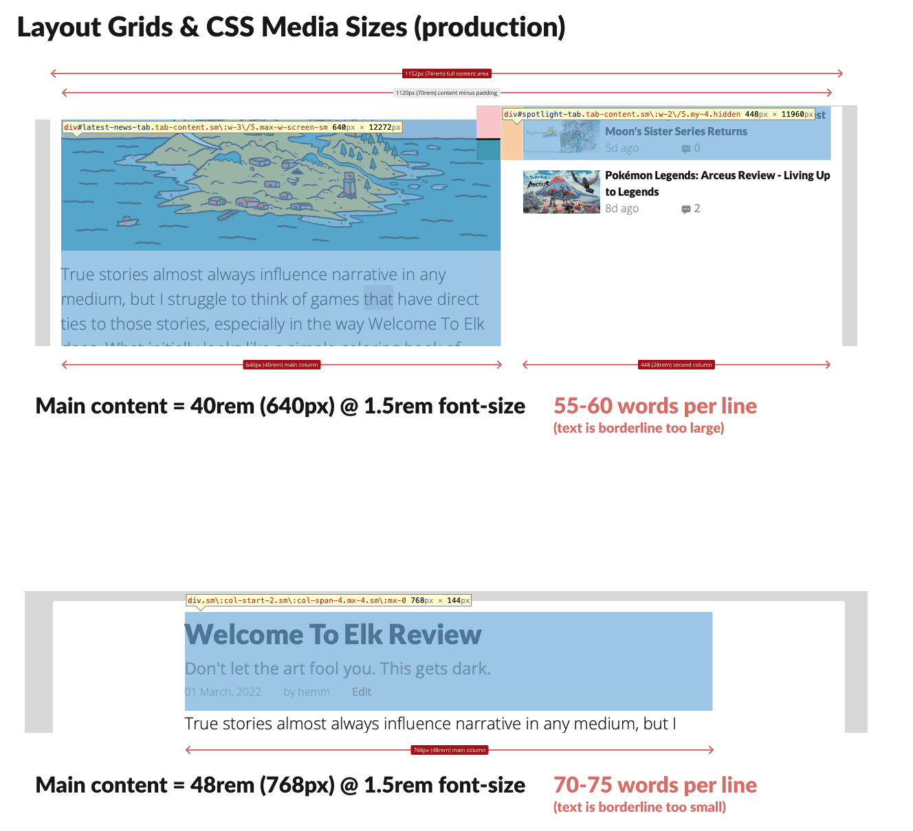
In the below example, a slight deviance from the desktop grid spec meant our app’s massive tomes of text would be less readable, and in fact many users commented on it despite being unable to articulate precisely why.
The issue: main content areas fell afoul of the defined grid spec. Even a deviance of 2rem (bottom) was subliminally detectable by users as being less legible.
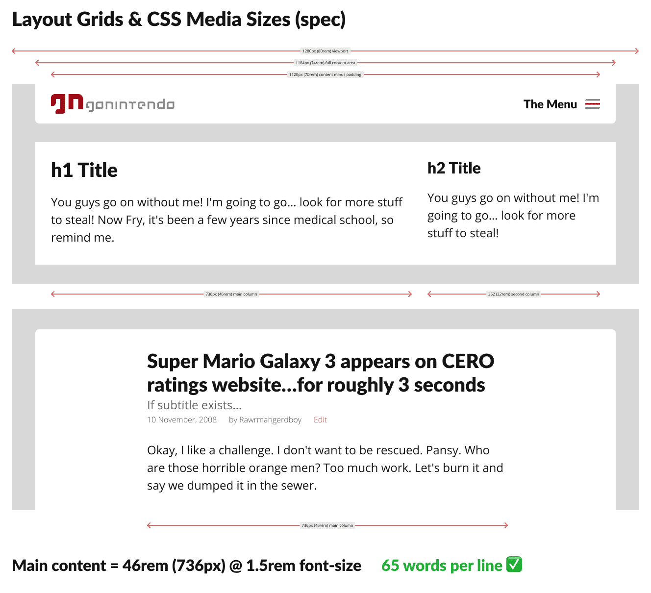
Showing the code examples in spec context. 46rem width is ideal and validated with user testing.
UX pros ought to understand classic typesetting principles; font size, column width, and leading are a balancing act with algorithmic underpinnings for ideal legibility, meaning this was simple to identify and fix.
Release
After teasing on social media for months prior, we publicly released right on time; precisely one year after going offline (what I dubbed our antiversary), to nearly universal acclaim, surprise and delight.
Thanks to our pre-release user testing, we anticipated the commonest constructive comments, and announced plans to address them in successive patches in the near future alongside our relaunch.
Results
Released all planned features on time.
Targeted 80% accuracy of code to design specs, achieved over 95%.
Vastly improved quality and consistency of staff output, while simplifying publishing workflows and virtually eliminated the need for any training.
Improved user onboarding, in reduced steps required and time needed from register to usable account.
High praise from users, partners, and even competition for both the product and our fresh take on a beloved branding from the past.
Exceedingly few unanticipated “issues”.
Obstacles and learnings
突貫工事. Honestly, the largest hurdle we faced was time. What would normally require 1-2 years to build had just four months (plus one upfront for planning) start to finish.
While the Product, UX, and development leads found a number of efficiencies to exploit, allowing us to perform some steps in parallel rather than purely sequential from planning to design to dev, a solid methodology was what truly allowed us to meet our targets.
Deadlines were what they were; sometimes walking a short plank is unavoidable, but given talented resources and a process, success is achievable.
User testing and research was invaluable. Not only did it provide insights during the planning stages leading to less design and development in production, it allowed us to rapidly narrow focus after our initial builds and iterate to release candidate.
A design system (including documentation) is worth multiple times its weight in gold, even for projects below the enterprise threshold. Without one, UX debt will seep into and dampen any project.
An organisation’s UX maturity can make or break a project, especially the more limited its resources of time, money, or talent. Being able to directly affect this from a Director level was a convenient win, but having worked with projects and companies suffering a lack of UX maturity, the contrast is black and white.
