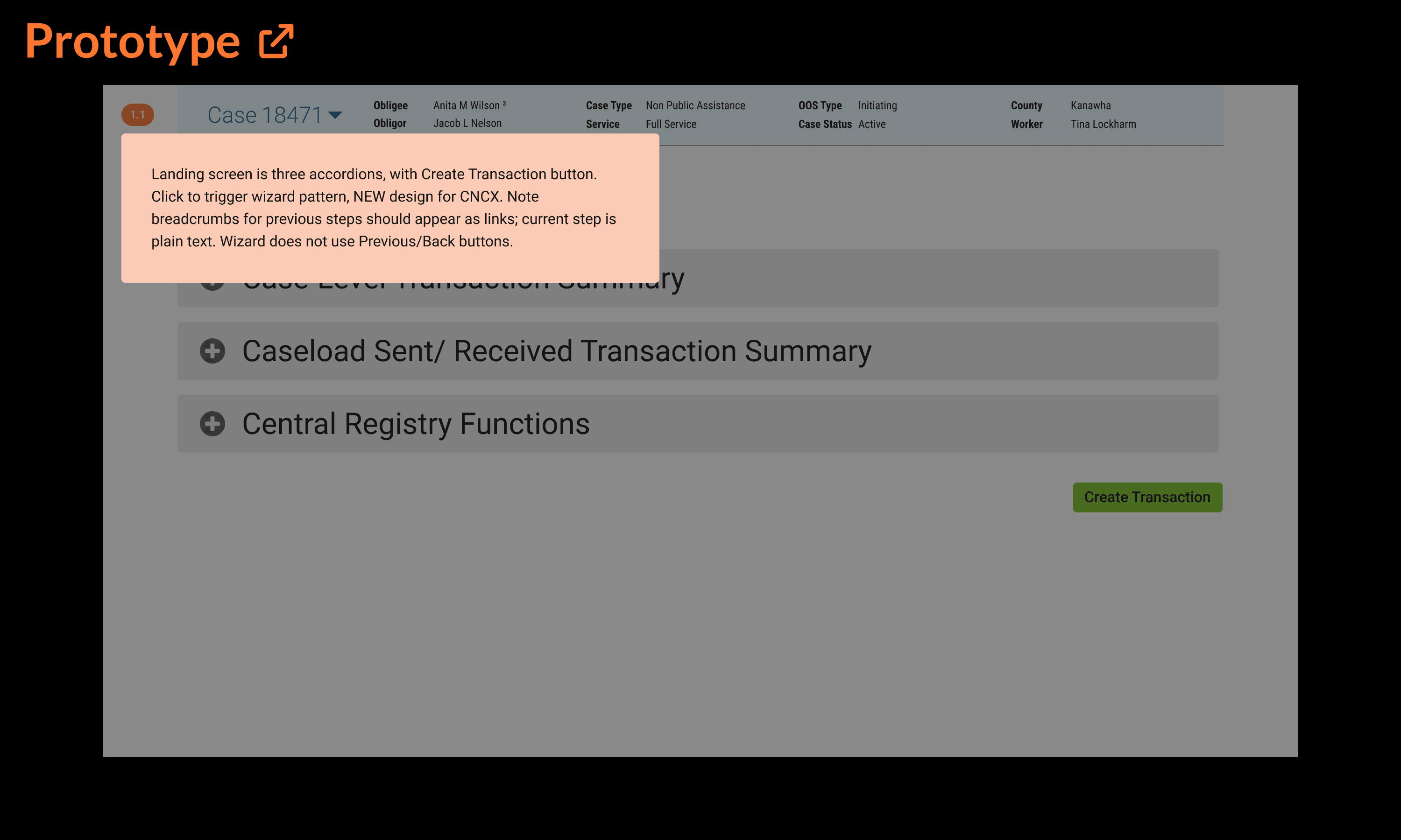
TLDR: what happens when a multinational corporation maintains a catalogue of 150 digital products, all designed and maintained separately? Absolute UX mayhem. Cue my efforts on their new team intended to add some clarity and direction to their UX group of over 250 fine people.
Project
OneUX Design System (tentative name)
Client
ADP
Role
Lead UX Designer
Team
Design System (20), UX department (250+)
Environment
remote
Methodology
agile
Website
N/A (all work for internal business systems products)
Key Skills
Design system, Patterns, Documentation, Component library, Wireframing, Research, Sketch to Figma transition
Summary
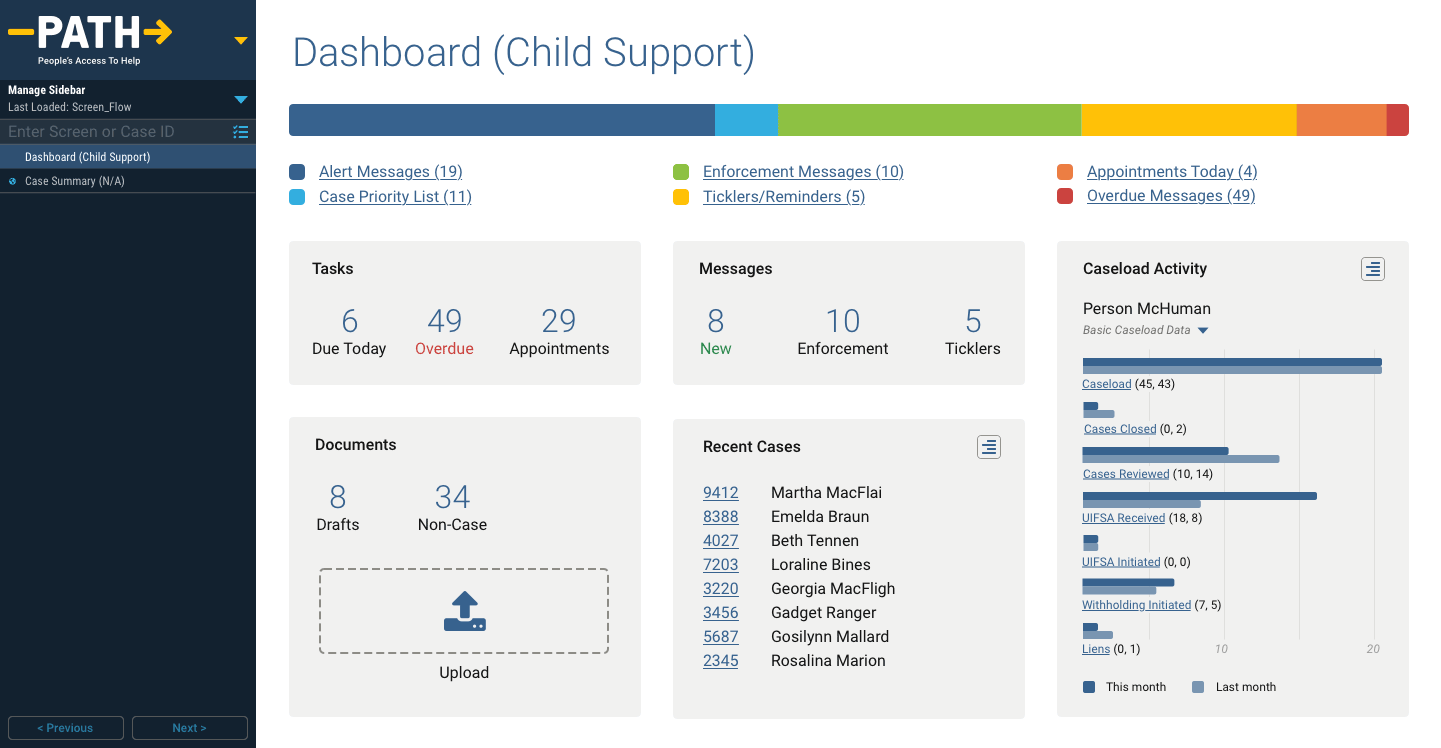
Provide UX governance; consistency and clarity to the many product and design teams through a well-built and documented design system.
Overview
In mid 2021, someone at ADP either noticed (or was notified) that their deep catalogue of digital products and services were completely misaligned.
Different designs, UX patterns, components, navigational conventions, etc. plagued the lot.
Perhaps difficult to identify from within, but painfully obvious to any customers using multiple ADP products everyday.
So in late 2021, they inaugurated a special new Design System team with the mandate to audit and realign all company UX/UI efforts.
How I joined this project
Technically headhunted by their official third-party agency partner, I joined in early 2022 interested in taking on a truly massive, complex challenge.
While it didn’t directly satisfy one of my prime directives to help society or improve the world, positively impacting tens of millions around the world using ADPs products in their everyday lives is arguably a related pursuit.
Objectives
In a nutshell: standardise everything and package it for mass consumption.
This included a catalogue topping 150 digital products and a UX team of over 250 talented professionals.
To tackle this, we divided deliverables into several categories:
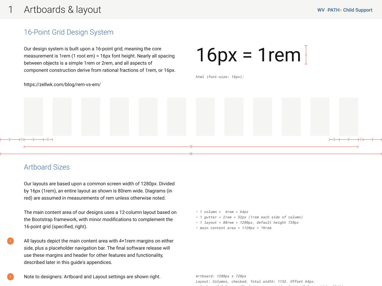
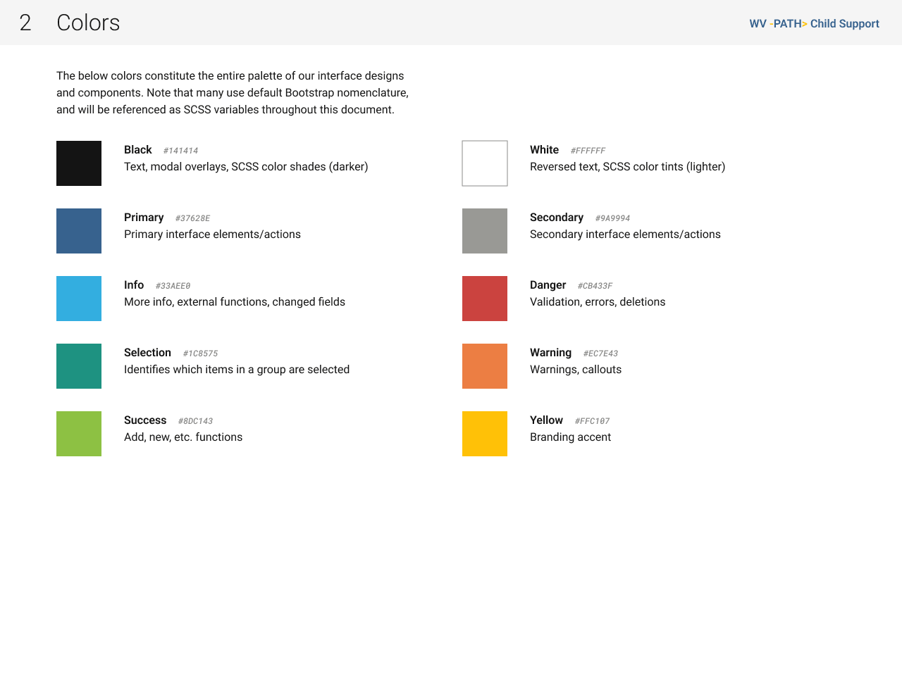
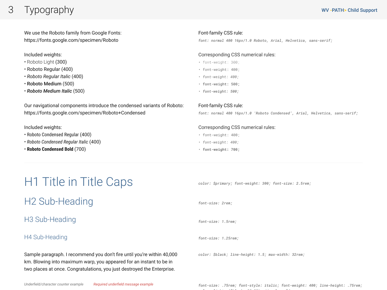
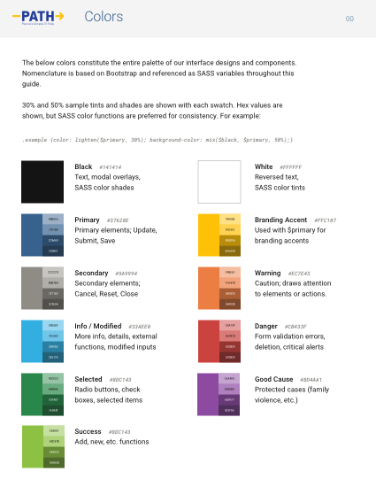
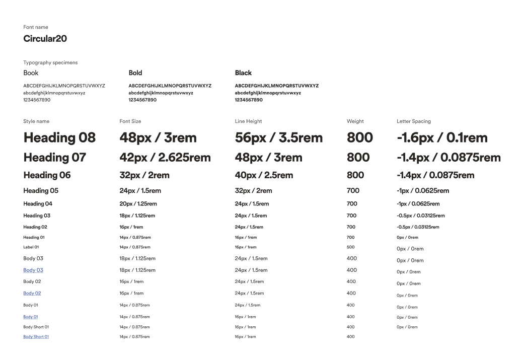
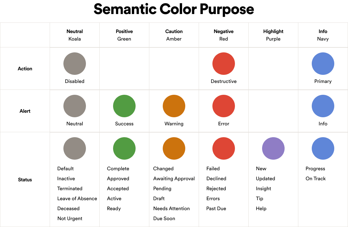
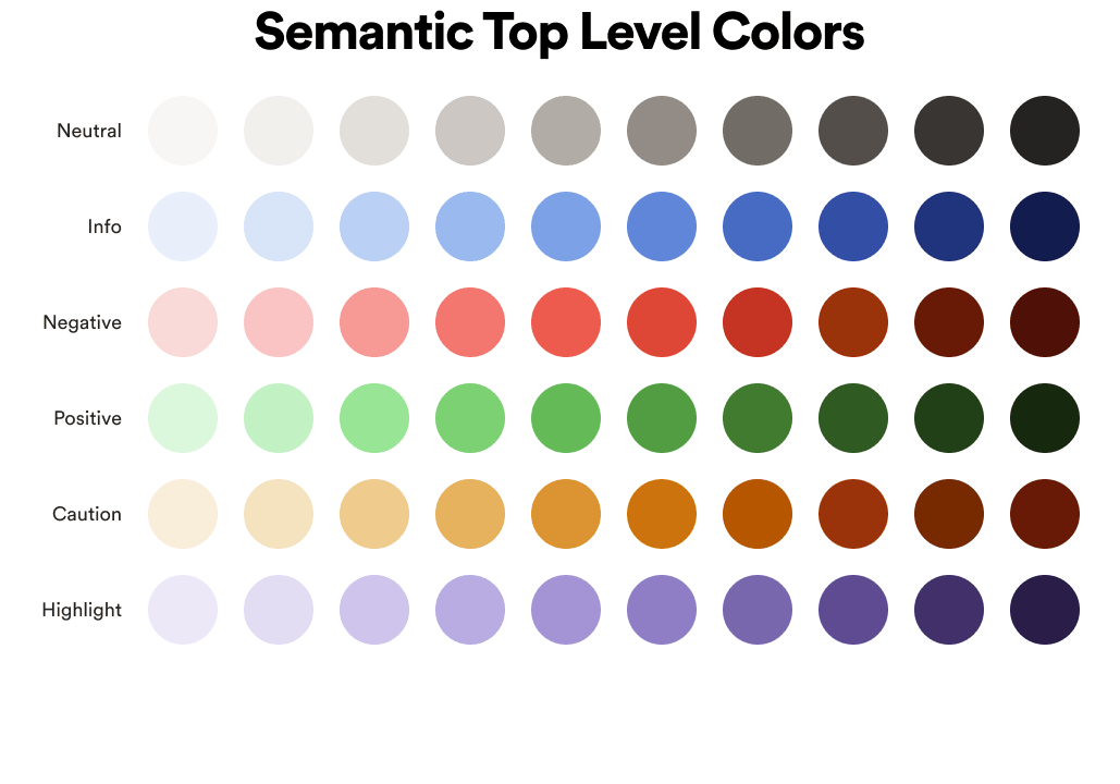
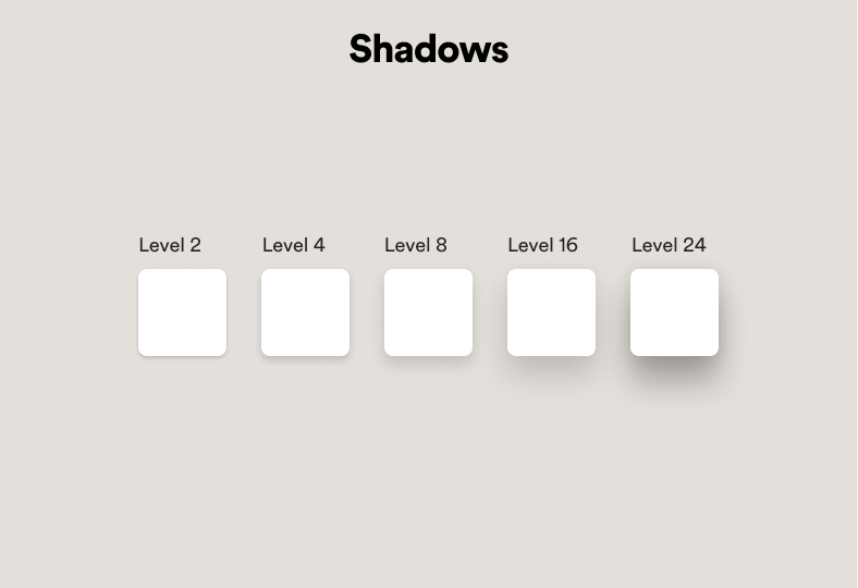
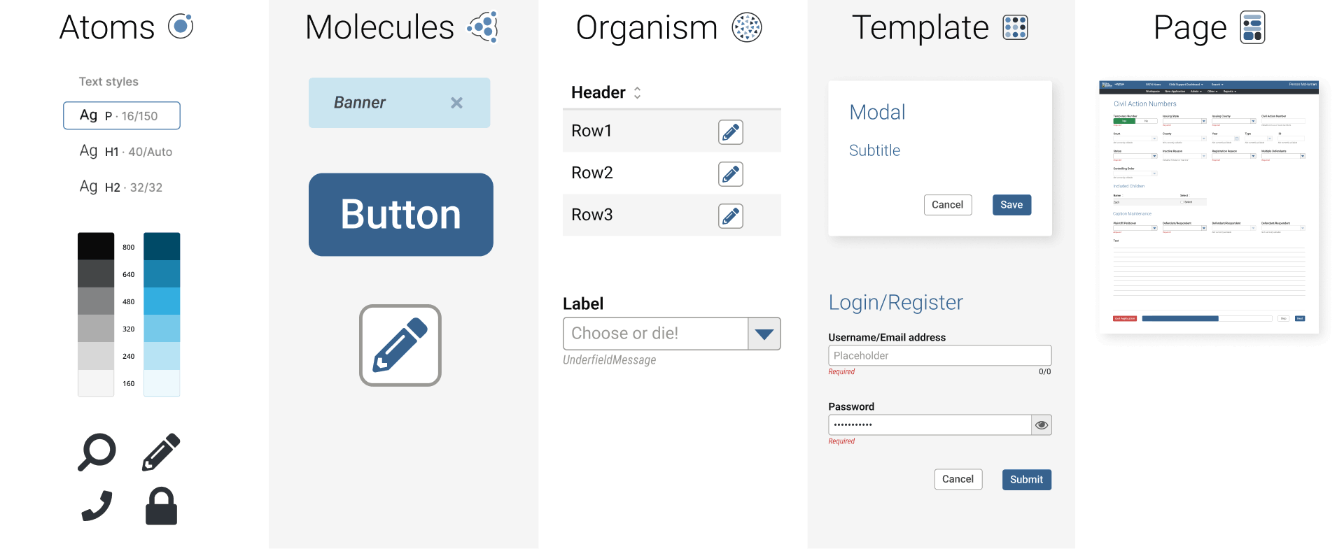
- Foundations (aka global atoms, partial gallery shown below)
- Component library – including code alignment
- Patterns
- Photos
- Illustrations
- Documentation
Publishing methods
As for the packaging end, we began by publishing an internal documentation website, though as we began authoring content, it quickly became obvious that maintaining everything in multiple areas and in multiple formats (Sketch, Figma, Miro, CMS-based web publisher) was not only inefficient, but an invitation to very quickly amass enormous volumes of UX debt.
Partnering with engineering, we then created a utility for Figma’s API that could, for the interim, scrape documentation from inside our design files and publish it, eliminating redundancies.
Long term, we planned to eschew the website altogether and harbour all documentation alongside the design content itself, inside the Figma library files published to the entire organisation, reserving any website presence for a public edition.
Process failures
In effort to avoid any bias or unpleasant impressions, I will limit these points purely to factual details without commentary and leaving any quality inferences to the reader.
- A Director and several Lead level designers from our Design System team, all with a decade or more service to ADP, left the company within the first few weeks of my arrival.
- VP inherited all of the subordinate Director’s duties for about six months.
- A single VP stretched between dozens of “direct reports” left scarce time for anyone to discuss issues or progress.
- HR, onboarding, payroll, etc functions fell to said VP rather than individuals’ managers, which prevented requisitioning hardware/ software licenses and introduced occasional payroll issues.
- After nearly a year, I never did receive a computer or mobile licences, instead needing to configure my personal hardware and software to work with or around their VPN.
- Full time employees enjoy a robust onboarding experience; contractors receive a link to someone’s Webex recording briefly describing a few of the company’s key digital products.
My contributions
Throughout a near-year with the team, my efforts were focused thus:
- Complete their enterprise “UI Shell” and navigational construct
- building the components
- aligning with code
- documenting all functionality and usage
- Author patterns
- identify
- research
- illustrate
- write and publish documentation
- Assist with enterprise transition from Sketch to Figma
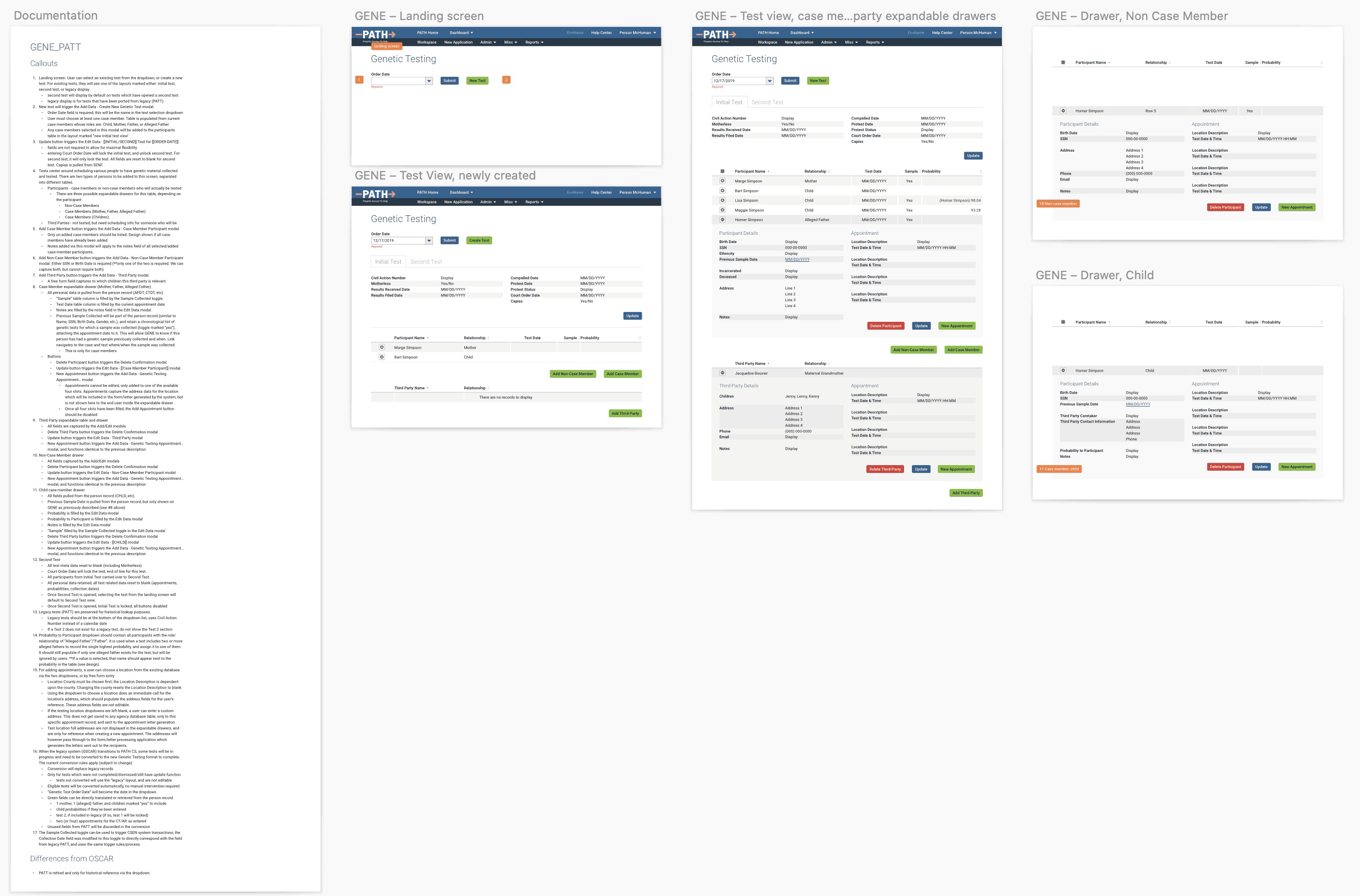
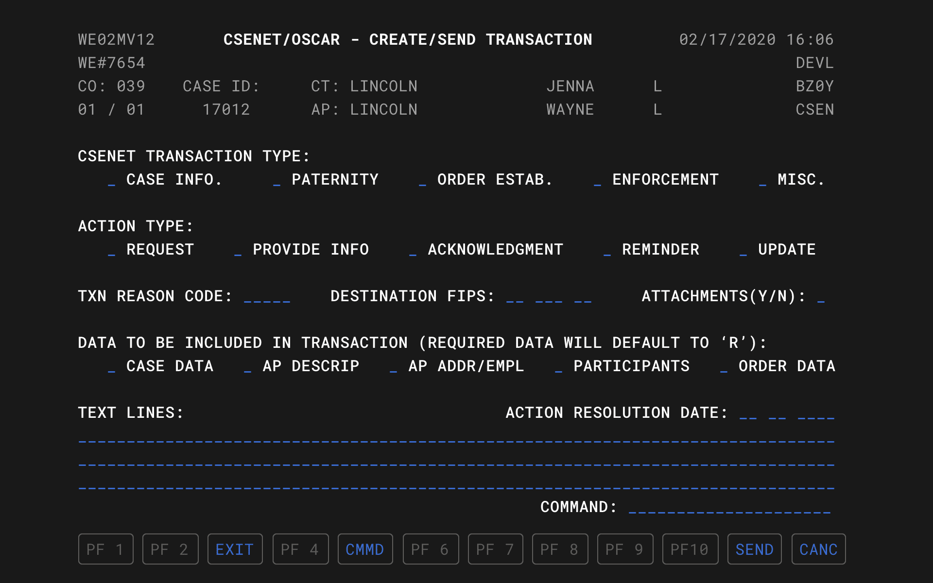
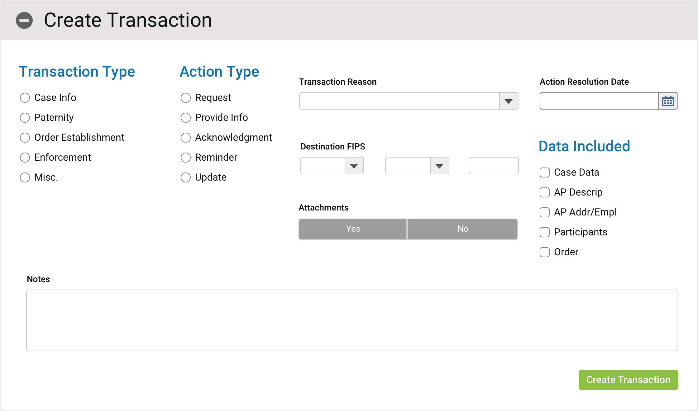
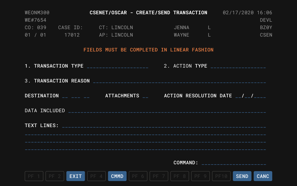
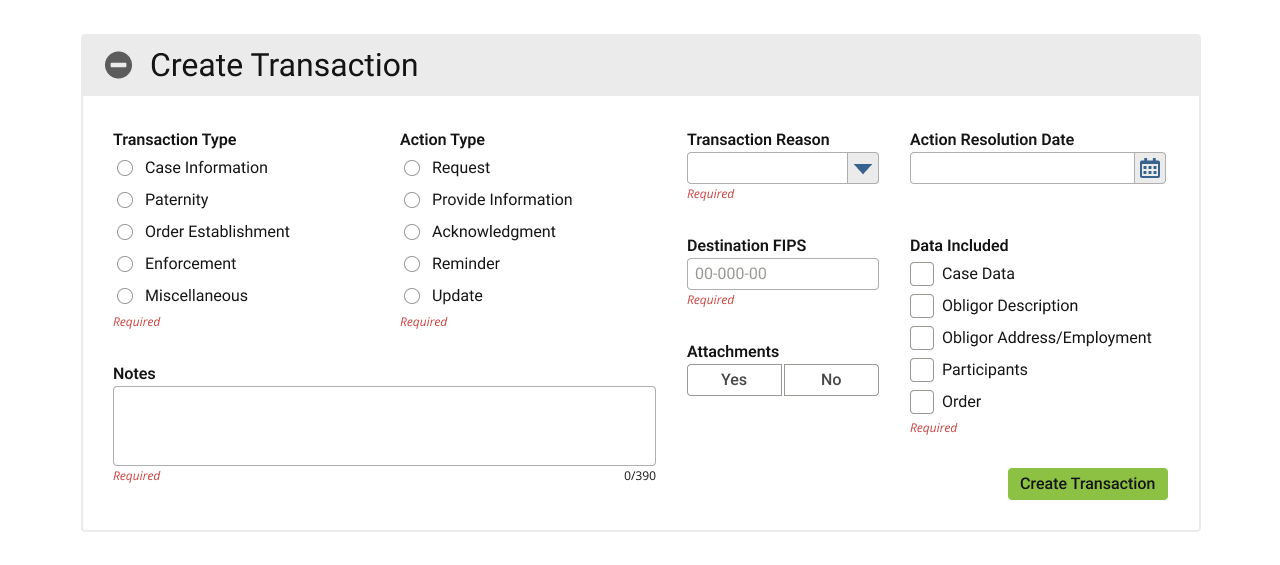
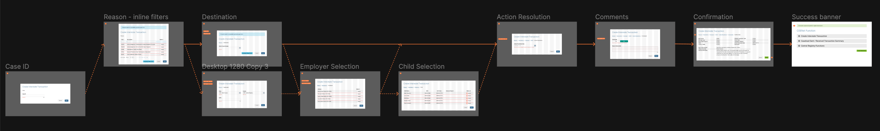
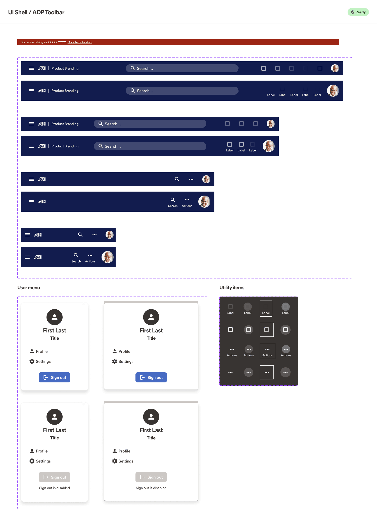
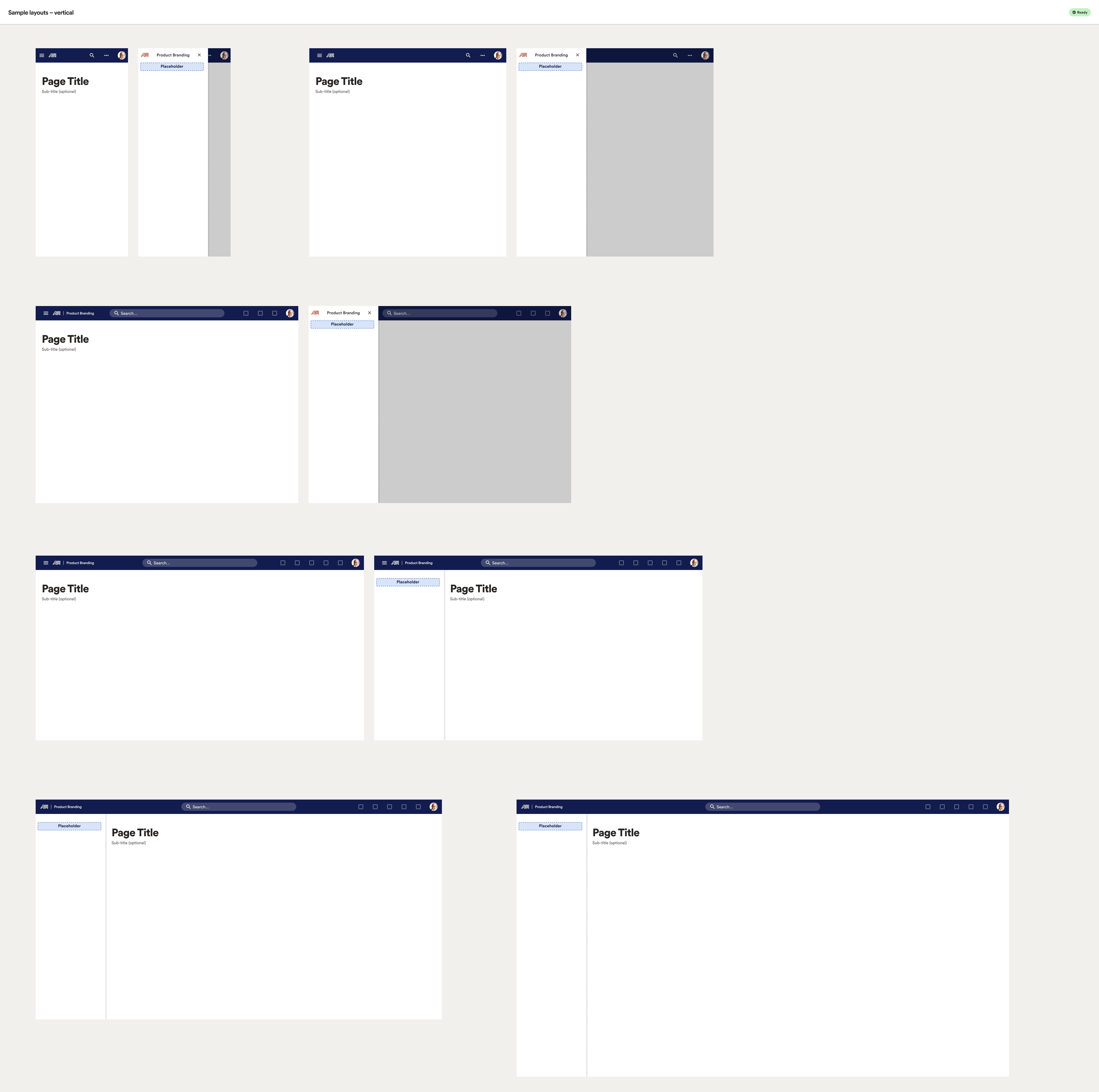
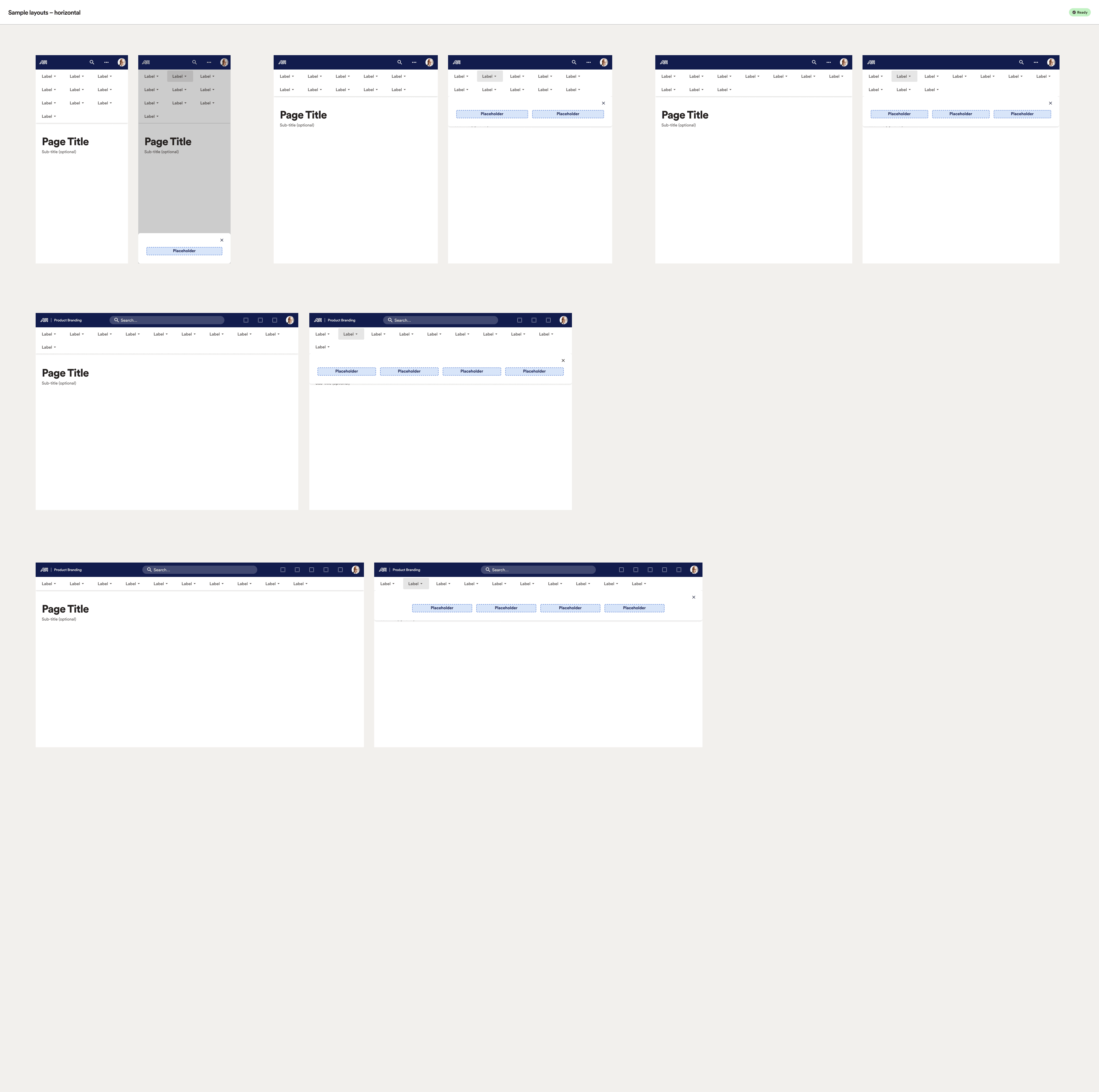
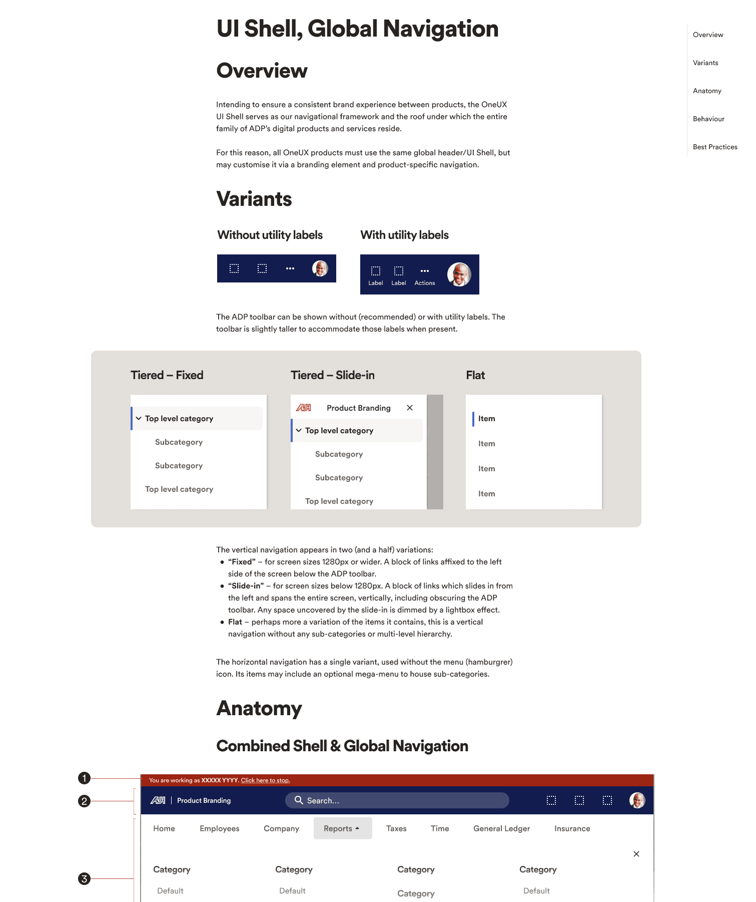
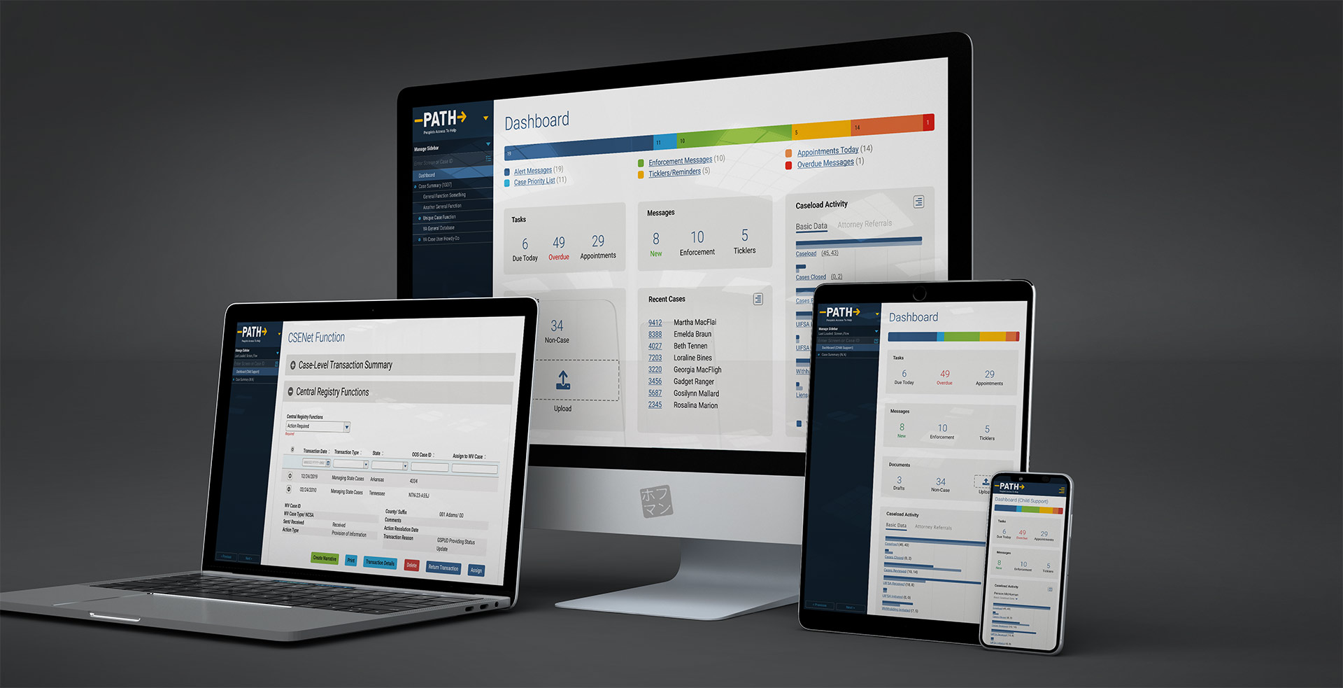
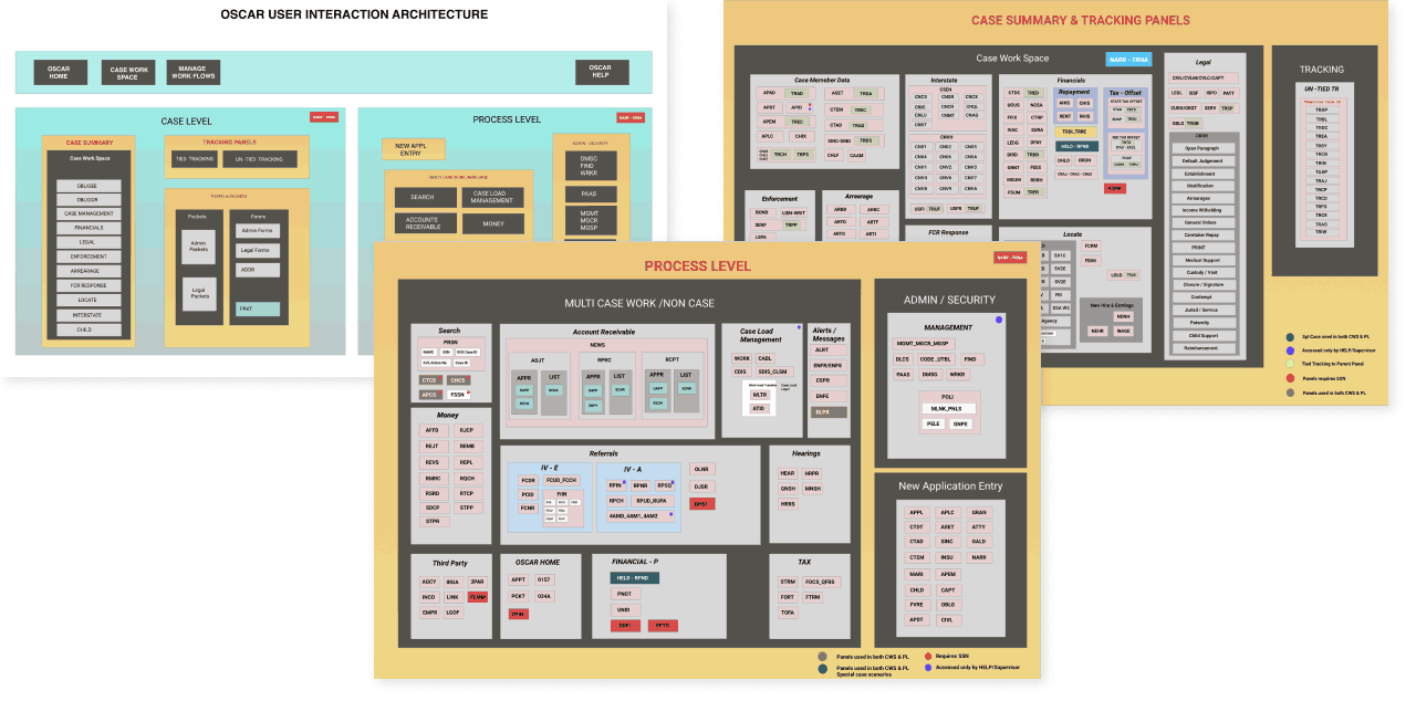
UI Shell
This may have been the most complex aspect of the entire design system as it touches literally every person and product.
Nothing like a trial by fire as my first endeavour! 🔥
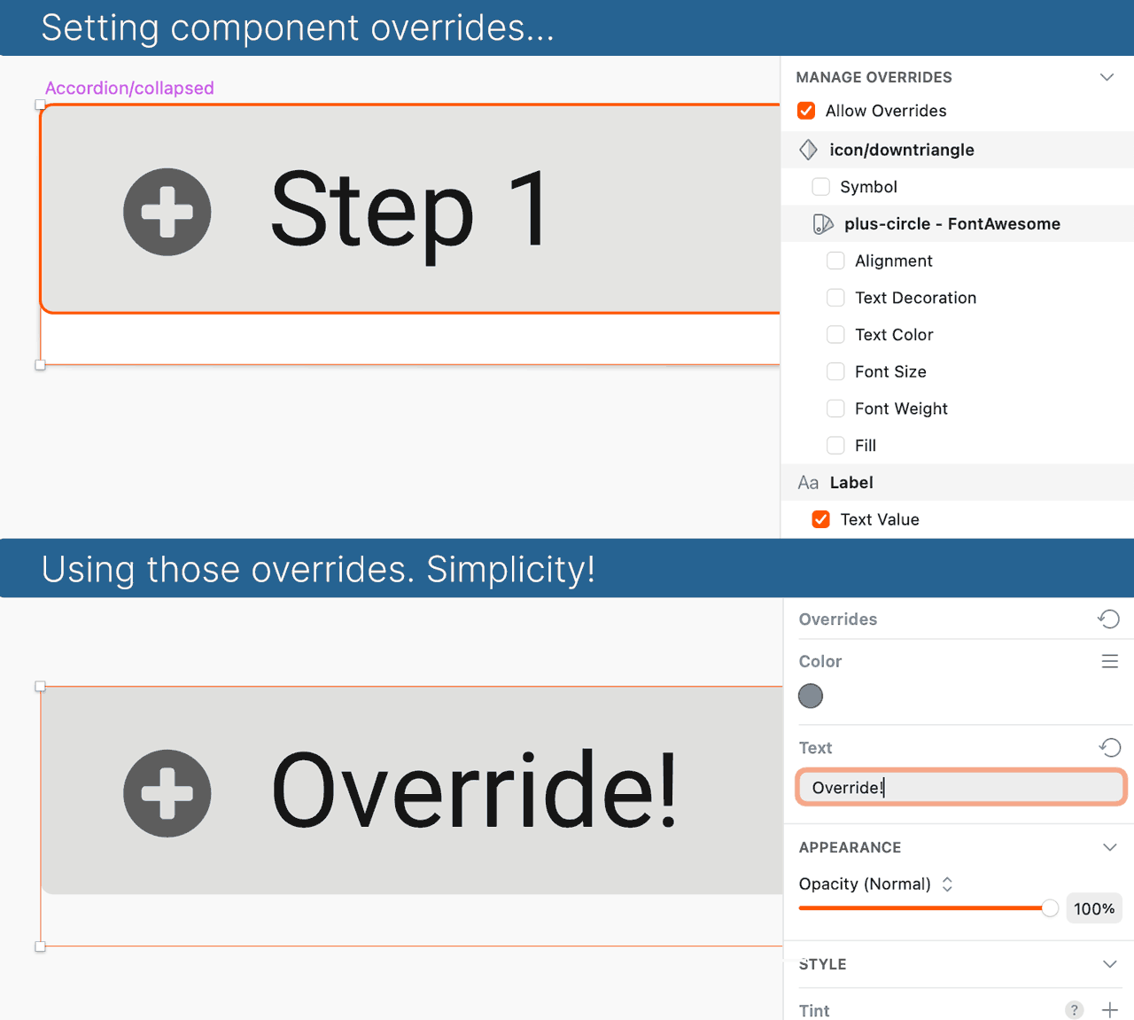
Component building
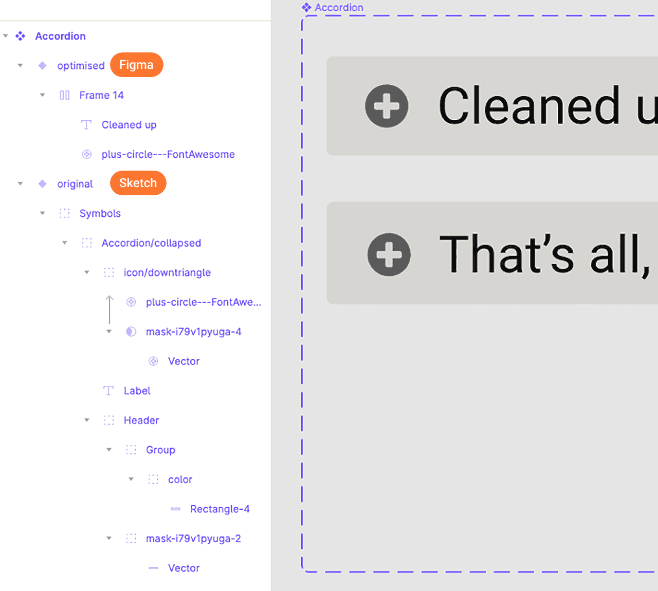
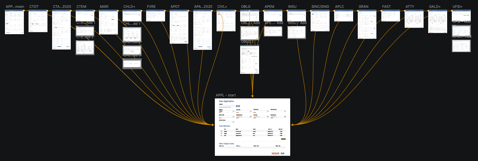
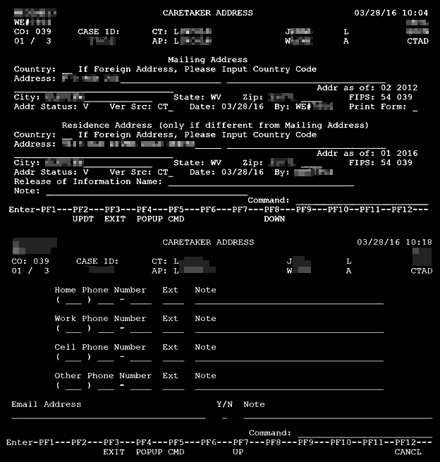
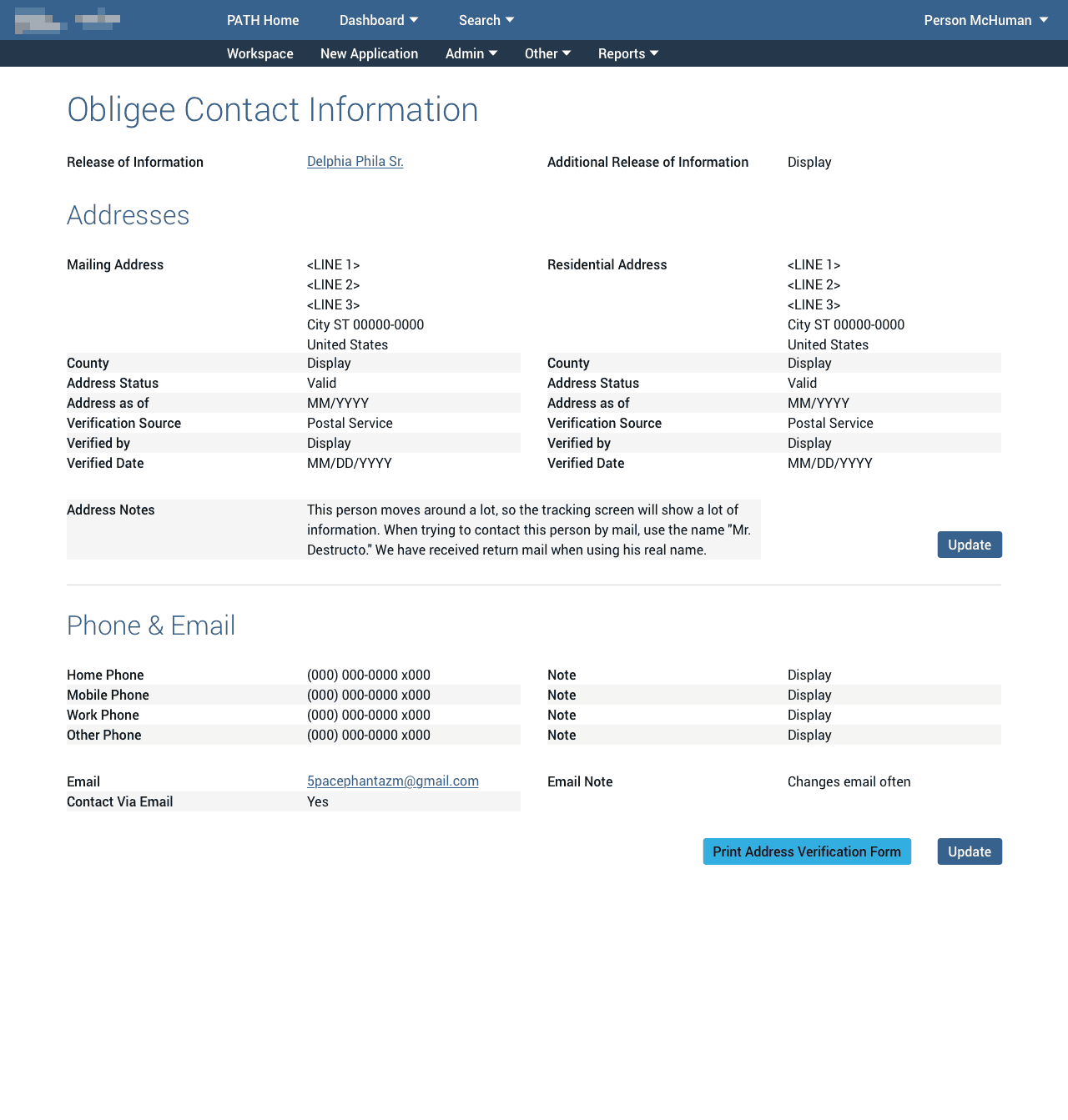
An incomplete array of assets and concepts existed in a derelict Sketch file started by someone long, long ago in a galaxy far, far away…
While that original file’s contents cannot be shown here, I can share excerpts of the final output below.
Specifically, I needed to convert any relevant, existing assets to Figma or create whatever necessary to fill the gaps across the atomic food chain.
To do this, I spent nearly a month in discovery, tracking down technical details, usage patterns, interviewing users, engineers, designers, etc. to map the truly mind-boggling number of requirements and pieces of the overall puzzle.
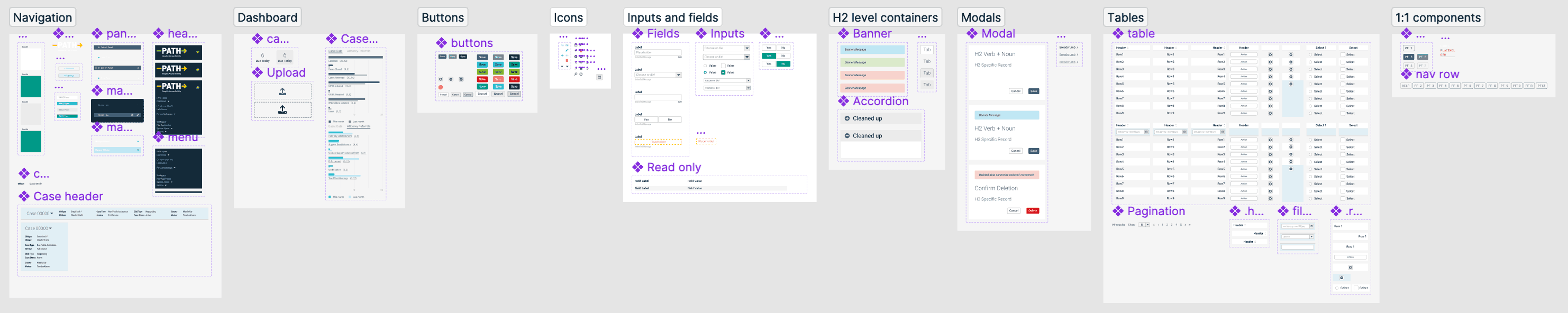
Below, you can see some of the atoms and molecules included within the layout. Others were hidden outside the visible area and withheld from publishing directly to library subscribers.
In all, nearly a hundred components and sub-components were created for this single system feature. 🤯
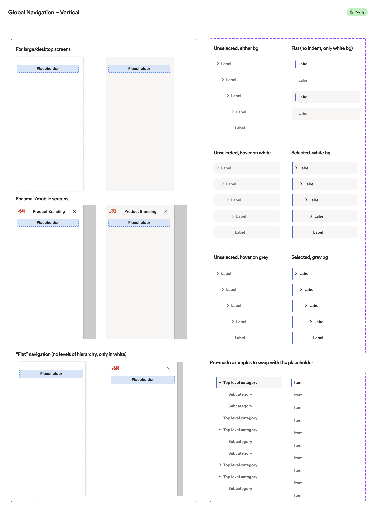
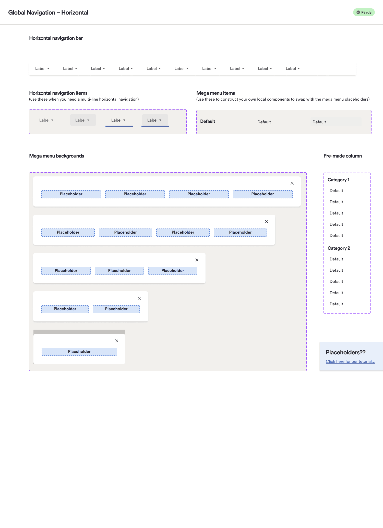
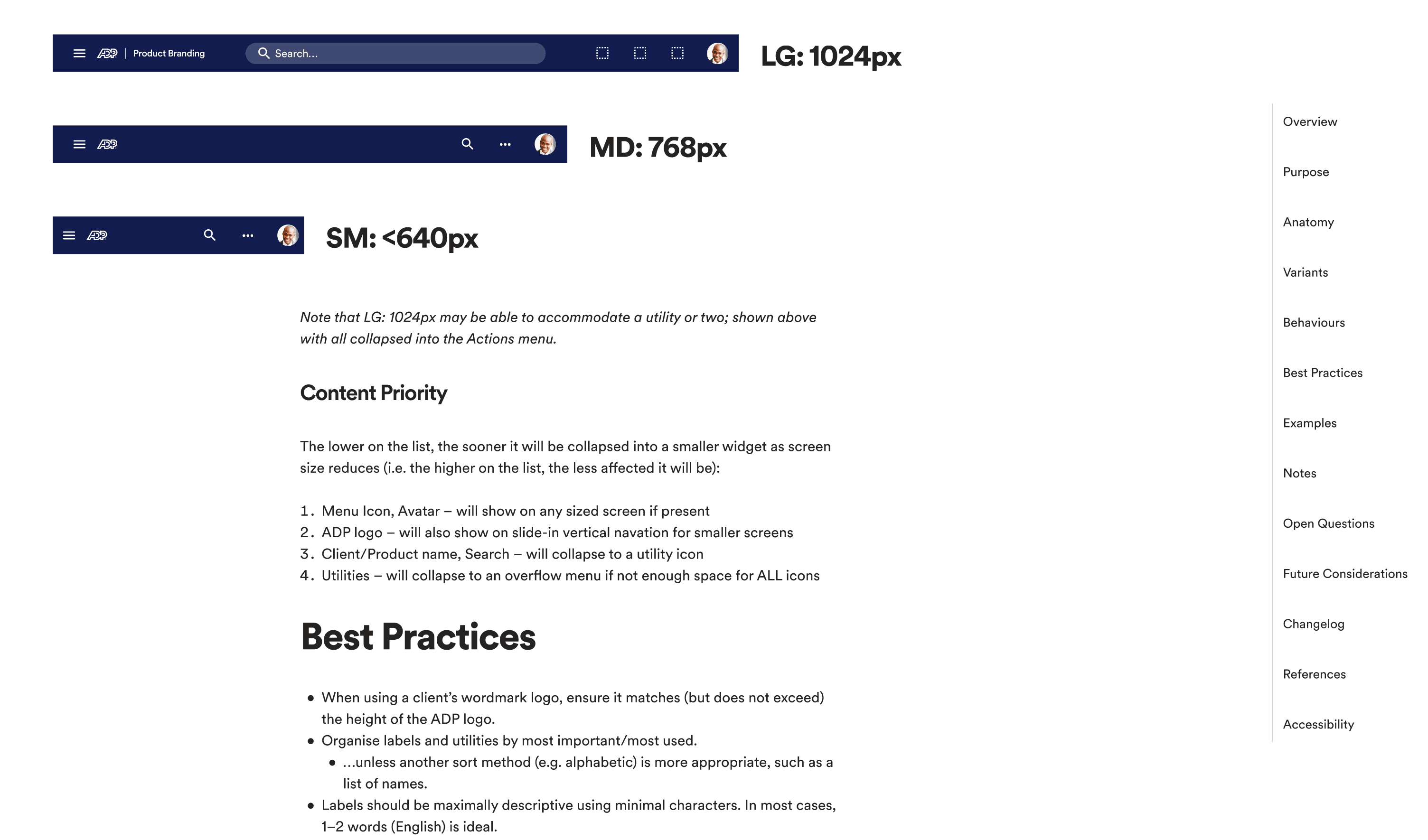
Since this universal shell was a bit foreign to many teams, I also needed to create some templates and examples for designers, including defining the coded environments’ actual column grids and break points, along with variations appropriate for each.
Curiously, developers in their thoroughness created breakpoints for the mega menu even on mobile where it would not be ideal, and where no patterns or direction had yet been given. Because we initially aimed for 100% code alignment, I also included horizontal menu examples for mobile that could be eliminated and tracked in a later sprint. 🤷🏻♂️
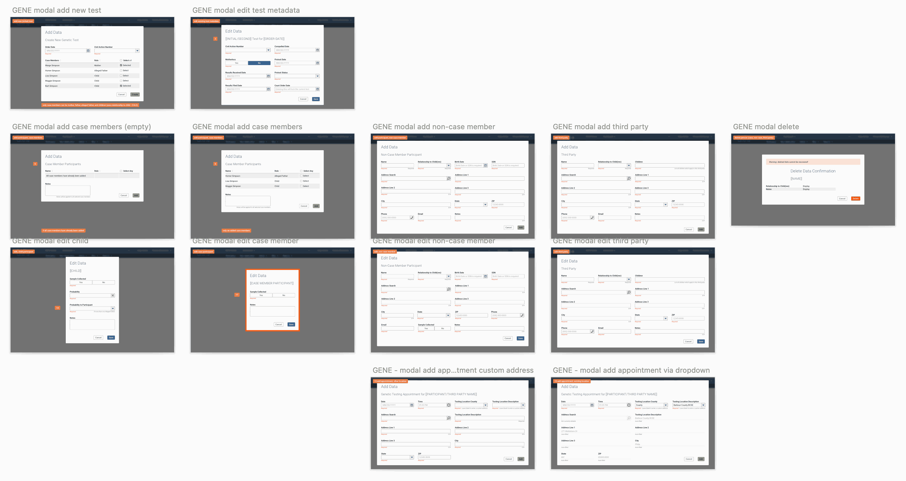
Code alignment
When it came to code aligning the dozens of UI Shell/Global Navigation components I designed, attention to every pixel of detail would in theory benefit the UX designers and engineers downstream.
To achieve total alignment nirvana, I spent 2-3 months in our Storybook environment examining every aspect of the navigation components’ code/stylesheets, in browser code inspectors, and on Webex calls with the lead engineer.
I even included the rendering glitches and CSS quirks in the designed components. Yes, I am that thorough. 😎
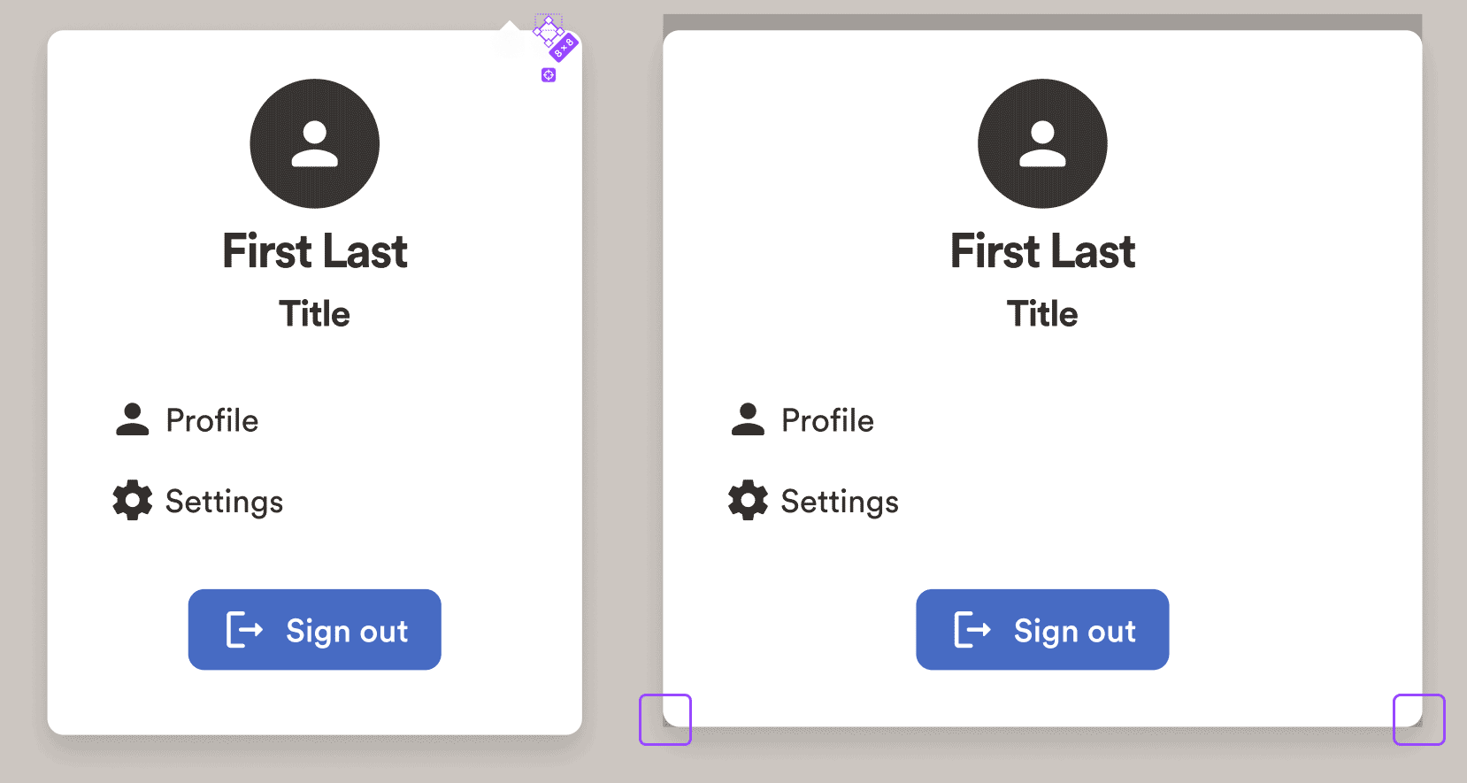
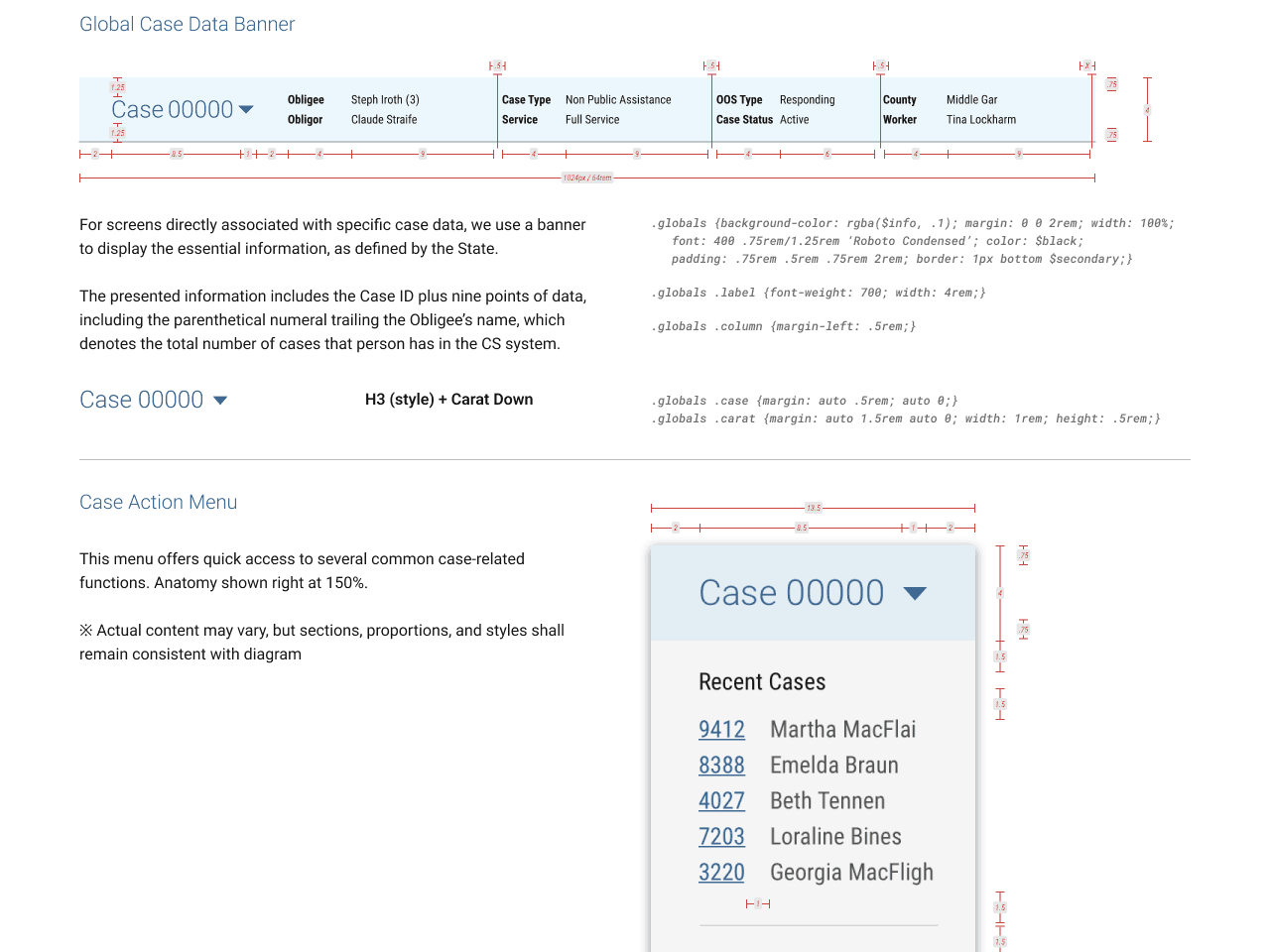
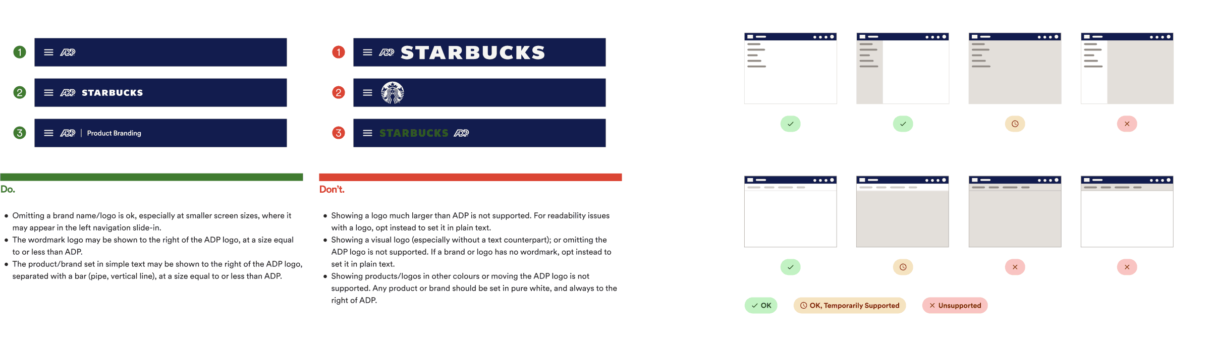
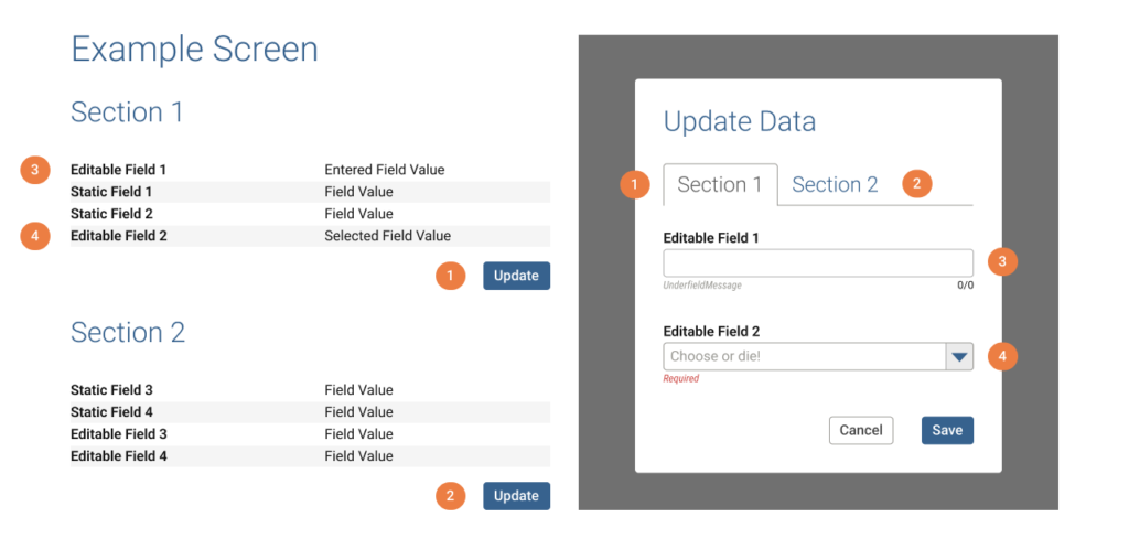
Inspecting the user pop-up menu (when clicking their avatar in the toolbar): left, the desktop version which appears immediately beneath the avatar; right, the mobile version is a modal sheet which slides up from the bottom of the screen and casts a focus overlay across the rest of the screen.
For the desktop version, the tiny arrow which normally points at the avatar above, in code was an 8px white square, rotated 45 degrees. So that’s exactly how it was built and named in my Figma component.
For the mobile version, the developed sheet still had a border-radius for the bottom corners, partially revealing the overlay. So again, for better or worse, this behaviour was replicated in the components, purely for alignment sake, which could then be tracked via a ticket during a future sprint.
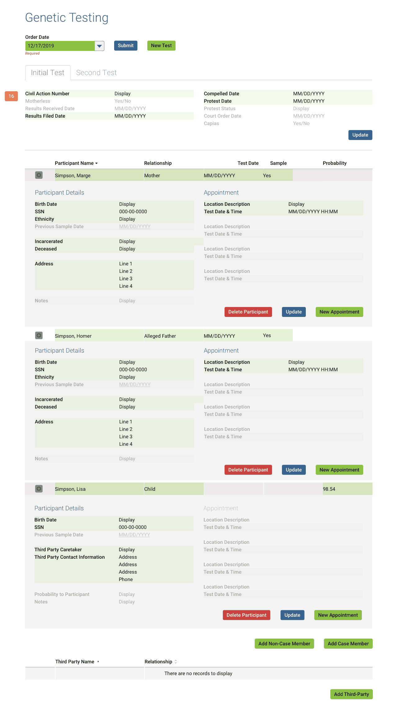
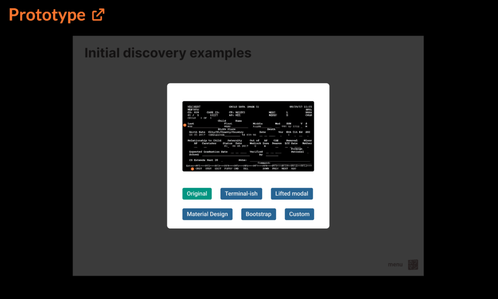
Documentation (prototype)
While we did need to explain every nuance of this component in excruciating verbosity, to be honest, much of that was purely for posterity, as designers and developers prefer to be shown than told.
So as often as possible, diagrams and illustrations served show. Check out a prototype of the component documentation (external link to Figma):
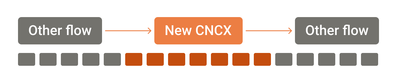
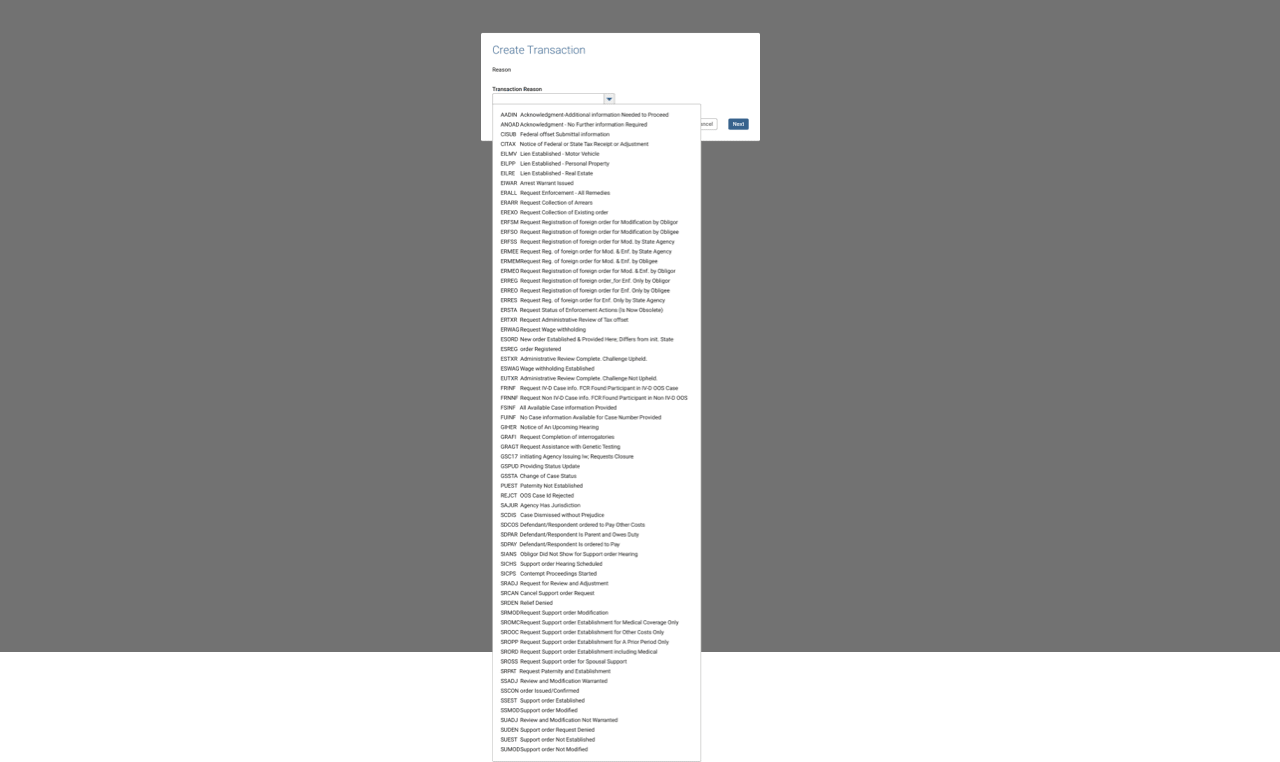
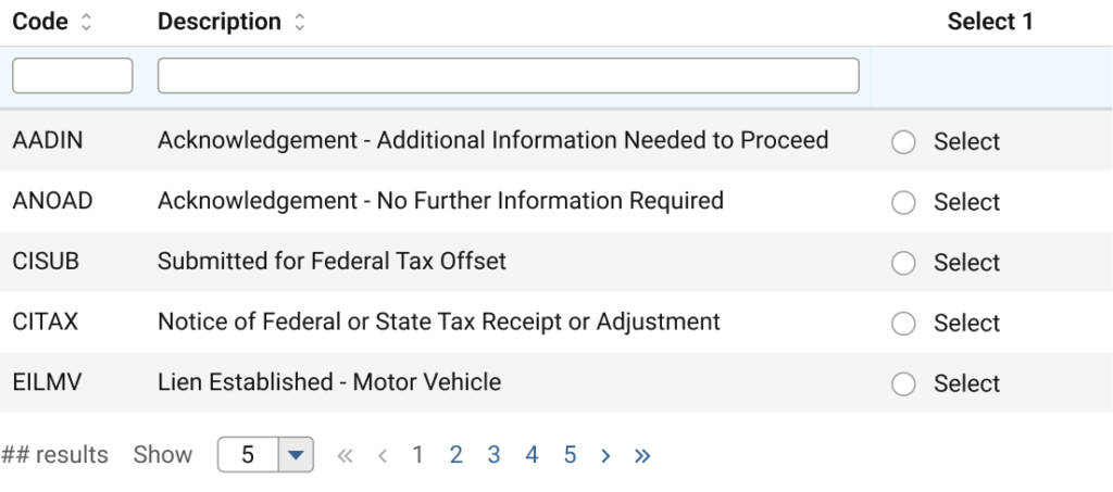
Patterns
Overall, the patterns pillar ran somewhat independent from the regular Agile sprints; aside from defining basic stages of progress, the timing of each was simply too nebulous. Each finished when it finished.
Discovery
The leading phases for defining/documenting each pattern involved two steps:
- Seek out and compile examples of said patterns existing within current products
- Conduct basic UX reference research via published literature (N/N Group, Baymard Institute, etc.)
- Show comparisons and contrast with other enterprise design systems
Authoring
A basic gallery of the collected examples alongside the research is published for each pattern in a central Miro board, and participants across multiple teams are invited to discuss.
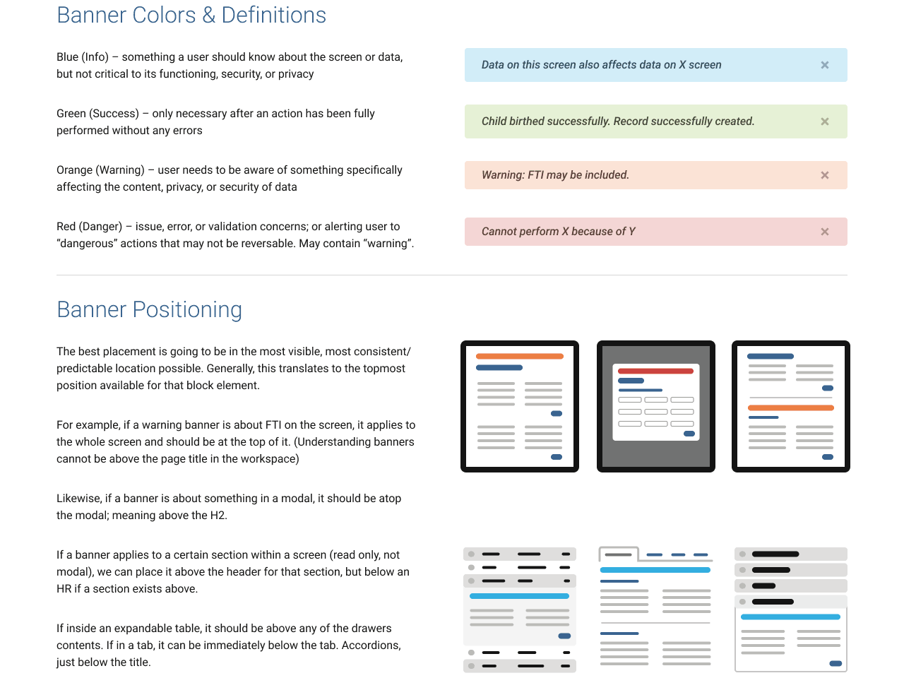
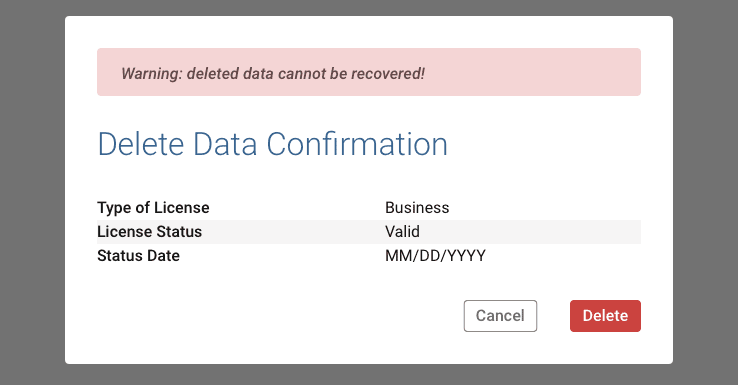
Feedback was then processed and discussed internally by the Design System team and a preliminary policy drafted, including creating any necessary illustrations or diagrams.
On a side but related note, while working on a number of patterns, I matured the team’s existing diagram illustration style.
Publishing
The entirety was presented centrally once more to collect final feedback before formatting and officially publishing.
The CMS-based web publisher required old-school exporting of web-optimised images and a lengthy formatting process.
The site was only published once per sprint, meaning new articles or updates needed meticulous planning to hit those deadlines.
As mentioned earlier, building and maintaining multiple instances of the documentation proved grossly inefficient, so we began migrating all documentation to reside inside their respective pages within the Figma library documents.
This allowed immediate updates at any time and a single source of truth directly adjacent to the content being described (in addition to allowing live elements in prototype view). 👍
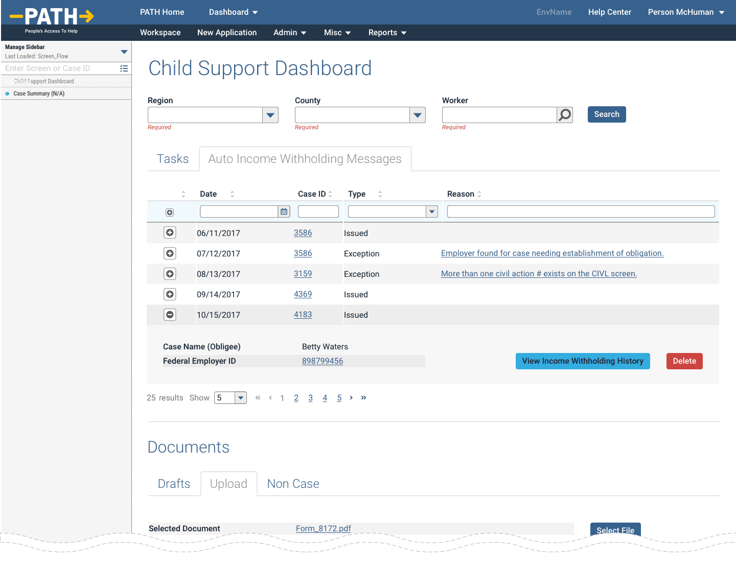
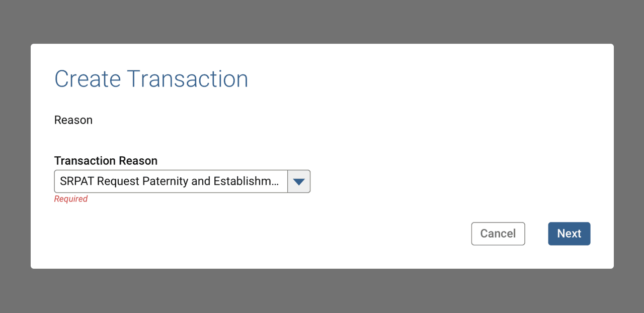
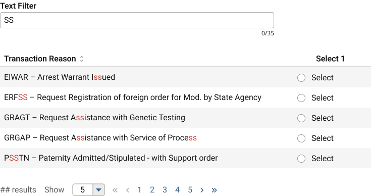
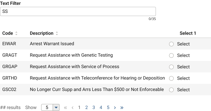
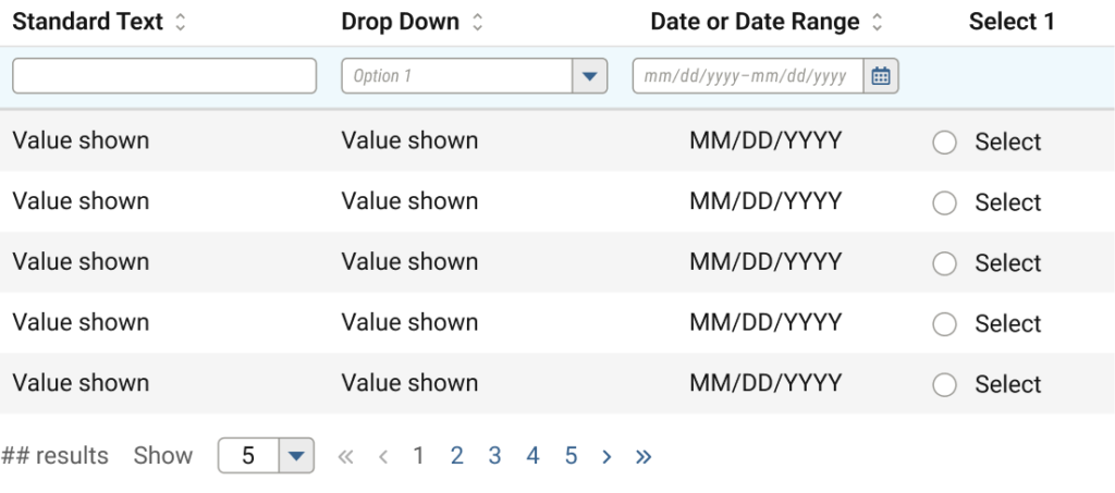
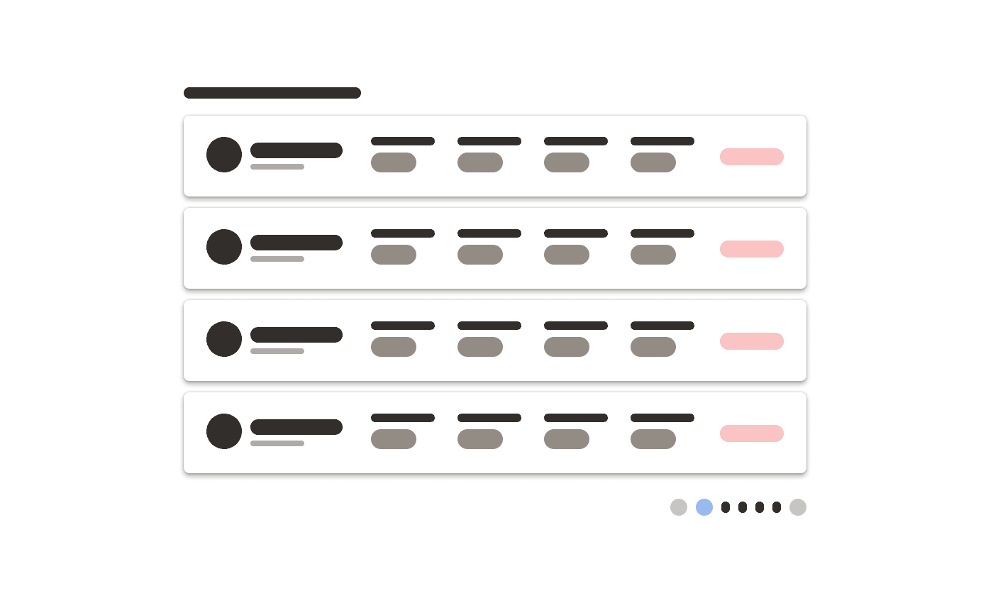
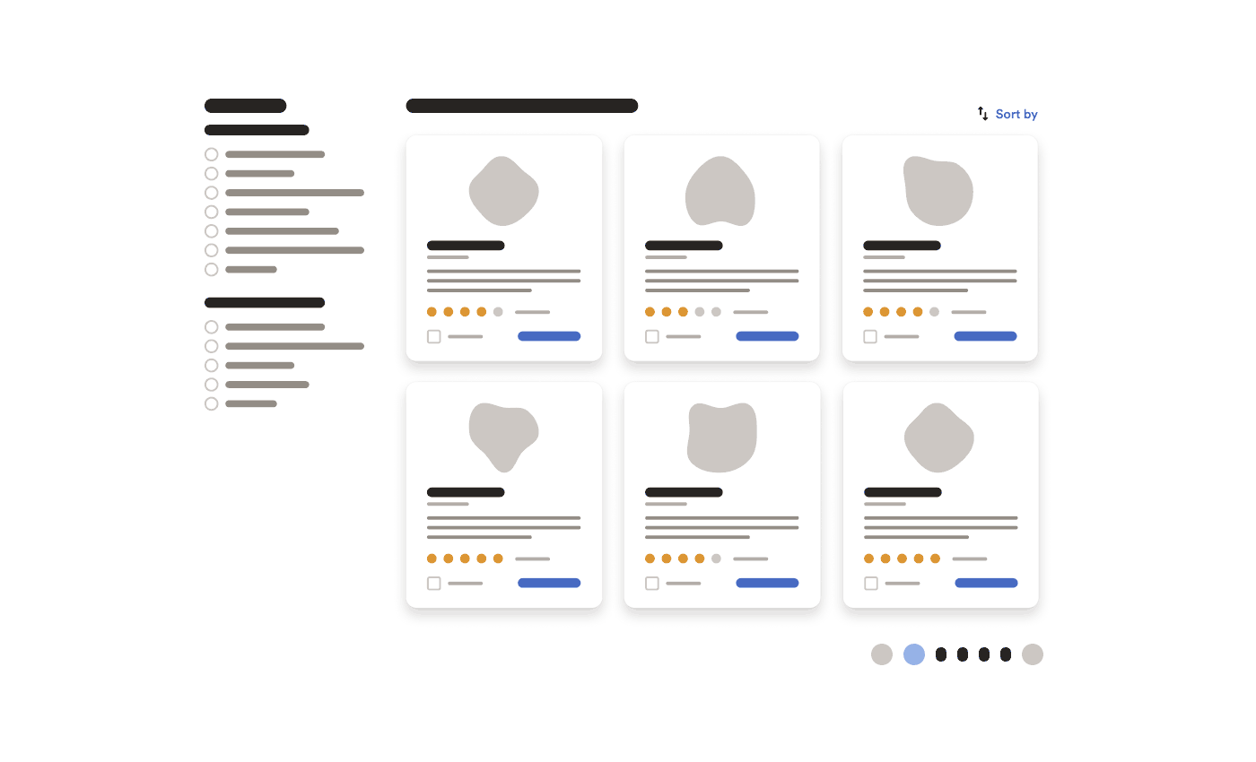
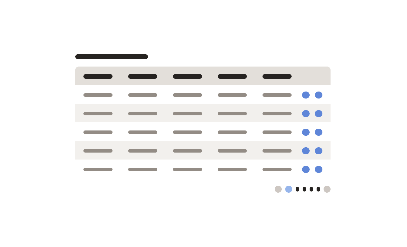
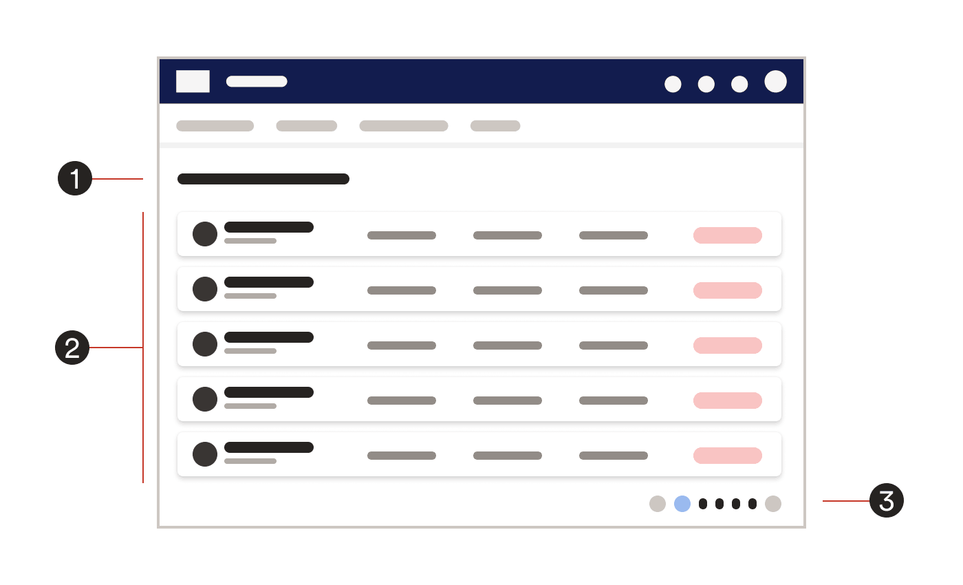
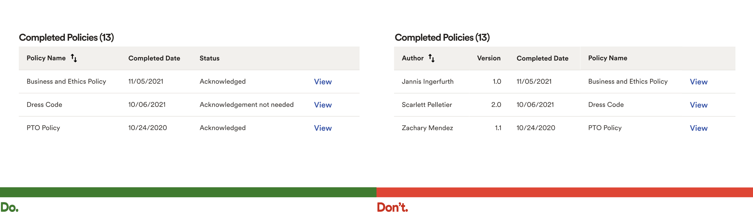
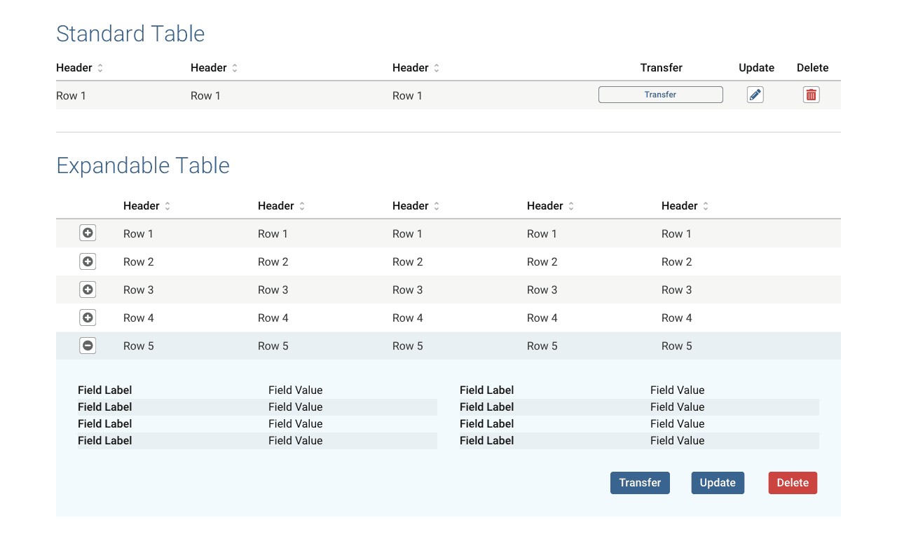
Examples from List Pages pattern
Many times, especially in data-rich corporate environments, software must display lists of various types.
To help the many product teams align on some standards, I identified a handful of core use cases, applied general UX research for best practices, and authored the pattern content.
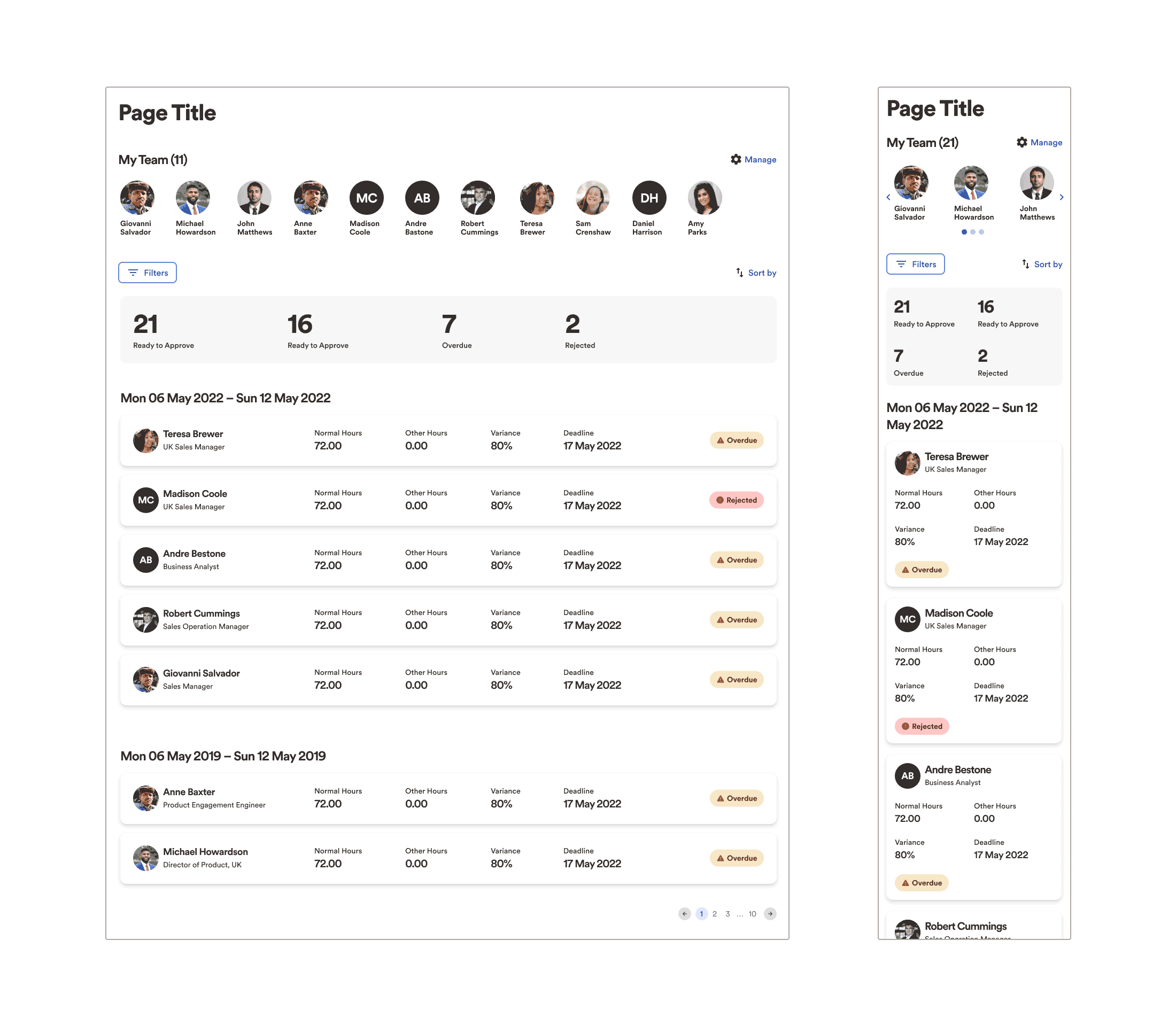
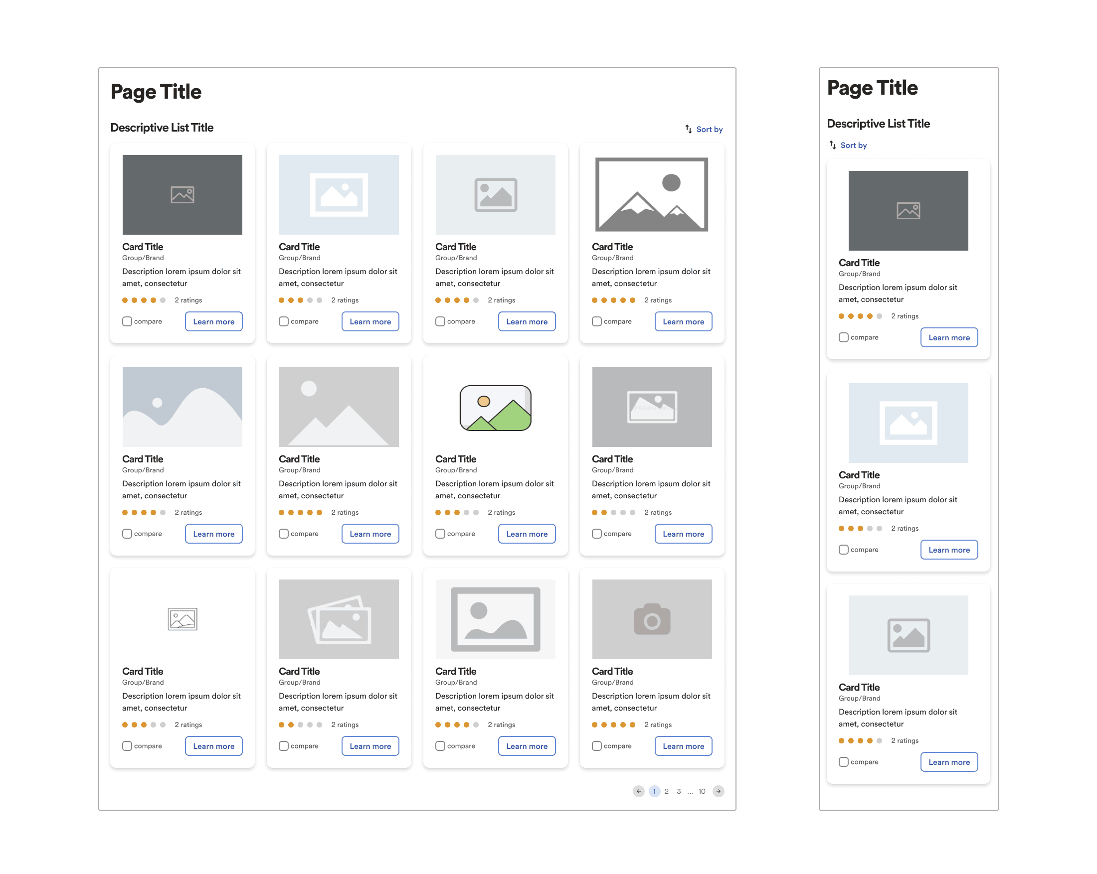
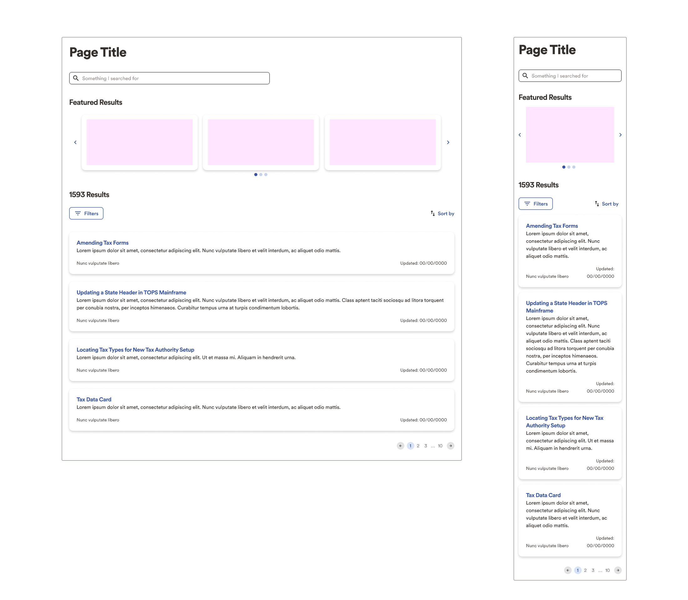
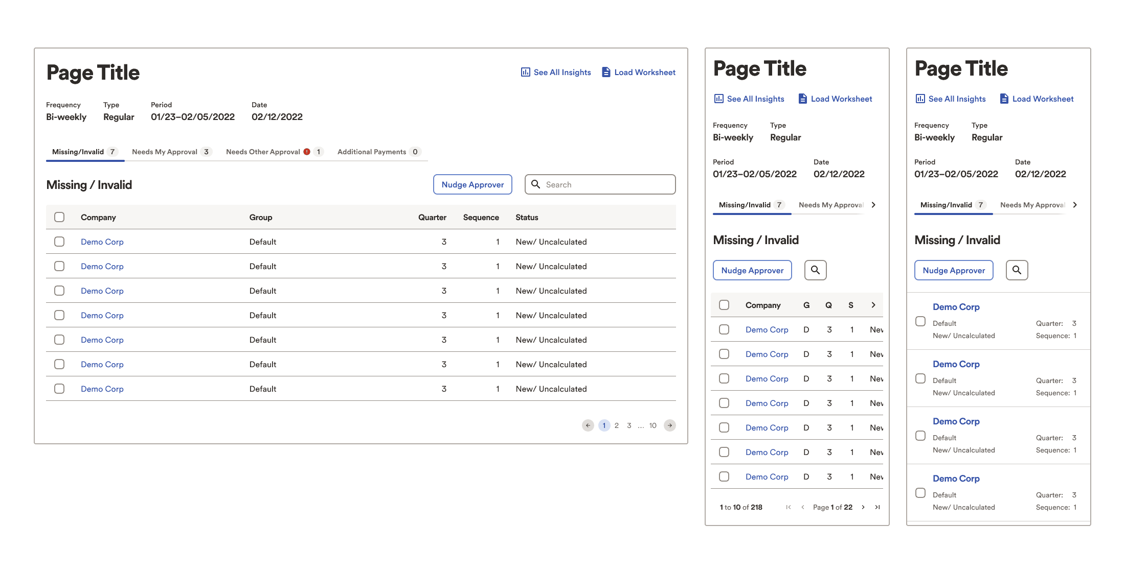
While the above examples were in progress, simpler, low-fidelity versions helped instruct the engineers about how to build templates. Interestingly, they had no trouble translating the super simple style into existing components.
Figma ambassador
The organisation began a mass transition from Sketch to Figma just as I arrived.
Fortuitous, as without a company-issued computer, I could not access their software installer nor company Sketch licence. Figma, however limited me not.
As a power user, I volunteered for their transition ambassador program, where I spent time:
- Fielding questions in a UX team chat (yes, the same hundreds of teammates)
- Demonstrating best practices
- Contributing to training and helpful resources
- Attending weekly ambassador meetings
- Attending personalised training directly from Figma’s design advocates
- Expediting Design System (components) transition from Sketch
Findings and insights
In contrast with the earlier process failures, these most certainly do contain some personal biases from my own experiences.
- Some highly visible product teams carried on as if immune to alignment efforts, in turn influencing other, smaller teams to also diverge from defined standards.
- Perhaps some manner of certification accountable to leadership would persuade more teams to participate in the design system.
- Some of these divergences were then submitted back to the Design System team as contributions, thinking they would simply overwrite established standards. This worsened inconsistencies and complicated alignment efforts.
- Many of the design system efforts were targeted only towards desktop users and layouts, procrastinating mobile for “later”
- My contributions always included a minimum of mobile, tablet, and desktop deliverables.
- I discovered a number of undesirable results from developers implementing their best guess in the absence of design guidance.
- I repeatedly advocated in our DS team roundtables for at least mobile standards in addition to desktop, to a fairly unreceptive audience from leadership and those with greatest seniority.
- Some of the Leads on our team, overly eager to win acceptance and adoption from other teams, approved external submissions to the DS without research, discussion, or any kind of QA, resulting in conflicting, redundant, superfluous, or inappropriate features, polluting rather than purifying the system. Better communication/submission process would improve the design system plus inter- and intra-team politics.
- Clearly some internal, political issues between management and team members caused an exodus of long time employees. Lesser human capital on the team deeply affected our efficacy.
- Similarly, the organisation clearly favours full-time employees, relegating contractors to second-class citizens with virtually no onboarding, lack of integration with the regular employee teammates, zero resources or privileges to acquire essential hard/software, nor the ability to engage directly with leadership, leading to gross inefficiencies.
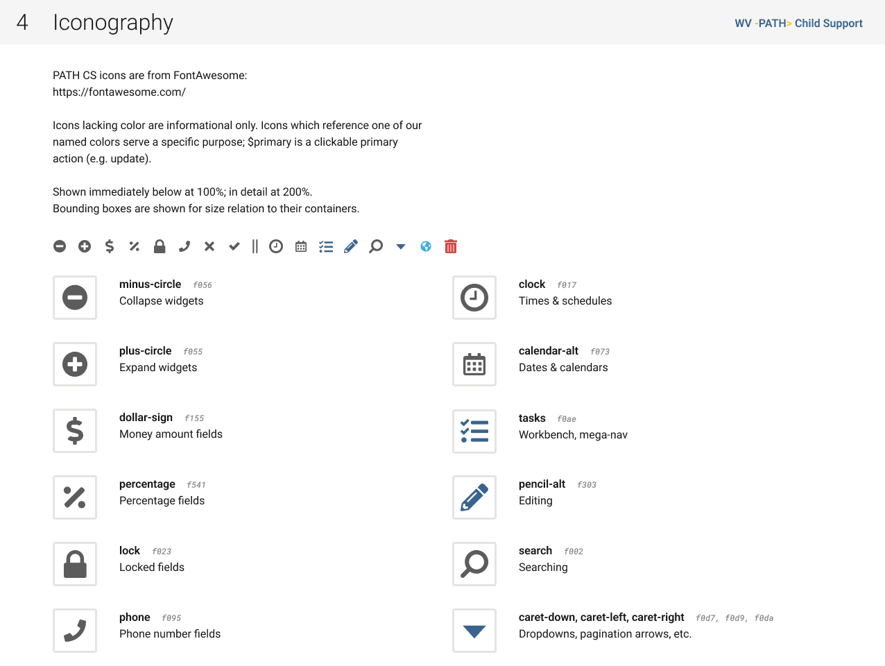
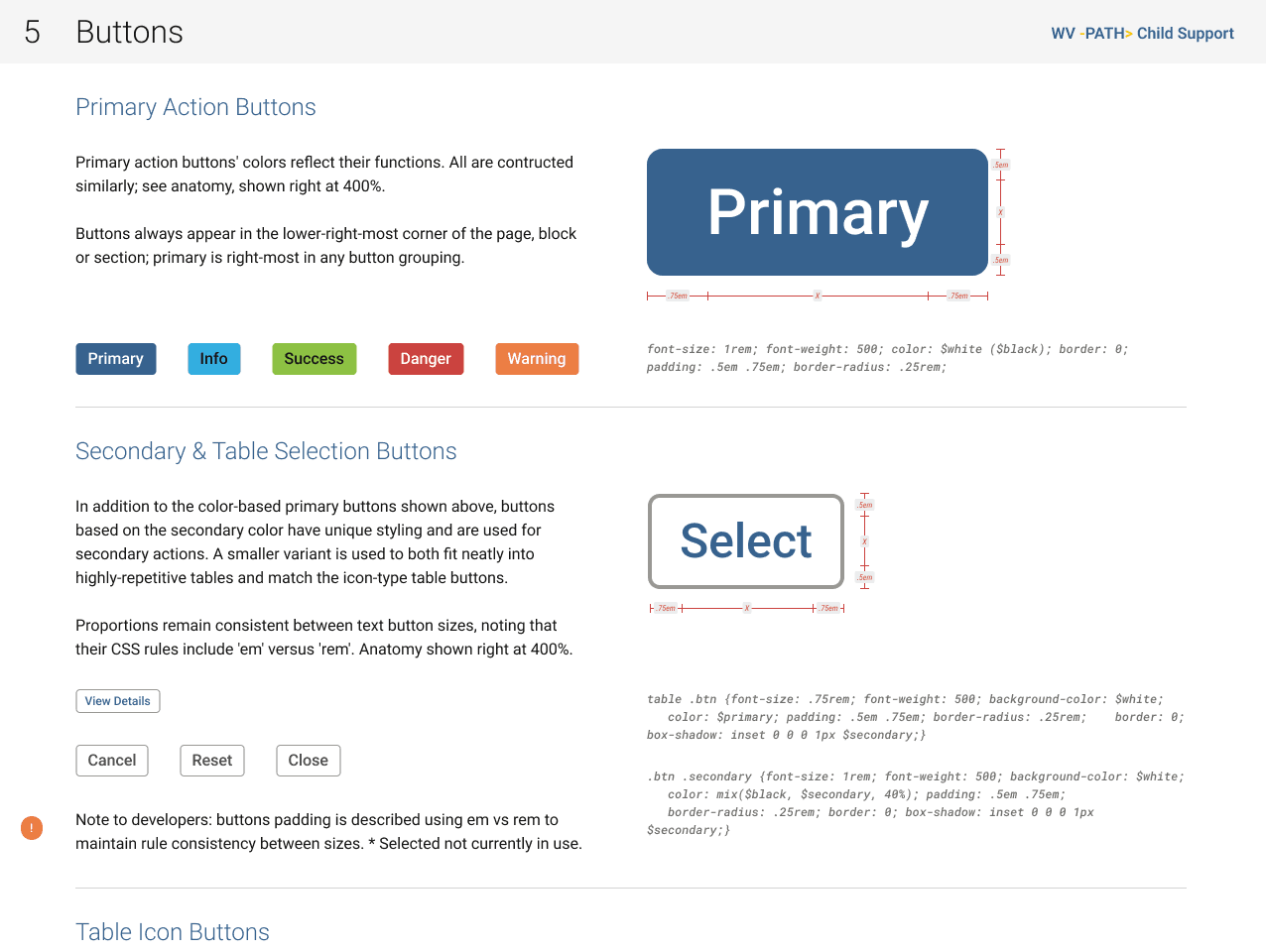
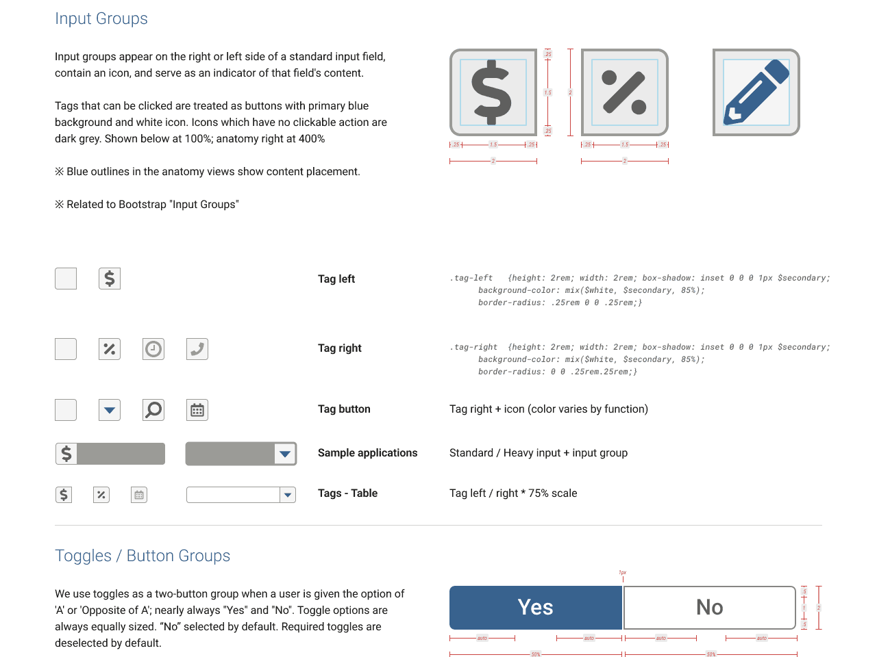
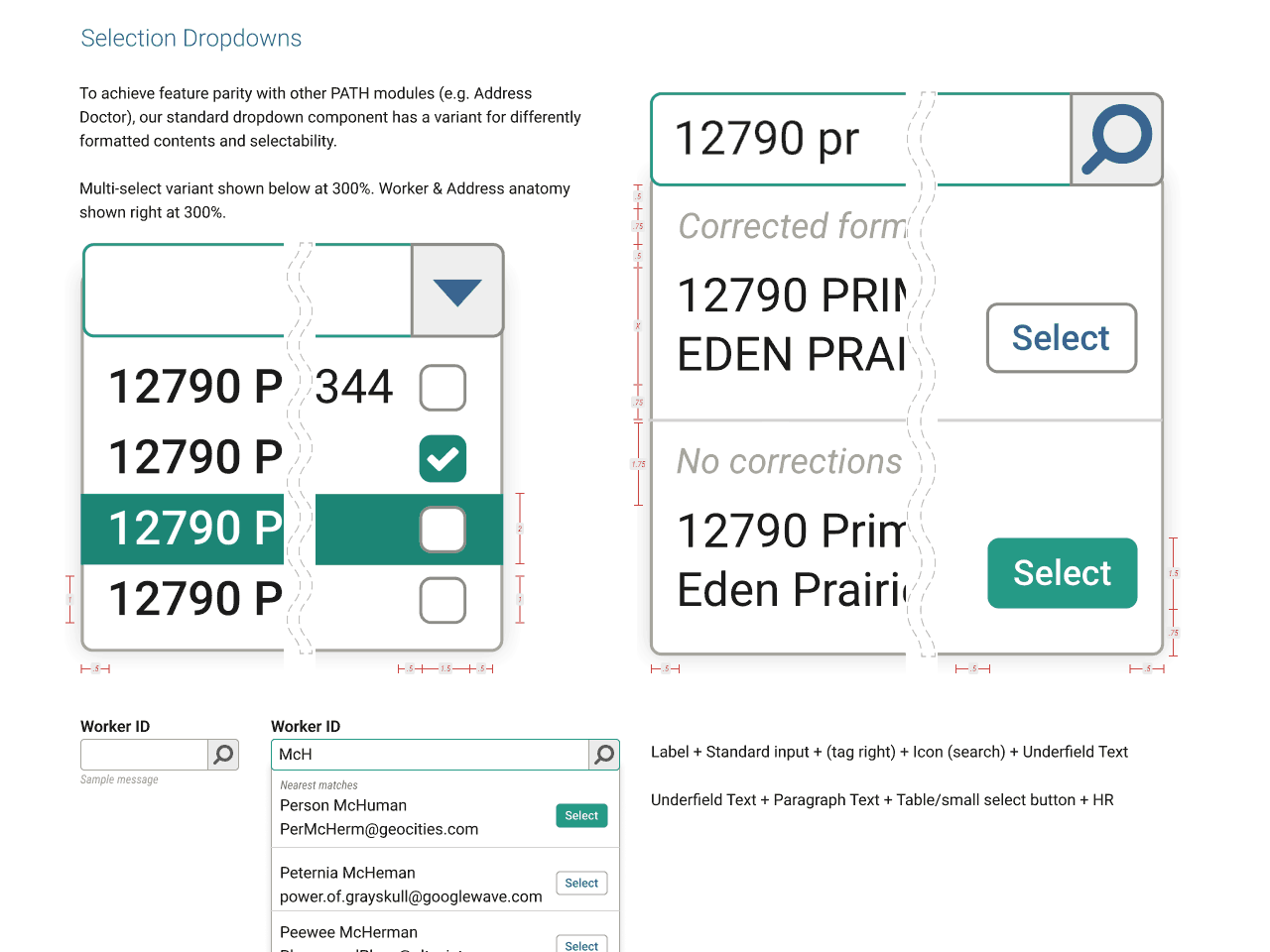
Additional design artefacts
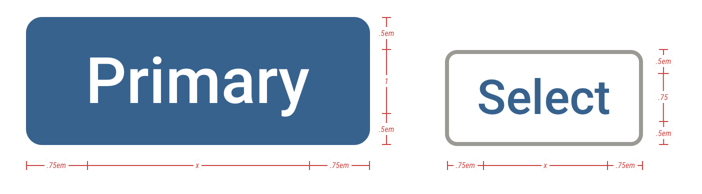
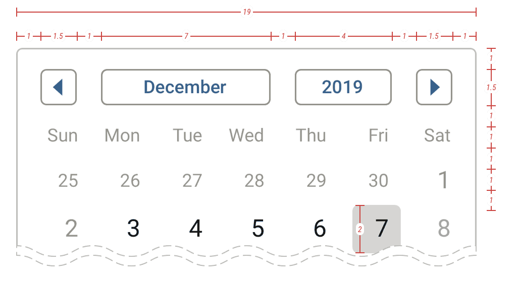
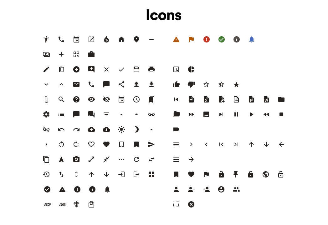
A handful of the foundations, or global atoms.
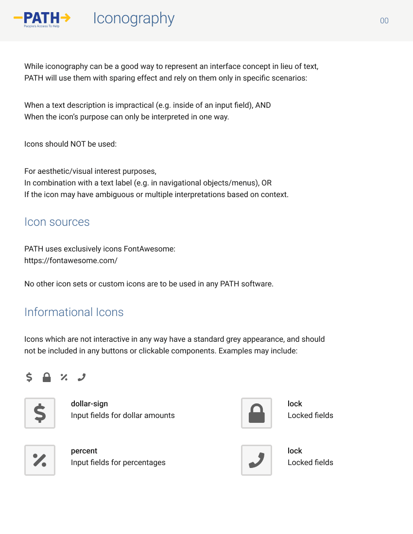
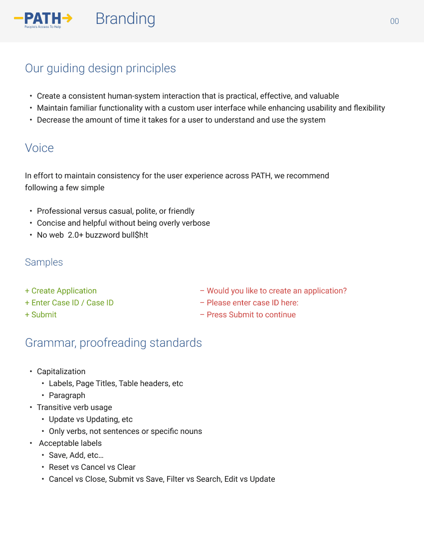
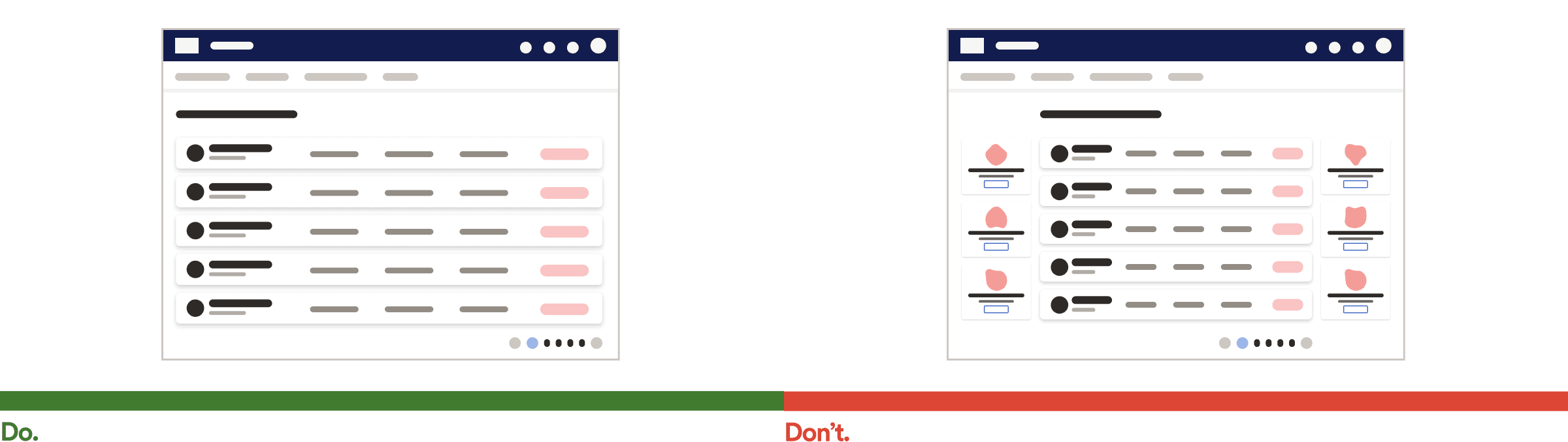
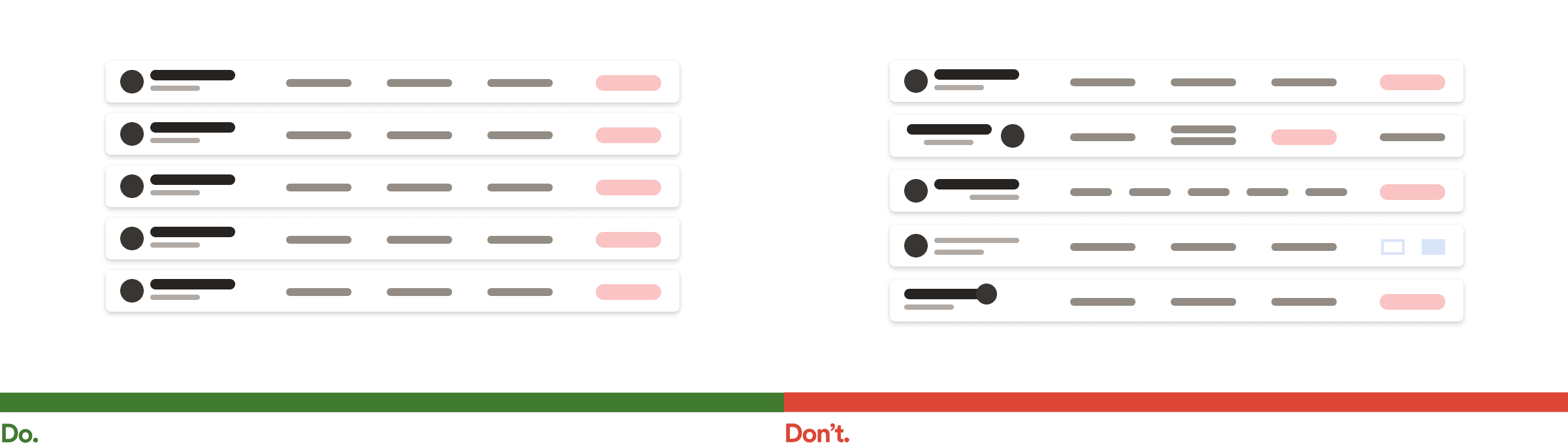
Some of my documentation supporting Do/Don’t illustrations