TLDR: a guided tour through my UX solving methods, followed by a case study showing it applied to a surprise failure under threat of an impending presentation deadline.
If you think good design is expensive, you should see the cost of bad design.
Ralf Speth, CEO, Jaguar Land Rover
Preface
You may notice from the contents above that at least numerically, “design” doesn’t appear until halfway through the UX process.
Certainly, given white boarding, napkin sketching, and other abstract visual activities; flavours of design can surface during any stage, but proper wireframes can only precipitate from the information and decisions of preceding stages.
Using a homebuilder analogy, imagine the foreman demanding blueprints straightaway; day one, because they already booked the construction crew and couldn’t afford them to stand idle. If the architect took a stab in the dark and started drawing things up without time to gather supporting information or even strategise their own output while the crew broke ground immediately; the client’s reaction to an industrial-sized department store lavatory dominating their living area or a trendy fire brigade pole supplanting a traditional staircase in the dead centre of the kitchen shouldn’t surprise anyone.
Succinctly put, design decisions follow data.
For all intents and purposes described here, let’s assume a project has already met the requisite thresholds and deemed viable.
Also, this process is first described in general, as it might apply to a product’s overall lifecycle, but can be scaled up or down to an individual feature if necessary (example of small-scale shown further below).
Process definitions
1. Define
If one doesn’t understand the problem or ask the right questions up front, should it be any surprise later on when the delivered solution misses the mark?
One of the most important yet often overlooked aspects of UX is the art of definition; ensuring a solid footing with clear goals and understandings about how to achieve them. “We need a website for X” lacks sufficient information to warrant any work, design or development.
A website for what audience? On which devices? On which tech stack? Why do you need a website; what do you hope it will do for you? Does the current solution succeed or fail in any ways we can build upon or avoid? To what end; which metrics will gauge success or failure? The list goes on…
Defining personas, user flows, user journeys, etc. may also happen at this stage.
Given a list of questions whose answers distill to a series of requirements and objectives, we can continue to flesh out each point with supporting data.
2. Research
Data informs the ideal pathway to a solution, and the research which gathers that data is the heart of all UX.
Though obviously not an all-inclusive list, this process might include
- competitive analysis to understand the relevant industry or audiences,
- interviewing existing or prospective users,
- research relevant existing, past, or future company products,
- gather style guides or other branding assets,
- exploring best practices (why reinvent the wheel??),
- or establishing the best mix of staff, tools, or technologies to achieve each objective.
3. Structure
With a wealth of knowledge in hand, we can develop the scaffolding upon which the resulting product can emerge.
At a minimum, this should include a design system and CRUD-like standards/patterns to establish a common toolset and design language with which all UX designers and developers can refer to and produce consistent results.
Sometimes a company or product may already have these (if so, gathered in the Research stage). If not, they should be created during this stage, precede Design, and align with the data from previous steps.
While a design system (and standards) continue evolving with the needs of the project, having them as mature as possible before design reduces the amount of avoidable rework and inconsistency, otherwise known as UX debt. This debt accumulates and compounds quickly, equating to real-world values of time and money to correct, reinforcing my recommendation to mature the Structures as early as possible.
Additionally, a style guide and documentation could benefit a larger team, such as BAs, developers, external agencies, etc. through detailed explanations and diagrams of the UX work.
4. Design
Finally, we can begin designing!
Starting with the lowest fidelity; often simple, monochromatic boxes and nondescript text (if necessary at all), the highest level features, functions, organisation, etc. are evaluated first. Think of it like this: the most abstract concepts of the product begin with the most abstract design.
We do this primarily for efficiency. For example, if we can explore whether a navigational layout does or doesn’t work using basic elements, we’ve avoided wasting heaps of time compared to producing highly detailed mockups. Similarly, lower fidelity allows us to iterate much more quickly without the burdens of complexity.
Any designs moving forward should in theory meet the success criteria we defined in stage one.
5. Validate
Designs complete, we need to test their viability by presenting to users, stakeholders, developers, etc. This step will identify issues, obstacles, inefficiencies or other points needing more UX attention.
Of course, project management may elect to ignore this feedback and proceed towards release, but in general, a client will expect improvements if given the chance to identify some.
6. Repeat
Humbled by feedback, anything which failed validation gets fed back into the UX machinery. Often this means the Design stage, but may also involve some additional research or structural augmentation.
Repeating the design or structural stages allows opportunity to increase wireframe fidelity, mature the design system, or improve any prototype or existing front-end implementation.
Upon completing revised design work, it needs revalidation. Rinse and repeat as many times as necessary or allowed (management will often push to curtail iterations, citing budgetary or deadline constraints).
Once considered “satisfactory” and all objectives achieved, proceed to release.
7. Release
Once a design passes validation (or is given a pass by management), a project can proceed to full development, QA, or whatever team follows in the pipeline.
UX should continue to advise on and validate the product on its journey to final release.
Case study: “CNCX”
Here, we’ll examine a specific issue-resolution from my Government Agency case study project. It revolves around a specific function within the application’s largest and most complex subsystem, known as CSENet, a federal interface enabling intra- and especially inter-state agencies to share and manage case data.
CNCX is the function’s archaic acronym for “Create New CSENet Trans’X’ions” and will be used here forth.
UX failure: the story begins
I flew across the country to deliver a progress report of sorts to the government officials on behalf of our UX and development teams. Arriving a week prior to prepare, imagine my surprise when in the eleventh hour, I get a frantic call from our SME that one of the core features we planned to present contained a fatal flaw…
It turns out one of our UX designers failed to follow a process like described in this article, which resulted in a design that did not attach to the codebase; it literally could not (ever) be made to work and required a complete redo.
Putting aside the obvious revelation of a show stopping gap in our validation process, while normally not an issue for UX pros, with the presentation just a business day and a half away, how could I possibly solve this?
A: methodically.
1. Defining
Obviously, the primary problem was that our UX solution solved nothing.
However, doing just a bit of legwork to determine precisely why it didn’t work serendipitously uncovered a secondary usability puzzle.
Let’s first examine the known pieces of this puzzle:
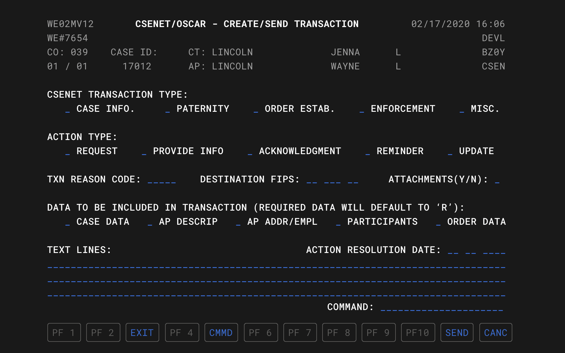
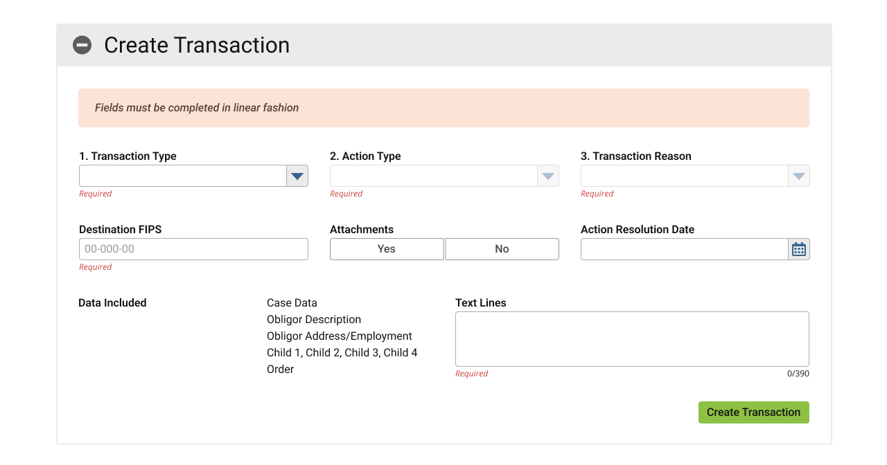
Technically, our guy included all of the fields, albeit in such a slapdash fashion that he seemed to intentionally disregard every one of our CRUD standards and the design system.
Putting those critical failures aside like so much spilled milk…
The problem laid in the fact that he did not interview anyone or investigate how the screen actually behaves in the legacy environment, instead referenced only a screenshot from the user manual and jumped straight to designing wireframes.
This meant that the designer was unaware that this screen features a linear chain of logic and business rules and thus requires a specific linear user flow.
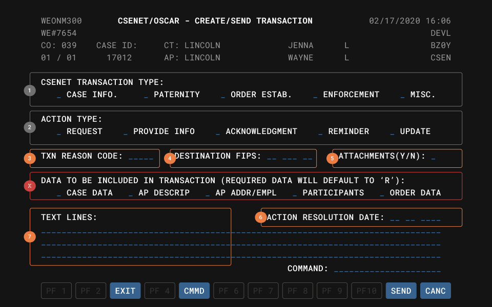
The legacy system included no mouse or free interaction with fields on-screen; every bit of navigation required use of the TAB key, much like screen readers today. This more or less forced users to complete every screen in sequential order.
Our CNCX solution lacked any linearity whatsoever; instead offering a smorgasbord of clicky interface widgets that [despite a tab order defined for accessibility] users could freely interact with in any order. Without the requisite linear flow and dependencies, the form could not validate or attach to the business rules.
The new system architecture omitted these limited legacy input methods as part of the overall modernisation mandate, meaning this cascading method of locking/unlocking fields based on completion order was not an option.
Further, our standards/patterns forbid the use of hiding/showing screen elements (for accessibility purposes), precluding our ability to simply reveal a new field as the user completes one.
The secondary problem emerged from the mouths of literally every person I interviewed in effort to define the primary problem: while the legacy software technically worked, it worked so obtusely that almost nobody could actually figure out how to use it. So most people didn’t. They would actually fill out the paper version and snail mail it. 😳
Definition summary:
- Design did not match the legacy system in form or function; causing it to fail validation.
- The legacy system was nigh unusable for all users, forcing them to time- and cost-inefficient non-digital workflows.
- Defined success as an interface that faithfully reproduces the input and output methods of the original system while also being usable with any level of experience.
- Defined the basic user flows.
2. Researching
Until I could gather more detailed technical specifications and supporting information, I couldn’t properly ideate solutions.
In this case, despite having already discovered the general nature of the problem, I was effectively brand new to this screen’s functionality and knew nothing of how it actually worked.
Problem one: technical defects
Why was this linear flow necessary?
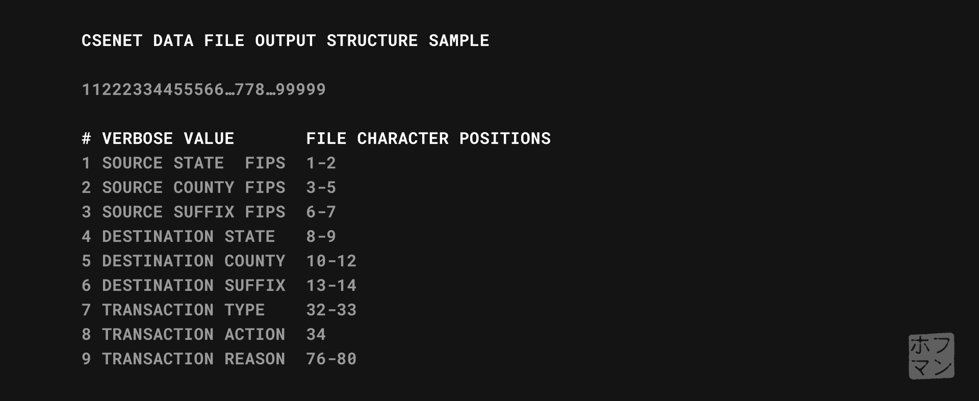
After reading through some of the dense source governmental documentation, it became clear that this function generates a whitespace-sensitive text file where each character position corresponds to a specific value and must therefore follow a universal standard so any recipient can decipher it.
*Not included in this case study is my research and solution for the underlying IRG (Intergovernmental Reference Guide) function that also stands atop a federal lookup table and powers many of the agency address functions throughout the system.
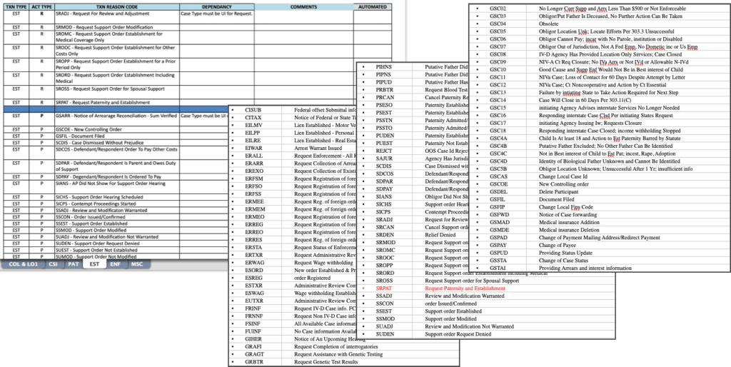
Examining again the basic user flow defined earlier, I came to understand that the initial field groupings (1-3) represented a hierarchy of specificity; earlier fields were more general and later more refined.
The first grouping served as a main category, the second a sub-category. The combination of those two act as a boolean AND operation; the result abridging a list of 250 reasons to a more browsable ~ten for the third field (Txn Reason).
This meant that presenting users a non-linear assortment of fields fundamentally violated the business logic, making the form unable to validate and ultimately why our original design failed.
Problem two: usability defects
This linear logic also reveals the usability failure affecting 99+ percent of users.
Through interviewing users, SMEs and developers, I learned that the third field was ultimately of most interest; the Txn Reason being a five-digit alphanumeric code describing the specific nature of the transaction.
Unfortunately users could not skip directly to this field; they needed to complete the first two steps. Why? Two reasons.
First, that is the same order those value are generated to the output file, and thinking like a developer, the simplest way to program the application too.
Second, the reason codes numbered an unwieldy 250 possible values and could benefit from a filter or two to shorten the list and improve discoverability. At least this was the thinking decades ago.
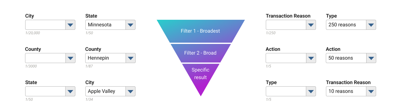
So, the legacy system implemented the first two fields as filters, each whittling down the list by about eighty percent, resulting in a more manageable list of 5-10 codes by the time our intrepid users got to step three.
In theory, this makes sense…use filters to reduce a long list to a shorter one. Looking at the graphic above, imagine scrolling through a list of 20k US cities. It makes much more sense to first sort by State, then County, making the City dropdown much, much shorter.
The usability problem arises whenever a user doesn’t know which Type/Action combinations produce which Reason codes.
And this was the case for literally all users, causing most to repeat the process multiple times, trial and error style, to find their desired code.
In fact, during the 30+ year lifespan of this software, apparently just one person in this agency ever memorised each code and its combination of filters.
Luckily this one person happened to be my primary SME and ultimately our saviour.
Fortunately for us, this person once upon a time transcoded their mental matrix of codes and combinations into a more tangible spreadsheet. Studying this allowed me to identify and extract data patterns which then led to the solution.
Because of the dangerously brief and looming deadline, these first two stages happened in a single afternoon (plus a few evening hours from my hotel room).
Research summary:
- Interviewing developers and technical SMEs filled in the blanks to how/why this screen functions as it does.
- Interviewing users helped identify their pain points and desired goals when using this screen.
- Studying the federal interface’s documentation and SME’s collateral allowed me to formulate a strategy to solve both the technical and usability problems.
3. Structuring
Fortunately, I built our entire design system and served a pivotal role in defining our CRUD standards/patterns, which gave me a holistic understanding of and how to best apply both to these problems.
We actually established a “wizards” pattern for linear processes; a parlance familiar to most Windows users. The nearest analogue for most people might be software installers, which guide users through an installation step-by-step.
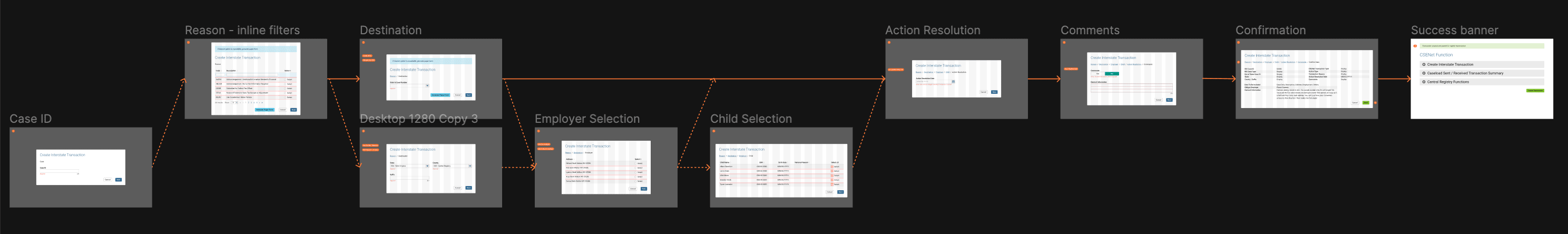
The fields on CNCX were a bit misleading in their visual simplicity; several of them triggering modal pop-ups with alternate steps/fields depending upon the larger data constellation. For example, a specific Type, Action, and Reason given a case’s details might also trigger a pop-up to select someone’s employer, or choose from a list of children who would be affected by this transaction. All still part of a linear process, yet each being much more complex steps that appeared in neither the original screen nor our designer’s version, but could be easily added as a step within a wizard.
Coincidentally, I designed other functions adjacent to CNCX which I already knew had hooks into and could bookend both sides of it in a user’s workflow. Those functions also used the wizard pattern, meaning CNCX as a wizard could integrate seamlessly between them, allowing a continuous, guided user flow rather than segmented steps.
Structure summary:
- My participation in the creation of our design system and patterns gave me a holistic view of the system to know that our wizard pattern would work best here.
- I designed adjacent functions (also wizard patterns) that could tie into CNCX as a wizard, offering a deeper integration and convenience for user workflows.
4. Designing
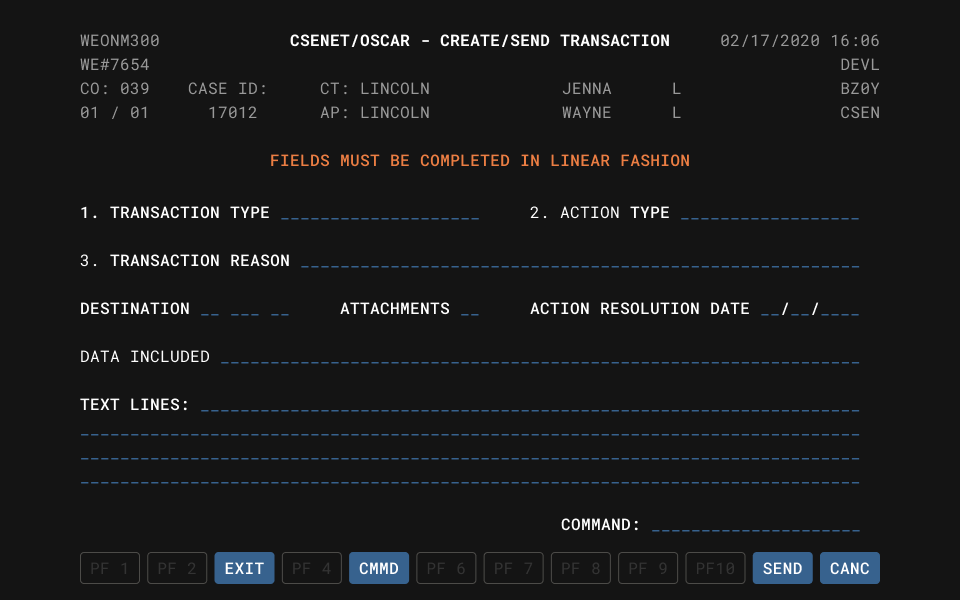
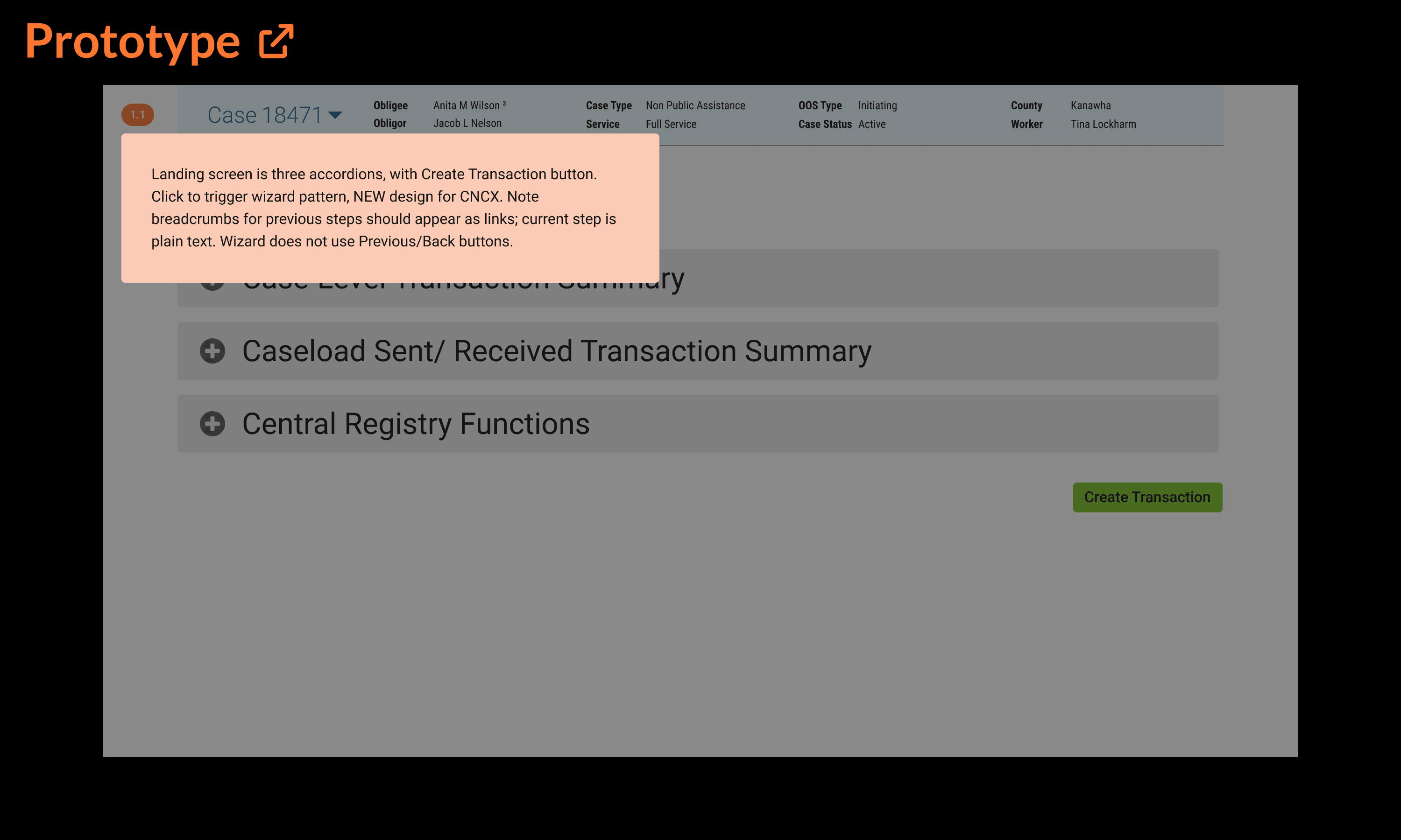
Remember that black and white screenshot of the legacy software…or our UX designer’s stab at it?
Both of those complicated, unusable failures transformed into this under my direction:
“Too simple to be true”, I can hear you thinking.
Technically correct as this is only the first step of the re-imagined process, and additional steps do follow.
However note that this new “step one” corresponds to the third step of the legacy process; those menacing first two steps no longer appear to hinder or confuse users.
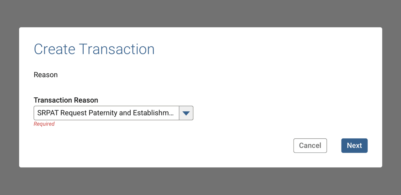
So what happened to them? As required fields, surely their values must exist when the data gets transmitted.
Rather than serve as obstacles users must forcibly overcome, my design grants users their wish to directly access the reason selection.
My research uncovered a way to let the system automate the rest of the annoying bits.
Why It Works
Simply put, we reverse engineer the filters/category selection with some automation and reverse lookup.
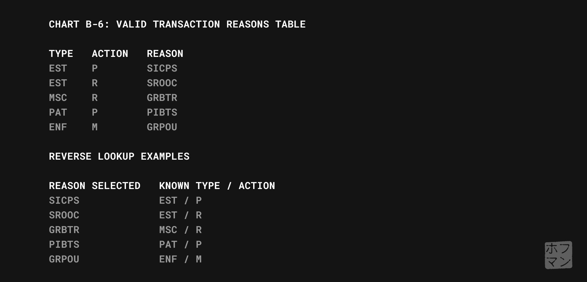
Referring to the graphic above, I’m effectively reordering the lookup table’s columns whilst leaving the rows intact. Putting the Reason first lets the system automatically populate the appropriate Type and Action from the next column with no additional user input required.
If I was the developer here, especially thirty years ago, a simple set of filters to match the lookup table structure, output file’s formatting, etc. might seem the obvious approach. But given modern UX practices, we can achieve much more efficient and usable products with just a bit of care.
This deceptively simple result neatly illustrates the tremendous value of UX to modern products.
Aaron Hoffmann
This design, wireframes and flow happened in a single day, leaving just a weekend between finishing and our presentation.
Design summary:
- Given a definition of success, adequate research data, and components/patterns from the design system, the actual design falls into place quite easily.
- The resulting wireframes and flows satisfy all of the success criteria while respecting our design system’s edicts.
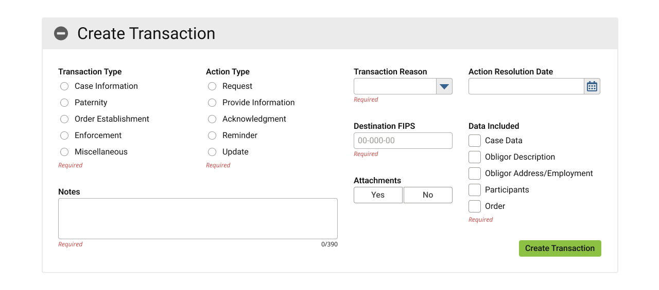
5. Validating
Blessed with a devoted team of developers inspired by this unique new vision and a desire to present their very best work to the state, they happily volunteered weekend overtime to build a semi-working live demo for our presentation Monday morning.
Below, one of the detailed, annotated prototypes I prepared for developers, to assist building our presentation demo. Orange buttons in the upper left corner contain notes on hover.
I also authored additional documentation and scripts to support additional scenarios in the demo.
The following Monday, when presented to the state officials and delegation of field case workers, the disbelief and delight could be read on everyone’s awestruck faces. Welcome to be sure, but far better a reaction than I anticipated. 😳😳🤯
Most of the audience seemed to expect a hidden catch, as though too good to be true. The tech/dev leads’ mental gears visibly churned, double- and triple-checking my logic until finally acquiescing in approval. A resounding success all around.
However…once the initial hubbub settled, one glaring issue remained:
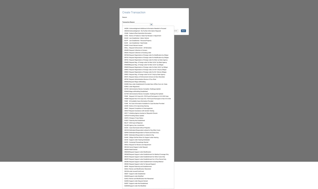
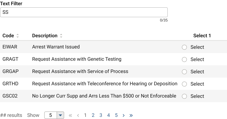
The above image shows only a fraction of the codes available in this field; imagine it four times longer.
Giving users what they really wanted (immediate access to that third step) turned out to be a wish too much granted. 🥴
Despite having a search-in-place functionality for dropdowns, one with 250 options clearly ran afoul of usability best practises. Not to mention now users couldn’t reach consensus around the data sort method in that dropdown: code first, or description first?
Right on cue, a BA towards the back of the room confidently suggested adding some filters or grouping the items by Type/Action to make better sense of all these Reason codes.
To which I could only respond by projecting a slide of that awful legacy screen and ask, “by a show of hands, how many preferred when we tried that last time?”
“Oh…right. Nevermind then”.
This illustrates why I love user feedback, but never take it at face value. What interests me is the rationale driving the feedback, and how my expertise can transform it to identify and solve the core problem.
I love user feedback, but never take it at face value…probing for their why reveals a more actionable insight.
Aaron Hoffmann
Rather than react literally to “can you add some tabs, add a link to X, put a button, etc.” I usually probe for why they want, need, or suggest something, and then as the UX expert, take the underlying insights back to the drawing board.
And so went the second (and a half) day of this process.
Validation summary
- Users and developers alike LOVED this new approach.
- However, the Reason selection method needed additional consideration, as a single dropdown with 250 options fails a number of usability concerns.
6. Repeating
The only aspect of my radical new approach that failed user validation was that pesky, overgrown dropdown.
As it happens, our design system contained other selection components and patterns. Tables to the rescue!
By transforming the dropdown into a table, we could offer a more robust method for viewing, sorting, or reducing the entire list using real-time text filters.
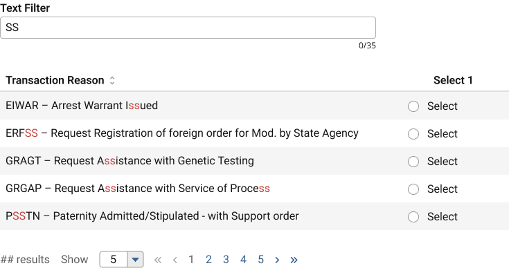
While a partial solution, not ironically, repeated user validation found users needed greater sort and filter functionality.
Step one, we split the data into two columns, which solved for sorting. However our real time text filters supported only one column per table, meaning one of the two would not be “searchable”.
Internally, this table selection pattern frequently caused debate amongst the UX team as to its viability, and this CNCX situation finally and firmly pushed the issue over the threshold into “must resolve” territory.
Surprise UX issue #3: the design system
Specifically, these points regarding the table selection pattern repeatedly arose over the course of our project, but now required an immediate resolution:
- Accessibility.
- Some tables required a button press with the filters to retrieve new data, while others could filter the data already there with no additional hit to the database.
- Filters and search patterns often looked the same, confusing users why one screen would be formatted as X while another as Y.
- Similarly, offering search and filtering for the same screen was impossible.
- The individual filters were also separated and sized differently from their respective table columns, often betraying user expectations.
- Inefficiency.
- If used at all, our developers insisted each column have a filter, even if it didn’t need one. This could be counterproductive in some situations, and certainly space-inefficient given the size of the filter fields.
- Inconsistency.
- Date fields especially presented issues. While often shown as a discrete value in the table, as a filter, users would realistically need a range, and our date picker could not accommodate two values for one field, requiring two date filters for one value.
- Developers had trouble implementing the filters (query DB or not?) due to poor documentation of the source material and
- Designers often delivered inconsistent or technically inaccurate wireframes. Sometimes a submit button would be present, sometimes a reset button, sometimes both, sometimes neither. Sometimes filters for each column, sometimes just one. 🤷🏻♂️🤷🏻♂️🤷🏻♂️
Introducing inline table filters
Let me first acknowledge that I did not invent this concept. It already existed in the wild and addresses all of the above issues.
I took this opportunity to jump back to Step 3: Structure and upgrade our design system components and patterns: the inline table filter.
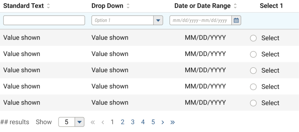
Issues resolved
- CNCX has sortable and searchable columns for its 250 codes
- Accessibility improved
- filters are directly connected to the data being filtered
- confusion over buttons and search eliminated
- ability to include both search and separate filtering functionality
- Inefficiency improved
- columns could show or not show filters if desired
- overall vertical space reduced by up to 200px
- Inconsistency improved
- Date filters can include ranges when necessary, and in a single input
- Developers no longer confused about data retrieval methods; all filters use the same method.
- Designers have a single, flexible component
The final CNCX selection solution
Now, after only a few brief revision cycles, we not only solved a massive UX conundrum, but introduced an upgraded component and interaction pattern that actually solved a number of other development and usability concerns throughout the rest of the product, while pleasing every single user in the process.
Conclusion

You made it to the end, congratulations!
I realise this process may sound overwhelming; that it must certainly require more time (and therefore money) to enact than just jumping straight to design concepts.
But consider that at 5-25x the cost, rework represents one of the greatest threats to a product’s budget, not to mention the additional time to do it all, adversely affecting any deadlines.
So imagine how likely success will be the first time around with undefined, uninformed, unstructured design.
Or by expecting high fidelity for all concepts, rather than start simple, validate, and build up complexity over time?
Or by appropriating funds to begin building designs with an army of developers day one, before anything has been tested or validated as worth developing in the first place?
Success would be highly unlikely, especially in a first or single round of effort. In these situations, everyone should expect plenty of extra rework effort by both design and development teams.
By contrast, imagine approaching a product cycle having defined the objectives, done research to narrow focus, etc. and before committing to the expensive development, having most of it figured out. Much less waste of time and money, despite a longer lead up to prototypes and codebase production.
The lessons learned from the tortoise and hare of Aesop’s Fables fame also applies here. While this process may seem counterintuitive or slow by comparison, the data and results speak for themselves: a steady methodology at any speed wins every time. 🐢💨💨💨 🐇