aka Not a sparkly UI design case study
TLDR: the story of how a lowly “wireframe monkey” showed a UX immature corporate startup the difference design makes, even when building a humdrum government SaaS platform.
Project
People’s Access to Help (PATH), f.k.a. WV Integrated Eligibility Solution (WVIES)
Client
State of West Virginia via Optum/ UnitedHealth Group State Government Solutions
Role
Principal, Senior UX Designer
Team
UX design (5–12); broader UX/UI team (dozens)
Environment
hybrid, distributed teams across US
Methodology
custom Agile (plus torrents of waterfall)
Website
N/A; internal system only, requires security clearance
Key Skills
Design system, CRUD standards, Component library, 508 compliance, WCAG, Wireframing, UX/UI, Style guide
Summary
Transforming a decades-old, mainframe/terminal government application from its pre-color, pre-mouse era into a responsive, modern application while integrating multiple disparate but adjacent systems into a single, cohesive experience. Building a sellable SaaS platform.
Overview
In 2016-17 UnitedHealth Group and its tech branch, Optum, must have foreseen a market in and some impending collision of government and insurance by founding a new startup division called State Government Solutions (SGS).
Their ultimate aim was to create a SaaS platform, leveraging their enterprise-level databases and security experience, that could be resold to multiple government entities who would benefit from instant access to these integrated systems.
They aimed to piggyback development of this new SaaS platform via their inaugural project with the State of West Virginia Department of Health & Human Resources, who had several decades-old systems sorely in need of modernisation and integration.
How, why I took this project
Why work on something that isn’t beautiful, cutting edge, or even at least lucrative?
In short, to help people.
Given WV’s rank of affluence in the union, I saw a good opportunity to lend my skills for the benefit of fellow Americans humans. Because being a good person and affecting positive change in the world ranks as a crucial criterion for my project selection process. The world is what you make of it, etc…
As for how, the poor intern who SGS thought would/could shoulder all of the design (and even some development) to the tune of massive profits quickly saw how deep the pool really was and immediately sought senior level pros like me to fill in the many, many competency blanks.
Though I was brought on as a Senior UX Designer, within the first year, my role became Principal level, overseeing many of the high level responsibilities, most complex subsystems, mentoring junior teammates, delivering formal presentations, partnering with engineers, of course along with my banana-fuelled wireframe output.
Objectives
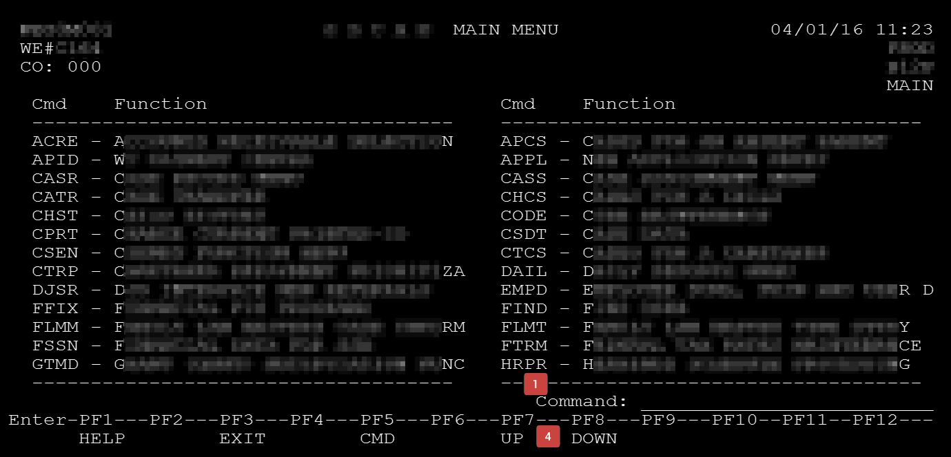
Not only were we charged with translating a legacy mainframe command-line application written in an extinct programming language—one bearing decades of accumulated development bandages and a prehistoric manner of database into modern equivalents—but also with transforming one lacking colour, shapes, the lower case alphabet, or input methods beyond a forty-year old keyboard…into an application usable on multiple form factors via modern interface conventions and strict usability standards compliance.
Primary: contractual requirements
- Translate code/functionality to modern language, framework, and database. Not a system rewrite.
- Modernise a system built in the early 1980s, using contemporary UX/UI standards and conventions
- Integrate with adjacent systems in form and function
- Strictly comply with all federal accessibility/WCAG/508 standards
Secondary: team-defined goals
- Build a SaaS platform that Optum SGS can sell to other government agencies leveraging work on this inaugural project.
- Reduce training necessary to master product
- legacy system required an average of three years for new users
- our self-imposed target was weeks, not years
- Improve efficiency across all agency workflows
- Analyse and revise all common tasks, consolidate and eliminate redundancies
- Improve data density and whitespace balance
- Improve data organisation
- Improve time and methods to search, input, modify, etc. data entry
A commitment to 508/WCAG accessibility tempered the common UX Designer tendency to pursue “fun”, “beautiful” or “engaging” solutions; luxuries that come at the expense of decreased accessibility.
This forced us to carefully consider and balance form with function. The result, while not social media gorgeous, is a clean and efficient kind of handsome…and fully accessible. 💯
Initial challenges
- Startup environment, extremely low UX maturity
- Immediately spent over 90% of budget on business analysts, PMs, and an army of developers
- Developers mostly stood idly by from day one with nothing to build
- The whole of UX and design was to be foisted upon a single intern 😳
- Actually, Optum maintains an internal UX Design Studio, but because its time is charged back to any other group requesting their time, with little/no remaining budget, SGS largely opted out of using UXDS
- UX viewed by leadership as low-level “monkey” work (sadly, their actual word), akin to graphic design…or something. A mindless, perfunctory step merely serving to assist unimaginative coders (aka the real contributors).
Process failures
Management somehow expected factory-volumes of polished wireframes from the UX team beginning day one–which we actually attempted–but those efforts met swift and utter failure, because:
- No time or resources allocated for UX team to define goals/targets, research anything, nor build UX infrastructure necessary for design and engineering efficiency or for the benefit of the SaaS platform
- No plan for design or UX beyond “deliver X velocity of screen layouts per sprint”
- Nothing defined, no research, and absence of UX infrastructure led to wildly inconsistent output
- Devs confused and effort wasted on building superfluous, redundant, or unusable components and patterns
- conflicting navigational methods
- missing functionality
- inconsistent nomenclatures
- differently-styled input fields
- buttons in a dizzying array of sizes and grammar
- slapdash, inaccurate layouts
- …the list went on.
“Lipstick on a pig”
…or what might otherwise be labelled a wakeup call or course correction.
Once the State witnessed our initial presentation of progress at the six month mark, that folksy idiom echoed repeatedly throughout the sizeable conference room.
They saw no meaningful improvement; at best some cosmetic differences that did not excite.
Resetting expectations
First, with the help of our project manager/director, we needed to remind them that our mandate was not to create a new system, but to refurbish their existing.
Second, we came prepared with slides articulating our high level UX vision, guiding principles, and goals.
Fortunately, business-friendly concepts like reducing clicks, system redundancies, improving overall organisation, accessibility, etc. brought even the hottest tempers back to earth.
Process successes!
Once management caught wind that their new SGS division was failing miserably, they sheepishly agreed to grant our humble UX team time and resources to actually deliver a quality product, such as:
- Information Architecture & system function card sorting
- Personas / roles
- Documentation, user manual
- CRUD standards
- Design system
- Styleguides
These topics shall be covered in detail later in this case study, but really represent the core explanation for why the project became successful, and why other teams who carried on without UX involvement consistently continued to fail their client.
My contributions
If it’s no stunner, what did I even do?? To be clear, we targeted “bookish” beauty versus “pageant” beauty here.
Specifically, as the principal of our team, I provided UX leadership for our team’s efforts at each step of the UX process and product life cycle. To summarise my specific involvement:
(emphasis denotes critical functions I managed alone 💪)
- Define
- gather requirements from BAs, state officials, tech SMEs
- translate requirements into discrete, achievable goals and define our core UX problems to solve
- Research
- interview users, SMEs, devs, and BAs
- define personas / roles
- attend actual, formal State user training
- analytical system research (understand the source material)
- investigating every nook and cranny of the old system
- reviewing the outdated user manual
- identifying its gaps and authoring/publishing missing content as an appendix to team.
- card sorting to support the information architecture & navigation
- match accessibility requirements to our project requirements
- research industry and best practices
- Infrastructure
- define “CRUD” standards in senior UX roundtable sessions
- designed all system components
- assembled all assets into a cohesive design system
- created the toolsets for the UX team to actually use the design system
- authored style guides and technical documentation to developers and other designers
- developed templates and best practices for design production
- Design
- produced wireframes (my focus was the most complex system functions)
- led (re)branding efforts
- facilitated bi-weekly UX team round tables to review work, answer questions, align efforts, gather suggestions, and provide mentoring for junior members
- Validate
- conducted user and stakeholder presentations, demos, and interviews
- constructed specific testing scenarios, authored scripts, and built presentational materials in close partnership with dev team
- validated code against UX schematics with dev team
- Iterate
- analysed/ synthesised feedback into actionable revisions
- maintained standards, design system, style guide, templates, etc. as necessary
The results
All said and done, how did we do?
- Reduced system complexity, from 450 to just 130 unique functions, all neatly organised (and even searchable…finally!)
- I personally designed over 60, including many of the most complex subsystems, including:
- Dashboard – another contentious endeavour that went from nothing to rubbish to proper dash.
- System navigation – one of the most contentious projects during my tenure, because it literally touched every user and function. Many heated “discussions” led to a solution suitable for a single, or in this case, multi-app environment.
- APPL – once a 30-step, error unforgiving, unstable process requiring up to an hour to complete, I streamlined this into a single screen which allows both error correcting and saved drafts, and could be completed in about five minutes.
- CSEN – a federal interface for connecting individual local agencies; described as the most complex subsystem in the application, I consolidated 27 individual functions into a single, streamlined and integrated interface.
- GENE – a 100% rewrite, largely due to long overdue certification requirements changing, but also due to an obtuse, byzantine workflow that failed to cater to a significant number of users’ and cases’ needs.
- IRGA – completely revamped this “Intergovernmental Reference Guide – Agencies” lookup tool; infamous for its unintuitive (and in many cases broken) interface
- UIFSA – a companion to CSEN, this puts an interface to a 1992 law. While extremely complex, I streamlined several previously disparate functions into a single, simple interface.
- I completed and revised at least a dozen junior designer efforts as well.
- I personally designed over 60, including many of the most complex subsystems, including:
- Established a design system which the company can reuse (and sell) on future projects
- Required auditing multiple teams’ efforts, collating it into a report for leadership with efficiency recommendations, and then aligning all component and patterns.
- Improved accessibility from 0% consideration to 100% compliance
- Reduced training time and resources necessary to onboard by up to 90%
- Indirectly reduces demands on Help Desk resources
- Improved workflows across the board, by up to 80%
Findings and insights
- Team structure: the new enterprise division exhausted ~95% of budget on BAs, PMs, and an army of Developers. Management expected devs to “build, build, build!” starting day one, without any direction, schematics, etc. UX cannot be effective as a procedural afterthought or post-production Instagram filter.
- UX Maturity: limited UX resources (time and money) and lack of leadership understanding about modern software development, meaning we spent inordinate amounts of time pitching and advocating for even the basics like research, time to define standards, building a design system, etc. We still had to cut plenty of corners.
- Statement of work: the contract stipulated tech migration and modernisation, but leadership planned both tracks to happen simultaneously.
- Realistically, this only muddied the waters of both, introducing countless issues that nobody could diagnose or attribute to one group’s efforts or the other, limiting either’s ability to correct. Ideally, these should have been done in consecutive, not concurrent stages.
- State officials frequently cited vaguely worded requirements to smuggle whole new features into the project, obviously also introducing significant costly delays. An escape hatch clause ensured we must comply or risk forfeiting any/all payment for work already done. More legal due diligence up front would have levelled this playing field.
- Enterprise-Government liaison: a third party meant to neutrally traffic both parties in reality limited communication and effectively prevented us access to users. Only when the agency noticed a lack of their own input into the process or its results did they start demanding direct involvement, finally allowing us limited user access and feedback. Access to target users should be explicitly negotiated or defined in any/all contracts.
- Third party vendors & software:
- Some external vendors were hired for their proprietary tools ended up clashing with internal tools and compatibility.
- Many sub-teams/project managers selected off-the-shelf and free/open source tech, apparently hoping to save time or money, but this only introduced additional incompatibilities and complications to assimilate. Always involve UX, even in the tech stack discussions, and invite representation from all teams when making foundational decisions, even to a single pillar of a project.
- Vendors frequently stalled progress in order to extend their own billable hours or statements of work; they also regularly refused to partner with internal teams, favouring their own billable resources.
- I spent an inordinate amount of time in audit trying to untangle this project’s UX spaghetti; overzealous PMs resisted any change to their own fiefdoms. We would have done well to be more judicious up front in evaluating these external tools and providing greater transparency to potential partners about the demands required for success.
Defining & researching
Despite the various failures, we continued facing pushback on UX process, but after some peristent campaigning, management allowed several months of intensive discovery:
- interviewing users, SMEs, systems engineers, etc.;
- reviewing existing literature such as the user manual, workflow guides, and technical specifications;
- attending the same training sessions actual State employees receive;
- seeking existing data from research institutes which align to our requirements
- card sorting, identifying personas, identifying user flows, journey mapping, etc.
Personas / roles
While immensely helpful in certain instances, many UX teams today are skipping “personas” altogether in favour of context-appropriate user definitions, and reallocating resources to direct user research, like interviews.
Why? Good personas require loads of time and money to build, and unless a solid business case exists for them from the outset, they may not sufficiently impact results nor represent a positive ROI.
For PATH, rather than focus deeply on demographics-based personas, we looked at user types/roles within the system, each with their own permissions, goals, workflows, etc.
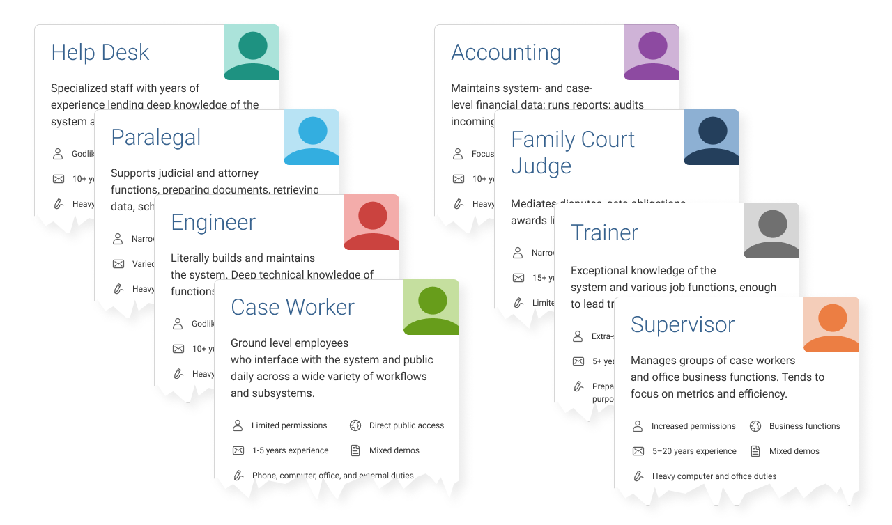
While roles and permissions were more salient attributes, we could still draw some demographic conclusions for several of them, plus chart similarities amongst groups of roles.
This allowed us to conquer and divide certain aspects of the work, and tailor specific solutions with those users in mind.
Initial conversion research
For converting the legacy app, we partnered with engineering to research the technical feasibility of several platforms, frameworks, methods, etc., and conducted usability testing of each via simple prototypes.
Except for one described below, each option disqualified itself by exhibiting 508 compliance issues, technical incompatibilities, or some obvious usability flaws…explore a few of them via the below prototype.
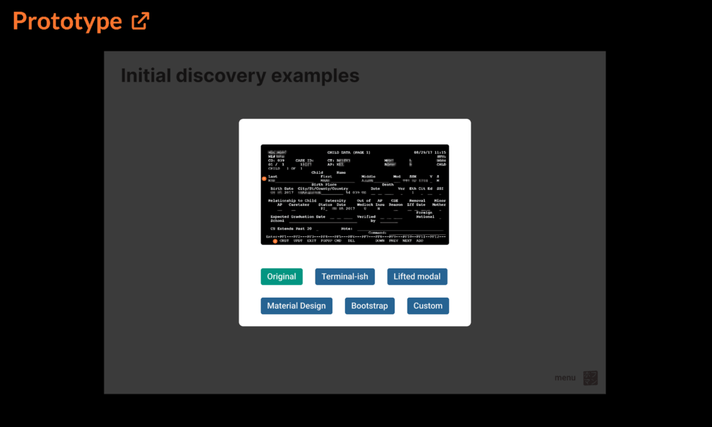
The winning formula
Labelled “custom” in the prototype above, the chosen solution evolved from one of the unusable Bootstrap options, introducing (controversial) modals to solve both usability and technical issues.
- neatly organizes all data into logical and semantic/structural sections
- also uses simple one- or two-column formatting for legibility and responsiveness
- improves whitespace ratio AND uses less space to present information
- clearly separates modes of data interactivity (read-only vs editable/adding/deleting data)
- clarifies actions available for each section
- zebra stripes display data
- editable fields in modals organised and aligned to a common grid
- introduces safety measures before permanently deleting data
- removes ambiguous abbreviations
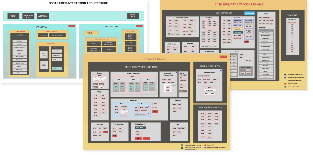
Building UX infrastructure
Beginning with team white boarding activities, our infrastructure consisted of three primary pillars: standards & patterns, components, and documentation.
Standards & patterns
CRUD, or Create, Read, Update, Delete served as our standards baseline, mainly because those database interactions represented everything our users would experience with the system.
CRUD also made sense because the legacy software relied exclusively on various “modes” that generally equated to one of the database interaction methods.
While we would have loved ultra-modern, edit-in-place fields, technical constraints (eg form validation logic, 508 compliance, error message handling, etc) dictated we use modals to clearly define for users which CRUD method they were currently interfacing.
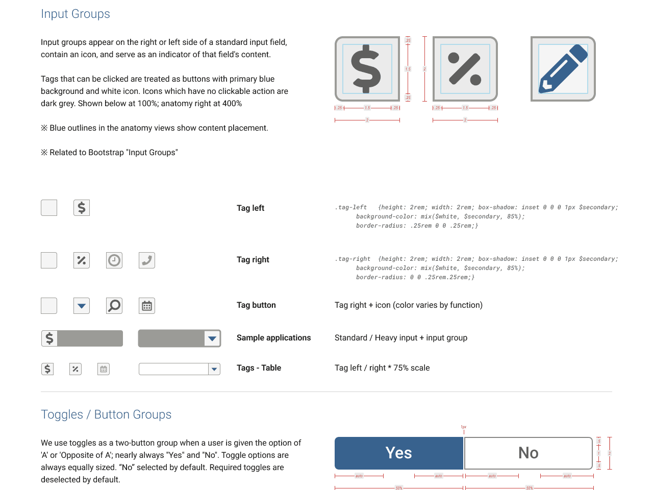
A few excerpts from a much larger body of governing standards:
Create/Add
- New/blank pages:
- If no records have been entered yet, design the page as if it has at least one, and provide the necessary modals to enter data.
- For screens with empty tables, provide the empty table with a “No records to display” type message.
- Expandable tables/Accordions:
- Text button to add rows/records should be located directly underneath the last record, to the right.
- Add buttons inside an accordion or expandable table drawer should add content inside it (not add a new row or accordion).
- All other adding:
- Use a text button in the lower-right corner of the relevant group where the data or record will be added.
Read/Display
- Accordions
- used for groups of data, especially when tabs would be impractical (e.g. dynamic content, excessive quantity)limited to ten (10) instances per screendefault state is (all) collapsed
- no recursive use (accordions inside accordions)
- may contain tables and tabs (conditions apply, below)
- Tables
- regular tables are limited to six columns, including buttons and icon buttons, for an average of two (2) bootstrap columns each
- each button requires at least one (1) bootstrap column
- define & prioritize key data pairs to be represented in columns, convert and move remaining data to display-only label/value pairs inside the expandable areathe expandable widget always uses one of the six columns; allowing for five (5) additional columns
- expandable tables may not contain accordions or other tables
- regular tables are limited to six columns, including buttons and icon buttons, for an average of two (2) bootstrap columns each
- Links
- used only for navigating to other pages or external content/sites
- may not be used to trigger modals or actions (use buttons instead)
- Tabs
- use to strategically shorten long or organize consolidated pages
- must be static (not dynamically added or titles changed in any way)
- must safely fit horizontal space on all media types; no stacking
- use a dropdown in cases where data are dynamic or will exceed the available horizontal space
- only one (1) set of tabs may be present at a time per layout
- cannot use tabs within tabs, or rows of tabs in multiple sections of the same screen)
Update/Edit
- Input fields
- fields which write to the database must appear inside a modal
- fields which do not write to the database (e.g. search/data filters) may appear inline/outside of a modal
- Tables
- regular: use a text or icon button in the right-most column to trigger a modal for that row; one button per bootstrap column
- expandable: proper text buttons (icon buttons should not used) inside the drawer, so user can see all relevant data before editing
- buttons in the row or inside the drawer relate to the data inside it; buttons beneath a table apply to it in whole
- Display mode data
- sections should include the appropriate tiered header, and be separated by an HR – horizontal ruleeach section with editable data should have its own text buttons appropriate to the available actions
- multiple sections can be grouped inside a single modal using tabseach tab in a modal correspond to a unique button in display mode, the tab title should match the section title
- buttons should open to the corresponding tab in a modal
- sections should include the appropriate tiered header, and be separated by an HR – horizontal ruleeach section with editable data should have its own text buttons appropriate to the available actions
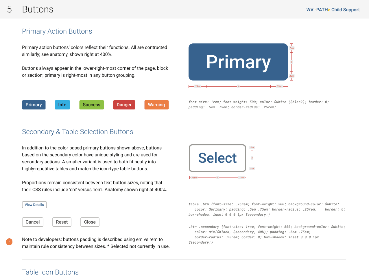
- Buttons
- always in lowest-right corner of page, section, or block
- always trigger actions / modals
- labels are an action / verb (update, save, close, cancel, submit, etc.)
- primary action is always right-most
- secondary / other actions should be to the left of primary buttons
Delete
- always use a modal to confirm any destructive actions to database
- include relevant data that will be deleted for review
- do not trigger a delete action inside another modal
- we cannot trigger multiple layers of modals
- we frown upon universe-collapsing modal-ception
The legacy software did not have any safeguards against permanent deletions, often to the chagrin of users and help desk operators fielding frantic calls hoping to recover accidentally deleted content (which they cannot). For this reason, it was imperative we introduce at least minimal safeguards. Ours not only require a confirming action, but give the user the opportunity to review precisely what they are about to permanently delete.
This was also where we reinforced to the UX team not to design recursive modals, or “modal-ception” for those familiar with the similarly titled Christopher Nolan film. Not only did our platform not technically support this, given the audience, we absolutely did not want to confuse the user, and instead maintain purity between the CRUD methods. Update is only for editing, Create is only for adding new data, and Delete is only for removing.
Additional context & detail
Due to the sheer volume of data on many screens, common instinct—even for experienced UX designers—is to parcel them away behind layers of various interface widgets.
Our target audience (primarily mid- to late-career professionals) was accustomed to straightforward display of information a la the legacy system and not reliably proficient in common app widgetry of 20XX. Obviously every click reduces efficiency, but with every layer of hiding data or functionality behind interface widgets, we risked confusing and frustrating users by making more difficult what never used to be.
Therefore, we wanted to explicitly define and limit those tendencies to conceal information. This included strict rules for how different expandable components may be used alone or in combination.
Links vs buttons
After discovering some of the agency’s systems using text links and buttons interchangeably and often for wildly different ends, we sought to clarify use patterns for a more consistent experience (a 508 concern).
- Buttons trigger actions, and never for navigating between pages.
- Being actions, button labels must contain a verb
- Links only navigate to other screens, and never trigger actions or modals.
We also defined placement for buttons, so any and all actions could be quickly identified.
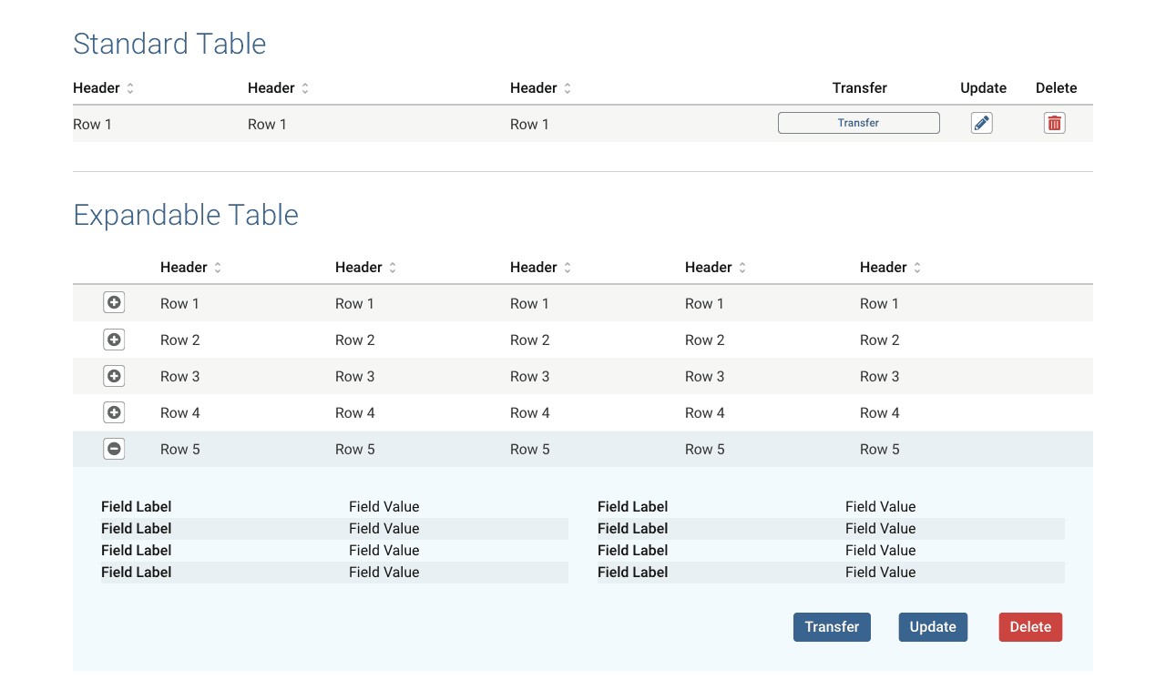
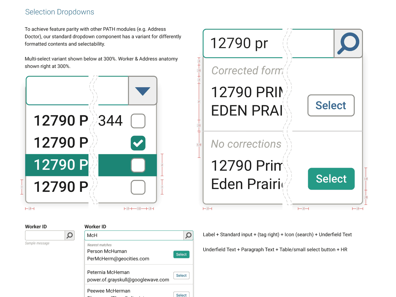
Tables
Ubiquitous throughout the system, we defined 2.5 table variants, largely to work nicely with the columnar flex box model.
The extra half variant really meant converting each table row into a card for mobile screens.
- A traditional table of rows and columns for simple purposes;
- A table with an expandable drawer that opens beneath the row to reveal additional data that would otherwise exceed the limitations of a traditional table.
- Careful consideration was given to data prioritisation; which would be columns in the main row and which inside the drawer.
We were also mindful of user focus and scope when it came to triggering actions.
- Simple tables showed all of the data in each row, so actions could be shown alongside it; in the same row.
- Expandable tables place lower priority data in the drawer, so to prevent users from accidentally deleting anything without seeing the full context of the row’s data, all action buttons also reside inside each row’s drawer.
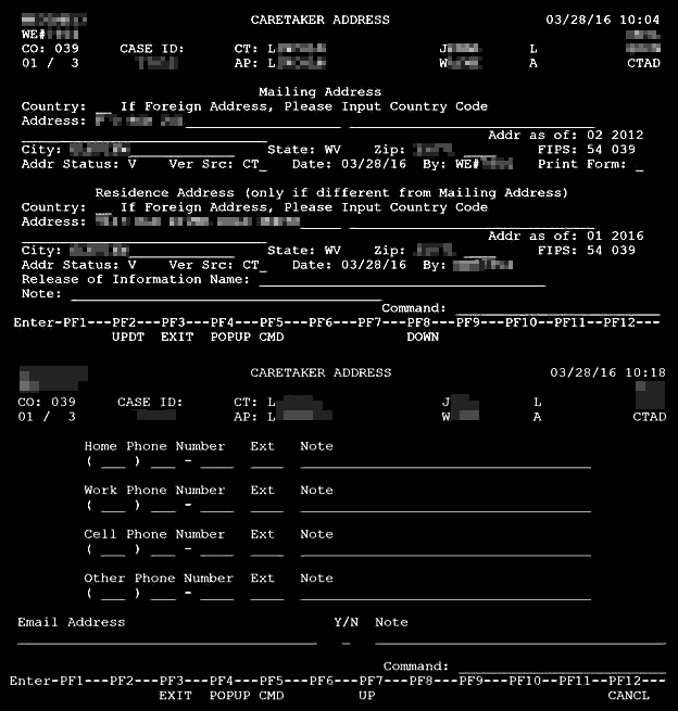
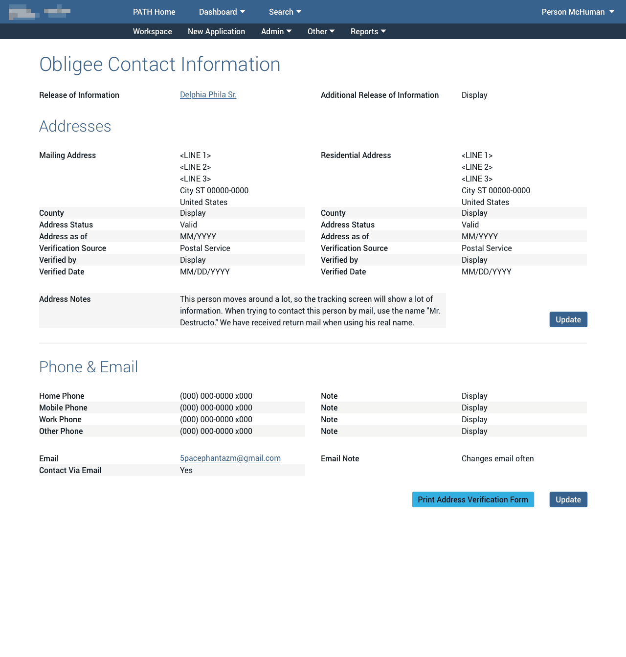
Modals
Information in legacy usually consisted of fields jigsawed and truncated to fit a single terminal window, with little rhyme or reason, making reading or finding information a chore.
Editing data however was straightforward: press the PF2 key and any editable fields would change from blue to green. When finished, press another key to save and exit update mode. The only failure here might be relying on changing text colour alone for accessibility reasons.
Vocally disliked by many, modals aptly solved switching from display mode to something like editing. We could neatly organise data into sections and columns, give users relevant actions per section, and then collect any modifiable fields into a single, focused, and labelled modal window.
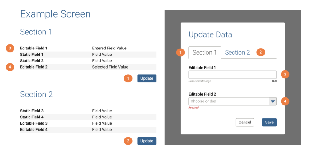
By including only the editable fields, users have a focused Update experience.
1 & 2. Buttons in each section correspond to a modal tab with the same label.
3 & 4. Only editable fields appear in the modal.
Gathering all editable fields to perform a specific action also solved a technical issue as all fields needed to validate together upon submitting the form.
We could also use modern UI widgets to deal with groups of information in ways not possible previously. Large section titles, columns, tabs, accordions…they all translated neatly to tabs inside a modal.
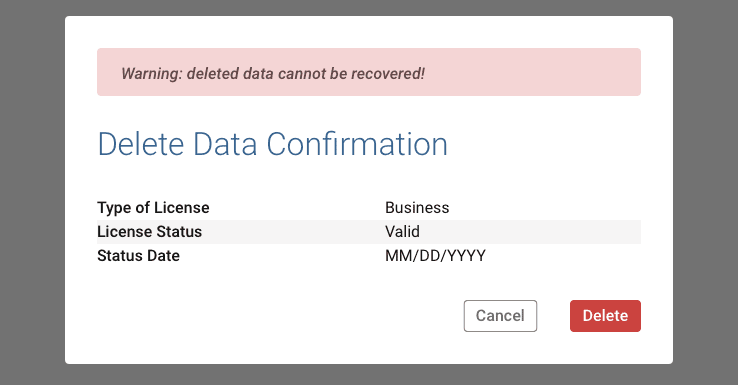
Curiously, the legacy system had virtually no methods to protect against accidental erasure of records. Modals allowed us to inject a confirmation step across the system and also clearly display specifically what would be permanently deleted.
Hydrogen design system
For PATH, it was imperative we resist the temptation (and frequent external suggestions) to introduce superfluous visual frills and other whiz-bang distractions like animations, graphics, or other elements better suited for social media sites and trendy smartphone apps.
Our primary duty was to maximise the efficient use of public monies by a government agency.
Aaron Hoffmann
Hydrogen represents not just a clever name for an atomic system, but thematically as the ultimate vision of simplicity.
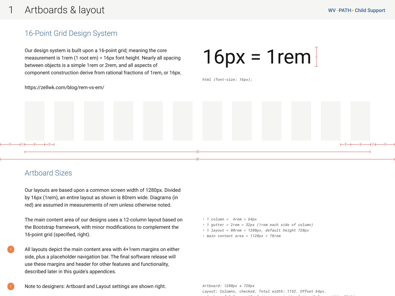
A 16-point atomic system
Our initial discovery found a commonality across virtually all personas: middle-aged, often with decades of experience…and eyeglasses to show for it.
Most modern software tends toward tiny text in effort to pack a screen with more of it, and indeed PATH being primarily text-based meant using that as a foundation for the design system made a lot of sense.
Therefore, our very first decision set the font size at 16px. Perhaps colossal to some, it coincidentally matches the recommended minimum, according to official US government web design system.
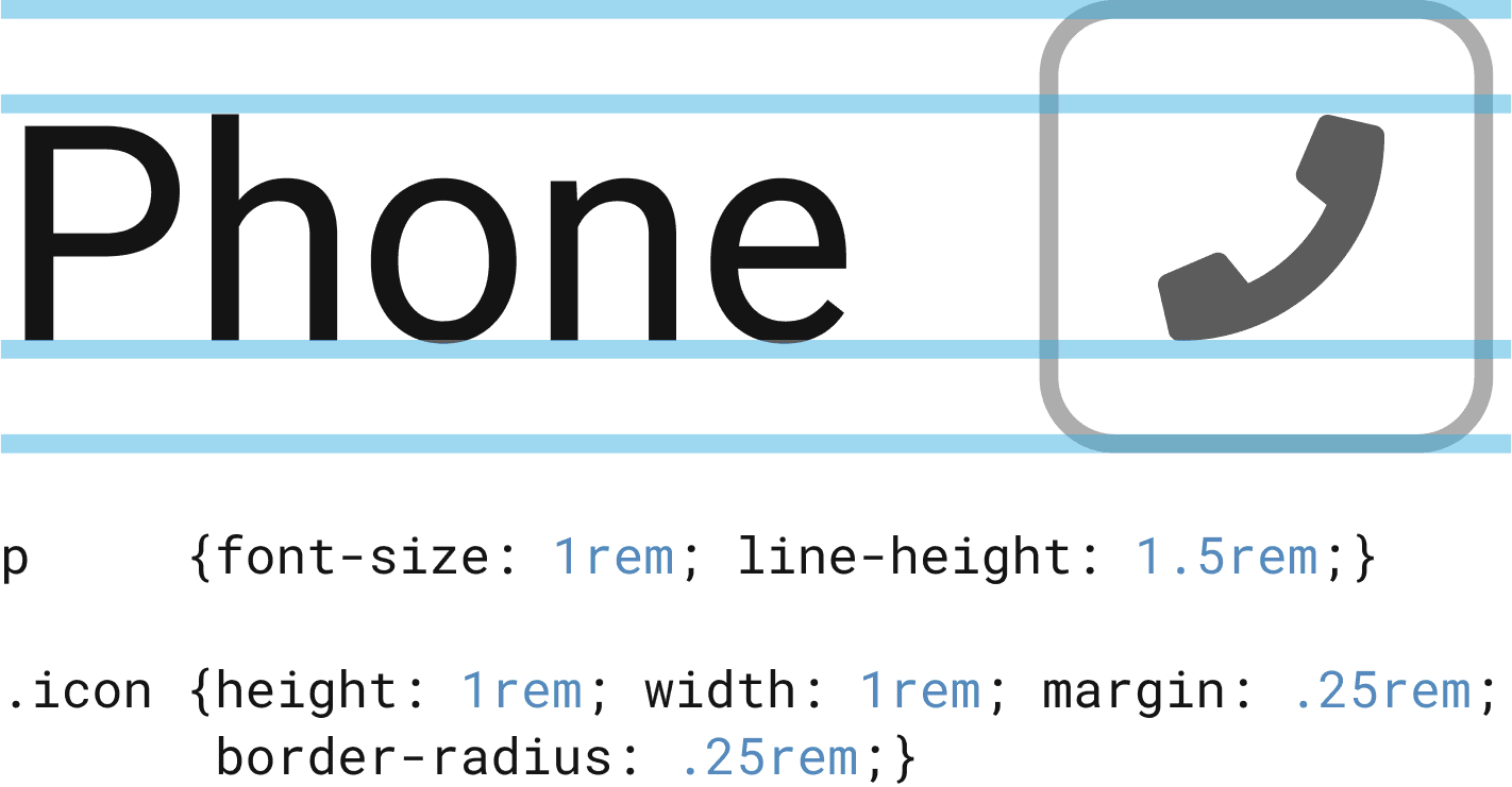
So for PATH, our Hydrogen atom was 1rem = 16px.
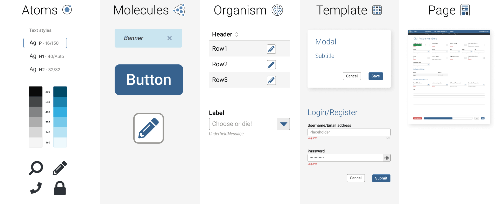
Displacing the ubiquitous “8-point grid”, which refers only to the spacing between objects, Hydrogen exercises our core text atom by basing virtually every aspect of the design system on it.
Spacing, border radii, margins, padding, columns and gutters, even the colour grades scale in increments of 16.
As someone capable of hand-writing both HTML and CSS, understanding how our components would/could eventually be built in code heavily influenced my decisions.
Constructing components
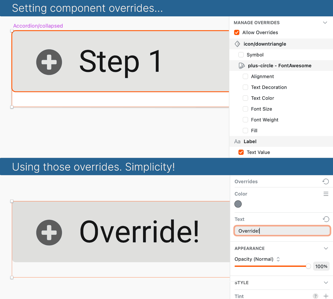
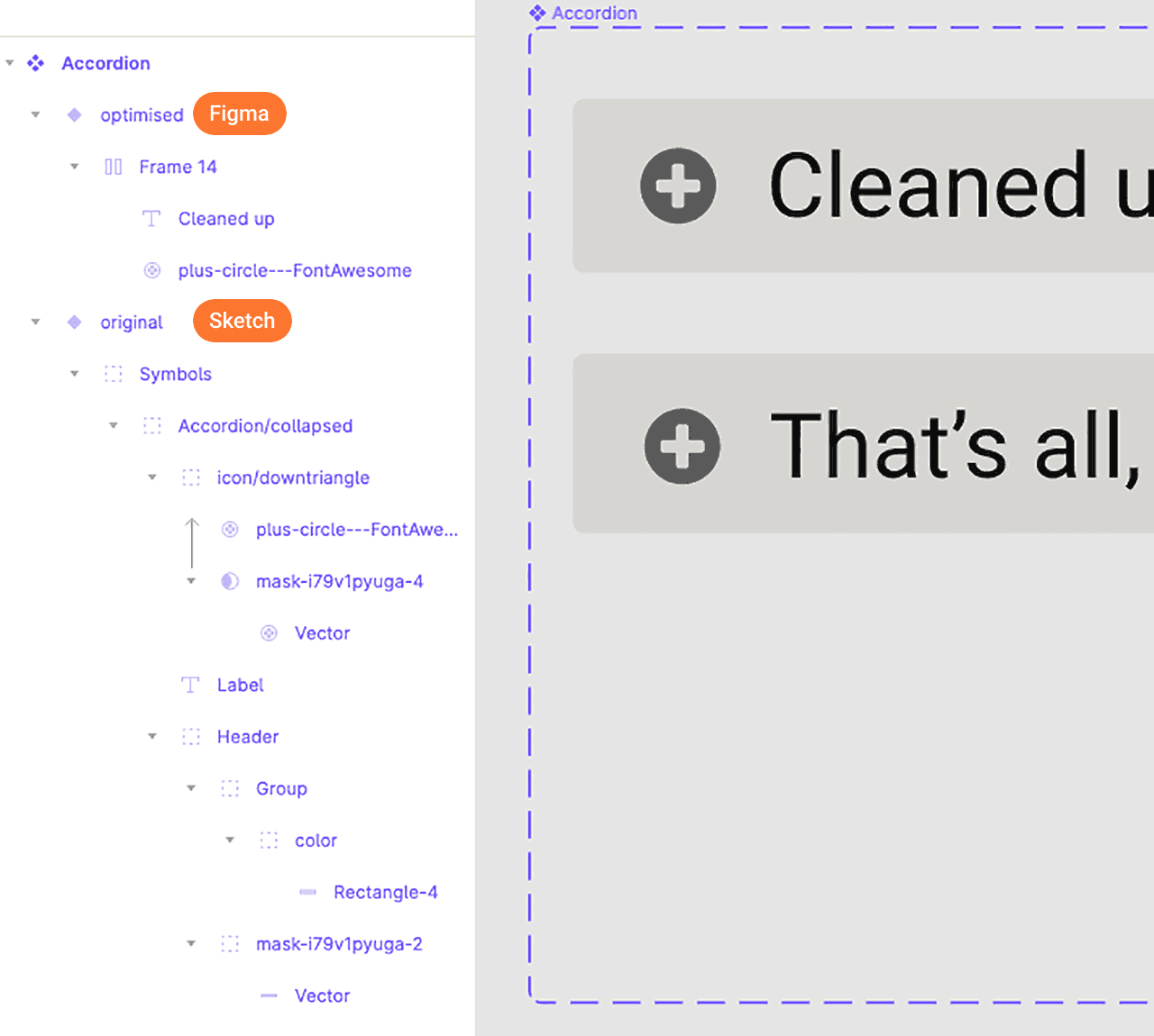
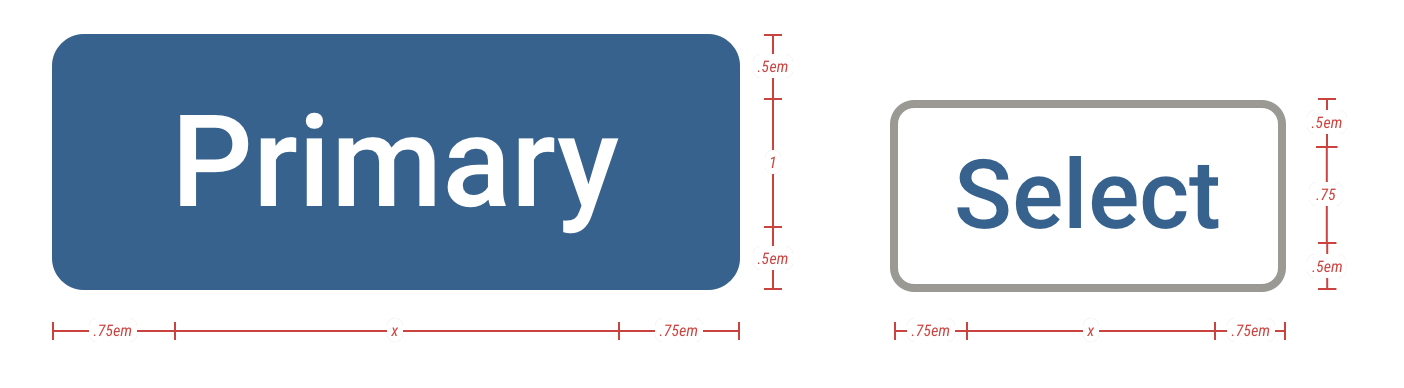
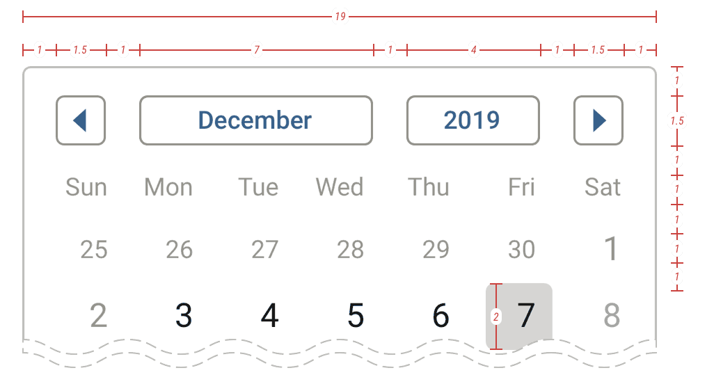
Below, a look at building components between Sketch and Figma. The key to good components is thoughtful attention to detail: efficiency, flexibility, and anticipating broad usage.
Hydrogen Documentation
Standards and patterns: ✅
Component library: ✅
Literature explaining it all: 🦗🦗🦗
Unfortunately management saw no point. “Design system? What’s that? Component library? Huh!? Style guide? More graphic designer prima donna hogwash!”
However, as an indefatigable optimist, I undertook these things anyway…on the DL and without approval. Not from a rebellious bent, but because I couldn’t stand to intentionally work inefficiently nor allow teammates to either.
A year later, these covert efforts paid off when management realised they needed documentation (and the rest of that “hogwash”). Cue muted words of appreciation.
This forethought helped build some credibility for our team, and got a foot in the door for additional UX advocacy. But I digress…
Anyway, we published two sets of documentation, one for engineers and one for a general audience. The former focused on specs; the latter upon explanation and demonstration.
Engineering edition
As with the components themselves, the documentation starts with the atoms and builds molecules, organisms, etc.
I have the CSS in mind whilst building components, so I often include excerpts, especially if suggesting SASS transformations or tokens, which would not be obvious simply from inspecting a design in Figma/Sketch.
Because we knew it would be displayed on a second monitor like our wireframes, I formatted this guide the same as our wireframes: landscape 1280, even using the same 12-column bootstrap grid.
General edition “Ultraguide”
Yes, we actually called it the Ultraguide internally, as it was meant to be all-encompassing; everything to everyone. Because we anticipated heavy printing, I formatted it portrait 8.5×11″.
Also built with an atomic mindset starting with the basics and building up complexity, this guide included orders of magnitude more explanation, do’s and don’ts, and guidance.
Seriously…I regularly received emails asking if we could include “a (whole??) page” on something as specific as defining date/time formats, because while built into the components for engineers and designers; BAs, managers, state officials needed this guidance.
Don’t get me wrong, I love pedantic detail, and when it comes to a large product with hundreds of moving parts and dozens of teams, one can never really be too prepared for delivering consistency.
Design artefacts
I shall break down a number of specific contributions, briefly describing the work and success of each.
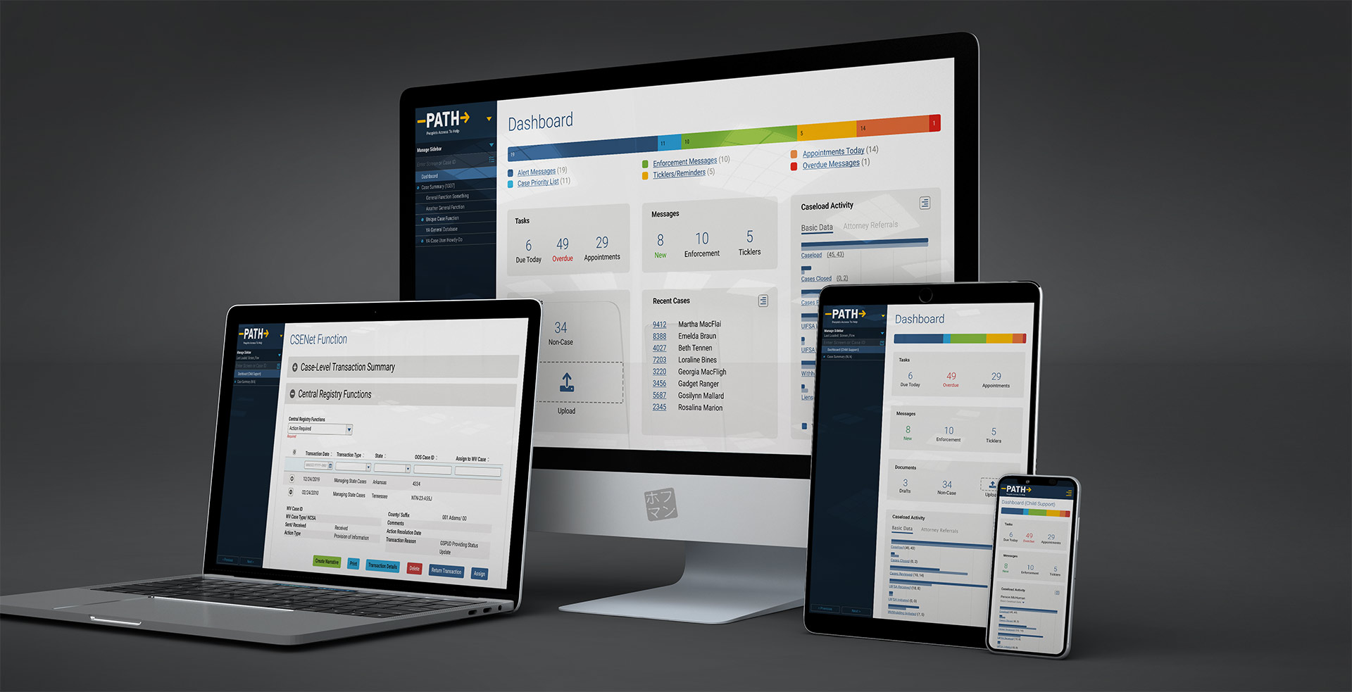
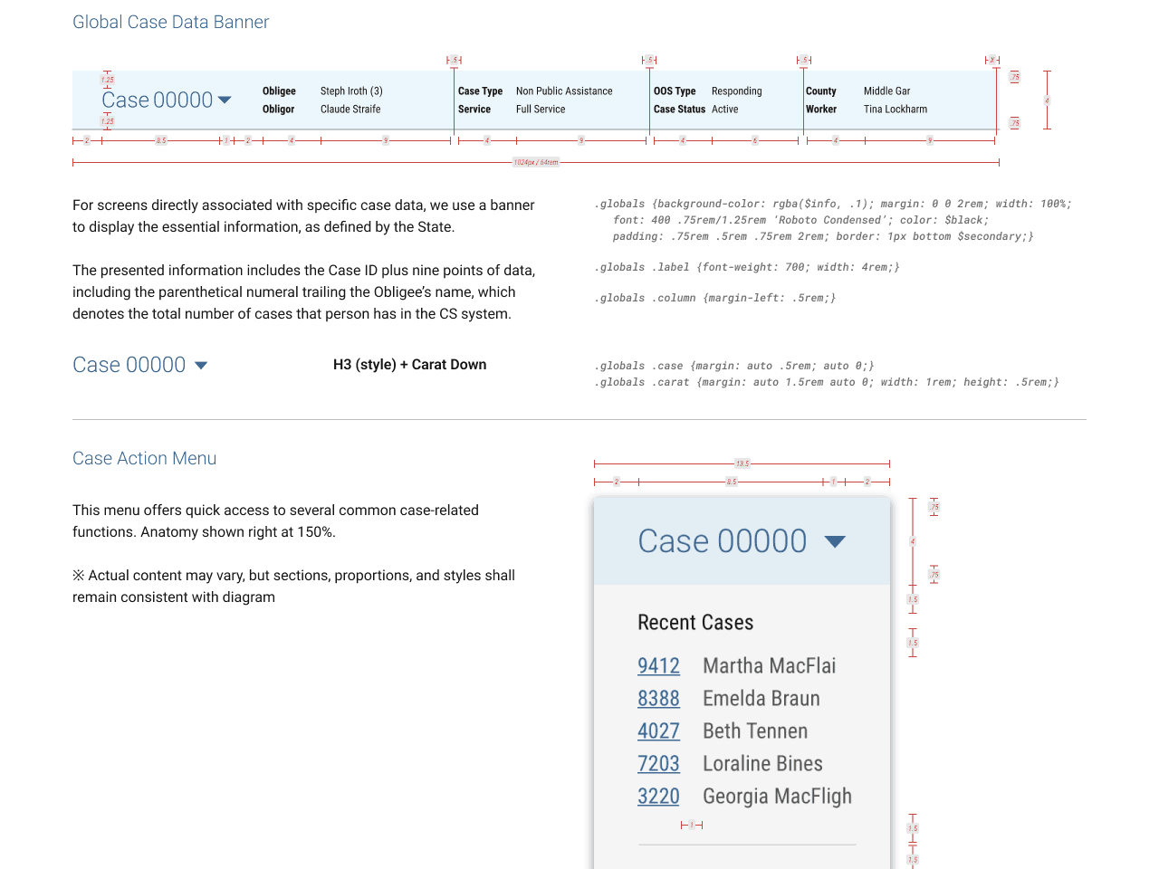
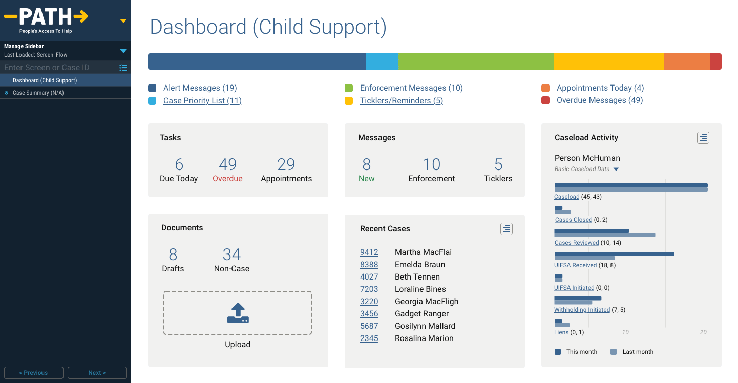
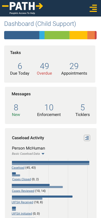
Dashboard
The legacy software never had a proper dashboard to welcome users when they logged on, only a rudimentary directory of high-level functions in curious disarrangement.
Even worse, most case workers started their sessions by visiting a variety of functions to check constantly-changing statistics, messages, alerts, etc. and assess their priorities…aka what should be on a dashboard.
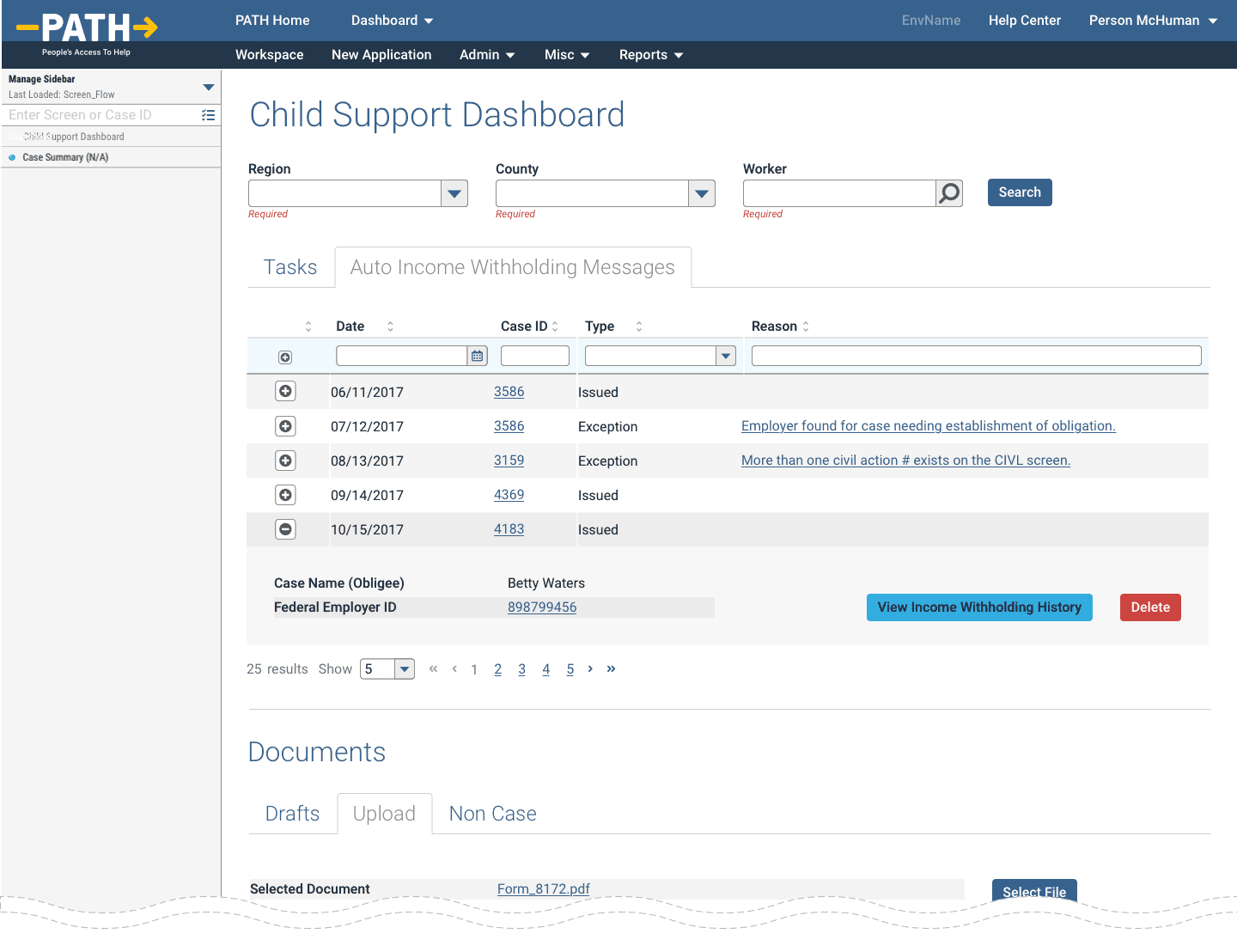
Our junior designers created an interim dashboard that survived most of the project’s lifecycle, mostly as a receptacle for weekly requirement changes.
Unfortunately, simply labelling a screen as such does not a dashboard make. While I helped maintain the interim design, it did not receive my final design pass and polish until just before heading to QA. Apparently, designing this last can actually make a big difference.
The interim design failed by having no information at a glance and a completely unresponsive design.
As we’ll see further below, the latter was partially a burden of the overall navigational construct, but the former completely solvable within the dashboard itself.
Essentially, all of the tables and widgets reduced to cards and their high level summaries which could be accessed in greater detail with a click/tap.
While we valiantly fought against all efforts to introduce superfluous graphical fluff, users reacted favourably to the colourful bar graph and even I can concede that it further simplified the ability to read the highest level at a glance.
Navigation
Coming soon!
New Application
While overall a non-linear system, one workflow officially defined by the State was for new applicants. It included
- up to 30 steps (actually just special versions of thirty otherwise standard functions)
- could take up to an hour
- timed out after an alarmingly brief period of inactivity
- allowed no backtracking or error correction
- nor a way to save drafts and resume later
If a case worker needed to backtrack, error correct, take a 10 minute phone call, etc they had no other option than cancel and start again from the beginning. Especially painful if they were near the end.
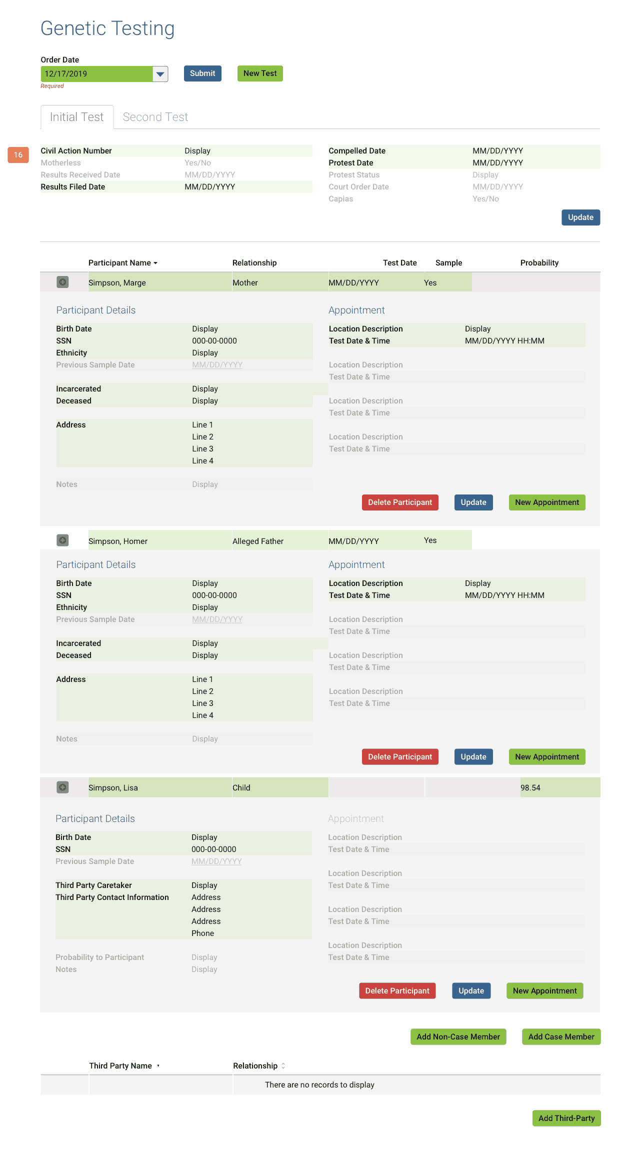
Without explicitly detailing each win, I will say that after nearly two years of work, all the above bullet point issues did get corrected.
The yellow arrows all point to my solution, which condensed and simplified everything to a single screen that could be finished in a scant few minutes, allowed error correction, and even drafts for resuming later.
To be continued…
CSENet
Coming soon!
Sub-topic link to mini-case study of process
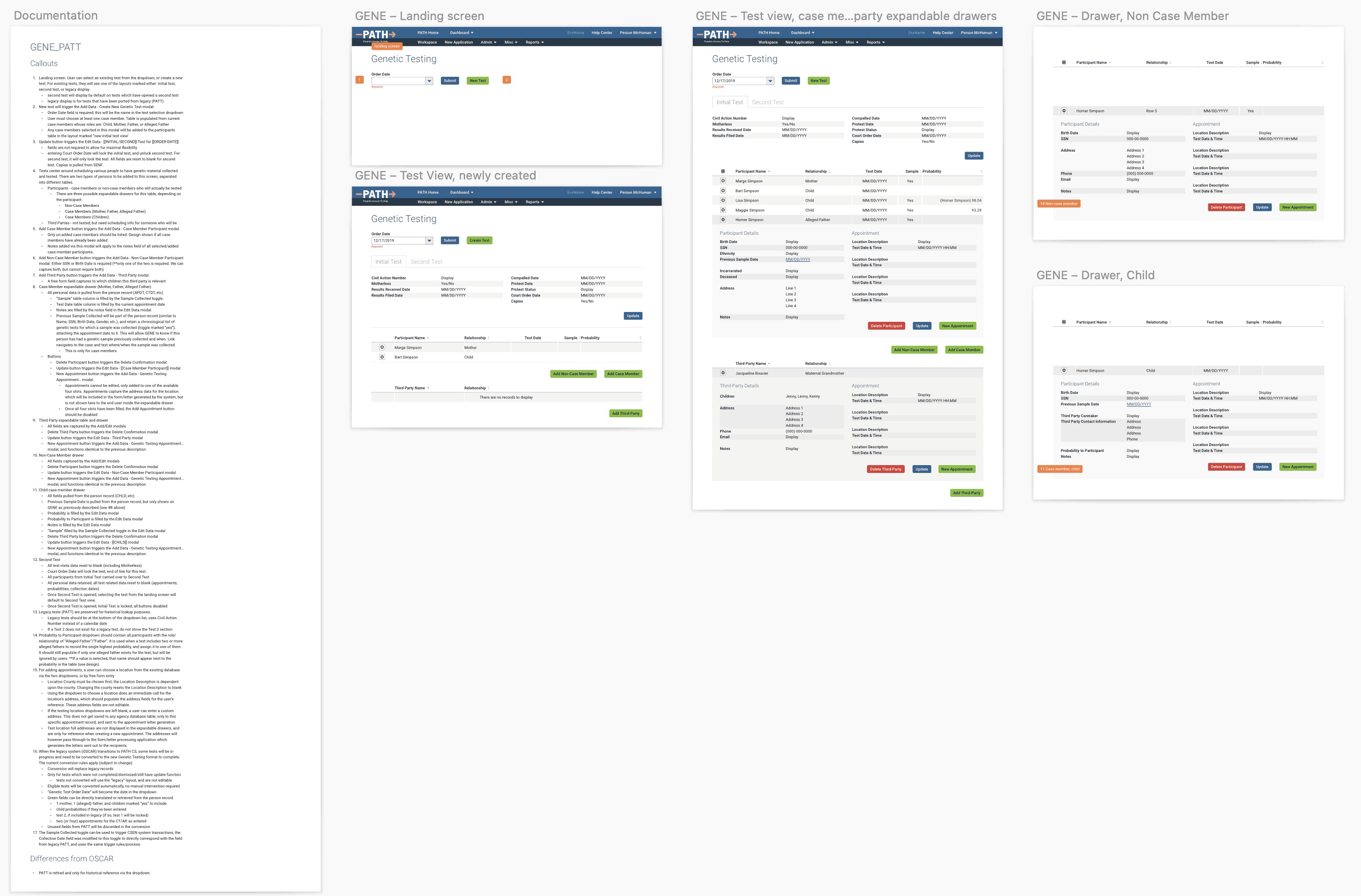
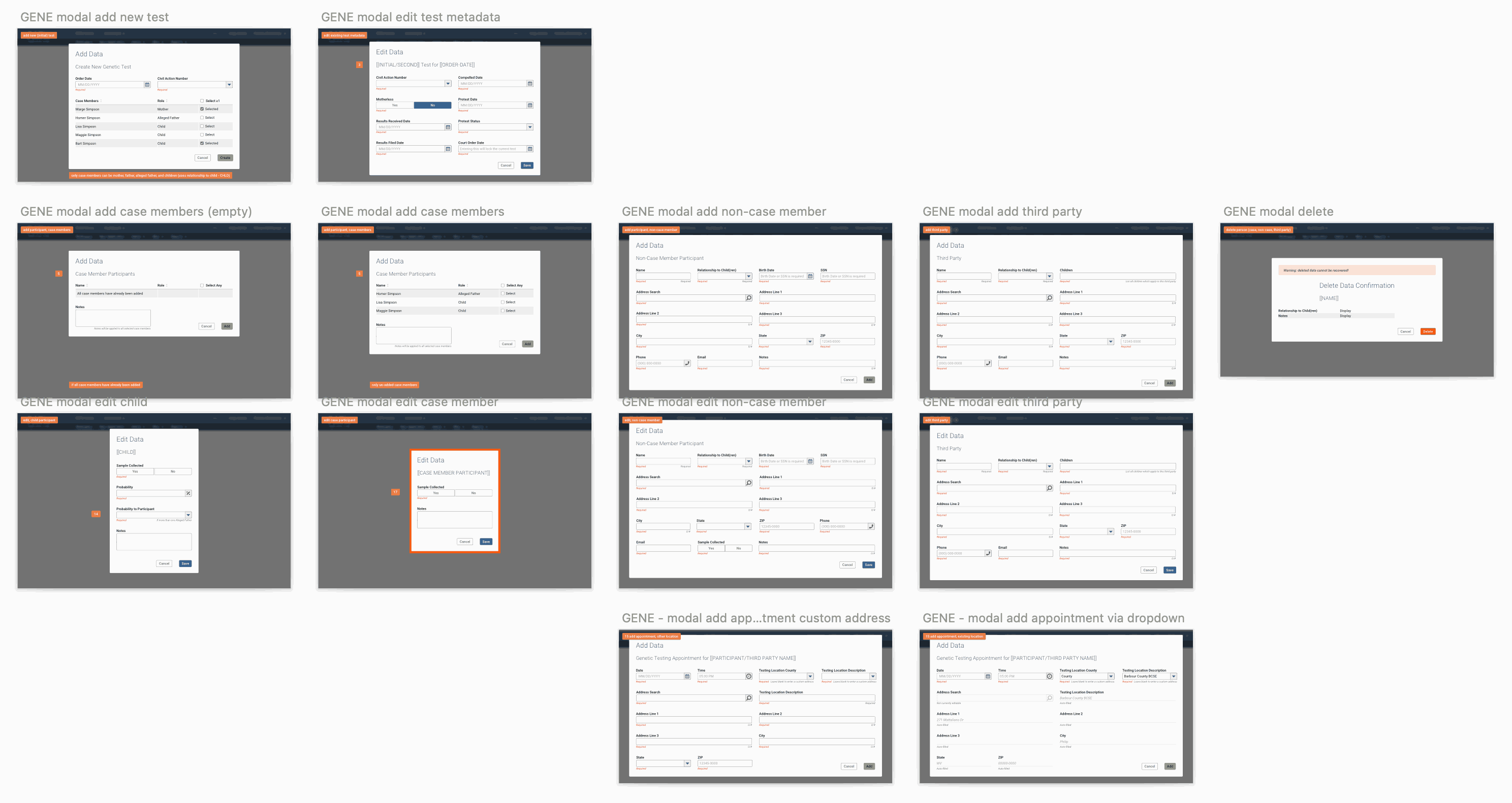
Genetic Testing
Paternity testing is a core function for establishing child support and other legal proceedings, so it’s a wonder the legacy screen lasted as long as it did.
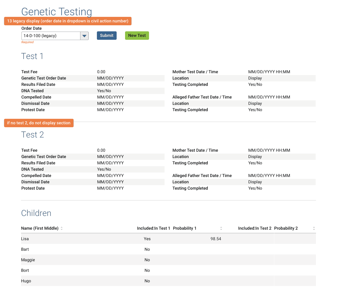
Despite a faithful translation of the source material (PATT fig 1 below, left), in order to satisfy years’ worth of accumulated new certification requirements as well as legal and administrative needs, this function needed a complete overhaul.
In addition to simply being sorely outdated by legal and federal standards, an ugly usability issue laid hidden beneath the surface (PATT fig 2 above, right).
Looking at fig 2, one sees the rows of steps required to successfully enter a test into the system. While a complex user flow is not an issue in itself, the fact that each step required the user to revisit the screen multiple times across multiple days and know precisely which fields to fill out and in which order…most certainly an issue.
We began by interviewing SMEs and collecting all internal, federal, and legal requirements. A few of the high level needs for the function to satisfy its myriad requirements:
- allow administrative tests (legacy required a civil action be filed first)
- allow greater flexibility in test participants (legacy was limited to the disputed parents and children)
- allow greater flexibility for addresses, both participants and testing locations
- allow greater flexibility and options for scheduling tests (legacy allowed one reschedule/correction before locking itself)
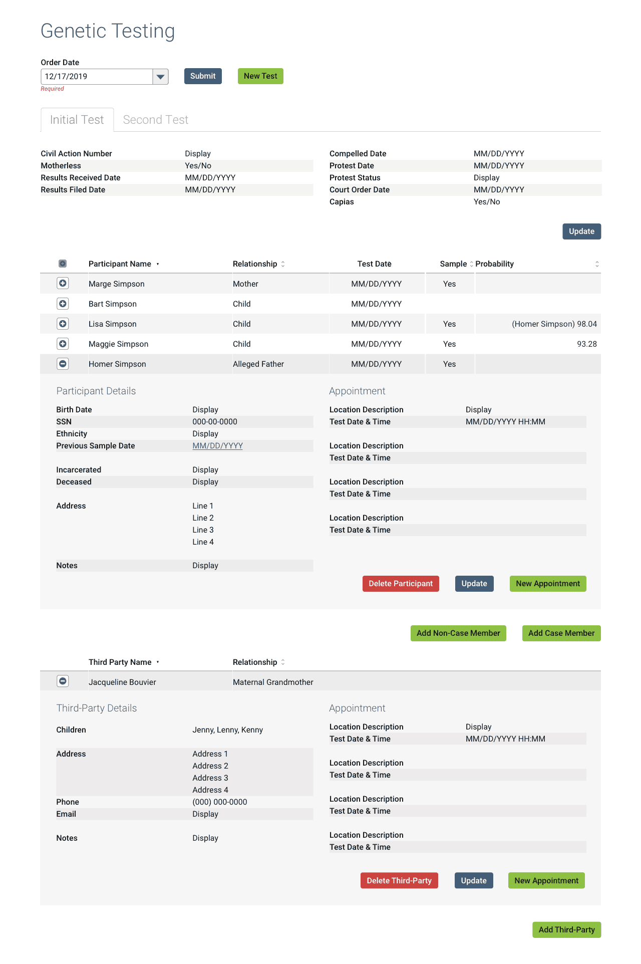
One of the major issues was how the new system would incorporate legacy tests, as that data must legally be retained. Details of the solution:
- All new tests must be the new format.
- I created a custom, read-only layout for any completed legacy tests in the database.
- Any legacy tests still in-progress on the system switchover date would be automatically converted to the new format.
- I created a legend for developers detailing how the legacy fields map to the new version (shown above), along with other technical documentation, spreadsheets, etc.
Over the course of 9 months, multiple formal presentations, user validation sessions, etc.; I completed the brand new Genetic Testing screen, replete with developer and user documentation.
Mission accomplished! 👍