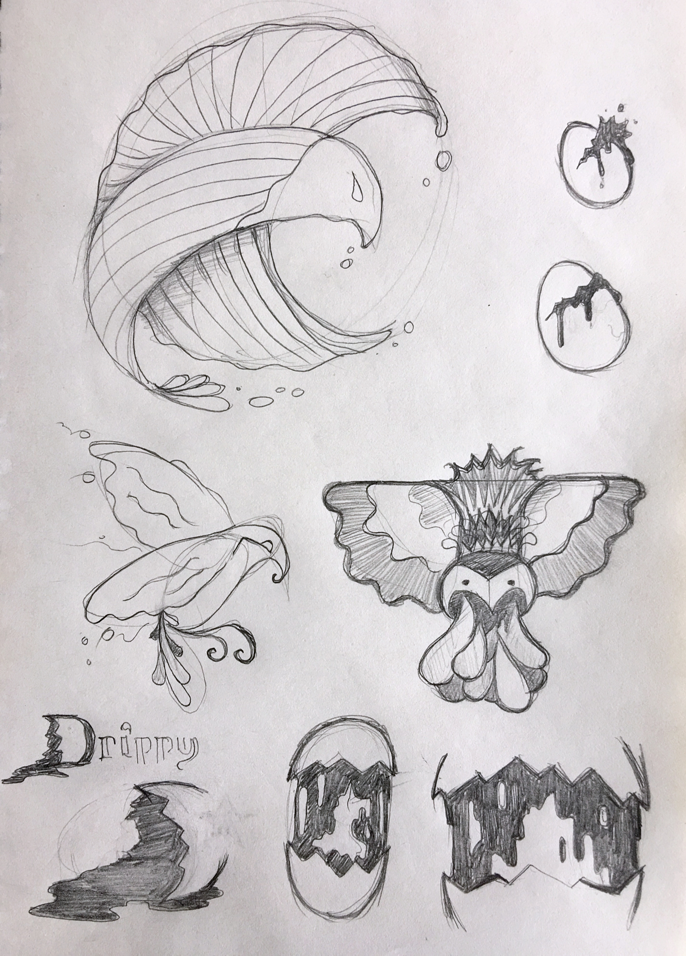
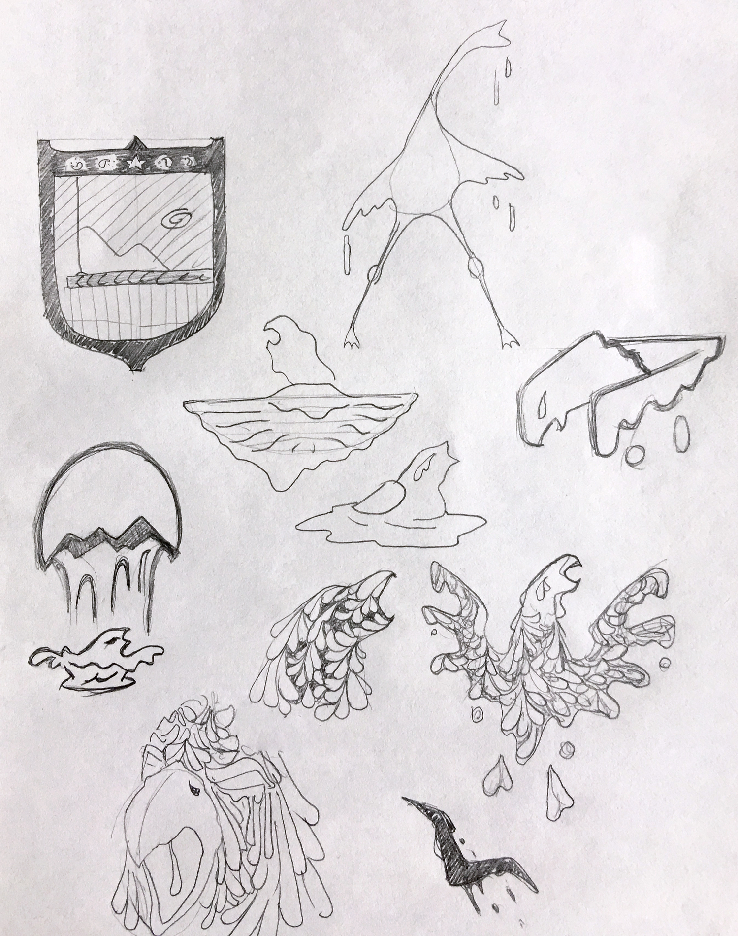
Well that was quicker than expected. I wound up churning out a couple pages of ideas based on the original Drippy Bird “Unscribble”. I just felt that was less of a logo/brand identity and more of a crap illustration, yet still an idea that deserved a proper execution.
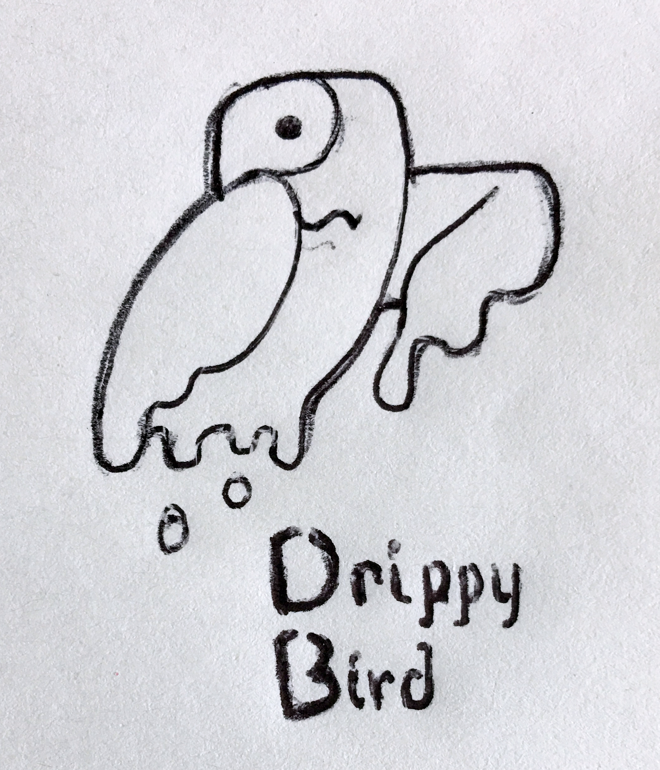
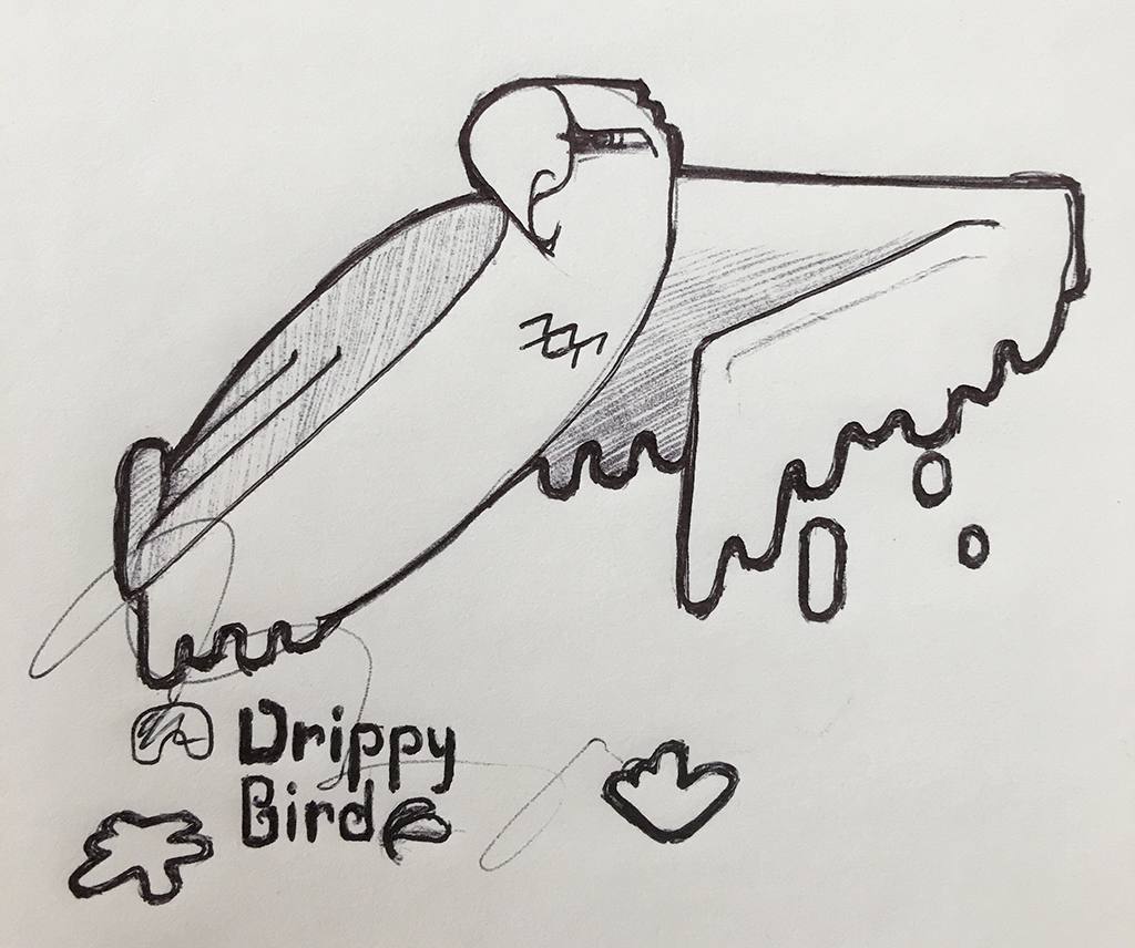
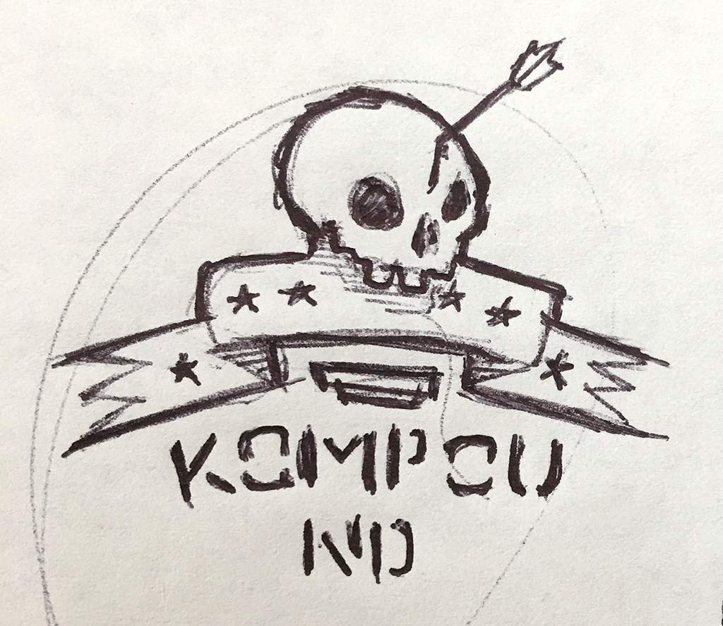
Among the three images below, a few solid core concepts could be selected and fleshed out further, but I’m happiest with the final image: a single, simplified version of the original mark.
Thoughts?