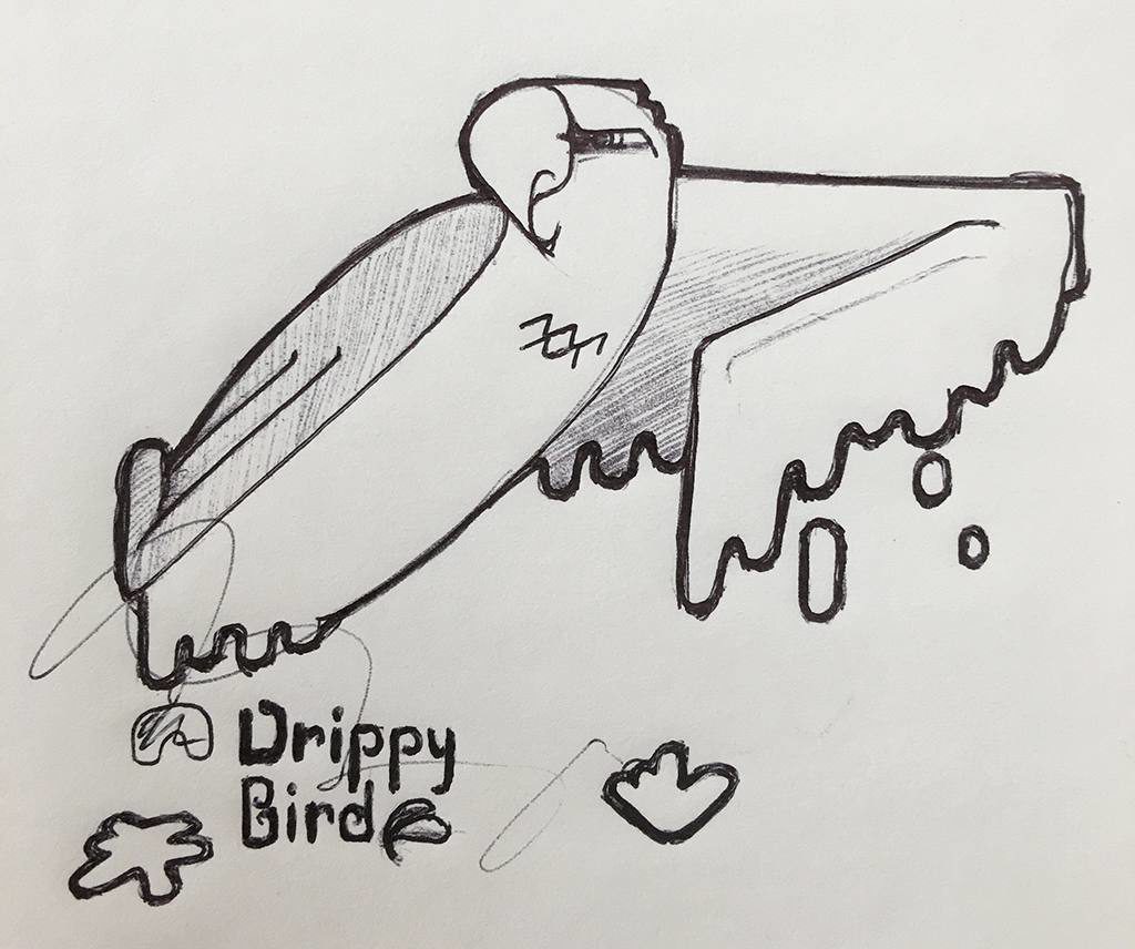
This might very well be my least favorite of the series so far. I think the idea is there, but the visual execution could use a lot of refinement. If I find myself with a bit of free time between thoughts and tasks, I’d really like to push this one. The bird’s pose can be toyed with a bit, maybe verging on a phoenix, but the little flourish after “Bird” in the word mark might be the key to a visual language in this brand identity.
So Drippy Bird. It’s an outdoor goods brand that specializes in keeping those with adventurous spirits dry. Sounds like it could be a park maintenance technician’s cleaning agent of choice, but no; that’s an adventure of a completely different nature.

