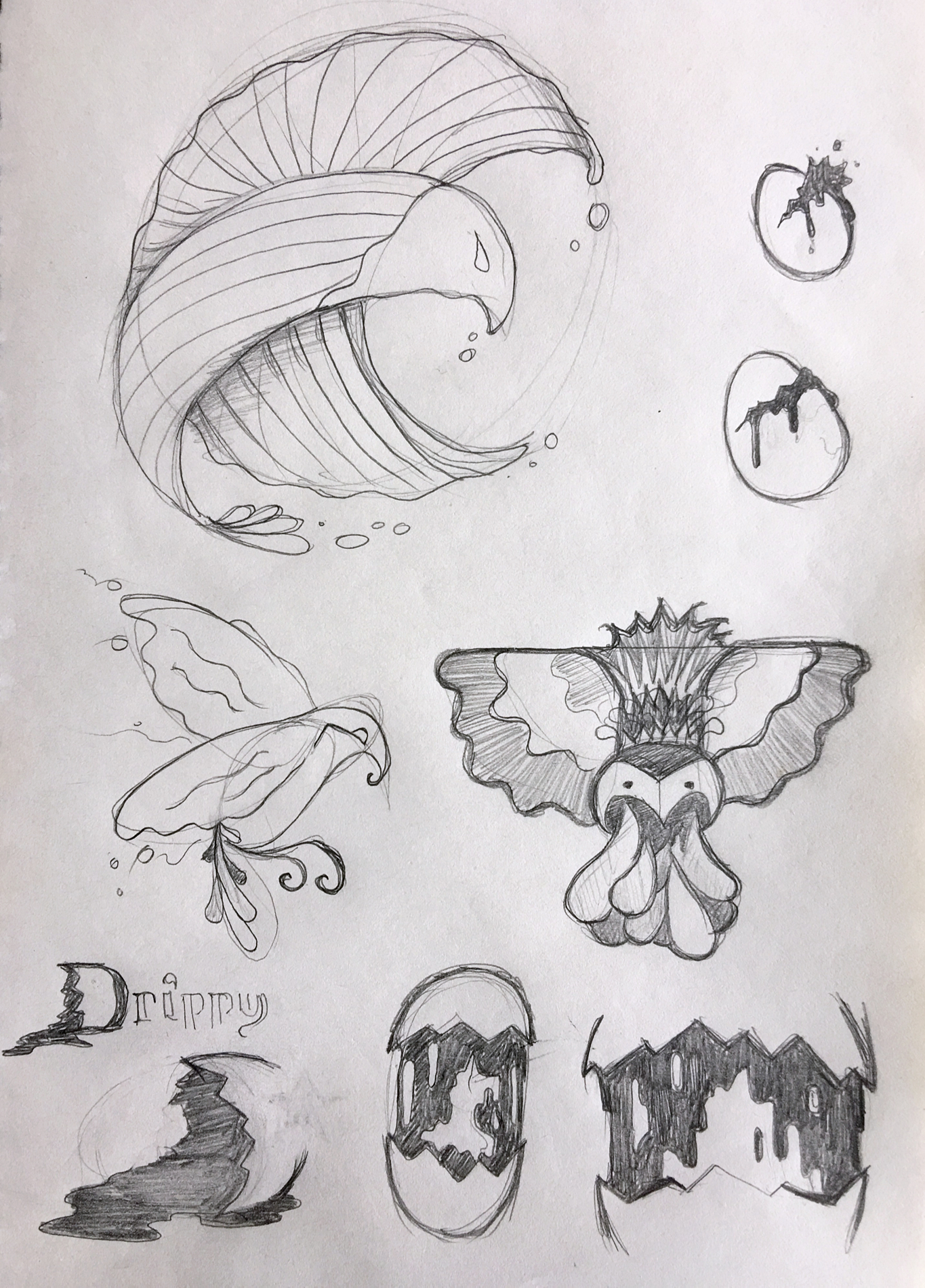
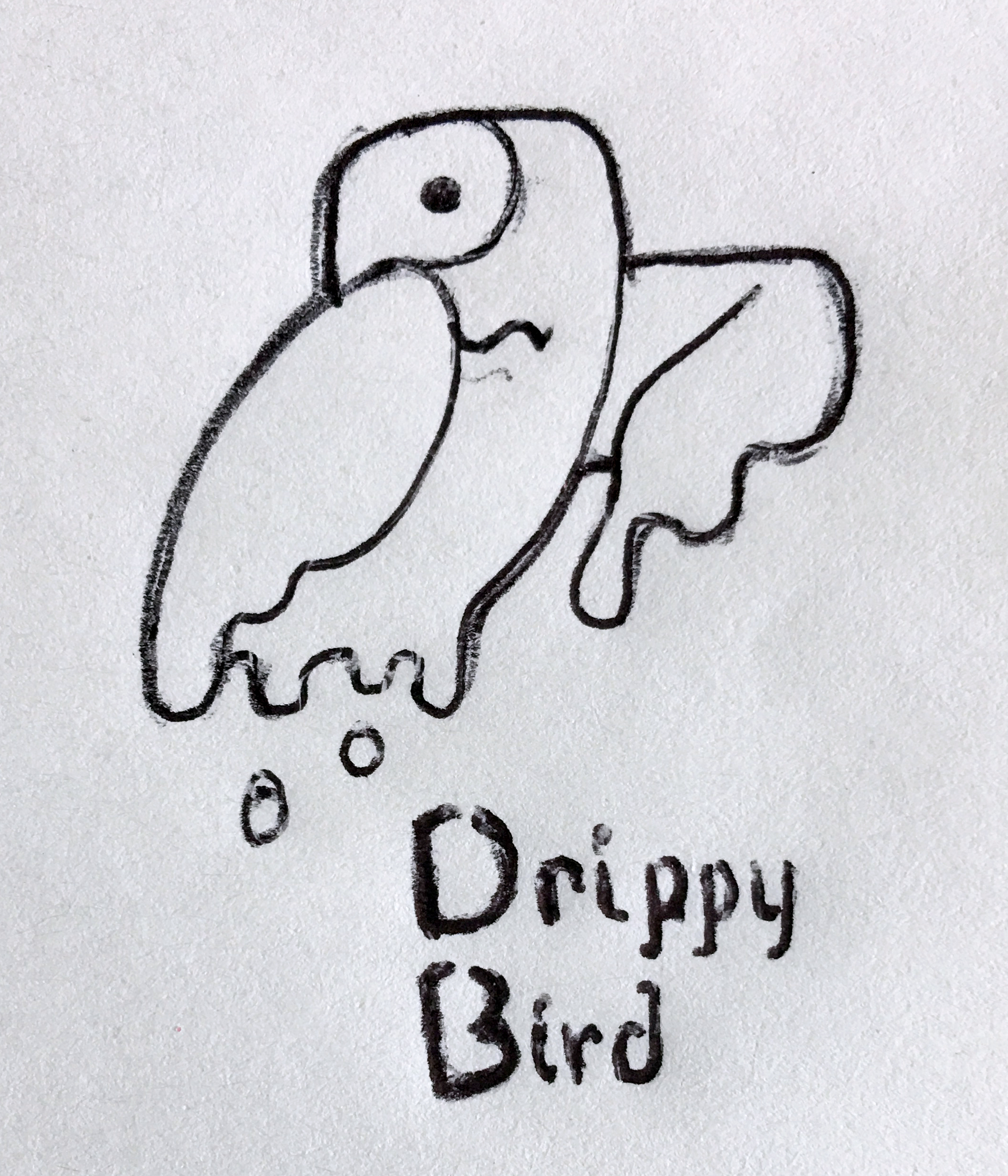
Well that was quicker than expected. I wound up churning out a couple pages of ideas based on the original Drippy Bird “Unscribble”. I just felt that was less of a logo/brand identity and more of a crap illustration, yet still an idea that deserved a proper execution.
Among the three images below, a few solid core concepts could be selected and fleshed out further, but I’m happiest with the final image: a single, simplified version of the original mark.
Thoughts?
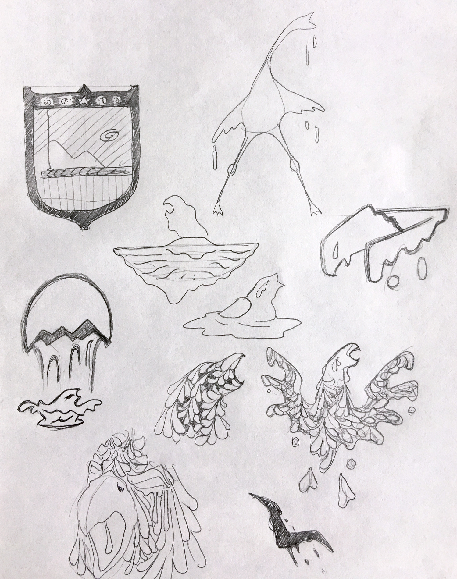
Page 2; I like pretty much all of these, though the spilled egg yolk in the lower right could easily be worked into part of the word mark as a capital D (also shown).Page 1. I like the two “paisley” style phoenix designs toward the bottom, right; and the “bird-splash” falling from the eggshell. Ignore the Mario brothers shield emblem.Print it! I might actually increase the volume of precipitation to help drive home the connection between the visual, word “Drippy”, and product lines.