Project: Various logo, icon, and illustrations
Role: Art Director & Designer, Brand Design & Integration team
Client: Silicon Valley Investors Network, Bluelink, Sleep Number, Best Buy
Key Skills: Photoshop, Illustrator, Brand Design, Campaign
Summary: An exploration of candidate marks for use in Best Buy’s national holiday campaign, and candidate marks for use by various divisions of an investor network.
SVIN – Silicon Valley Investors Network
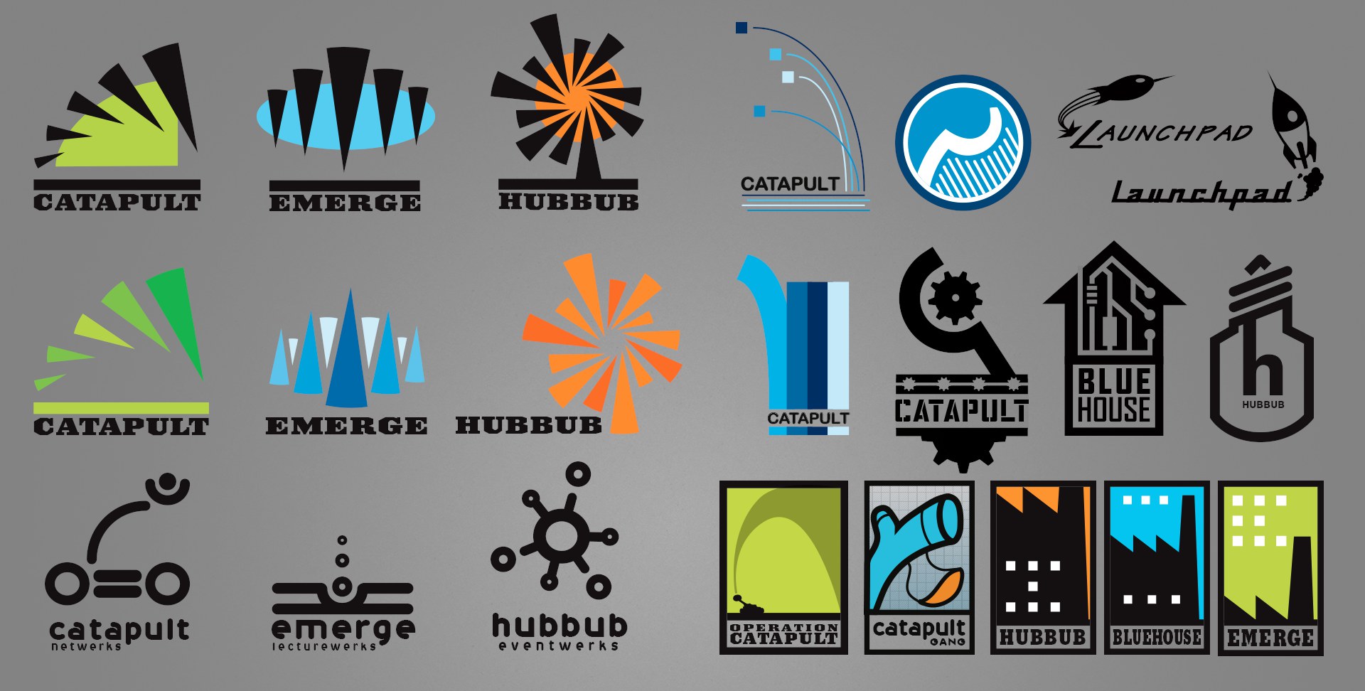
An organisation with three distinct divisions sought logos/marks for each group while retaining a cohesive identity between them. Above is a small sampling of my logo exploration for them.
The left half shows how I might carry one concept across all three identities; the right half shows additional graphic treatments, to show how I approach variety.
Bluelink
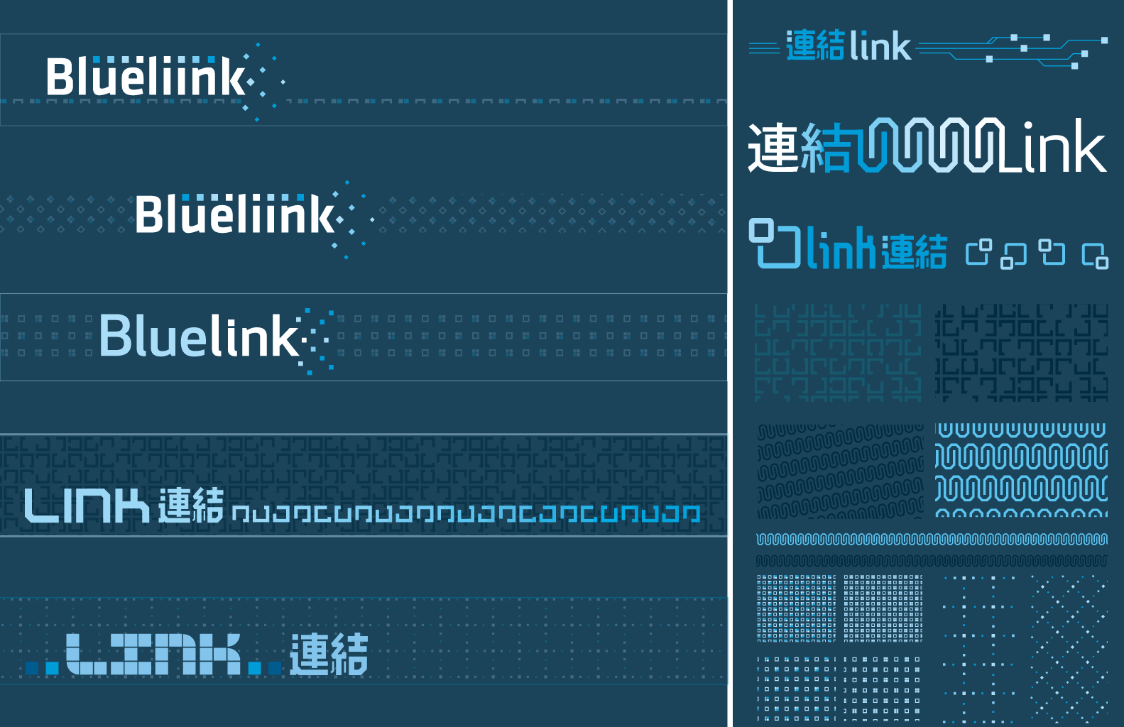
An exploration of sub-brand identity for a joint US–China venture. In Japanese, these characters mean “linking” or “connection”; I can only imagine there is a similar interpretation in Chinese (characters were provided by the international liaison).
Best Buy
Project: Holiday national advertising campaign style guide
Role: Art Director & Designer, Brand Design & Integration team
Client: Best Buy Co.
Key Skills: Photoshop, Illustrator, InDesign, Brand Design, Campaign
Summary: A thorough document which defines and illustrates every detail and usage for elements of a national ad campaign. Disseminated to Best Buy’s multiples channels (newspaper ads, print ads, in-store signage, website, etc.) to unify and govern execution for a consistent campaign experience.
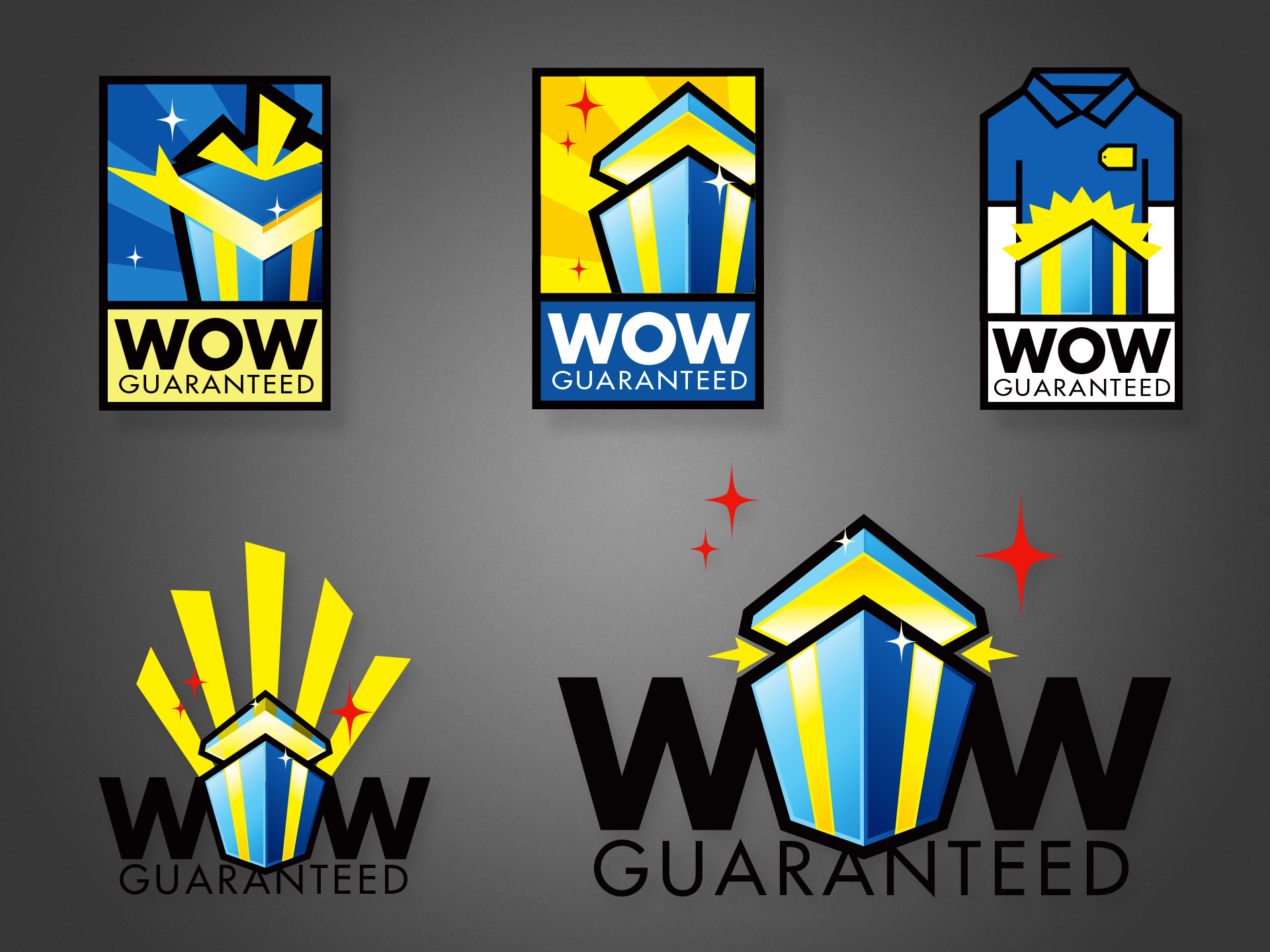
For ‘Holiday’ 2007, Best Buy used a hexagonal gift icon for its national campaign, with the slogan “Wrap up the WOW”, using typography similar to the lower two designs above. It was successful enough that the company wanted to recycle the idea for the following year. The difference was that while the first campaign focused on abundance and availability of gifts, the second wanted to add a focus on how the stores’ various services and staff can “guarantee” or maximize the experience.
Thus, several of my icon explorations feature a richer palette and a gift pictured at the magic moment when the recipient is blasted with delight. One concept even literally depicts a store staff to drive home the message that the company is here to make this magic happen for you.
While ultimately a slightly tweaked logo from the prior year was used, several of these were final candidates. I was one designer and art director on a small team tasked with this campaign, and all the work pictured above is my own illustration. Please check out my work creating the company’s style guide for the same drive period.
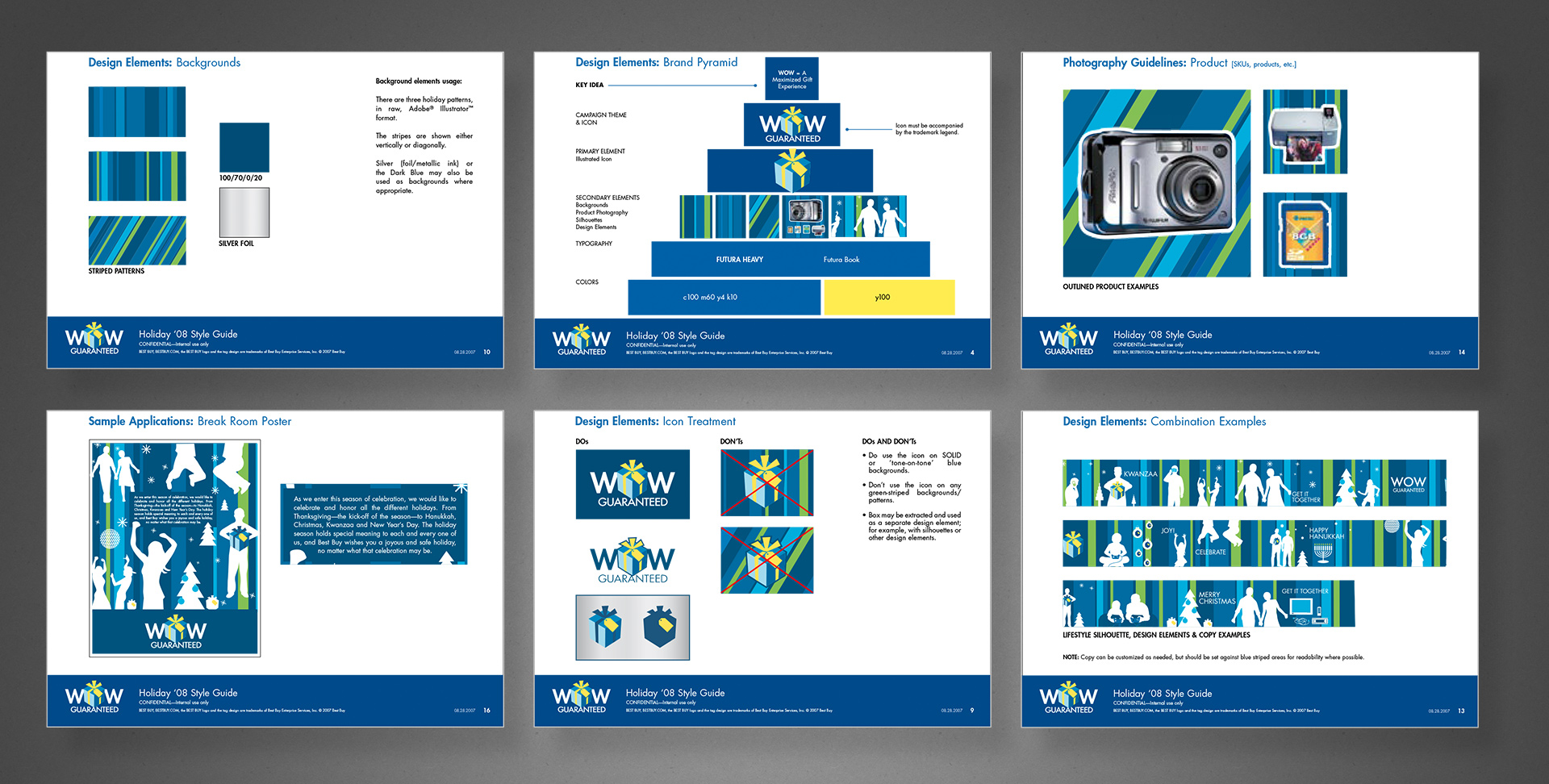
Several times per year, Best Buy would run national campaigns that would coincide with various holidays or drive times such as Christmas, Father’s Day, Back to School, and with each campaign would come a complete branded identity.
At the time, I was on the Brand Design & Integration team that helped conceptualize and then fully develop the campaign assets from a brief to roll-out across several channels, including online, in-store and signage, direct mail, newspaper insert, etc. So as a designer and art director, I helped come up with the visual components, but then I was also personally in charge of creating and managing a complete style guide so each creative department could apply it to their channel’s work, but also be used by the marketing groups in their various capacities.
The above example is a few pages from the Holiday campaign in 2008, though I personally managed dozens of similar campaign style guides. I created the template, layouts, and most of the sample design executions, based on actual workflows and guidelines of each channel. Note that this was created approximately a year and a half before the campaign’s public release, and thus each page contains a “confidential” mark.

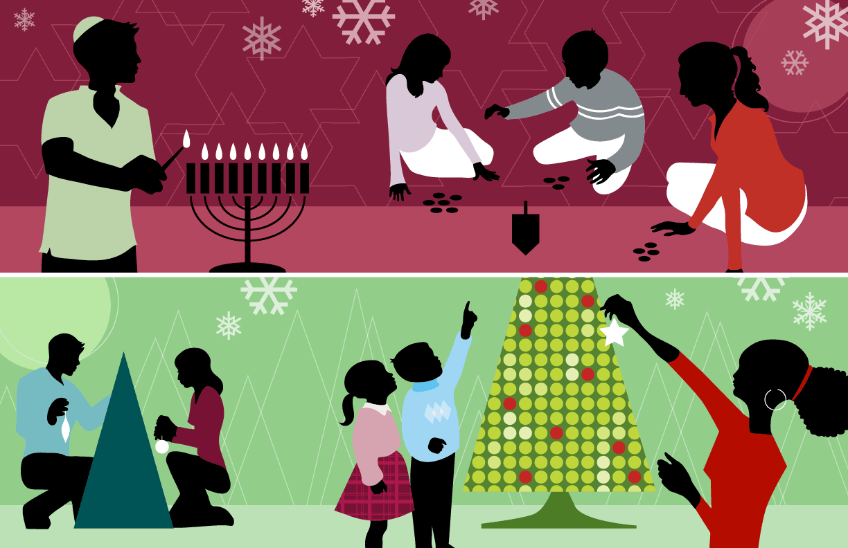
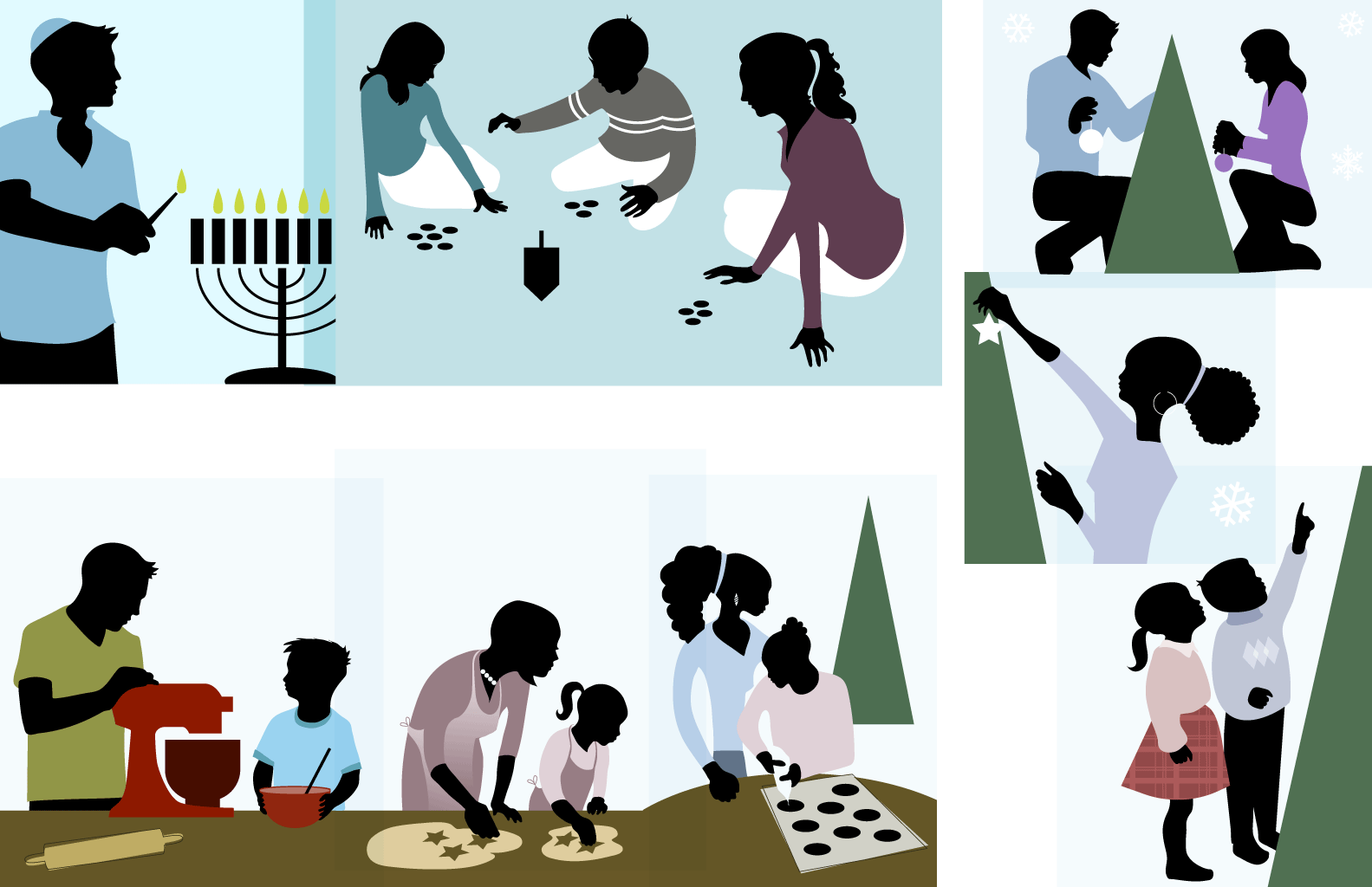

A collection of illustrations for an inclusive holiday season campaign.
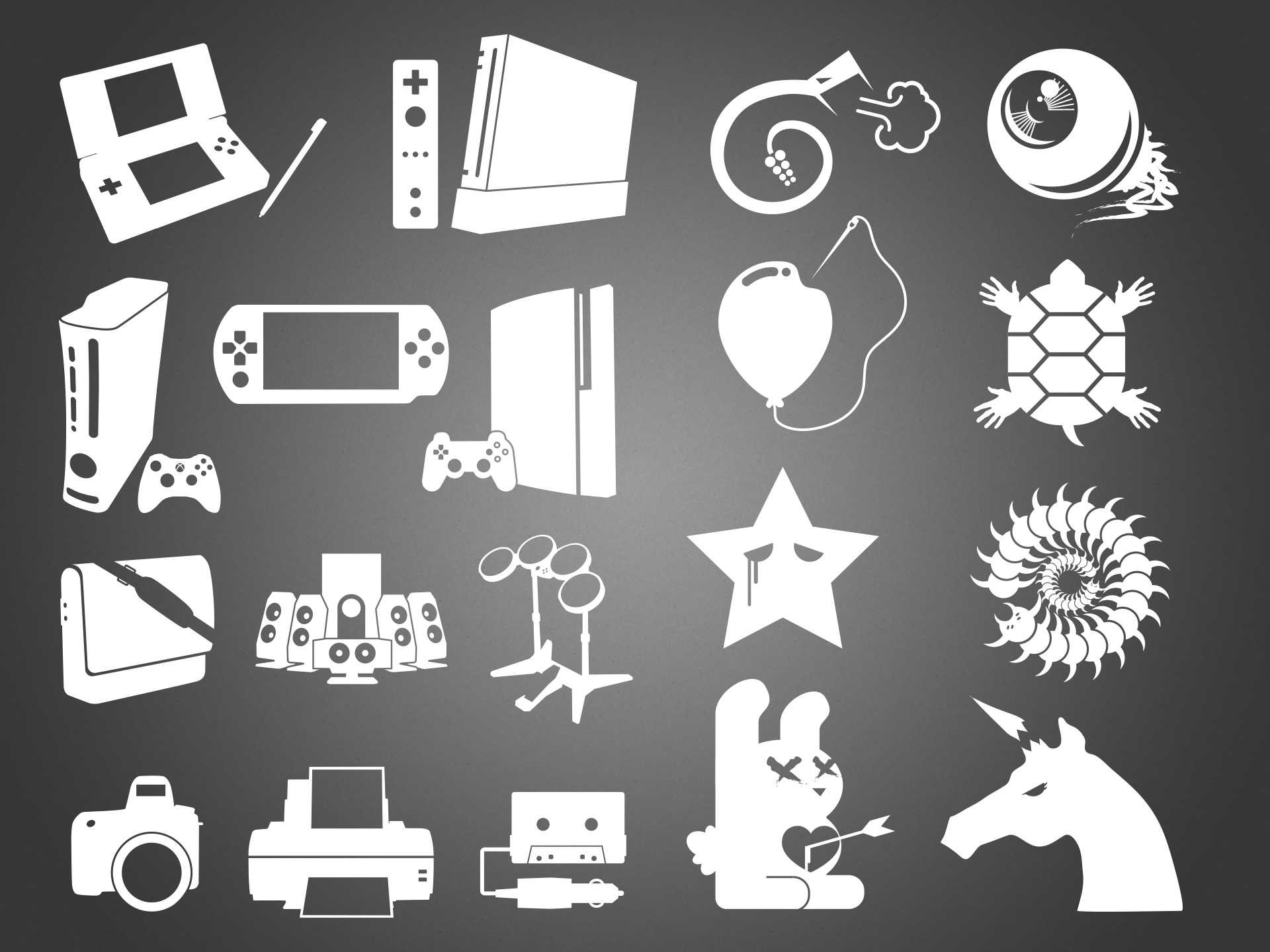
“Flat” design is all the rage these days, but I’ve always had a thing for a minimalist approach.
Left half: as part of a national drive-time campaign, we needed icons for a range of products to be advertised; icons that would give away a specific product or category at a glance, but be simple enough not to clash with any of the campaign’s visual vocabulary. I wound up doing hundreds of these, making the above image a tiny sample.
Right half: an collection of unusual or counter-culture style icons/illustrations intended for use in a “tween”-targeted gift card. Again, a small sampling of a much larger exploration set.
Sleep Number
As documented in the larger case study, the it Bed’s brand (design) had fallen into madness when I joined. Part of its journey back to rationality included a revised and refined brand visual language, replete with its own iconography similar to yet distinct from the company’s other product lines.
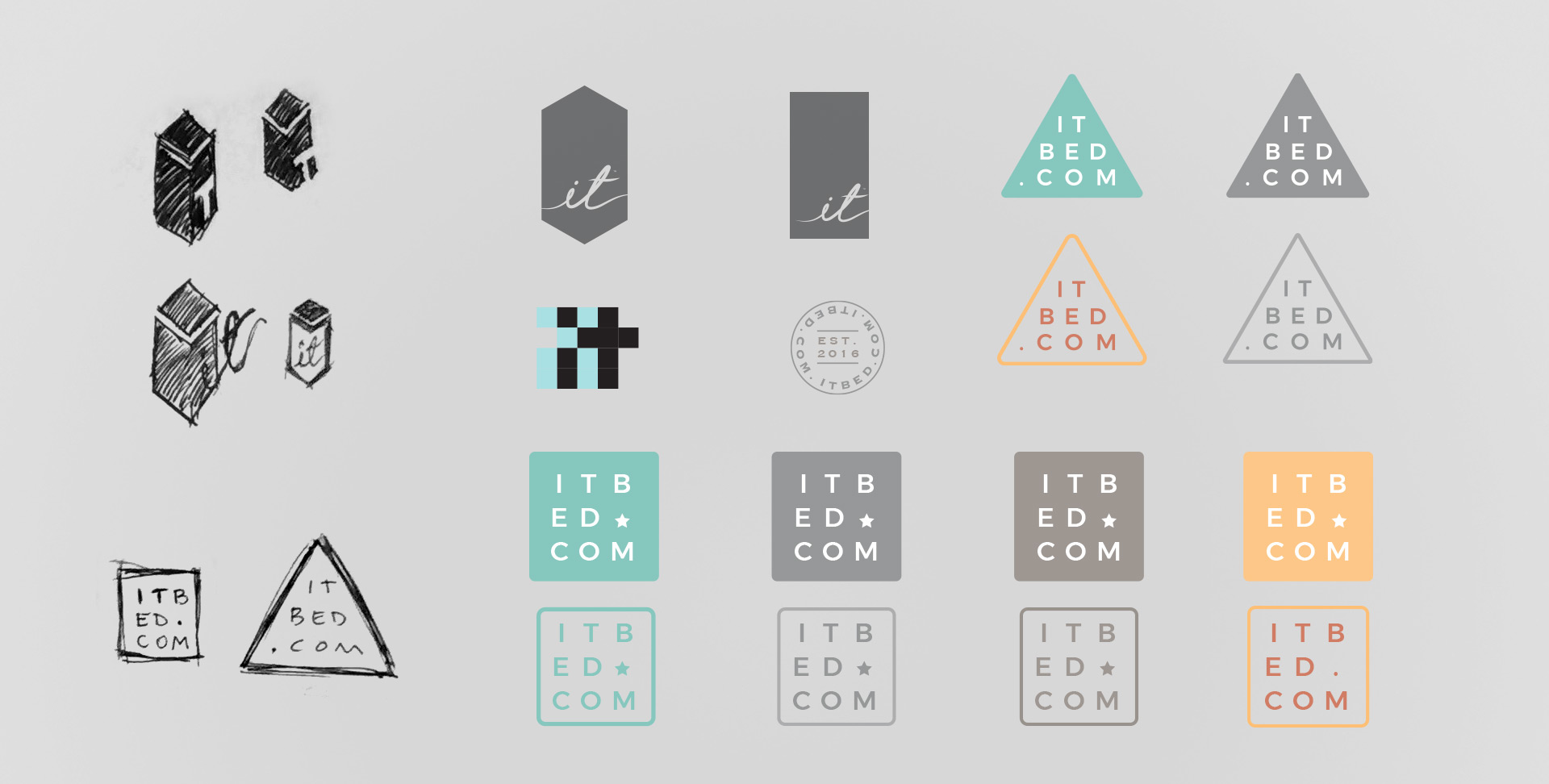
Similarly, I explored a new logo to bridge its existing brand equity with the rest of its new identity, keeping in mind this was a tech-connected bed (vacuum packed and shipped in a tall, thin box).
