TLDR; A look at what went into trying to launch an unusual new product within a larger, successful line of traditional offerings.
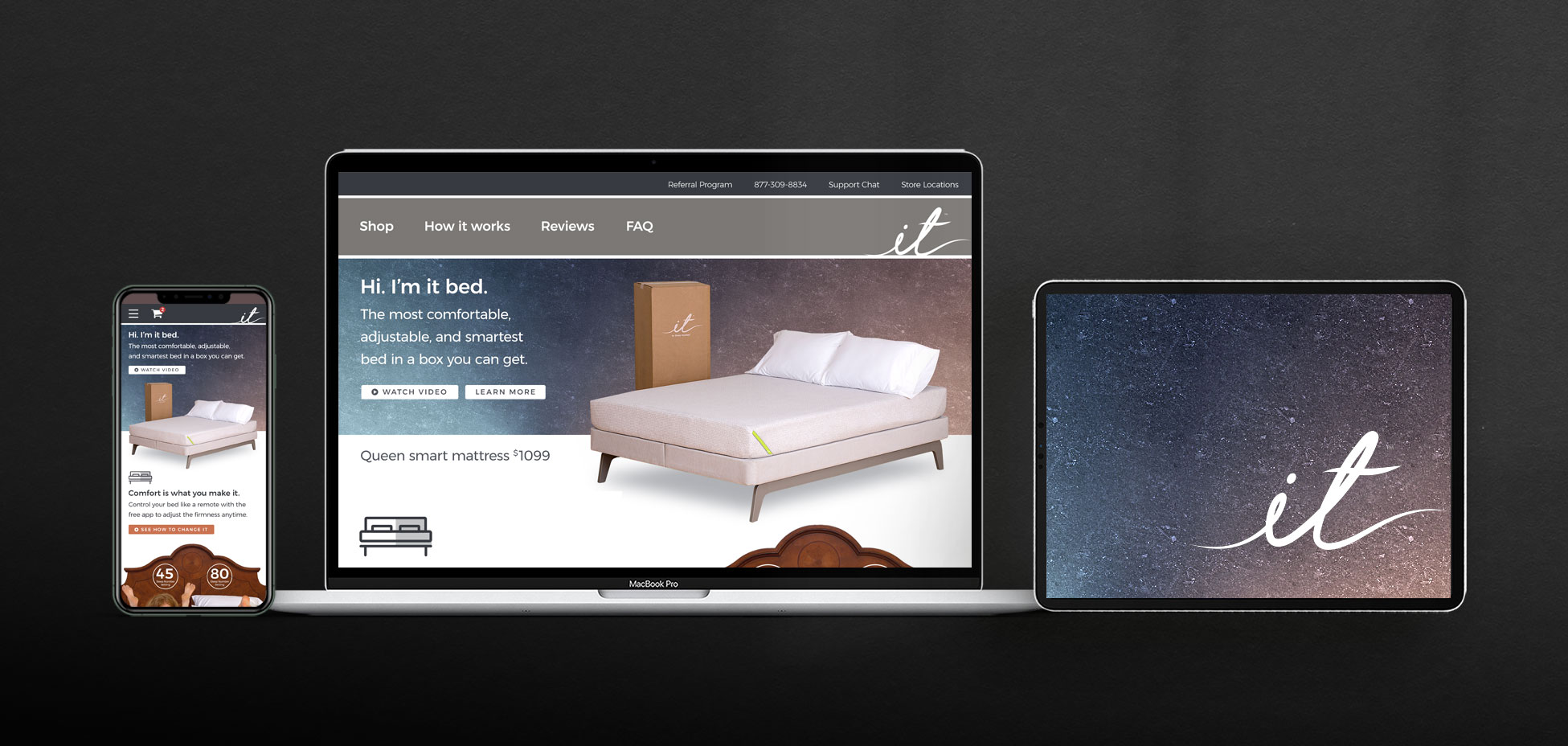
Project: “it™ bed” Product, Brand UX/CX Design
Role: Art Director, Product Designer
Client: Sleep Number (formerly Select Comfort)
Key Skills: Wireframing, Photoshop, UX/UI, Web design, Brand design, Style guide, Illustrator, Figma
Website: itbed.com (retired; now redirects to sleepnumber.com)
Summary: A swashbuckling adventure to define the branding and (mostly digital) brand user experience of a new product within the confines of its larger retail brand.
Preamble
Sleep Number (formerly Select Comfort) is a premium mattress and sleep product brand in America. In mid- to late-2016 they launched a new product to compete in the growing “bed in a box” space mostly owned and pioneered by Casper, but also to reach a younger demographic than they had been pursuing for decades. Enter the it bed. It married some of the adjustable Sleep Number technology with smartphone connectivity, but delivered in slender, unboxing-memeable cardboard.
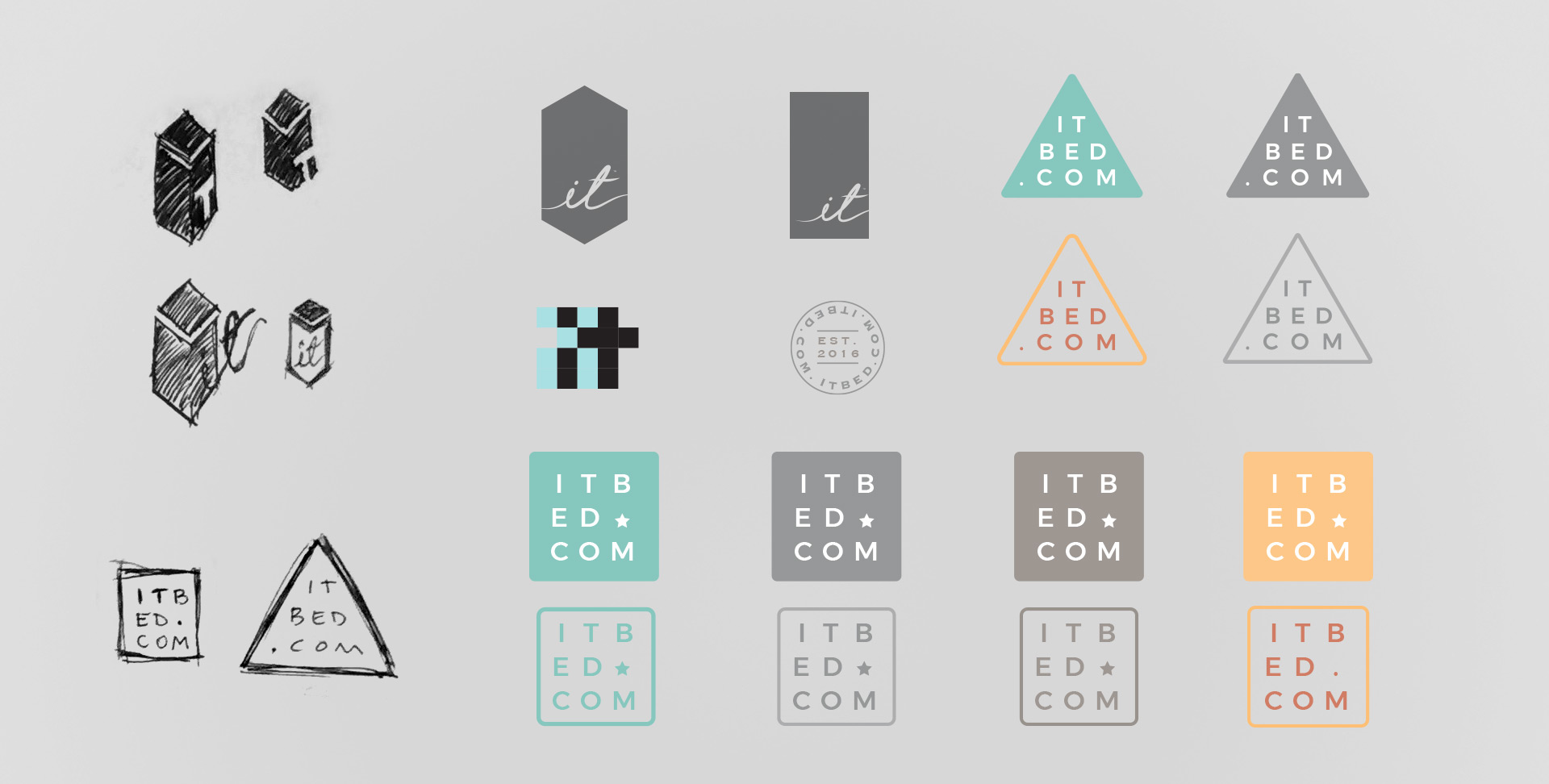
The efforts put into engineering this new product unfortunately did not translate in equal measure to its marketing or branding; the result: an obvious collage of individual contributions, ranging from elements indistinguishable from the company’s “core” line of products to a schizophrenic series of new identities, tones, and brand languages every other month. Nobody said launching a new brand and identity was easy or quick.
In early 2017 Sleep Number approached me to lend my skills in product design and UX to help unify all of these points, paired with a structured market plan. Because all of the brand’s assets were designed scattershot by whomever seemed to have bandwidth on a given day, rather than approach any of those individual components (like the website, logo, or app), I aimed to apply comprehensive, end-to-end UX concepts to the entire brand; everywhere the public might encounter it.
Harnessing Scattershot Efforts
That said, due to the it bed being a subset of the larger Sleep Number brand, a few things were unfortunately beyond our team’s control or influence, such as affecting the product name, logo, etc.; the prevailing reasoning was to avoid disrupting the delicate sensibilities of the myriad contributors thus far.
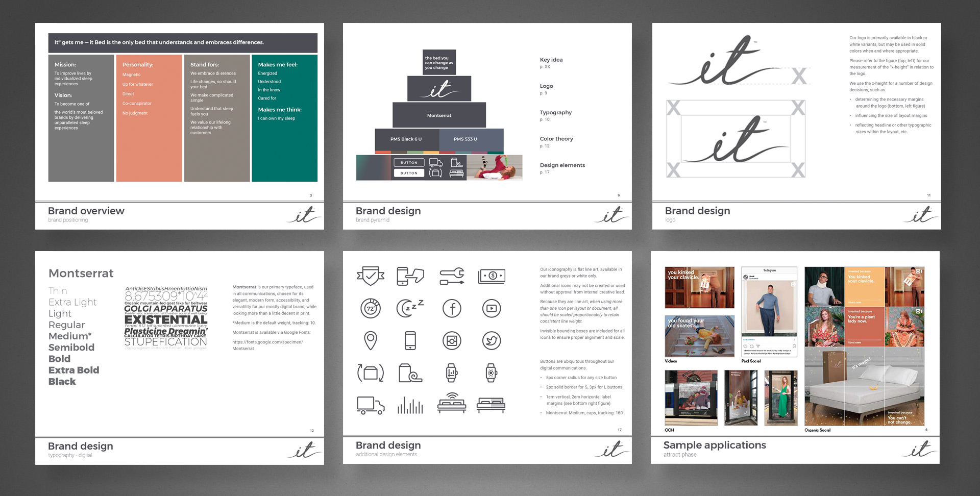
A Styleguide to Rule Them All
My first point of business was to establish a brand style guide, replete with baseline tone, voice, and visual language to serve as a yardstick against any work—whether done internally or externally, across all channels. Until my involvement, only partial guides with vague aspirational content and stock imagery existed; courtesy of an external agency—the entire body of them outdated by virtually every measure of our new internal team’s white boarding of brand attributes, so it was an obvious cornerstone towards building a stable foundation for the brand’s design and overall UX.

Aligning Multi-channel Touchpoints
The second was to begin scaling the mountain of the product’s website, built impetuously to be little more than a two- or three-page promotional resource and merely to have a minimal online presence. Shockingly, according to the company’s web manager, the site was built without any regard whatsoever for commerce, a brutally honest admission made brutally aware to any visitor looking to make purchases or find deeper information, only to encounter wave upon wave of sales-affecting hurdles. Luckily, this wasn’t the first time I have inherited what is essentially a WordPress theme and challenged with maturing the UX end to end.
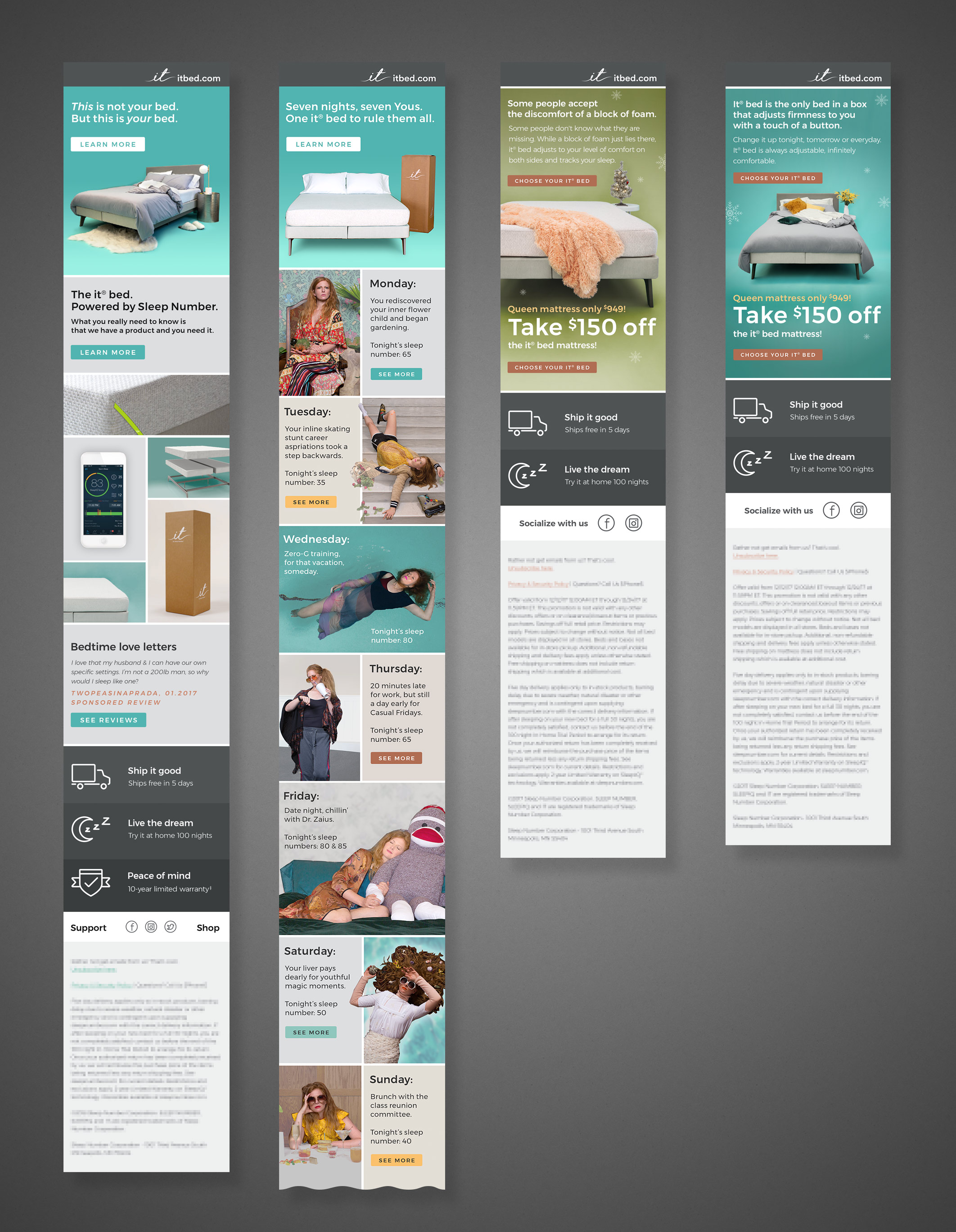
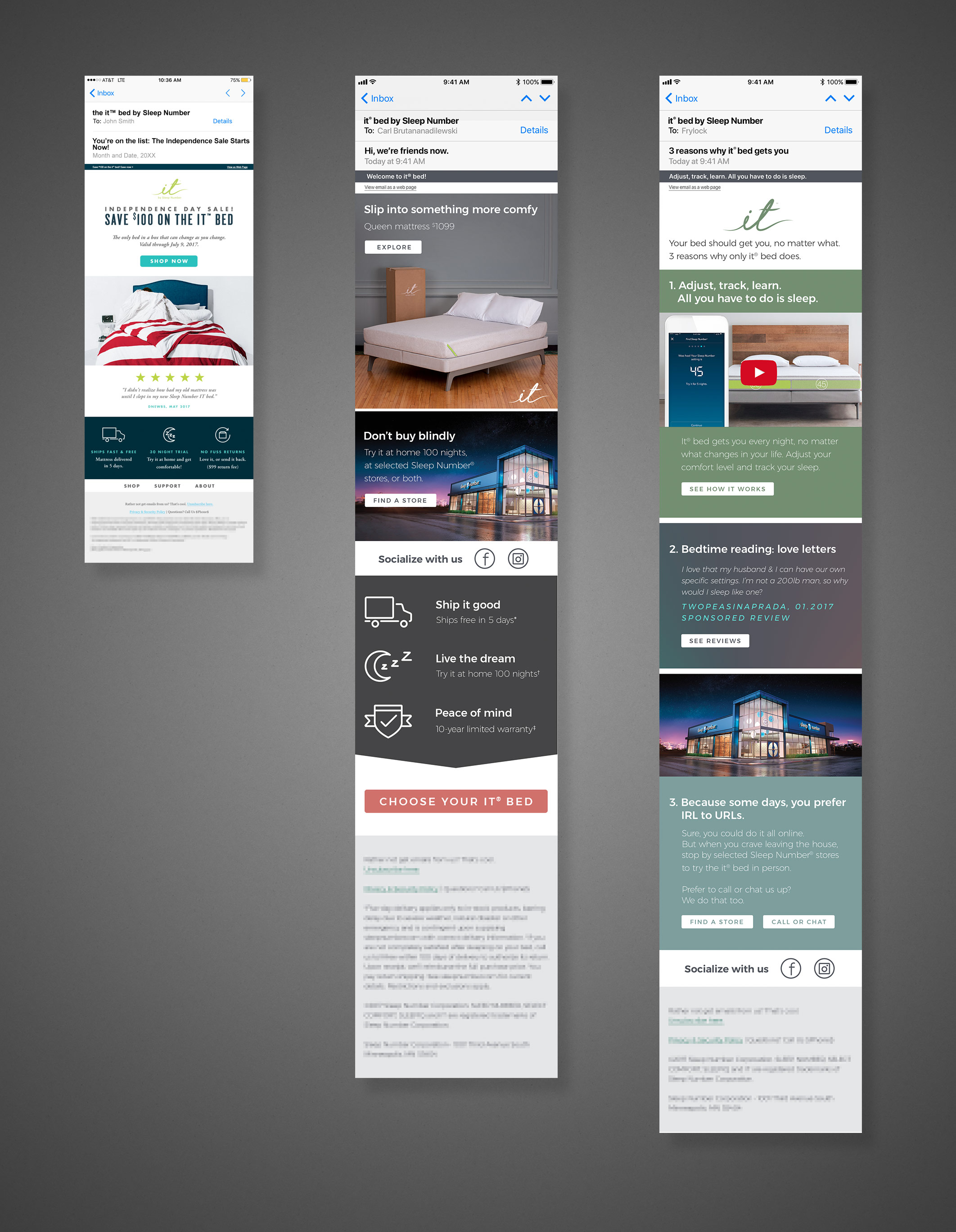
The third point, was to develop regular marketing materials (promo emails, display ads, etc.) to refine the content used to inform the bigger, more permanent first and second points, through iterative design exploration and A/B testing. As above, the prevailing method for these consumer touchpoints had been to apply whatever the current identity to the persistent cycles of sales promotions; so an email or banner ad campaign every few weeks with the new promo—and of course, a menagerie of brand identities to match.
Posthumous Recognition
Unfortunately, despite my and the team’s best efforts, based on a nearly complete erasure of it from the internet, it appears the it bed—a premium, tech-infused, semi-portable mattress for the millennial vagabond—was simply too limited a market and too expensive a product to survive. Mere months after my departure from Sleep Number, the company disappeared the it bed, apparently in favor of the lower end version of its traditional product line.
What you’ll see in the materials shown here are a few snapshots representing the resulting direction of the above explorative processes; I feel uncomfortable revealing the starting points because a) they aren’t my work to share, and b) by comparison might reflect negatively upon those who did work on them.
Of note: a) the responsive designs; b) consistent branding elements; c) custom iconography… all my direct efforts, made in Adobe Illustrator, Figma, and Photoshop.
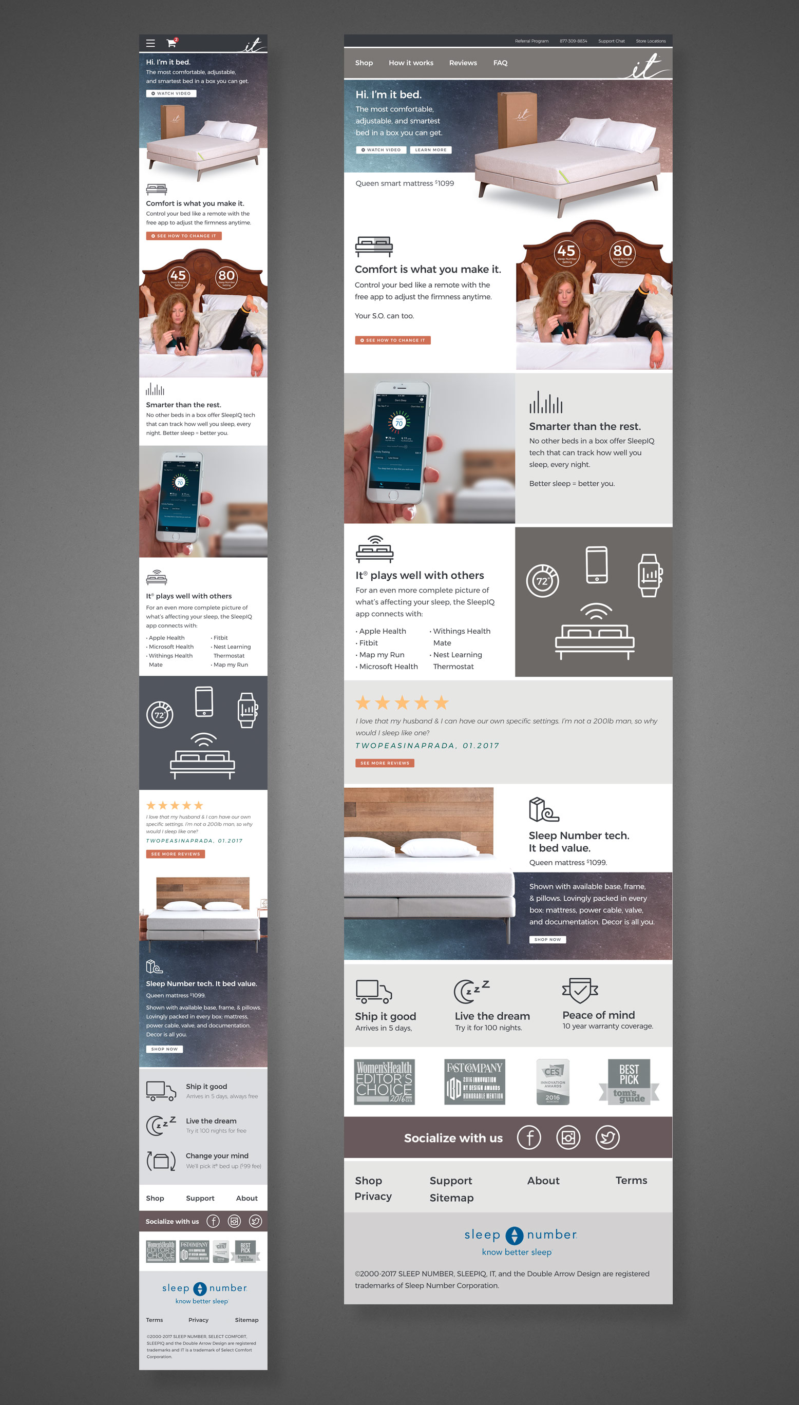
Some of these designs represent actual creative released to the public. Others represent in-progress/in-development projects that remained private to protect any promotional or sensitive brand information; available now that the product has expired over a year ago.
