TLDR: My definition of UX, and dispelling myths about what it isn’t.
UX is the “R” of digital product R&D; the research that informs what gets developed.
Aaron Hoffmann
Contents
“UX makes mockups, right?”
“Or…wireframes. That’s what I was thinking of”
“Oh…oh, I know! You guys make logos and help when HR needs a break room flyer designed for the company chili cookout.”
These common misconceptions confront UX pros everyday, when people view us through the narrowest of lenses based on a familiar deliverable: the wireframe. Or perceive us as vaguely equivalent to graphic designers, because it’s all just colours and shapes, or something.
If one defined a manager as a desk sitter, a business analyst as a spreadsheet doer, a developer as a monitor junkie, or summarised an architect as merely a blueprint maker; how would each of those people react to such descriptions?
Not kindly, I’d wager.
Adding insult to injury, some managers write off the entirety of UX as “irrelevant” to a product’s life cycle because only the hands actually writing code directly contribute to its bottom line; implying UX is a sunk cost, a liability, a budget-consuming cost centre (funds better appropriated towards hiring more developers and theoretically hasten release). Besides, any “monkey with a laptop” can do UX. And yes, that’s a real quote from management of an organisation large enough to know better.
Ironically, anyone believing non-coders are just “takers” also just deprecated every business analyst, the QA team, and of course themselves as managers. But I digress…
Too many words, not enough visuals!
So why include something like this article in my UX portfolio??
Two reasons.
First, as a senior level professional, I consider it my duty to advocate for the industry, educate and dispel misperceptions, especially because these things invariably impair a company’s business/product/bottom line.
Second, it articulates my own perspectives on UX, which are not (always) about eye candy, but rather text, data, and analysis.
Really, no pretty pictures??
Browse here if words tire you.
Well if UX isn’t only about wireframes, what is it exactly? Thank you for asking.
UX is a process for solving problems, contextually. We discover and solve issues early to avoid more expensive ones later.
Aaron Hoffmann
UX is a method; a process to problem solving, contextually.
Many like to think about the field of User Experience as purely user centric; as though it’s all about ice cream with sprinkles, campfire choruses of kumbaya, or the warm fuzzies we get from whimsically delighting end users. Admirable objectives to be sure but hardly the only target or benefit of UX.
Physical products benefit from R&D. If we already understand what “development” means for digital products, UX is invariably the “R”; the research end that informs what gets developed.

Surrounded by a moat of undesirable outcomes for digital products, UX is the only bridge to connect each island.
- UX reduces business risk via research and gathering data early in the process and continually correcting course. Changes or corrections add time and cost–exponentially–the later in the product life cycle they occur.
- UX reduces waste by identifying unnecessary features and functions through wireframes, prototypes, testing and interviews. This can manifest as fewer things to develop, or a project requiring fewer developers overall.
- UX improves production efficiencies. Bridges the language barrier and translates between business lingo, clients, users, and the technical jargon of developers.
- UX improves satisfaction, by the same methods above, for users and business alike. Funny how actually listening to users and clients yields a positive result. This satisfaction is the threshold across which lies greater engagement, increased usage or sales, improved productivity, etc.
If most people think of UX as the look and feel or even give us credit for making something easier to use, they’re just scratching the surface.
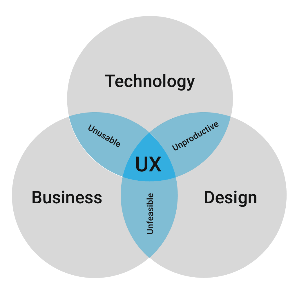
UX may achieve those things, but only as a byproduct of asking questions like:
- Have we satisfied the target audience’s needs?
- Does the solution align with business objectives?
- Do our recommendations fall within our technical limitations and capabilities?
- Will everyone/anyone want to use it…or be able to?
But what about the pictures??
Fine, let’s talk about pictures. As a gesture of goodwill, I’ll even share one.

If one hears the word “dentist”, many will conjure images of drills, needles, steampunk-like appliances or any number of other negative, mental bogeymen, because those are common, memorable tropes from a lay point of view. These impressions of dentistry conveniently overlook the vast majority of the field, such as the practitioner’s education or wide variety of skills necessary to provide a long menu of services, etc.
Furthermore, how many think of “instrument sterilisation”, “how to interpret x-rays”, “wardrobe that instills confidence in patients”, or even “chair-side demeanour, in the service of diminishing anxiety”?
Nobody asked about teeth tho…
So why is UX so commonly and mistakenly equated with wireframes, and not its other, more salient competencies?
Perhaps because wireframes are the most common and tangible aspect of UX people ever see. Or, conversely, maybe due to UX pros not often enough revealing the many other set pieces dwelling behind the stage curtain, and limit interactions with partnering teams to discussing, you guessed it…wireframes.
For example, while many may assume wireframes are built on a designer’s whim, slapped together based on their knowledge of design software or some combination of barometric pressure and astrological positioning; if one takes even a moment to ponder the actual origin of a mockup, it becomes immediately apparent that a vast array of decisions and problem-solutions are necessary before one could arrive at a visual destination.
UX is not inherently a creative discipline, aside from employing creative means to solve problems.
Aaron Hoffmann
What has only reinforced the stereotypes are UX designers who themselves speak in subjectivities “I think X”, “I feel like Y should be…”; relying primarily on hunches or their own internal biases to describe and defend their work. Coming from a background in visual design and advertising, I can attest that articulating one’s work in this fashion is exactly the purview of graphic designers, who can get away with selling Castilian Blue as “relaxed and trustworthy” or the juxtaposition of layout elements as indicative of deeper (cleverer) meanings.
UX does not–or should not–rely on this kind of qualitative basis to articulate the fruits of their labours; at least not if they want to rightfully distance themselves from creative disciplines, because by and large, UX is not a creative discipline, except in the sense that we may employ creative means to solve specific problems.
That pull quote doesn’t count as a picture…
While a UX designer may rely on any variety of data to inform their decisions; good UXers should stand behind a sturdy shield of evidence to fend off the slung arrows by critics of any warring faction. Less experienced designers will tend to rely more heavily on their gut intuition to drive decisions; precisely the same hunches that drive users, clients, stakeholders, etc. to tear away at the designs.
In my experience, supporting data serves as the most bulletproof armour.
Other common misperceptions
UI and UX are not interchangeable
UI is actually a subset of UX. Fighting words to be sure in some circles, but my experience in both qualifies the distinction.
While both affect the user interface, UI centres around delivering polished visual assets as its ultimate goal; and UX design permeates the product lifestyle, beginning with lower-fidelity deliverables (e.g. whiteboard sketches) and can include non-visual designs such as interaction patterns, flows, information groupings, etc. The data resulting from UX efforts then informs UI decisions, which are then fed back through the UX feedback loops such as interviews, user testing, etc.
UX is not a development plugin
Some project managers view UX as something like a Winamp equaliser plugin that can be installed into a product lifecycle to “make it good”, often a final step at the end of development, like stamping a holiday ham with a seal of guaranteed quality as it leaves the inspection conveyor.
Still others imagine there must/should be some kind of UX checklist, as in literally a collection of bullet points that they or the developers can tick when writing code to fell two birds by a single stone. “Who needs UX pros when our devs can simply refer to this mythical three step list for perfect UX nirvana?” I wish the preceding line were purely fictional, and not a quote by a critical leader of a past project.
The truth, once again, UX is a process; a mentality; an approach to bringing a product to market. It simultaneously considers desires of the client, the various requirements, technical limitations, accessibility, end users (both proactively and reactively), and synthesises it all into a solution to achieve all ends.
Because each product, its teams, its audience, its requirements, etc represent a unique combination of criteria and objectives, successfully solving the larger jigsaw puzzle requires an equally unique, intentional UX approach that cannot be simply summarised nor recycled between projects.
OK, so UX is more than pictures.
Anything else we’ve overlooked?
So glad you asked. Do any of these sound familiar?
- User Research and Usability Testing, comes in many shapes and sizes to gather critical info
- Competitive Analysis, know the market and rival products
- Accessibility Analysis, can everyone actually use the product?
- Personas, User Journeys, Experience Maps, help with defining the audience and their experiences
- Information Architecture and Site Maps, how is the content of the product organised
- Prototyping, using sample, pre-release versions of the product for testing and research purposes
- Design Systems and Styleguides, the building and documentation of UX tools, components, patterns
How many of the above could you name? Hopefully this article has bestowed enough information to resist conflating UX with (only) wireframes, and perhaps even allow you to make your team’s UX staff’s day when you strike up a conversation about other aspects of their contributions, or…gasp!…request an accessibility analysis, user journey, etc.!
