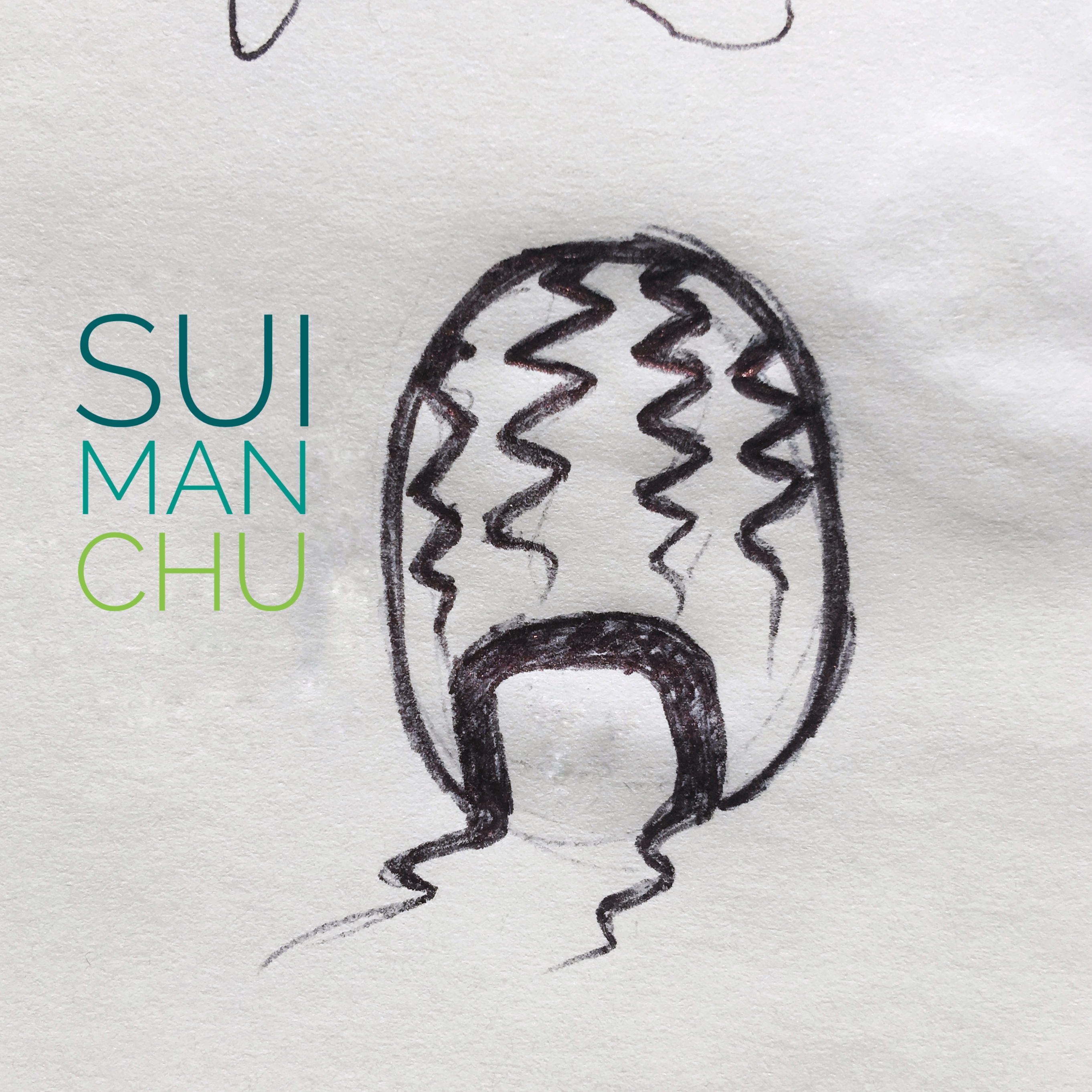
Sui Man Chu hair products for men are renowned the fictional world-over for their responsible ingredient sourcing and professional, salon grade quality.
The logo is a visual and literal pun. Sui (æ°´) in Japanese means “water”, implying either that wet-hair look, or short for suika, “watermelon”. Man does double duty standing for men’s products, or as part of Fu man chu; that glorious facial hairstyle of decades past.
Apologies for cheating on the lettering; the ink version was just a bit too close to the mark and unattractively compressed. I brushed it out and input a sketch-level bit of typography.

