GoingSony tablet and mobile incarnations, as designed in Sketch.
So far in my explorations of modern UX/UI apps, I’ve run through Axure RP 8, Balsamiq, and Adobe XD. Each has their strengths, and Sketch from Bohemian Coding is no different.
I find the overall toolset and options to be the most authentic visual analogue to designing directly with HTML and CSS code. Whereas Axure includes many authentic CSS properties, they don’t always render correctly, even within the application, and many CSS level 3 properties are absent from tool and object options. Sketch really fills out its panels with nearly every option you can think of (while remaining faithful to CSS3 spec), especially when it comes to visual design and layout. It also lets you recycle elements easily, making the creation of responsive layouts very quick. Overall, designs tend to look much more polished than Axure.
What it misses out of the box are all of the interactive elements and scripting that Axure does offer, though to be fair, these features are easily acquired through free plugins, something Axure is short on (many Axure add-ons, plugins, etc. are NOT free, and tend to be quite expensive, IMHO).
I think going forward, I’d personally prefer to use Photoshop/Sketch for pixel-perfect layouts and designs, but use Axure (or Adobe XD to a lesser extent) for wire framing and interaction design before passing off to the dev team.
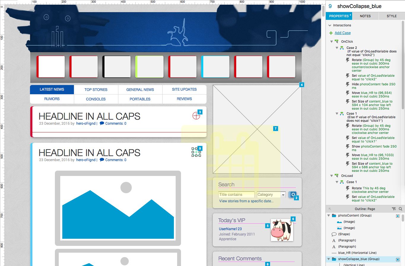
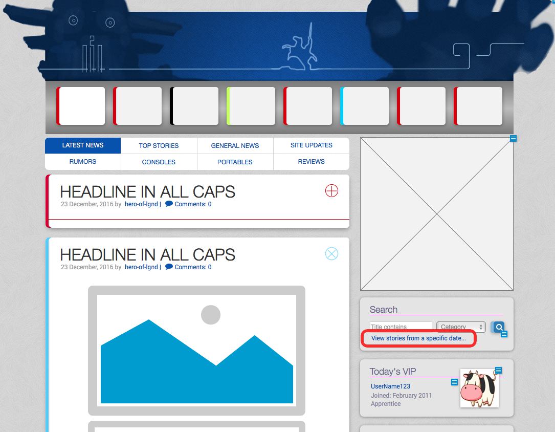
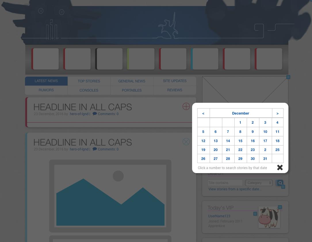
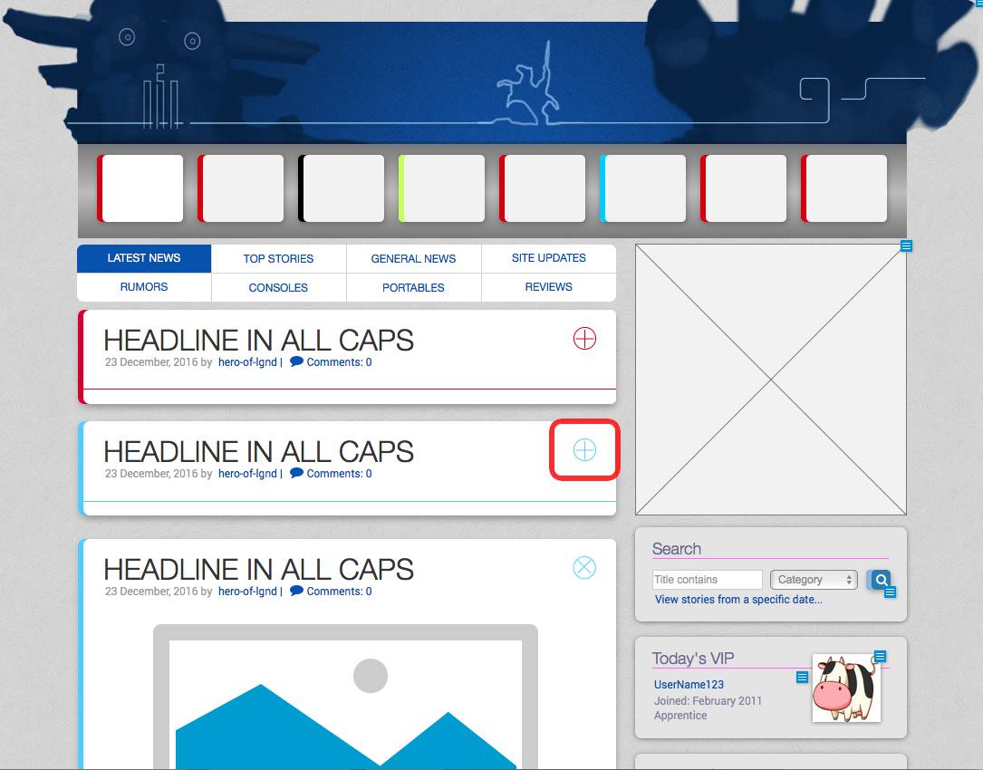
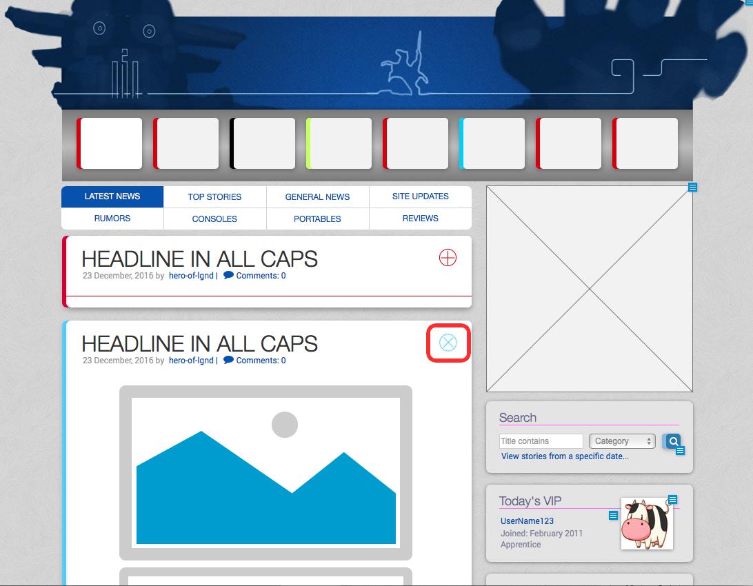
A view of the GoingSony site, built as an Axure wireframeThe red box shows a link that when clicked, opens a calendar in a lightbox style dialogue box (shown below).The calendar (not a polished design), in the lightbox style pop-up.A widget for collapsing stories to just its headline, post metadata and a color-coded category, especially useful for scrolling content on compact devices. This shows the story after collapsing; all stories beneath are pulled upward upon collapse to maintain document flow.When clicked, the + or x rotates smoothly, story content fades in/out, and the containing box’s shape fluidly expands/collapses.
It probably goes without saying that the web and its design is fundamentally different than it was at the turn of the century. Gone are layouts comprised of hacked-together tables, text and headlines made from optimized images, animated sparkly background patterns, etc., though interestingly, the animated GIF has made a strange resurgence in popularity in recent years.
My process with all of design–both print and web–starts with pencil on paper, then moves to a basic digital execution to work out any logistics before beginning on any final production. However, where paper and Photoshop may have been my first and second steps in the past, many professionals these days rely on specialized tools like Axure, Balsamiq, Sketch, and Adobe XD (Experience Design).
Gone are the days of the web designer everyman, who designs, optimizes assets, writes the markup code, and maintains files on some FTP; now, each of those tasks are divided into wholly separate and distinct sub-categories of web work: UI and UX design, front-end developer, back-end developer, etc. Not necessarily a bad thing since the landscape and scope of web or application work is much larger and complicated than ever before.
As for the above software, I’ve only ever played with any of them to achieve some core familiarity while continuing to favor my tried and true paper/pencil method as I just find it quicker. However in efforts to better market my skills, a deeper understanding of these applications are necessary, and so I’ve begun recreating some of my previous web projects using these prototyping tools.
The first is Axure RP 8. In use, I find it somewhere near the expected offspring of Adobe Flash and Dreamweaver. It has a canvas to drop assets into, tweak with panels full of settings, and set up interactions between elements. For the most part, any familiarity with those two legacy Adobe apps will make using Axure a breeze.
The result of a single afternoon’s efforts is a wireframe of the GoingSony site, partially as it is currently but also as it was during beta, including placeholder art and interface elements instead of actual content. I find it particularly rewarding to reverse-engineer some of the interactive elements in Axure, just to see how close I can get to what we actually developed for the live site.
Built completely from scratch in about 5-6 hours, this wireframe has annotated elements, images and links; custom styles and library widgets, a modal lightbox-style popup (to select dates from a calendar for searching stories by date), and widgets on each story entry that show or collapse the story to just its headline and post metadata, replete with animation of the widget itself, the story box and its contents, and also animates the position of successive stories to keep the bottom of one story X pixels from the top of the next, regardless of its shown or hidden state.
Fun. Next up: Balsamiq.
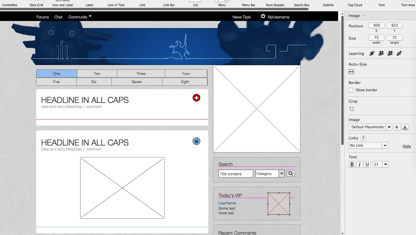
A passable take on wire framing the GoingSony site.
After using Axure, going to Balsamiq in some ways felt like doing a still life oil painting using MS Paint, but that has more to do with my expectations than the software itself.
Touted as a digital analogue to real-world dry erase boards, it does look and act very similarly. It lacks detail and options that otherwise distract people who should be focusing on more high-level, functional decisions about a site design than whether a drop shadow ought to be .3 or .35 alpha.
I put as much due diligence as I could to faithfully reproduce the GoingSony layout in Balsamiq, with passable results. Had the above screen been presented at our first development meeting, I think everyone would have been able to grasp what direction things would take visually.
Maybe suitable for some designers, I tend to work more efficiently in this brainstorming manner with pen and paper. When moving to digital, I prefer putting a lot more detail into a visualization than Balsamiq allows, so it felt more restrictive than anything else. Not bad, just different.
Will see about producing similar versions using Sketch and Adobe XD if possible!
Hard to believe it’s already been two weeks since my parents were here on their possibly final trip to Japan. As is true for most, everyday life is a struggle, lesson in humility, and trial of patience. I do enjoy non-Western life here, but something about having my parents here–the people who raised me, taught me English in the first place; and being able to communicate frankly, directly, and naturally while enjoying the comfort and support of family–was refreshing and feels like it reset my perspective on life. A little outside perspective really does wonders from time to time since it can be far too easy to fall victim to routines and the petty issues of daily living.
That said, I’ve come to wonder whether my time in this place has become an hourglass with countable grains of sand poised over the inevitable aperture. A telling dream the other night has stuck with me. While it’s been nearly two decades since my last dream interpretation session with classmates in a high school biology class, a bit of introspection might reveal something my subconscious wishes to express.
The dream takes place in the dining area of some family house; perhaps MY house, perhaps my parents’ house. I’m enjoying a meal with some generic friends and…oh yeah, Johnny Depp. He hands me a fancy shirt and demands I change immediately. Once begun, the meal is interrupted by a certain executive from my workplace, though he appears 35 years younger, dressed like a suburban hip-hop fan from the 1990s. Not sure why he was even recognizable in this form, unless it was his trademark carefree and whimsical words, but he was. He seemed to be taunting me; pushing buttons either to rub my nose into some inadequacy or perhaps prod me into taking action where I might have otherwise been inert.
I put on the fancy shirt and suddenly found myself soaring above the clouds, but slightly losing altitude. As I took in the incredible view, I noticed a turtle below me, also falling, but every few seconds flipping itself side-over-side to keep aloft. Hrm.
Looking at it through the lens of my personal circumstances, everything takes on a specific meaning. Without spelling it all out, the changing of a shirt in the presence of a company man to something fancy like I used to wear, and then appearing to fly alongside the impossibility of an airborne turtle who defies all expectations and found freedom instead of remaining tethered to the ground…yeah, there are parallels to my life right now, and potential future.
At least I can enjoy these rad headphones while everything unfolds. Maybe it’s time to start dreaming of the new Infiniti Q60 coupe as well..
Thought of the day: Photoshop giggles: for the pen tool, P on the keyboard.
Pity that posting to my own blog has come to feel more like a chore than when I first started it eight years ago. Of course this site has been around pre-blog for an additional five to six years, but somehow having more streamlined tools like WordPress to ease the process of updating seems to have an inverse psychological effect where I’d rather wait until something big needs to happen or be posted instead of quickly publishing smaller things of less significance.
Speaking of big, it’s been awhile since the site has had a design refresh. I like the direction, but things need a little facelift. Look for that and some other creative work to be posted soon.
In the mean time, check out a couple panoramas from a visit home earlier this summer:
A bit of a diversion from my typical posts, but in case someone stumbles upon it from a search engine, hopefully my hours of turmoil will lessen another’s burden.
Last week, I updated one of my computer’s iTunes installation to version 8.1.1, while my other machine (with the primary music library) stayed on version 8.0. For whatever reason, the newer version stopped seeing the older one’s shared library across the network. Huh??
So after tinkering with the router, scouring the web, updating the other machine to 8.1.1, and fidgeting with every damn preference or setting between both machines for hours and coming up completely nowhere, I gave up.
Until someone else logged into their account on my machine…I had them try launching iTunes (a fresh account), and behold, it saw both of my other shared libraries, yet those two couldn’t see this new one nor each other. Hmm..
At that point, it was clear to me that it had something to do with the iTunes preference files (.plist) in my home directory: ~/Library/Preferences/ and ~/Library/Preferences/ByHost/.
After trashing them and rebooting iTunes on the problematic computers and accounts, re-agreeing to the license and re-enabling my sharing settings, suddenly my network sharing was back to working 100%.
An old trick from the MacOS 7,8,9 days that is often forgotten today. Hopefully it saves somebody else a lot of time and trouble!
ps.. note that the icon for iTunes 8 actually says “itunes 7” on the center ring of the disc. interesting detail.
Since I don’t currently have television services at my apartment, any programs I want to watch must be seen from their network’s website. I actually prefer this method; can see it at my leisure, minimum ads, completely free…some of them are even available in HD (thanks ABC!!) What’s not to like?
As my luck would have it, ABC’s interstitial ads over the past two weeks during episodes of LOST have been about Honda’s new campaign for the Civic, called “Grooves” or “Musical Road”. It follows a team of creatives going about transforming a stretch of highway into something of an old time self-playing piano using the safety rumble strips in such a way that the spacing of grooves creates notes as drivers pass over.
A great idea to be sure, but it’s nothing new; not even close. The first I saw of the concept came a couple years ago via a car magazine or tv show, and featured some small countryside roads in Japan using the concept to draw tourists in for revenue. The first known use of such a musical road was in Denmark circa 1995, but used a slightly different approach and technology for the sound.
The thing that rubbed me the wrong way was the tone of the ad/video from Honda… it had some windbag (probably the Creative Director) explaining his genius concept to the rest of the team, as they all looked on in awe and disbelief of his sheer brilliance, and he basked in their glow the whole while, taking credit for an idea he clearly nicked elsewhere. Check it out:
Now that I’ve probably offended all of the potential creative offices/agencies I could work for out here in San Francisco, check out the “Melody Road” of Japan. Both the Honda and Melody Road of Japan concepts promote something commercial, but one seems like a fun idea to be proud of, the other is a disingenuous plot to try and be cool. First rule of being cool… don’t try to be.
thought of the day: happiness is a flower that could not blossom without the existence of tears.
Click to embiggen it!
A couple years ago I was dumbstruck to discover the existence of peculiar, creative watches. Not surprised as there are always oddball versions of just about every product out there, but something about the attention to detail and geeky allure of this brand really caught my eye and never let go. I’ve always liked nice watches for whatever reason, but these elevated my taste to a new level entirely.
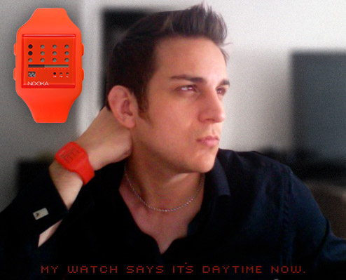
Among the first bunch to fry my noggin was the Eleeno Kion Elite (shown, right) in blue and black, a stunning gem that has since been discontinued and become hard to find. If you’re curious why it has but one time-telling hand, it’s because the striped pattern forms an arrow that also points. Originally selling for about 160$, I kick myself for not jumping on it then. If you found and bought one of these for me; I would gladly gestate your future babies.
Since then, I can’t help but froth all the way from the pleasure centre of my brain right out my mouth like a mammalian cappuccino machine as I browse the shops and online galleries like Tokyoflash. Pictured below are a few of their current darlings, a couple of them quite “cheap”, relatively speaking, so you could find yourself a surrogate for less than you’d think.


