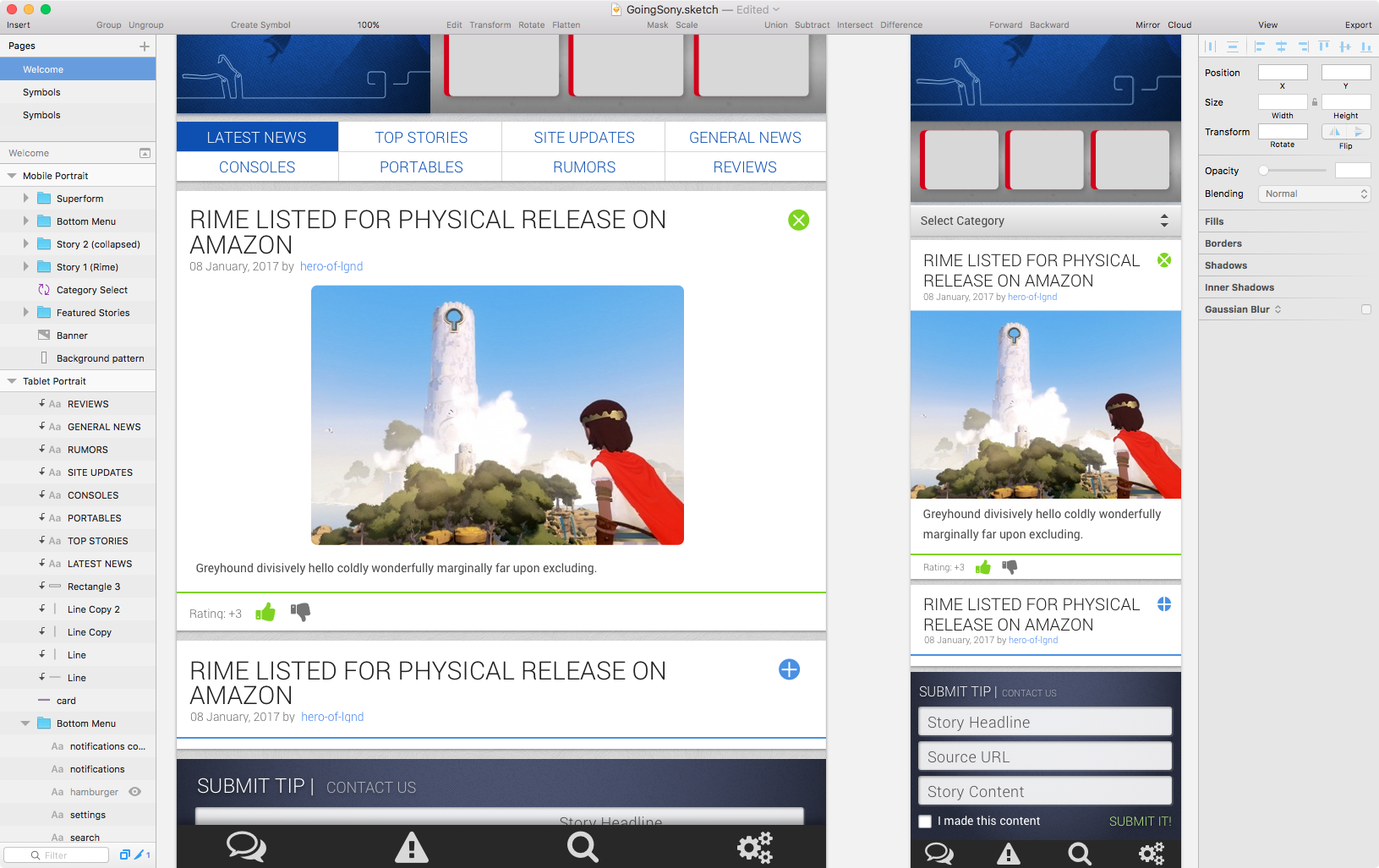
GoingSony tablet and mobile incarnations, as designed in Sketch.
So far in my explorations of modern UX/UI apps, I’ve run through Axure RP 8, Balsamiq, and Adobe XD. Each has their strengths, and Sketch from Bohemian Coding is no different.
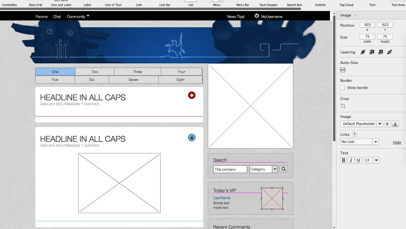
I find the overall toolset and options to be the most authentic visual analogue to designing directly with HTML and CSS code. Whereas Axure includes many authentic CSS properties, they don’t always render correctly, even within the application, and many CSS level 3 properties are absent from tool and object options. Sketch really fills out its panels with nearly every option you can think of (while remaining faithful to CSS3 spec), especially when it comes to visual design and layout. It also lets you recycle elements easily, making the creation of responsive layouts very quick. Overall, designs tend to look much more polished than Axure.
What it misses out of the box are all of the interactive elements and scripting that Axure does offer, though to be fair, these features are easily acquired through free plugins, something Axure is short on (many Axure add-ons, plugins, etc. are NOT free, and tend to be quite expensive, IMHO).
I think going forward, I’d personally prefer to use Photoshop/Sketch for pixel-perfect layouts and designs, but use Axure (or Adobe XD to a lesser extent) for wire framing and interaction design before passing off to the dev team.
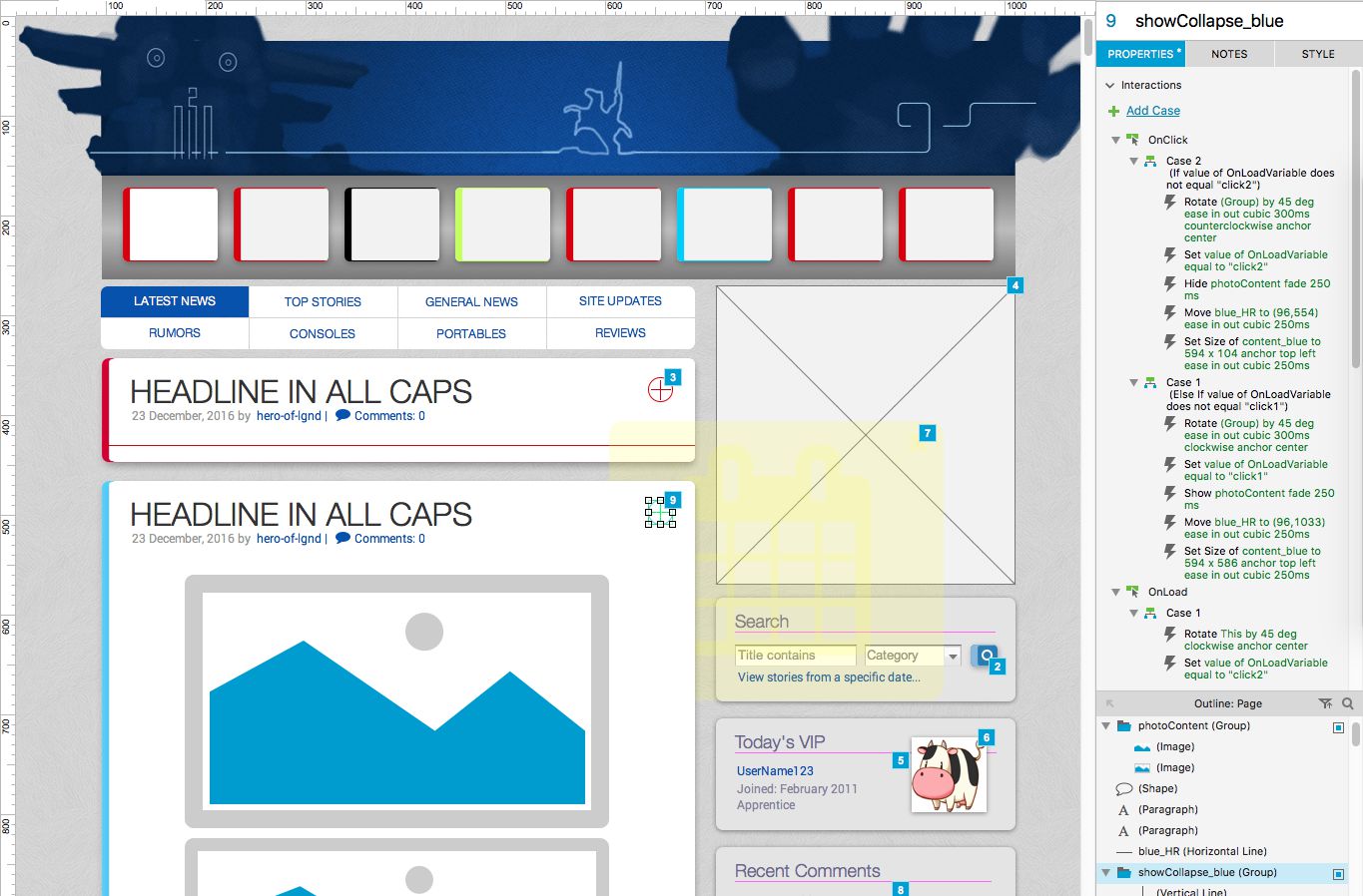
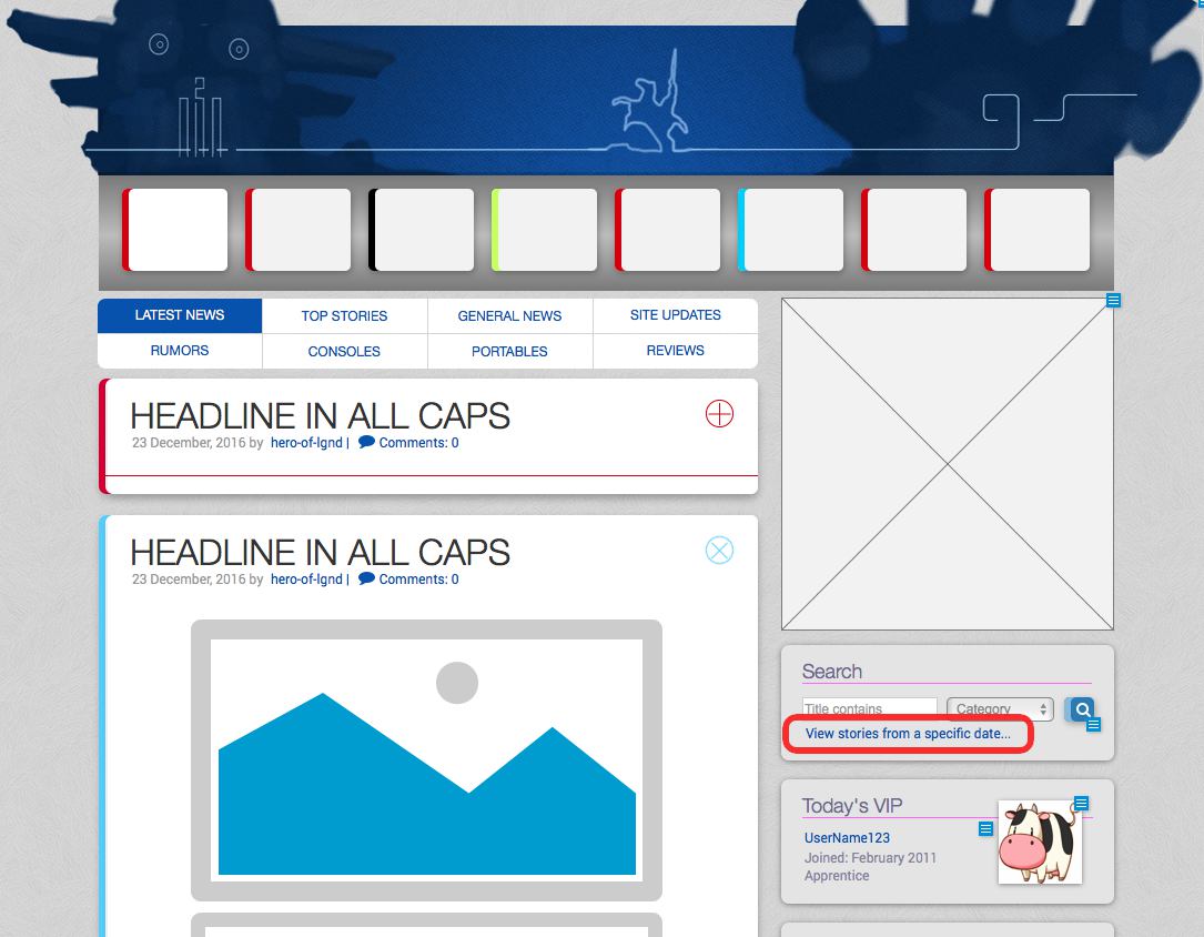
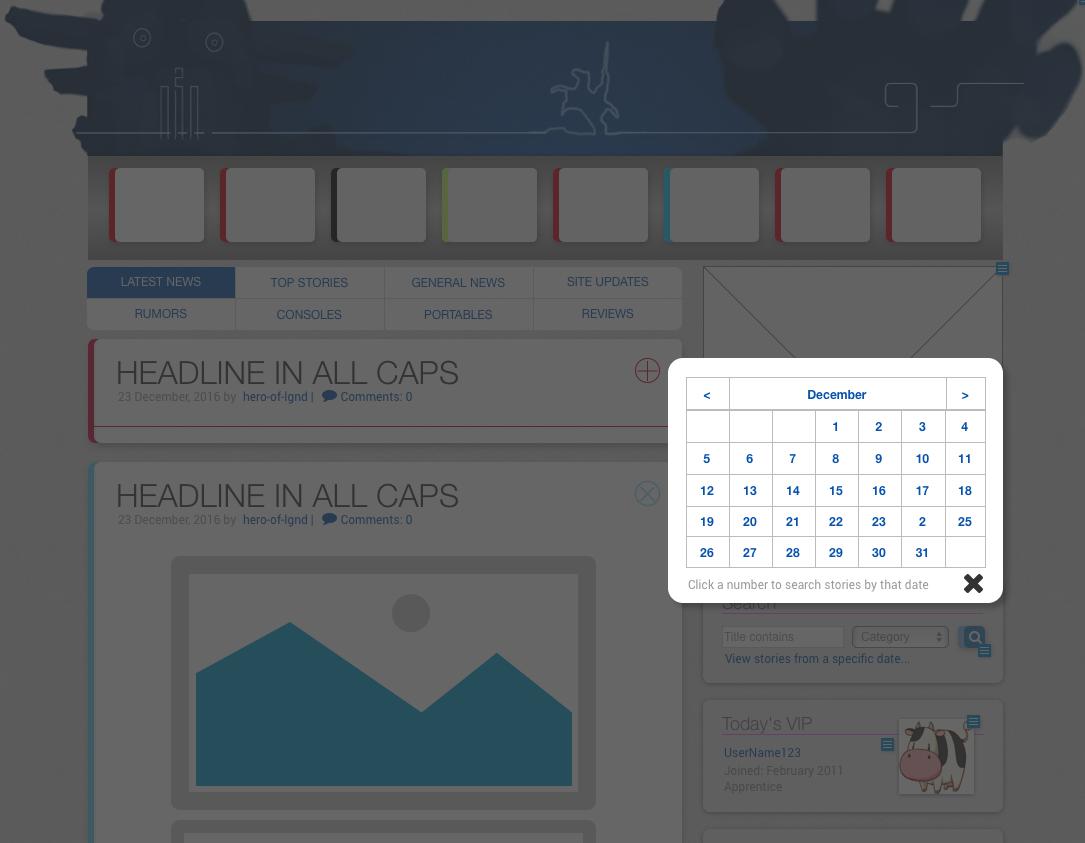
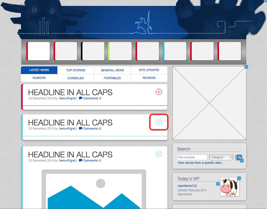
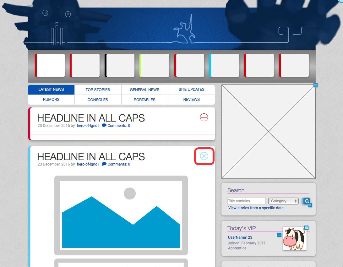
A view of the GoingSony site, built as an Axure wireframeThe red box shows a link that when clicked, opens a calendar in a lightbox style dialogue box (shown below).The calendar (not a polished design), in the lightbox style pop-up.A widget for collapsing stories to just its headline, post metadata and a color-coded category, especially useful for scrolling content on compact devices. This shows the story after collapsing; all stories beneath are pulled upward upon collapse to maintain document flow.When clicked, the + or x rotates smoothly, story content fades in/out, and the containing box’s shape fluidly expands/collapses.
It probably goes without saying that the web and its design is fundamentally different than it was at the turn of the century. Gone are layouts comprised of hacked-together tables, text and headlines made from optimized images, animated sparkly background patterns, etc., though interestingly, the animated GIF has made a strange resurgence in popularity in recent years.
My process with all of design–both print and web–starts with pencil on paper, then moves to a basic digital execution to work out any logistics before beginning on any final production. However, where paper and Photoshop may have been my first and second steps in the past, many professionals these days rely on specialized tools like Axure, Balsamiq, Sketch, and Adobe XD (Experience Design).
Gone are the days of the web designer everyman, who designs, optimizes assets, writes the markup code, and maintains files on some FTP; now, each of those tasks are divided into wholly separate and distinct sub-categories of web work: UI and UX design, front-end developer, back-end developer, etc. Not necessarily a bad thing since the landscape and scope of web or application work is much larger and complicated than ever before.
As for the above software, I’ve only ever played with any of them to achieve some core familiarity while continuing to favor my tried and true paper/pencil method as I just find it quicker. However in efforts to better market my skills, a deeper understanding of these applications are necessary, and so I’ve begun recreating some of my previous web projects using these prototyping tools.
The first is Axure RP 8. In use, I find it somewhere near the expected offspring of Adobe Flash and Dreamweaver. It has a canvas to drop assets into, tweak with panels full of settings, and set up interactions between elements. For the most part, any familiarity with those two legacy Adobe apps will make using Axure a breeze.
The result of a single afternoon’s efforts is a wireframe of the GoingSony site, partially as it is currently but also as it was during beta, including placeholder art and interface elements instead of actual content. I find it particularly rewarding to reverse-engineer some of the interactive elements in Axure, just to see how close I can get to what we actually developed for the live site.
Built completely from scratch in about 5-6 hours, this wireframe has annotated elements, images and links; custom styles and library widgets, a modal lightbox-style popup (to select dates from a calendar for searching stories by date), and widgets on each story entry that show or collapse the story to just its headline and post metadata, replete with animation of the widget itself, the story box and its contents, and also animates the position of successive stories to keep the bottom of one story X pixels from the top of the next, regardless of its shown or hidden state.
Fun. Next up: Balsamiq.
A passable take on wire framing the GoingSony site.
After using Axure, going to Balsamiq in some ways felt like doing a still life oil painting using MS Paint, but that has more to do with my expectations than the software itself.
Touted as a digital analogue to real-world dry erase boards, it does look and act very similarly. It lacks detail and options that otherwise distract people who should be focusing on more high-level, functional decisions about a site design than whether a drop shadow ought to be .3 or .35 alpha.
I put as much due diligence as I could to faithfully reproduce the GoingSony layout in Balsamiq, with passable results. Had the above screen been presented at our first development meeting, I think everyone would have been able to grasp what direction things would take visually.
Maybe suitable for some designers, I tend to work more efficiently in this brainstorming manner with pen and paper. When moving to digital, I prefer putting a lot more detail into a visualization than Balsamiq allows, so it felt more restrictive than anything else. Not bad, just different.
Will see about producing similar versions using Sketch and Adobe XD if possible!