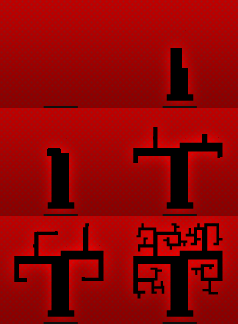
in case anyone hadn’t noticed, i’ve ditched the moody, gothic black and red design for something a bit more light-hearted, not to mention inspired; the previous design was pretty dull in my opinion. this time around, brighter tones everywhere, as well as some more organic elements give a more accurate representation of my personal design style and skill.
 replacing the branching tree animation of the previous header are the row of navigational buttons just beneath the header, each with a small, subtle animation. it’s probably my favourite new element to the site, followed by the new image viewer. click almost any image from a post or gallery to have it neatly presented in a larger format, scaled to your window.
one disclaimer: the site is designed to work in all modern browsers, which contrary to some beliefs, does NOT include Internet Explorer 6. i have done my best to keep things reasonably designed and functional with IE6, but the truth is the program is old hat, and was never very good to begin with. it’s an anchor this boat isn’t interested in dragging anymore. so you can do your best to enjoy the site with IE6 minus the full experience and plus a few layout quirks, or you can do the internet a favour by joining the rest of 2008 and using Firefox or Safari.
it’s my hope that people enjoy it; if you experience any issues or just totally hate it, leave a comment. in the coming days, i’ll be refreshing/streamlining my portfolio images to be more concise and current. thanks for stopping by!

listening to:
Modern Guilt
Beck

3 replies on “emo no mo’”
you should put your old theme out for download for wp developers such as myself….oh, and great job on the new theme! 😀
maybe i will, it’s not really doing me any favours anymore 😛
thanks for the compliment!
No problem! 😛