Enterprise UX Governance

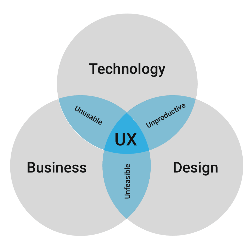
TLDR: what happens when a multinational corporation maintains a catalogue of 150 digital products, all designed and maintained separately? Absolute UX mayhem. Cue my efforts on their new team intended to add some clarity and direction to their UX group of over 250 fine people.
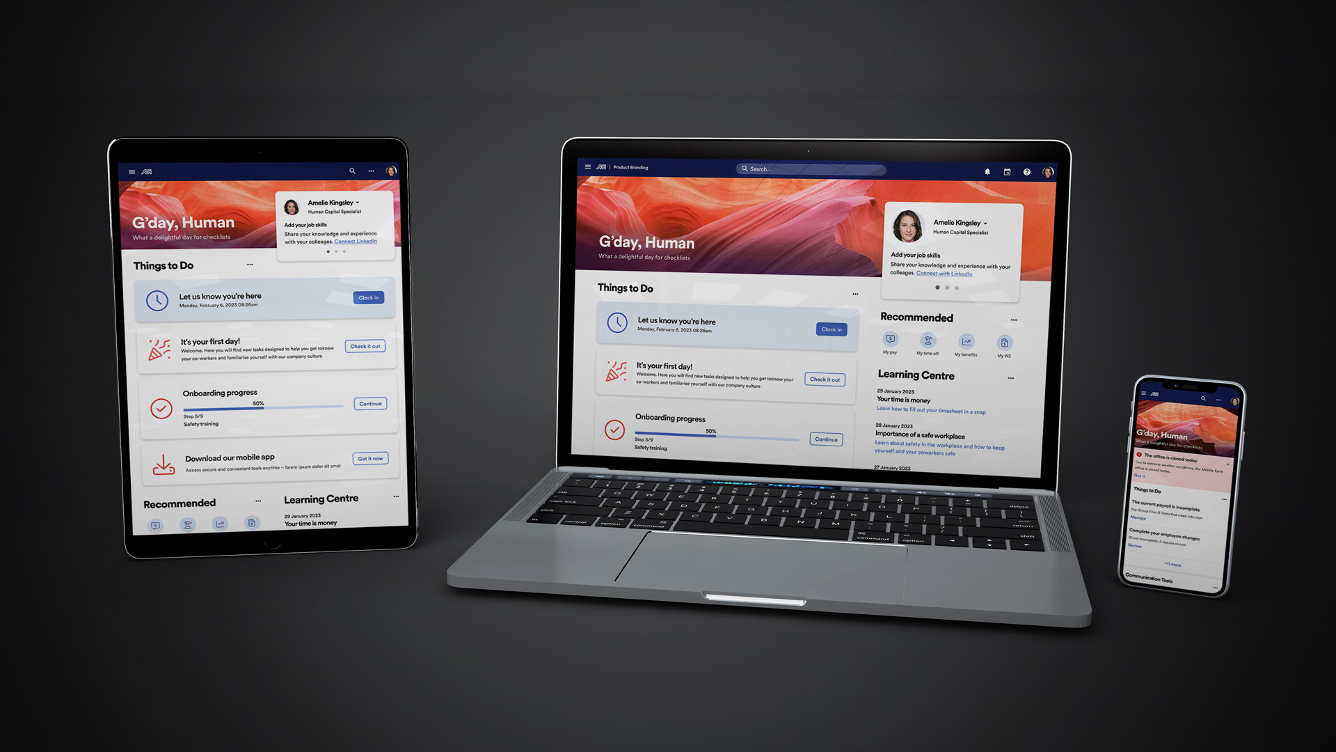
Project

OneUX Design System (tentative name)

Client

ADP

Role

Lead UX Designer

Team

Design System (20), UX department (250+)

Environment

remote

Methodology

agile

Website

N/A (all work for internal business systems products)

Key Skills

Design system, Patterns, Documentation, Component library, Wireframing, Research, Sketch to Figma transition

Summary

Provide UX governance; consistency and clarity to the many product and design teams through a well-built and documented design system.

Overview

In mid 2021, someone at ADP either noticed (or was notified) that their deep catalogue of digital products and services were completely misaligned.

Different designs, UX patterns, components, navigational conventions, etc. plagued the lot.

Perhaps difficult to identify from within, but painfully obvious to any customers using multiple ADP products everyday.

So in late 2021, they inaugurated a special new Design System team with the mandate to audit and realign all company UX/UI efforts.

How I joined this project

Technically headhunted by their official third-party agency partner, I joined in early 2022 interested in taking on a truly massive, complex challenge.

While it didn’t directly satisfy one of my prime directives to help society or improve the world, positively impacting tens of millions around the world using ADPs products in their everyday lives is arguably a related pursuit.

Objectives

In a nutshell: standardise everything and package it for mass consumption.

This included a catalogue topping 150 digital products and a UX team of over 250 talented professionals.

To tackle this, we divided deliverables into several categories:

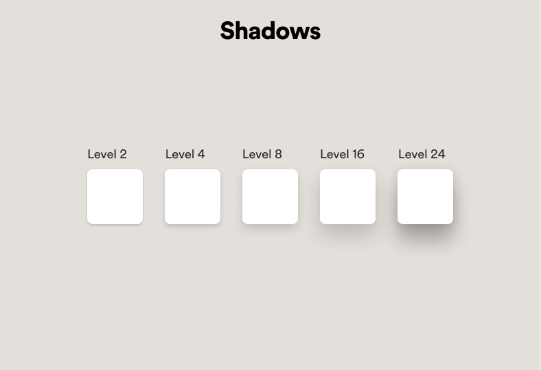
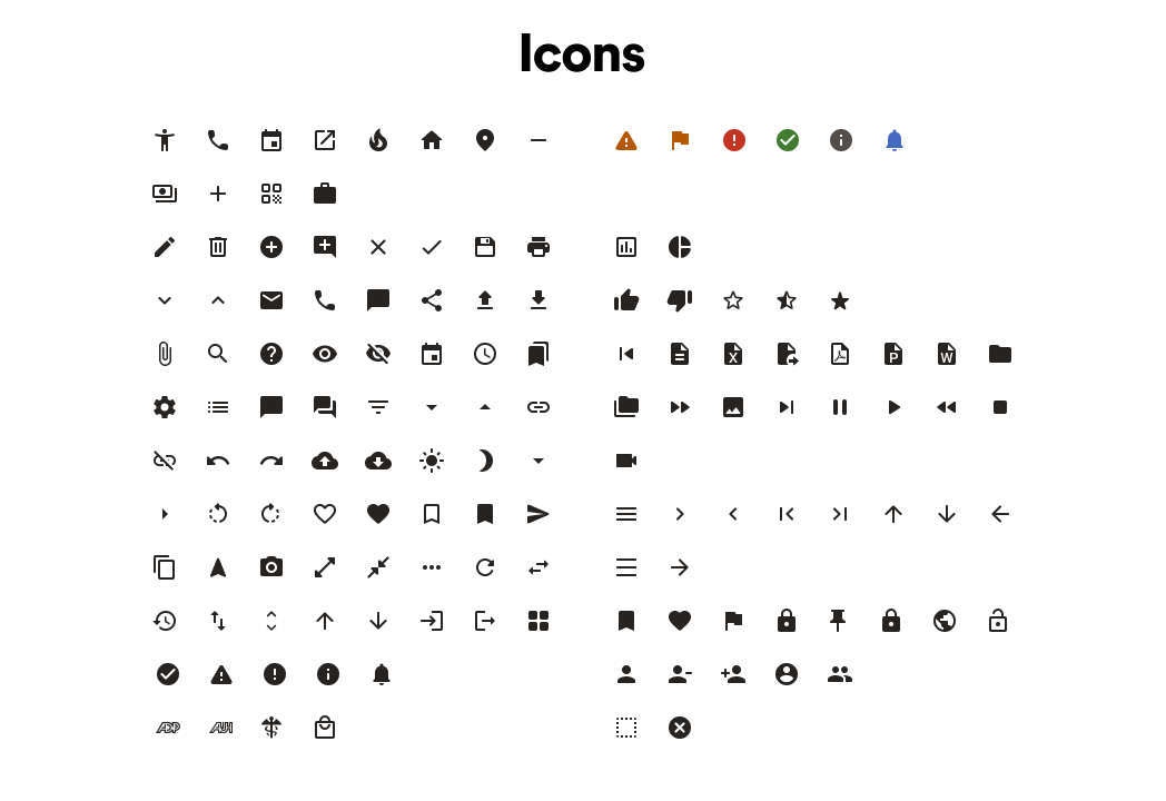
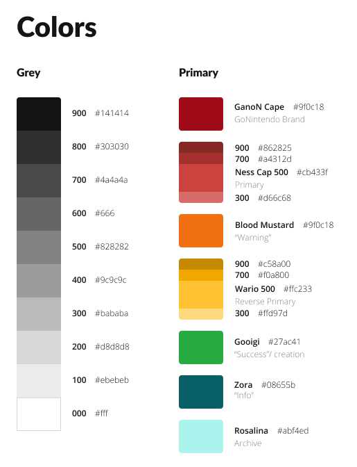
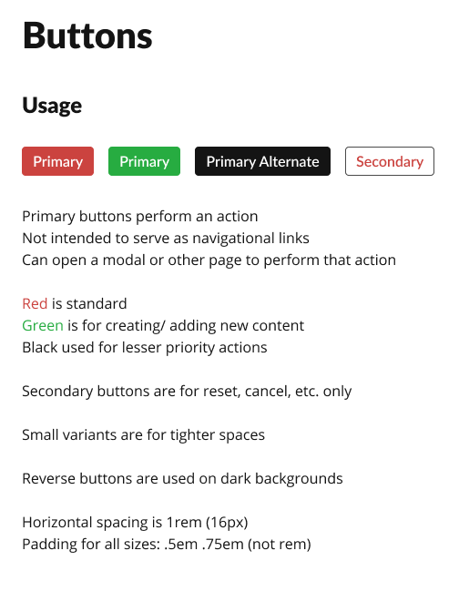
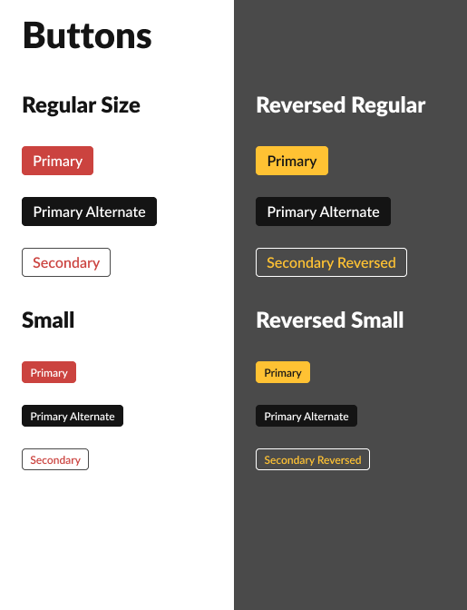
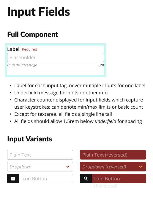
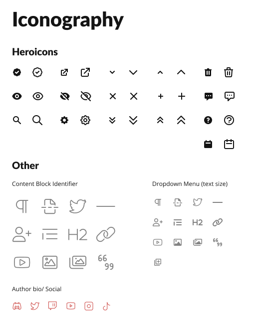
  • Foundations (aka global atoms, partial gallery shown below)
  • Component library – including code alignment
  • Patterns
  • Photos
  • Illustrations
  • Documentation

Publishing methods

As for the packaging end, we began by publishing an internal documentation website, though as we began authoring content, it quickly became obvious that maintaining everything in multiple areas and in multiple formats (Sketch, Figma, Miro, CMS-based web publisher) was not only inefficient, but an invitation to very quickly amass enormous volumes of UX debt.

Partnering with engineering, we then created a utility for Figma’s API that could, for the interim, scrape documentation from inside our design files and publish it, eliminating redundancies.

Long term, we planned to eschew the website altogether and harbour all documentation alongside the design content itself, inside the Figma library files published to the entire organisation, reserving any website presence for a public edition.

Process failures

In effort to avoid any bias or unpleasant impressions, I will limit these points purely to factual details without commentary and leaving any quality inferences to the reader.

  • A Director and several Lead level designers from our Design System team, all with a decade or more service to ADP, left the company within the first few weeks of my arrival.
    • VP inherited all of the subordinate Director’s duties for about six months.
    • A single VP stretched between dozens of “direct reports” left scarce time for anyone to discuss issues or progress.
  • HR, onboarding, payroll, etc functions fell to said VP rather than individuals’ managers, which prevented requisitioning hardware/ software licenses and introduced occasional payroll issues.
    • After nearly a year, I never did receive a computer or mobile licences, instead needing to configure my personal hardware and software to work with or around their VPN.
  • Full time employees enjoy a robust onboarding experience; contractors receive a link to someone’s Webex recording briefly describing a few of the company’s key digital products.

My contributions

Throughout a near-year with the team, my efforts were focused thus:

  1. Complete their enterprise “UI Shell” and navigational construct
    • building the components
    • aligning with code
    • documenting all functionality and usage
  2. Author patterns
    • identify
    • research
    • illustrate
    • write and publish documentation
  3. Assist with enterprise transition from Sketch to Figma

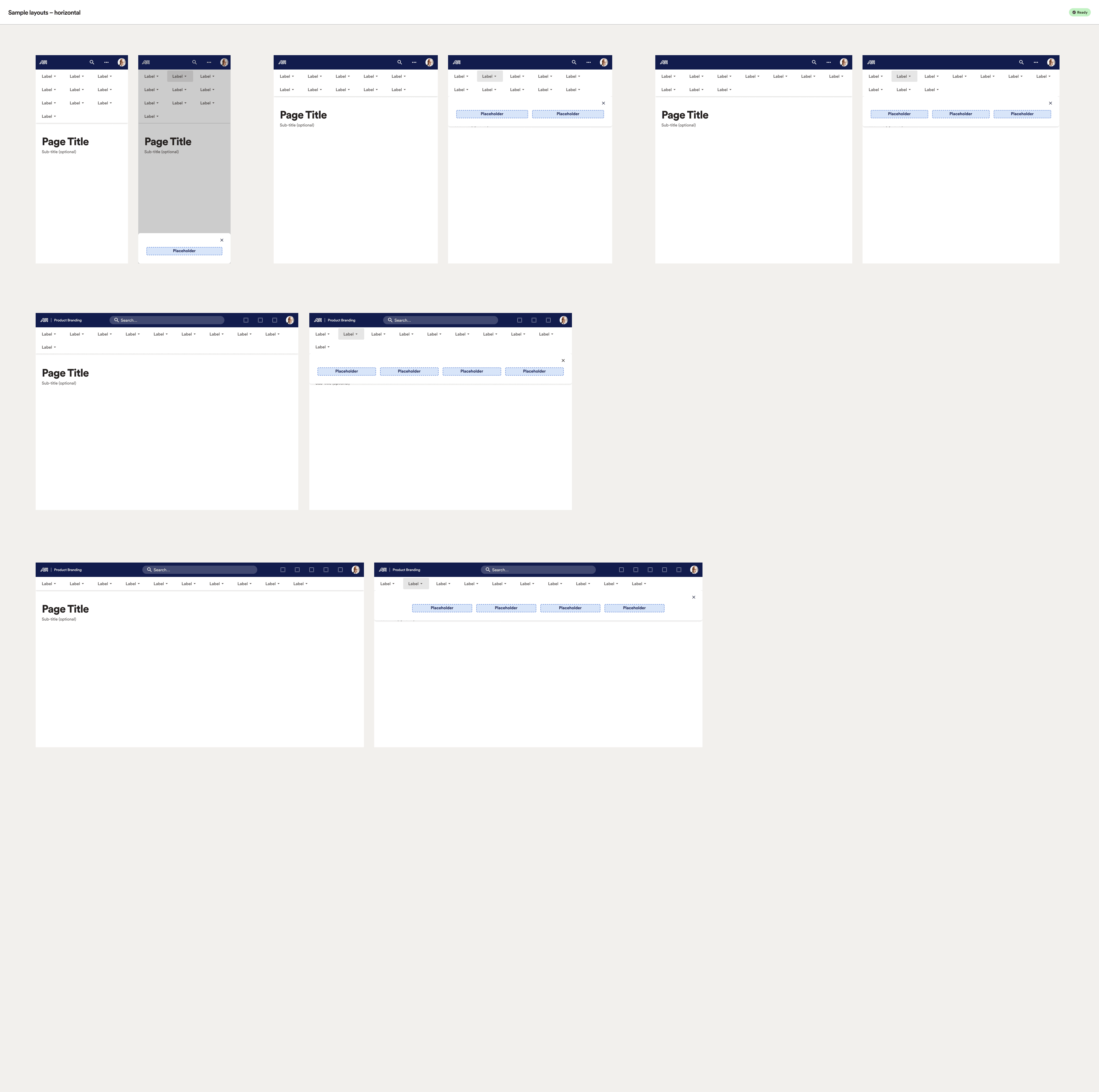
UI Shell

This may have been the most complex aspect of the entire design system as it touches literally every person and product.

Nothing like a trial by fire as my first endeavour! 🔥

Component building

An incomplete array of assets and concepts existed in a derelict Sketch file started by someone long, long ago in a galaxy far, far away…

While that original file’s contents cannot be shown here, I can share excerpts of the final output below.

Specifically, I needed to convert any relevant, existing assets to Figma or create whatever necessary to fill the gaps across the atomic food chain.

To do this, I spent nearly a month in discovery, tracking down technical details, usage patterns, interviewing users, engineers, designers, etc. to map the truly mind-boggling number of requirements and pieces of the overall puzzle.

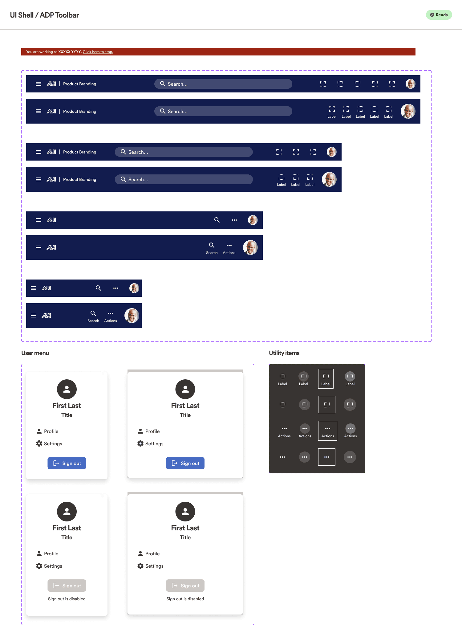
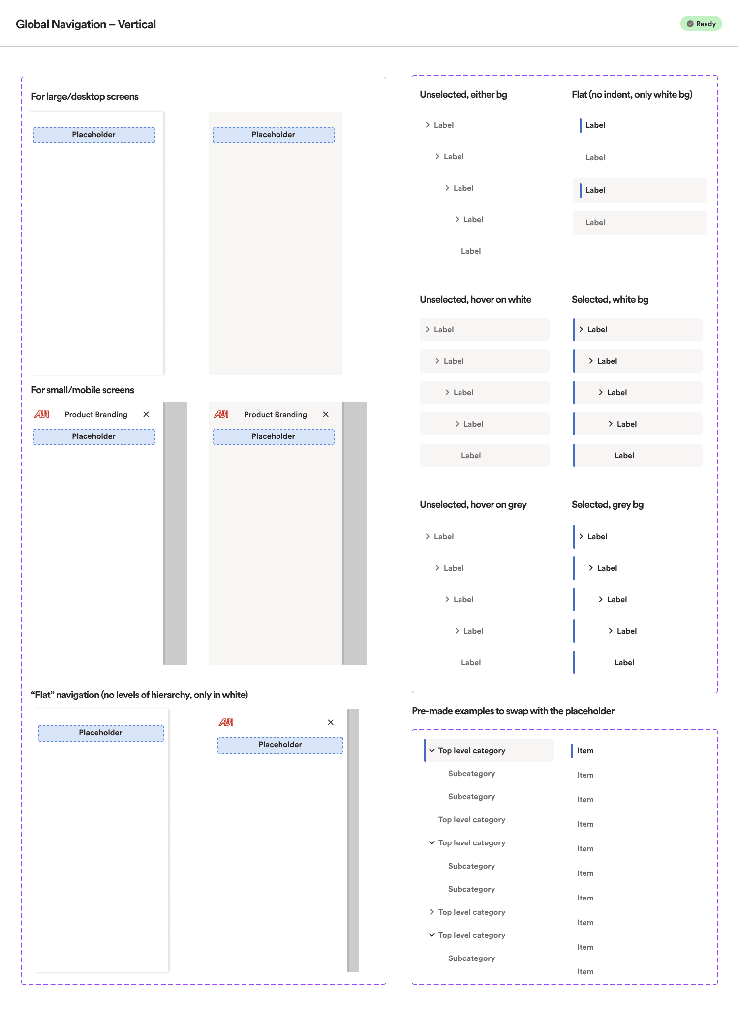
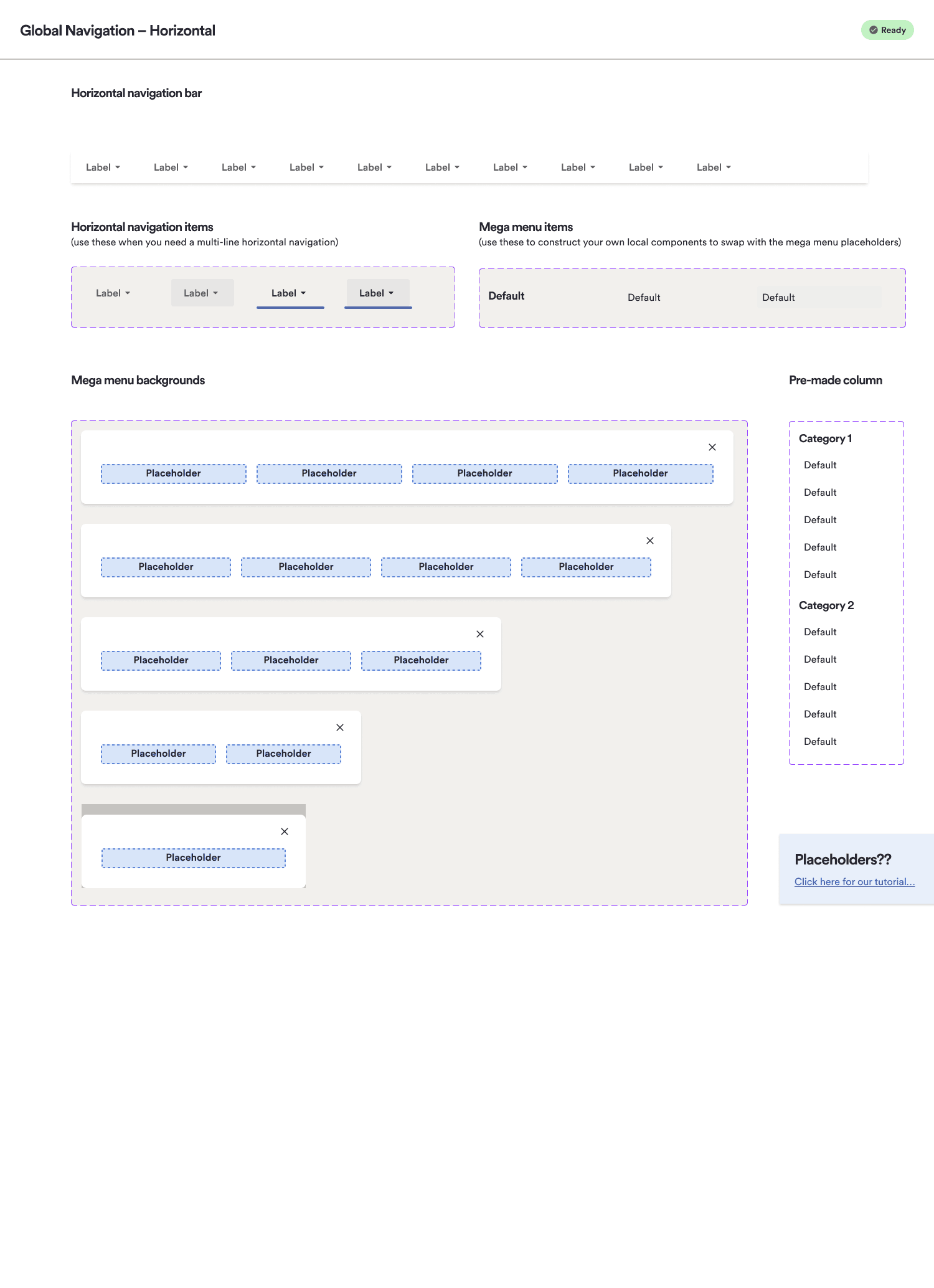
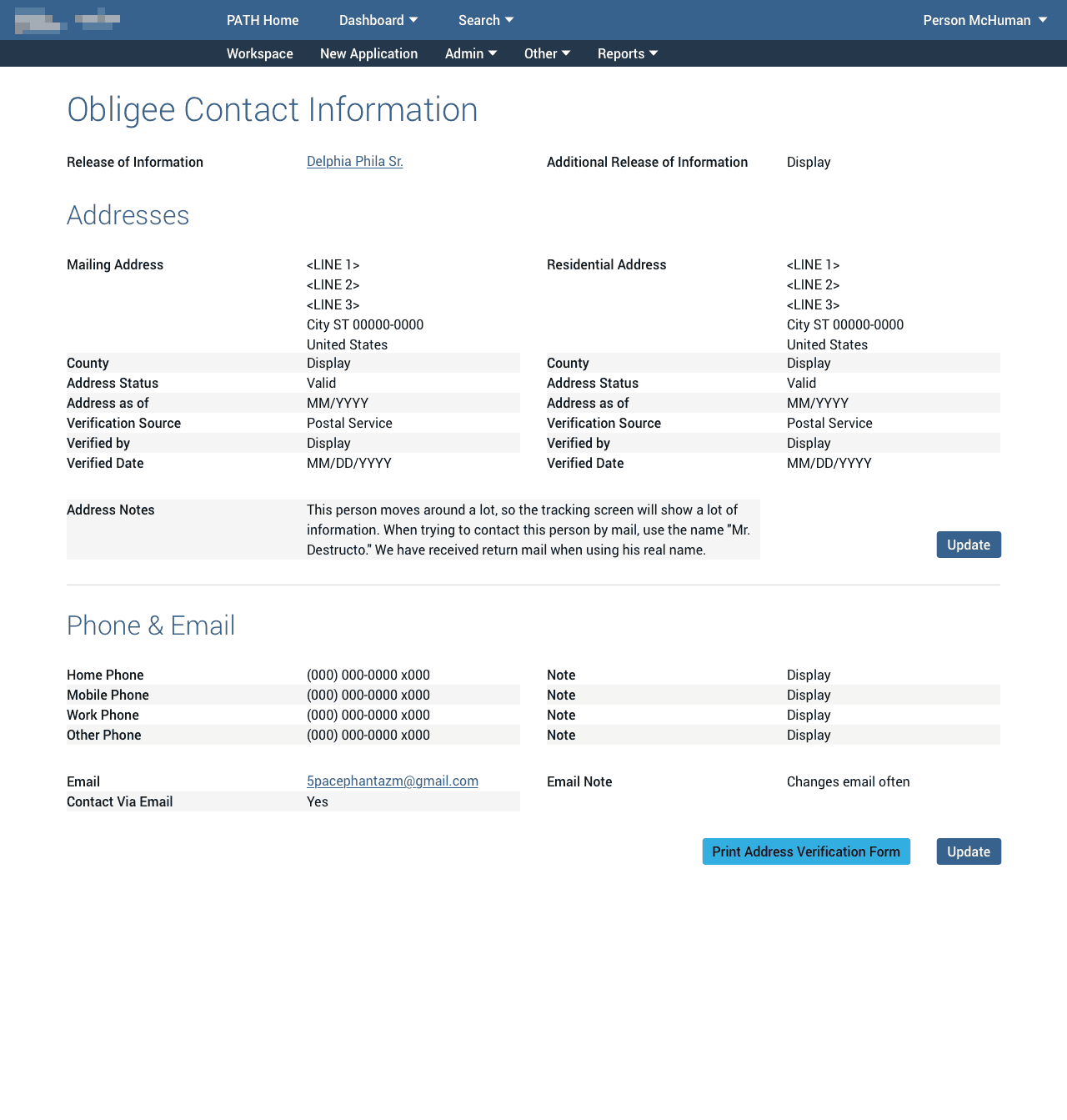
Below, you can see some of the atoms and molecules included within the layout. Others were hidden outside the visible area and withheld from publishing directly to library subscribers.

In all, nearly a hundred components and sub-components were created for this single system feature. 🤯

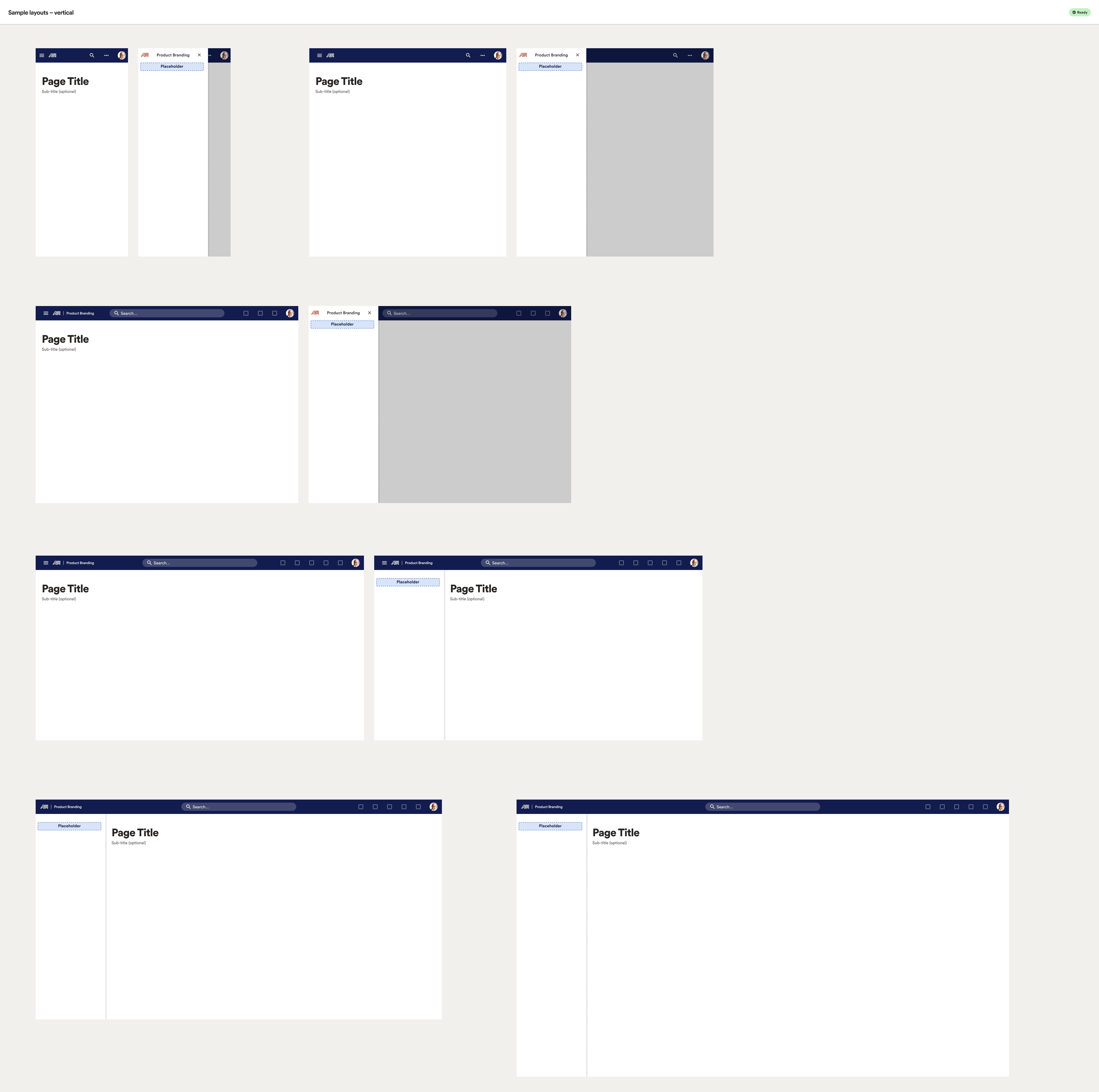
Since this universal shell was a bit foreign to many teams, I also needed to create some templates and examples for designers, including defining the coded environments’ actual column grids and break points, along with variations appropriate for each.

Curiously, developers in their thoroughness created breakpoints for the mega menu even on mobile where it would not be ideal, and where no patterns or direction had yet been given. Because we initially aimed for 100% code alignment, I also included horizontal menu examples for mobile that could be eliminated and tracked in a later sprint. 🤷🏻‍♂️

Code alignment

When it came to code aligning the dozens of UI Shell/Global Navigation components I designed, attention to every pixel of detail would in theory benefit the UX designers and engineers downstream.

To achieve total alignment nirvana, I spent 2-3 months in our Storybook environment examining every aspect of the navigation components’ code/stylesheets, in browser code inspectors, and on Webex calls with the lead engineer.

I even included the rendering glitches and CSS quirks in the designed components. Yes, I am that thorough. 😎
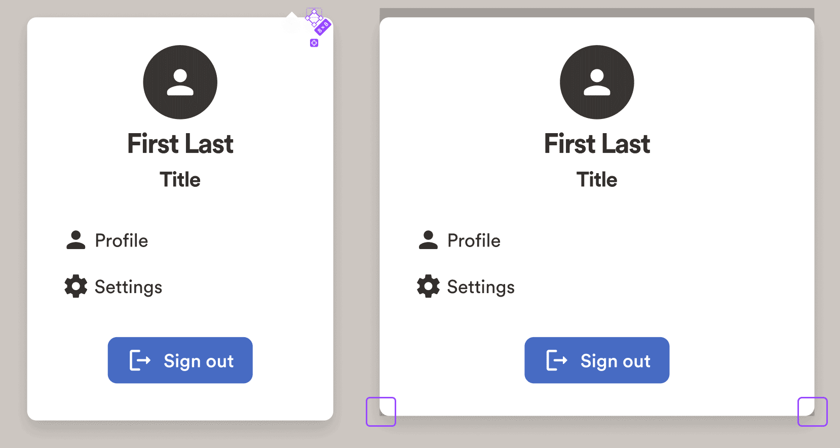
CSS quirks from code intentionally recreated in component design. User pop-up menu. Left, desktop; right, mobile.

Inspecting the user pop-up menu (when clicking their avatar in the toolbar): left, the desktop version which appears immediately beneath the avatar; right, the mobile version is a modal sheet which slides up from the bottom of the screen and casts a focus overlay across the rest of the screen.

For the desktop version, the tiny arrow which normally points at the avatar above, in code was an 8px white square, rotated 45 degrees. So that’s exactly how it was built and named in my Figma component.

For the mobile version, the developed sheet still had a border-radius for the bottom corners, partially revealing the overlay. So again, for better or worse, this behaviour was replicated in the components, purely for alignment sake, which could then be tracked via a ticket during a future sprint.

Documentation (prototype)

While we did need to explain every nuance of this component in excruciating verbosity, to be honest, much of that was purely for posterity, as designers and developers prefer to be shown than told.

So as often as possible, diagrams and illustrations served show. Check out a prototype of the component documentation (external link to Figma):
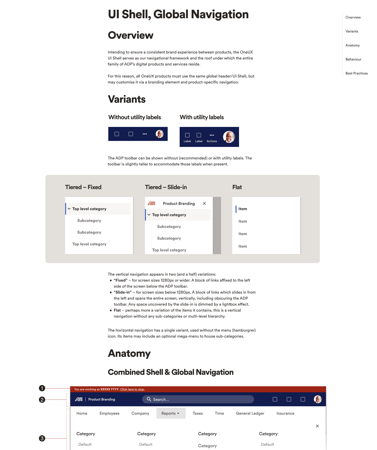
Check out the prototype for a sense of the documentation style.

Patterns

Overall, the patterns pillar ran somewhat independent from the regular Agile sprints; aside from defining basic stages of progress, the timing of each was simply too nebulous. Each finished when it finished.

Discovery

The leading phases for defining/documenting each pattern involved two steps:

  • Seek out and compile examples of said patterns existing within current products
  • Conduct basic UX reference research via published literature (N/N Group, Baymard Institute, etc.)
  • Show comparisons and contrast with other enterprise design systems
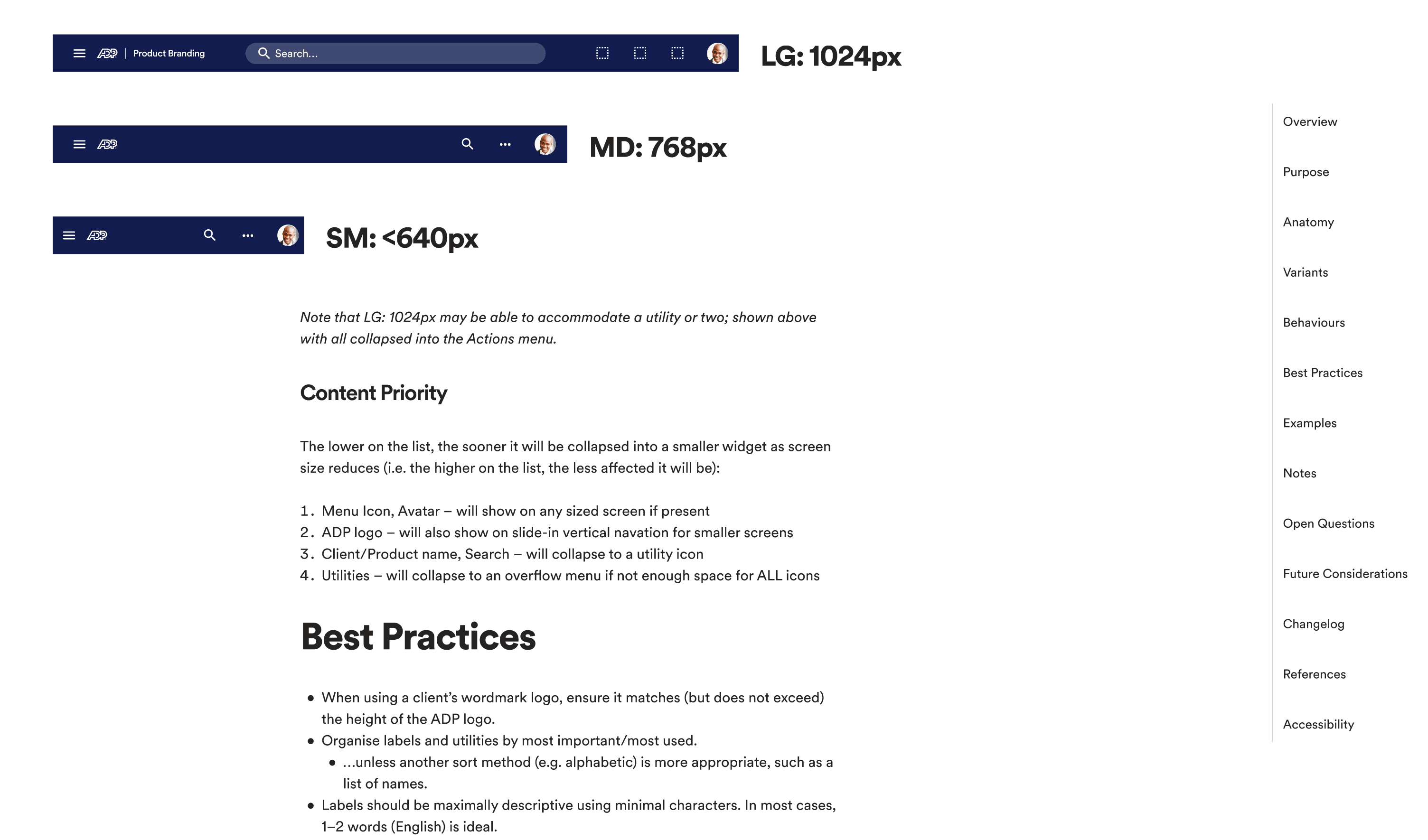
Excerpt from the UI Shell/Global Navigation pattern

Authoring

A basic gallery of the collected examples alongside the research is published for each pattern in a central Miro board, and participants across multiple teams are invited to discuss.

Feedback was then processed and discussed internally by the Design System team and a preliminary policy drafted, including creating any necessary illustrations or diagrams.

On a side but related note, while working on a number of patterns, I matured the team’s existing diagram illustration style.

Publishing

The entirety was presented centrally once more to collect final feedback before formatting and officially publishing.

The CMS-based web publisher required old-school exporting of web-optimised images and a lengthy formatting process.

The site was only published once per sprint, meaning new articles or updates needed meticulous planning to hit those deadlines.

As mentioned earlier, building and maintaining multiple instances of the documentation proved grossly inefficient, so we began migrating all documentation to reside inside their respective pages within the Figma library documents.

This allowed immediate updates at any time and a single source of truth directly adjacent to the content being described (in addition to allowing live elements in prototype view). 👍

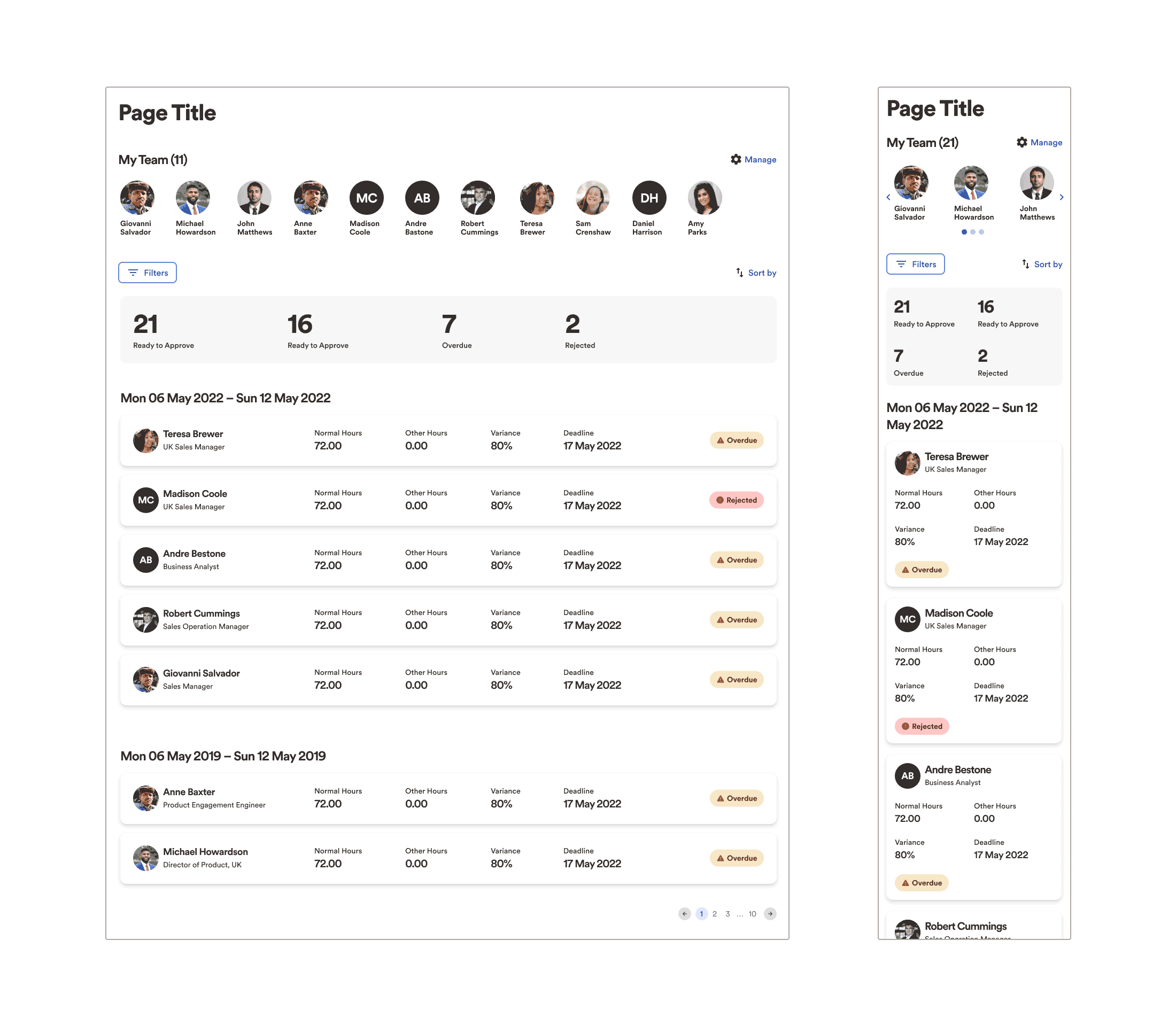
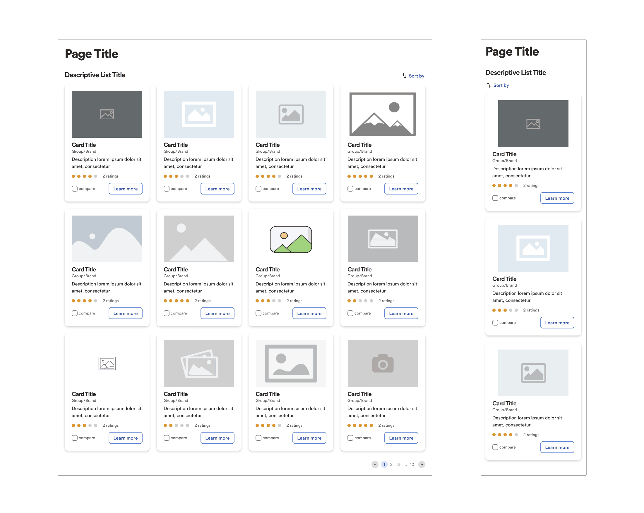
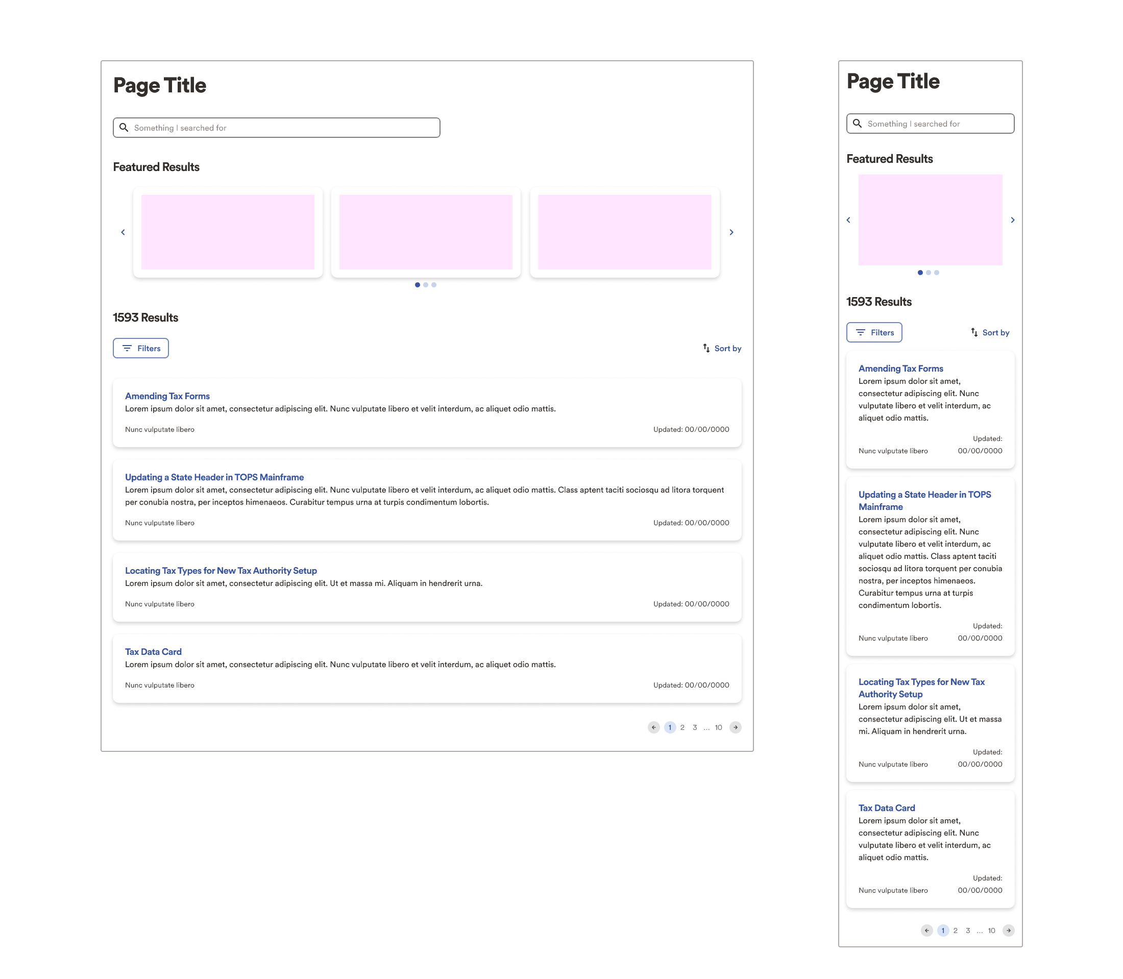
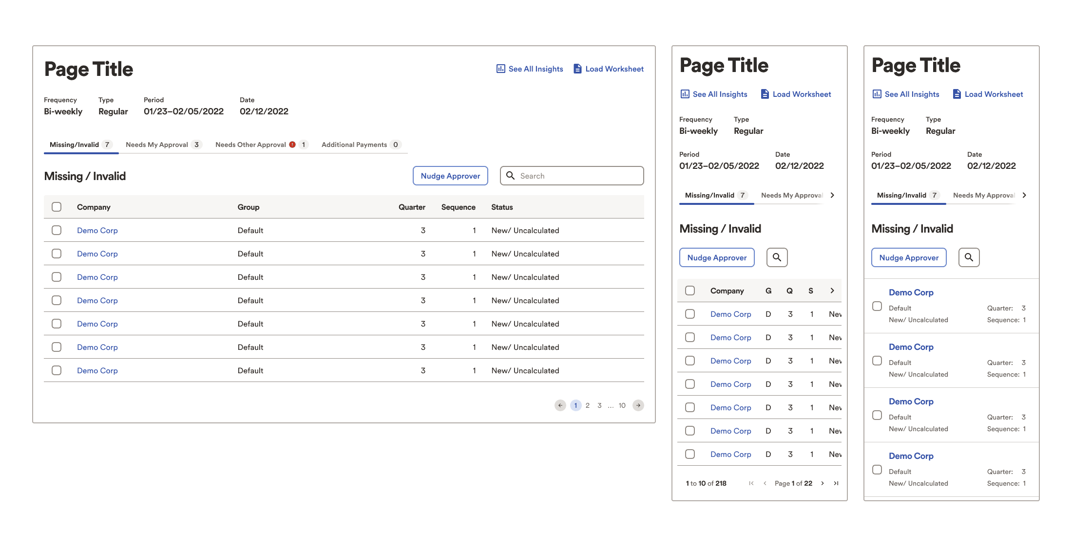
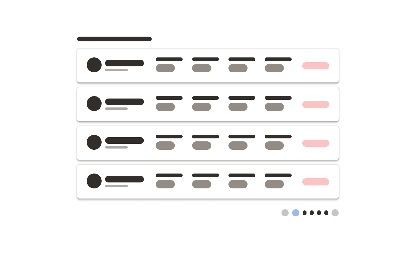
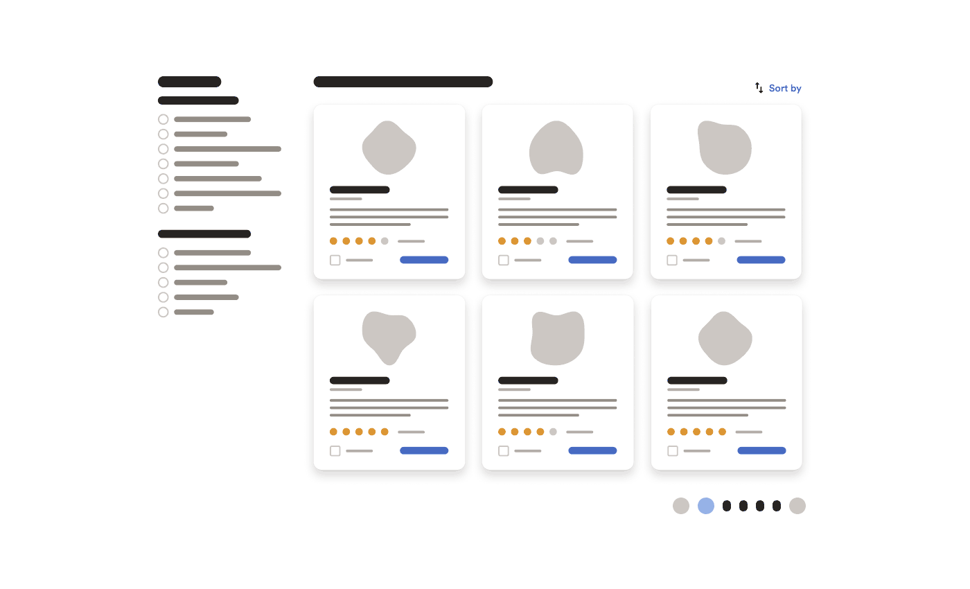
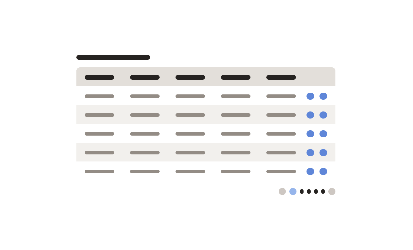
Examples from List Pages pattern

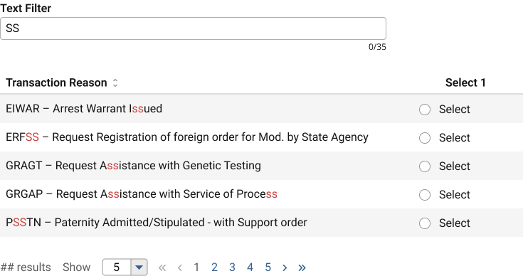
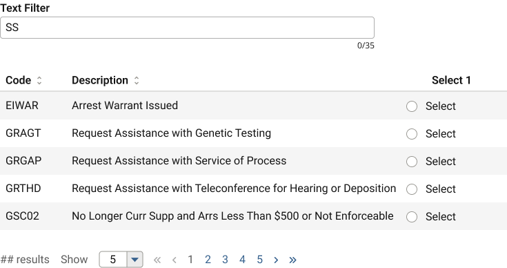
Many times, especially in data-rich corporate environments, software must display lists of various types.

To help the many product teams align on some standards, I identified a handful of core use cases, applied general UX research for best practices, and authored the pattern content.

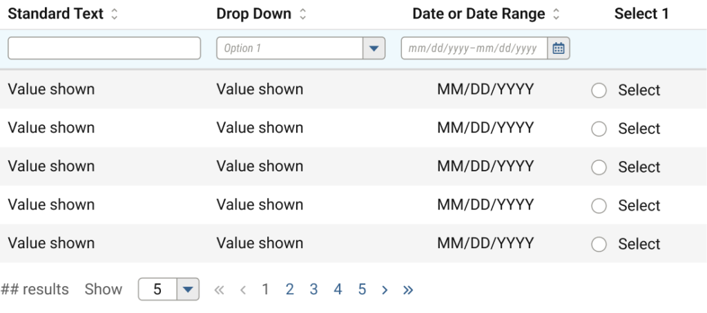
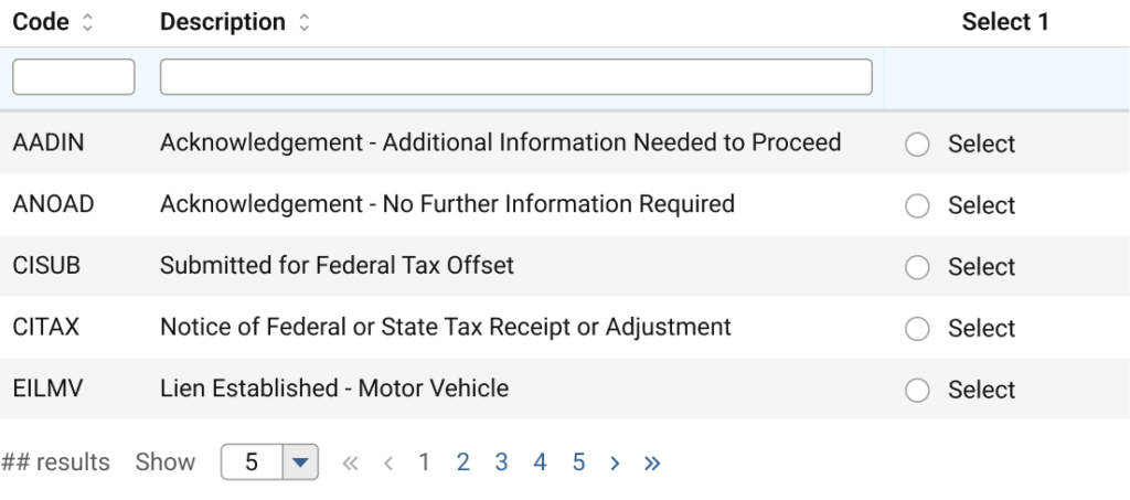
While the above examples were in progress, simpler, low-fidelity versions helped instruct the engineers about how to build templates. Interestingly, they had no trouble translating the super simple style into existing components.

Figma ambassador

The organisation began a mass transition from Sketch to Figma just as I arrived.

Fortuitous, as without a company-issued computer, I could not access their software installer nor company Sketch licence. Figma, however limited me not.

As a power user, I volunteered for their transition ambassador program, where I spent time:

  • Fielding questions in a UX team chat (yes, the same hundreds of teammates)
  • Demonstrating best practices
  • Contributing to training and helpful resources
  • Attending weekly ambassador meetings
  • Attending personalised training directly from Figma’s design advocates
  • Expediting Design System (components) transition from Sketch

Findings and insights

In contrast with the earlier process failures, these most certainly do contain some personal biases from my own experiences.

  • Some highly visible product teams carried on as if immune to alignment efforts, in turn influencing other, smaller teams to also diverge from defined standards.
    • Perhaps some manner of certification accountable to leadership would persuade more teams to participate in the design system.
    • Some of these divergences were then submitted back to the Design System team as contributions, thinking they would simply overwrite established standards. This worsened inconsistencies and complicated alignment efforts.
  • Many of the design system efforts were targeted only towards desktop users and layouts, procrastinating mobile for “later”
    • My contributions always included a minimum of mobile, tablet, and desktop deliverables.
    • I discovered a number of undesirable results from developers implementing their best guess in the absence of design guidance.
    • I repeatedly advocated in our DS team roundtables for at least mobile standards in addition to desktop, to a fairly unreceptive audience from leadership and those with greatest seniority.
  • Some of the Leads on our team, overly eager to win acceptance and adoption from other teams, approved external submissions to the DS without research, discussion, or any kind of QA, resulting in conflicting, redundant, superfluous, or inappropriate features, polluting rather than purifying the system. Better communication/submission process would improve the design system plus inter- and intra-team politics.
  • Clearly some internal, political issues between management and team members caused an exodus of long time employees. Lesser human capital on the team deeply affected our efficacy.
  • Similarly, the organisation clearly favours full-time employees, relegating contractors to second-class citizens with virtually no onboarding, lack of integration with the regular employee teammates, zero resources or privileges to acquire essential hard/software, nor the ability to engage directly with leadership, leading to gross inefficiencies.

Additional design artefacts

A handful of the foundations, or global atoms.

Some of my documentation supporting Do/Don’t illustrations

Government SaaS Platform

aka Not a sparkly UI design case study

TLDR: the story of how a lowly “wireframe monkey” showed a UX immature corporate startup the difference design makes, even when building a humdrum government SaaS platform.

Project

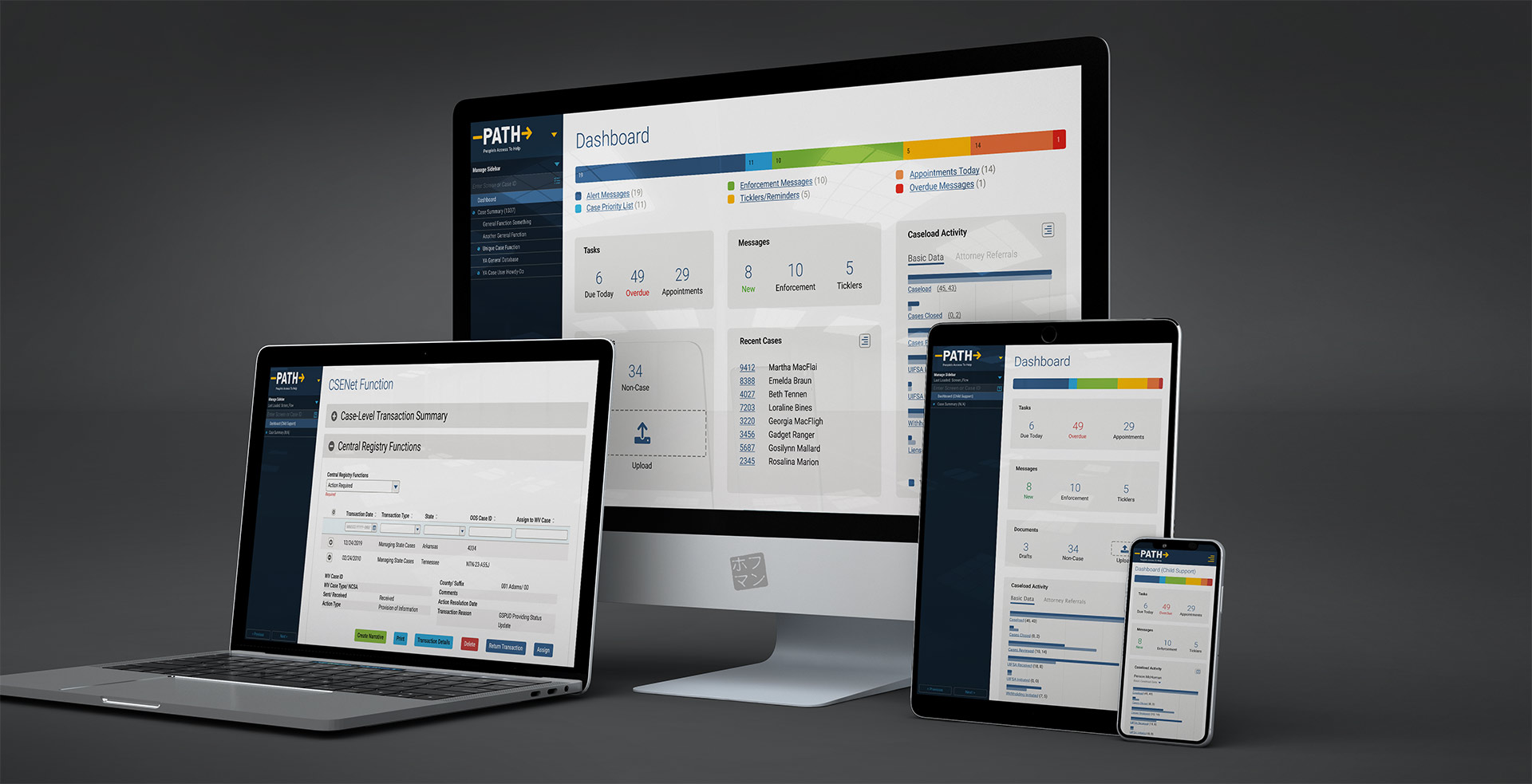
People’s Access to Help (PATH), f.k.a. WV Integrated Eligibility Solution (WVIES)

Client

State of West Virginia via Optum/ UnitedHealth Group State Government Solutions

Role

Principal, Senior UX Designer

Team

UX design (5–12); broader UX/UI team (dozens)

Environment

hybrid, distributed teams across US

Methodology

custom Agile (plus torrents of waterfall)

Website

N/A; internal system only, requires security clearance

Key Skills

Design system, CRUD standards, Component library, 508 compliance, WCAG, Wireframing, UX/UI, Style guide

Summary

Transforming a decades-old, mainframe/terminal government application from its pre-color, pre-mouse era into a responsive, modern application while integrating multiple disparate but adjacent systems into a single, cohesive experience. Building a sellable SaaS platform.

Disclaimer: due to the confidential nature of taxpayer data and non-public government software, some content may be modified from their originals to protect identity and trade secret information.

Overview

In 2016-17 UnitedHealth Group and its tech branch, Optum, must have foreseen a market in and some impending collision of government and insurance by founding a new startup division called State Government Solutions (SGS).

Their ultimate aim was to create a SaaS platform, leveraging their enterprise-level databases and security experience, that could be resold to multiple government entities who would benefit from instant access to these integrated systems.

They aimed to piggyback development of this new SaaS platform via their inaugural project with the State of West Virginia Department of Health & Human Resources, who had several decades-old systems sorely in need of modernisation and integration.

How, why I took this project

Why work on something that isn’t beautiful, cutting edge, or even at least lucrative?

In short, to help people.

Given WV’s rank of affluence in the union, I saw a good opportunity to lend my skills for the benefit of fellow Americans humans. Because being a good person and affecting positive change in the world ranks as a crucial criterion for my project selection process. The world is what you make of it, etc…

As for how, the poor intern who SGS thought would/could shoulder all of the design (and even some development) to the tune of massive profits quickly saw how deep the pool really was and immediately sought senior level pros like me to fill in the many, many competency blanks.

Though I was brought on as a Senior UX Designer, within the first year, my role became Principal level, overseeing many of the high level responsibilities, most complex subsystems, mentoring junior teammates, delivering formal presentations, partnering with engineers, of course along with my banana-fuelled wireframe output.

Objectives

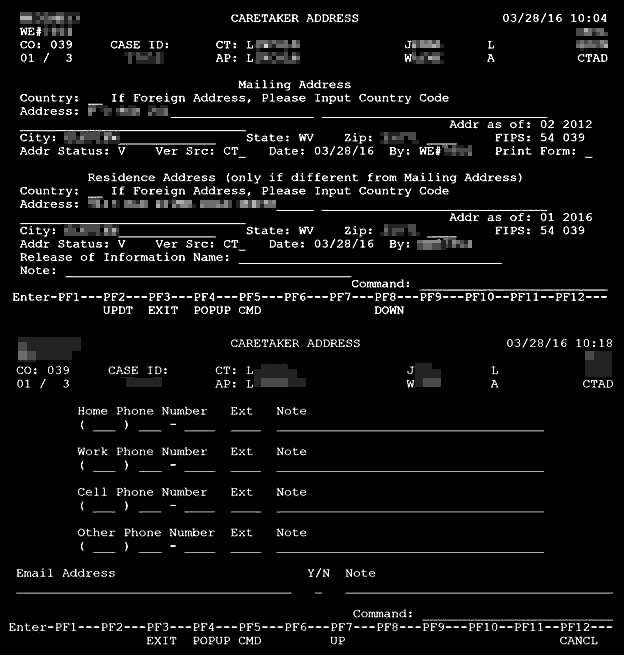
Not only were we charged with translating a legacy mainframe command-line application written in an extinct programming language—one bearing decades of accumulated development bandages and a prehistoric manner of database into modern equivalents—but also with transforming one lacking colour, shapes, the lower case alphabet, or input methods beyond a forty-year old keyboard…into an application usable on multiple form factors via modern interface conventions and strict usability standards compliance.

Primary: contractual requirements

  • Translate code/functionality to modern language, framework, and database. Not a system rewrite.
  • Modernise a system built in the early 1980s, using contemporary UX/UI standards and conventions
  • Integrate with adjacent systems in form and function
  • Strictly comply with all federal accessibility/WCAG/508 standards

Secondary: team-defined goals

  • Build a SaaS platform that Optum SGS can sell to other government agencies leveraging work on this inaugural project.
  • Reduce training necessary to master product
    • legacy system required an average of three years for new users
    • our self-imposed target was weeks, not years
  • Improve efficiency across all agency workflows
    • Analyse and revise all common tasks, consolidate and eliminate redundancies
    • Improve data density and whitespace balance
    • Improve data organisation
    • Improve time and methods to search, input, modify, etc. data entry

A commitment to 508/WCAG accessibility tempered the common UX Designer tendency to pursue “fun”, “beautiful” or “engaging” solutions; luxuries that come at the expense of decreased accessibility.

This forced us to carefully consider and balance form with function. The result, while not social media gorgeous, is a clean and efficient kind of handsome…and fully accessible. 💯

Initial challenges

  • Startup environment, extremely low UX maturity
  • Immediately spent over 90% of budget on business analysts, PMs, and an army of developers
    • Developers mostly stood idly by from day one with nothing to build
  • The whole of UX and design was to be foisted upon a single intern 😳
    • Actually, Optum maintains an internal UX Design Studio, but because its time is charged back to any other group requesting their time, with little/no remaining budget, SGS largely opted out of using UXDS
  • UX viewed by leadership as low-level “monkey” work (sadly, their actual word), akin to graphic design…or something. A mindless, perfunctory step merely serving to assist unimaginative coders (aka the real contributors).

Process failures

Management somehow expected factory-volumes of polished wireframes from the UX team beginning day one–which we actually attempted–but those efforts met swift and utter failure, because:

  • No time or resources allocated for UX team to define goals/targets, research anything, nor build UX infrastructure necessary for design and engineering efficiency or for the benefit of the SaaS platform
  • No plan for design or UX beyond “deliver X velocity of screen layouts per sprint”
  • Nothing defined, no research, and absence of UX infrastructure led to wildly inconsistent output
  • Devs confused and effort wasted on building superfluous, redundant, or unusable components and patterns
    • conflicting navigational methods
    • missing functionality
    • inconsistent nomenclatures
    • differently-styled input fields
    • buttons in a dizzying array of sizes and grammar
    • slapdash, inaccurate layouts
    • …the list went on.

“Lipstick on a pig”

…or what might otherwise be labelled a wakeup call or course correction.

Once the State witnessed our initial presentation of progress at the six month mark, that folksy idiom echoed repeatedly throughout the sizeable conference room.

They saw no meaningful improvement; at best some cosmetic differences that did not excite.

Resetting expectations

First, with the help of our project manager/director, we needed to remind them that our mandate was not to create a new system, but to refurbish their existing.

Second, we came prepared with slides articulating our high level UX vision, guiding principles, and goals.

Fortunately, business-friendly concepts like reducing clicks, system redundancies, improving overall organisation, accessibility, etc. brought even the hottest tempers back to earth.

Process successes!

Once management caught wind that their new SGS division was failing miserably, they sheepishly agreed to grant our humble UX team time and resources to actually deliver a quality product, such as:

  • Information Architecture & system function card sorting
  • Personas / roles
  • Documentation, user manual
  • CRUD standards
  • Design system
  • Styleguides

These topics shall be covered in detail later in this case study, but really represent the core explanation for why the project became successful, and why other teams who carried on without UX involvement consistently continued to fail their client.

My contributions

If it’s no stunner, what did I even do?? To be clear, we targeted “bookish” beauty versus “pageant” beauty here.

Specifically, as the principal of our team, I provided UX leadership for our team’s efforts at each step of the UX process and product life cycle. To summarise my specific involvement:

(emphasis denotes critical functions I managed alone 💪)

  • Define
    • gather requirements from BAs, state officials, tech SMEs
    • translate requirements into discrete, achievable goals and define our core UX problems to solve
  • Research
    • interview users, SMEs, devs, and BAs
    • define personas / roles
    • attend actual, formal State user training
    • analytical system research (understand the source material)
      • investigating every nook and cranny of the old system
      • reviewing the outdated user manual
      • identifying its gaps and authoring/publishing missing content as an appendix to team.
    • card sorting to support the information architecture & navigation
    • match accessibility requirements to our project requirements
    • research industry and best practices
  • Infrastructure
    • define “CRUD” standards in senior UX roundtable sessions
    • designed all system components
    • assembled all assets into a cohesive design system
    • created the toolsets for the UX team to actually use the design system
    • authored style guides and technical documentation to developers and other designers
    • developed templates and best practices for design production
  • Design
    • produced wireframes (my focus was the most complex system functions)
    • led (re)branding efforts
    • facilitated bi-weekly UX team round tables to review work, answer questions, align efforts, gather suggestions, and provide mentoring for junior members
  • Validate
    • conducted user and stakeholder presentations, demos, and interviews
    • constructed specific testing scenarios, authored scripts, and built presentational materials in close partnership with dev team
    • validated code against UX schematics with dev team
  • Iterate
    • analysed/ synthesised feedback into actionable revisions
    • maintained standards, design system, style guide, templates, etc. as necessary

The results

All said and done, how did we do?

Comparing apples to apples; better organisation and white space yet no abbreviations or other shortcuts.
  • Reduced system complexity, from 450 to just 130 unique functions, all neatly organised (and even searchable…finally!)
    • I personally designed over 60, including many of the most complex subsystems, including:
      • Dashboard – another contentious endeavour that went from nothing to rubbish to proper dash.
      • System navigation – one of the most contentious projects during my tenure, because it literally touched every user and function. Many heated “discussions” led to a solution suitable for a single, or in this case, multi-app environment.
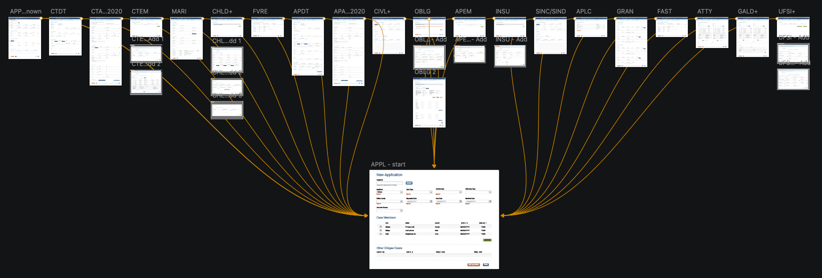
      • APPL – once a 30-step, error unforgiving, unstable process requiring up to an hour to complete, I streamlined this into a single screen which allows both error correcting and saved drafts, and could be completed in about five minutes.
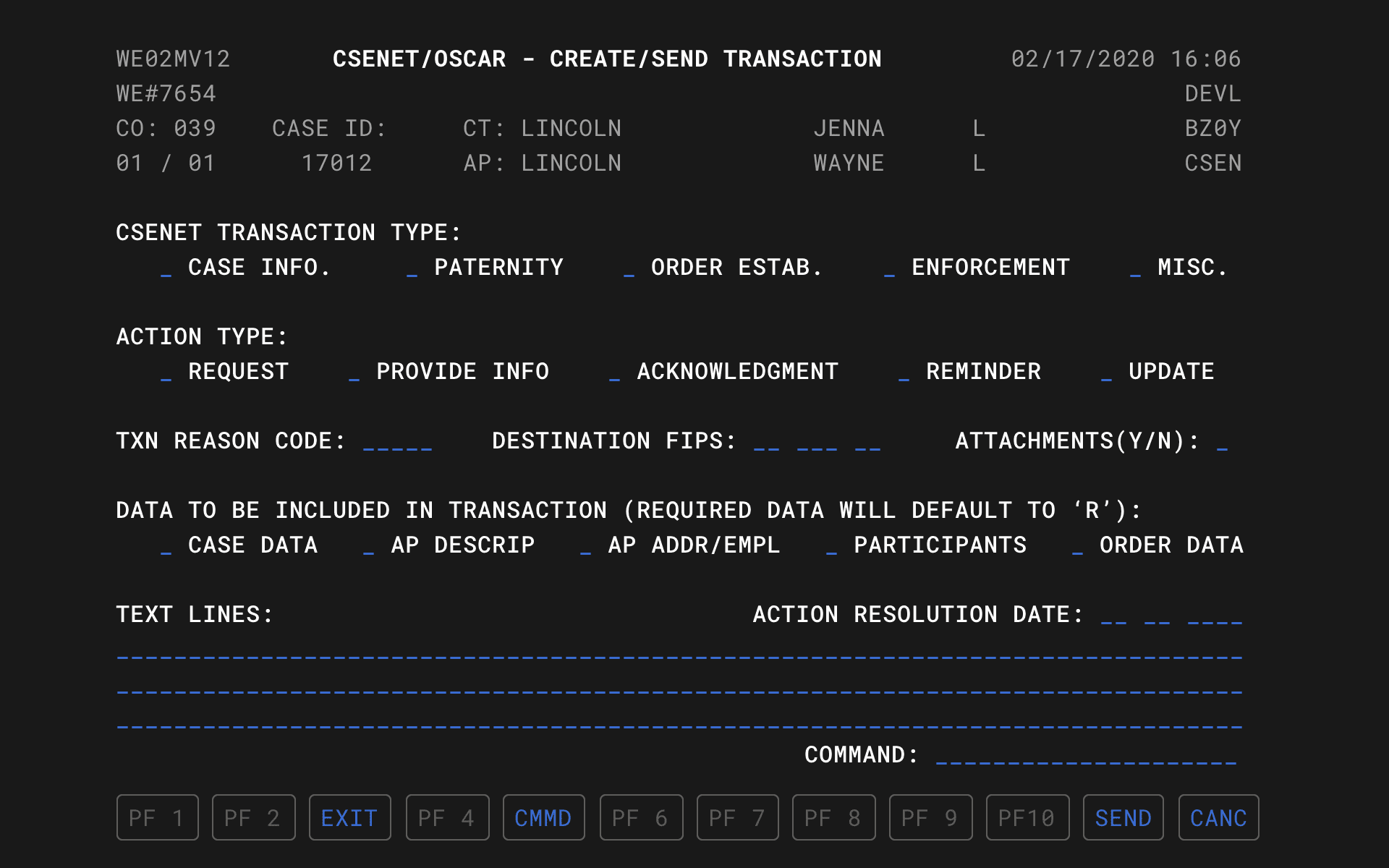
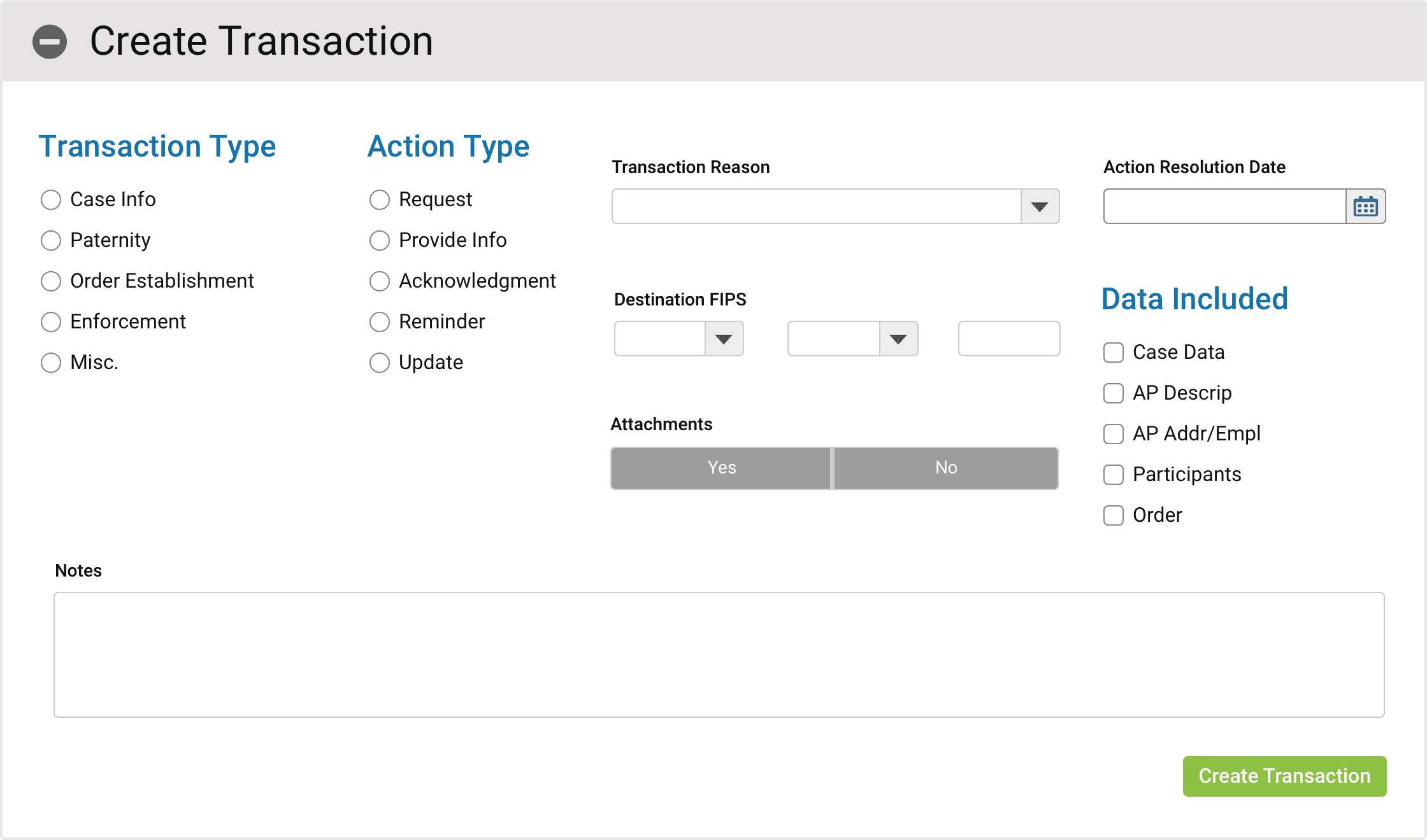
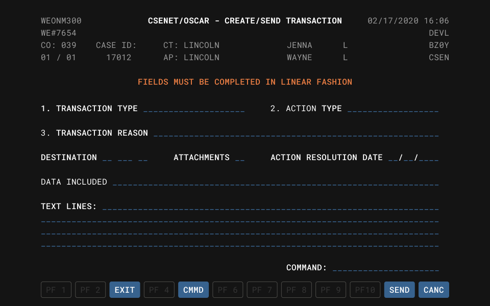
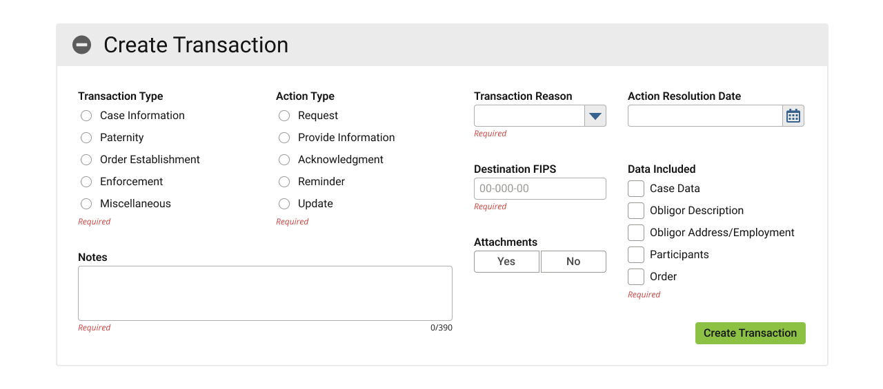
      • CSEN – a federal interface for connecting individual local agencies; described as the most complex subsystem in the application, I consolidated 27 individual functions into a single, streamlined and integrated interface.
      • GENE – a 100% rewrite, largely due to long overdue certification requirements changing, but also due to an obtuse, byzantine workflow that failed to cater to a significant number of users’ and cases’ needs.
      • IRGA – completely revamped this “Intergovernmental Reference Guide – Agencies” lookup tool; infamous for its unintuitive (and in many cases broken) interface
      • UIFSA – a companion to CSEN, this puts an interface to a 1992 law. While extremely complex, I streamlined several previously disparate functions into a single, simple interface.
    • I completed and revised at least a dozen junior designer efforts as well.
  • Established a design system which the company can reuse (and sell) on future projects
    • Required auditing multiple teams’ efforts, collating it into a report for leadership with efficiency recommendations, and then aligning all component and patterns.
  • Improved accessibility from 0% consideration to 100% compliance
  • Reduced training time and resources necessary to onboard by up to 90%
    • Indirectly reduces demands on Help Desk resources
  • Improved workflows across the board, by up to 80%

Findings and insights

  • Team structure: the new enterprise division exhausted ~95% of budget on BAs, PMs, and an army of Developers. Management expected devs to “build, build, build!” starting day one, without any direction, schematics, etc. UX cannot be effective as a procedural afterthought or post-production Instagram filter.
  • UX Maturity: limited UX resources (time and money) and lack of leadership understanding about modern software development, meaning we spent inordinate amounts of time pitching and advocating for even the basics like research, time to define standards, building a design system, etc. We still had to cut plenty of corners.
  • Statement of work: the contract stipulated tech migration and modernisation, but leadership planned both tracks to happen simultaneously.
    • Realistically, this only muddied the waters of both, introducing countless issues that nobody could diagnose or attribute to one group’s efforts or the other, limiting either’s ability to correct. Ideally, these should have been done in consecutive, not concurrent stages.
    • State officials frequently cited vaguely worded requirements to smuggle whole new features into the project, obviously also introducing significant costly delays. An escape hatch clause ensured we must comply or risk forfeiting any/all payment for work already done. More legal due diligence up front would have levelled this playing field.
  • Enterprise-Government liaison: a third party meant to neutrally traffic both parties in reality limited communication and effectively prevented us access to users. Only when the agency noticed a lack of their own input into the process or its results did they start demanding direct involvement, finally allowing us limited user access and feedback. Access to target users should be explicitly negotiated or defined in any/all contracts.
  • Third party vendors & software:
    • Some external vendors were hired for their proprietary tools ended up clashing with internal tools and compatibility.
    • Many sub-teams/project managers selected off-the-shelf and free/open source tech, apparently hoping to save time or money, but this only introduced additional incompatibilities and complications to assimilate. Always involve UX, even in the tech stack discussions, and invite representation from all teams when making foundational decisions, even to a single pillar of a project.
    • Vendors frequently stalled progress in order to extend their own billable hours or statements of work; they also regularly refused to partner with internal teams, favouring their own billable resources.
    • I spent an inordinate amount of time in audit trying to untangle this project’s UX spaghetti; overzealous PMs resisted any change to their own fiefdoms. We would have done well to be more judicious up front in evaluating these external tools and providing greater transparency to potential partners about the demands required for success.

Defining & researching

Despite the various failures, we continued facing pushback on UX process, but after some peristent campaigning, management allowed several months of intensive discovery:

  • interviewing users, SMEs, systems engineers, etc.;
  • reviewing existing literature such as the user manual, workflow guides, and technical specifications;
  • attending the same training sessions actual State employees receive;
  • seeking existing data from research institutes which align to our requirements
  • card sorting, identifying personas, identifying user flows, journey mapping, etc.
Some of our initial IA mapping and card sorting; here, attempting to make some organisational sense of 450 unique system functions into usable groups and hierarchy.

Personas / roles

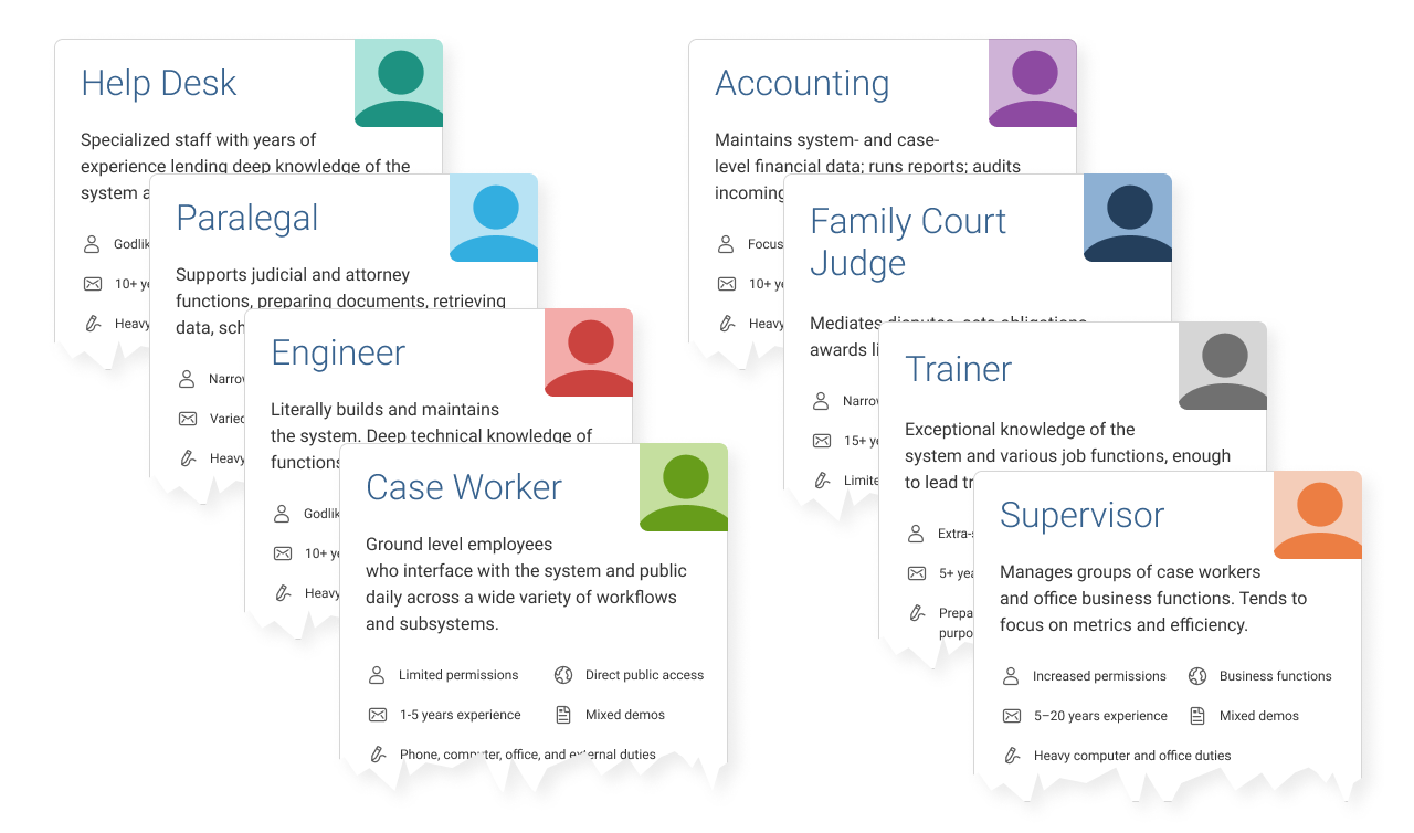
While immensely helpful in certain instances, many UX teams today are skipping “personas” altogether in favour of context-appropriate user definitions, and reallocating resources to direct user research, like interviews.

Why? Good personas require loads of time and money to build, and unless a solid business case exists for them from the outset, they may not sufficiently impact results nor represent a positive ROI.

For PATH, rather than focus deeply on demographics-based personas, we looked at user types/roles within the system, each with their own permissions, goals, workflows, etc.

A truncated sample of the over 30 “personas” in PATH.

While roles and permissions were more salient attributes, we could still draw some demographic conclusions for several of them, plus chart similarities amongst groups of roles.

This allowed us to conquer and divide certain aspects of the work, and tailor specific solutions with those users in mind.

Initial conversion research

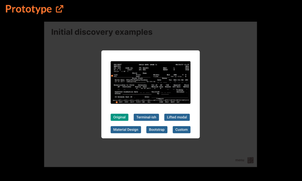
For converting the legacy app, we partnered with engineering to research the technical feasibility of several platforms, frameworks, methods, etc., and conducted usability testing of each via simple prototypes.

Except for one described below, each option disqualified itself by exhibiting 508 compliance issues, technical incompatibilities, or some obvious usability flaws…explore a few of them via the below prototype.

Prototype demonstrating several platforms researched during the initial stages of the project. External link to Figma.

The winning formula

Labelled “custom” in the prototype above, the chosen solution evolved from one of the unusable Bootstrap options, introducing (controversial) modals to solve both usability and technical issues.

  • neatly organizes all data into logical and semantic/structural sections
    • also uses simple one- or two-column formatting for legibility and responsiveness
  • improves whitespace ratio AND uses less space to present information
  • clearly separates modes of data interactivity (read-only vs editable/adding/deleting data)
  • clarifies actions available for each section
  • zebra stripes display data
  • editable fields in modals organised and aligned to a common grid
  • introduces safety measures before permanently deleting data
  • removes ambiguous abbreviations

Building UX infrastructure

Beginning with team white boarding activities, our infrastructure consisted of three primary pillars: standards & patterns, components, and documentation.

Standards & patterns

CRUD, or Create, Read, Update, Delete served as our standards baseline, mainly because those database interactions represented everything our users would experience with the system.

CRUD also made sense because the legacy software relied exclusively on various “modes” that generally equated to one of the database interaction methods.

While we would have loved ultra-modern, edit-in-place fields, technical constraints (eg form validation logic, 508 compliance, error message handling, etc) dictated we use modals to clearly define for users which CRUD method they were currently interfacing.

A few excerpts from a much larger body of governing standards:

Create/Add

  • New/blank pages:
    • If no records have been entered yet, design the page as if it has at least one, and provide the necessary modals to enter data.
    • For screens with empty tables, provide the empty table with a “No records to display” type message.
  • Expandable tables/Accordions:
    • Text button to add rows/records should be located directly underneath the last record, to the right.
    • Add buttons inside an accordion or expandable table drawer should add content inside it (not add a new row or accordion).
  • All other adding:
    • Use a text button in the lower-right corner of the relevant group where the data or record will be added.

Read/Display

  • Accordions
    • used for groups of data, especially when tabs would be impractical (e.g. dynamic content, excessive quantity)limited to ten (10) instances per screendefault state is (all) collapsed
    • no recursive use (accordions inside accordions)
    • may contain tables and tabs (conditions apply, below)
  • Tables
    • regular tables are limited to six columns, including buttons and icon buttons, for an average of two (2) bootstrap columns each
      • each button requires at least one (1) bootstrap column
      if data exceeds six (6) columns, use an expandable table
      • define & prioritize key data pairs to be represented in columns, convert and move remaining data to display-only label/value pairs inside the expandable areathe expandable widget always uses one of the six columns; allowing for five (5) additional columns
      favor expandable tables over accordions when possible/practical
    • expandable tables may not contain accordions or other tables
  • Links
    • used only for navigating to other pages or external content/sites
    • may not be used to trigger modals or actions (use buttons instead)
  • Tabs
    • use to strategically shorten long or organize consolidated pages
    • must be static (not dynamically added or titles changed in any way)
    • must safely fit horizontal space on all media types; no stacking
    • use a dropdown in cases where data are dynamic or will exceed the available horizontal space
    • only one (1) set of tabs may be present at a time per layout
      • cannot use tabs within tabs, or rows of tabs in multiple sections of the same screen)

Update/Edit

  • Input fields
    • fields which write to the database must appear inside a modal
    • fields which do not write to the database (e.g. search/data filters) may appear inline/outside of a modal
  • Tables
    • regular: use a text or icon button in the right-most column to trigger a modal for that row; one button per bootstrap column
    • expandable: proper text buttons (icon buttons should not used) inside the drawer, so user can see all relevant data before editing
    • buttons in the row or inside the drawer relate to the data inside it; buttons beneath a table apply to it in whole
  • Display mode data
    • sections should include the appropriate tiered header, and be separated by an HR – horizontal ruleeach section with editable data should have its own text buttons appropriate to the available actions
      • multiple sections can be grouped inside a single modal using tabseach tab in a modal correspond to a unique button in display mode, the tab title should match the section title
    • buttons should open to the corresponding tab in a modal
  • Buttons
    • always in lowest-right corner of page, section, or block
    • always trigger actions / modals
    • labels are an action / verb (update, save, close, cancel, submit, etc.)
    • primary action is always right-most
    • secondary / other actions should be to the left of primary buttons

Delete

  • always use a modal to confirm any destructive actions to database
    • include relevant data that will be deleted for review
  • do not trigger a delete action inside another modal
    • we cannot trigger multiple layers of modals
    • we frown upon universe-collapsing modal-ception

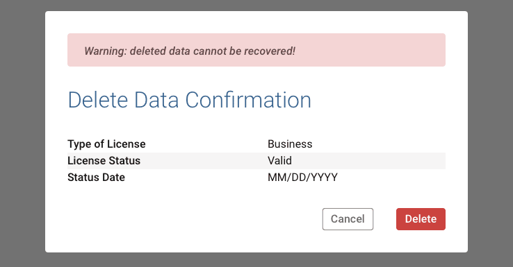
The legacy software did not have any safeguards against permanent deletions, often to the chagrin of users and help desk operators fielding frantic calls hoping to recover accidentally deleted content (which they cannot). For this reason, it was imperative we introduce at least minimal safeguards. Ours not only require a confirming action, but give the user the opportunity to review precisely what they are about to permanently delete.

This was also where we reinforced to the UX team not to design recursive modals, or “modal-ception” for those familiar with the similarly titled Christopher Nolan film. Not only did our platform not technically support this, given the audience, we absolutely did not want to confuse the user, and instead maintain purity between the CRUD methods. Update is only for editing, Create is only for adding new data, and Delete is only for removing.

Additional context & detail

Due to the sheer volume of data on many screens, common instinct—even for experienced UX designers—is to parcel them away behind layers of various interface widgets.

Our target audience (primarily mid- to late-career professionals) was accustomed to straightforward display of information a la the legacy system and not reliably proficient in common app widgetry of 20XX. Obviously every click reduces efficiency, but with every layer of hiding data or functionality behind interface widgets, we risked confusing and frustrating users by making more difficult what never used to be.

Therefore, we wanted to explicitly define and limit those tendencies to conceal information. This included strict rules for how different expandable components may be used alone or in combination.

After discovering some of the agency’s systems using text links and buttons interchangeably and often for wildly different ends, we sought to clarify use patterns for a more consistent experience (a 508 concern).

  • Buttons trigger actions, and never for navigating between pages.
    • Being actions, button labels must contain a verb
  • Links only navigate to other screens, and never trigger actions or modals.

We also defined placement for buttons, so any and all actions could be quickly identified.

Tables

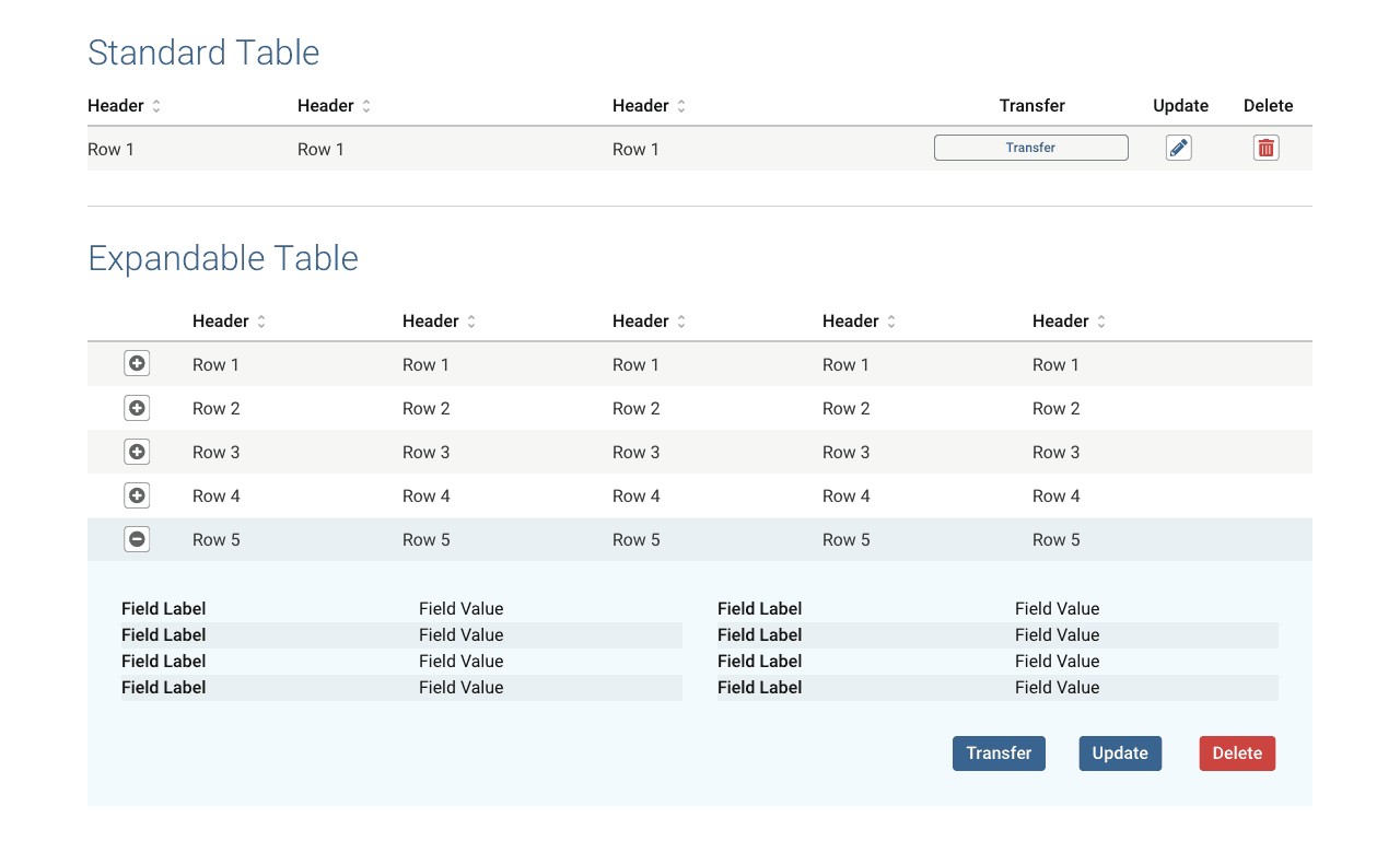
Ubiquitous throughout the system, we defined 2.5 table variants, largely to work nicely with the columnar flex box model.

The extra half variant really meant converting each table row into a card for mobile screens.

  • A traditional table of rows and columns for simple purposes;
  • A table with an expandable drawer that opens beneath the row to reveal additional data that would otherwise exceed the limitations of a traditional table.
    • Careful consideration was given to data prioritisation; which would be columns in the main row and which inside the drawer.

We were also mindful of user focus and scope when it came to triggering actions.

  • Simple tables showed all of the data in each row, so actions could be shown alongside it; in the same row.
  • Expandable tables place lower priority data in the drawer, so to prevent users from accidentally deleting anything without seeing the full context of the row’s data, all action buttons also reside inside each row’s drawer.
Equivalent actions between standard (top) and expandable tables. The latter put all actions inside the drawer to prevent accidental manipulation without seeing all the data affected.
Modals

Information in legacy usually consisted of fields jigsawed and truncated to fit a single terminal window, with little rhyme or reason, making reading or finding information a chore.

Editing data however was straightforward: press the PF2 key and any editable fields would change from blue to green. When finished, press another key to save and exit update mode. The only failure here might be relying on changing text colour alone for accessibility reasons.

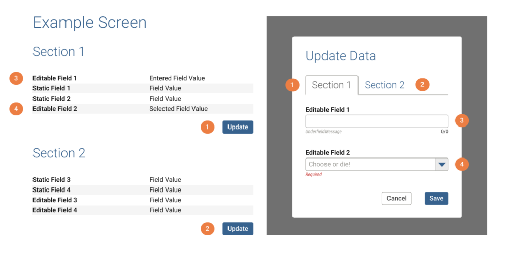
Vocally disliked by many, modals aptly solved switching from display mode to something like editing. We could neatly organise data into sections and columns, give users relevant actions per section, and then collect any modifiable fields into a single, focused, and labelled modal window.

Readable data organised into sections (left), and their editable counterpart (right)
By including only the editable fields, users have a focused Update experience.

1 & 2. Buttons in each section correspond to a modal tab with the same label.
3 & 4. Only editable fields appear in the modal.

Gathering all editable fields to perform a specific action also solved a technical issue as all fields needed to validate together upon submitting the form.

We could also use modern UI widgets to deal with groups of information in ways not possible previously. Large section titles, columns, tabs, accordions…they all translated neatly to tabs inside a modal.

Confirmation patterns introduce a layer of protection absent from the legacy software’s tendency to permanently delete without any warning whatsoever.

Curiously, the legacy system had virtually no methods to protect against accidental erasure of records. Modals allowed us to inject a confirmation step across the system and also clearly display specifically what would be permanently deleted.

Partial, maintenance view of the component library in Figma. See style guide section for formal presentation/documentation.

Hydrogen design system

For PATH, it was imperative we resist the temptation (and frequent external suggestions) to introduce superfluous visual frills and other whiz-bang distractions like animations, graphics, or other elements better suited for social media sites and trendy smartphone apps.

Our primary duty was to maximise the efficient use of public monies by a government agency.

Aaron Hoffmann

Hydrogen represents not just a clever name for an atomic system, but thematically as the ultimate vision of simplicity.

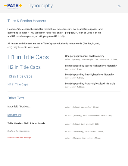
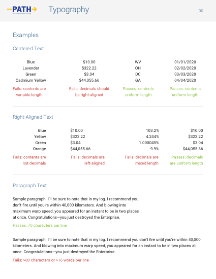
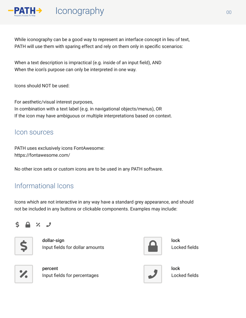
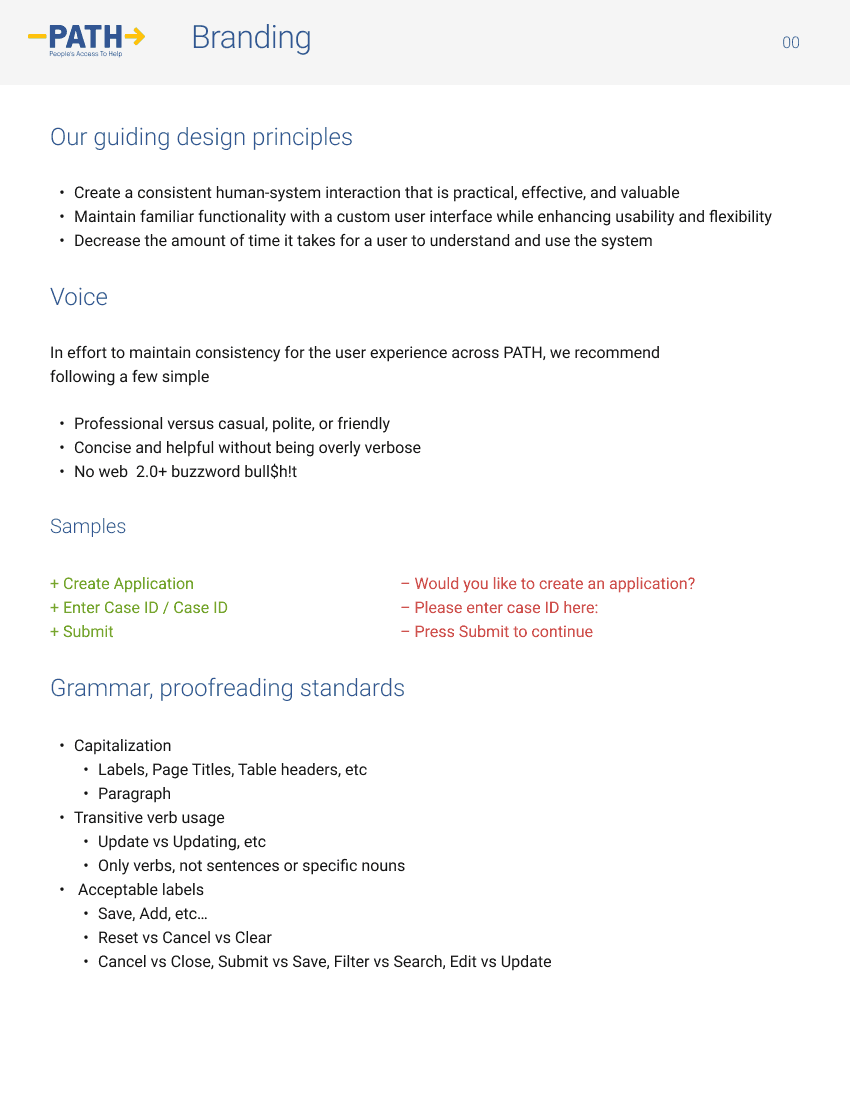
A 16-point atomic system

Our initial discovery found a commonality across virtually all personas: middle-aged, often with decades of experience…and eyeglasses to show for it.

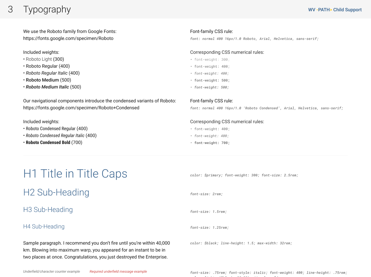
Most modern software tends toward tiny text in effort to pack a screen with more of it, and indeed PATH being primarily text-based meant using that as a foundation for the design system made a lot of sense.

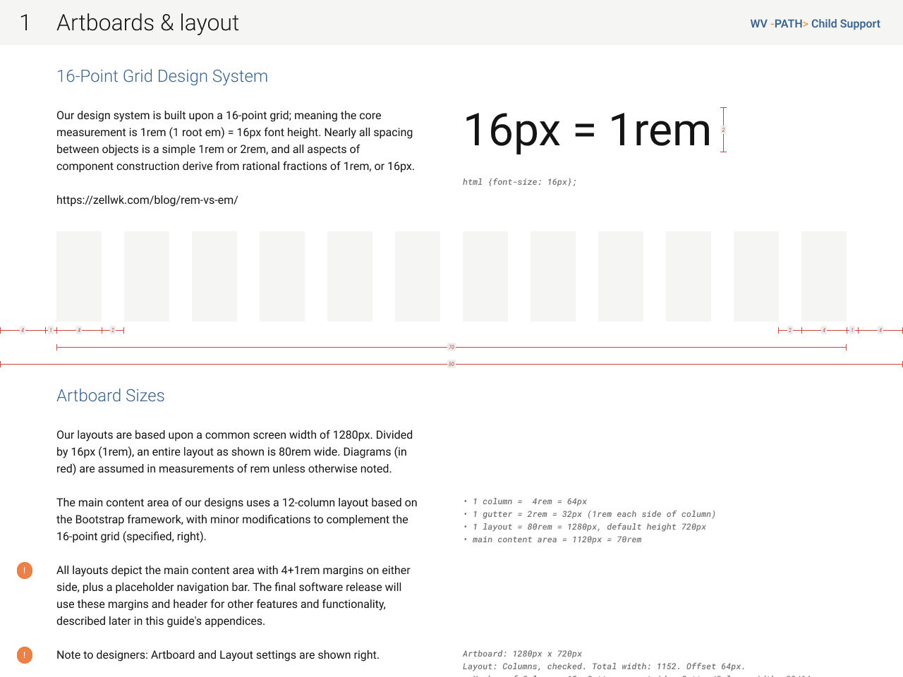
Therefore, our very first decision set the font size at 16px. Perhaps colossal to some, it coincidentally matches the recommended minimum, according to official US government web design system.

So for PATH, our Hydrogen atom was 1rem = 16px.

How the 16px Hydrogen atom combines and compounds to assemble ever-complex objects.

Displacing the ubiquitous “8-point grid”, which refers only to the spacing between objects, Hydrogen exercises our core text atom by basing virtually every aspect of the design system on it.

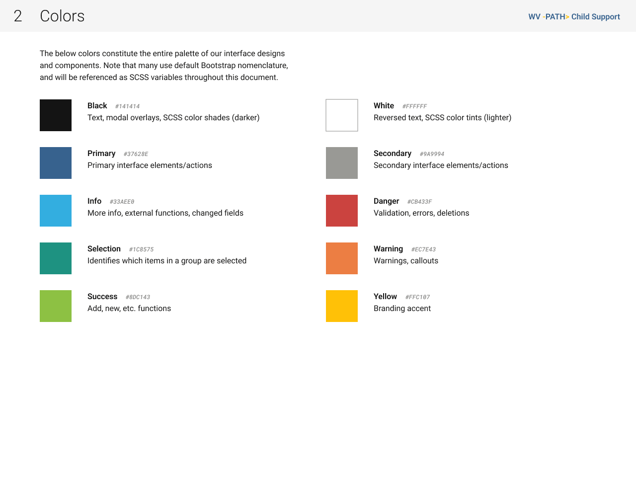
Spacing, border radii, margins, padding, columns and gutters, even the colour grades scale in increments of 16.

As someone capable of hand-writing both HTML and CSS, understanding how our components would/could eventually be built in code heavily influenced my decisions.

Constructing components

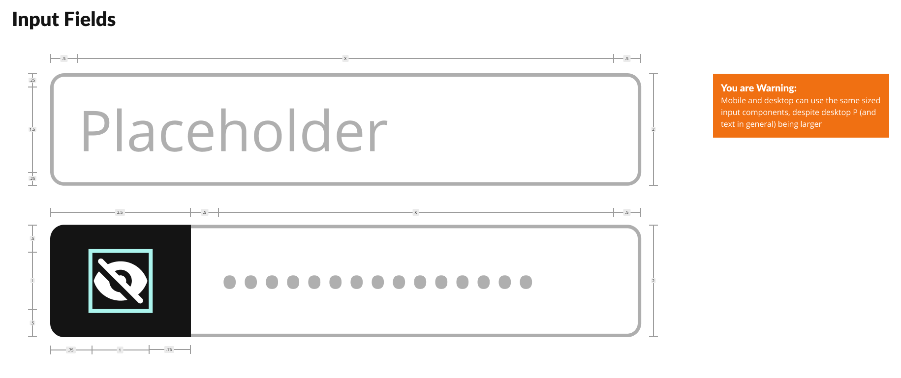
Text and icons existing in mathematical harmony using 16px/1rem as the core measure.
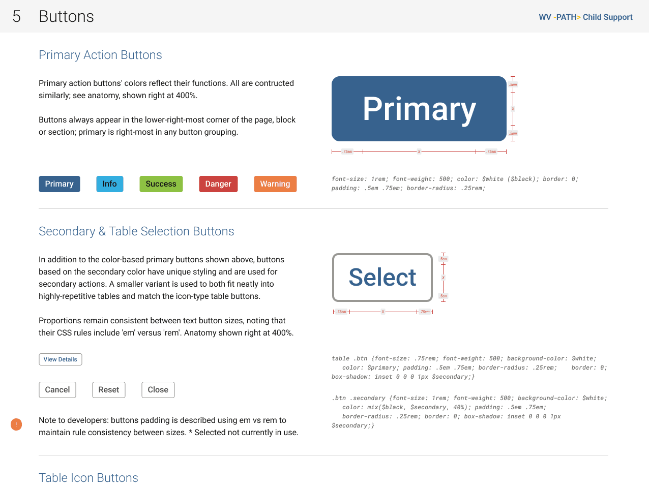
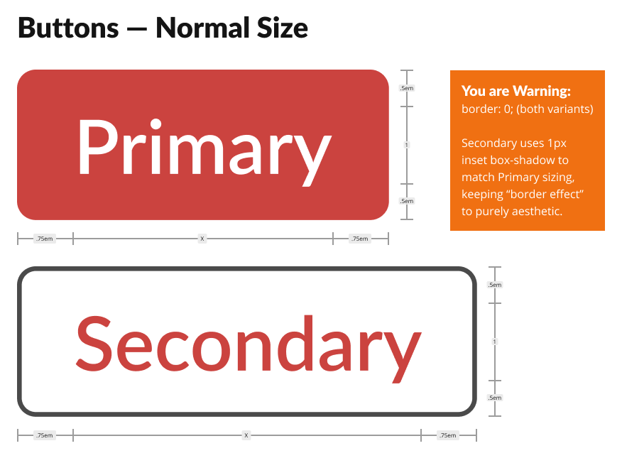
Anatomical diagram of the two button sizes; note dimensions are in REM unless specified otherwise (EM for padding)
The interactive calendar widget’s anatomy reveals how the root em affects every aspect of simple and complex molecules within the system.

Below, a look at building components between Sketch and Figma. The key to good components is thoughtful attention to detail: efficiency, flexibility, and anticipating broad usage.

If you fancy watching me for an hour build components, or more accurately, convert them from Sketch to Figma, please check out this video.

Hydrogen Documentation

Standards and patterns: ✅
Component library: ✅

Literature explaining it all: 🦗🦗🦗

Unfortunately management saw no point. “Design system? What’s that? Component library? Huh!? Style guide? More graphic designer prima donna hogwash!”

However, as an indefatigable optimist, I undertook these things anyway…on the DL and without approval. Not from a rebellious bent, but because I couldn’t stand to intentionally work inefficiently nor allow teammates to either.

A year later, these covert efforts paid off when management realised they needed documentation (and the rest of that “hogwash”). Cue muted words of appreciation.

This forethought helped build some credibility for our team, and got a foot in the door for additional UX advocacy. But I digress…

Anyway, we published two sets of documentation, one for engineers and one for a general audience. The former focused on specs; the latter upon explanation and demonstration.

Engineering edition

As with the components themselves, the documentation starts with the atoms and builds molecules, organisms, etc.

I have the CSS in mind whilst building components, so I often include excerpts, especially if suggesting SASS transformations or tokens, which would not be obvious simply from inspecting a design in Figma/Sketch.

Because we knew it would be displayed on a second monitor like our wireframes, I formatted this guide the same as our wireframes: landscape 1280, even using the same 12-column bootstrap grid.

General edition “Ultraguide”

Yes, we actually called it the Ultraguide internally, as it was meant to be all-encompassing; everything to everyone. Because we anticipated heavy printing, I formatted it portrait 8.5×11″.

Also built with an atomic mindset starting with the basics and building up complexity, this guide included orders of magnitude more explanation, do’s and don’ts, and guidance.

Seriously…I regularly received emails asking if we could include “a (whole??) page” on something as specific as defining date/time formats, because while built into the components for engineers and designers; BAs, managers, state officials needed this guidance.

Don’t get me wrong, I love pedantic detail, and when it comes to a large product with hundreds of moving parts and dozens of teams, one can never really be too prepared for delivering consistency.

Design artefacts

I shall break down a number of specific contributions, briefly describing the work and success of each.

Dashboard

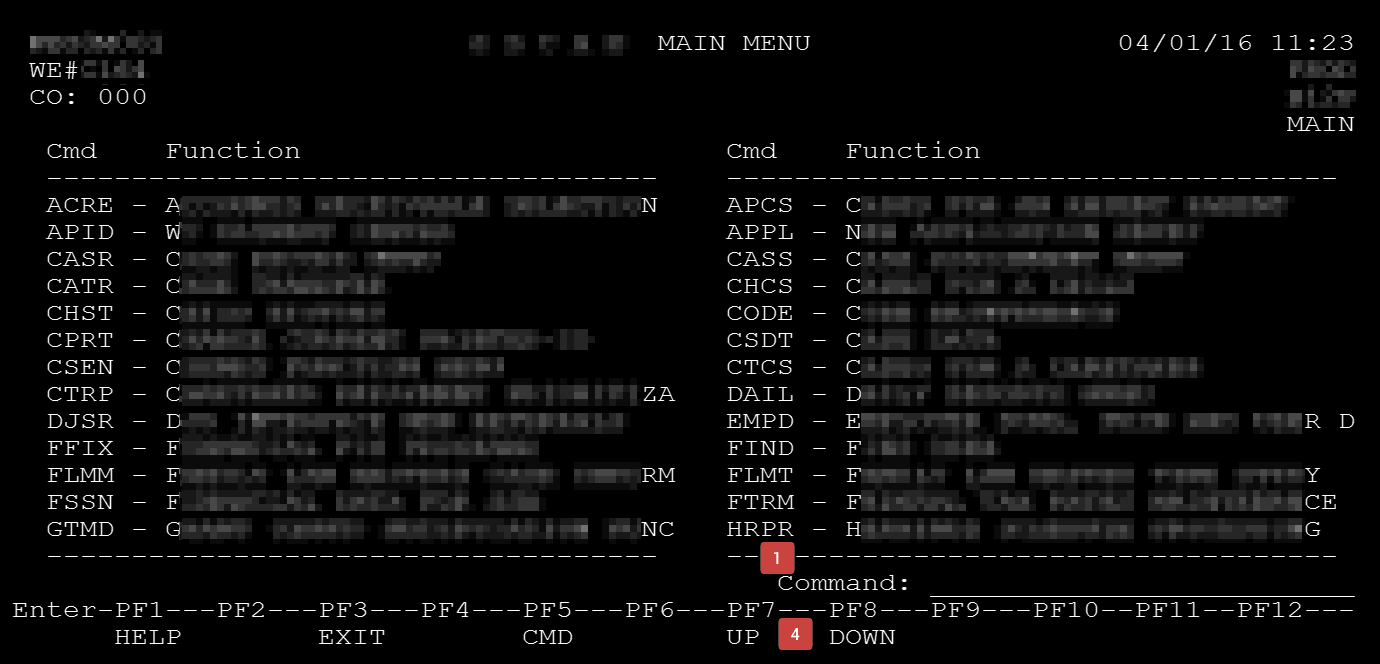
The legacy software never had a proper dashboard to welcome users when they logged on, only a rudimentary directory of high-level functions in curious disarrangement.

Legacy greeting screen

Even worse, most case workers started their sessions by visiting a variety of functions to check constantly-changing statistics, messages, alerts, etc. and assess their priorities…aka what should be on a dashboard.

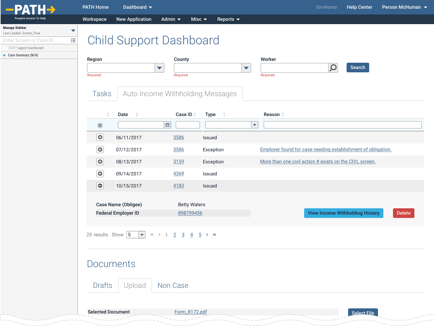
The interim dashboard: not responsive (at all), content overload, and scrolls for days.

Our junior designers created an interim dashboard that survived most of the project’s lifecycle, mostly as a receptacle for weekly requirement changes.

Unfortunately, simply labelling a screen as such does not a dashboard make. While I helped maintain the interim design, it did not receive my final design pass and polish until just before heading to QA. Apparently, designing this last can actually make a big difference.

The interim design failed by having no information at a glance and a completely unresponsive design.

As we’ll see further below, the latter was partially a burden of the overall navigational construct, but the former completely solvable within the dashboard itself.

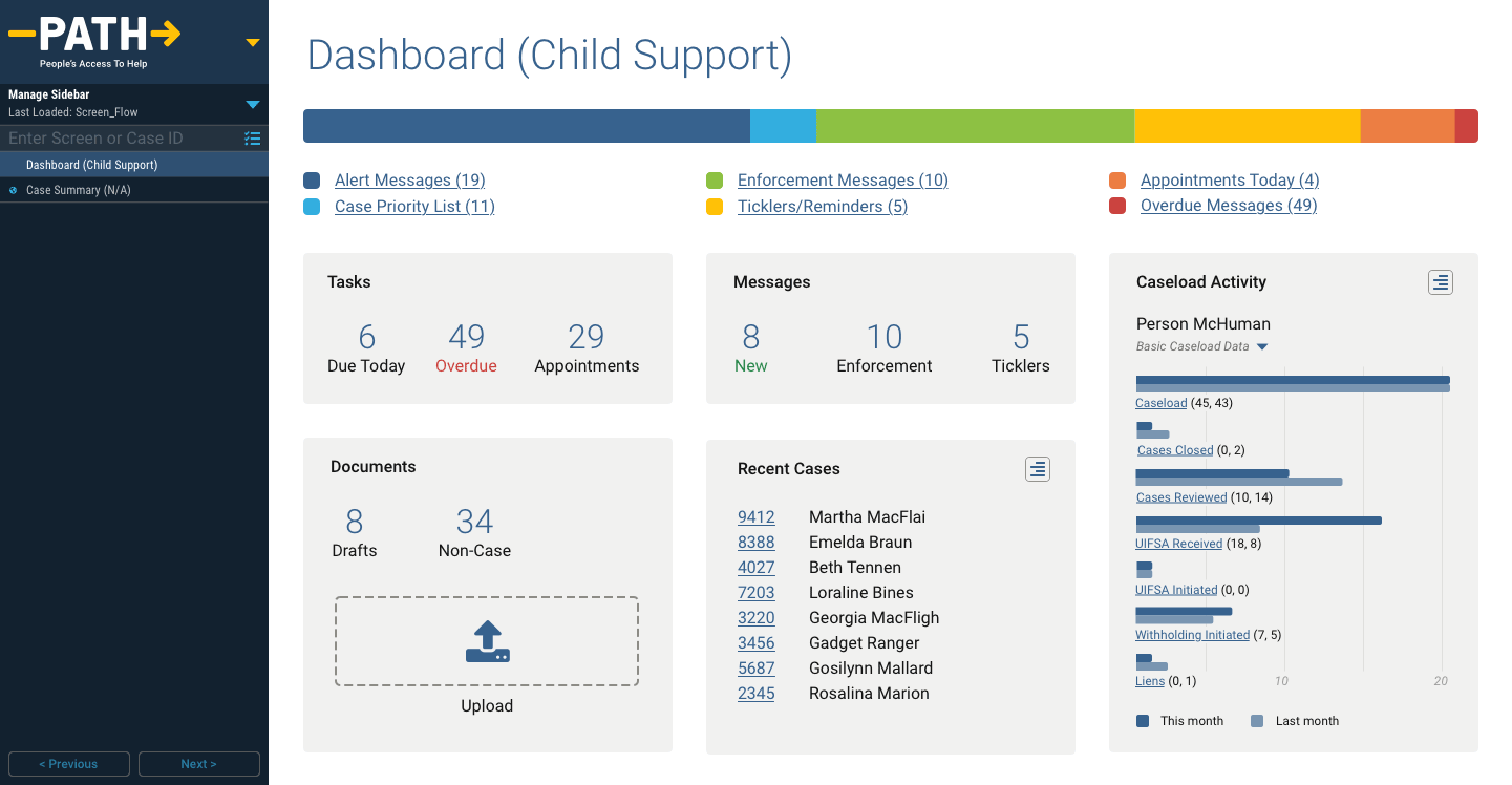
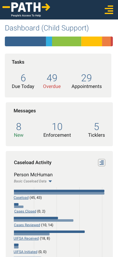
Essentially, all of the tables and widgets reduced to cards and their high level summaries which could be accessed in greater detail with a click/tap.

While we valiantly fought against all efforts to introduce superfluous graphical fluff, users reacted favourably to the colourful bar graph and even I can concede that it further simplified the ability to read the highest level at a glance.

Desktop prototype
Mobile prototype
Tablet prototype
Watch me walk through the dashboard prototypes on multiple devices.

Coming soon!

New Application

While overall a non-linear system, one workflow officially defined by the State was for new applicants. It included

  • up to 30 steps (actually just special versions of thirty otherwise standard functions)
  • could take up to an hour
  • timed out after an alarmingly brief period of inactivity
  • allowed no backtracking or error correction
  • nor a way to save drafts and resume later

If a case worker needed to backtrack, error correct, take a 10 minute phone call, etc they had no other option than cancel and start again from the beginning. Especially painful if they were near the end.

Without explicitly detailing each win, I will say that after nearly two years of work, all the above bullet point issues did get corrected.

The original onboarding/application process of up to 30 steps that could take 30-60 minutes to complete and didn’t allow for mistake correction; only quitting and restarting.

The yellow arrows all point to my solution, which condensed and simplified everything to a single screen that could be finished in a scant few minutes, allowed error correction, and even drafts for resuming later.

To be continued…

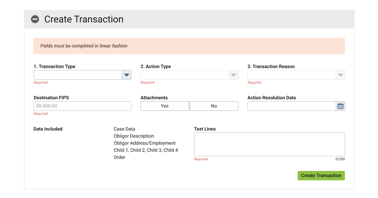
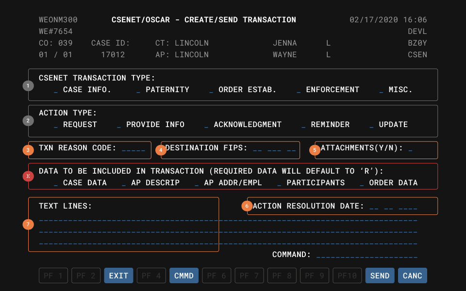
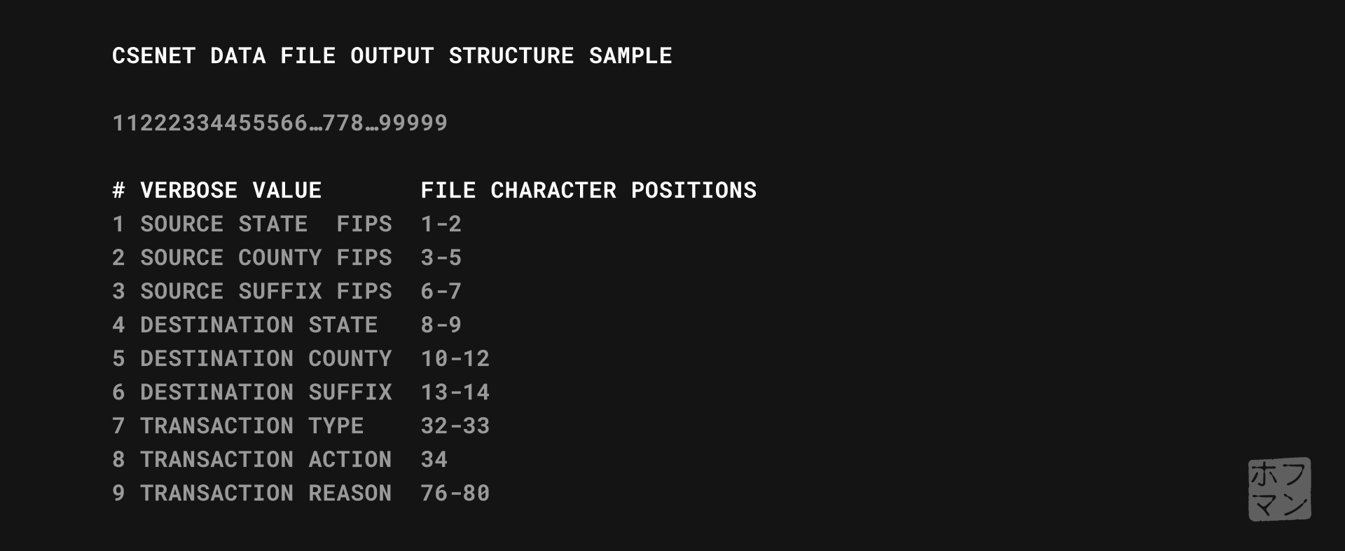
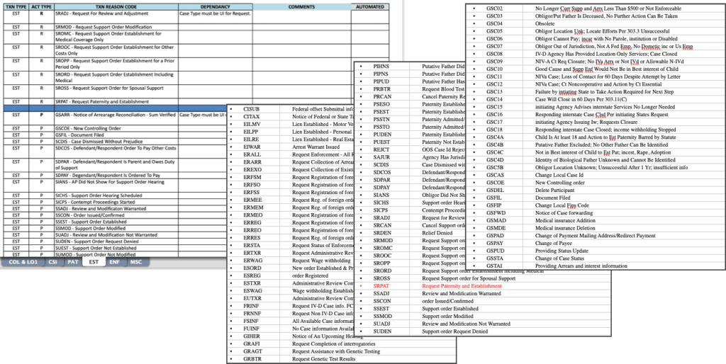
CSENet

Coming soon!

Sub-topic link to mini-case study of process

Genetic Testing

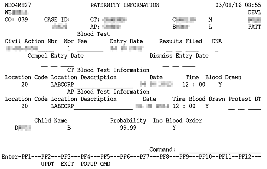
Paternity testing is a core function for establishing child support and other legal proceedings, so it’s a wonder the legacy screen lasted as long as it did.

The original Paternity Testing screen.

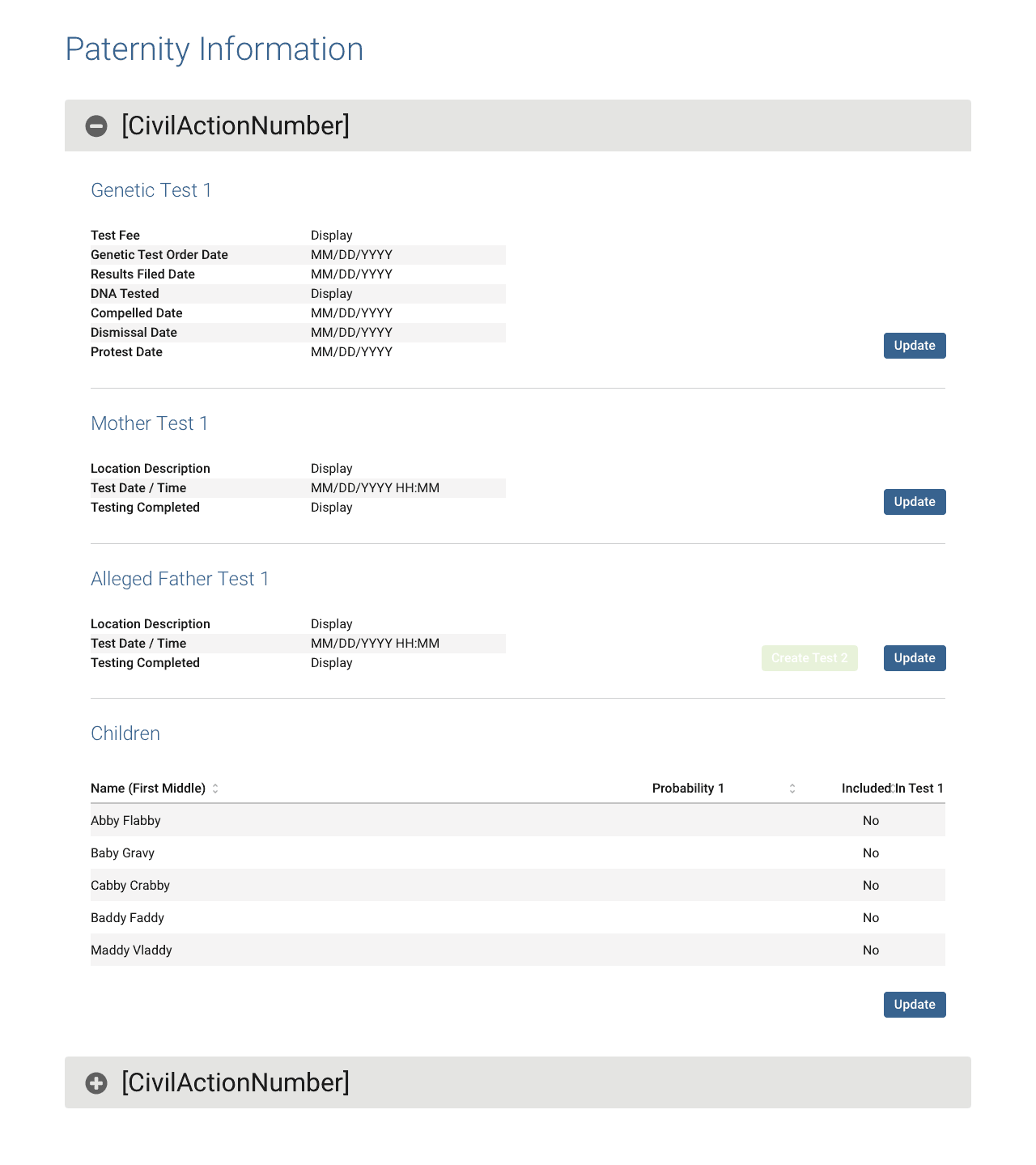
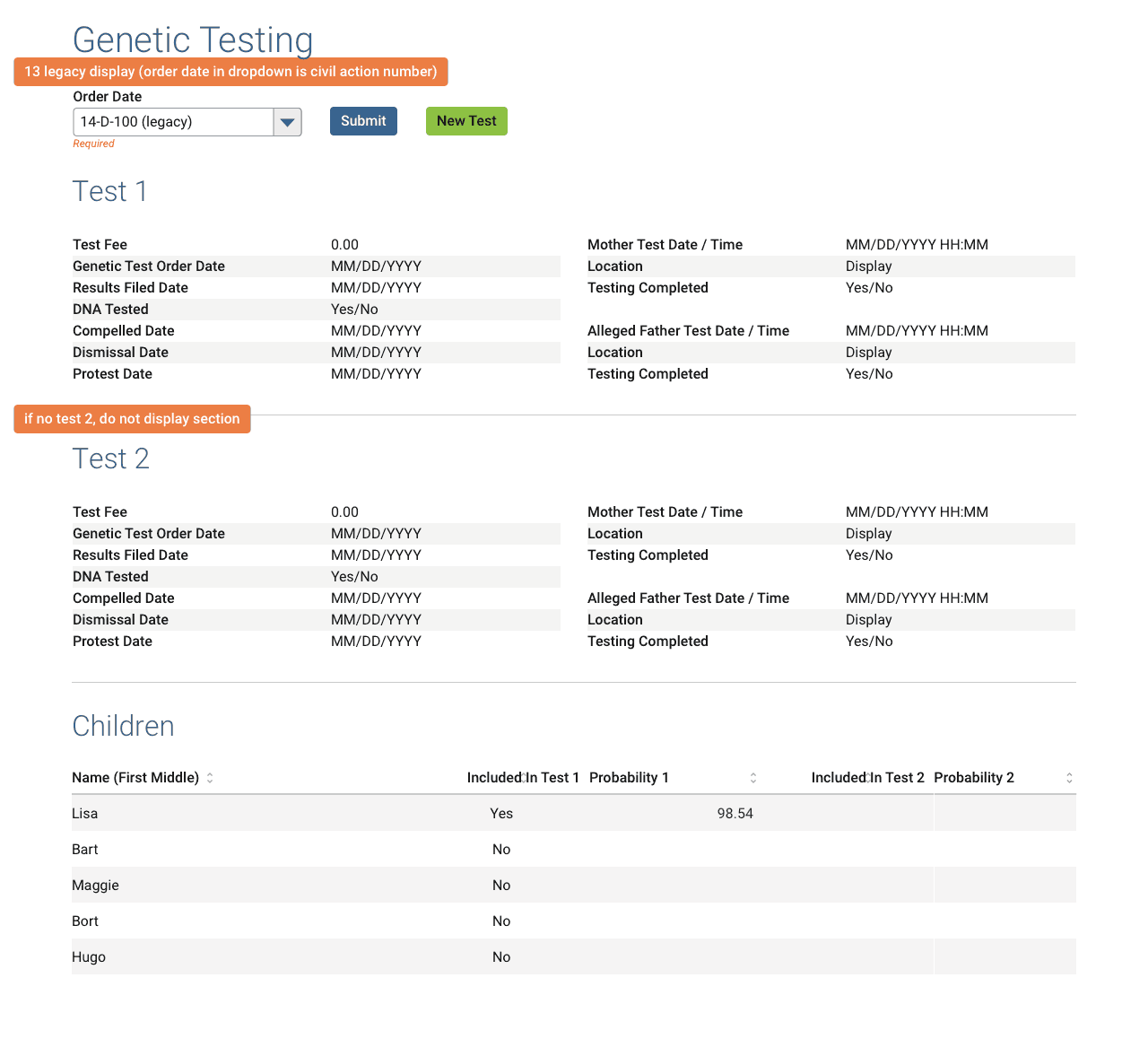
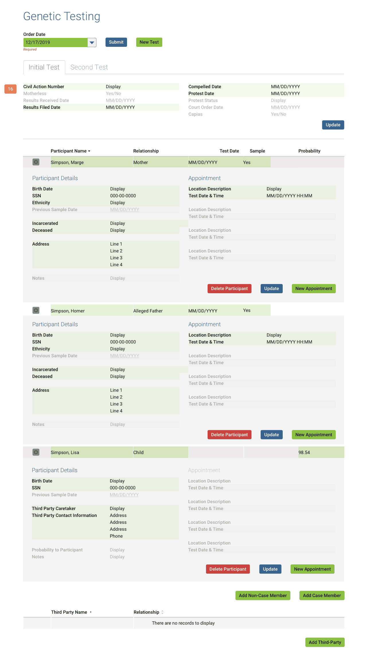
Despite a faithful translation of the source material (PATT fig 1 below, left), in order to satisfy years’ worth of accumulated new certification requirements as well as legal and administrative needs, this function needed a complete overhaul.

In addition to simply being sorely outdated by legal and federal standards, an ugly usability issue laid hidden beneath the surface (PATT fig 2 above, right).

Looking at fig 2, one sees the rows of steps required to successfully enter a test into the system. While a complex user flow is not an issue in itself, the fact that each step required the user to revisit the screen multiple times across multiple days and know precisely which fields to fill out and in which order…most certainly an issue.

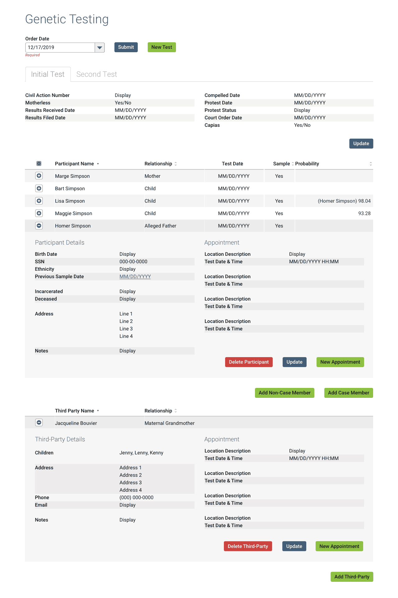
We began by interviewing SMEs and collecting all internal, federal, and legal requirements. A few of the high level needs for the function to satisfy its myriad requirements:

  • allow administrative tests (legacy required a civil action be filed first)
  • allow greater flexibility in test participants (legacy was limited to the disputed parents and children)
  • allow greater flexibility for addresses, both participants and testing locations
  • allow greater flexibility and options for scheduling tests (legacy allowed one reschedule/correction before locking itself)

One of the major issues was how the new system would incorporate legacy tests, as that data must legally be retained. Details of the solution:

  • All new tests must be the new format.
  • I created a custom, read-only layout for any completed legacy tests in the database.
  • Any legacy tests still in-progress on the system switchover date would be automatically converted to the new format.
  • I created a legend for developers detailing how the legacy fields map to the new version (shown above), along with other technical documentation, spreadsheets, etc.

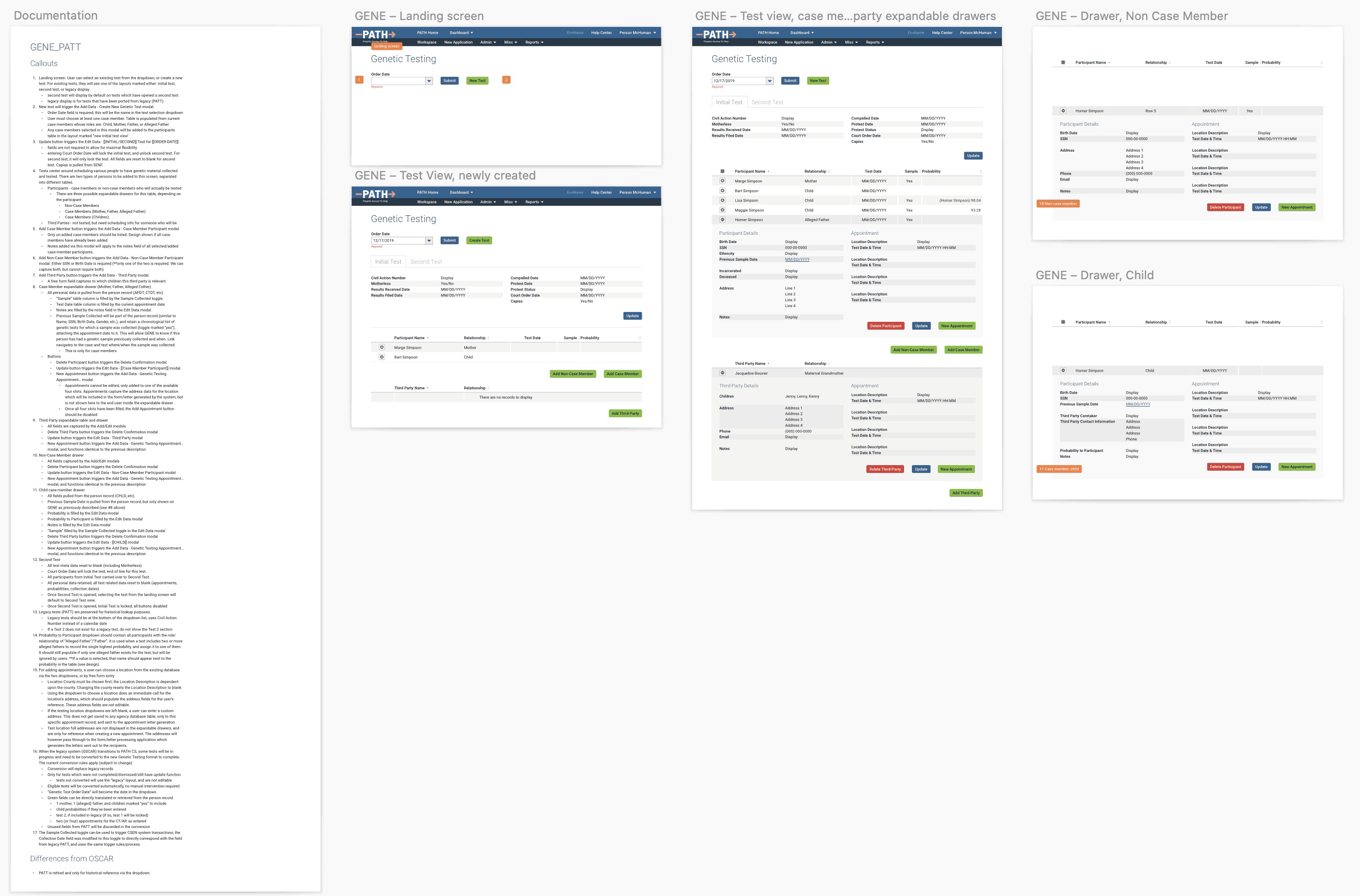
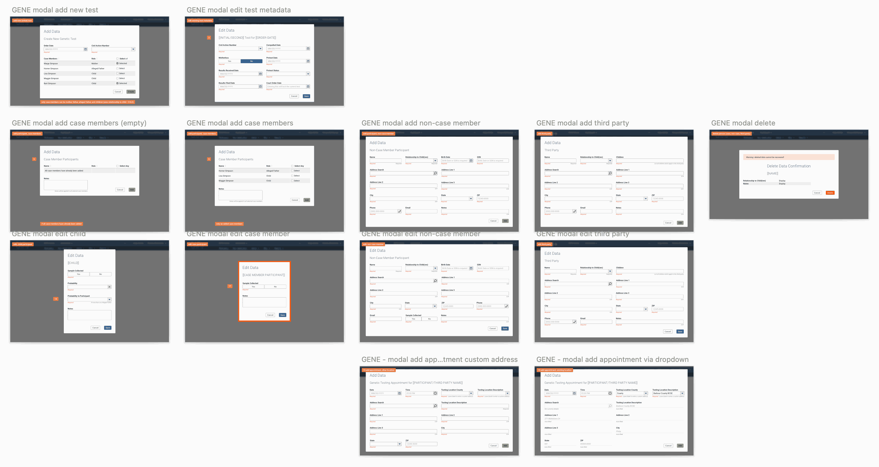
Over the course of 9 months, multiple formal presentations, user validation sessions, etc.; I completed the brand new Genetic Testing screen, replete with developer and user documentation.

Mission accomplished! 👍

Promotional Product Design


Retail Packaging

Project: Packaging and Retail Displays Design
Role: Designer, Production Artist
Client: Ghirardelli Chocolate
Key Skills: Photoshop, Illustrator, InDesign, Product design, Concept development
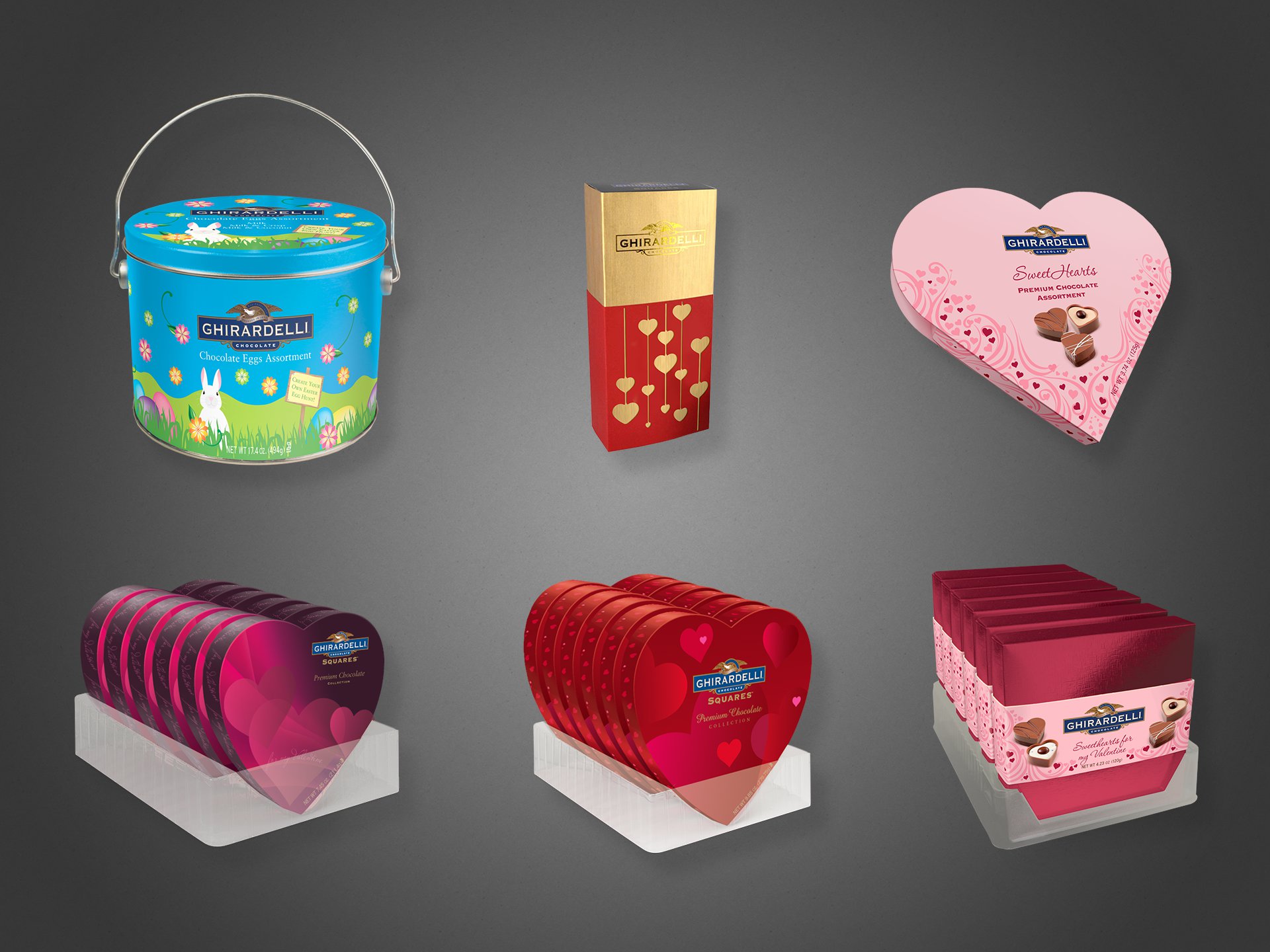
Summary: A collection of designs and illustrations for retail product packaging and POS displays. I worked on the final mechanical files released to the printers, as well as photo-realistic visualizations of what the products would look like once produced, for use by the marketing teams when selling to external vendors.
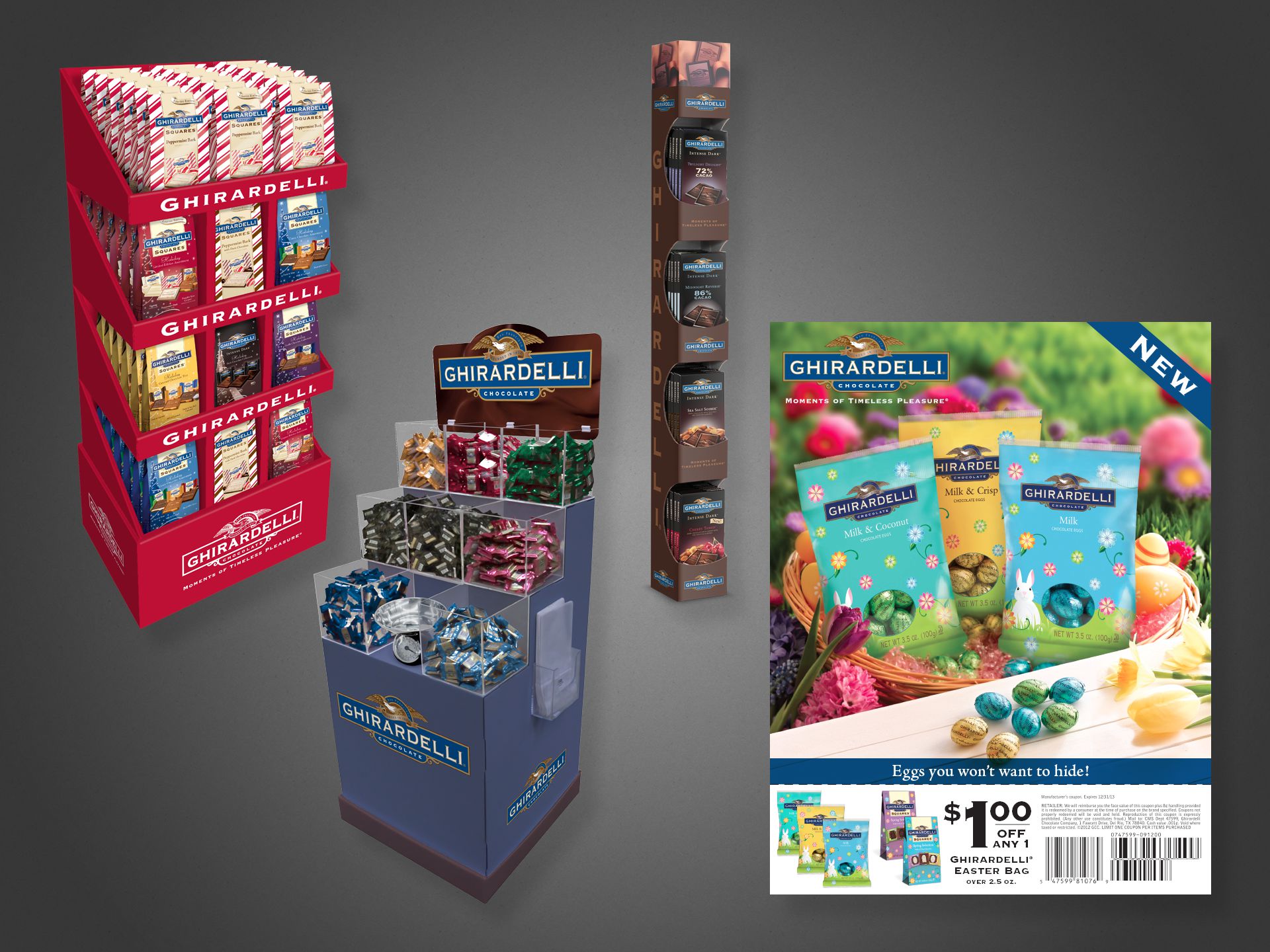
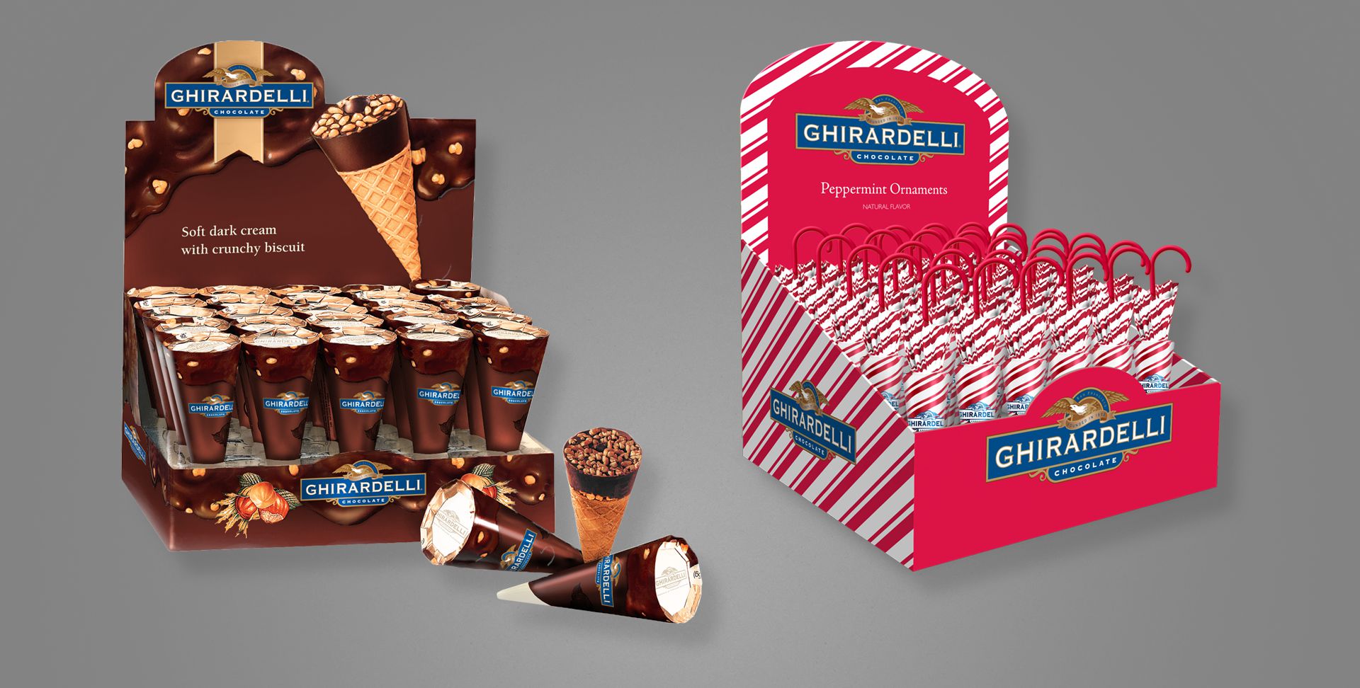
All of the images on this page may look like photographs, but are actually Adobe Photoshop renderings meant to look realistic.

The company’s Marketing team would often request imagery of upcoming products for promotional or sales meetings with retail vendors, but because the products had not yet been produced (in order to photograph), I would be tasked with producing “photography” for the non-existent items, using only design files, and flat printer’s dielines, to aid in visualizing.

ghirardelli3_set

The above are all seasonal products, for Easter and Valentine’s Day.

ghirardelli2_set

Above left, three free-standing in-store displays. Above right, an Easter coupon, available in stores and as magazine or newspaper inserts. All product shown in the coupon flyer—even in the photographed basket—is fictional; actual product had not yet been produced.

ghirardelli1_set

Above are two additional counter- or shelf-sitting displays. All product and the displays themselves were fabricated and painted for illustrative purposes.


Promotional Literature

Project: Recruiting trifold pamphlet
Role: Art Director, Designer, Copywriter, Production Artist
Client: KidsDuo, Hokkaido Tsuushin Tokki
Key Skills: Photoshop, Illustrator, InDesign, Print design
Summary: A 6-panel trifold used for recruiting English teachers for a chain of private children’s schools in northern Japan.

tokki_brochure_fin

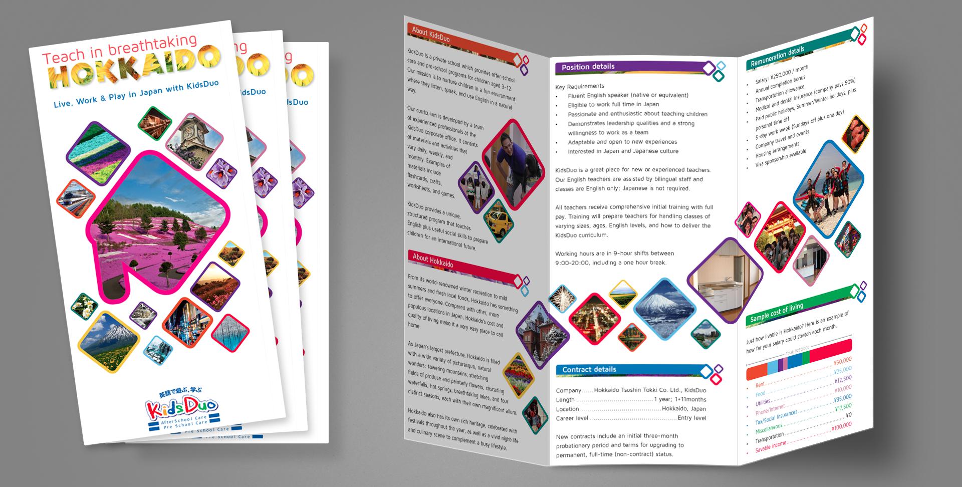
A chain of franchised children’s English schools in northern Japan was looking to expand its business and needed to attract foreign teachers, so an informational pamphlet was commissioned to that end.

I served as the entire team for this one: Art Director, Designer, Production Artist, Photographer, Copywriter, and Print Producer. Basically, everything you see (including the white space in some sense) is my work. Of note to anyone unfamiliar with Hokkaido or Japan’s geography, the large shape on the front cover is a very stylized representation of the island’s shape, and the swath of photo diamonds on the inside spread is a rough representation of Japan as a collection of islands.

Distributed throughout high-traffic areas for foreigners, this trifold generated an immediate increase of interest for job-seeking English-speakers, allowing the business to expand with additional locations.


Direct Marketing

Project: Direct mail envelope design
Role: Art Director & Designer, Brand Design & Integration team
Client: Best Buy Co.
Key Skills: Photoshop, Illustrator, InDesign, Brand Design
Summary: Redesign of the envelope delivered to millions of customers per year; the plain blue kit with a simple logo lacked energy and failed to generate enthusiasm amongst recipients.

A Failure of Communication

Best Buy sends physical mail to millions of customers per year–sometimes coupons, promotional offers, or other communique–but found a distinct lack of enthusiasm when polling recipients amid waning response rates. Surprising no one, it turns out sending people something that looks like junk mail or workaday marketing chirashi will generate disinterest.

Recognising an opportunity to upgrade their brand image and also improve redemption without having to sweeten the offers, the underwhelming envelope needed replacing. That said, while the enclosed communique also underwent a redesign, this case study discusses only the envelope.

ese_set
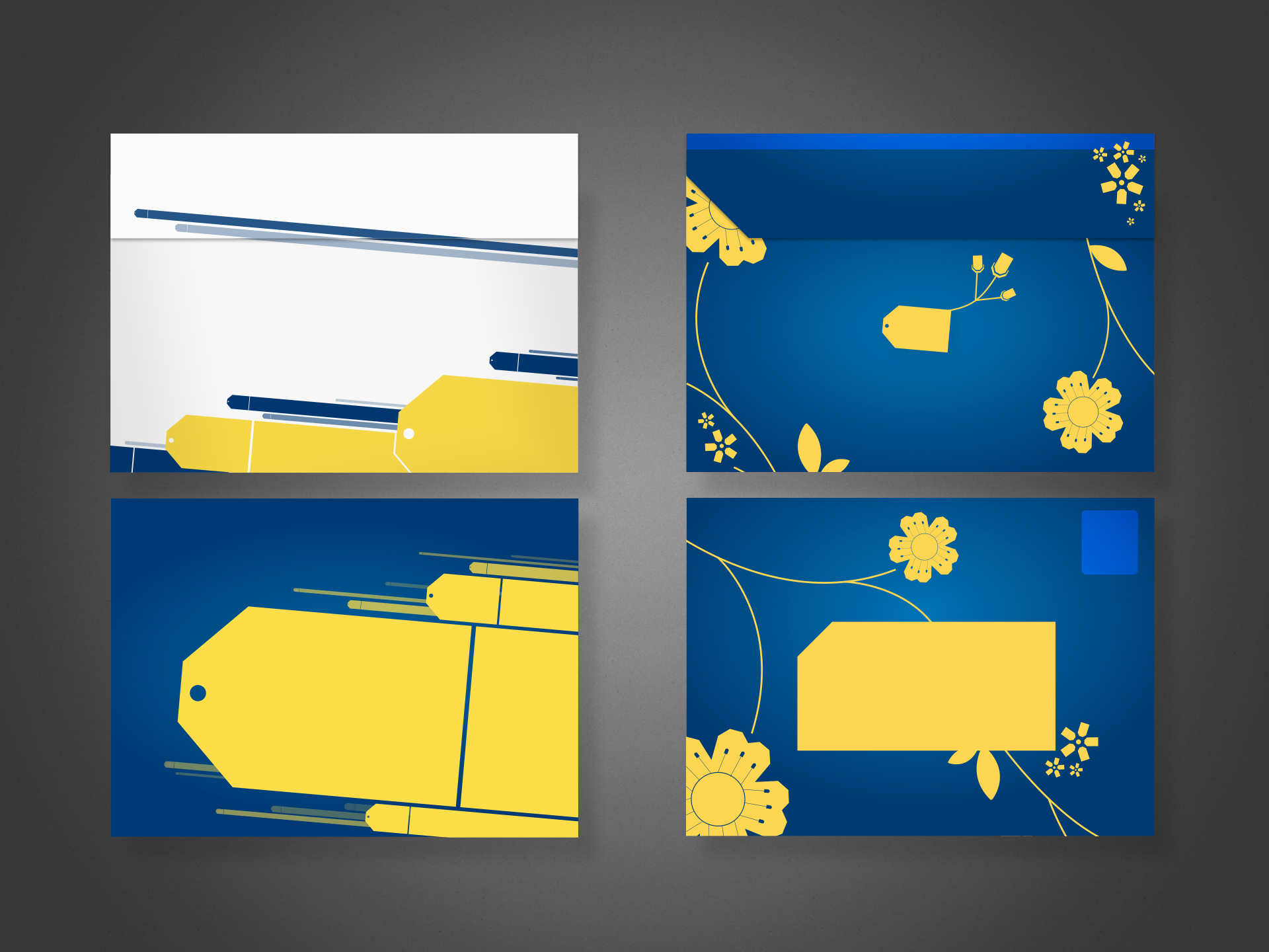
Left: the selected concept, final design. Top shows the rear with flap. Bottom shows postage and address areas.
Right: alternate concept

Concepts Galore

All said and done, I produced well over a dozen concepts, each in varying stages of polish; four of them shared here. Aside from demonstrating diversity of thought, comparing the different ideas allows one to discern the various anatomical aspects of the envelope perhaps not otherwise obvious: the addressee area (reversed/white text not allowed), the return address, and the postage area.

At the time, efforts to transform the organisation into one more “customer centric” permeated virtually all discussions related to marketing.

For this project, I was the designer and art director. I produced pencil concepts, rough and polished presentational comps, and helped prepare files for press.

Legacy Product Design

TLDR; some of my old, publicly released web/digital product work 🤷🏻‍♂️

Before we begin, realise most of the below projects precede the emergence of flat design trends, before responsive web design was standard practice, or even UX/UI as their own distinct fields.

Included here for context in my larger career and to illustrate some sense of design progression or contrast my natural aesthetic against the trends of yesteryear (skeuomorphism, anyone??).


Monkeypaw Games

Project: Branding and websites
Role: Creative Director, Designer, Front-end Developer
Team: <10
Environment: Remote
Key Skills: Photoshop, Illustrator, Brand Identity, Web design, HTML, CSS
Summary: Creating a teaser website for display during development of a full e-commerce site, plus establish corporate branding/identity.

Monkeypaw Games approached me first in need of a new website to promote its line of digital game releases on the Playstation Store, and as a company based in Japan, it marked my first international project*. A secondary objective to re-imagine the logo and branding lurked in the bushes, as their interim identity frankly looked the result of too casual a black Sharpie on napkin.

Die first, resurrect and live later

Monkeypaw needed something for visitors to land upon while their more robust site containing an online store and media engine underwent development.

A “tombstone” site back in the day described a single-page website, usually meant as a placeholder or simple informational block to satiate visitors with the basics. No links, tabs, menus or other frills; just the one page.

A surprising cottage industry sprouted in the late 00s supporting this trend, especially favouring new or small businesses wary of investing heavily in an online presence. Ironic for tombstones to represent so many new companies rather than “deceased” 🤷🏻‍♂️

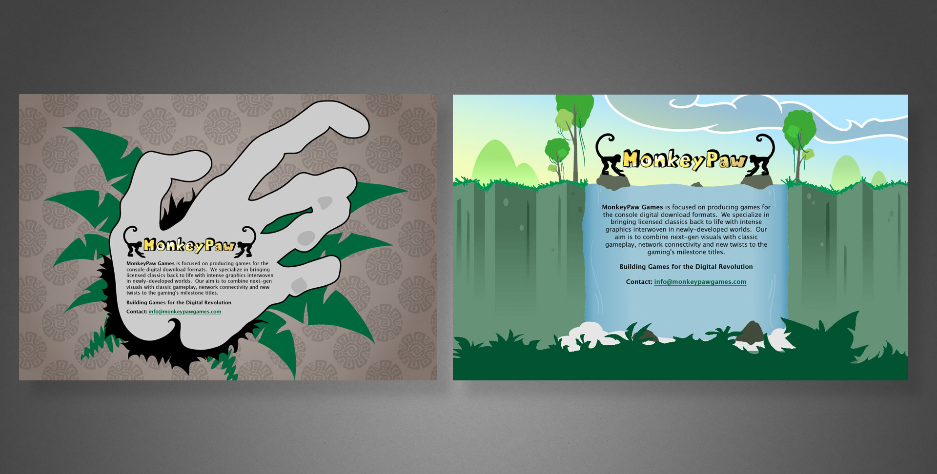
Two discarded concepts. Too literal/grotesque (left) and too whimsical (right).

Curiously, their initial branding centred around a rather kitschy jungle motif instead of something slick and befitting a tech/gaming company. Anyway, a few rounds of sketches led us to the image below; a light-hearted illustration evoking tropical undergrowth and Incan ornamentation. …because monkeys?

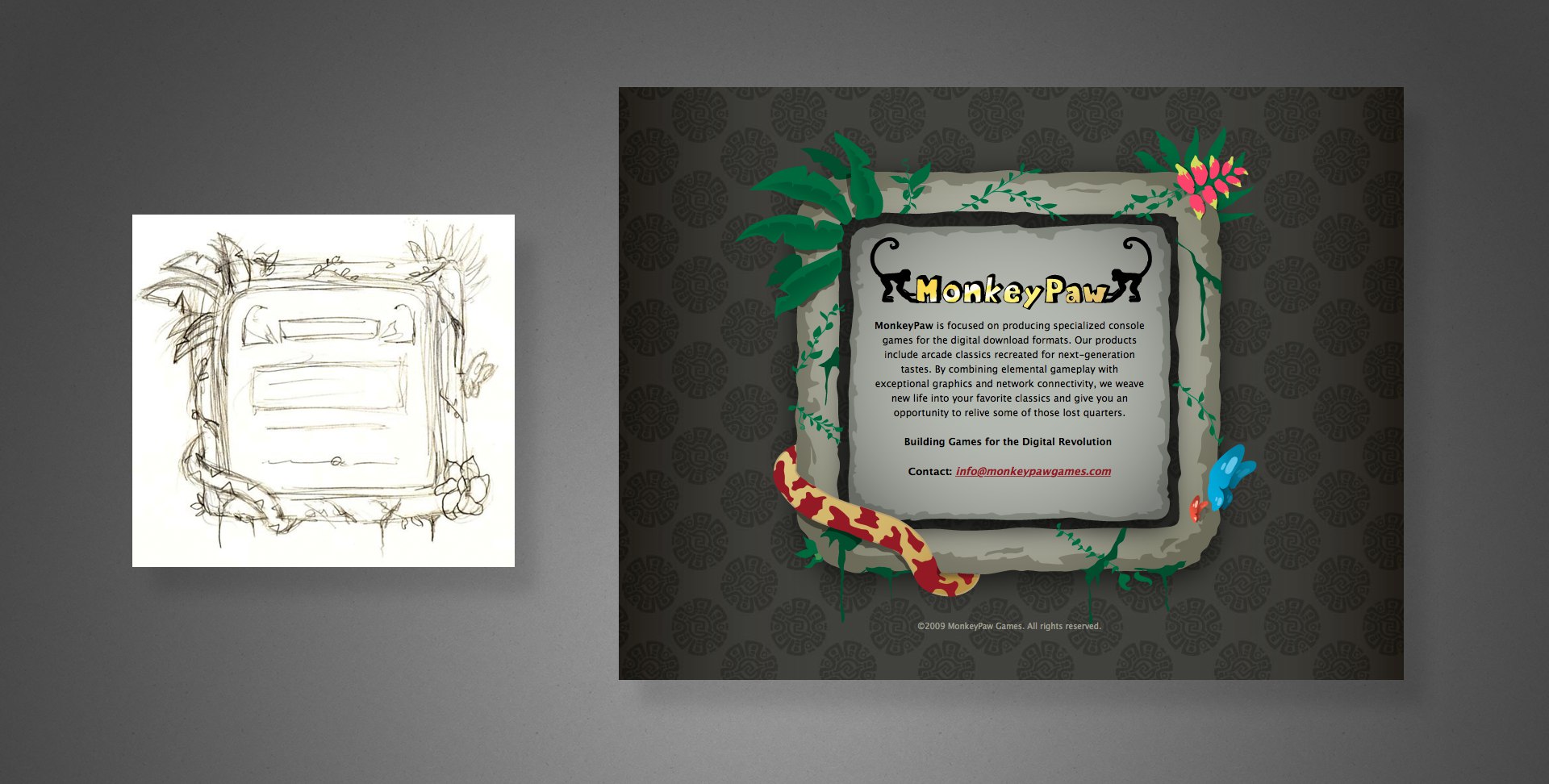
Left: My quick sketch
Right: the fully illustrated final UI

Rebranding

I do remember learning from our calls that their starter logo really was hand-drawn…on an inappropriately disposable substrate no less. Disposable indeed.

Because of illegibility at small sizes and an unrefined appearance, the simians bookending “MonkeyPaw” had but a single redeeming quality: its one colour reproducibility. It otherwise absolutely misfired as the image of a fresh gaming upstart whose products all lived on digital storefronts.

Going back to the drawing board, something much more edgy–literally in your face–emerged.

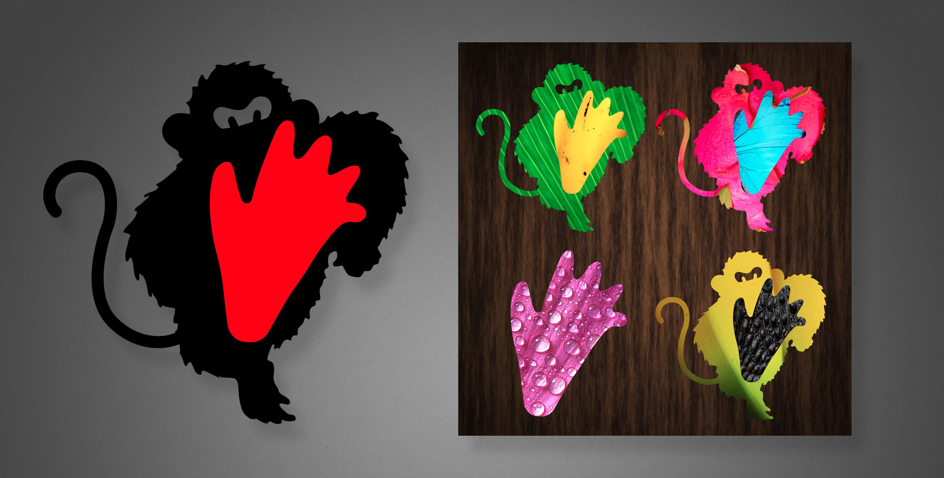
Left: The actual logo, shown in the brand’s black and red colours.
Right: Alternate photo-textured motifs using the logo’s shapes as masks.

In addition to the standard black and red branding colours, the new logo allowed contrasting photographic textures masked within the shapes, as shown above right, or displaying the foot as a standalone graphic element.

Somewhere in my vast collection of sketchbooks lie a cornucopia of progress sketches, however their location remains a mystery…for now.

The accompanying word mark can be seen in my web examples below.

Reincarnated web experiences

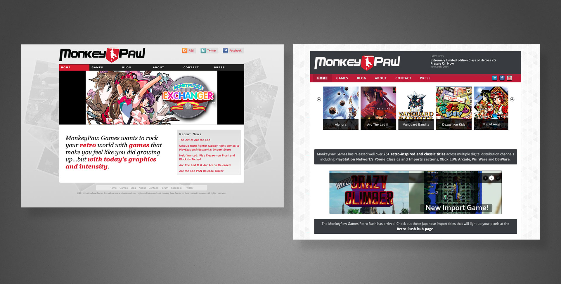
Beyond the tombstone, we eventually released a full website. Primarily a destination for fans and customers to gather news or other information about the company’s products, for the first five years it existed as a non-responsive, “classic” website (see below), courtesy of other designers/agencies.

Early versions of the desktop only website. Note these sport an alternate logo and word mark, courtesy of another designer.

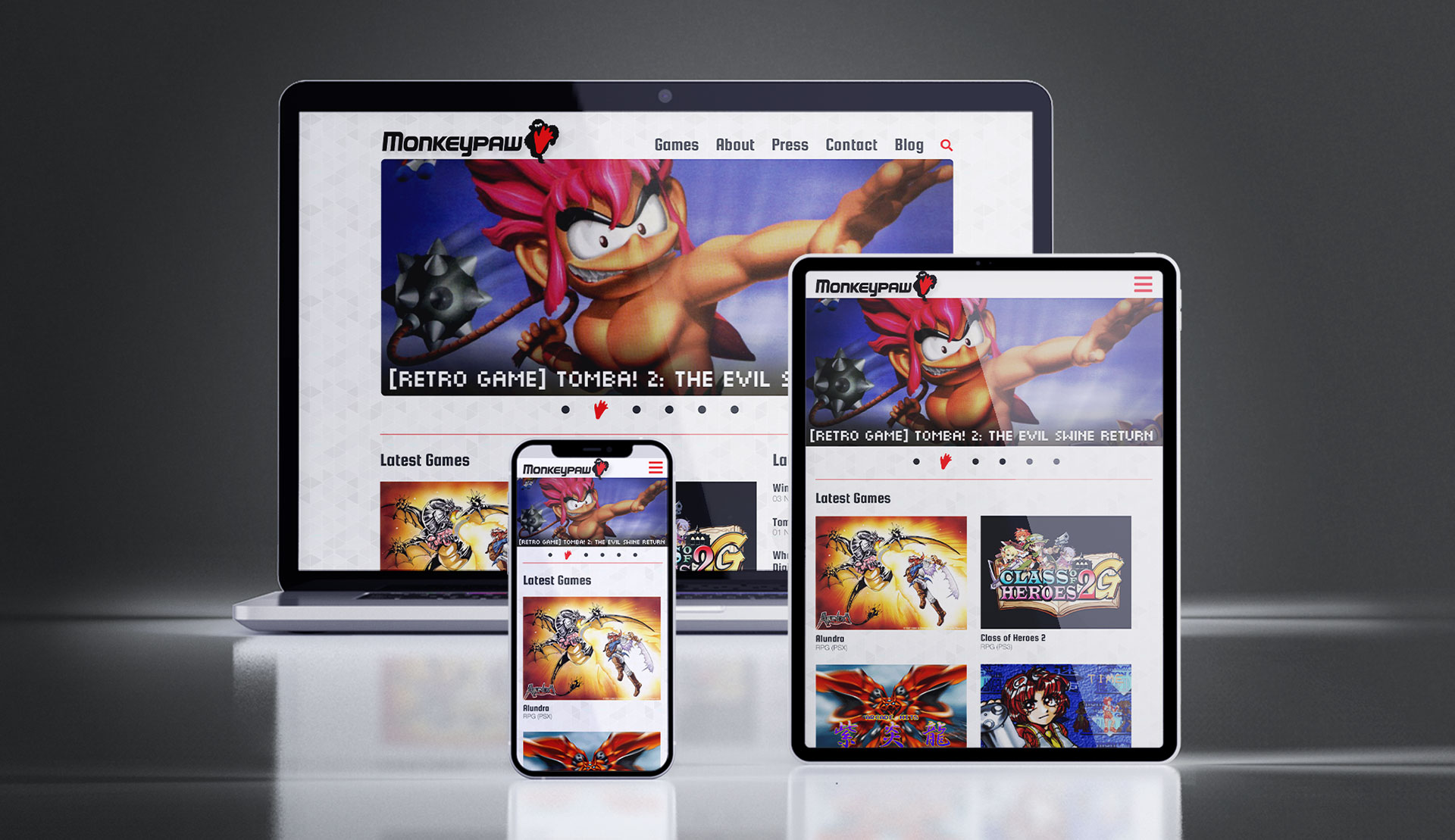
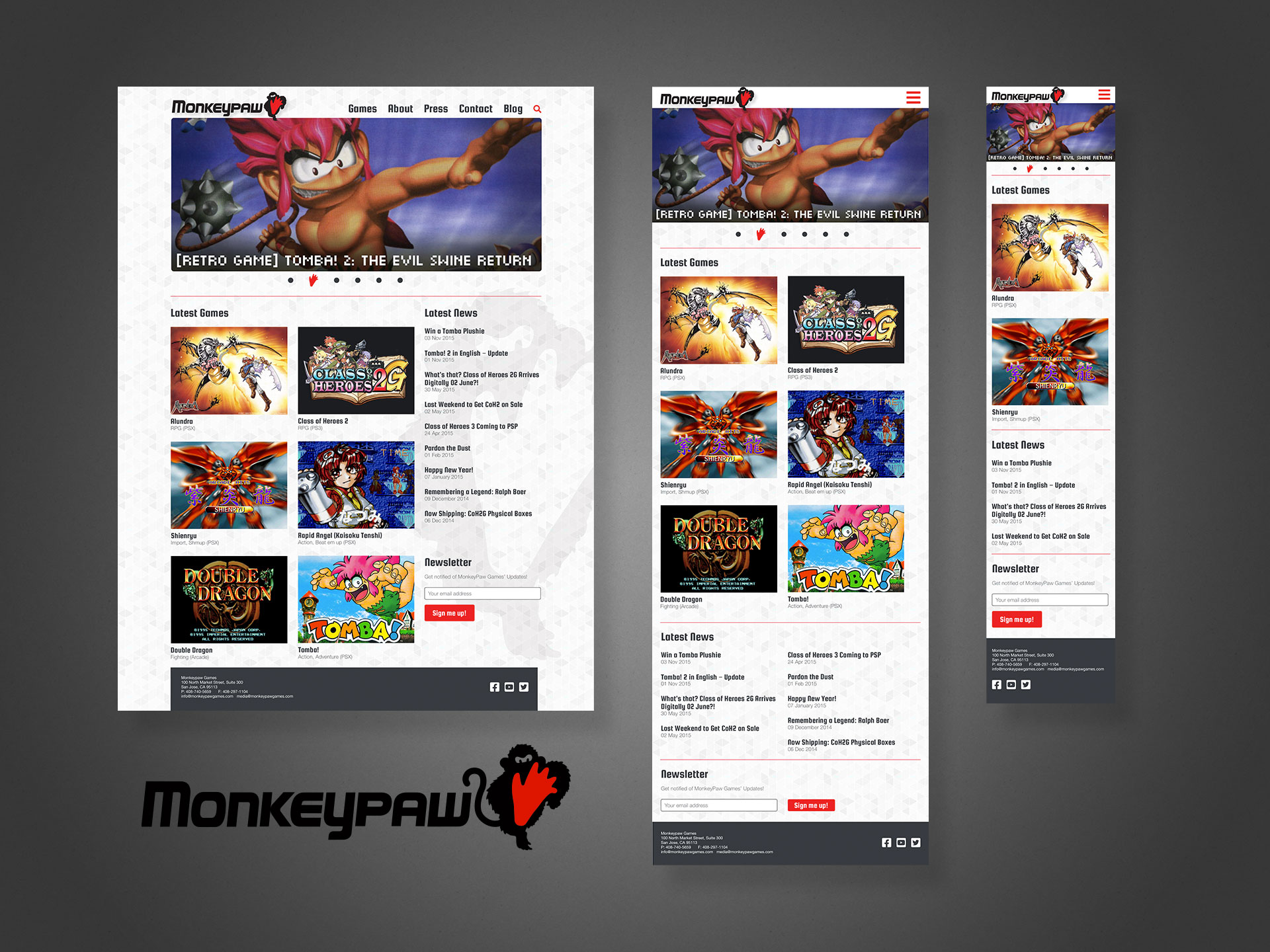
Only when 2015 came around did the site blossom into a fully responsive, multi-device offering. Shown below with my layouts, logo and word mark. Note the mobile (phone) version is intentionally truncated to display alongside its counterparts; some repetitive content not shown.

My responsive layouts, plus the logo and word mark. No disparagement intended to the previous designers, but these all display an obviously higher degree of professional TLC.

* Technically, I joined a project in the late 90s with a Canadian company, but do not consider it part of my professional canon 👍


Bardo Entertainment

Project: Website, pitch decks 
Role: Creative Director, Designer
Team: <10
Environment: On-site in San Francisco Bay Area, California
Key Skills: Photoshop, UX/UI, Web design, HTML, CSS
Summary: A small tech company website (Bardo) aimed at delivering community-focused portal and B2B partner program sites, primarily to the gaming industry.

Freshly transplanted in the San Francisco Bay Area during the late aughts, this marks one of my first freelance projects in the area, spearheaded by my contacts in the video game industry and online game developer Bardo Entertainment.

Bardo hired me to design and pitch a massive growth project for their online community and gamification platform. We also partnered with enterprise web software company, OneSite, who developed much of the back-end technology.

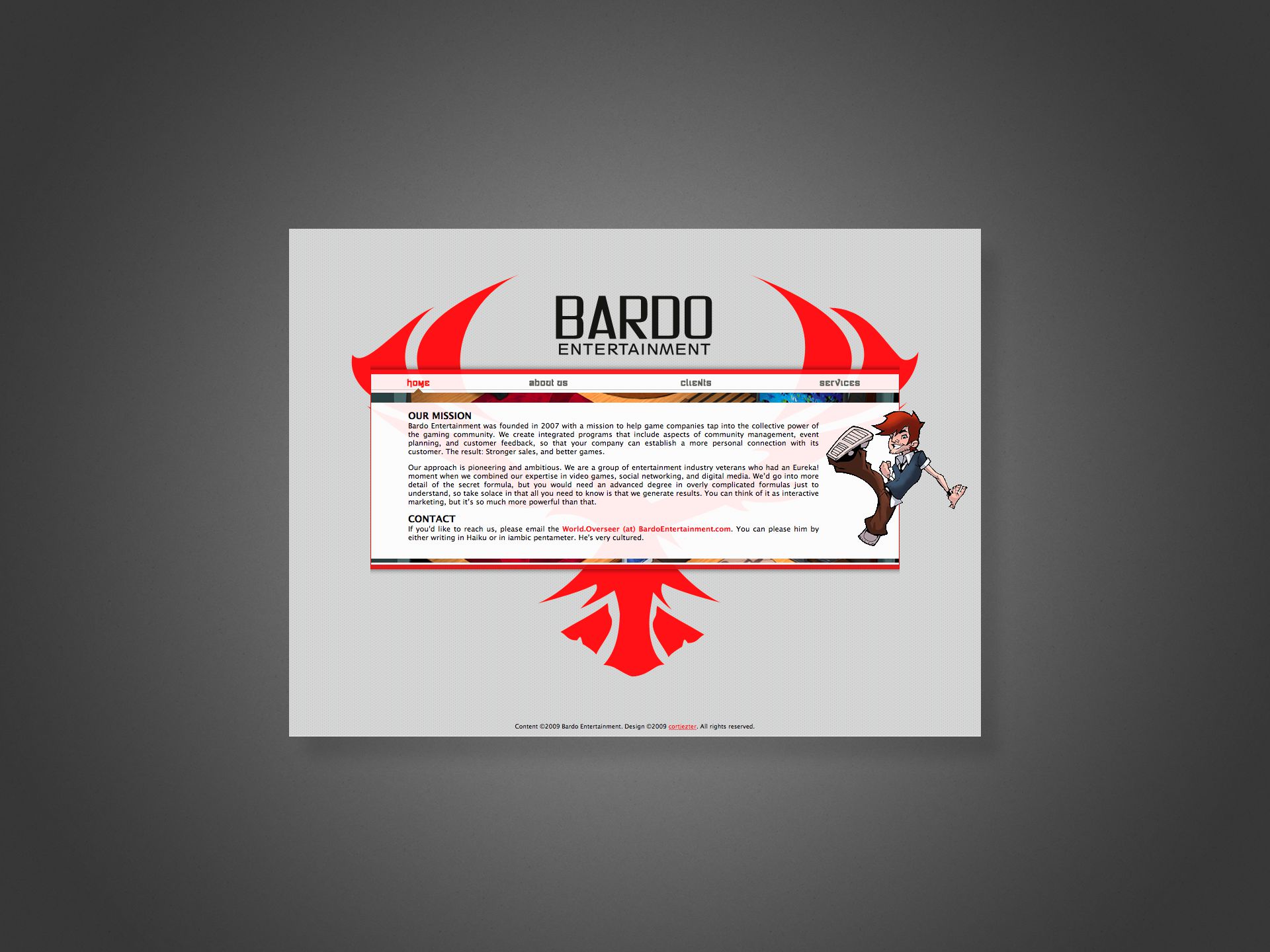
Despite IE6 chucking its notorious wrenches into cross-browser compatibility for years, we wanted to include a few “cutting edge” web techniques (for 2009), such as massive, floating and overlapping layers and translucent elements, mostly for projecting some pizazz and technical prowess, given the site’s otherwise simple presentation.

Web browsers generally didn’t support 24-bit PNG yet, forcing us to adopt 8-bit GIFs and PNGs with their inherent jaggies and dithering effects familiar to anyone who might have played SNES games back in the 90s.

The Bardo “phoenix” in the background helps funnel the viewer to the centre and then downwards through the content. This let us streamline and prioritise the information, giving users just what they need, nothing more or less.


Sega of America, SegaNerds

Project: Website, pitch decks 
Role: Creative Director, Designer
Team: <10
Environment: On-site in San Francisco Bay Area, California
Key Skills: Photoshop, UX/UI, Web design, HTML, CSS
Summary: A reinvention of Sega’s own community-facing presence while also building a network of third-party partner/affiliate sites under its umbrella.

A joint effort with Bardo Entertainment and Sega of America to improve their community outreach program both with their everyday users and also fans running their own sites, blogs, forums, etc.

We partnered with OneSite, a provider of enterprise-level front- and back-end solutions, especially for social media, which includes blog and forum features, but the platform’s biggest draw was its community gamification; giving users points for various activities, redeemable for exclusive gaming swag or digital goodies.

The plan included migrating Sega’s existing site, blogs and forums to OneSite’s platform, and then invite select fans to migrate their sites to sit alongside Sega’s official offering. Post launch, additional game studios and tiers of fan sites were scheduled for inclusion into the network, exercising common templates while also featuring each organisation’s unique branding, staff, and voices.

Shown above is an example pitch of “SegaNerds”, the world’s most popular unofficial Sega site, as it might look on the OneSite platform circa 2010. Note that I took liberties with an original typeset logo and custom illustration, since at the time, their site was essentially a WordPress blog with some stolen sprite art plus the actual Sega logo.

Admittedly, by today’s standards, the web portal style might be a bit busy, however it still represents an approach to organising heaps of content into a single page, in this case unifying a blog, forum, and the new platform’s content all in a single touchpoint.

Although now offline, a not insignificant portion of the intellectual property is evident in services like Loot Crate.


Nicalis

The deceptively simple, yet responsive site for Nicalis software's head honcho.
The deceptively simple, yet responsive site for Nicalis software’s head honcho.

Project: Website 
Role: Designer, Front-end developer
Team: <20
Environment: Remote
Key Skills: Photoshop, UX/UI, Web design, HTML, CSS
Summary: A companion site for the CEO of an indie gaming company to do fan-direct PR and other random communication.

Nicalis is a darling of the indie gaming scene, amassing a huge fanbase with their niche titles released across virtually every platform. The studio’s boss came to me around 2014 looking for a way to make personal announcements and connect directly with those fans in ways exceeding Twitter’s capabilities.

Using Tumblr as the base CMS platform, additional requirements and features such as Twitter integration, AMA events, and multi-device responsiveness were designed and implemented.

The graphic above shows screen grabs of the site as it exists today (latest post 2017), replete with rendering anomalies either the result of modifications made by the client post release or changes to the hosting platform/browsers over time. 

Curiously, instead of any title imagery, he opted to render his name in simple Japanese kana and live HTML text. Whatever the thinking behind it, it remained a popular destination far longer than Tumblr itself.

Sadly, no static renderings or wireframes of the pre-release development process exist, as most of the UX design work happened directly in the browser while I coded it, but the above does closely resemble the product I delivered. I may at some point recreate assets to further illustrate the process.

Physical Product Design


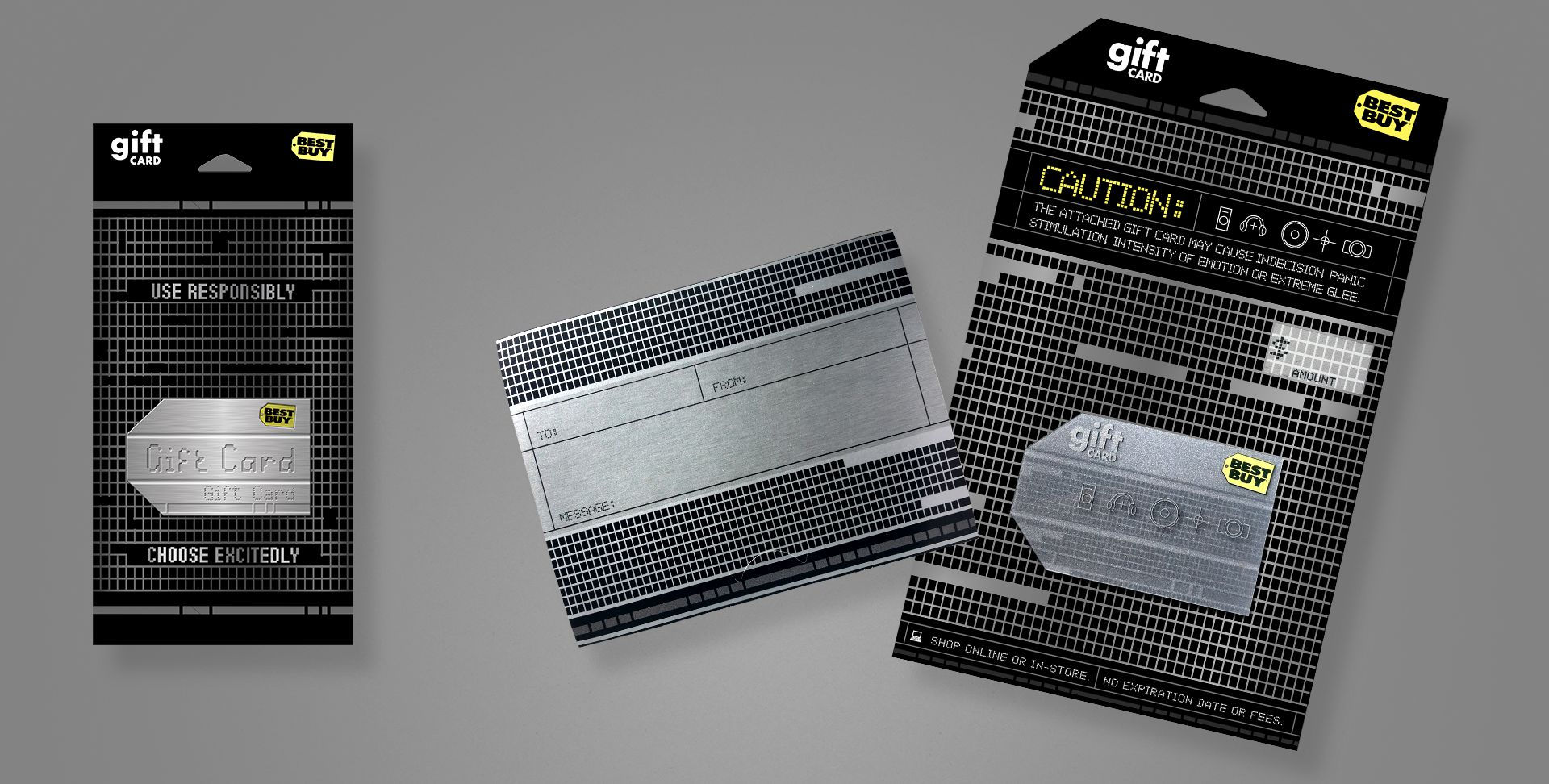
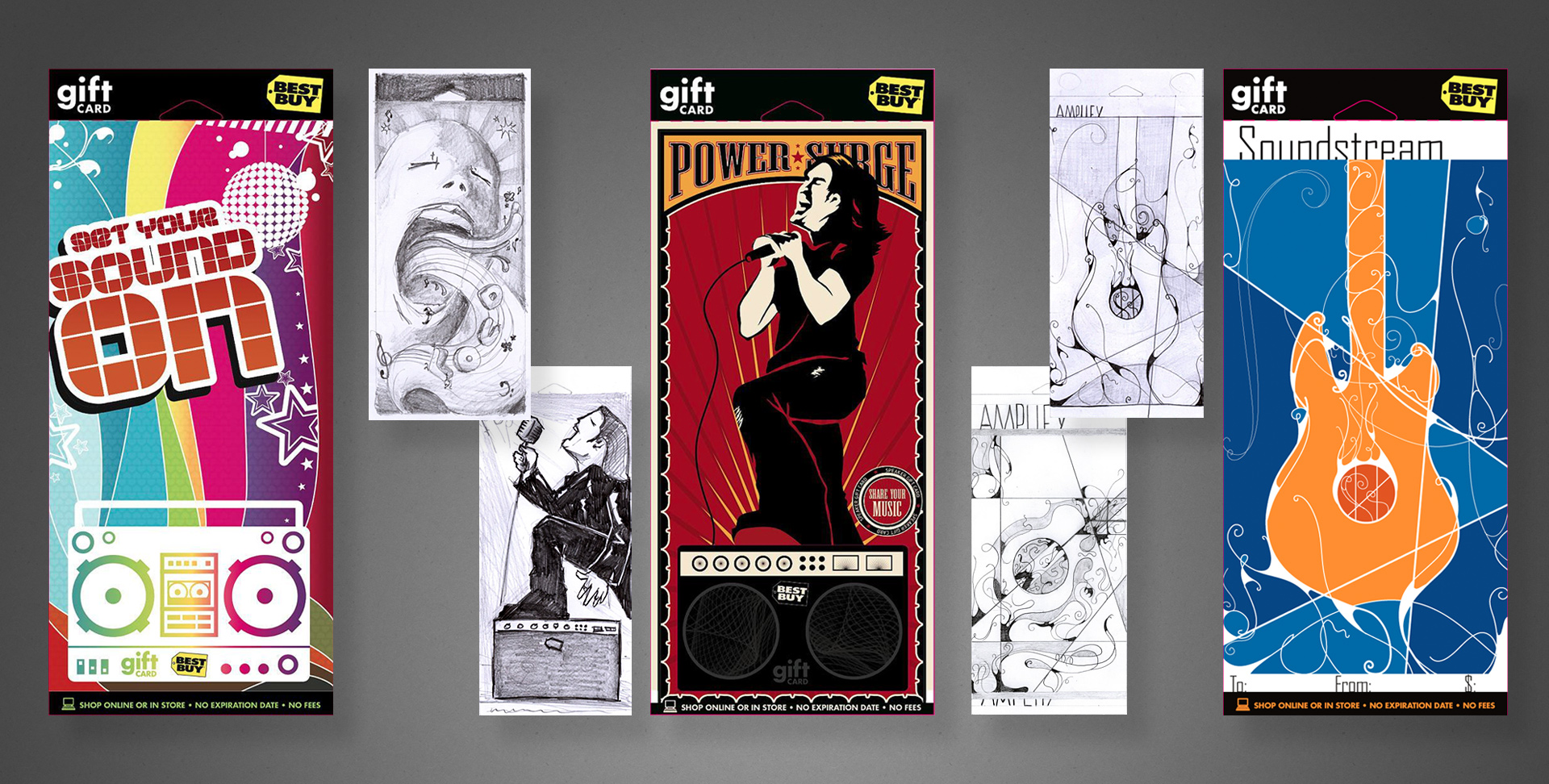
Gift Cards

Project: BBY Gift Card Program 
Role: Art Director & Designer, Brand Design & Integration team
Client: Best Buy Co.
Key Skills: Photoshop, Illustrator, Brand Identity, Product Design
Summary: An ongoing program of various gift card assortments. Each card targeted either a specific drive time, holiday, season, or consumer demographic. For each card, I began at the concept stage, finished at the press check, and everything in between.

Below is a gallery of assorted Gift Cards from my time with Best Buy. Photography of the final, printed product is shown where available.

Click any image to enlarge detail.

tweenskulls_fin

This is a trifold gift card that was produced to appeal to younger, edgier folks than the typical “vanilla” (slightly generic) cards otherwise available. Had to fight a bit to get approval for the skulls appearing on the game controller; the original concepts had heaps more, and my brainstorming files filled with similar odd/twisted cute-but-disturbing entries.

This card features UV spot gloss and spot thermographic (raised) texture for the white areas. My role spanned from the original concept sketch to illustrator, final mechanical production, and press check.

openvalue_fin

The open value, or “generic”, gift card is (or rather was at the time; I have no current data for comparison) Best Buy’s number one SKU; meaning it alone accounts for more revenue per year than any other single item they sell, exceeding a billion dollars annually. This makes it incredibly valuable as a brand vehicle—not just a product, and by far the most visible, high-dollar design I’ve ever created.

Some background on the project: at the time of its redesign, the company had been using a couple of flashy, and frankly gimmicky/gaudy designs that relied on cheap lenticular or hologram effects to gain attention. I understand the time and place for these things, but at a time when the company was looking to elevate their brand design, public image, and sophistication, such gimmicks are toys better left behind in childhood.

As such, a streamlined, elegant approach that put the brand name, marks and elements first. Solid on-brand blue, simple typography, and the use of subtle textures and contrast between shiny vs matte to do the talking. The card is a color-matched solid core plastic with a spot silver foil, and the giant logo on the carrier is a UV spot matte that exhibits different effects at varying viewing angles.

This design changed very little from my first concept presentation, and was received well both internally and publicly. I served as the Art Director, Designer, and Production Artist for this project, and assisted with on-site press checks.

demin_final

A brand-focused card, we decided to go all out with this one. Embossed, spot UV, spot matte, custom spot foil, and hand-affixed jewels to both the carrier and card. Shown left are two concepts for a gift bag, which eventually became the gift card.

My role spanned from original concept, to photographer, designer, production artist for final mechanicals, and on-press art director.

mothersday_set

A gift card, available in Spring 2007. The brief was targeted at higher-middle income mothers, or at least as gifts for said demographic. We were to illicit a bit of “boutique”, plus a sense of abundance/selection. So I came up with a box of brand-specific chocolates. When closed, it looks like a box of chocolates, replete with a ribbon. When opened, you see the assortment of sweets.

Shown left are my original illustration and a digital comp. Shown right are my original concept sketch, my rough digital draft, and photography of the final product to show my workflow and vision carried out between media. I was responsible for the concept, client presentation, art direction and supervision of an illustrator hired for the final image, and the press check.

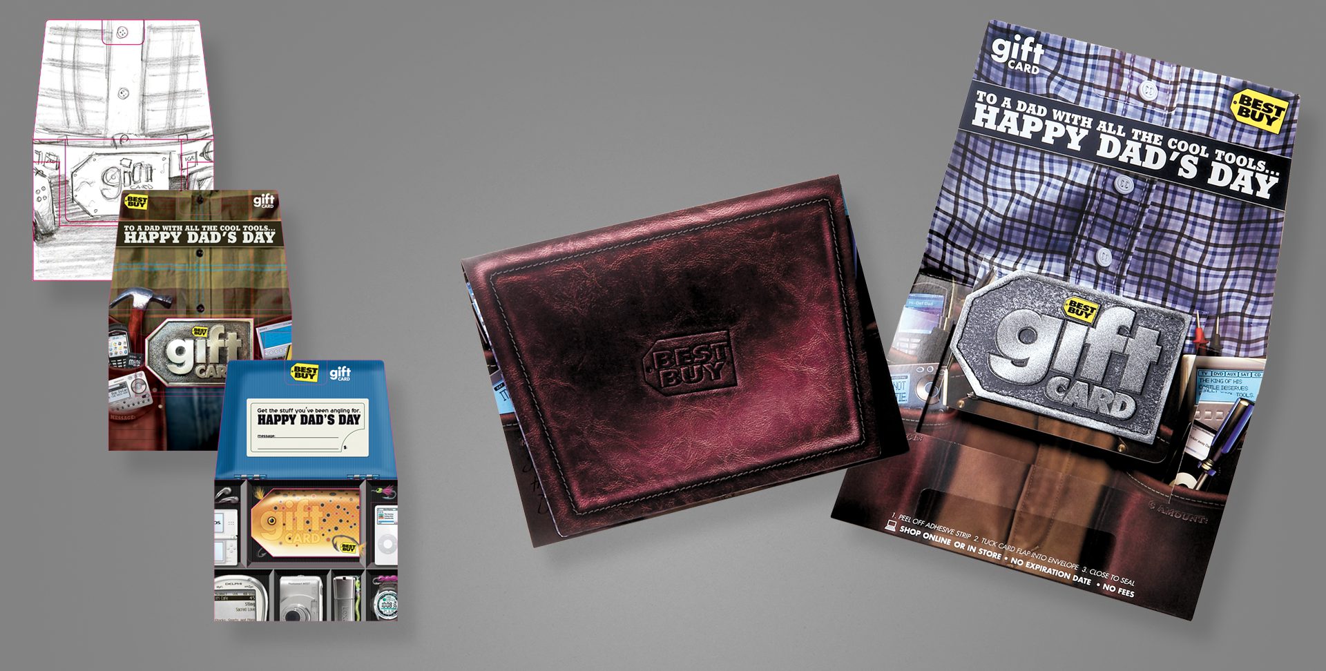
dadsday_final

After having a Mother’s Day card aimed at a more sophisticated, upscale demographic, we of course needed one to match the fathers in the same category as well.

Shown left are my original pencil concept, and my first rough digital comp. An additional, unused tackle box concept is also shown. Finally, photography of the finished, printed illustration, open and closed. The closed design mimics a fine leather wallet, and the card design used a layered process with metallic inks to give depth and some visual flash.

Pencils and digital comps are my direct work; I art directed the final illustration via a sourced illustrator, and oversaw the printing process/press check.

brandmetal_final

A brand card that aimed at a more sophisticated, tech-savvy or early-adopter demographic. This project used a silver ink with 1C overprint for the textured metal effect on the carrier, and a layered card that shows different elements on the fronts and backs of each plastic layer, to give a parallax, 3D depth effect.

My original concept is on the left, and photography of the final printed card/carrier on the right. I art directed an illustrator for the final, prepared mechanical files as the project production artist, and oversaw the printing process/press check.

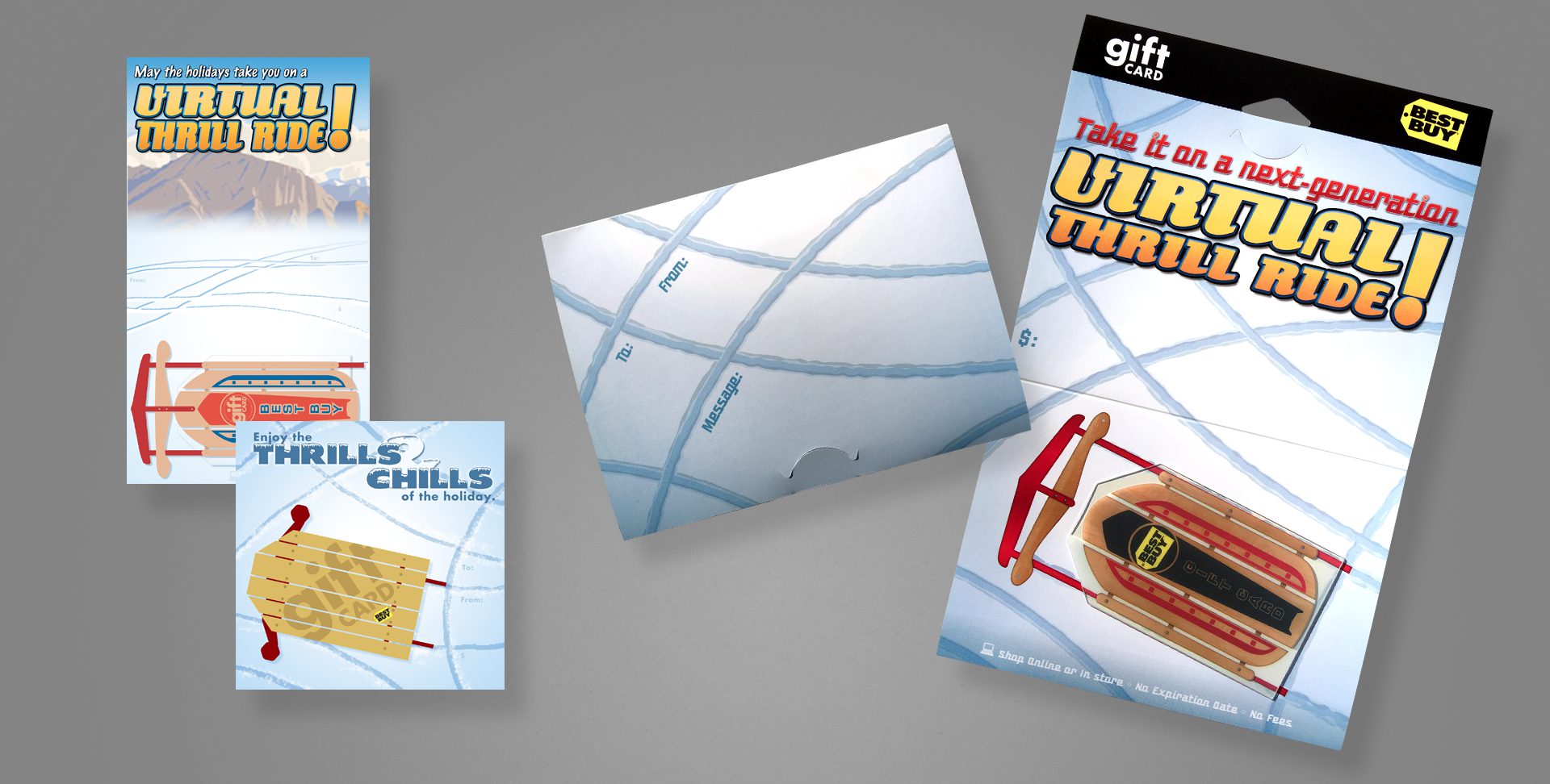
sled_final

A holiday card that plays off the shape of the Best Buy tag. This card uses a clear card technology, so surrounding the sled body and between its wooden slots are completely clear.

My original concepts are on the left; photography of the final card and carrier are on the right.

I served as the designer from concept to the final design, with the exception of art directing an external illustrator, who produced the woodgrain and metallic elements of the sled; as well as assisted on production art of the mechanical files and attended all press checks.

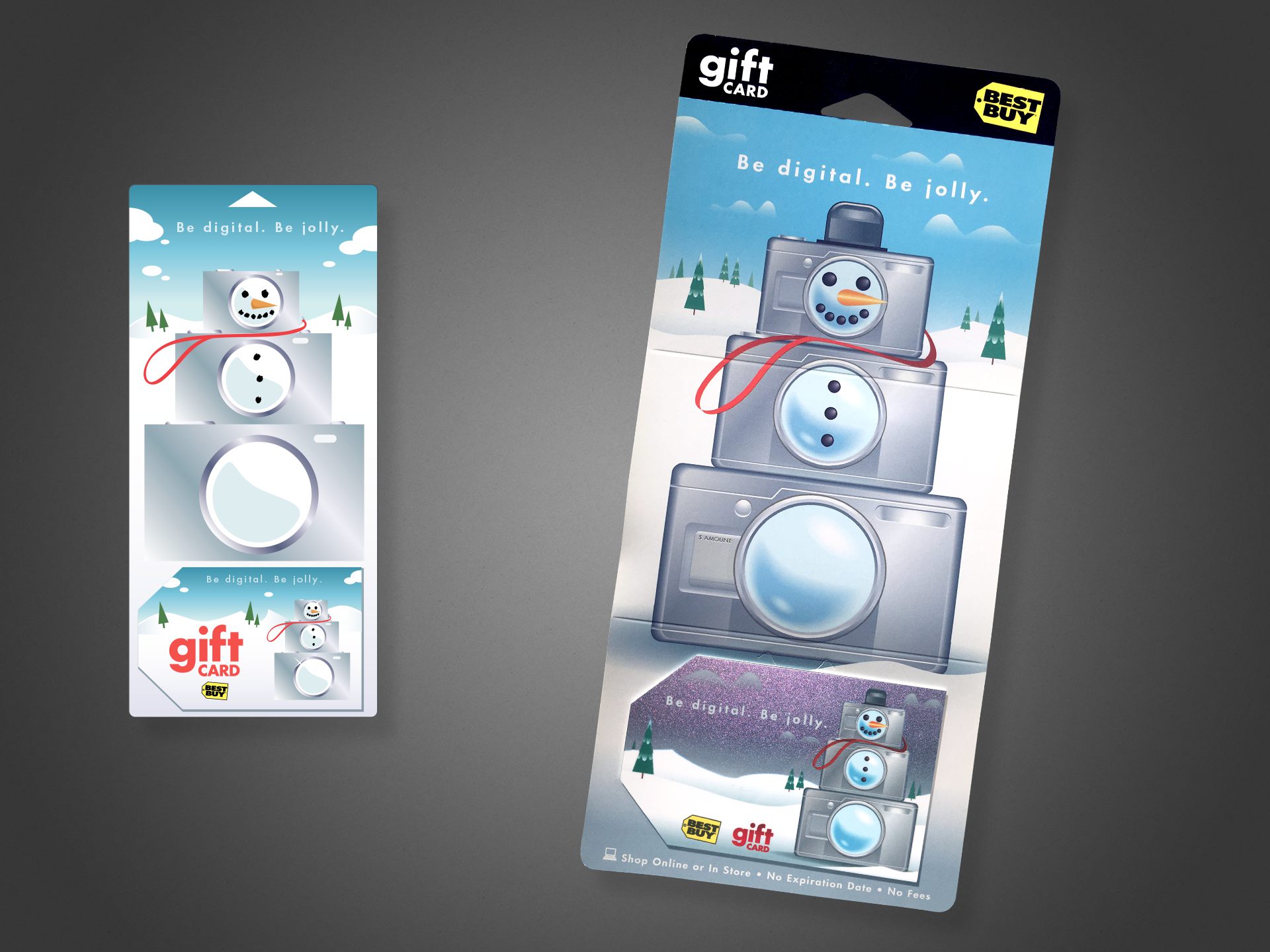
snowman_final

This holiday card is, conceptually, one of my favorites, simply due to it’s light-hearted, whimsical take on the Best Buy brand and its “abundance” component. This project features a color-shifting metallic fleck on the card, shifting between blue, teal, and the purple tones visible above.

Shown left is my original digital concept; shown right is photography of the final product. I served as the designer from concept, to art directing an external illustrator for the final illustration. I assisted with production art of the mechanical files, and attended press checks.

Cutting Room Floor

speaker_set

As gift cards became more popular in the mid ’00s, ways of standing out amid the massive selection became more important for the business end. That included exploring new substrates (plastic, clear, metal, etc.), new inks (metallic, color-changing, textured, etc.), and new form factors.

One of the alternate form factors our group explored was a gift card that doubled as a standalone speaker–requiring only an external audio source be plugged in via a standard headphone-style jack. Yes, it was thicker than a standard card, making swiping a magnetic strip impossible, and yes, the speaker was tiny and didn’t sound like much, but it was certainly on-brand as electronics and entertainment go, and something new to the gift card arena.

Included are a number of my pencil concept sketches, plus a number of digital comps.

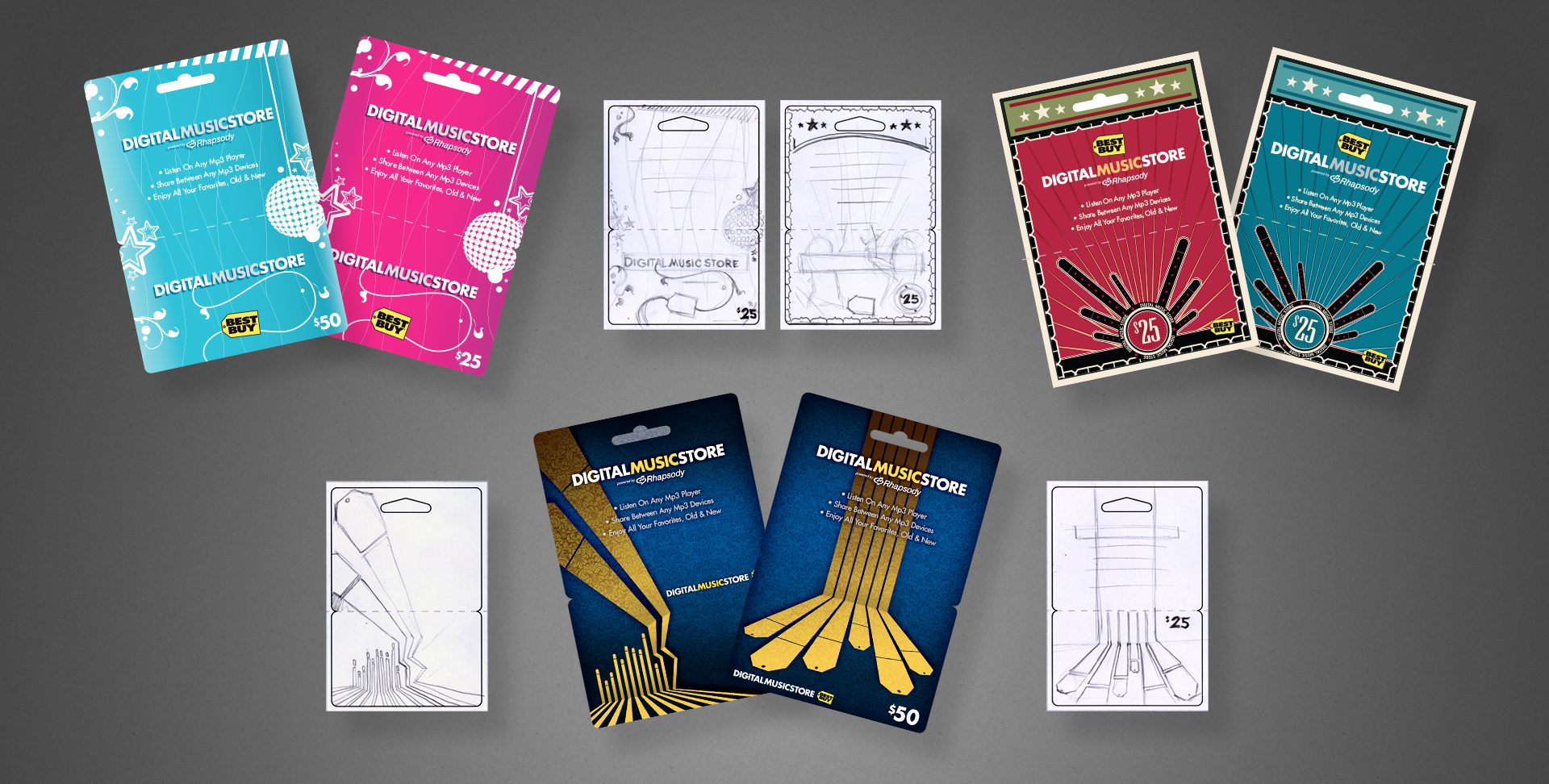
dms_set

Above are a variety of concepts to be used for an online music service, each accompanied by my original sketch to illustrate my typical work flow. The dark blue cards in the lower-center were ultimately chosen for production, along with a third design in the series not pictured here.

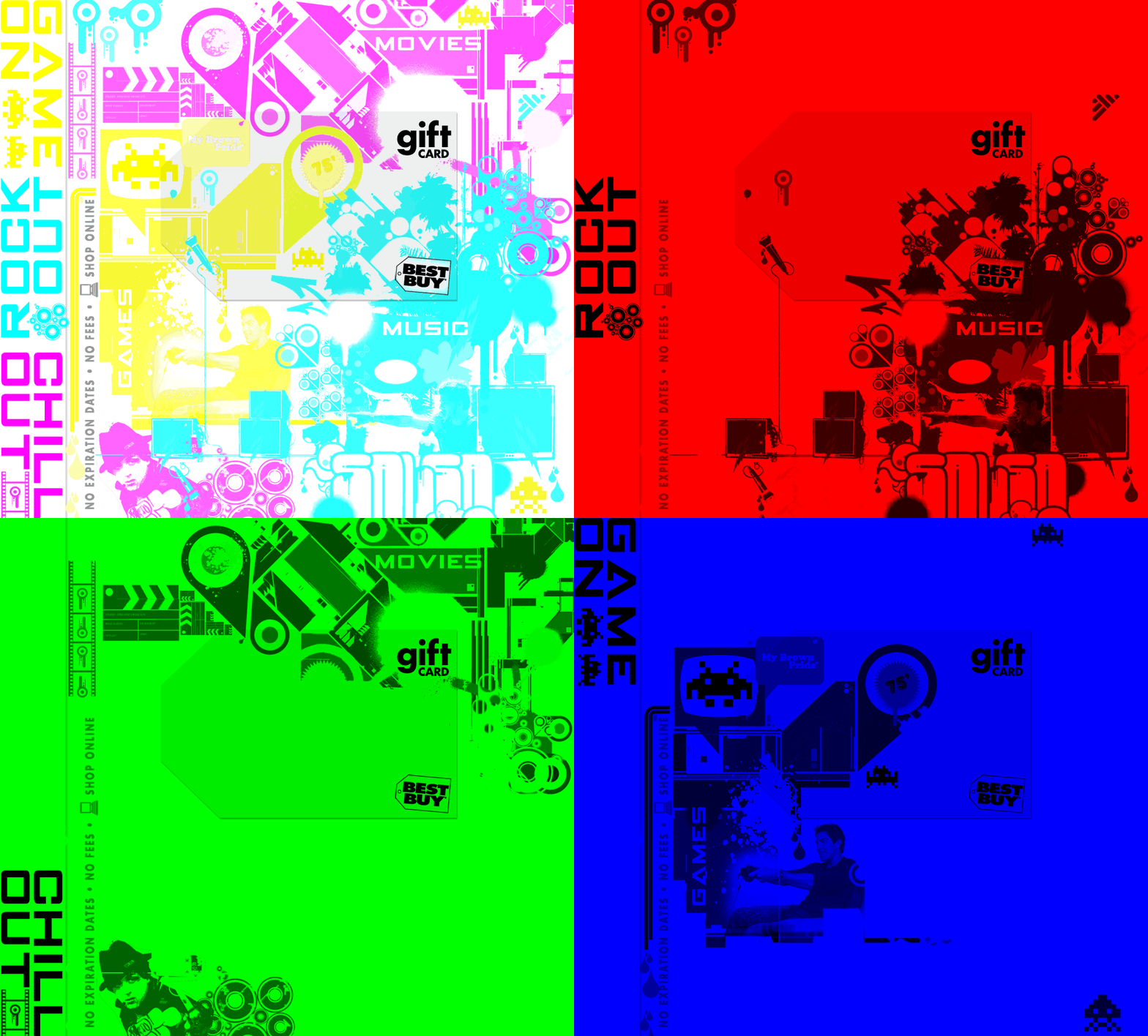
Less formally presented but my favourite… the 3-in-1 jewel case card:

How the concept breaks down. For every vellum overlay, two ink colours would be “hidden”. For example, green hides cyan and yellow while darkening magenta, etc.

The brief was to design three entertainment gift cards, all to be merchandised amongst the in-store media (music, dvds, games).

To make the most of a limited budget, with some inspired and cunning use of the physical sciences, I devised a single design that would be transformed for each category using a different colour vellum overlay inside the jewel case. By exploiting properties of light, I could effectively hide two ink colours with a single transparent overlay.


B2B Gift Package

Project: B2B holiday gift package
Role: Art Director & Designer, Brand Design & Integration team
Client: Best Buy Co.
Key Skills: Photoshop, Illustrator, InDesign, Brand Design, Product Design
Summary: A premium holiday gift package for B2B customers, complete with a mailable box/packaging, exclusive discount coupons, and signed greeting card.

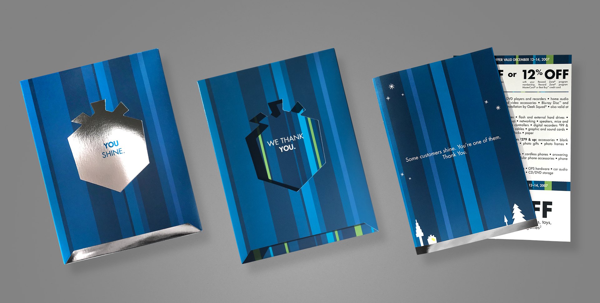
b2bthankyou_final

Every year, Best Buy produces a special holiday greeting card to its business customers (B2B), as a thank you for their patronage. When approached to lead the project one year, I took things a step beyond a simple greeting card, and created more of an actual gift package, one that also matched the company’s holiday campaign, which included gift box iconography and copy.

The box includes an additional flap that folds over the messaging visible on the above image (leftmost two samples), with space for mailing. Once opened, the recipient reads “You shine.”, on a shiny, silver foil box. Sliding out that box reveals a secondary message printed on the inside of the carton, “We thank you.” Inside the box is an actual greeting card, hand-signed by the team and containing a special offer coupon. The elegance and simplicity throughout this piece was really satisfying, and went over remarkably well with recipients.

My role extended from the original concept, where I literally spent the first week working through the form factor, hand-making various mockups to test; to the design and production of the final mechanical files.


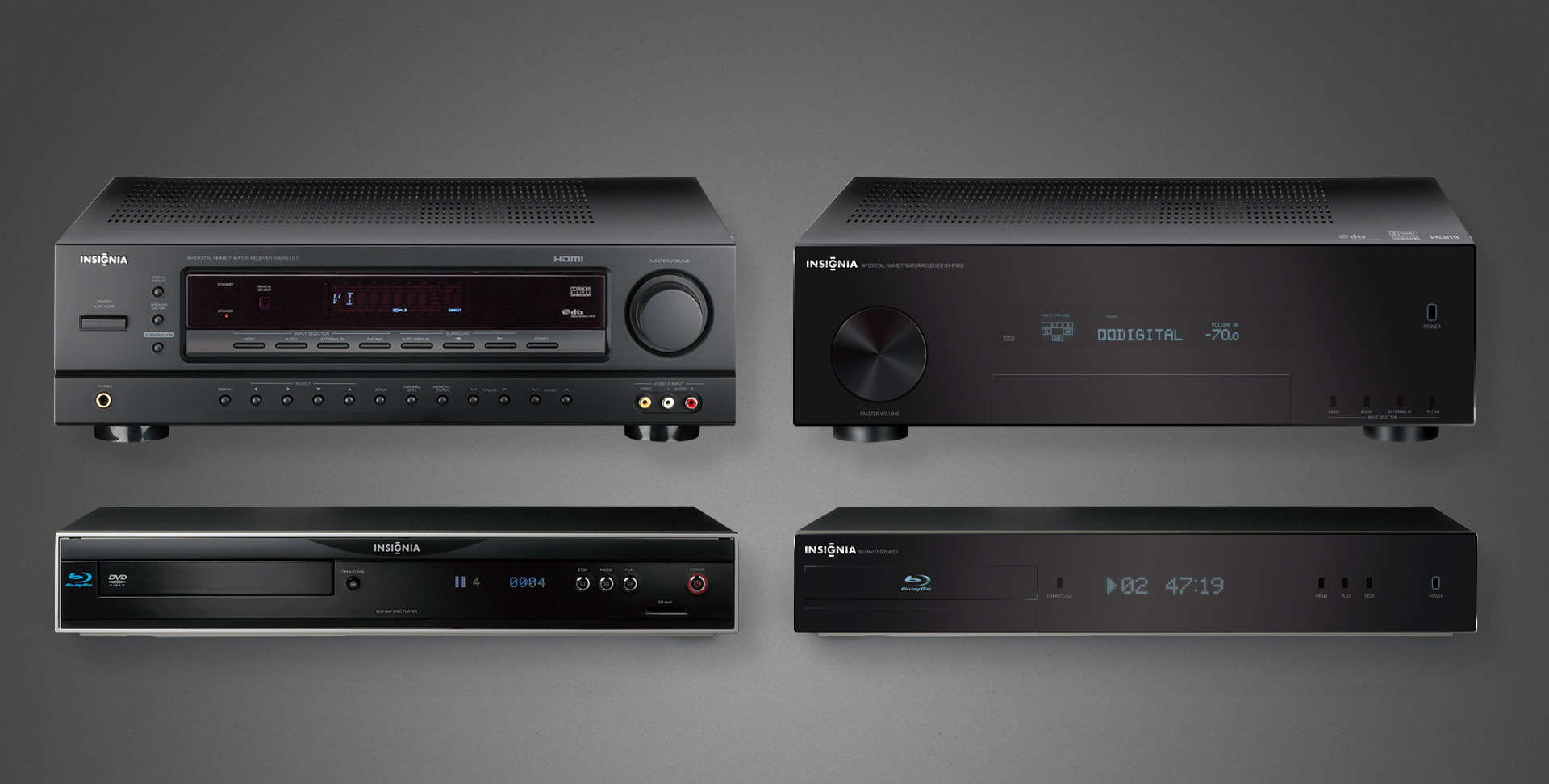
Industrial Product Design

Project: Private label product line revision 
Role: Art Director & Industrial Designer
Client: Insignia
Key Skills: Photoshop, Illustrator, Brand Identity, Product Design
Summary: A new line of private label products struggled to achieve a cohesive—and upscale—image across its variety of products.

Many consumers immediately associate private label (or as they’re commonly referred to in the pejorative, “generic”) products with similar, but inferior quality, at least compared to brand-name equivalents.

What those same consumers don’t know is that in many cases, the generics are manufactured by the same factories on the same equipment, etc. as their more expensive counterparts. Swapping a mould, logo, or packaging design between them is almost trivial.

The Insignia brand manufactures a heap of private label electronic goods for Best Buy, but early in their journey, they struggled to create a cohesive identity amongst their product lines, because each was produced independently by whichever facility was manufacturing it.

Left: the individually serviceable but collectively unrelated original A/V components
Right: the family resemblance is not only obvious, but its refined elegance suitable for any discerned A/V enthusiasts

No more apparent a case made than that of home theatre products, when they’re often literally stacked together. Insignia A/V offerings were all over the place, literally and figuratively, because each factory did whatever they wanted to satisfy the technical requirements and called it a day.

I was charged with providing branding and industrial design support, both to align the products’ appearances but also elevate their chicness, especially when placed on shelves alongside high-design and higher-priced competition. The scattershot fit and finish simply reflected poorly on both the products and brand.

A peek at one example of product families, we can see on the left the somewhat schizophrenic and mismatched pairing of a receiver and its cohort Blu-ray player.

My recommendation for revisions to both—staying within budget—is shown on the right. All done completely in Photoshop (and with vector shapes/layer styles for resolution independence no less).

These efforts did spark something of a renaissance within Insignia’s product and manufacturing group, evident to this day in their more well-conceived line of goods.

I actually enjoyed this enough that I considered returning to school to get certified/qualified in industrial design. However, in the course of informational interviews with existing professionals, all interestingly shared the same warning: “if you want to do industrial design, just realise that everything you ever do will end up in a landfill someday”.

Ouch. Digital products it shall be then.

New Retail Product CX Design Case Study

TLDR; A look at what went into trying to launch an unusual new product within a larger, successful line of traditional offerings.

Project: “it™ bed” Product, Brand UX/CX Design
Role: Art Director, Product Designer
Client: Sleep Number (formerly Select Comfort)
Key Skills: Wireframing, Photoshop, UX/UI, Web design, Brand design, Style guide, Illustrator, Figma
Website: itbed.com (retired; now redirects to sleepnumber.com)
Summary: A swashbuckling adventure to define the branding and (mostly digital) brand user experience of a new product within the confines of its larger retail brand.


Preamble

Sleep Number (formerly Select Comfort) is a premium mattress and sleep product brand in America. In mid- to late-2016 they launched a new product to compete in the growing “bed in a box” space mostly owned and pioneered by Casper, but also to reach a younger demographic than they had been pursuing for decades. Enter the it bed. It married some of the adjustable Sleep Number technology with smartphone connectivity, but delivered in slender, unboxing-memeable cardboard.

The efforts put into engineering this new product unfortunately did not translate in equal measure to its marketing or branding; the result: an obvious collage of individual contributions, ranging from elements indistinguishable from the company’s “core” line of products to a schizophrenic series of new identities, tones, and brand languages every other month. Nobody said launching a new brand and identity was easy or quick.

In early 2017 Sleep Number approached me to lend my skills in product design and UX to help unify all of these points, paired with a structured market plan. Because all of the brand’s assets were designed scattershot by whomever seemed to have bandwidth on a given day, rather than approach any of those individual components (like the website, logo, or app), I aimed to apply comprehensive, end-to-end UX concepts to the entire brand; everywhere the public might encounter it.

Harnessing Scattershot Efforts

Left: a sample of one inherited brand identity. Right (2): two excerpts of a larger onboarding series of emails targeted to new or interested prospective buyers.

That said, due to the it bed being a subset of the larger Sleep Number brand, a few things were unfortunately beyond our team’s control or influence, such as affecting the product name, logo, etc.; the prevailing reasoning was to avoid disrupting the delicate sensibilities of the myriad contributors thus far. 

A Styleguide to Rule Them All

My first point of business was to establish a brand style guide, replete with baseline tone, voice, and visual language to serve as a yardstick against any work—whether done internally or externally, across all channels. Until my involvement, only partial guides with vague aspirational content and stock imagery existed; courtesy of an external agency—the entire body of them outdated by virtually every measure of our new internal team’s white boarding of brand attributes, so it was an obvious cornerstone towards building a stable foundation for the brand’s design and overall UX.

Sample pages from the brand guide. Note that some pages are altered to show analogous content from other brand guides in this portfolio.
New iconography that contributed to the overall new design language that would eventually inform the digital product UI.
New logo exploration to mirror and dovetail with the other design language and also better describe the physical product.

Aligning Multi-channel Touchpoints

The second was to begin scaling the mountain of the product’s website, built impetuously to be little more than a two- or three-page promotional resource and merely to have a minimal online presence. Shockingly, according to the company’s web manager, the site was built without any regard whatsoever for commerce, a brutally honest admission made brutally aware to any visitor looking to make purchases or find deeper information, only to encounter wave upon wave of sales-affecting hurdles. Luckily, this wasn’t the first time I have inherited what is essentially a WordPress theme and challenged with maturing the UX end to end.

Onboarding, welcome, and promotional emails that benefit from intentional copy, photography, and brand UX principles.

The third point, was to develop regular marketing materials (promo emails, display ads, etc.) to refine the content used to inform the bigger, more permanent first and second points, through iterative design exploration and A/B testing. As above, the prevailing method for these consumer touchpoints had been to apply whatever the current identity to the persistent cycles of sales promotions; so an email or banner ad campaign every few weeks with the new promo—and of course, a menagerie of brand identities to match.

Posthumous Recognition

Unfortunately, despite my and the team’s best efforts, based on a nearly complete erasure of it from the internet, it appears the it bed—a premium, tech-infused, semi-portable mattress for the millennial vagabond—was simply too limited a market and too expensive a product to survive. Mere months after my departure from Sleep Number, the company disappeared the it bed, apparently in favor of the lower end version of its traditional product line.

What you’ll see in the materials shown here are a few snapshots representing the resulting direction of the above explorative processes; I feel uncomfortable revealing the starting points because a) they aren’t my work to share, and b) by comparison might reflect negatively upon those who did work on them.

Of note: a) the responsive designs; b) consistent branding elements; c) custom iconography… all my direct efforts, made in Adobe Illustrator, Figma, and Photoshop.

Responsive web designs: mobile (left) and tablet/desktop (right). New video content was developed to support all of the points, especially because the target market favors video over reading blocks of text.

Some of these designs represent actual creative released to the public. Others represent in-progress/in-development projects that remained private to protect any promotional or sensitive brand information; available now that the product has expired over a year ago.

Custom CMS Product Design Case Study

TLDR; an online gaming news site and community I’ve led the building and rebuilding half a dozen times since 2005.

Project: Web-based app, custom-built CMS for online media outlet
Role: Director of Product & Design
Client: GoNintendo
Team: 5–40
Environment: Fully remote
Key Skills: User research, market research, mobile first, wire framing, Figma, design system, brand design, documentation, code alignment, leadership
Website: gonintendo.com
Summary: An iterative web project spanning more than fifteen years, starting from the reskin of a humble WordPress-based site to its rebranding and replacement by a custom-built, responsive CMS…twice thrice.

Overview

GoNintendo has been the world’s top destination dedicated to Nintendo gaming news and community since 2005. Having undergone six major product launches in that time—all under my direction, this case study will document the most recent launch from March 2022 following an internal tragedy which forced a site hiatus for the better part of a year.

For a deeper look at the history and previous releases, including my biggest career failure, read my article here

The Objectives

While we had previously built two completely custom CMS front- and back-end solutions replete with a content publisher and admin interface, the latest incarnation brought several new challenges that meant we could not simply recycle past efforts.

The outgoing site—while still highly capable—remains a testament to yesterday and simply not up to the challenges facing devices in 2022, supporting a team of writers or the structural differences in presenting feature content versus news.

Tragedy tends to put things into perspective. What worked yesterday was suddenly unfit for tomorrow.

– Aaron Hoffmann

Where things were

  • A fifth-generation system that while efficient, was built to support a feature set suffering from years of accumulated bloat
  • Fully responsive, but built to serve a largely desktop-based audience
  • Supported multiple domains, users and permissions groups, but the largely code-based editor resulted in huge output discrepancies and rendering issues between authors, even after training
  • Almost exclusively focused on the news feed in a blog-like format, at the expense of promoting editorial and exclusive content

Where we needed to go

  • New content mix, new layout and database/information architecture. Post-tragedy, the CEO’s vision for the site changed from mostly news to a larger emphasis on editorial and exclusive content.
    • New layout could not completely betray the passionate user base’s expectations. We learned this the hard way once before.
  • Massively streamline the feature list. Not minimal viable product, but it required a serious discussion of priorities amongst leadership. In terms of overall feature quantity, most of the past would be left behind.
  • Mobile first. For realz this time. Based on traffic analytics, we would for the first time be building for a mostly (80%) mobile audience. Compared to ten years prior, mobile technologies and expectations evolved substantially.
  • More organised editorial review workflows. The team would be expanding ten-fold to realise the new site’s direction and needed completely different technology and UX to support everyone.
  • A publishing tool that forced consistency between all authors. Expecting dozens of new staff to be or quickly become well-versed in HTML/CSS enough to all produce compliant content is unreasonable. Needs to work for beginners and experts alike.

The Work

Of course, with me, projects never begin with wireframes, largely because like developers, I prefer to avoid wasting time or expensive rework as much as possible.

While some back-end technology pieces began immediately and in parallel with design due to time constraints, I directed the project follow a structured UX methodology.

Define

  • gather requirements from CEO/leadership
  • translate requirements into discrete goals, including feature set
  • establish timeline and roadmap for launch and post-launch
  • define personas and essential new workflows

Research

  • conduct user interviews
    • understand usage patterns
    • understand device usage
  • outline essential workflow diagrams and matrices
  • competitive research and analysis

Structure

  • created design system
    • tokenised colours, sizes, etc
    • all components
  • began branding / identity refresh
  • authored documentation / style guide
    • targeting devs and future advertising partners

Design

  • produced wireframes and prototypes
  • facilitated weekly check-ins with leadership and design/development
  • completed re-branding efforts

Validate

  • weekly check-ins with leadership and dev lead, including demos and presentation of progress
  • conducted regular user interviews
    • A/B testing
    • Group interviews
    • Individual interviews
    • guided and unguided sessions
  • validated code against UX schematics with dev lead
    • my target was 80% accuracy by launch

Repeat

  • analysed/ synthesised feedback into actionable revisions
  • weekly sprints

Definition

We conducted a series of preliminary meetings to define the goals, then identify and triage the feature list, and finally establish realistic delivery windows for launch and beyond.

Defining basic IA, core feature set, personas, and a publishing user flow.
Persona matrix and publishing user flow
Working out the onboarding user flow and permissions, accounting for previously onboarded accounts and brand new people.
Defining the semantic structures early, to simplify design output later, but also to allow development to begin creating basic templates and test code with semi-accurate placeholders.

Research

We then conducted market/competitive research, partly to discover whether similar solutions existed but also to understand what our target audience is experiencing elsewhere, aka Jakob’s Law.

We spent considerable time researching and analysing our traffic data. Surprising almost no one, our device demographics nearly flipped since our previous iteration (built 2013-15), going from roughly 70% desktop to 80% mobile, 18% desktop, and the remainder filled by tablet and non-traditional devices.

Admin headaches

When it came to the publisher, the single greatest struggle in past iterations was training new users how to use the bloody thing, because until recently, good WYSIWYG editors still often relied on knowing enough HTML to tweak/fix things to achieve the desired result.

Plus, even if we could get the average person to rudimentary HTML fluency, each writer would still format their content however the cosmos struck them that day, aka zero consistency.

Rudimentary example of a block editor. Authors can easily and consistently build articles without coding. Simple options shown in the first header’s contextual flyout.

The lead developer and I each independently brought in the concept of a block editor, basically a component library for writers.

By stacking pre-made content blocks (eg headers, image galleries, pullquotes, etc.), each with predefined styling and simplified options, users would never need to muck about in the code, and would all produce identically formatted, valid HTML entries.

Ironically, WordPress introduced a similar feature in 2018, and though we had no interest in reverting to the platform we ditched over a decade earlier, their Gutenberg block editor did represent the direction we wanted to go, just without all its complexity and fluff.

To determine what blocks we would need, we first brainstormed a list, and scraped the database for 50k past stories to generate a word cloud of common tags used by authors, and then compared the two.

It was then just a matter of prioritising (or alphabetising) the final collection, much like the arrangement of keys on an English-based keyboard. We chose organisation by usage over alphabetisation, as not every writer would know our vocab for the block they needed.

The complete list of blocks available to the writing teams.

Structure

Building an entire web app from scratch with an extremely tight delivery window meant that feeling our way in the dark was not an option. Unlike past iterations which allowed organic progress, highly collaborative efforts between design and development was critical to success this time around.
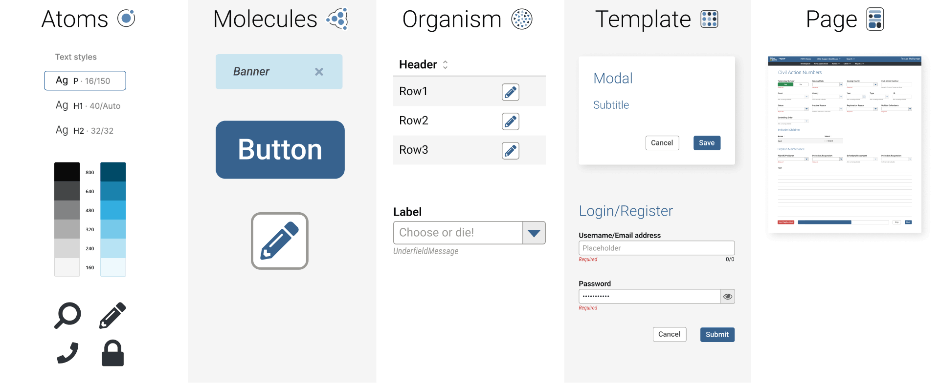
To that end, though we had some very, very rudimentary sketches to illustrate the overall concept and vision from the Define and Research stages, as development set its groundwork with various frameworks and libraries, I began building out our design system, starting with the essentials.

To save time further (ie two birds with one stone), I compiled and documented all components and design system elements as a style guide as they were built.

Design system foundations
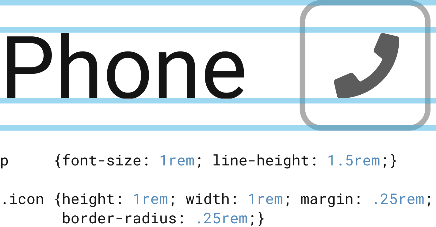
As always, my preferred design system rests upon an atomic, 16-point soft grid. All facets of the system from font sizes to spacing relate to multiples or fractions of 16.

Happy to explain that in greater detail…just reach out.

The most basic elements like font scales, colour grades, and tokens came first, followed by layout grids, buttons and input fields.
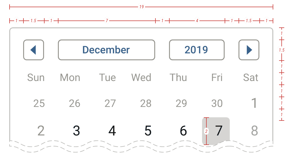
With Tailwind CSS as our presentational foundation, we also relied upon their official Heroicons collection to cover our limited iconography needs for the external facing front end.
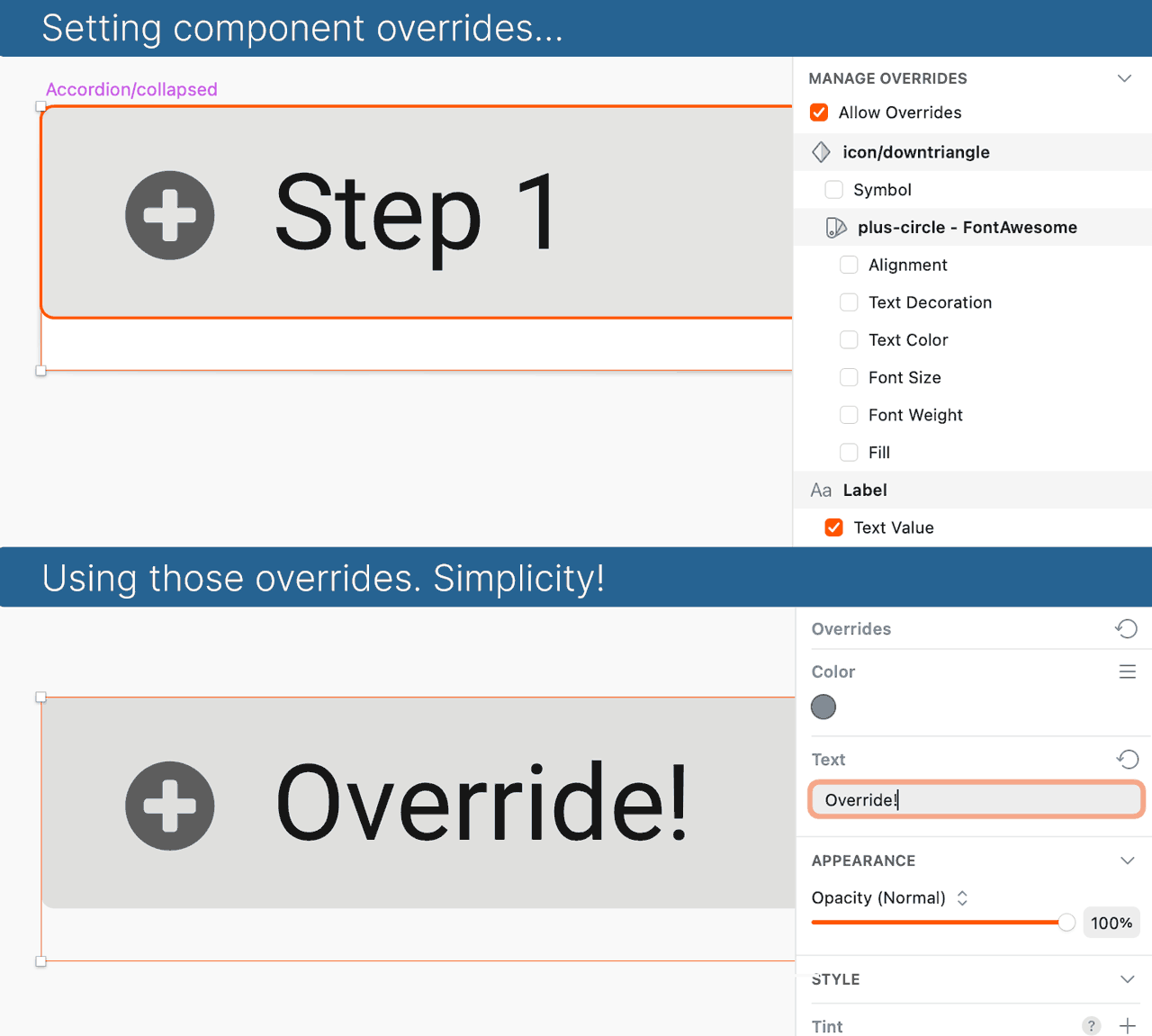
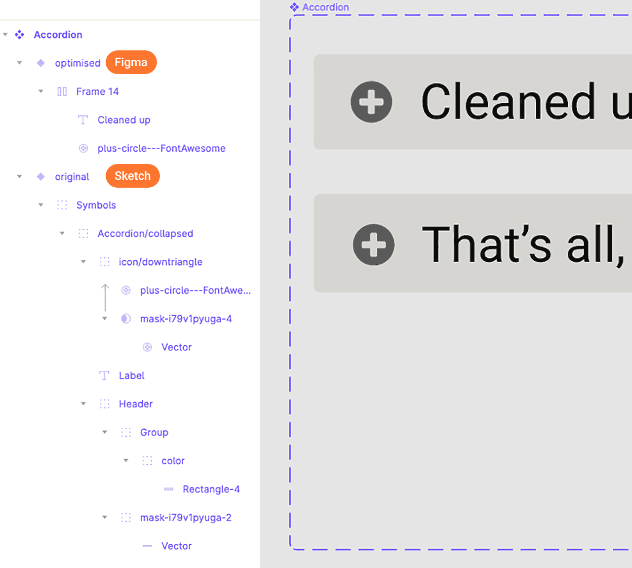
For the block editor within the admin panel, we relied on a combination of official and custom icons inspired by FontAwesome 6.

Additional examples of more developer focused anatomical diagrams and notes:

Rebranding efforts

For a major relaunch not only of the digital product, but also a renewed vision of the services offered within it, we also wanted to introduce a refreshed branding to reflect a resurrected spirit.

Ok, enough with the “re-” words.

Some of the branding exploration. 1, one of our past logos. 2, the revised version. Third column, partial showing of commercial typeface options. Fourth column, my custom-designed typeface options. 3, the final selected lock-up.

Without exhausting the long history, we explored a number of options, but decided upon a simple streamlining of a past, fan-favourite identity.

For this, my goal was to reduce overall geometry for maximal use across devices and sizes.

Although we explored a number of commercial typefaces for our word mark, we ultimately used one I completely custom designed via Adobe Illustrator.

Design

Our goals included not just a responsive, public-facing front end, but a full admin panel and publisher, plus the new identity.

Public-facing

Given our early discussions, competitive analyses, etc.; we quickly settled into a viable mobile concept as our flagship and then expanding upon it to create desktop and tablet versions.

Early, low-medium fidelity mobile menu prototype options test:

Working prototypes of initial mobile menu options considered. External link to Figma.

The desktop navigation proved a more formidable hurdle, as the additional real estate allowed for a much wider variety of options. We ultimately presented these options in A/B testing for user validation (further below).

The remainder of the public-facing UI design mostly revolved around how each of the publisher’s story blocks would render across devices.

Examples sorting out other UX work like feature user flows and device-specific prototypes:

Ad placement

Ad placement required us to consider both the intrusiveness impact to users while balancing business needs to pay bills.

But the larger UX conundrum was how to intersperse ads given the user behaviour we discovered in earlier research.

In the past, standard pagination (click Next or Previous to load a new page) allowed us to place ads in consistent and specific locations within a layout; something highly desirable to ad companies.
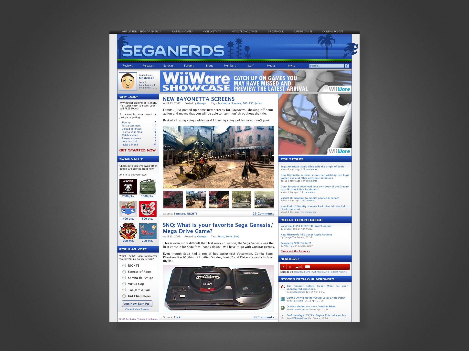
However, based on our initial user research and their usage patterns, we explored using infinite scrolling instead of static pagination. This added several issues:

  • Infinite scrolling only allows a single masthead (most valuable, main header) ad once, and then lesser value ads between content as the user scrolls. This means considerably less revenue.
  • Most ads use iframes and loads of javascript, which significantly reduce performance with each instance, a serious problem for mobile (read: 80% of our) users.
    • this is further compounded by the media-heavy content our editors already post
  • Some users reported hating (automatically loading) infinite scrolling, so we needed to find a solution that allowed the freedom to peruse content endlessly but also remain purely opt-in.
Given the high level templates for both desktop (left) and mobile, we also needed to account for the necessary evil of ad placement (yellow blocks).

As visible in the low-fidelity wireframes above, once we identified the main sections per layout across the app, we could identify the prime locations for ads.
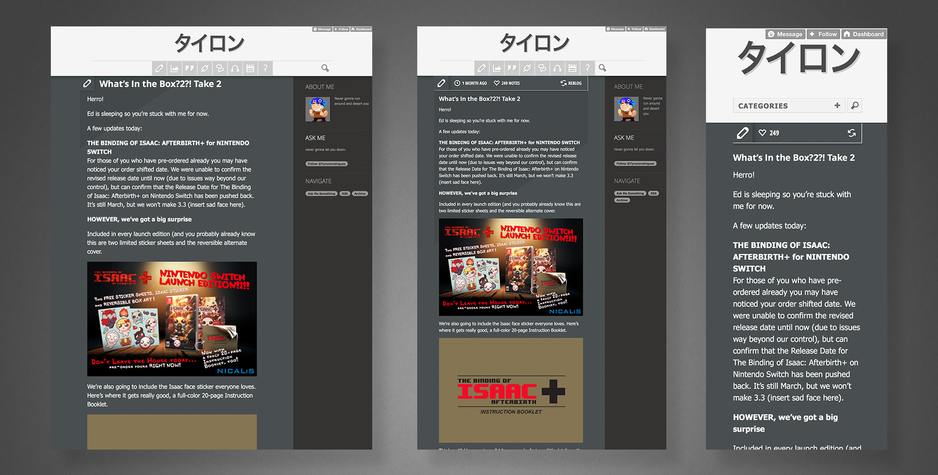
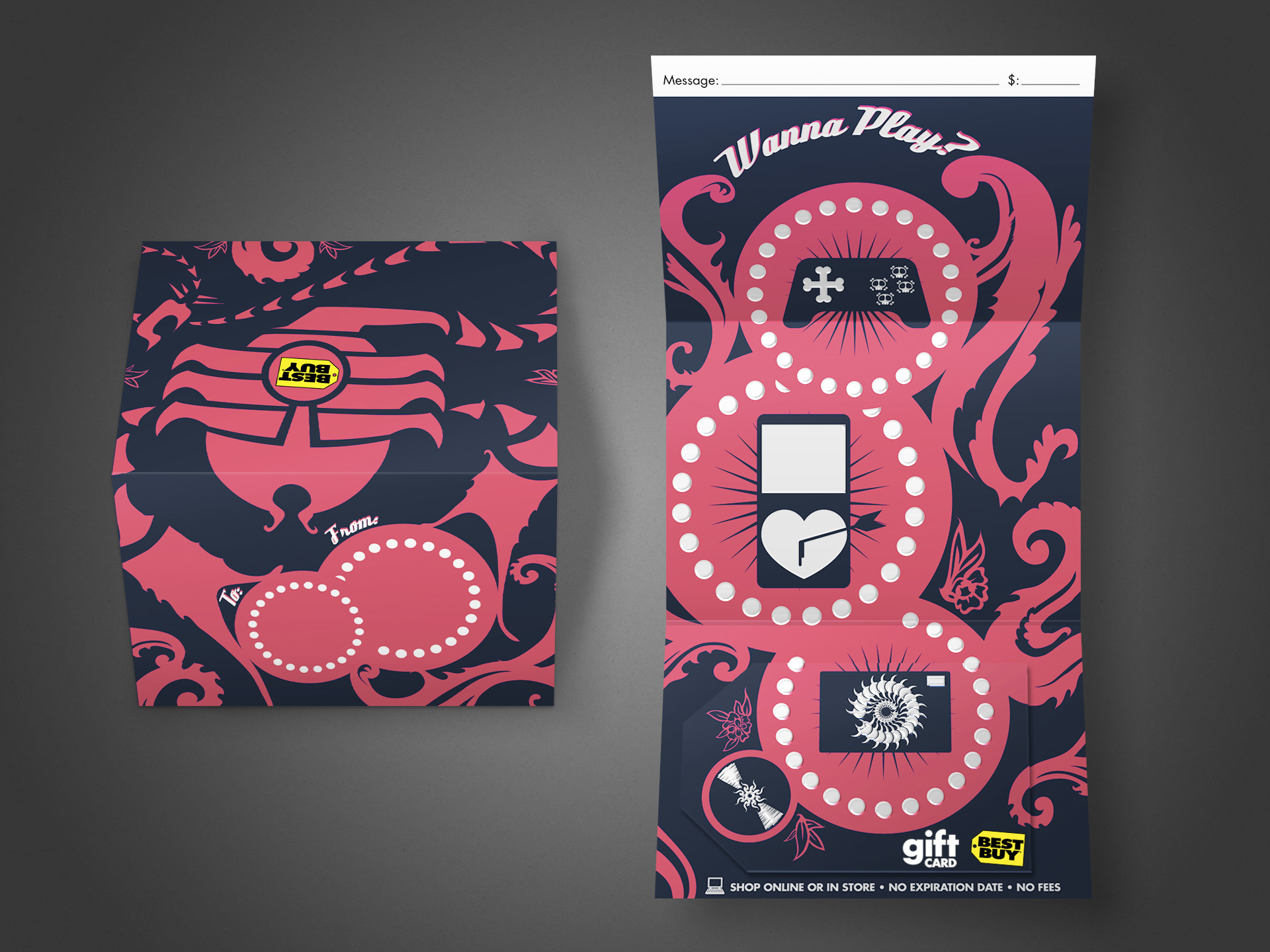
When it came to infinite scrolling, to solve for the desired opt-in behaviour, avoid performance hits, and a consistent placement for advertisers, we:

  • Made loading infinite content a simple button/link at the bottom of each block.
  • Ad placement only affects the first fifteen articles; the initial load of content.
  • Users see the same amount of ads as a single static pagination, have freedom to load additional content as desired, and advertisers gain their reliable placement. 🥇

Admin panel & publisher

Having defined the necessary publisher blocks earlier and their external-facing appearances, we needed more detailed design and UX attention given to the space our staff would be interacting with the most.

As shown below, we began with really bare bones wireframes, mostly to establish the base functionality, necessary fields, database structures, etc. Everything was essentially a single column with tiny block management buttons hugging the left side; with a stationary, floating panel along the bottom of the user’s screen.
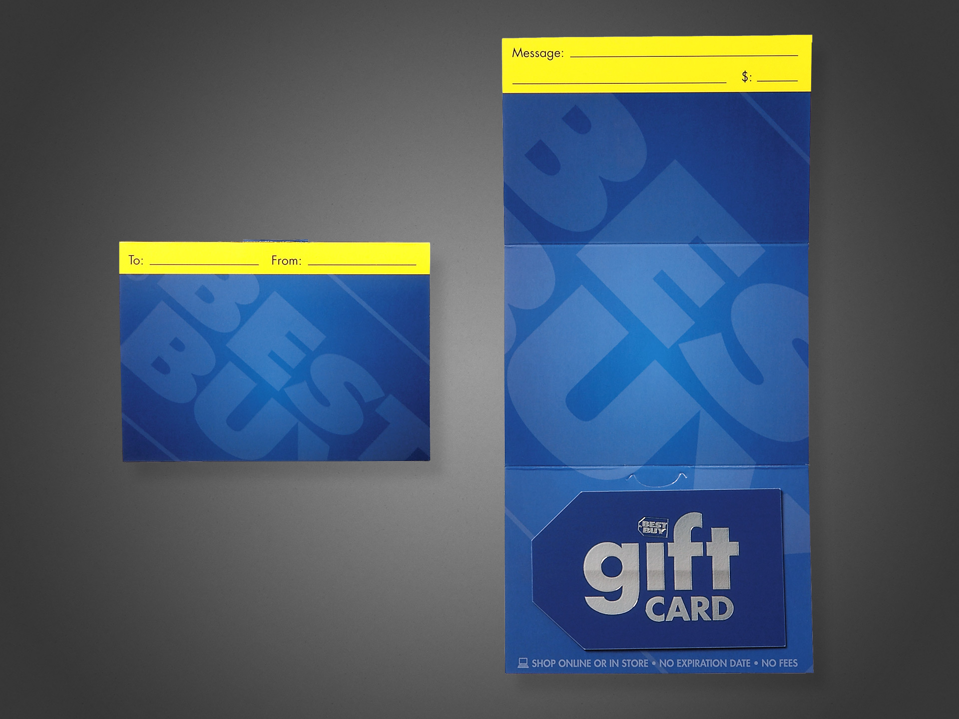
The main UX challenges here:

  • assert consistency/logic to field arrangement
  • provide users a preview of the block content when appropriate
  • provide users enough help/context for each block’s functionality
  • make each block visibly unique/identifiable when scrolling through a longer list of them
  • simplify block management tools while providing a more robust selection of functions
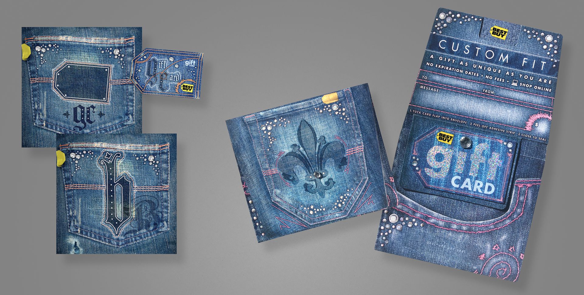
  • simplify the footer contents
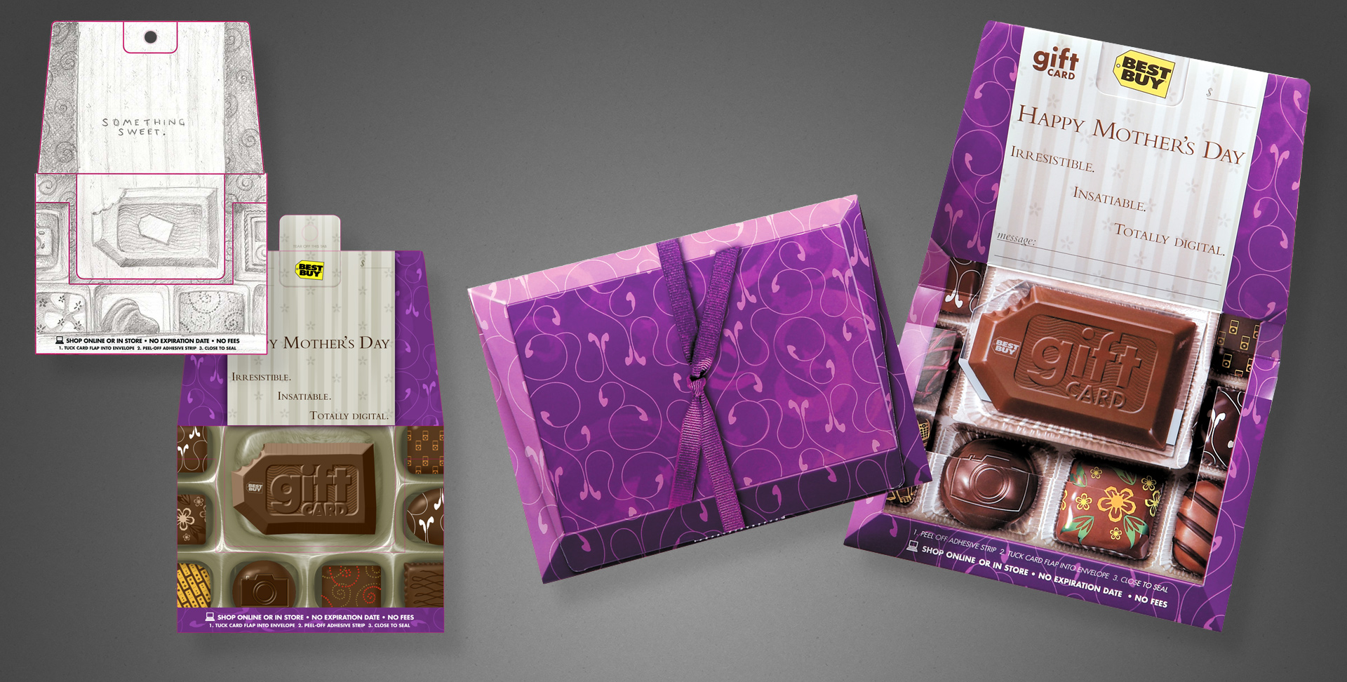
We performed a rigorous testing of the interface, blocks, options, etc. over the course of several weeks to refine and optimise the UX for maximum productivity and usability.

The solutions (shown in image):

  • a two-column layout was chosen; data left, options/preview right.
  • previews for blocks like images or text appear in the right column, immediately next to the input for side-by-side comparison
  • explanatory text resides beneath and/or placeholders inside most fields
  • the left margin was repurposed for its identifying icon, which can easily be scanned whilst scrolling
  • each block has a management menu next to its title, with greater options to re-order, add, remove, etc.
  • footer was simplified to a single dropdown, allowing the interface to remain consistent across browsers, display sizes, and independent of the addition/removal of blocks

Our block editor brilliantly achieved its goal of a large, diverse team all publishing consistent content and with virtually zero training.

Aaron Hoffmann

When it came to other areas of the admin area, we again streamlined wherever possible.

The dashboard underwent several iterations, ultimately formatted with cards to present writers/editors all of their necessary stats or to-dos at a glance.

It wasn’t always this organised.

And finally, to show a bit of the other scaffolding, flows, and IA behind the scenes of behind the scenes, in this case, features available to moderator and admin personas.

Orange buttons/text on and adjacent to wireframes indicate notes for design/development.

Branding

Honestly, we kept most of the identity work internal throughout the process until launch, relying more upon leadership approvals than user validation or external focus groups.

We felt confident with this approach for one reason: as mentioned earlier, we based the new branding upon our most popular past identity, and our primary aim was to reduce complexity while remaining faithful to the source.

The overwhelmingly positive reaction upon release validated this decision.

Validate

Our validation phase relied on two primary sources: direct user feedback via interviews and sessions; and code review.

We relied upon the former to ensure the layouts, navigation, etc worked as expected and that we delivered on users’ needs.

The latter, in order to reach our defined goal of 80% compliance by launch, largely relied on my personal review of production code and comparing it to the design specs, and then prioritising for the most salient or efficacious cost/benefit ratio.

User focused

For user interviews, due to Covid and our internationally-distributed team, all sessions were conducted remotely.

Users would be presented anything from low-fidelity wireframes to working coded demos. Notes taken during sessions were processed and findings presented in our weekly leadership and development check-ins.

Below, an example of a medium-fidelity A/B prototype I designed, meant to capture user feedback regarding possible desktop navigation constructs.

Note the lovingly crafted micro-interactions and transitions intended to make each option maximally desirable. ❤️

Prototype designed for A/B user testing of desktop navigation options. External link to Figma.

In this particular case, after user testing, we ultimately pursued the “Mega Menu” approach:

  • Amongst users who expressed a preference, they strongly favoured either Traditional menus or the Slide-in, and strongly disliked the other.
  • While fewer people so strongly preferred it as the other two, nobody disliked the Mega Menu. 🤷🏻‍♂️

Code focused

Often this process involved excerpting the Github repository or browser inspector, then using Figma to create aides that illustrate deltas, issues, or present rationale for needing certain code revisions.

In the below example, a slight deviance from the desktop grid spec meant our app’s massive tomes of text would be less readable, and in fact many users commented on it despite being unable to articulate precisely why.

UX pros ought to understand classic typesetting principles; font size, column width, and leading are a balancing act with algorithmic underpinnings for ideal legibility, meaning this was simple to identify and fix.

Release

After teasing on social media for months prior, we publicly released right on time; precisely one year after going offline (what I dubbed our antiversary), to nearly universal acclaim, surprise and delight.

Thanks to our pre-release user testing, we anticipated the commonest constructive comments, and announced plans to address them in successive patches in the near future alongside our relaunch.

Results

  • Released all planned features on time.
  • Targeted 80% accuracy of code to design specs, achieved over 95%.
  • Vastly improved quality and consistency of staff output, while simplifying publishing workflows and virtually eliminated the need for any training.
  • Improved user onboarding, in reduced steps required and time needed from register to usable account.
  • High praise from users, partners, and even competition for both the product and our fresh take on a beloved branding from the past.
  • Exceedingly few unanticipated “issues”.

Obstacles and learnings

  • 突貫工事. Honestly, the largest hurdle we faced was time. What would normally require 1-2 years to build had just four months (plus one upfront for planning) start to finish.
    • While the Product, UX, and development leads found a number of efficiencies to exploit, allowing us to perform some steps in parallel rather than purely sequential from planning to design to dev, a solid methodology was what truly allowed us to meet our targets.
    • Deadlines were what they were; sometimes walking a short plank is unavoidable, but given talented resources and a process, success is achievable.
  • User testing and research was invaluable. Not only did it provide insights during the planning stages leading to less design and development in production, it allowed us to rapidly narrow focus after our initial builds and iterate to release candidate.
  • A design system (including documentation) is worth multiple times its weight in gold, even for projects below the enterprise threshold. Without one, UX debt will seep into and dampen any project.
  • An organisation’s UX maturity can make or break a project, especially the more limited its resources of time, money, or talent. Being able to directly affect this from a Director level was a convenient win, but having worked with projects and companies suffering a lack of UX maturity, the contrast is black and white.

Case study: my UX process

TLDR: a guided tour through my UX solving methods, followed by a case study showing it applied to a surprise failure under threat of an impending presentation deadline.

If you think good design is expensive, you should see the cost of bad design.

Ralf Speth, CEO, Jaguar Land Rover

Preface

You may notice from the contents above that at least numerically, “design” doesn’t appear until halfway through the UX process.

Certainly, given white boarding, napkin sketching, and other abstract visual activities; flavours of design can surface during any stage, but proper wireframes can only precipitate from the information and decisions of preceding stages.

Using a homebuilder analogy, imagine the foreman demanding blueprints straightaway; day one, because they already booked the construction crew and couldn’t afford them to stand idle. If the architect took a stab in the dark and started drawing things up without time to gather supporting information or even strategise their own output while the crew broke ground immediately; the client’s reaction to an industrial-sized department store lavatory dominating their living area or a trendy fire brigade pole supplanting a traditional staircase in the dead centre of the kitchen shouldn’t surprise anyone.

Succinctly put, design decisions follow data.

For all intents and purposes described here, let’s assume a project has already met the requisite thresholds and deemed viable.

Also, this process is first described in general, as it might apply to a product’s overall lifecycle, but can be scaled up or down to an individual feature if necessary (example of small-scale shown further below).

Process definitions

1. Define

If one doesn’t understand the problem or ask the right questions up front, should it be any surprise later on when the delivered solution misses the mark?

One of the most important yet often overlooked aspects of UX is the art of definition; ensuring a solid footing with clear goals and understandings about how to achieve them. “We need a website for X” lacks sufficient information to warrant any work, design or development.

A website for what audience? On which devices? On which tech stack? Why do you need a website; what do you hope it will do for you? Does the current solution succeed or fail in any ways we can build upon or avoid? To what end; which metrics will gauge success or failure? The list goes on…

Defining personas, user flows, user journeys, etc. may also happen at this stage.

Given a list of questions whose answers distill to a series of requirements and objectives, we can continue to flesh out each point with supporting data.

2. Research

Data informs the ideal pathway to a solution, and the research which gathers that data is the heart of all UX.

Though obviously not an all-inclusive list, this process might include

  • competitive analysis to understand the relevant industry or audiences,
  • interviewing existing or prospective users,
  • research relevant existing, past, or future company products,
  • gather style guides or other branding assets,
  • exploring best practices (why reinvent the wheel??),
  • or establishing the best mix of staff, tools, or technologies to achieve each objective.

3. Structure

With a wealth of knowledge in hand, we can develop the scaffolding upon which the resulting product can emerge.

At a minimum, this should include a design system and CRUD-like standards/patterns to establish a common toolset and design language with which all UX designers and developers can refer to and produce consistent results.

Sometimes a company or product may already have these (if so, gathered in the Research stage). If not, they should be created during this stage, precede Design, and align with the data from previous steps.

While a design system (and standards) continue evolving with the needs of the project, having them as mature as possible before design reduces the amount of avoidable rework and inconsistency, otherwise known as UX debt. This debt accumulates and compounds quickly, equating to real-world values of time and money to correct, reinforcing my recommendation to mature the Structures as early as possible.

Additionally, a style guide and documentation could benefit a larger team, such as BAs, developers, external agencies, etc. through detailed explanations and diagrams of the UX work.

4. Design

Finally, we can begin designing!

Starting with the lowest fidelity; often simple, monochromatic boxes and nondescript text (if necessary at all), the highest level features, functions, organisation, etc. are evaluated first. Think of it like this: the most abstract concepts of the product begin with the most abstract design.

We do this primarily for efficiency. For example, if we can explore whether a navigational layout does or doesn’t work using basic elements, we’ve avoided wasting heaps of time compared to producing highly detailed mockups. Similarly, lower fidelity allows us to iterate much more quickly without the burdens of complexity.

Any designs moving forward should in theory meet the success criteria we defined in stage one.

5. Validate

Designs complete, we need to test their viability by presenting to users, stakeholders, developers, etc. This step will identify issues, obstacles, inefficiencies or other points needing more UX attention.

Of course, project management may elect to ignore this feedback and proceed towards release, but in general, a client will expect improvements if given the chance to identify some.

6. Repeat

Humbled by feedback, anything which failed validation gets fed back into the UX machinery. Often this means the Design stage, but may also involve some additional research or structural augmentation.

Repeating the design or structural stages allows opportunity to increase wireframe fidelity, mature the design system, or improve any prototype or existing front-end implementation.

Upon completing revised design work, it needs revalidation. Rinse and repeat as many times as necessary or allowed (management will often push to curtail iterations, citing budgetary or deadline constraints).

Once considered “satisfactory” and all objectives achieved, proceed to release.

7. Release

Once a design passes validation (or is given a pass by management), a project can proceed to full development, QA, or whatever team follows in the pipeline.

UX should continue to advise on and validate the product on its journey to final release.

Case study: “CNCX”

Here, we’ll examine a specific issue-resolution from my Government Agency case study project. It revolves around a specific function within the application’s largest and most complex subsystem, known as CSENet, a federal interface enabling intra- and especially inter-state agencies to share and manage case data.

CNCX is the function’s archaic acronym for “Create New CSENet Trans’X’ions” and will be used here forth.

UX failure: the story begins

I flew across the country to deliver a progress report of sorts to the government officials on behalf of our UX and development teams. Arriving a week prior to prepare, imagine my surprise when in the eleventh hour, I get a frantic call from our SME that one of the core features we planned to present contained a fatal flaw

It turns out one of our UX designers failed to follow a process like described in this article, which resulted in a design that did not attach to the codebase; it literally could not (ever) be made to work and required a complete redo.

Putting aside the obvious revelation of a show stopping gap in our validation process, while normally not an issue for UX pros, with the presentation just a business day and a half away, how could I possibly solve this?

A: methodically.

1. Defining

Obviously, the primary problem was that our UX solution solved nothing.

However, doing just a bit of legwork to determine precisely why it didn’t work serendipitously uncovered a secondary usability puzzle.

Let’s first examine the known pieces of this puzzle:

Technically, our guy included all of the fields, albeit in such a slapdash fashion that he seemed to intentionally disregard every one of our CRUD standards and the design system.

Putting those critical failures aside like so much spilled milk…

The problem laid in the fact that he did not interview anyone or investigate how the screen actually behaves in the legacy environment, instead referenced only a screenshot from the user manual and jumped straight to designing wireframes.

This meant that the designer was unaware that this screen features a linear chain of logic and business rules and thus requires a specific linear user flow.

The legacy system included no mouse or free interaction with fields on-screen; every bit of navigation required use of the TAB key, much like screen readers today. This more or less forced users to complete every screen in sequential order.

Our CNCX solution lacked any linearity whatsoever; instead offering a smorgasbord of clicky interface widgets that [despite a tab order defined for accessibility] users could freely interact with in any order. Without the requisite linear flow and dependencies, the form could not validate or attach to the business rules.

The new system architecture omitted these limited legacy input methods as part of the overall modernisation mandate, meaning this cascading method of locking/unlocking fields based on completion order was not an option.

Further, our standards/patterns forbid the use of hiding/showing screen elements (for accessibility purposes), precluding our ability to simply reveal a new field as the user completes one.

The secondary problem emerged from the mouths of literally every person I interviewed in effort to define the primary problem: while the legacy software technically worked, it worked so obtusely that almost nobody could actually figure out how to use it. So most people didn’t. They would actually fill out the paper version and snail mail it. 😳

Definition summary:

  1. Design did not match the legacy system in form or function; causing it to fail validation.
  2. The legacy system was nigh unusable for all users, forcing them to time- and cost-inefficient non-digital workflows.
  3. Defined success as an interface that faithfully reproduces the input and output methods of the original system while also being usable with any level of experience.
  4. Defined the basic user flows.

2. Researching

Until I could gather more detailed technical specifications and supporting information, I couldn’t properly ideate solutions.

In this case, despite having already discovered the general nature of the problem, I was effectively brand new to this screen’s functionality and knew nothing of how it actually worked.

Problem one: technical defects

Why was this linear flow necessary?

After reading through some of the dense source governmental documentation, it became clear that this function generates a whitespace-sensitive text file where each character position corresponds to a specific value and must therefore follow a universal standard so any recipient can decipher it.

Example of the coded data output plus chart explaining what vales each character position corresponds to.

*Not included in this case study is my research and solution for the underlying IRG (Intergovernmental Reference Guide) function that also stands atop a federal lookup table and powers many of the agency address functions throughout the system.

Examining again the basic user flow defined earlier, I came to understand that the initial field groupings (1-3) represented a hierarchy of specificity; earlier fields were more general and later more refined.

The first grouping served as a main category, the second a sub-category. The combination of those two act as a boolean AND operation; the result abridging a list of 250 reasons to a more browsable ~ten for the third field (Txn Reason).

This meant that presenting users a non-linear assortment of fields fundamentally violated the business logic, making the form unable to validate and ultimately why our original design failed.

Problem two: usability defects

This linear logic also reveals the usability failure affecting 99+ percent of users.

Through interviewing users, SMEs and developers, I learned that the third field was ultimately of most interest; the Txn Reason being a five-digit alphanumeric code describing the specific nature of the transaction.

Unfortunately users could not skip directly to this field; they needed to complete the first two steps. Why? Two reasons.

First, that is the same order those value are generated to the output file, and thinking like a developer, the simplest way to program the application too.

Second, the reason codes numbered an unwieldy 250 possible values and could benefit from a filter or two to shorten the list and improve discoverability. At least this was the thinking decades ago.

So, the legacy system implemented the first two fields as filters, each whittling down the list by about eighty percent, resulting in a more manageable list of 5-10 codes by the time our intrepid users got to step three.

In theory, this makes sense…use filters to reduce a long list to a shorter one. Looking at the graphic above, imagine scrolling through a list of 20k US cities. It makes much more sense to first sort by State, then County, making the City dropdown much, much shorter.

The usability problem arises whenever a user doesn’t know which Type/Action combinations produce which Reason codes.

And this was the case for literally all users, causing most to repeat the process multiple times, trial and error style, to find their desired code.

In fact, during the 30+ year lifespan of this software, apparently just one person in this agency ever memorised each code and its combination of filters.

Luckily this one person happened to be my primary SME and ultimately our saviour.

Making sense of mountains of coded data. Some of this data is also available publicly.

Fortunately for us, this person once upon a time transcoded their mental matrix of codes and combinations into a more tangible spreadsheet. Studying this allowed me to identify and extract data patterns which then led to the solution.

Because of the dangerously brief and looming deadline, these first two stages happened in a single afternoon (plus a few evening hours from my hotel room).

Research summary:

  1. Interviewing developers and technical SMEs filled in the blanks to how/why this screen functions as it does.
  2. Interviewing users helped identify their pain points and desired goals when using this screen.
  3. Studying the federal interface’s documentation and SME’s collateral allowed me to formulate a strategy to solve both the technical and usability problems.

3. Structuring

Fortunately, I built our entire design system and served a pivotal role in defining our CRUD standards/patterns, which gave me a holistic understanding of and how to best apply both to these problems.

We actually established a “wizards” pattern for linear processes; a parlance familiar to most Windows users. The nearest analogue for most people might be software installers, which guide users through an installation step-by-step.

The maximal wizard flow, replete with alternate and conditionally dependent steps not shown in the original designs, but which fit neatly within the overall process and everything in their correct order.

The fields on CNCX were a bit misleading in their visual simplicity; several of them triggering modal pop-ups with alternate steps/fields depending upon the larger data constellation. For example, a specific Type, Action, and Reason given a case’s details might also trigger a pop-up to select someone’s employer, or choose from a list of children who would be affected by this transaction. All still part of a linear process, yet each being much more complex steps that appeared in neither the original screen nor our designer’s version, but could be easily added as a step within a wizard.

CNCX as a wizard could connect to adjacent wizards for a seamless user workflow.

Coincidentally, I designed other functions adjacent to CNCX which I already knew had hooks into and could bookend both sides of it in a user’s workflow. Those functions also used the wizard pattern, meaning CNCX as a wizard could integrate seamlessly between them, allowing a continuous, guided user flow rather than segmented steps.

Structure summary:

  1. My participation in the creation of our design system and patterns gave me a holistic view of the system to know that our wizard pattern would work best here.
  2. I designed adjacent functions (also wizard patterns) that could tie into CNCX as a wizard, offering a deeper integration and convenience for user workflows.

4. Designing

Remember that black and white screenshot of the legacy software…or our UX designer’s stab at it?

Both of those complicated, unusable failures transformed into this under my direction:

Step one of the new Create Transaction process = step three of the old one.

“Too simple to be true”, I can hear you thinking.

Technically correct as this is only the first step of the re-imagined process, and additional steps do follow.

However note that this new “step one” corresponds to the third step of the legacy process; those menacing first two steps no longer appear to hinder or confuse users.

So what happened to them? As required fields, surely their values must exist when the data gets transmitted.

Rather than serve as obstacles users must forcibly overcome, my design grants users their wish to directly access the reason selection.

My research uncovered a way to let the system automate the rest of the annoying bits.

Why It Works

Simply put, we reverse engineer the filters/category selection with some automation and reverse lookup.

Top: example Reason codes with their corresponding Type and Actions. If you rearrange the table columns, it still works with all rows aligned.

Referring to the graphic above, I’m effectively reordering the lookup table’s columns whilst leaving the rows intact. Putting the Reason first lets the system automatically populate the appropriate Type and Action from the next column with no additional user input required.

If I was the developer here, especially thirty years ago, a simple set of filters to match the lookup table structure, output file’s formatting, etc. might seem the obvious approach. But given modern UX practices, we can achieve much more efficient and usable products with just a bit of care.

This deceptively simple result neatly illustrates the tremendous value of UX to modern products.

Aaron Hoffmann

This design, wireframes and flow happened in a single day, leaving just a weekend between finishing and our presentation.

Design summary:

  1. Given a definition of success, adequate research data, and components/patterns from the design system, the actual design falls into place quite easily.
  2. The resulting wireframes and flows satisfy all of the success criteria while respecting our design system’s edicts.

5. Validating

Blessed with a devoted team of developers inspired by this unique new vision and a desire to present their very best work to the state, they happily volunteered weekend overtime to build a semi-working live demo for our presentation Monday morning.

Below, one of the detailed, annotated prototypes I prepared for developers, to assist building our presentation demo. Orange buttons in the upper left corner contain notes on hover.

I also authored additional documentation and scripts to support additional scenarios in the demo.

Prototype excerpt of the presented, revised CNCX workflow. External link to Figma.

The following Monday, when presented to the state officials and delegation of field case workers, the disbelief and delight could be read on everyone’s awestruck faces. Welcome to be sure, but far better a reaction than I anticipated. 😳😳🤯

Most of the audience seemed to expect a hidden catch, as though too good to be true. The tech/dev leads’ mental gears visibly churned, double- and triple-checking my logic until finally acquiescing in approval. A resounding success all around.

However…once the initial hubbub settled, one glaring issue remained:

This overpopulated dropdown extends well into the ninth circle of UX Inferno.

The above image shows only a fraction of the codes available in this field; imagine it four times longer.

Giving users what they really wanted (immediate access to that third step) turned out to be a wish too much granted. 🥴

Despite having a search-in-place functionality for dropdowns, one with 250 options clearly ran afoul of usability best practises. Not to mention now users couldn’t reach consensus around the data sort method in that dropdown: code first, or description first?

Right on cue, a BA towards the back of the room confidently suggested adding some filters or grouping the items by Type/Action to make better sense of all these Reason codes.

To which I could only respond by projecting a slide of that awful legacy screen and ask, “by a show of hands, how many preferred when we tried that last time?”

“Oh…right. Nevermind then”.

This illustrates why I love user feedback, but never take it at face value. What interests me is the rationale driving the feedback, and how my expertise can transform it to identify and solve the core problem.

I love user feedback, but never take it at face value…probing for their why reveals a more actionable insight.

Aaron Hoffmann

Rather than react literally to “can you add some tabs, add a link to X, put a button, etc.” I usually probe for why they want, need, or suggest something, and then as the UX expert, take the underlying insights back to the drawing board.

And so went the second (and a half) day of this process.

Validation summary

  1. Users and developers alike LOVED this new approach.
  2. However, the Reason selection method needed additional consideration, as a single dropdown with 250 options fails a number of usability concerns.

6. Repeating

The only aspect of my radical new approach that failed user validation was that pesky, overgrown dropdown.

As it happens, our design system contained other selection components and patterns. Tables to the rescue!

By transforming the dropdown into a table, we could offer a more robust method for viewing, sorting, or reducing the entire list using real-time text filters.

While a partial solution, not ironically, repeated user validation found users needed greater sort and filter functionality.

Step one, we split the data into two columns, which solved for sorting. However our real time text filters supported only one column per table, meaning one of the two would not be “searchable”.

Internally, this table selection pattern frequently caused debate amongst the UX team as to its viability, and this CNCX situation finally and firmly pushed the issue over the threshold into “must resolve” territory.

Surprise UX issue #3: the design system

Specifically, these points regarding the table selection pattern repeatedly arose over the course of our project, but now required an immediate resolution:

  1. Accessibility.
    • Some tables required a button press with the filters to retrieve new data, while others could filter the data already there with no additional hit to the database.
    • Filters and search patterns often looked the same, confusing users why one screen would be formatted as X while another as Y.
    • Similarly, offering search and filtering for the same screen was impossible.
    • The individual filters were also separated and sized differently from their respective table columns, often betraying user expectations.
  2. Inefficiency.
    • If used at all, our developers insisted each column have a filter, even if it didn’t need one. This could be counterproductive in some situations, and certainly space-inefficient given the size of the filter fields.
  3. Inconsistency.
    • Date fields especially presented issues. While often shown as a discrete value in the table, as a filter, users would realistically need a range, and our date picker could not accommodate two values for one field, requiring two date filters for one value.
    • Developers had trouble implementing the filters (query DB or not?) due to poor documentation of the source material and
    • Designers often delivered inconsistent or technically inaccurate wireframes. Sometimes a submit button would be present, sometimes a reset button, sometimes both, sometimes neither. Sometimes filters for each column, sometimes just one. 🤷🏻‍♂️🤷🏻‍♂️🤷🏻‍♂️

Introducing inline table filters

Let me first acknowledge that I did not invent this concept. It already existed in the wild and addresses all of the above issues.

I took this opportunity to jump back to Step 3: Structure and upgrade our design system components and patterns: the inline table filter.

In addition to simple sorting per column, users could also independently filter the data of each via targeted widgets.
Issues resolved
  • CNCX has sortable and searchable columns for its 250 codes
  • Accessibility improved
    • filters are directly connected to the data being filtered
    • confusion over buttons and search eliminated
    • ability to include both search and separate filtering functionality
  • Inefficiency improved
    • columns could show or not show filters if desired
    • overall vertical space reduced by up to 200px
  • Inconsistency improved
    • Date filters can include ranges when necessary, and in a single input
    • Developers no longer confused about data retrieval methods; all filters use the same method.
    • Designers have a single, flexible component
The final CNCX selection solution
The entire product benefits from solving this one (actually three) surprise UX failures.

Now, after only a few brief revision cycles, we not only solved a massive UX conundrum, but introduced an upgraded component and interaction pattern that actually solved a number of other development and usability concerns throughout the rest of the product, while pleasing every single user in the process.

Conclusion

You made it to the end, congratulations!

I realise this process may sound overwhelming; that it must certainly require more time (and therefore money) to enact than just jumping straight to design concepts.

But consider that at 5-25x the cost, rework represents one of the greatest threats to a product’s budget, not to mention the additional time to do it all, adversely affecting any deadlines.

So imagine how likely success will be the first time around with undefined, uninformed, unstructured design.

Or by expecting high fidelity for all concepts, rather than start simple, validate, and build up complexity over time?

Or by appropriating funds to begin building designs with an army of developers day one, before anything has been tested or validated as worth developing in the first place?

Success would be highly unlikely, especially in a first or single round of effort. In these situations, everyone should expect plenty of extra rework effort by both design and development teams.

By contrast, imagine approaching a product cycle having defined the objectives, done research to narrow focus, etc. and before committing to the expensive development, having most of it figured out. Much less waste of time and money, despite a longer lead up to prototypes and codebase production.

The lessons learned from the tortoise and hare of Aesop’s Fables fame also applies here. While this process may seem counterintuitive or slow by comparison, the data and results speak for themselves: a steady methodology at any speed wins every time. 🐢💨💨💨 🐇

Essay: what is UX?

TLDR: My definition of UX, and dispelling myths about what it isn’t.


UX is the “R” of digital product R&D; the research that informs what gets developed.

Aaron Hoffmann

Contents


“UX makes mockups, right?”

“Or…wireframes. That’s what I was thinking of”

“Oh…oh, I know! You guys make logos and help when HR needs a break room flyer designed for the company chili cookout.”

These common misconceptions confront UX pros everyday, when people view us through the narrowest of lenses based on a familiar deliverable: the wireframe. Or perceive us as vaguely equivalent to graphic designers, because it’s all just colours and shapes, or something.

If one defined a manager as a desk sitter, a business analyst as a spreadsheet doer, a developer as a monitor junkie, or summarised an architect as merely a blueprint maker; how would each of those people react to such descriptions?

Not kindly, I’d wager.

Adding insult to injury, some managers write off the entirety of UX as “irrelevant” to a product’s life cycle because only the hands actually writing code directly contribute to its bottom line; implying UX is a sunk cost, a liability, a budget-consuming cost centre (funds better appropriated towards hiring more developers and theoretically hasten release). Besides, any “monkey with a laptop” can do UX. And yes, that’s a real quote from management of an organisation large enough to know better.

Ironically, anyone believing non-coders are just “takers” also just deprecated every business analyst, the QA team, and of course themselves as managers. But I digress…

Too many words, not enough visuals!

So why include something like this article in my UX portfolio??

Two reasons.

First, as a senior level professional, I consider it my duty to advocate for the industry, educate and dispel misperceptions, especially because these things invariably impair a company’s business/product/bottom line.

Second, it articulates my own perspectives on UX, which are not (always) about eye candy, but rather text, data, and analysis.

Really, no pretty pictures??

Browse here if words tire you.

Well if UX isn’t only about wireframes, what is it exactly? Thank you for asking.

UX is a process for solving problems, contextually. We discover and solve issues early to avoid more expensive ones later.

Aaron Hoffmann

UX is a method; a process to problem solving, contextually.

Many like to think about the field of User Experience as purely user centric; as though it’s all about ice cream with sprinkles, campfire choruses of kumbaya, or the warm fuzzies we get from whimsically delighting end users. Admirable objectives to be sure but hardly the only target or benefit of UX.

Physical products benefit from R&D. If we already understand what “development” means for digital products, UX is invariably the “R”; the research end that informs what gets developed.

UX: the combination, culmination, and intersection of Business, Tech, and Design.
Surrounded by a moat of undesirable outcomes for digital products, UX is the only bridge to connect each island.
  • UX reduces business risk via research and gathering data early in the process and continually correcting course. Changes or corrections add time and cost–exponentially–the later in the product life cycle they occur.
  • UX reduces waste by identifying unnecessary features and functions through wireframes, prototypes, testing and interviews. This can manifest as fewer things to develop, or a project requiring fewer developers overall.
  • UX improves production efficiencies. Bridges the language barrier and translates between business lingo, clients, users, and the technical jargon of developers.
  • UX improves satisfaction, by the same methods above, for users and business alike. Funny how actually listening to users and clients yields a positive result. This satisfaction is the threshold across which lies greater engagement, increased usage or sales, improved productivity, etc.

If most people think of UX as the look and feel or even give us credit for making something easier to use, they’re just scratching the surface.

UX may achieve those things, but only as a byproduct of asking questions like:

  • Have we satisfied the target audience’s needs?
  • Does the solution align with business objectives?
  • Do our recommendations fall within our technical limitations and capabilities?
  • Will everyone/anyone want to use it…or be able to?

But what about the pictures??

Fine, let’s talk about pictures. As a gesture of goodwill, I’ll even share one.

Meme or not; this rings truer than most will believe.

If one hears the word “dentist”, many will conjure images of drills, needles, steampunk-like appliances or any number of other negative, mental bogeymen, because those are common, memorable tropes from a lay point of view. These impressions of dentistry conveniently overlook the vast majority of the field, such as the practitioner’s education or wide variety of skills necessary to provide a long menu of services, etc.

Furthermore, how many think of “instrument sterilisation”, “how to interpret x-rays”, “wardrobe that instills confidence in patients”, or even “chair-side demeanour, in the service of diminishing anxiety”?

Nobody asked about teeth tho…

So why is UX so commonly and mistakenly equated with wireframes, and not its other, more salient competencies?

Perhaps because wireframes are the most common and tangible aspect of UX people ever see. Or, conversely, maybe due to UX pros not often enough revealing the many other set pieces dwelling behind the stage curtain, and limit interactions with partnering teams to discussing, you guessed it…wireframes.

For example, while many may assume wireframes are built on a designer’s whim, slapped together based on their knowledge of design software or some combination of barometric pressure and astrological positioning; if one takes even a moment to ponder the actual origin of a mockup, it becomes immediately apparent that a vast array of decisions and problem-solutions are necessary before one could arrive at a visual destination.

UX is not inherently a creative discipline, aside from employing creative means to solve problems.

Aaron Hoffmann

What has only reinforced the stereotypes are UX designers who themselves speak in subjectivities “I think X”, “I feel like Y should be…”; relying primarily on hunches or their own internal biases to describe and defend their work. Coming from a background in visual design and advertising, I can attest that articulating one’s work in this fashion is exactly the purview of graphic designers, who can get away with selling Castilian Blue as “relaxed and trustworthy” or the juxtaposition of layout elements as indicative of deeper (cleverer) meanings.

UX does not–or should not–rely on this kind of qualitative basis to articulate the fruits of their labours; at least not if they want to rightfully distance themselves from creative disciplines, because by and large, UX is not a creative discipline, except in the sense that we may employ creative means to solve specific problems.

That pull quote doesn’t count as a picture…

While a UX designer may rely on any variety of data to inform their decisions; good UXers should stand behind a sturdy shield of evidence to fend off the slung arrows by critics of any warring faction. Less experienced designers will tend to rely more heavily on their gut intuition to drive decisions; precisely the same hunches that drive users, clients, stakeholders, etc. to tear away at the designs.

In my experience, supporting data serves as the most bulletproof armour.

Other common misperceptions

UI and UX are not interchangeable

UI is actually a subset of UX. Fighting words to be sure in some circles, but my experience in both qualifies the distinction.

While both affect the user interface, UI centres around delivering polished visual assets as its ultimate goal; and UX design permeates the product lifestyle, beginning with lower-fidelity deliverables (e.g. whiteboard sketches) and can include non-visual designs such as interaction patterns, flows, information groupings, etc. The data resulting from UX efforts then informs UI decisions, which are then fed back through the UX feedback loops such as interviews, user testing, etc.

UX is not a development plugin

Some project managers view UX as something like a Winamp equaliser plugin that can be installed into a product lifecycle to “make it good”, often a final step at the end of development, like stamping a holiday ham with a seal of guaranteed quality as it leaves the inspection conveyor.

Still others imagine there must/should be some kind of UX checklist, as in literally a collection of bullet points that they or the developers can tick when writing code to fell two birds by a single stone. “Who needs UX pros when our devs can simply refer to this mythical three step list for perfect UX nirvana?” I wish the preceding line were purely fictional, and not a quote by a critical leader of a past project.

The truth, once again, UX is a process; a mentality; an approach to bringing a product to market. It simultaneously considers desires of the client, the various requirements, technical limitations, accessibility, end users (both proactively and reactively), and synthesises it all into a solution to achieve all ends.

Because each product, its teams, its audience, its requirements, etc represent a unique combination of criteria and objectives, successfully solving the larger jigsaw puzzle requires an equally unique, intentional UX approach that cannot be simply summarised nor recycled between projects.

OK, so UX is more than pictures.

Anything else we’ve overlooked?

So glad you asked. Do any of these sound familiar?

  • User Research and Usability Testing, comes in many shapes and sizes to gather critical info
  • Competitive Analysis, know the market and rival products
  • Accessibility Analysis, can everyone actually use the product?
  • Personas, User Journeys, Experience Maps, help with defining the audience and their experiences
  • Information Architecture and Site Maps, how is the content of the product organised
  • Prototyping, using sample, pre-release versions of the product for testing and research purposes
  • Design Systems and Styleguides, the building and documentation of UX tools, components, patterns

How many of the above could you name? Hopefully this article has bestowed enough information to resist conflating UX with (only) wireframes, and perhaps even allow you to make your team’s UX staff’s day when you strike up a conversation about other aspects of their contributions, or…gasp!…request an accessibility analysis, user journey, etc.!