TLDR; an online gaming news site and community I’ve led the building and rebuilding half a dozen times since 2005.
Project: Web-based app, custom-built CMS for online media outlet
Role: Director of Product & Design
Client: GoNintendo
Team: 5–40
Environment: Fully remote
Key Skills: User research, market research, mobile first, wire framing, Figma, design system, brand design, documentation, code alignment, leadership
Website: gonintendo.com
Summary: An iterative web project spanning more than fifteen years, starting from the reskin of a humble WordPress-based site to its rebranding and replacement by a custom-built, responsive CMS…twice thrice.
Overview
GoNintendo has been the world’s top destination dedicated to Nintendo gaming news and community since 2005. Having undergone six major product launches in that time—all under my direction, this case study will document the most recent launch from March 2022 following an internal tragedy which forced a site hiatus for the better part of a year.
For a deeper look at the history and previous releases, including my biggest career failure, read my article here
The Objectives
While we had previously built two completely custom CMS front- and back-end solutions replete with a content publisher and admin interface, the latest incarnation brought several new challenges that meant we could not simply recycle past efforts.
The outgoing site—while still highly capable—remains a testament to yesterday and simply not up to the challenges facing devices in 2022, supporting a team of writers or the structural differences in presenting feature content versus news.
Tragedy tends to put things into perspective. What worked yesterday was suddenly unfit for tomorrow.
– Aaron Hoffmann
Where things were
- A fifth-generation system that while efficient, was built to support a feature set suffering from years of accumulated bloat
- Fully responsive, but built to serve a largely desktop-based audience
- Supported multiple domains, users and permissions groups, but the largely code-based editor resulted in huge output discrepancies and rendering issues between authors, even after training
- Almost exclusively focused on the news feed in a blog-like format, at the expense of promoting editorial and exclusive content
Where we needed to go
- New content mix, new layout and database/information architecture. Post-tragedy, the CEO’s vision for the site changed from mostly news to a larger emphasis on editorial and exclusive content.
- New layout could not completely betray the passionate user base’s expectations. We learned this the hard way once before.
- Massively streamline the feature list. Not minimal viable product, but it required a serious discussion of priorities amongst leadership. In terms of overall feature quantity, most of the past would be left behind.
- Mobile first. For realz this time. Based on traffic analytics, we would for the first time be building for a mostly (80%) mobile audience. Compared to ten years prior, mobile technologies and expectations evolved substantially.
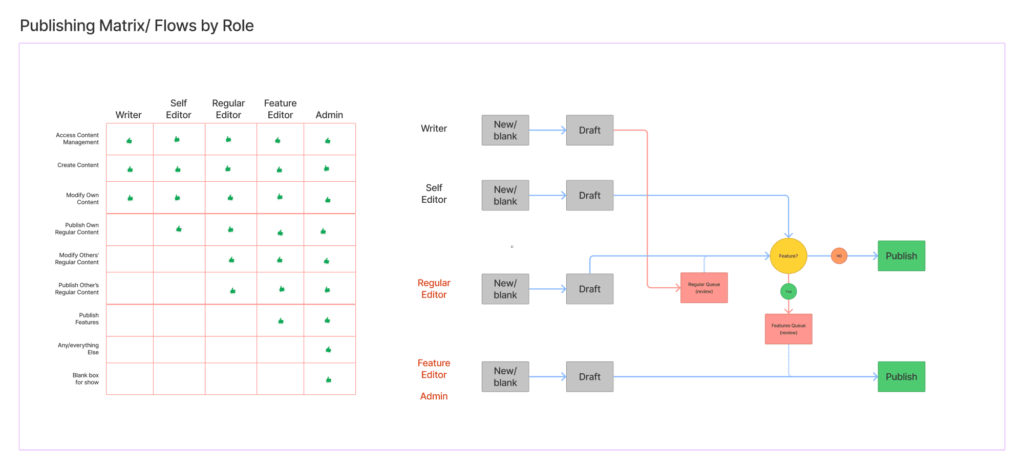
- More organised editorial review workflows. The team would be expanding ten-fold to realise the new site’s direction and needed completely different technology and UX to support everyone.
- A publishing tool that forced consistency between all authors. Expecting dozens of new staff to be or quickly become well-versed in HTML/CSS enough to all produce compliant content is unreasonable. Needs to work for beginners and experts alike.
The Work
Of course, with me, projects never begin with wireframes, largely because like developers, I prefer to avoid wasting time or expensive rework as much as possible.
While some back-end technology pieces began immediately and in parallel with design due to time constraints, I directed the project follow a structured UX methodology.
Define
- gather requirements from CEO/leadership
- translate requirements into discrete goals, including feature set
- establish timeline and roadmap for launch and post-launch
- define personas and essential new workflows
Research
- conduct user interviews
- understand usage patterns
- understand device usage
- outline essential workflow diagrams and matrices
- competitive research and analysis
Structure
- created design system
- tokenised colours, sizes, etc
- all components
- began branding / identity refresh
- authored documentation / style guide
- targeting devs and future advertising partners
Design
- produced wireframes and prototypes
- facilitated weekly check-ins with leadership and design/development
- completed re-branding efforts
Validate
- weekly check-ins with leadership and dev lead, including demos and presentation of progress
- conducted regular user interviews
- A/B testing
- Group interviews
- Individual interviews
- guided and unguided sessions
- validated code against UX schematics with dev lead
- my target was 80% accuracy by launch
Repeat
- analysed/ synthesised feedback into actionable revisions
- weekly sprints
Definition
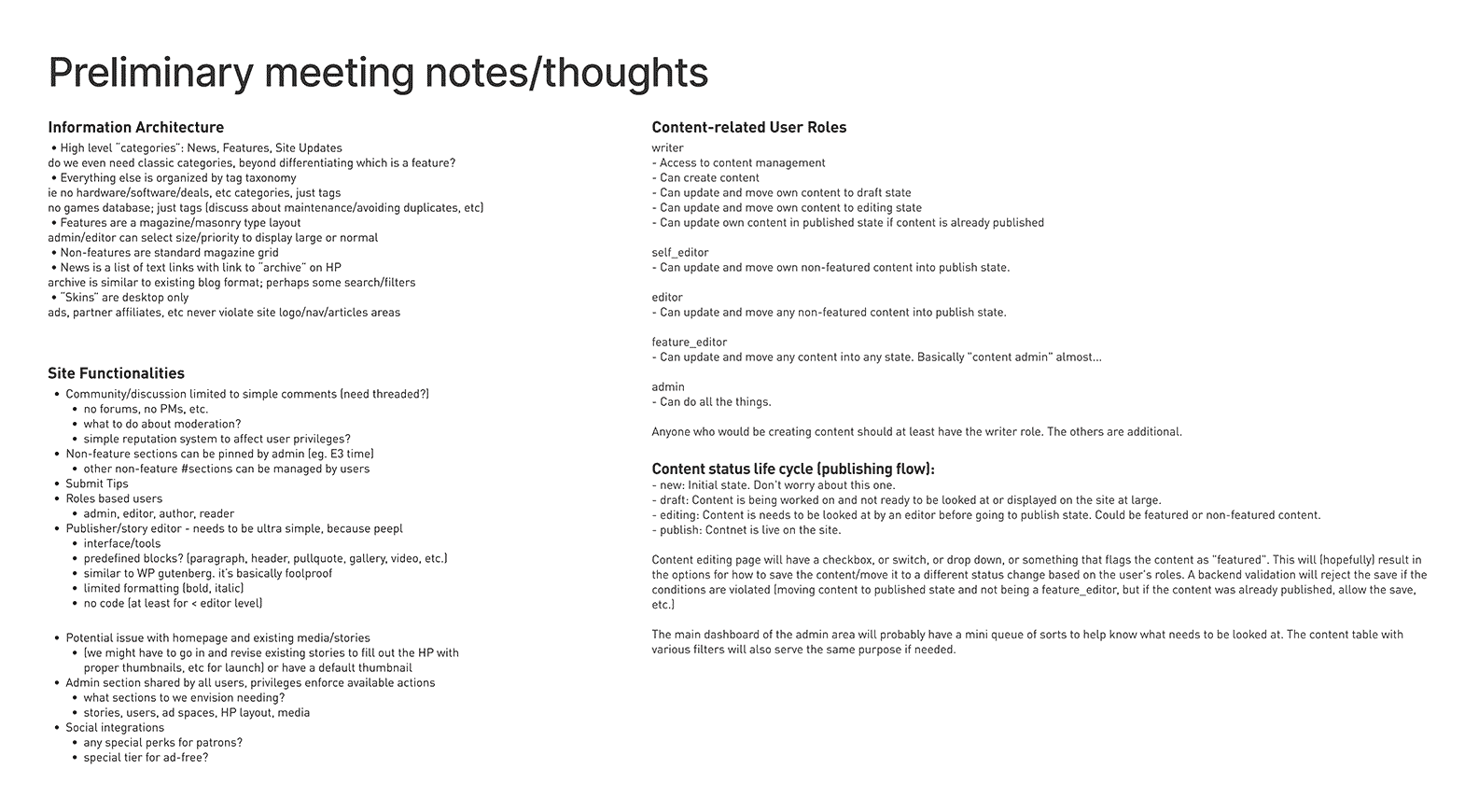
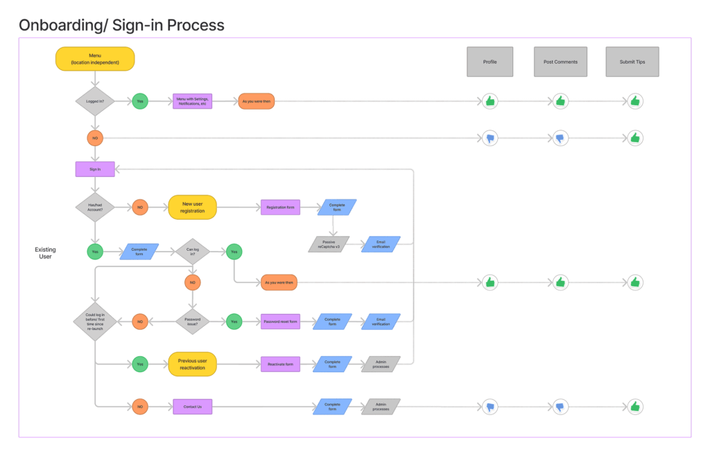
We conducted a series of preliminary meetings to define the goals, then identify and triage the feature list, and finally establish realistic delivery windows for launch and beyond.

Research
We then conducted market/competitive research, partly to discover whether similar solutions existed but also to understand what our target audience is experiencing elsewhere, aka Jakob’s Law.
We spent considerable time researching and analysing our traffic data. Surprising almost no one, our device demographics nearly flipped since our previous iteration (built 2013-15), going from roughly 70% desktop to 80% mobile, 18% desktop, and the remainder filled by tablet and non-traditional devices.
Admin headaches
When it came to the publisher, the single greatest struggle in past iterations was training new users how to use the bloody thing, because until recently, good WYSIWYG editors still often relied on knowing enough HTML to tweak/fix things to achieve the desired result.
Plus, even if we could get the average person to rudimentary HTML fluency, each writer would still format their content however the cosmos struck them that day, aka zero consistency.
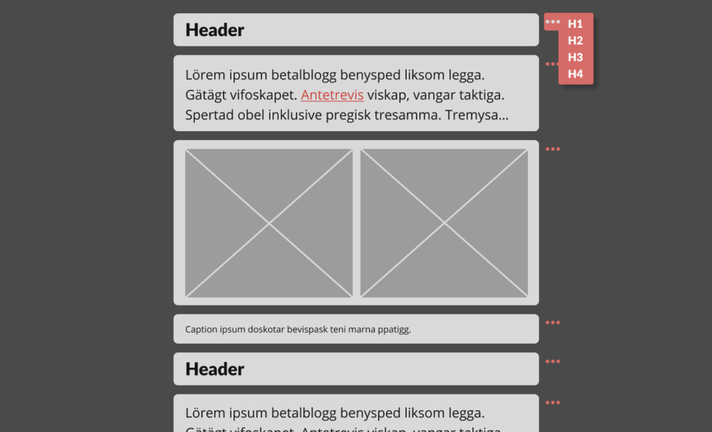
The lead developer and I each independently brought in the concept of a block editor, basically a component library for writers.
By stacking pre-made content blocks (eg headers, image galleries, pullquotes, etc.), each with predefined styling and simplified options, users would never need to muck about in the code, and would all produce identically formatted, valid HTML entries.
Ironically, WordPress introduced a similar feature in 2018, and though we had no interest in reverting to the platform we ditched over a decade earlier, their Gutenberg block editor did represent the direction we wanted to go, just without all its complexity and fluff.
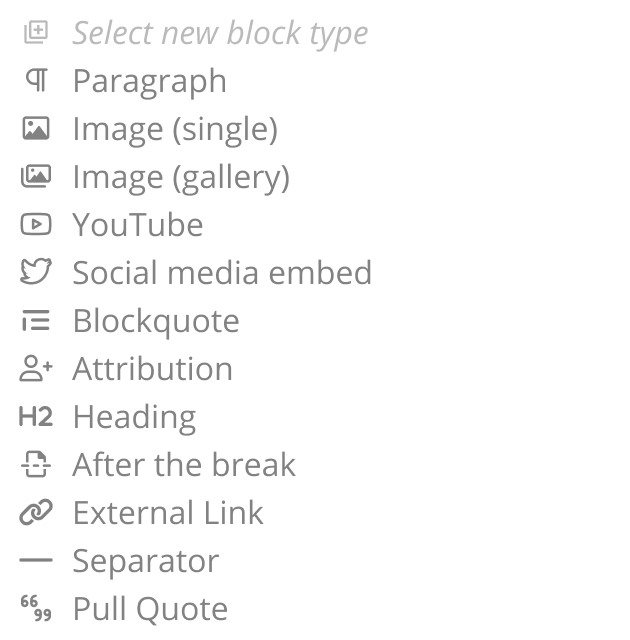
To determine what blocks we would need, we first brainstormed a list, and scraped the database for 50k past stories to generate a word cloud of common tags used by authors, and then compared the two.
It was then just a matter of prioritising (or alphabetising) the final collection, much like the arrangement of keys on an English-based keyboard. We chose organisation by usage over alphabetisation, as not every writer would know our vocab for the block they needed.
Structure
Building an entire web app from scratch with an extremely tight delivery window meant that feeling our way in the dark was not an option. Unlike past iterations which allowed organic progress, highly collaborative efforts between design and development was critical to success this time around.
To that end, though we had some very, very rudimentary sketches to illustrate the overall concept and vision from the Define and Research stages, as development set its groundwork with various frameworks and libraries, I began building out our design system, starting with the essentials.
To save time further (ie two birds with one stone), I compiled and documented all components and design system elements as a style guide as they were built.
Design system foundations
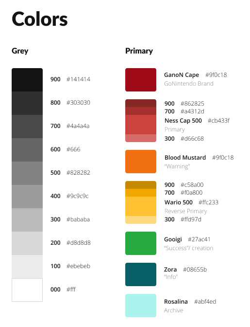
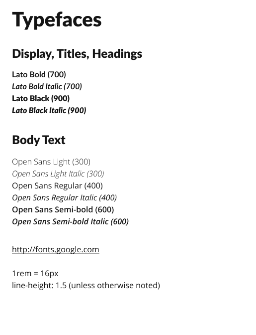
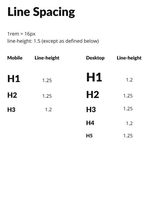
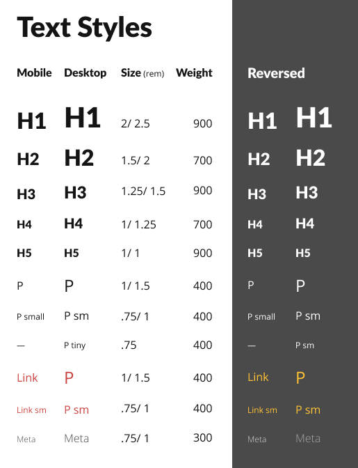
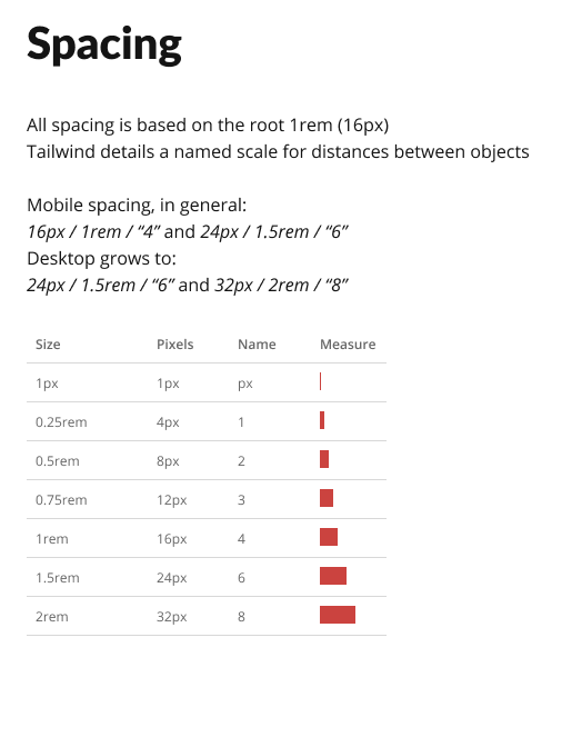
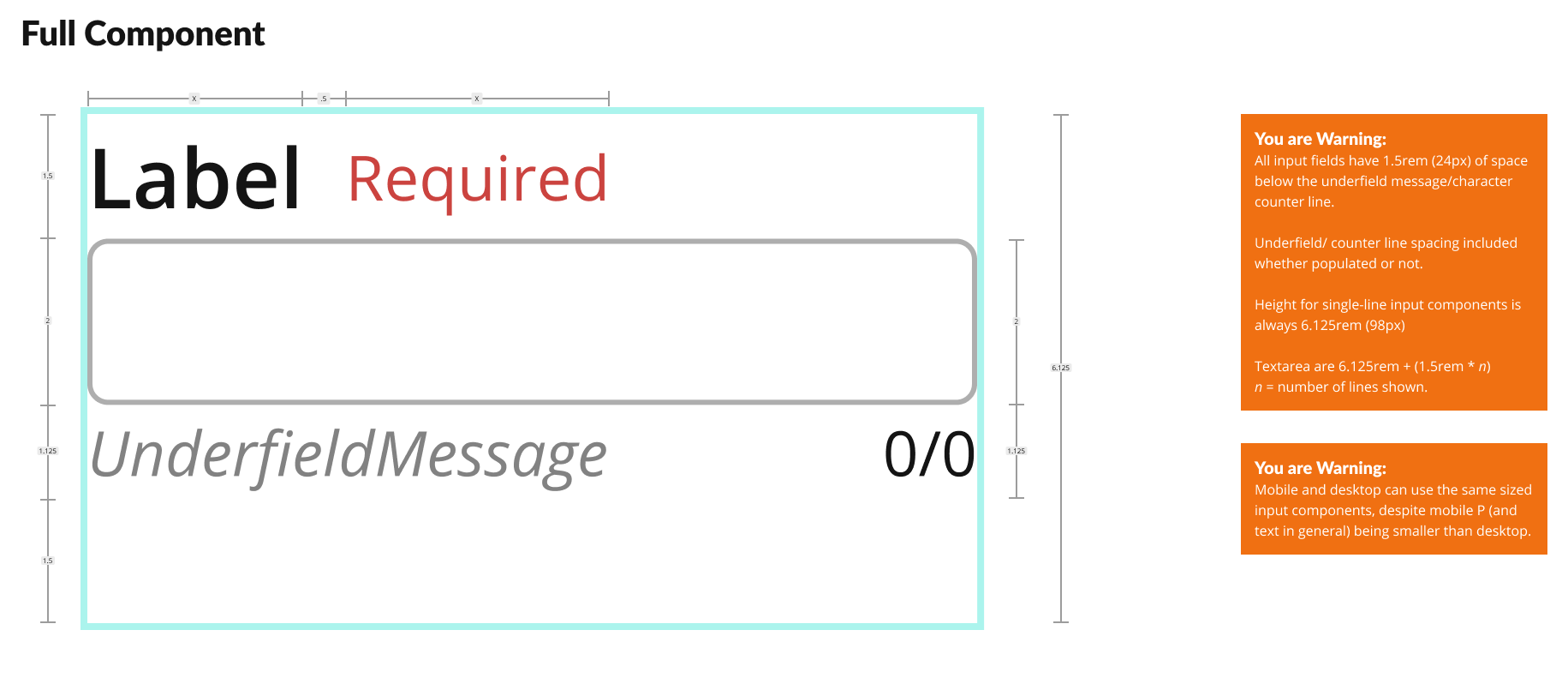
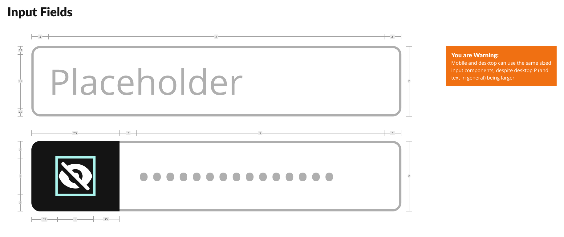
As always, my preferred design system rests upon an atomic, 16-point soft grid. All facets of the system from font sizes to spacing relate to multiples or fractions of 16.
Happy to explain that in greater detail…just reach out.
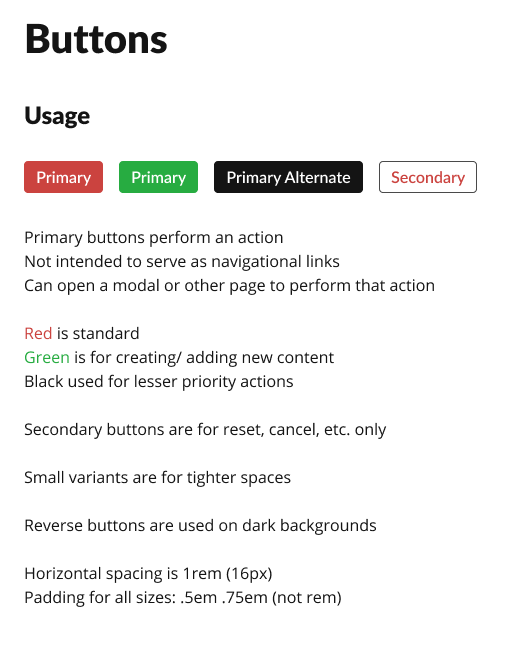
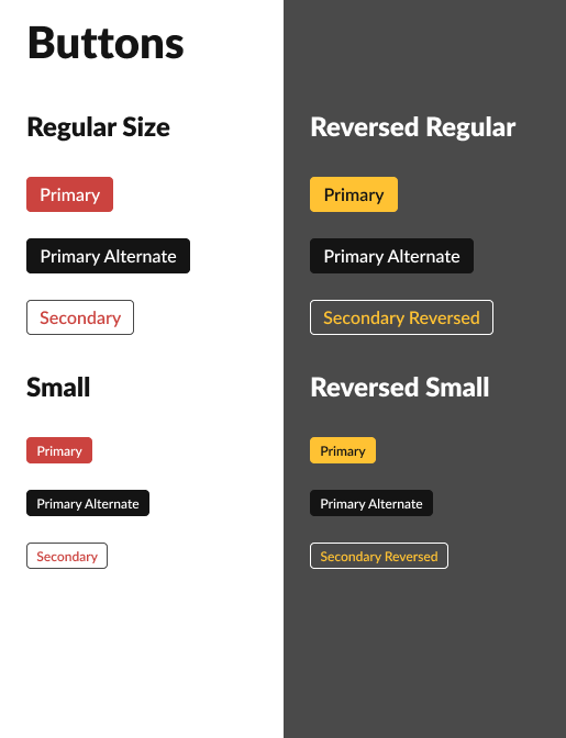
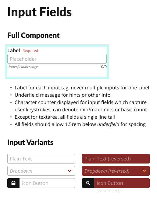
The most basic elements like font scales, colour grades, and tokens came first, followed by layout grids, buttons and input fields.
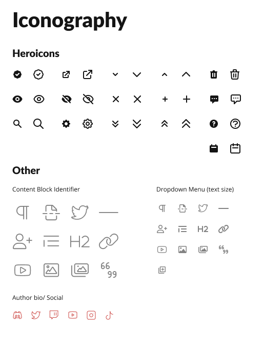
With Tailwind CSS as our presentational foundation, we also relied upon their official Heroicons collection to cover our limited iconography needs for the external facing front end.
For the block editor within the admin panel, we relied on a combination of official and custom icons inspired by FontAwesome 6.
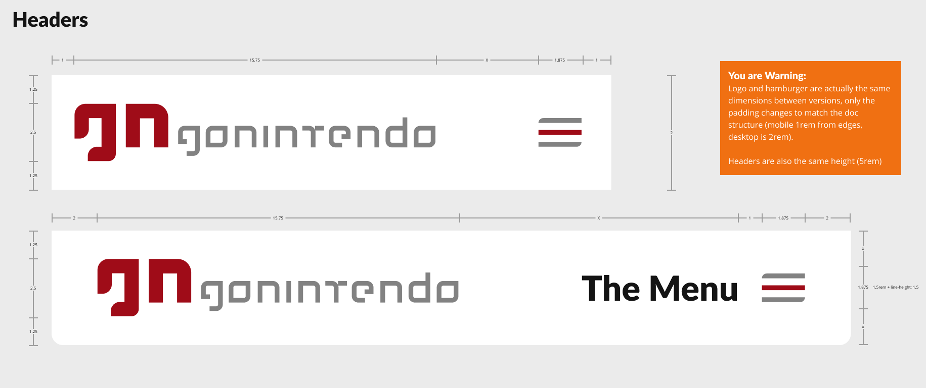
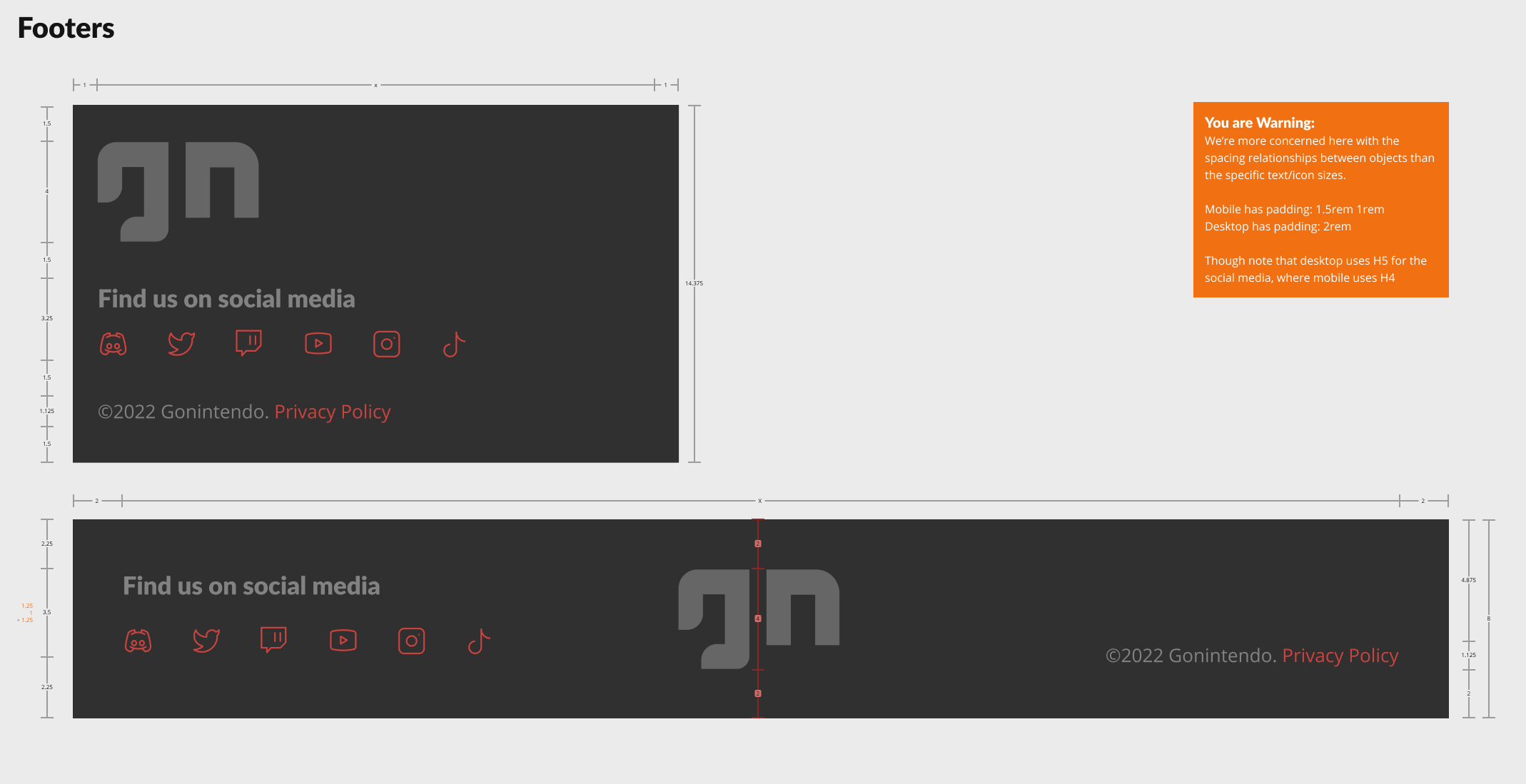
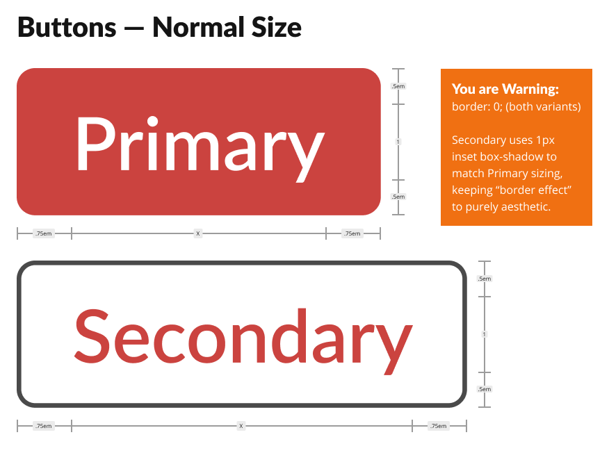
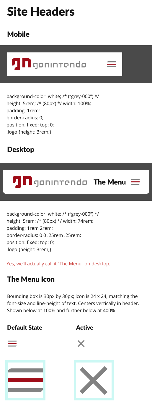
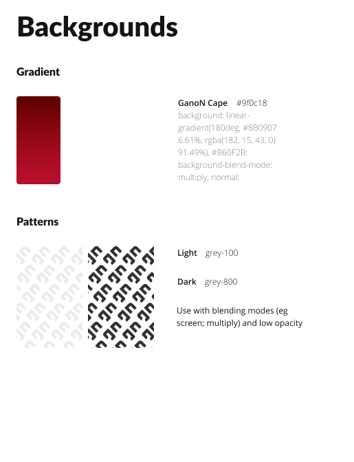
Additional examples of more developer focused anatomical diagrams and notes:
Rebranding efforts
For a major relaunch not only of the digital product, but also a renewed vision of the services offered within it, we also wanted to introduce a refreshed branding to reflect a resurrected spirit.
Ok, enough with the “re-” words.
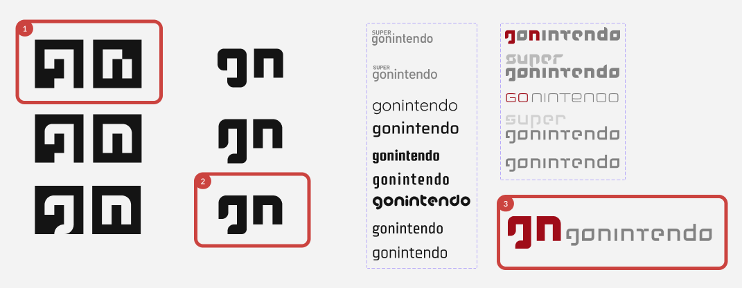
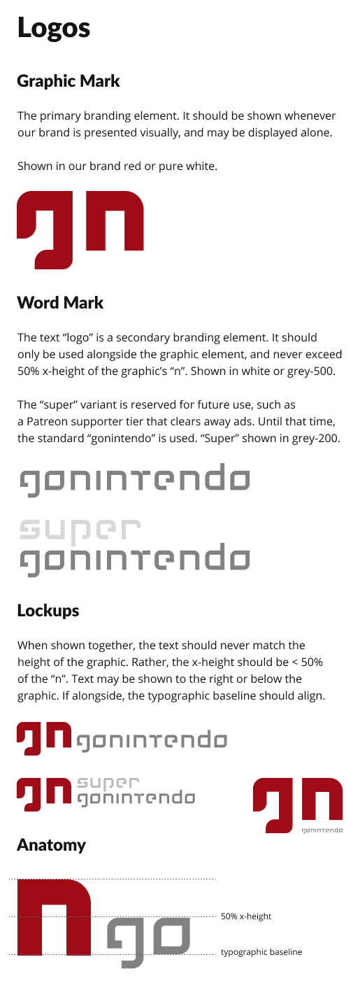
Without exhausting the long history, we explored a number of options, but decided upon a simple streamlining of a past, fan-favourite identity.
For this, my goal was to reduce overall geometry for maximal use across devices and sizes.
Although we explored a number of commercial typefaces for our word mark, we ultimately used one I completely custom designed via Adobe Illustrator.
Design
Our goals included not just a responsive, public-facing front end, but a full admin panel and publisher, plus the new identity.
Public-facing
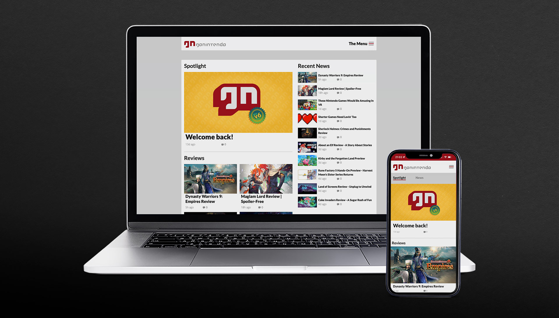
Given our early discussions, competitive analyses, etc.; we quickly settled into a viable mobile concept as our flagship and then expanding upon it to create desktop and tablet versions.
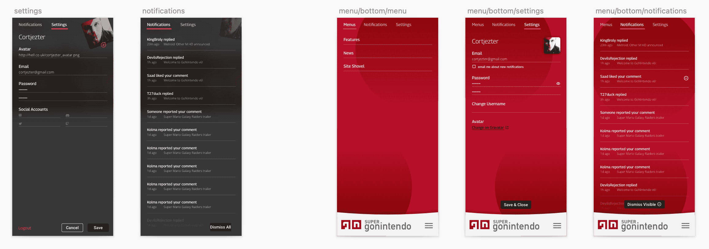
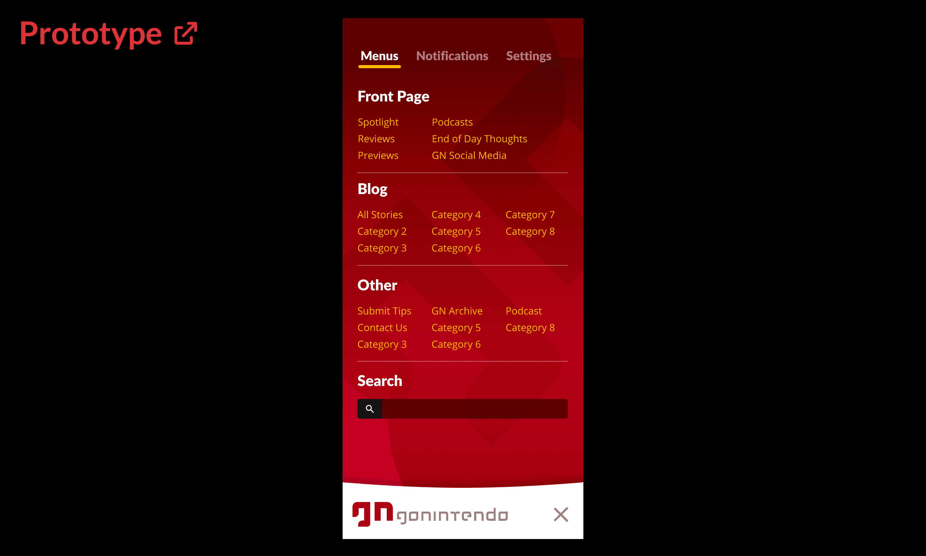
Early, low-medium fidelity mobile menu prototype options test:
The desktop navigation proved a more formidable hurdle, as the additional real estate allowed for a much wider variety of options. We ultimately presented these options in A/B testing for user validation (further below).
The remainder of the public-facing UI design mostly revolved around how each of the publisher’s story blocks would render across devices.
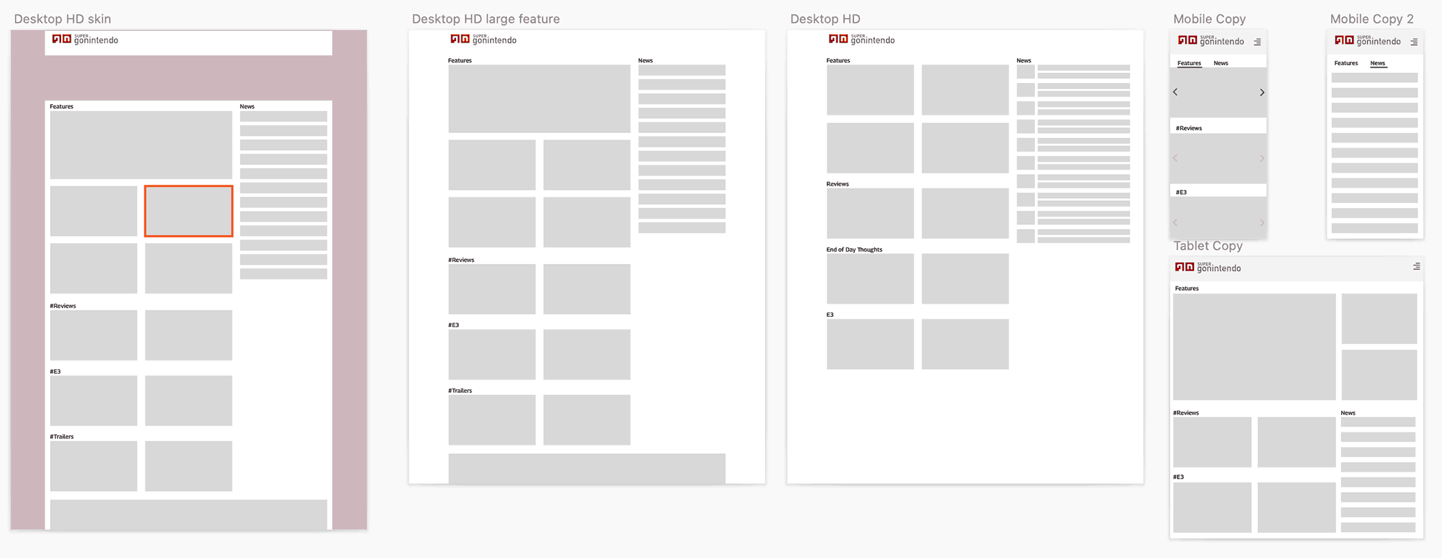
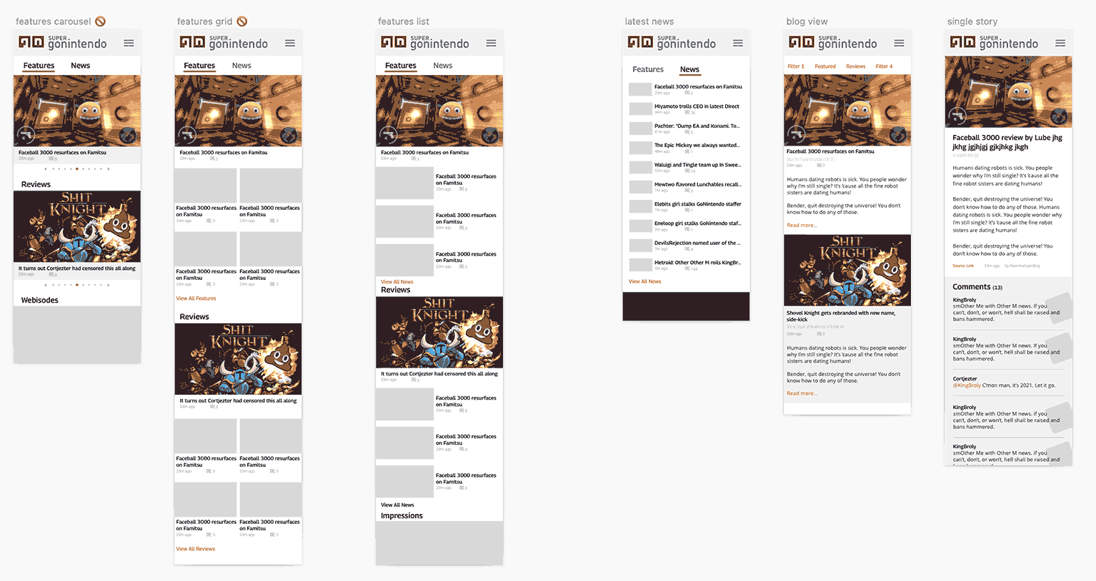
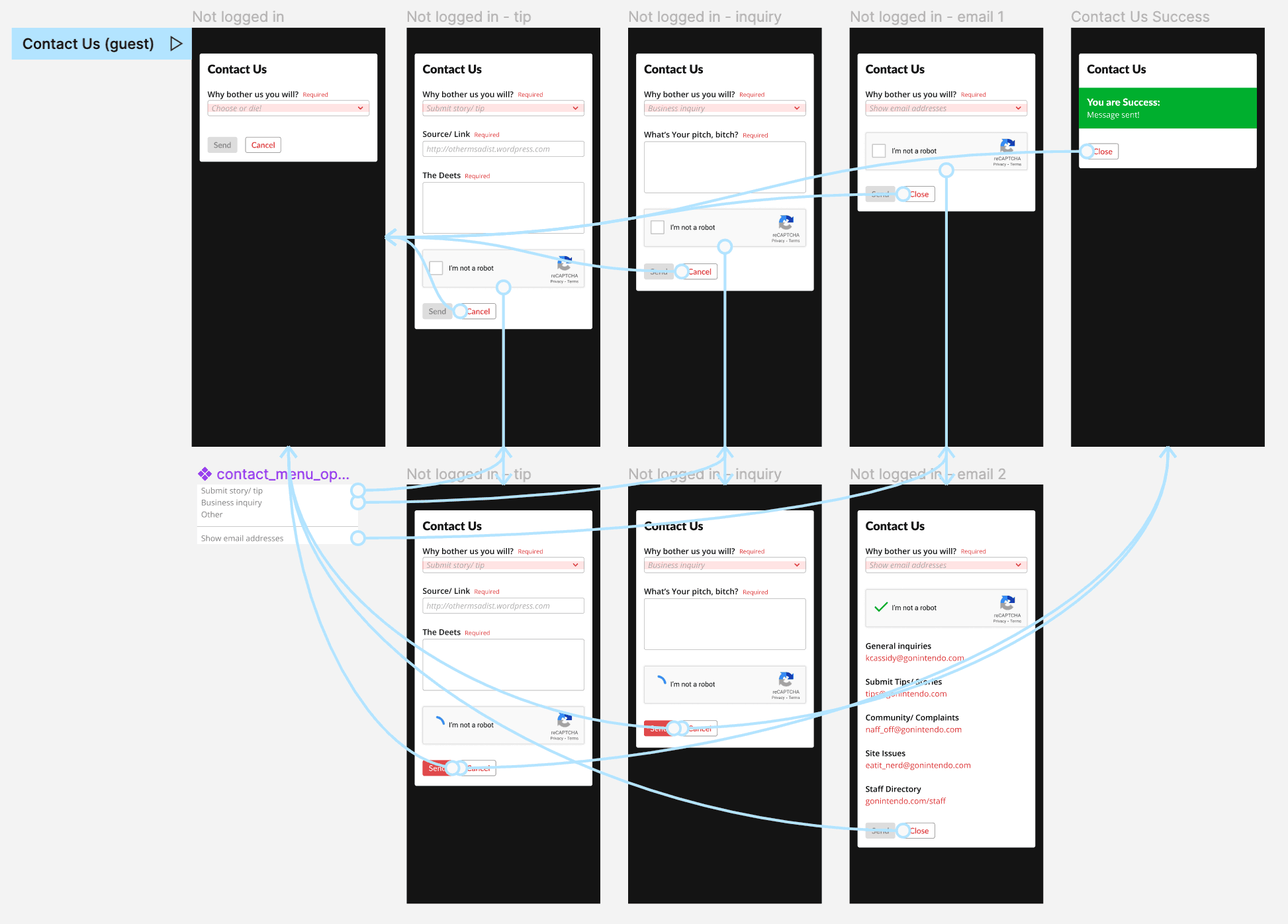
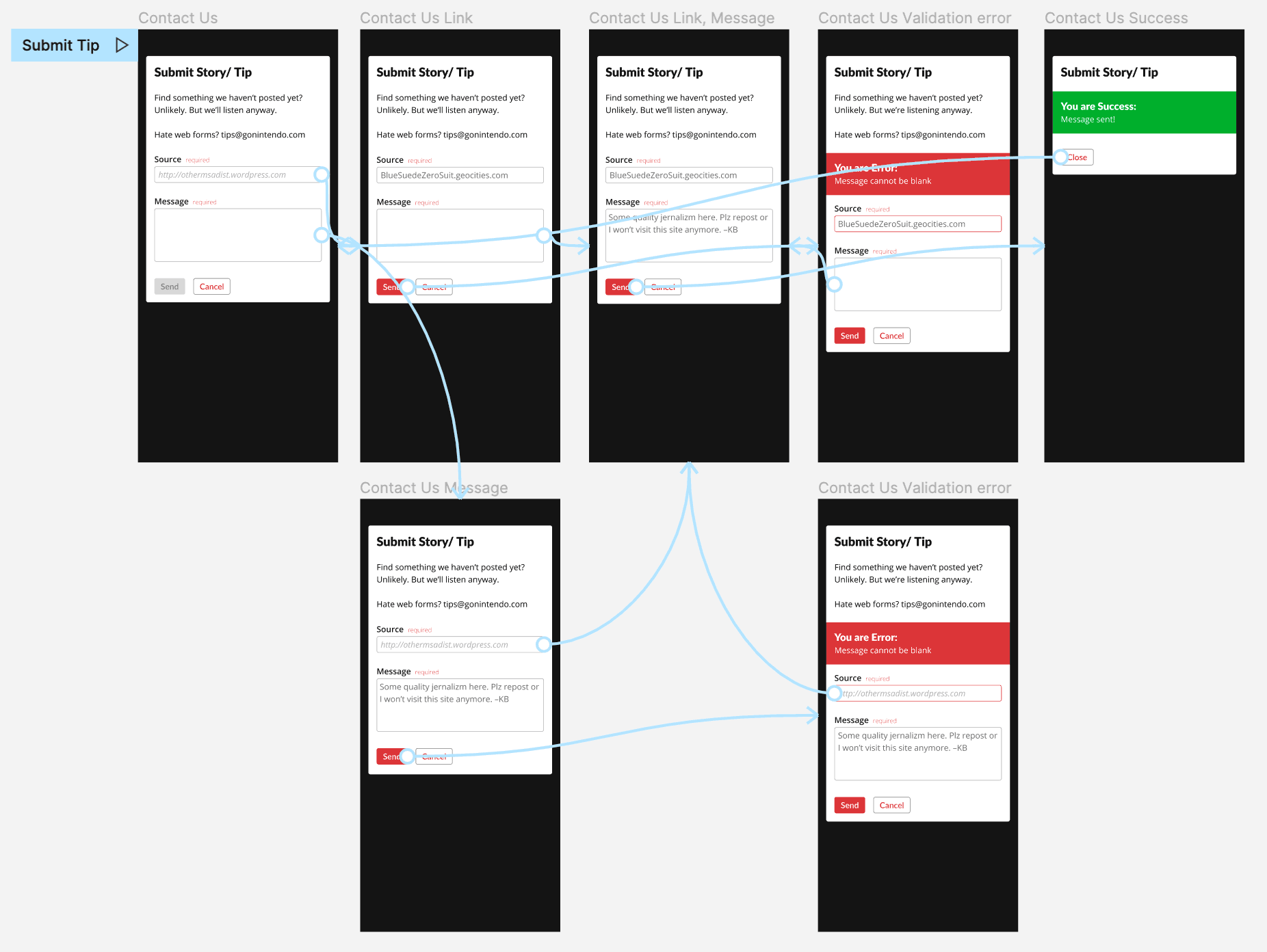
Examples sorting out other UX work like feature user flows and device-specific prototypes:
Ad placement
Ad placement required us to consider both the intrusiveness impact to users while balancing business needs to pay bills.
But the larger UX conundrum was how to intersperse ads given the user behaviour we discovered in earlier research.
In the past, standard pagination (click Next or Previous to load a new page) allowed us to place ads in consistent and specific locations within a layout; something highly desirable to ad companies.
However, based on our initial user research and their usage patterns, we explored using infinite scrolling instead of static pagination. This added several issues:
- Infinite scrolling only allows a single masthead (most valuable, main header) ad once, and then lesser value ads between content as the user scrolls. This means considerably less revenue.
- Most ads use iframes and loads of javascript, which significantly reduce performance with each instance, a serious problem for mobile (read: 80% of our) users.
- this is further compounded by the media-heavy content our editors already post
- Some users reported hating (automatically loading) infinite scrolling, so we needed to find a solution that allowed the freedom to peruse content endlessly but also remain purely opt-in.
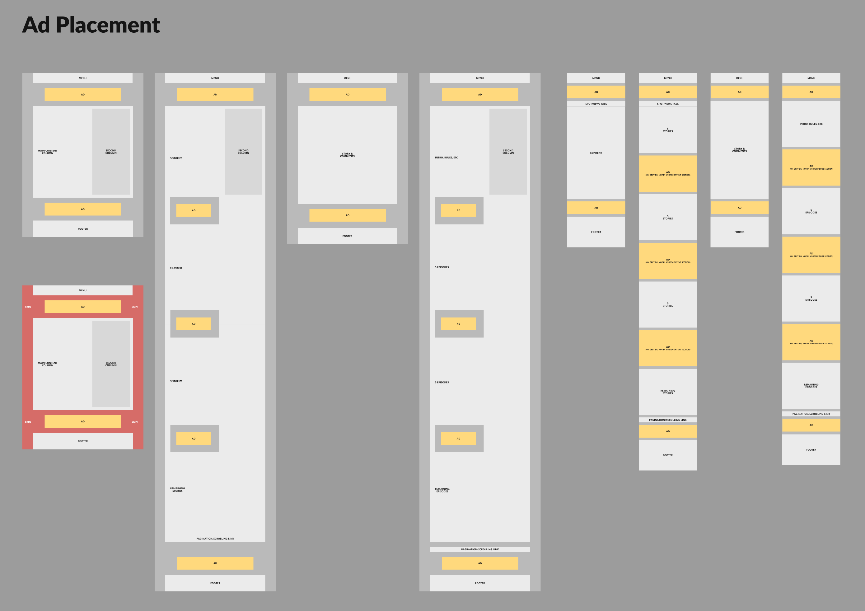
As visible in the low-fidelity wireframes above, once we identified the main sections per layout across the app, we could identify the prime locations for ads.
When it came to infinite scrolling, to solve for the desired opt-in behaviour, avoid performance hits, and a consistent placement for advertisers, we:
- Made loading infinite content a simple button/link at the bottom of each block.
- Ad placement only affects the first fifteen articles; the initial load of content.
- Users see the same amount of ads as a single static pagination, have freedom to load additional content as desired, and advertisers gain their reliable placement. 🥇
Admin panel & publisher
Having defined the necessary publisher blocks earlier and their external-facing appearances, we needed more detailed design and UX attention given to the space our staff would be interacting with the most.
As shown below, we began with really bare bones wireframes, mostly to establish the base functionality, necessary fields, database structures, etc. Everything was essentially a single column with tiny block management buttons hugging the left side; with a stationary, floating panel along the bottom of the user’s screen.
The main UX challenges here:
- assert consistency/logic to field arrangement
- provide users a preview of the block content when appropriate
- provide users enough help/context for each block’s functionality
- make each block visibly unique/identifiable when scrolling through a longer list of them
- simplify block management tools while providing a more robust selection of functions
- simplify the footer contents
We performed a rigorous testing of the interface, blocks, options, etc. over the course of several weeks to refine and optimise the UX for maximum productivity and usability.
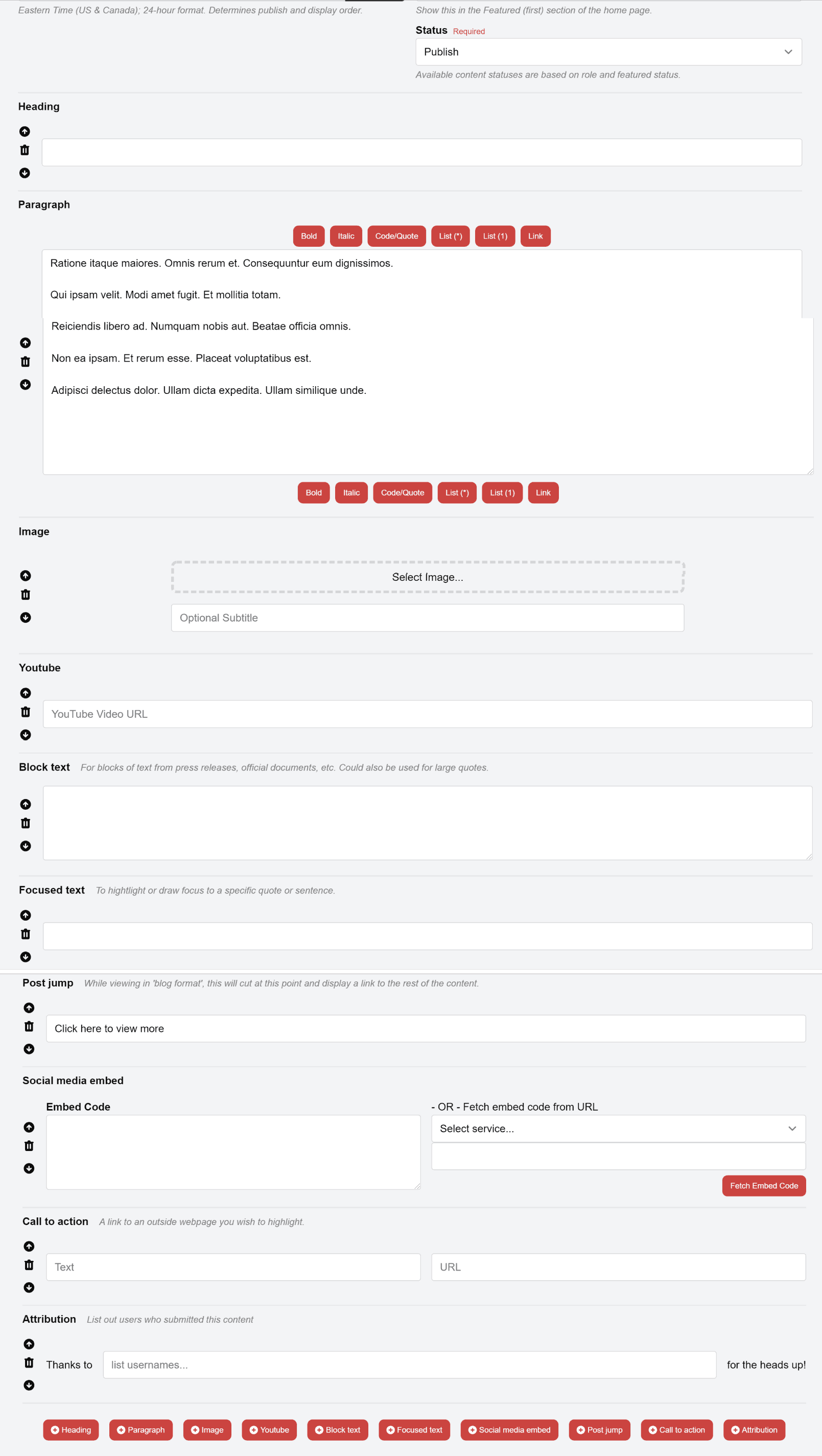
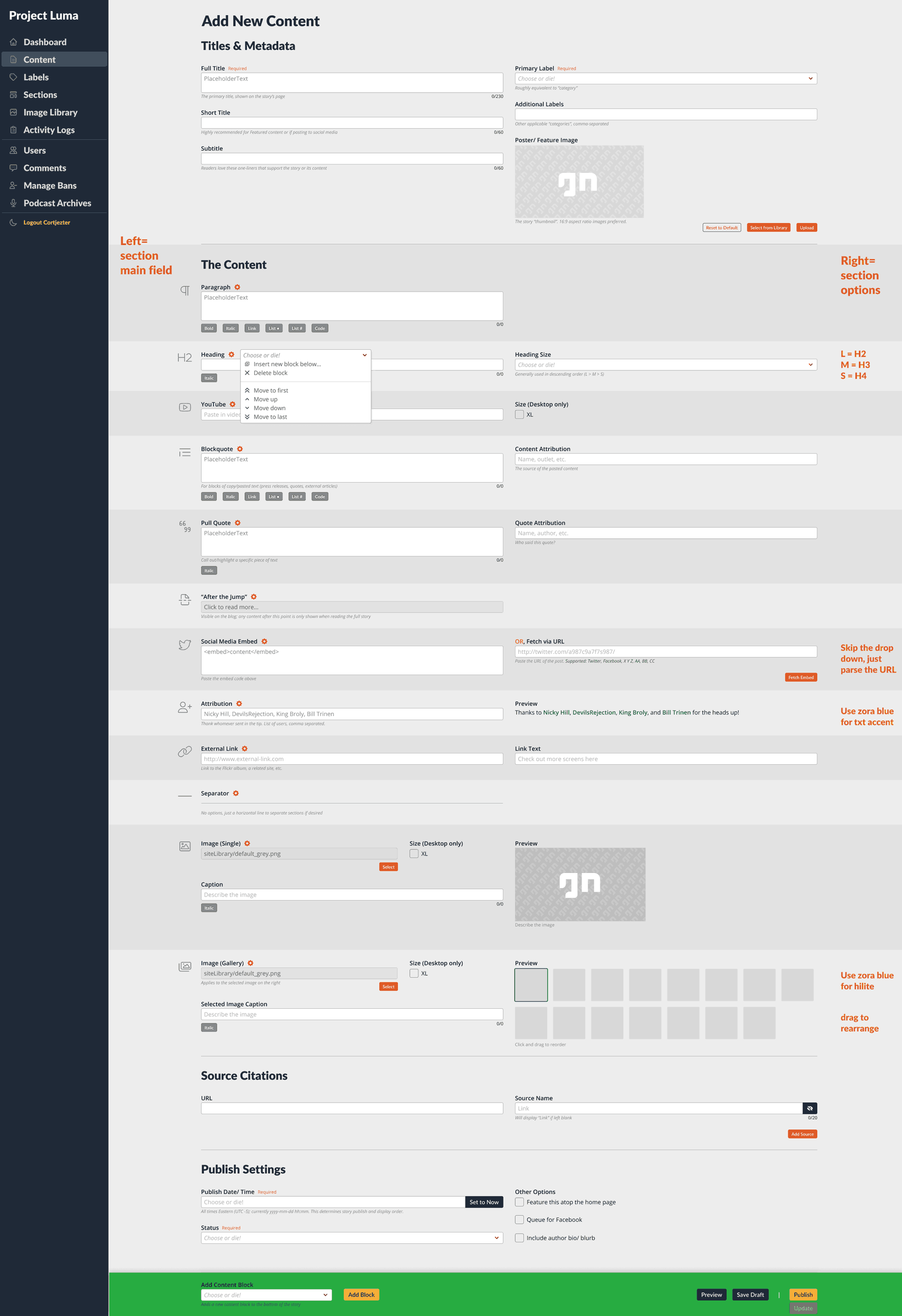
The solutions (shown in image):
- a two-column layout was chosen; data left, options/preview right.
- previews for blocks like images or text appear in the right column, immediately next to the input for side-by-side comparison
- explanatory text resides beneath and/or placeholders inside most fields
- the left margin was repurposed for its identifying icon, which can easily be scanned whilst scrolling
- each block has a management menu next to its title, with greater options to re-order, add, remove, etc.
- footer was simplified to a single dropdown, allowing the interface to remain consistent across browsers, display sizes, and independent of the addition/removal of blocks
Our block editor brilliantly achieved its goal of a large, diverse team all publishing consistent content and with virtually zero training.
Aaron Hoffmann
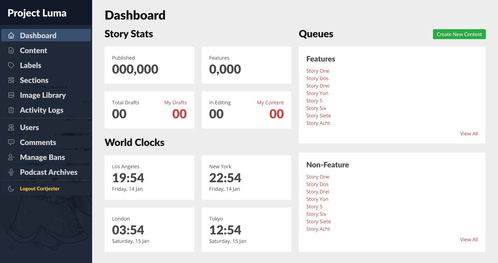
When it came to other areas of the admin area, we again streamlined wherever possible.
The dashboard underwent several iterations, ultimately formatted with cards to present writers/editors all of their necessary stats or to-dos at a glance.
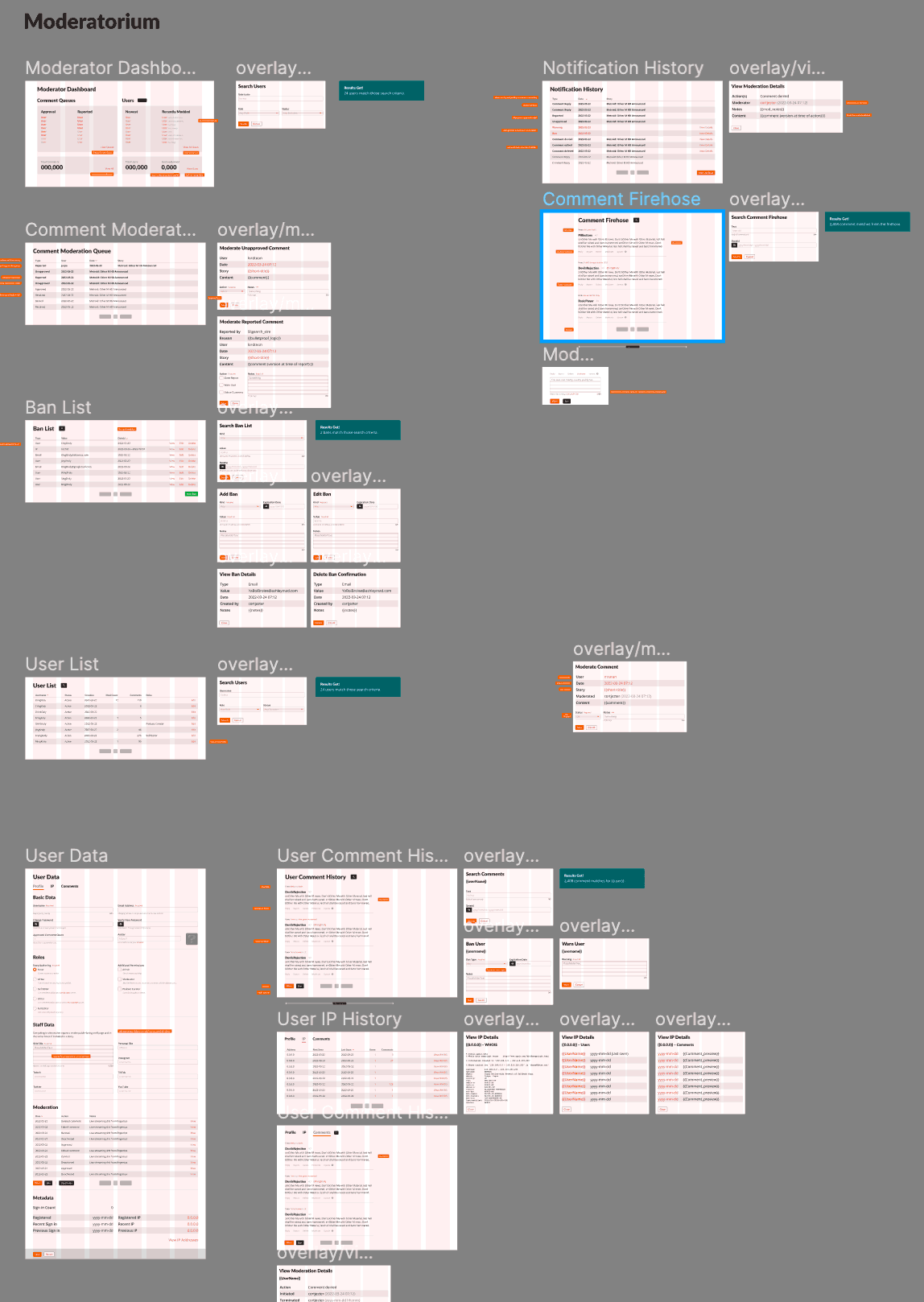
And finally, to show a bit of the other scaffolding, flows, and IA behind the scenes of behind the scenes, in this case, features available to moderator and admin personas.
Branding
Honestly, we kept most of the identity work internal throughout the process until launch, relying more upon leadership approvals than user validation or external focus groups.
We felt confident with this approach for one reason: as mentioned earlier, we based the new branding upon our most popular past identity, and our primary aim was to reduce complexity while remaining faithful to the source.
The overwhelmingly positive reaction upon release validated this decision.
Validate
Our validation phase relied on two primary sources: direct user feedback via interviews and sessions; and code review.
We relied upon the former to ensure the layouts, navigation, etc worked as expected and that we delivered on users’ needs.
The latter, in order to reach our defined goal of 80% compliance by launch, largely relied on my personal review of production code and comparing it to the design specs, and then prioritising for the most salient or efficacious cost/benefit ratio.
User focused
For user interviews, due to Covid and our internationally-distributed team, all sessions were conducted remotely.
Users would be presented anything from low-fidelity wireframes to working coded demos. Notes taken during sessions were processed and findings presented in our weekly leadership and development check-ins.
Below, an example of a medium-fidelity A/B prototype I designed, meant to capture user feedback regarding possible desktop navigation constructs.
Note the lovingly crafted micro-interactions and transitions intended to make each option maximally desirable. ❤️
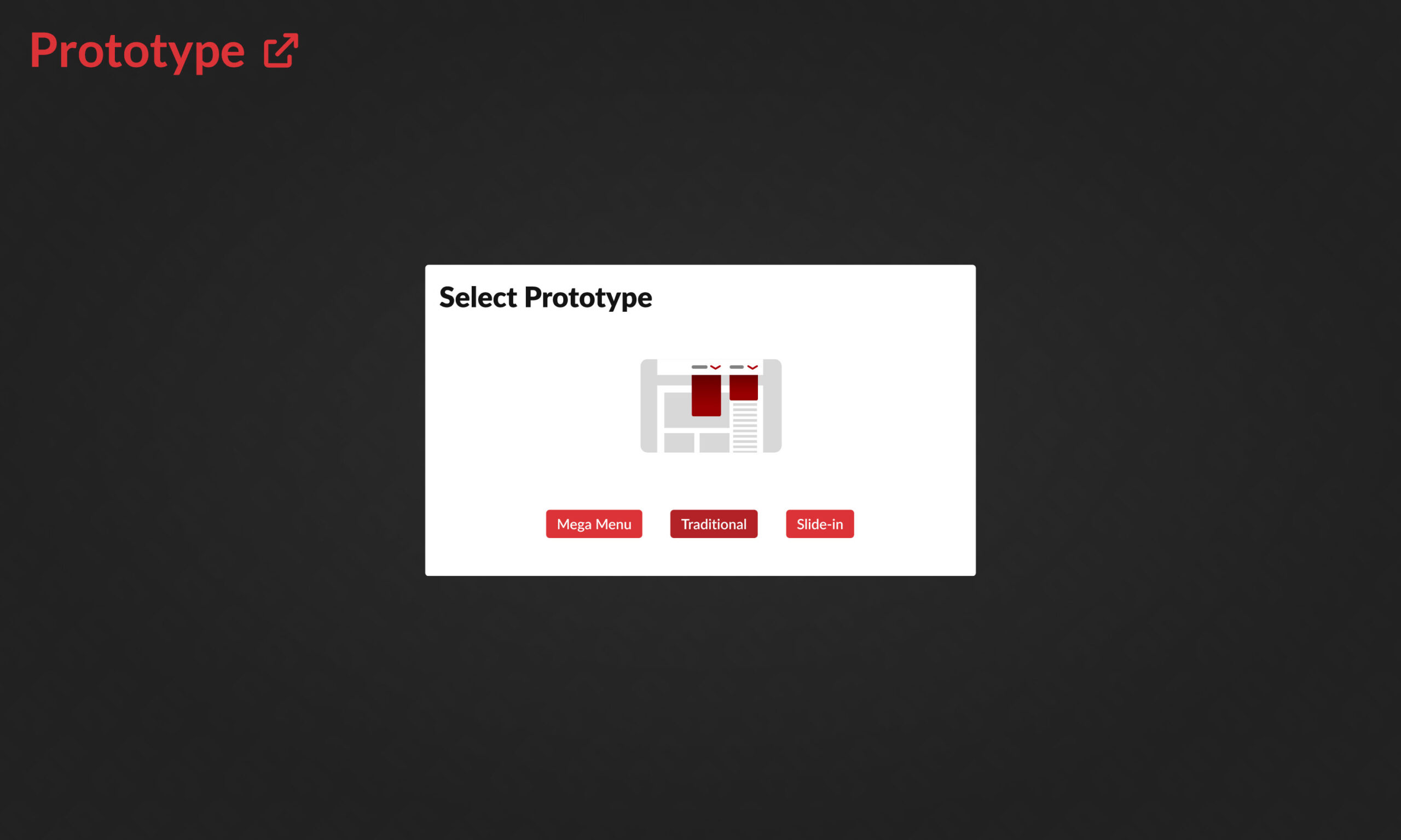
In this particular case, after user testing, we ultimately pursued the “Mega Menu” approach:
- Amongst users who expressed a preference, they strongly favoured either Traditional menus or the Slide-in, and strongly disliked the other.
- While fewer people so strongly preferred it as the other two, nobody disliked the Mega Menu. 🤷🏻♂️
Code focused
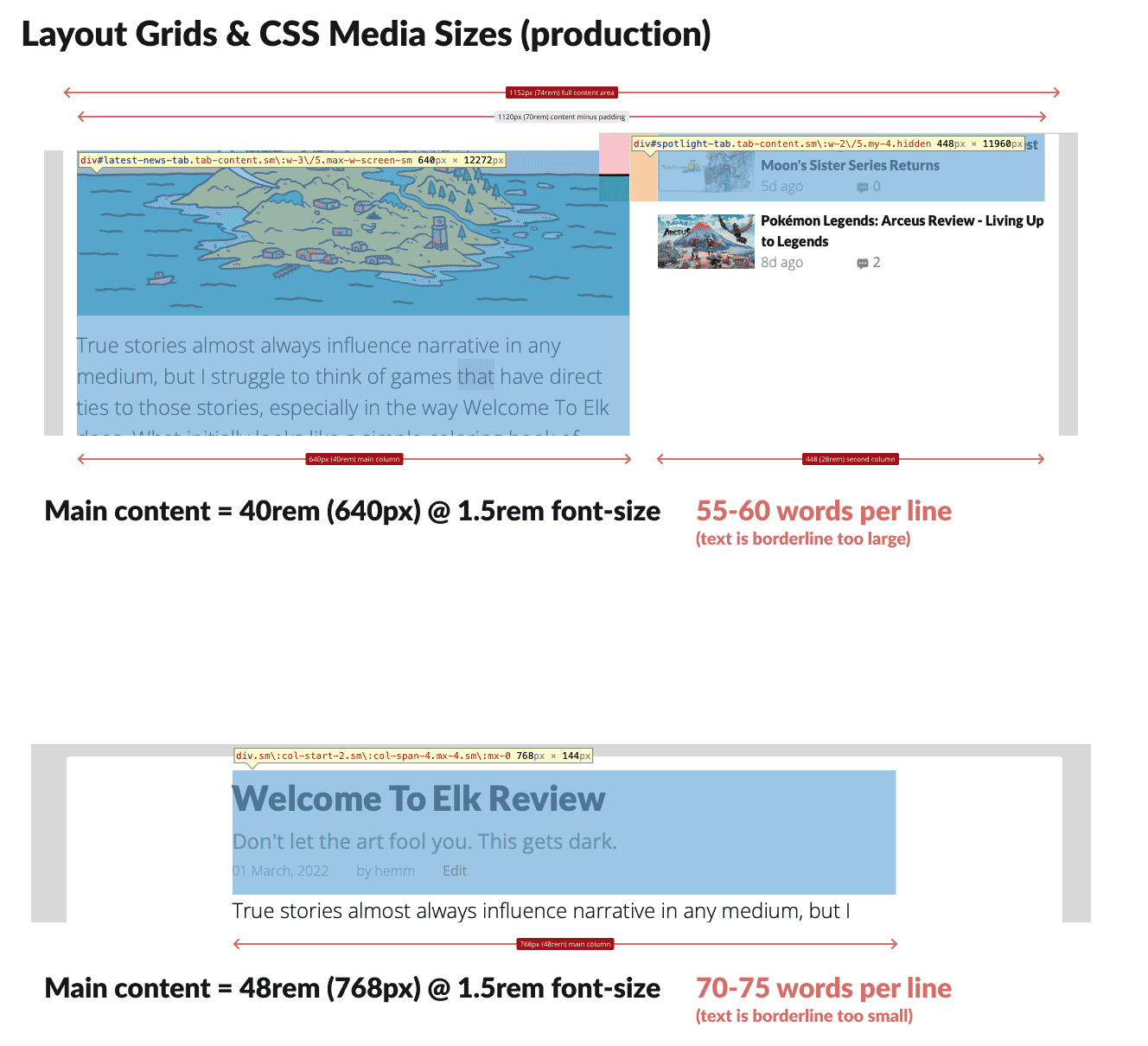
Often this process involved excerpting the Github repository or browser inspector, then using Figma to create aides that illustrate deltas, issues, or present rationale for needing certain code revisions.
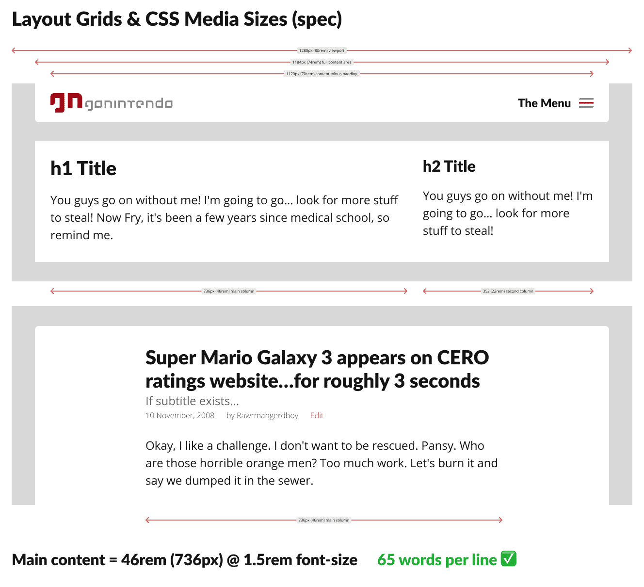
In the below example, a slight deviance from the desktop grid spec meant our app’s massive tomes of text would be less readable, and in fact many users commented on it despite being unable to articulate precisely why.
UX pros ought to understand classic typesetting principles; font size, column width, and leading are a balancing act with algorithmic underpinnings for ideal legibility, meaning this was simple to identify and fix.
Release
After teasing on social media for months prior, we publicly released right on time; precisely one year after going offline (what I dubbed our antiversary), to nearly universal acclaim, surprise and delight.
Thanks to our pre-release user testing, we anticipated the commonest constructive comments, and announced plans to address them in successive patches in the near future alongside our relaunch.
Results
- Released all planned features on time.
- Targeted 80% accuracy of code to design specs, achieved over 95%.
- Vastly improved quality and consistency of staff output, while simplifying publishing workflows and virtually eliminated the need for any training.
- Improved user onboarding, in reduced steps required and time needed from register to usable account.
- High praise from users, partners, and even competition for both the product and our fresh take on a beloved branding from the past.
- Exceedingly few unanticipated “issues”.
Obstacles and learnings
- 突貫工事. Honestly, the largest hurdle we faced was time. What would normally require 1-2 years to build had just four months (plus one upfront for planning) start to finish.
- While the Product, UX, and development leads found a number of efficiencies to exploit, allowing us to perform some steps in parallel rather than purely sequential from planning to design to dev, a solid methodology was what truly allowed us to meet our targets.
- Deadlines were what they were; sometimes walking a short plank is unavoidable, but given talented resources and a process, success is achievable.
- User testing and research was invaluable. Not only did it provide insights during the planning stages leading to less design and development in production, it allowed us to rapidly narrow focus after our initial builds and iterate to release candidate.
- A design system (including documentation) is worth multiple times its weight in gold, even for projects below the enterprise threshold. Without one, UX debt will seep into and dampen any project.
- An organisation’s UX maturity can make or break a project, especially the more limited its resources of time, money, or talent. Being able to directly affect this from a Director level was a convenient win, but having worked with projects and companies suffering a lack of UX maturity, the contrast is black and white.

