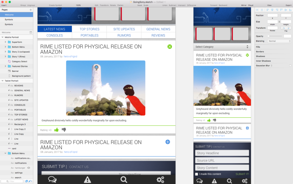
So far in my explorations of modern UX/UI apps, I’ve run through Axure RP 8, Balsamiq, and Adobe XD. Each has their strengths, and Sketch from Bohemian Coding is no different.
I find the overall toolset and options to be the most authentic visual analogue to designing directly with HTML and CSS code. Whereas Axure includes many authentic CSS properties, they don’t always render correctly, even within the application, and many CSS level 3 properties are absent from tool and object options. Sketch really fills out its panels with nearly every option you can think of (while remaining faithful to CSS3 spec), especially when it comes to visual design and layout. It also lets you recycle elements easily, making the creation of responsive layouts very quick. Overall, designs tend to look much more polished than Axure.
What it misses out of the box are all of the interactive elements and scripting that Axure does offer, though to be fair, these features are easily acquired through free plugins, something Axure is short on (many Axure add-ons, plugins, etc. are NOT free, and tend to be quite expensive, IMHO).
I think going forward, I’d personally prefer to use Photoshop/Sketch for pixel-perfect layouts and designs, but use Axure (or Adobe XD to a lesser extent) for wire framing and interaction design before passing off to the dev team.
